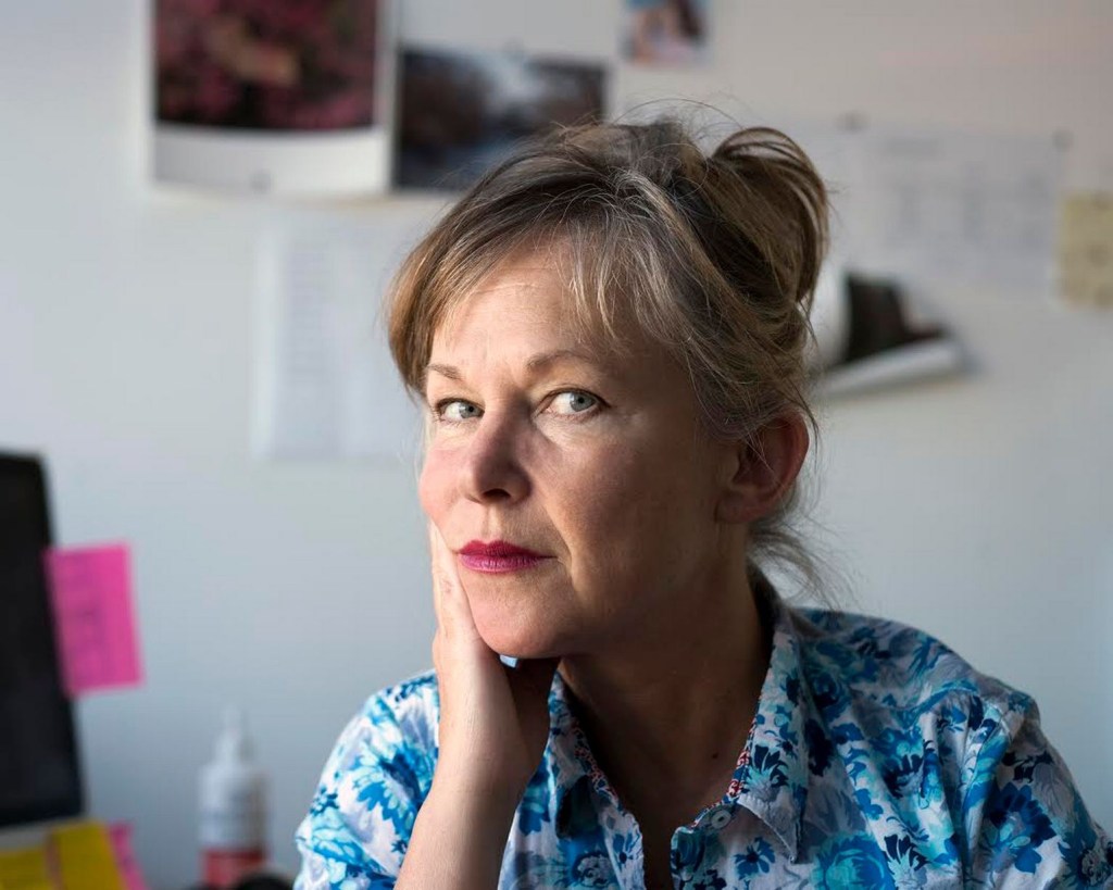
During my work for Assignment 5 I found Helen Sear. She is an artist who states she was influenced by David Casper Friedrichs. I couldn’t move on until I had completed some research into Helen and her work as she was unknown to me.
Helen was born in 1955 in Worcestershire in sight of Wales. She has made her reputation from her studio in Monmouthshire, Wales. As a small girl her father used to go on long walks with her where he taught her about the countryside and nature.
She came to prominence in 1991 when her work was included in the British Council exhibition “De-Composition Constructed Photography in Britain”, this exhibition was popular in Latin America and Eastern Europe (1997).
Artsy (2018) says of Sears work, “She explores her/our relationship with the natural world”. Her work “Inside out” (Sear) reminds me of Friedrichs work with the subject back to camera Helen adds elements to make the photo painterly and dreamlike.
Sear describes her work as a “Double time of image making” referring to the time between taking the initial image and the time during which she superimposes her photographic images (Artsy, 2018).
She was educated at:
1975-1979 Reading university, BA Hons.
1981-1983 Slade School London, HDFA.
2009 PhD University of Newport, Wales.
Jane Wainwright writing in says of her approach “I am trying to slow down the instantaneous of the camera” Wright continues about Sear “ She highlights the ordinary, making it extraordinary. Forcing the viewer to engage with the work and puzzle out the image”.
When Wainwright asked Sear if she had any particular artists or pictures that influenced her work she replied “I am interested in Romantic Painting particularly the work of Turner and perhaps the German romantics such as David Casper Friedrichs.
Pushed further she continues “The people who influenced me were in the end the ones who taught me at college. At the Slade artists like Tim Head and Helen Chadwick” (Wainwright, 2000).
Friedrich`s “Wanderer above a sea of fog” (1818) must have influenced Sear as it did me. However I can not find any specific reference to it doing so. When I look at Sears images I see a similar message as the one I wanted to portray however Sears images have added layers where mine are straight photographs. I want to experiment with this technique and will do so before I leave this research.
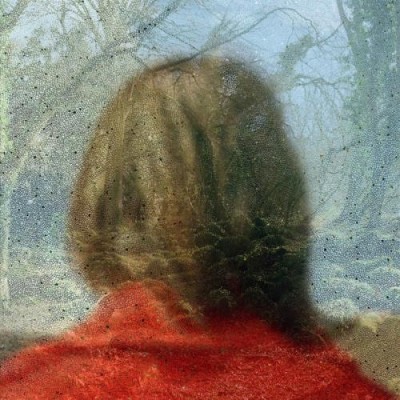
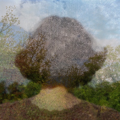
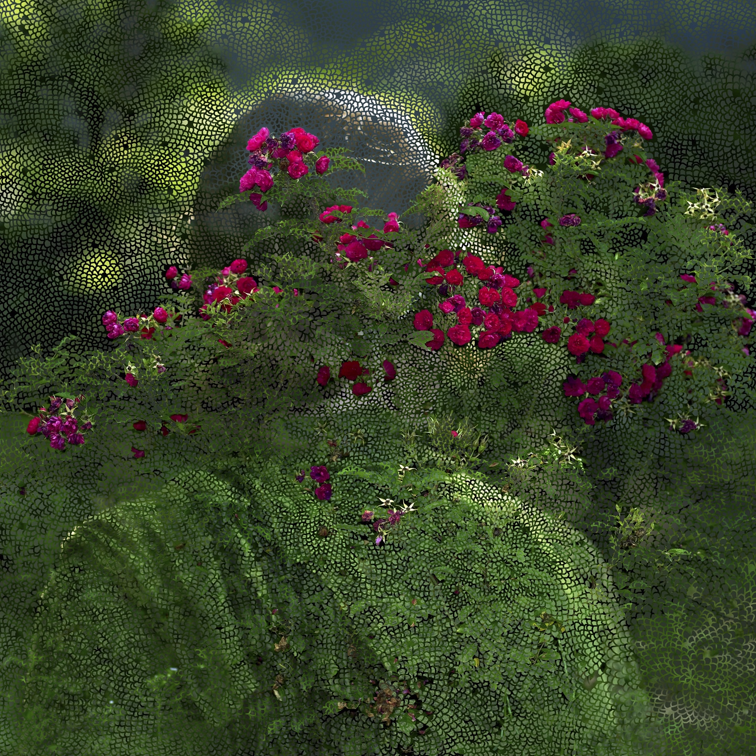
Three images from Helen Sears work “Inside the view” (Sear, 1997).
Valerie Reardon wrote off Sears’s body of work, “Sear draws on the Freud’s notion of the “unheimlich” the uncanny sense that what is hidden is also somehow ghastly. Jacques Lacan reworked this notion and came up with the term extemite a blurring of the line between interiority and exteriority which points to neither but is located where they coincide and become threatening”(1998).
This paragraph was challenging to me I didn’t understand the two words unheimlich and extemite. So I had to spend some time understanding them both. The former means Uncanny/weird and the latter means the lines become blurred and thus threatening. I can see this Angst in Sear’s images at first glance they look sweet but when you look and see the layers they take on new meaning which to me are somehow dark.
David Campany compares her work with Fox Talbot’s image of lace “Talbot placed black lace directly on to sensitised paper and exposed it to the sun, The lace appears white on a dark background it doesn’t look like a negative, the flat fabric is so well rendered by the simple technique. It is stoic and removed yet the light that touches the object then touches a receptive surface” (Campany, 2005). This is talking about the single layer Sear adds more layers to create her art.
Having looked at this work I thought that at first sight it seems simple. It is not, within the square frame are complex layers. The more I look and reflect the more the work asks me to think. I like Helen Sears work very much and I think I will have to explore the artists who influenced her.
Earlier I said I would experiment with how I see Sears’s images and here is that work.
I am a level 2 student with Open College of the Arts. I have been interested in photography since attending college in Leeds in my teens. I spent hours in the college library looking at photography books showing varied subjects, history to autopsy photographs. The ones that interested me most linked photography with Art.
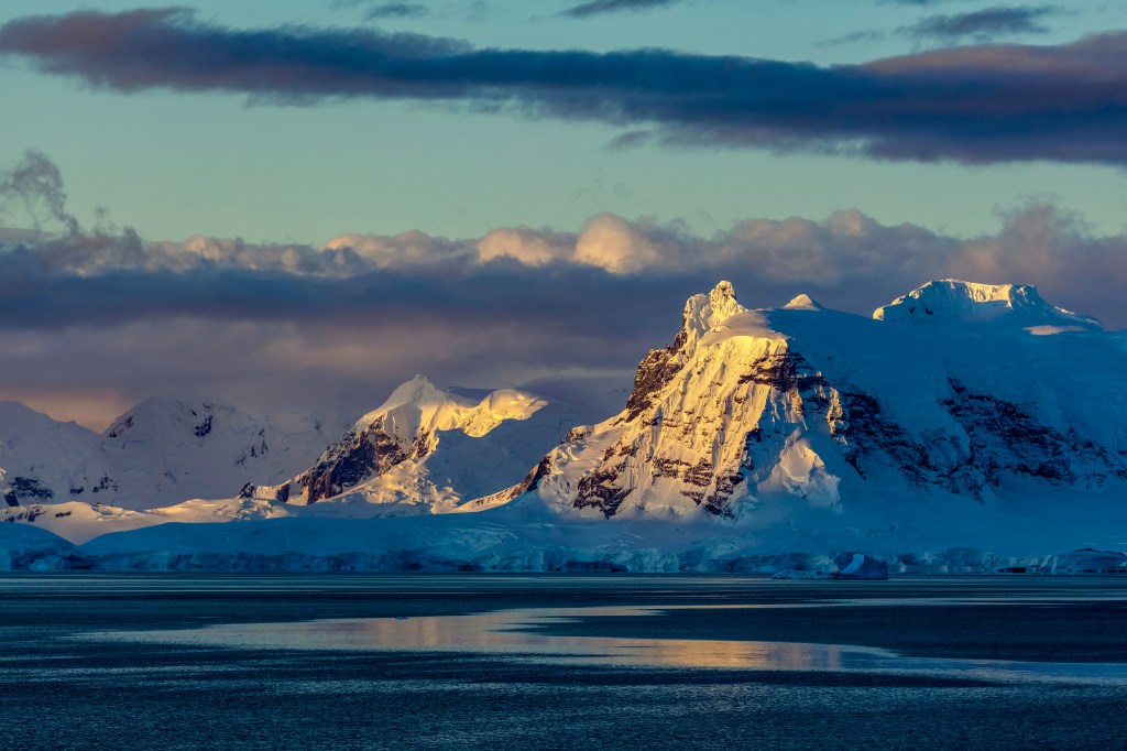
Recently I have been fortunate to visit Antarctica. I tried to capture the scale of the landscapes in Antarctica with varied success. Whilst thinking about these landscapes I saw people having a spiritual experience as they observe the scale of this place. These spiritual moments made me think of Caspar David Friedrich and his painting “The wanderer above the sea of fog”. This painting depicts a person having a reaction to the landscape before them. I see this same reaction in many of the people who witness the landscape in this polar place.
I find it fascinating watching people taking selfies as I did in a previous course. Equally beguiling is the way this landscape has the power to stop you in your tracks. I used my compact camera allowing me to carry it wherever I went and enabling me to quickly deploy it to capture these moments so I can share them with you.
This exercise was great fun to complete. It felt to me like telling a story and supported my thought process out in the field.
On a visit to St Andrews Bay in South Georgia I saw a beach with 100,000 breeding pairs of King Penguin and 5000 seals. They arrive on this beach within a few days of one another and return to the sea just as quickly once they have all bred and raised young.
Earlier in the course I had read about Roger Fenton (Fenton, 1854) and had seen his photographs of the aftermath of the charge of the light brigade his photo shows cannonball on the road used for the charge. This started me to think of the aftermath of the visit of the animals at the site I was to visit.
Roger Fenton Valley of the shadow of death 1854.
So I started by creating an outline of the kind of shots I would like to tell the story of the aftermath. The shots will not be easy for the viewer to see as they show all the gruesome aftermath much as those used to depict a battle.
I will open with a shot of the site fully populated by the breeding birds and then later in the season look for shots showing the suffering the creation of the next generation produces. I took sixty photographs over the next three months.
On my return home I looked at these exposures and got the list of ones I wanted to use down to twenty. The extra forty are duplicates of the same shots so are not needed.
I looked at several slideshows including the one in the course work by Andy Adams (Adams, 2013). I didn’t want to subject my viewer to 18 minutes. The duration I could comfortably watch was around three minutes so that is my target duration.
Another that stood out was Hunter Noack (Noack, 2017) and the Slideshow entitled In a Landscape. This slideshow tells of a classical concert about the landscape. It shows photos of the concert and people enjoying music in the outdoors. It is two minutes long and I felt comfortable watching for this duration.
This means each exposure in the slideshow will be visible for four seconds. This gives a total run time of just over two minutes. This should leave my viewer wanting more. One of my key aims in producing this work.
I used Photoshop to edit the images and then transferred them to my iPad where I used movie maker to produce the show. The process was very easy to follow and the instructions were informative and helped me add titles where I wanted them.
Next I considered music. I tried Sinfonia Antarctica No 7 by Vaughn Williams (Williams, 1952). It worked to a degree but was too long and a little too dramatic. I had made a series of recordings of animal noises and the sound of the sea and wind on my iPad so I tried these. They work perfectly and will allow me to add commentary so the viewer understands what they are looking at.
Last I played with titles I kept this as short and simple as possible just giving the location at the beginning and ending with the words “Until next year” to make it clear this will repeat every year.
Below you will find a link to my work, click on the link and the file will open on your system,please feel free to comment and let me know if what you think of my approach to the subject.
I read the article written by Sharon Boothroyd (Boothroyd, 2020) and agreed with her observation that it was professional looking. I wondered though what I had gained and lost with the experience?
Andy Adams (Adams, 2012) has curated an interesting,beautiful and an entertaining slideshow. With some great images in recognizable styles.
I felt the slideshow was a little long at 18 minutes but stayed the course and overall enjoyed the experience. It certainly showcased many artists and their work. The accompanying words added to the experience and I noted quite a few names for me to look at after the show.
Not being able to spend more time with some shots and less time with others was frustrating at times. However I went back and paused to look with more detail at both shots I liked and liked less. However when paused the detail suffered and I wasn’t getting the best I could from the work being shown to me.
Therefore this would work well if accompanying another format say a book or as a trailer for an exhibition. It would work well to tease me to seeing more. I enjoyed it though. The different artists use of irony and humor made the show very watchable.
The film was lacking sound or commentary and the fact the film is so long made it feel a little sterile to me. Just a few sound effects or some words from the artist would have added a new dimension to the piece of work I watched.
I wonder about commentary but I am not sure if the world is ready for my Yorkshire accent but will experiment when I make my slideshow.
I think my slideshow will be called aftermath and will show the aftermath of a breeding season of a penguin colony. I will add sound and commentate over the images. I am looking forward to this one. However I will keep the time length down so my viewer wants more and is less inclined to become bored.
In this exercise I am asked to put together a quotation and comparison from three companies to get my images professionally printed. To get this done I will need to have a set of criteria to work to. I think that I must look at getting the print completed as big as possible so A3 or A2. I will look at C- Type printing and Giclee printing.
Before I put together the quote I think it would be useful to look at the difference to fully understand what is on offer from the companies I get quotations from.
C-Type printing or Lampda printing is much like a develop analogue print. Photographic paper is exposed to light to create a high quality print. It is almost a darkroom in a digital age. Quality photographic paper goes through the printer and is exposed to light. This light contains the data from a digital file. The source can be either LED or Laser light. After exposure it goes through a typical chemical process to fix the exposure. The paper can be Matte, Gloss or Metallic and the finished print is termed Archival and has a life of up to 40 years. The finished product will be of around 400 dpi.
Giclee printing uses a high quality printing employing 8 to 12 inks sprayed through a print head. This produces a high quality print however it will not be quite as detailed as the C Type print but will be of high quality none the less. The big advantage for Giclee is the number of papers available From Matte, Gloss, Super Gloss, Cotton, Textured and so on. You can combine this to create effects to bring the best out of you images. The finished product will be 300dpi.
Neither is better than the other they produce high quality prints we artists need to think carefully about what we want to say when we show our images. Using the right process can bring the best out of our work.
This first set of quotes is for C Type printing on A3 Matte paper with no mounting and no finishing coat. All prices include VAT. Paper weight is gm2.
Company
Place
Paper
Price
P&P
Spectrum
Brighton
Fuji Crystal Archive Matte
£8.88
£6.50
The Print Space
London
Fuji Crystal Archive Matte
£9.85
£4.35
Digital Lab
Newcastle
Fuji Crystal Archive Matte
£7.32
£6.95
Quotations for C Type Prints.
This quotation is for Giclee prints the size is A3 Matte paper with a weight of around 310gsm. The great thing with Giclee is the number of papers available this allows us to create different effects. For this quote though it makes it a little difficult to create a level playing field. So I used cotton rag as a benchmark to create this level playing field.
Company
Place
Paper
Price
P&P
Spectrum
Brighton
Cotton Rag Matte
£12.48
£6.50
The Print Space
London
Cotton Rag Matte
£12.96
£4.35
Digital Lab
Newcastle
Photo Rag Matte
£34.00
£6.95
Quotations for Giclee Prints.
Next we were asked to prepare a print to the specifications the company require to obtain the maximum print quality for one of the companies. I chose Digital Labs to prepare an image for their process. Their website required the following.
To get the best results please work in sRGB colour space ( please do not work in CMYK ).
Files should be supplied in 8-bit mode. We use Noritsu 3701HD and 3704HD printers and a Chromira printer for large format prints and these will only handle 8-bit files. When working with 16 bit files please change to 8 bit as the last step of your workflow.
All prints up to and including 18″x12″ (plus panoramic format prints up to 36″x12″) are printed on our Noritsu machines. Ideally these should be supplied at the required print size at 300ppi.(For good quality we advise at least 200ppi.)
All prints larger than 18″x12″ are printed on our Chromira 50 printer and these should be supplied at the required print size at 300 ppi. (For good quality we advise at least 200ppi.)
If you require large prints on our Chromira printer you can supply JPG files via our online ordering system or if you prefer to send TIF files please use the WeTransfer channel. When saved at a high quality compression setting (10-12) JPG files are perfectly acceptable in comparison with TIF files.
If you do send TIF files for very large prints please flatten your images and do not use LZW compression.
This image meets the criteria set by Digital Labs for Printing by both C Type or Giclee.
In the final part of the exercise I am asked to consider if an inkjet print is a photograph. I thought it would be good to consider the meaning of the word photograph. The word derives from Greek and translates to light drawing. Collins english dictionary (Collins, 2019) gives the definition:
The process of allowing light to fall on a photo sensitive material is within my camera with light passing through a lens onto light sensitive material, the sensor. It is then store and manipulated digitally and finally printed using an inkjet printer at home.
I feel this is most definitely a photographic process which produces an image. What I must decide is how I want my viewer to see the image. Unlike a film camera I can decide to create a chemically produced image or I can use many different papers to create the look I want to get the best from my images.
Some photographic competitions wont allow inkjet prints but these are becoming fewer and fewer. I can understand why the organisers want to see chemically produced images however an inkjet image created with quality ink stands up just as well as a chemically produced image.
Works Cited
Collins. (2019). Collins English Dictionary. London: Collins Publishers.
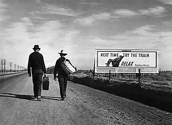
Looking at “Towards Los Angeles” (Lange, 1937) has taken me on a journey. This journey had a starting point just enjoying Dorothea Lange’s photograph. Stops along the way included the New Deal, Roy Stryker and his methods of work. Jack Delano writes “Through these travels and the photographs I got to love the United States more than I could have in any other way” (Delano, 1942). My journey ends with an understanding of the catalyst that created this body of work.
I chose to review this photograph partly because it doesn’t show female subjects in a matriarchal role. Dorothea Lange was unfairly called the “Mother” of the group of photographers within the Farm Security Administration. Dorothea Lange was given this title as she showed mothers in a lot of her photographs. I disagree she showed strong female icons who were struggling to hold together their families. Florence Owens Thompson the primary subject in “Migrant Mother”, had just sold the tires from her car to put food on her children’s table. This was a lady doing whatever to keep her family intact and to my interpretation the use of ‘Mother’ is intended to reduce and oversimplify the importance of her role
.
Looking at “Towards Los Angeles” I see two men travelling along a dusty road past a billboard which shows the advertising slogan “Next time try the train……..Relax”. Both men look like they couldn’t afford to take the train. They are walking a dusty road Highway 99 through a dark verge and a line of telegraph poles which form strong leading lines emphasising the distance travelled and the way to go to reach their destination. They are carrying their luggage by hand. Both wear hats shielding them from the sun hinted at with brown necks. The boot of the man on the right is raised making me feel it is a “decisive moment” in the style of Henri Cartier Bresson. Bresson’s photo “Behind the Gare Saint Lazare” (Bresson, 1932) shows the decisive moment of a man leaping across a puddle. The man’s foot is above the water separating him from the physical world it hints at movement in the instant. Neither of the men in Towards Los Angeles appears to be taking any notice of the billboard the punch line of the photograph. As I study this photograph I begin to wonder if it was staged.
Why include a Billboard? In February 1936 Walker Evans had taken “Framed houses and a billboard” (Evans 1936) followed a year later by Edwin Locke who took “Road sign near Kingwood, West Virginia”, (Locke, 1937). Lange took similar images along route 99 and would have been aware of all of the images taken by Evans and Locke as they were colleagues.
At the same time Margaret Bourke-White was in Kentucky not part of the FSA project. She saw a line of people, displaced by a flood, the people were queuing underneath a billboard she created “Kentucky Flood”, the billboard shows an all American white family with the slogan “Worlds Highest Standard of Living” then a second line stating “there’s no way like the American Way” (Bourke-White, 1937) a truly powerful image as it includes black people, waiting in line for relief from hunger. With a white family enjoy the American dream.
Concurrent to Bourke-White, Lange had been sent to document peoples living conditions along Route 99 in California. It is my interpretation that Lange must have been aware of these photographs as she worked with and was friends with Evans and Locke. Life magazine published “Kentucky Flood”. Around this time she took several shots showing billboards in the landscape but then she made several shots of Pea Pickers using bill boards as shelter. She made “Dispossessed” (Lange, 1937). This photo is less tidy and to me looks like it is a true record of the scene not staged at all.
A little later in the day she made “Towards Los Angeles”. The Billboards in all these exposure are for Southern Pacific Railway but all have different pictures and slogans. None would have been suitable for the two walkers shown in “Towards Los Angeles” as they all had too much of the clutter around the billboard.
Researching this photo took me to the Farm Security Administration. This organisation was formed as part of President Franklin Dwight Roosevelt’s, New Deal. The organisation was tasked with recording the plight of the agricultural population of the United States. Roy Stryker was employed to head the documentary department.
Roy Stryker was an academic specialising in economics. He applied his academic knowledge to his given task. He said “Our editors, I’m afraid, have come to believe that the photograph is an end in itself. They’ve forgotten that the photograph is only the subsidiary, the little brother, of the word” (Stryker, 1936). He realised that photographers with an artistic background would help him gather the images needed to support the written word. He was a firm believer that photographs supported written words and was only part of the truth to be shown.
Stryker had served in the infantry during World War One. This would have given him self discipline and could have been a part of creating his over bearing reputation. In 1964 Lange described his working practices thus “That freedom that there was where you found your own way, without criticism from anyone, was special. That was germane to that project. That’s the thing that is almost impossible to duplicate or find. Roy Stryker…had an instinct for what’s important. Its instinct. And he is a colossal watchdog for his people. If you were on the staff, you were one of his people, and he was a watchdog, and a good one” (Lange, 1964).
Much of the work I researched spoke about Stryker being a micro manager, who told his team of photographers what to read, where to go, the things to shoot and how to show them. I then found some examples of Stryker and his assistants taking a hole punch to exposures that they felt didn’t meet the brief. I found this shocking. In completing my research I found letters from Stryker (Library of Congress, Various dates) in which he talks about the cost of setting up shoots and questions such small amounts as $5 for travel. He was in control of every detail of his brief, supervising all parts of the work his team produced.
In an interview in 1997 Naomi Rosenblum the author of A History of women photographers (Rosenblum 1994) describes the FSA process “In common with other government agencies that embraced photographic projects, the FSA supplied prints for reproduction in the daily and periodical press. In that project photographers were given shooting scripts from which to work, did not own the negatives, and had no control over how the pictures might be cropped, arranged and captioned. There position was similar to that of photojournalists working for the commercial press – a situation that Evans and Lange found particularly distasteful” (Rosenblum, 1997 336-9).
Stryker frowned on manipulation of images evidenced by his reaction when Dorothea Lange removed a floating thumb from “Migrant Mother” (Lange, 1937) Stryker admonished her for doing so. However at this time many famous photographs were manipulated Josef Stalin had Nikolai Yezhov removed from a photograph taken at Moscow Canal (Getty Images, 1934) and Frank Hurley photographer on the Shackleton expedition removed a second boat from the famous “Rescue by the Yelco” (Hurley, 1916) a photograph taken of the crews rescue. He simply scratched the second boat from the negative to add drama. So manipulation was employed long before photoshop (Adobe, 1991).
The FSA produced 164,000 monochrome negatives. 77,000 were made into prints (Library of Congress, 2012). 664 colour prints were produced from 1600c negatives. They featured in the press and in magazines making the cover of Time and Life magazine to show the suffering to all people in the USA. They created a picture of the Great Depression and triggered social changes in both housing and working conditions across the states.
Roy Stryker receives a criticism, I see a man who was educated, focused and understood his brief totally. He also understood he needed to direct his team who were working remotely with little supervision. We live and work in an environment utilizing the internet to give us almost instant reaction to our work. Think of sports photographers they send photos from the stadia direct to their office, getting the image into print or online in seconds. Stryker’s team had to post film into their office taking days to reach Washington. Then the images were processed and a contact sheet would be returned to the practitioner to be captioned and returned. This process would take at least fourteen days. Stryker would need to micromanage this to control it.
Whilst completing my research I found several letters to and from Stryker one of which admonishes the photographer for duplicating the same image five times (Library of Congress, 2012). These negatives would need to be destroyed to save filing space. He also made decisions about exposures whether they were in focus and whether complied with the Governments brief. With 77,000 images to control the process would need to be efficient so the work process could be efficient. I think of my digital library and the issues I experience keeping it clearly catalogued.
All of this begs the question did he trust his team of highly experienced photographers to deliver the photographs he needed to deliver his brief?
I think Stryker trusted his team based on letters (Library of Congress, 2012) he had a tight rein on the shots he wanted from photographer’s who had just started working with the FSA and he gives a free rein to the local organisation to create an itinerary of shots with Dorothea Lange. If she had been given a strict set of instructions I feel Lange wouldn’t have produced “Towards Los Angeles”.
Early in the project Stryker would destroy unwanted exposures with a hole punch. Ben Shahn another FSA photographer said “Roy was a little bit dictatorial in his editing and he ruined quite a number of my pictures, which he stopped doing later. He used to punch a hole through a negative. Some of them were incredibly valuable” (Arbuckle, 2009). Evans and Lange were vociferous from the start about this issue. He listened to the concerns of the photographers stopping this later in the programme. Most of the photographers had protested against the destruction of their images.
In 1942 during WW2 the FSA was incorporated into the Office of War Information. Stryker employed Paul Vanderbilt to catalogue, improve and simplify access to these images. They arranged for the images to enter the Library of Congress, Vanderbilt went with them and continued his cataloguing work. Many would have just walked away job done, Stryker worked to ensure the collection not only was secured but was kept for all to see.
So far I have considered the way the FSA and Stryker organised the brief to gather the shots needed to support this national story. Discussing his dictatorial style, his prescriptive demands could have predisposed the photographers such as Lange to stage their images. If she did would it matter? I don’t think so. Lange had been tasked with showing the gap between the haves and have not’s. This photograph achieves that.
Arthur Rothstein staged some of his scenes for the FSA. Photographs that captured the workers suffering supported the word. Stryker was overbearing, however he recognized his team’s strengths and allowed them some freedom after he had guided them, if they strayed he would not allow the work to progress. He kept tight rein on the purse strings and wanted control of everything from beginning to end. His military background coupled with his academic disciplines gave him the skills to do this. He was the catalyst behind this great project. Without him it would have been quite different, then at the end of the project he ensured its preservation for future generations to view.
This journey has taken me to many stops before I arrived at my destination. Critiquing “Towards Los Angeles” has allowed me to discover the workings of the FSA under Stryker. Without Roy Stryker this collection would probably not exist. We certainly would not have such a concise collection to view and revere.
Bourke-White, M. The Louisville Flood. Art and Artists. Whitney Museum of American Art, New York.
Bresson, H. C. Behind Gare Saint Lazarre. MoMa, San Francisco.
Delano, J. a. (1965, June Puerto Rico). Oral history interview with Jack and Irene Delano, 1965 June 12. (R. Doud, Interviewer)
Evans, W. Houses and Billboards in Atlanta. Art and Artists. Museum of Modern Art, New York.
Hurley, F. Rescue by the tug Yelco. South. London.
Lange, D. Disposessed. Office of War Collection. Library of Congress, Washington.
Lange, D. Migrant Mother. Destitute pea pickers in California. Mother of seven children. Age thirty-two. Nipomo, California. Library of Congress, Washington.
Lange, D. Towards Los Angeles. FSA Photographs. Library of Congress, Washington.
Rosenblum, N. (1994). A History of Women in Photography. New York: Abbeville Press.
Rosenblum, N. (2010). A history of women photographers. In N. Rosenblum, A history of women photographers (pp. 336-339). New York, London and Paris: Abbeville Press.
Southern Pacific Railroad. (1937, March). San Francisco, California, USA.
Unknown. Josef Stalin Group at Moscow Canal. Josef Stalin Great Purge Photo Retouching. Fine art images/Heritage Images/Getty Images and AFP Group, Chicago.
Walther, P. (2008). New Deal Photography. Koln: Taschen.
Walther, P. (2008). New Deal Photography. In P. Walther, New Deal Photography (pp. 18-19). Koln: Taschen. Wells, L. (2015). Photography a critical introduction. London and New York: Routledge, Taylor and Francis Group.
Below is my proposal for the self directed project. I created this in Pages on my iPad and have saved it as a PDF. Click on the file below to read my proposal offered to my tutor for my coursework.
The objective of my work is to show people affected by the polar landscape they are experiencing.
What
A series of photographs in which the subject is immersed in the landscape. These photographs will be inspired by David Casper Friedrich’s work “Wanderer above the sea of fog”.
How and why
Through digital photography I will show people immersed in the landscapes of Antarctica. I want to show people who have been affected by the spectacular scenes in front of them. These people will have shown some kind of reaction to the vista, some stand, a lot are forced to sit and contemplate. All will have shown some kind of reaction to the big landscape they are part of, I will have to employ a degree of patience to obtain these images.
Wider Context
I have taken many photographs in this region and most don’t do justice to how the landscape makes you feel. Friedrich wanted to show the sublime in his landscapes, in fact he wanted to display the moment the sublime effects a person. He captured the sublime in “The Sea of ice” and this painting was one of the first to depict a polar scene. It shows an untouched icy landscape so isn’t the same as the work I want to create. Later he employs a “Rückenfigur” a figure shown from behind looking into the scene, I will employ the same method as Friedrich’s to try to show how its splendour makes you feel.
Influences
Friedrich’s has to be the biggest influence on my work. However Ansel Adams, Alfred Stieglitz and Sebastian Salgado all have an influence on it as well. Adams captured images with great detail and gave a feeling of big spaces. Stieglitz showed winter scenes in the city and showed the difficulties of being cold and working in the snow. Salgado captured the landscape and the animals in the landscape of Antarctica. I want to add the element of a person or persons moved by either the landscape and/or animals they are experiencing.
Output
A book of 17 prints 15 of which will be the photos, plus 1 map of locations plus 1 page outlining the work. To complete this work I will need to study Japanese Stab Book Binding. Page layout using Microsoft Publisher or equivalent. Printing techniques with newly acquired printer (these hours are not included in the budget below).
As we are locked down due to CoVid 19 I will show this in either a short time lapse video or perhaps a slideshow. I may consider both one time lapse showing the production process and a slideshow presenting the work.
Budget To produce my photo-book
The cost to produce a single publication for one copy for assessment.
After reading Barthes Rhetoric of image I had a couple of goes at using his method to look at photographs. I looked at a bill board advert and then just chose a photograph from my own collection. Doing this was enlightening. I look at pictures differently after doing so.
He likes structure so puts what he sees into boxes in a table. It makes looking at images and or text easier to break down. Doing this helped focus my mind on even the initially simple image as shown below.
For this exercise I have chose an image that doesn’t have a photograph at all. I did this as I was interested if the technique would work for a simple piece of typology. I think it does. I chose Coca Cola`s advert “You don’t have to stay between the lines”.
It is a bold image that leaps out of the page and appears very simple at first glance. However when you look it is a sophisticated image with a number of signs and signifiers. The table below shows the ones I saw. Maybe you may see more.
Sign
Signifier
Red and White
Company colours recognised the world over.
Bottle Shape
Instantly recognised even though most product delivered in cans.
Usual Simple lines broken.
Implies you can break the rules. Hint at other products available.
Bottle shape made of dashed lines.
Subtle hint at lines crossed rules broken edgy and maybe risky.
Hint at choice
Made me think of other options or alternative products in the range.
Vignetting
Focussed the eye on the product in the center of the image.
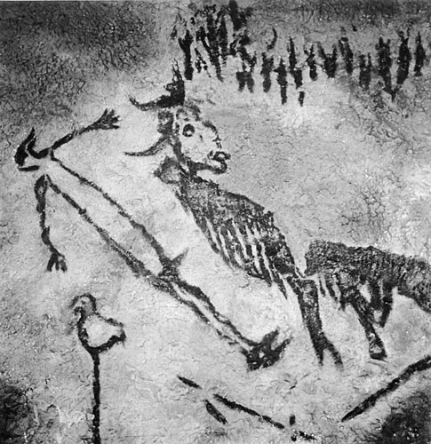
Definition: noun The attribution of human characteristics or behaviour to a god, animal or object.
Earliest example I can find is of a god/mystic from a cave in France painted 40,000 years ago. Zeus Apollo and other Greek deities all had human characteristics too. Hindu animal gods all have human traits to enhance their mystic properties.
God or wizard from French cave art.
First recorded use of the word in western culture is 1745-55 for applying human traits to Christian god! Male image at that.
Aesop’s fables all show animals with human personalities and morals.
Literature has many examples mainly in children’s novels. Here are five fron just the last century.
1. 1865 Alice in wonderland Lewis Carroll.
2. 1894 The Jungle book Rudyard Kipling.
3. 1928 The house at Pooh corner A.A. Milne.
4. 1954 Lord of the rings J.R.R. Tolkien.
5. 1972 Watership Down Richard Adams.
All have been made into films mainly by Disney Studios. Most have some animation within them.
Recent films include Cars, Planes, and Toy Story 1, 2, 3, 4. which move away from showing animals to depicting objects.
Cars Animation of McQueen.
Car design itself is a science of face usage from Smart Car and its friendly face to Ferrari and its angry face. Even the Trabant has a face on its front. Online you can find pages of car face design tips.
Ferrari shows its anger beautifully.
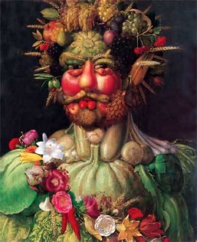
In art Giuseppe Arcimboldo uses inanimate fruit to form portraits the detail is sublime. Vegetables show the form and character of the subject. I wonder what they made of the images?
Giuseppe Arcemodi
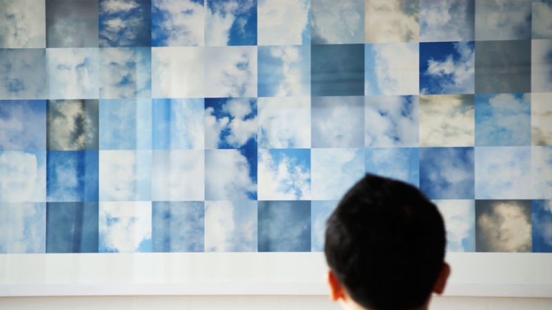
Shinseungback Kimyonghun used face recognition surveillance software to look at the clouds in the sky. From 40,000 captured images 1000 clearly show detailed faces. The images were displayed in Bradford. At first I didn’t see them but when you do it is amazing how much detail you see.
Shinseungback Kimyonghun cloud faces.
As children we do this, playing with our imaginations, we grow out of it! Let’s not, let us use our imagination like a child again, the world would be better for it.
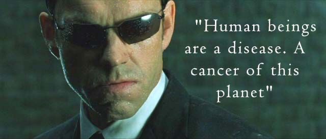
Finally…..for now! Agent Smith says in the Matrix “Humans are a disease Mr Anderson”. He is a Robot displaying feelings so even this pivotal scene in a film displays Anthropomorphism. It is everywhere look for yourself! What can you find?
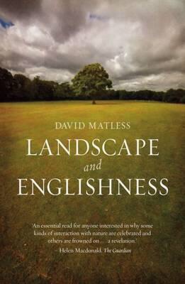
This book looks at what influences the landscape has had on the English being English in the post war years. The author has drawn from many sources, Art, History, Literature, Town Planning and Architecture to name just a few.
The book has many illustrations to support the written word, these are invaluable in helping the reader understand the visualisation which triggered the thought. An early example is the punch cartoon showing the ideal landscape sold to the soldier against the reality he returned to.
He draws from many sources even the AA road books from the 1950s. He discusses the way roads spread across the land then fill in with workplaces and homes. This made me think of the agent in the matrix movie who states “Humans are a disease, Mr Anderson”. (read about anthromophorcism here…………………………….).
Even the general fitness of the population is covered. Hiking and rambling being an ideal way to gain fitness and explore our landscapes. Related to this is a chapter on diet where the diet of Indians is examined at length comparing the varied diet of the healthy Indian with the poorer diet of Europeans with too much bread and processed food. Nothing changes.
All our landscapes are covered from the rural with Morris dancers and travellers to urban with its sprawl and centres of life.
This book is thought provoking and enlightening, I had never realised how much outside sources had influenced the way I see and use the English landscape. Plus the way that has been turned right around to influence what I will do to protect it.
David Matless has written with an easy to read style, with well informed sections that invite more in-depth research to explore the areas discussed. I am scouring second hand bookstores to find some of his source materials. This is a great book just to sit on a train and read.
Work Cited
(1) David Matless “Landscape and Englishness Reaktion Books London 1998.