Whilst discussing my work for assignment 5 it was pleasing to hear my tutor liked the work and was great when we explored the work and found areas for improvement. After our video meeting I set to work completing the following work to fine tune the assignment.
First I corrected the spelling of Evaluation in the title this had been auto corrected to evolution and I had missed it when proofreading. This is my first learning to be more attentive to detail when checking my work so errors are eradicated.
I also added a short piece of writing about what I felt photography added to my work compared to painting.
My tutor asked me to look at the series and ensure all the photographs fit within it. After some time looking at the book I felt the photo of the man in football kit didn’t fit. It wasn’t spontaneous, the subject must have planned to take off his outer garments and be in his football strip. Therefore I removed this from the book.
I also reprinted the image of the man stood on the large rock. My tutor was correct I had burned the subject to show texture in his clothing, it detracted from the shot. So I included the original exposure in the re-stitched book. I feel it fits better within the series my tutor was right.
Making a video showing the work in the finished book was a new challenge. I made it from the point of view of my eyes looking at the book as the pages are turned showing each page being turned. This was a hard process, getting the angle of the book so it was parallel to the lens was vital. If this wasn’t achieved the perspective was off and detracted from the video I wanted to show the viewer. Using a tripod made the whole process easier to set up.
My learning log doesn’t allow video, so I will provide a link to it on my dropbox so anyone can see it. I will also include the video for assessment at the relevant time.
Looking at the Artist Statement I agreed that it could be more critical and added more work to the statement. I explained the urgency I had had to work. Not having the time to ponder before the critical moment passed. This was one of the hardest parts of producing this work. The moment lasted a few seconds and I had to be ready.
In the explanation of the process of Japanese Stab Binding I had included the photographs from Portsmouth University (Batey, 2014) I removed these photos and referred to them instead. Providing a link to the work so any reader can see the process I used. Experimenting with a gallery of me re-stitching the book proved difficult, my attempt is not as clear as the photos from Portsmouth University`s site.
Untitled Landscapes Trangmar 1985
Inside the view Sear 2014.
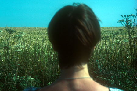
My tutor pointed me to the work of two artists first, Susan Trangmar and her work “Untitled Landscapes” (suetrangmar.com, 1985) shows women looking into the landscape. Each image invites us to look past the back of the viewer into the landscape. The subject is placed so the blind spot is emphasised. This makes me wonder what I am not seeing I start to make stories based on what I am shown and what I cant see. Intriguing and puzzling at the same time. I was unsure if the different scale of the subject worked within the series.
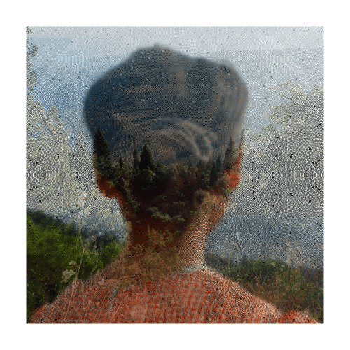
I looked at Helen Sears work focusing on “inside the view” (HelenSear.com, 2014). This work also shows people looking into a landscape., Sears shows two images combined into one, then she adds a third element a layer of fabric. Adding this fabric layer creates a different mood or feeling to each image. I have looked at these images in different mood and they make me feel different reflecting my mood.
Horizon Lennon 2012Boundless Lennon 2012
Whilst looking at the work of these two artists I found work by Julian Lennon (Lennon, 2014). He showed many techniques in his work but two shots showed similar emphasis on the big landscape with people looking into it (Horizon, 2014) (Follow, 2014). A third though has the subject looking out of frame into the camera. (Boundless, 2014). This was challenging to look at, I cannot decide whether I have become accustomed to seeing people looking into the frame. This image seems to bounce my gaze back out of the frame.
This assignment stretched my learning in many ways. I learnt new skills, looked at varied ways of approaching the same technique and considered my work in new ways. It was completely satisfying and most importantly enjoyable.
Looking at “Towards Los Angeles” (Lange, 1937) has taken me on a journey. This journey had a starting point just enjoying Dorothea Lange’s photograph. Stops along the way included the New Deal, Roy Stryker and his methods of work. Jack Delano writes “Through these travels and the photographs I got to love the United States more than I could have in any other way” (Delano, 1942). My journey ends with an understanding of the catalyst that created this body of work.
I chose to review this photograph partly because it doesn’t show female subjects in a matriarchal role. Dorothea Lange was unfairly called the “Mother” of the group of photographers within the Farm Security Administration. Dorothea Lange was given this title as she showed mothers in a lot of her photographs. I disagree she showed strong female icons who were struggling to hold together their families. Florence Owens Thompson the primary subject in “Migrant Mother”, had just sold the tires from her car to put food on her children’s table. This was a lady doing whatever to keep her family intact and to my interpretation the use of ‘Mother’ is intended to reduce and oversimplify the importance of her role
.
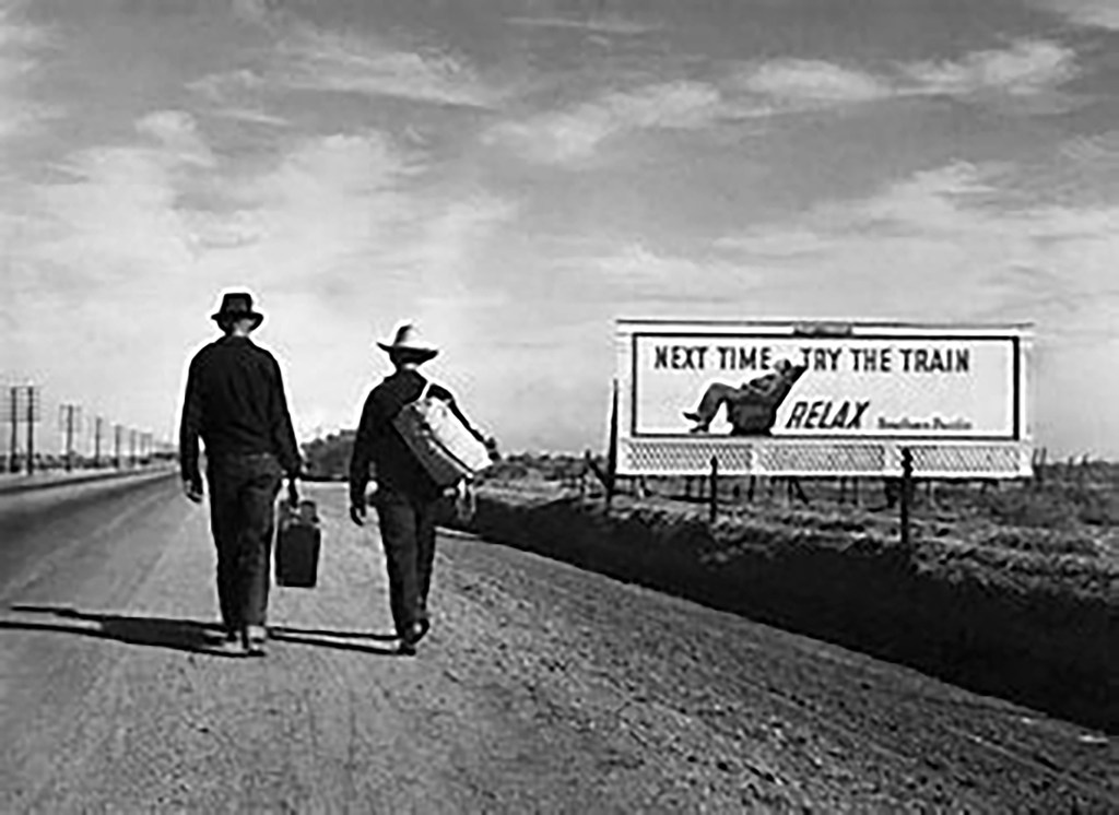
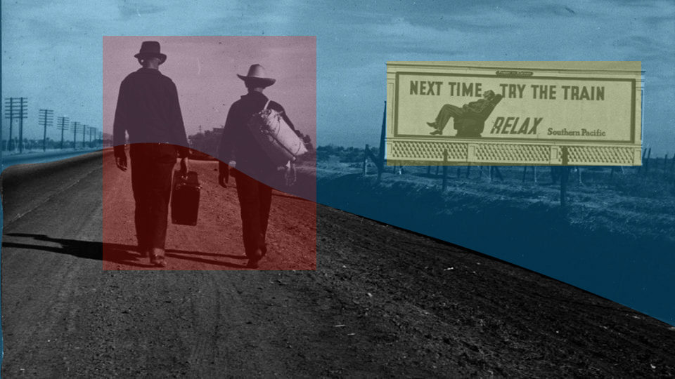
Looking at “Towards Los Angeles” I see two men travelling along a dusty road past a billboard which shows the advertising slogan “Next time try the train……..Relax”. Both men look like they couldn’t afford to take the train. They are walking a dusty road Highway 99 through a dark verge and a line of telegraph poles which form strong leading lines emphasising the distance travelled and the way to go to reach their destination. They are carrying their luggage by hand. Both wear hats shielding them from the sun hinted at with brown necks. The boot of the man on the right is raised making me feel it is a “decisive moment” in the style of Henri Cartier Bresson. Bresson’s photo “Behind the Gare Saint Lazare” (Bresson, 1932) shows the decisive moment of a man leaping across a puddle. The man’s foot is above the water separating him from the physical world it hints at movement in the instant. Neither of the men in Towards Los Angeles appears to be taking any notice of the billboard the punch line of the photograph. As I study this photograph I begin to wonder if it was staged.
Why include a Billboard? In February 1936 Walker Evans had taken “Framed houses and a billboard” (Evans 1936) followed a year later by Edwin Locke who took “Road sign near Kingwood, West Virginia”, (Locke, 1937). Lange took similar images along route 99 and would have been aware of all of the images taken by Evans and Locke as they were colleagues.
At the same time Margaret Bourke-White was in Kentucky not part of the FSA project. She saw a line of people, displaced by a flood, the people were queuing underneath a billboard she created “Kentucky Flood”, the billboard shows an all American white family with the slogan “Worlds Highest Standard of Living” then a second line stating “there’s no way like the American Way” (Bourke-White, 1937) a truly powerful image as it includes black people, waiting in line for relief from hunger. With a white family enjoy the American dream.
Concurrent to Bourke-White, Lange had been sent to document peoples living conditions along Route 99 in California. It is my interpretation that Lange must have been aware of these photographs as she worked with and was friends with Evans and Locke. Life magazine published “Kentucky Flood”. Around this time she took several shots showing billboards in the landscape but then she made several shots of Pea Pickers using bill boards as shelter. She made “Dispossessed” (Lange, 1937). This photo is less tidy and to me looks like it is a true record of the scene not staged at all.
A little later in the day she made “Towards Los Angeles”. The Billboards in all these exposure are for Southern Pacific Railway but all have different pictures and slogans. None would have been suitable for the two walkers shown in “Towards Los Angeles” as they all had too much of the clutter around the billboard.
Researching this photo took me to the Farm Security Administration. This organisation was formed as part of President Franklin Dwight Roosevelt’s, New Deal. The organisation was tasked with recording the plight of the agricultural population of the United States. Roy Stryker was employed to head the documentary department.
Roy Stryker was an academic specialising in economics. He applied his academic knowledge to his given task. He said “Our editors, I’m afraid, have come to believe that the photograph is an end in itself. They’ve forgotten that the photograph is only the subsidiary, the little brother, of the word” (Stryker, 1936). He realised that photographers with an artistic background would help him gather the images needed to support the written word. He was a firm believer that photographs supported written words and was only part of the truth to be shown.
Stryker had served in the infantry during World War One. This would have given him self discipline and could have been a part of creating his over bearing reputation. In 1964 Lange described his working practices thus “That freedom that there was where you found your own way, without criticism from anyone, was special. That was germane to that project. That’s the thing that is almost impossible to duplicate or find. Roy Stryker…had an instinct for what’s important. Its instinct. And he is a colossal watchdog for his people. If you were on the staff, you were one of his people, and he was a watchdog, and a good one” (Lange, 1964).
Much of the work I researched spoke about Stryker being a micro manager, who told his team of photographers what to read, where to go, the things to shoot and how to show them. I then found some examples of Stryker and his assistants taking a hole punch to exposures that they felt didn’t meet the brief. I found this shocking. In completing my research I found letters from Stryker (Library of Congress, Various dates) in which he talks about the cost of setting up shoots and questions such small amounts as $5 for travel. He was in control of every detail of his brief, supervising all parts of the work his team produced.
In an interview in 1997 Naomi Rosenblum the author of A History of women photographers (Rosenblum 1994) describes the FSA process “In common with other government agencies that embraced photographic projects, the FSA supplied prints for reproduction in the daily and periodical press. In that project photographers were given shooting scripts from which to work, did not own the negatives, and had no control over how the pictures might be cropped, arranged and captioned. There position was similar to that of photojournalists working for the commercial press – a situation that Evans and Lange found particularly distasteful” (Rosenblum, 1997 336-9).
Stryker frowned on manipulation of images evidenced by his reaction when Dorothea Lange removed a floating thumb from “Migrant Mother” (Lange, 1937) Stryker admonished her for doing so. However at this time many famous photographs were manipulated Josef Stalin had Nikolai Yezhov removed from a photograph taken at Moscow Canal (Getty Images, 1934) and Frank Hurley photographer on the Shackleton expedition removed a second boat from the famous “Rescue by the Yelco” (Hurley, 1916) a photograph taken of the crews rescue. He simply scratched the second boat from the negative to add drama. So manipulation was employed long before photoshop (Adobe, 1991).
The FSA produced 164,000 monochrome negatives. 77,000 were made into prints (Library of Congress, 2012). 664 colour prints were produced from 1600c negatives. They featured in the press and in magazines making the cover of Time and Life magazine to show the suffering to all people in the USA. They created a picture of the Great Depression and triggered social changes in both housing and working conditions across the states.
Roy Stryker receives a criticism, I see a man who was educated, focused and understood his brief totally. He also understood he needed to direct his team who were working remotely with little supervision. We live and work in an environment utilizing the internet to give us almost instant reaction to our work. Think of sports photographers they send photos from the stadia direct to their office, getting the image into print or online in seconds. Stryker’s team had to post film into their office taking days to reach Washington. Then the images were processed and a contact sheet would be returned to the practitioner to be captioned and returned. This process would take at least fourteen days. Stryker would need to micromanage this to control it.
Whilst completing my research I found several letters to and from Stryker one of which admonishes the photographer for duplicating the same image five times (Library of Congress, 2012). These negatives would need to be destroyed to save filing space. He also made decisions about exposures whether they were in focus and whether complied with the Governments brief. With 77,000 images to control the process would need to be efficient so the work process could be efficient. I think of my digital library and the issues I experience keeping it clearly catalogued.
All of this begs the question did he trust his team of highly experienced photographers to deliver the photographs he needed to deliver his brief?
I think Stryker trusted his team based on letters (Library of Congress, 2012) he had a tight rein on the shots he wanted from photographer’s who had just started working with the FSA and he gives a free rein to the local organisation to create an itinerary of shots with Dorothea Lange. If she had been given a strict set of instructions I feel Lange wouldn’t have produced “Towards Los Angeles”.
Early in the project Stryker would destroy unwanted exposures with a hole punch. Ben Shahn another FSA photographer said “Roy was a little bit dictatorial in his editing and he ruined quite a number of my pictures, which he stopped doing later. He used to punch a hole through a negative. Some of them were incredibly valuable” (Arbuckle, 2009). Evans and Lange were vociferous from the start about this issue. He listened to the concerns of the photographers stopping this later in the programme. Most of the photographers had protested against the destruction of their images.
In 1942 during WW2 the FSA was incorporated into the Office of War Information. Stryker employed Paul Vanderbilt to catalogue, improve and simplify access to these images. They arranged for the images to enter the Library of Congress, Vanderbilt went with them and continued his cataloguing work. Many would have just walked away job done, Stryker worked to ensure the collection not only was secured but was kept for all to see.
So far I have considered the way the FSA and Stryker organised the brief to gather the shots needed to support this national story. Discussing his dictatorial style, his prescriptive demands could have predisposed the photographers such as Lange to stage their images. If she did would it matter? I don’t think so. Lange had been tasked with showing the gap between the haves and have not’s. This photograph achieves that.
Arthur Rothstein staged some of his scenes for the FSA. Photographs that captured the workers suffering supported the word. Stryker was overbearing, however he recognized his team’s strengths and allowed them some freedom after he had guided them, if they strayed he would not allow the work to progress. He kept tight rein on the purse strings and wanted control of everything from beginning to end. His military background coupled with his academic disciplines gave him the skills to do this. He was the catalyst behind this great project. Without him it would have been quite different, then at the end of the project he ensured its preservation for future generations to view.
This journey has taken me to many stops before I arrived at my destination. Critiquing “Towards Los Angeles” has allowed me to discover the workings of the FSA under Stryker. Without Roy Stryker this collection would probably not exist. We certainly would not have such a concise collection to view and revere.
Bourke-White, M. The Louisville Flood. Art and Artists. Whitney Museum of American Art, New York.
Bresson, H. C. Behind Gare Saint Lazarre. MoMa, San Francisco.
Delano, J. a. (1965, June Puerto Rico). Oral history interview with Jack and Irene Delano, 1965 June 12. (R. Doud, Interviewer)
Evans, W. Houses and Billboards in Atlanta. Art and Artists. Museum of Modern Art, New York.
Hurley, F. Rescue by the tug Yelco. South. London.
Lange, D. Disposessed. Office of War Collection. Library of Congress, Washington.
Lange, D. Migrant Mother. Destitute pea pickers in California. Mother of seven children. Age thirty-two. Nipomo, California. Library of Congress, Washington.
Lange, D. Towards Los Angeles. FSA Photographs. Library of Congress, Washington.
Rosenblum, N. (1994). A History of Women in Photography. New York: Abbeville Press.
Rosenblum, N. (2010). A history of women photographers. In N. Rosenblum, A history of women photographers (pp. 336-339). New York, London and Paris: Abbeville Press.
Southern Pacific Railroad. (1937, March). San Francisco, California, USA.
Unknown. Josef Stalin Group at Moscow Canal. Josef Stalin Great Purge Photo Retouching. Fine art images/Heritage Images/Getty Images and AFP Group, Chicago.
Walther, P. (2008). New Deal Photography. Koln: Taschen.
Walther, P. (2008). New Deal Photography. In P. Walther, New Deal Photography (pp. 18-19). Koln: Taschen. Wells, L. (2015). Photography a critical introduction. London and New York: Routledge, Taylor and Francis Group.
In this review of Dorothea Lange’s “Towards Los Angeles” (Lange 1936) I want to consider the photograph and look at its structure, context and its meaning. Why did she take it? What does it say? Finishing with how the photograph sits within the Farm Security Administrations work.
The photograph was taken in February 1936 during the Great Depression in the United States. It is a Silver Gelatin Print taken during her work around El Monte and San Fernando, California for the Farm Service Agency (FSA). It is taken on the road to Los Angeles.
The work is a landscape with a billboard and two men walking along a road lined with telegraph poles. The both carry luggage. The man on the left is carrying a suitcase in his left hand whilst the man on the right is carrying a canvass holdall on his right shoulder. They both look like Cowboys or at least farm hands. The luggage they carry looks to be in good condition and the clothes they are wearing appear to be in good order. The left mans right shoulder is drooping due to the weight of his luggage.
Both men`s necks and hands are visible and look well tanned from hard days working on the land that this road snakes across. Their feet are in different stages of walking the right mans left foot is off the ground and the man on the left has is right foot raised off the ground in a purposeful march into the future.
The road they are walking on is a tarmac road with a dusty verge and they are walking with the billboard to their right. The bill board says “Next time try the train”, with a line underneath that states “RELAX” accompanied by the name of the railroad placing the advert “Southern Pacific”. Underneath the billboard there is a trellis to finish off the billboard but it adds a new texture to the picture.
From the left edge of the picture run telegraph poles at least ten in number run along the verge of the road. On the right side a series of fence posts runs between the men and the billboard forming a barrier between the longed for better life and the walk. The surface of the dusty verge is indented with the treads of the cars which have pulled over off the tarmac for unknown purposes.
The billboard appears to be on land between the fence and open farmland the type of land these men are leaving. There is a second less prominent fence behind the billboard which emphasises the lead line it forms.
The sky makes me think it is blue and peppered with wispy clouds being blown into majestic lines which luckily add to the lead lines in the rest of the picture. It is a bright sunny day with little wind on a dry dusty day.
The line of telegraph poles and the fences form a great lead line into the picture and give it feel of great perspective emphasising the distance these men have yet to travel. The billboard makes a statement just in its presence. The lines of perspective are added to by the tire tracks and even the clouds being blown into shape in the air. The right hand verge adds a shadow which breaks up the photo and adds the strongest lead line in the photograph.
The photo whilst having these strong lead lines also follows the rules of thirds if you draw a line through the left shoulder of the left man from top to bottom you get the space for the telegraph poles, Do the same through the right shoulder of the man on the right you get a space for the men with a third segment for the billboard.
It also follows this rule horizontally the line of the horizon gives a large empty space, secondly a line across the picture level with the soles of the feet has all the detail in it. Finally the lower space has the tarmac road and the dusty verge forming a second empty space.
The last observation I make looking at the photograph is that the men are taking no notice of the billboard they seem to be just focused on the task in hand the journey through this landscape to a hoped for better future.
Within the frame I see a triangle formed with the perspective of the road between the verge and the telegraph poles. Then two rectangles one is the obvious one in the billboard, the second one is formed by the sky. Finally is see a square around the two men walking?
At first glance the picture appears balanced and almost flat. However look further and you see the perspective formed by all the lines. Then the Billboard throws the picture out of balance and you see the writing this begins the questions and made me laugh when I read the words. Then men then throw the picture back into balance with all the action in the middle section.
The contrast is uniform in most of the picture, one element the dark verge to the right emphasises this lead line and takes you into the picture to the billboard.
Feet walking into the scene give a sense of movement and hint at the long journey being completed. The lead lines emphasise this journey adding a sense that this walk is to be a long one which alternatively could be made by rail. The lines guide you into the photo and to the billboard. The sky and the land show that this is big country. Telegraph poles disappearing are the last element giving a sense of distance yet to travel.
My eye goes to the centre of the photo to begin with but this area is empty between the men and the board. Sometimes my eye goes left to the men and sometimes to the right to the billboard. My eye does this as the two main subjects are balanced on the central line. Then my eye looks at the telegraph poles and gets the sense of distance. The two men are darker than the rest of the photo so stand out due to their darkness. Then the board stands out because it is brighter than the men.
This photo is unusual as Lange usually takes photographs showing serious scenes. This has satire and subtle humour whilst still having a serious message. Shadows leading from the men’s feet hint that it is late in the day and they have already travelled far whilst having far to go. Reclining on a seat a man has an easy time travelling this same route whilst our two heroes have to suffer a long walk.
This work was created to document the suffering of the workers in the USA caused by the Great Depression. The failure of the crops coupled with banks foreclosing on loans led to mass migration of people across the USA. This is summed up in one simple shot. In a fraction of a second Lange has caught the migration of agricultural workers who can’t even afford a rail ticket. She has then presented it with humour showing how these people just got up and got on with it. What choice did they have?
When I was completing my research I watched a film in which Dorothea Lange and John Swarkowski use on of Lange’s favourite sayings “Grab a hunk of lightning” she certainly did that here.
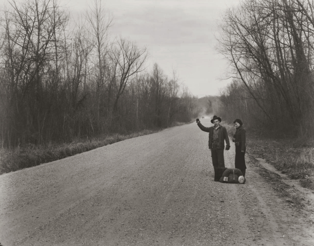
I find this work rewarding to look at, “Always look on the bright side of life” (Idle 1980) comes to mind when I see this photograph. These men are walking to a hoped for brighter future. I see the same thing in Walker Evans photograph “Hitch hikers near Vicksburg Mississippi” (Evans 1935), however Lange has added the billboard in her shot, this added element makes it more palatable but takes nothing away from the serious message.
This photograph has travelled well through the 80 years since it was taken. We have migrants across the world moving to find better futures for their families caused by financial institution and governmental mistakes. Different times same mistakes.
Looking at this exposure gives me a sense of hope for the future whilst dreading the past left behind. I wonder if these two men have left families behind who will join them once new hopeful lives have been created. Much like when I see the male refugees arriving on the shores of Europe today.
This work is poignant, funny, striking, timeless and disturbing all at the same time. It is a beautiful, simple depiction of an ugly subject. Much like some of the work we see in the media capturing the hope people have when they suffer indignities to get to a Promised Land.
This work is a huge success it makes me think. I want to know the stories behind the footsteps and I want to find out where the steps into the unknown led these two men. I want to understand what led to this Hunk of Lightning. If I had seen the photo at the time it was taken I would have spent time to find out all I could and would be doing all I could to help. Whether it is beautiful or ugly is unimportant it is a success because it makes me care.
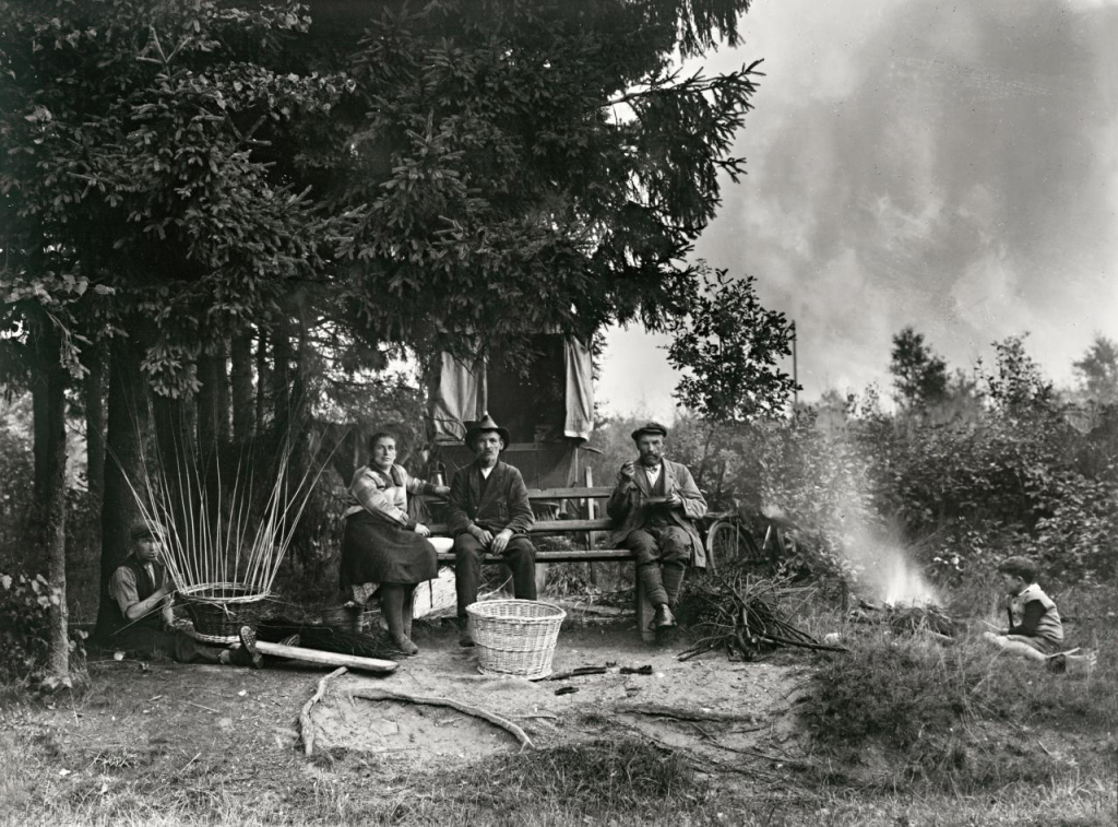
On first seeing this photograph I thought it was original, doing my research though led me to several examples where a similar scene was shown. August Sander shows a similar scene with “Itinerant Basket Weavers (Sander, 1929) as does Walker Evans in “Hitchhikers near Vicksburg Mississippi” (Evans, 1939). The difference is the billboard this adds a memorable element, at first funny then thought provoking. Interesting that Lange and Evans knew each other and took similar shots of the same subject in the same year did they compare and discuss their work?
August Sander Itinerant Basket Weavers 1929.
Walker Evans Hitchikers near Vicksburg Mississippi 1939.
Dorothea Lange used her camera well by understanding her brief from the FSA and applying it to what was on the road to tell the story, however she used her number one and number two instruments exquisitely, her eye and her brain. She will have had moments to see and set up this shot, she did it superbly.
In looking at this exposure I began by critiquing it as a photograph but have ended relishing it for the mood it creates. It captures the situation these people were forced into then shows the spirit of these two humans in dealing with their situation. Lange then shows us some humour and we empathise with these two men. We all enjoy a little humour even dark humour in times of trouble.
These individuals are going on a journey together, I am going with them. More than this I want to get involved not just with these individuals but with the struggle the farmers are suffering. Some critics of photography have pointed out that “privileged people” use their cameras to look down on poor subjects. I believe this work and others like it encourage us to find out more, when other organisations may not want us to see it at all.
Writing this review made me think of a lyric in the song “Walking down Madison” (McColl, Marr, 1982) that says “From the sharks in the penthouse to rats in the basement, it’s not that far”, making me think how precarious all our lives are. It doesn’t take much to put me on a journey to a new place to find a new future…….scary.
All this from one photograph that at the outset looked like a simple, slightly humorous shot. If you set out with an interest and have an open mind it is amazing where these practitioners can take us.
“Compassion is an unstable emotion. It needs to be translated into action, or it withers. The question of what to do with the feelings that have been aroused, the knowledge that has been communicated. If one feels that there is nothing ‘we’ can do — but who is that ‘we’? — and nothing ‘they’ can do either — and who are ‘they’ — then one starts to get bored, cynical, apathetic.” (Sontag, 1964).
We must not be apathetic.
Works Cited
Evans, Walker. Hitch hikers near Vicksburg Mississippi. FSA, San Francisco.
Grab a hunk of lightning. Directed by Dyanna Taylor. Performed by Dorothea Lange. 2014.
Lange, Dorothea. Towards Los Angeles. MoMA, Chicago.
Maccoll, Kirsty. Walking down Madison. Comp. Kirsty Maccoll and Jonny Marr. 1982.
Python, Monty. Always look on the brightside of life. Comp. Eric Idle. 1979.
Sander, August. Itinerant Basket Weavers. National Gallery of Victoria, Victoria.
Sontag, Susan. “On Photography.” In On Photography, by Susan Sontag. New York: Penguin, 1978.
After a delay when my tutor and I kept missing each other due to my adventures down South. I finally received an email from him with some areas to work on.
1. Research Anthropomorphism.
2. Add reference to environments having no emotions.
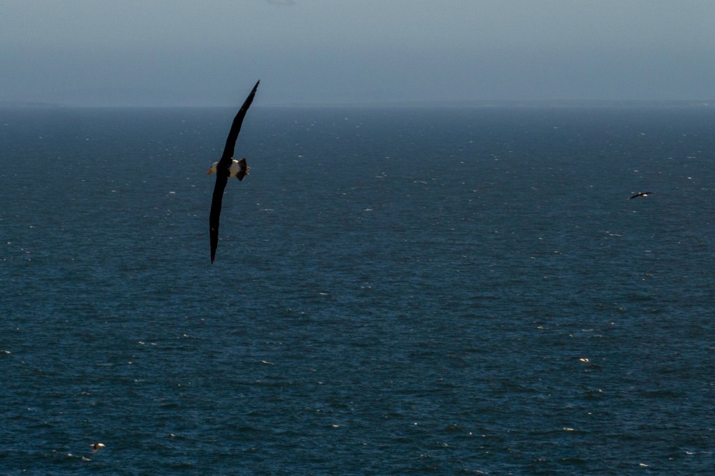
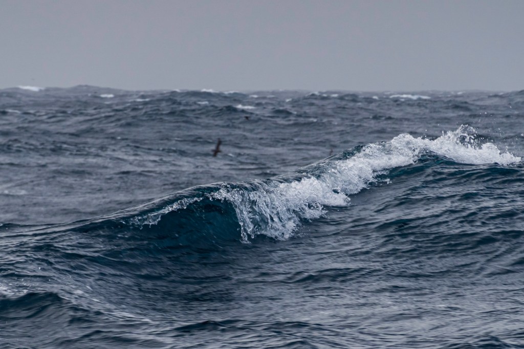
3. Identity of the birds in my photos.
4. Replace the shots for “That melted the wings wax”, “It was spring” and “A farmer was ploughing his field.
5. Read Derek Gregory “Between the book and the lamp”.
6. Write about the books I have been reading to research the course so far.
7. Add reference to other posts to link my work.
Over all my tutor liked my work and his suggestions added to the overall effect of the images and the words.
At first I didn’t agree with changing the image for the farmer ploughs his field. But on looking through my images and reviewing the painting again I realised that this line has to have the third element. So I replaced with a shot with a bird and a whale. The whale being the third element (The Farmer).
My work clearly states that things don’t have feelings so I am a little unsure what my tutor wants me to add. I will take this up with him on my return.
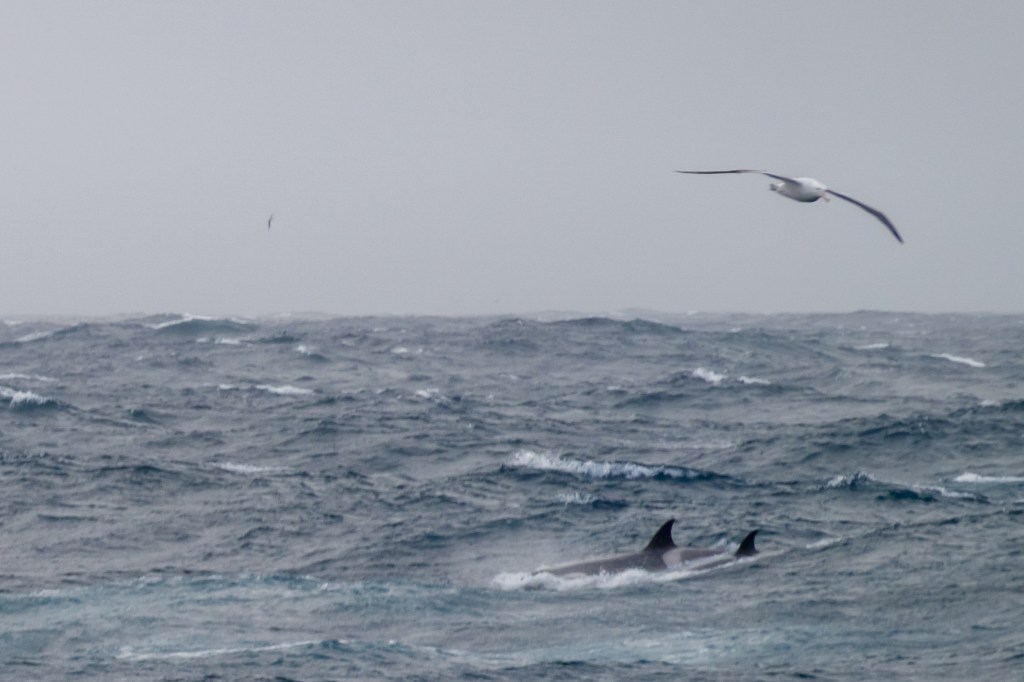
The birds in the shots are all either Petrels or Albatross. The final shot shows Wilson’s Storm Petrels which are the size of swallows and amaze how they survive in such a inhospitable place.
I have downloaded Gregory’s essay and will read and review it shortly.
Likewise I will add general reviews over the coming weeks of the books and such like I have researched to help my work develop. These I will publish shortly.
I added a link to my work so viewers can find background information about the events that inspired this assignment.
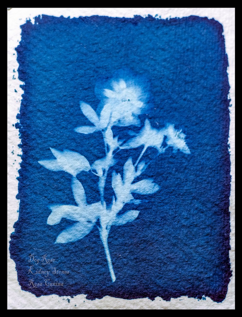
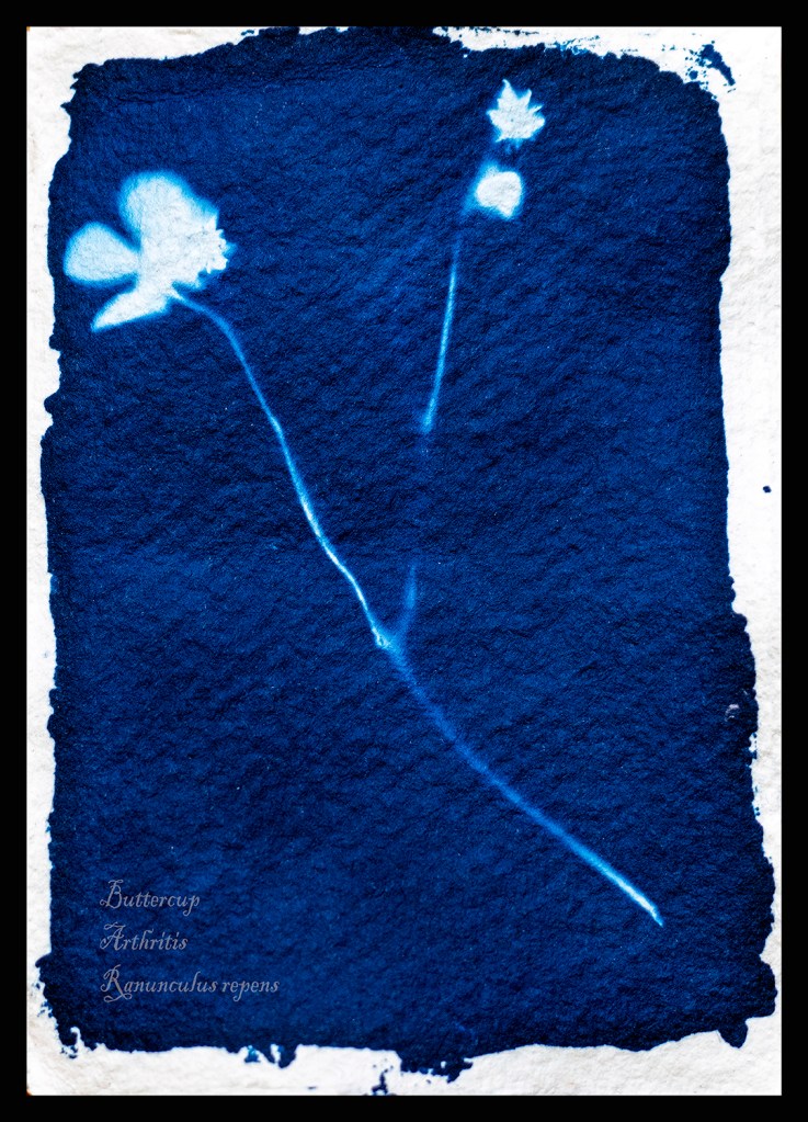
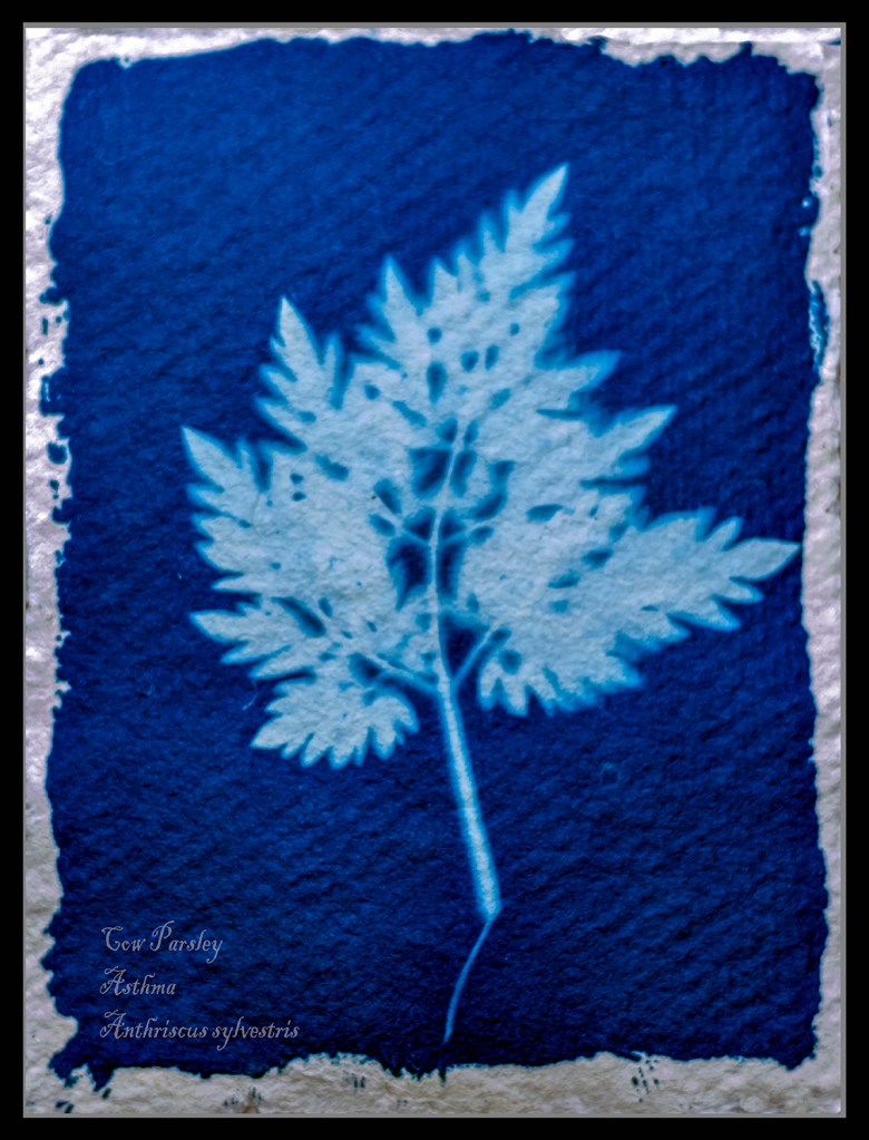
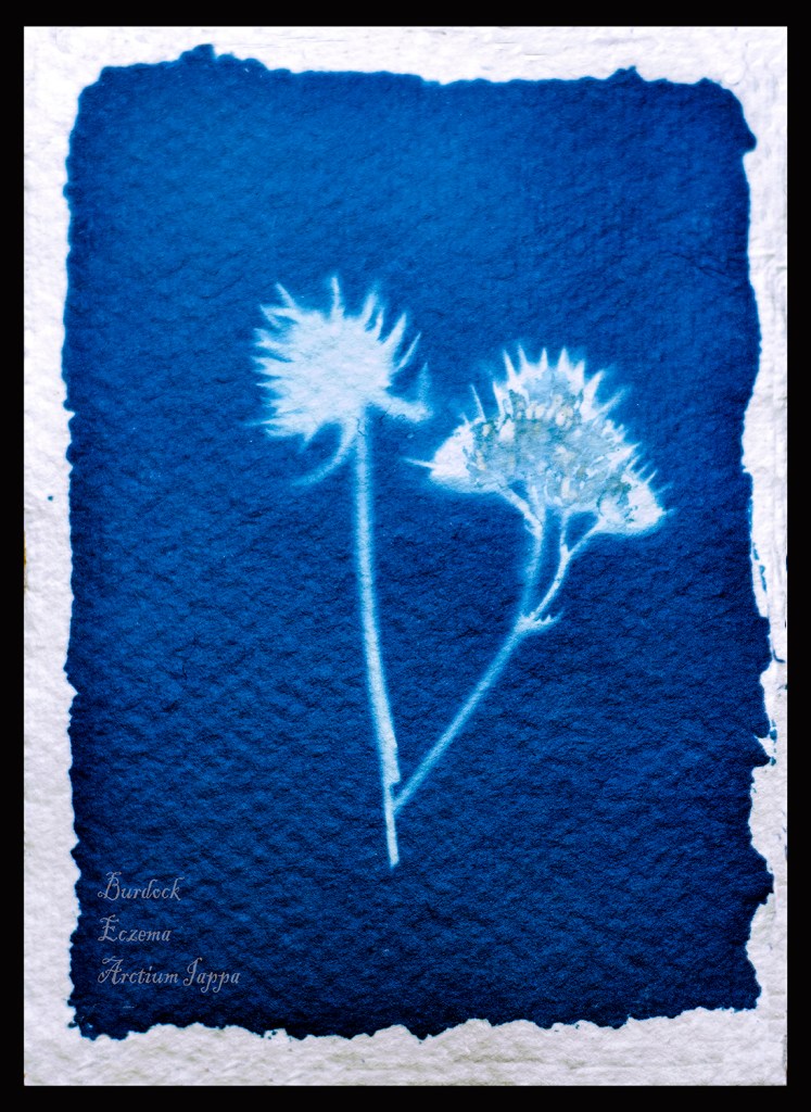
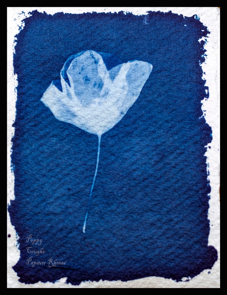
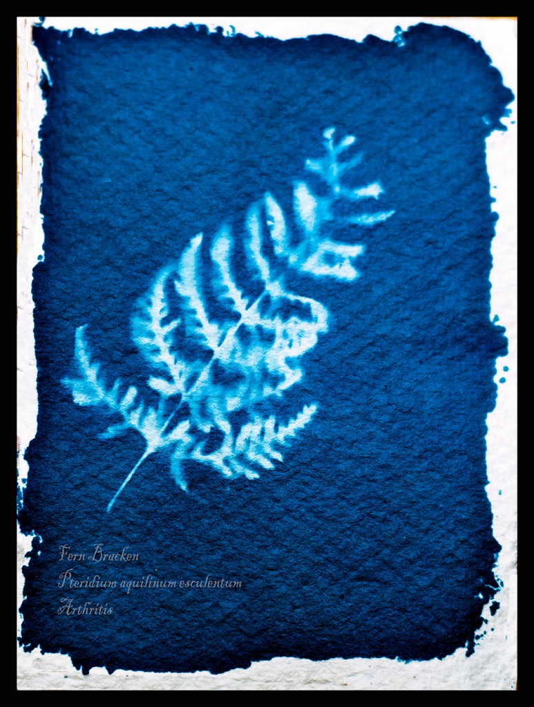
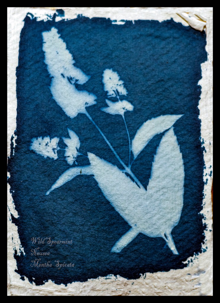
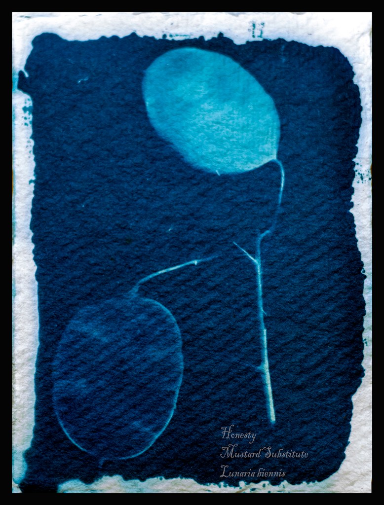
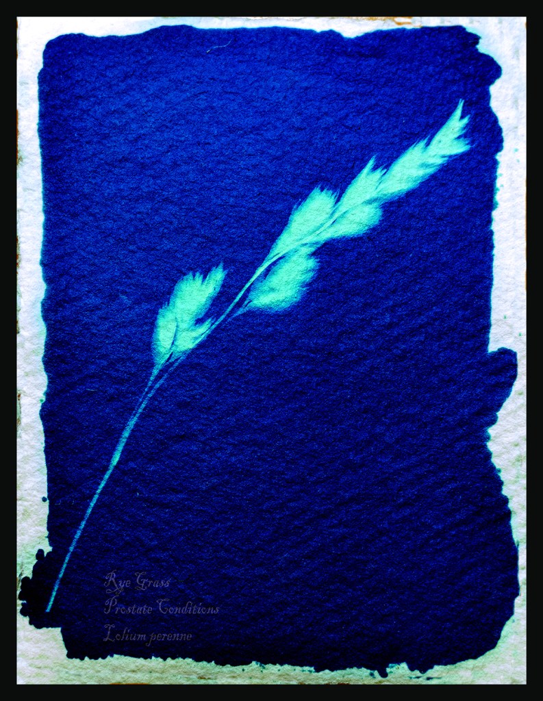
Below are the three pictures I added in response to my tutor feedback.
The most important thing I have learnt through completing this work is not to cram too much into the assignment. Keep it simple was great advice from my tutor.
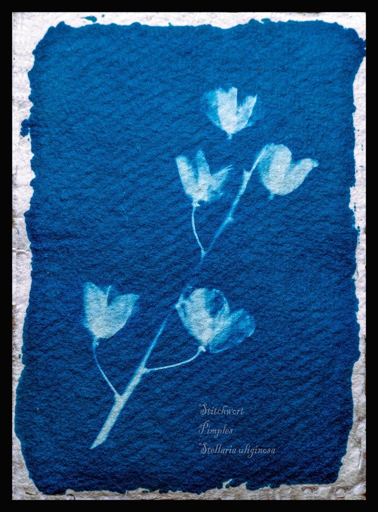
He wanted me to discuss a little more of the technicalities in producing this work. I started by making paper which involved using a blender to pulp fibres from wood and old drawing paper until it was a smooth paste. then I placed this onto a frame with fine filter mesh stretched taut. I then let this air dry before lifting the paper with a scalpel. One out of three sheets failed and were re-pulped to form the next batch. I didn’t bleach or stain the paper it came out the colour I wanted. This method produced paper strong enough to survive the rigours of the washing process later.
I used a metal ruler and rough tore the paper to the size I wanted for my Cyanotypes.
For the solutions I mixed two solutions mix A is 10g of Potassium Ferricyanide which is mixed in 100ml of distilled water.
Solution B is 25g of Ferric Ammonium Citrate with 100ml of distilled water.
These two solutions are kept separate in brown bottles in a cool dark place till I want to coat the paper. Kept like this they will keep for several months.
Next when I want to coat my paper with sensitizer I mix equal quantities of the solution in dim light, Taking care to only mix the amount I will need in the clean mixing bottle. When the two solutions are mixed the resulting solution is light sensitive and has an intense yellow colour. (1)I used the recipe from Thames and Hudsons Book Experimental Photography A Handbook of Techniques.
Next I chose my subjects on my walks along the lane at the back of my home. It was always in the back of my mind that I was in the shadow of Pendle Hill and if it were the 1600s I would be in danger of being called a witch and burnt at the stake.
To make the exposure I placed the sensitized paper on top of a card and then placed a clear piece of Perspex on top of the subject securing with bulldog clips to keep everything tight and in place. The exposure time varied from 5 to 20 minutes depending on the strength of the sunlight. I read my tutors comments about striving for continuity and will do more of this in future. However I agree that as this is more organic work I should leave as is.
Finally I placed the exposed paper in a tray to wash the paper however I rinsed each for three minutes in gently running cold water to start the cleaning process. Then I hung them to dry in air, the cyanotypes change as they dry and in fact continue to dry for several weeks after as they react with the air.
Whilst the process is lengthy it is extremely rewarding and I plan to experiment with larger versions and prints in the coming months.
I read the methods to colour match in Photoshop and experimented with them. I am pleased with the results and the finished results are a nearer colour to the original work. I also read and carried out work to frame the work, thinking about how to present it to a viewer.
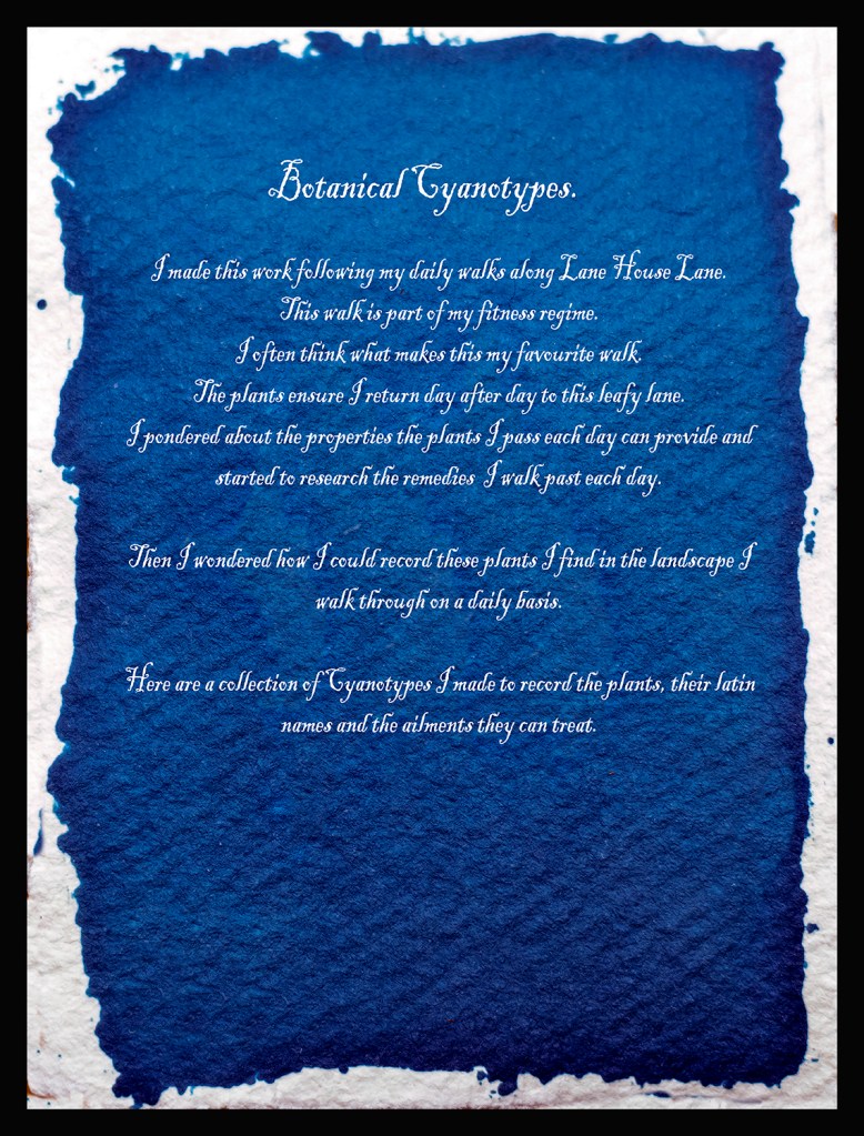
I think the work needs a starting point to set the scene. However a poster, map and description is just too much. I have narrowed this down to a one page description of why I completed the work.
I have started to read about critical writing and will add sections to my posts in the near future. I also looked at the suggested work by Laurie Snyder and Liz Nicol.
(2)Snyders work is more precise than mine and makes me realise I must use this process more to master it to her high standards. I plan to make some very large prints of full plants in the near future. However I am pleased with this work as an early starting point. (3)Liz Nicols work with Rubber Bands her daughter found dropped by the postman. This word made me think of a future body of using cyanotypes give a feeling of some part of this landscape others effect.
I have reworked my Cyanotypes and have dropped the Poster and the Map to replace them with a brief description of why I made this work. This is presented in the style of a cyanotype although I manipulated an existing cyanotype in Photoshop. I see them now on a white wall in a gallery next to each other in a level straight line so that each image is equal.
(1)Gomez, Anthonini Minniti, and Lunganella Bendandi. Experimental Photography. London: Thames and Hudson, 2015.