Exercise 5.1 Origins of the White Cube.

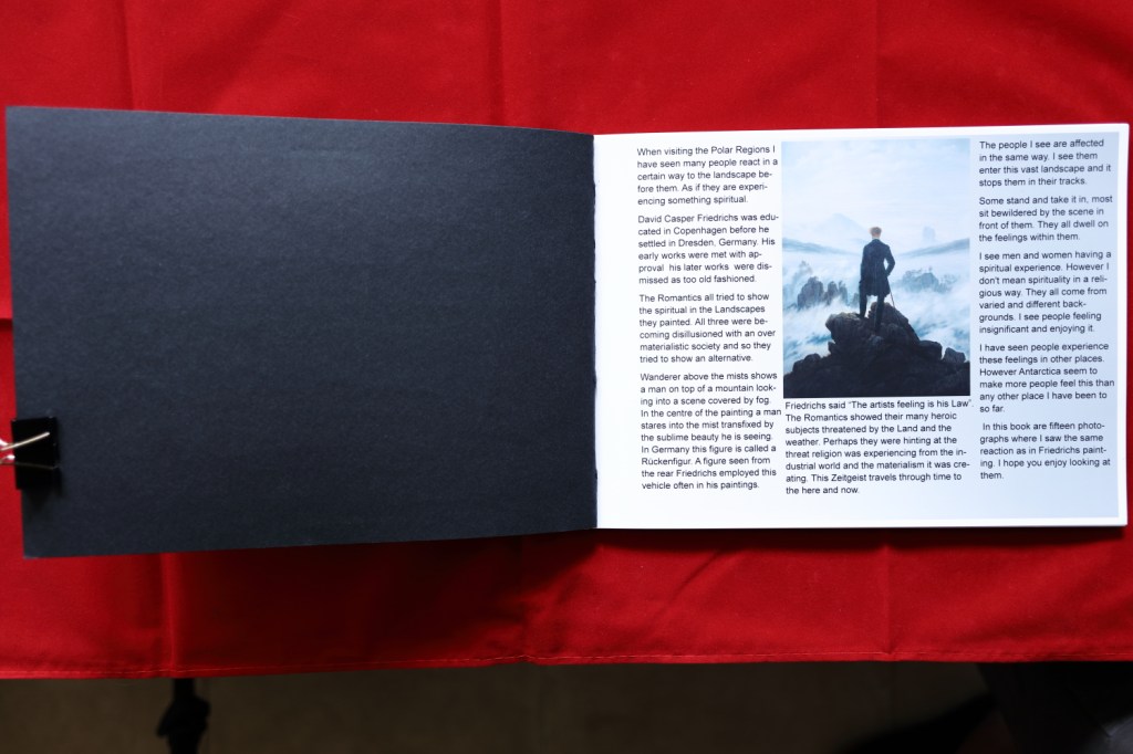
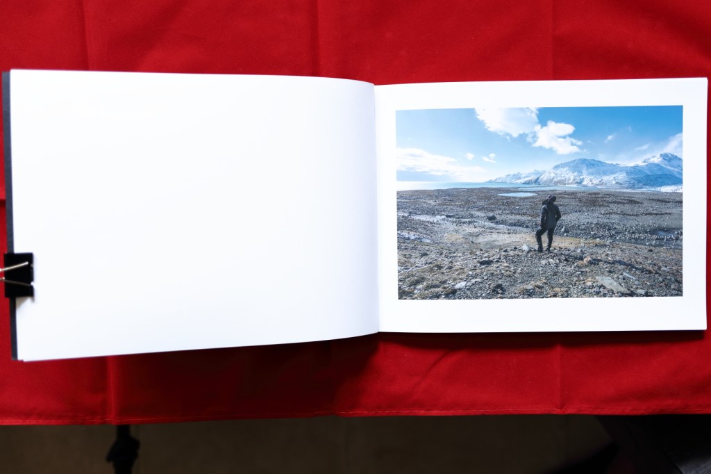
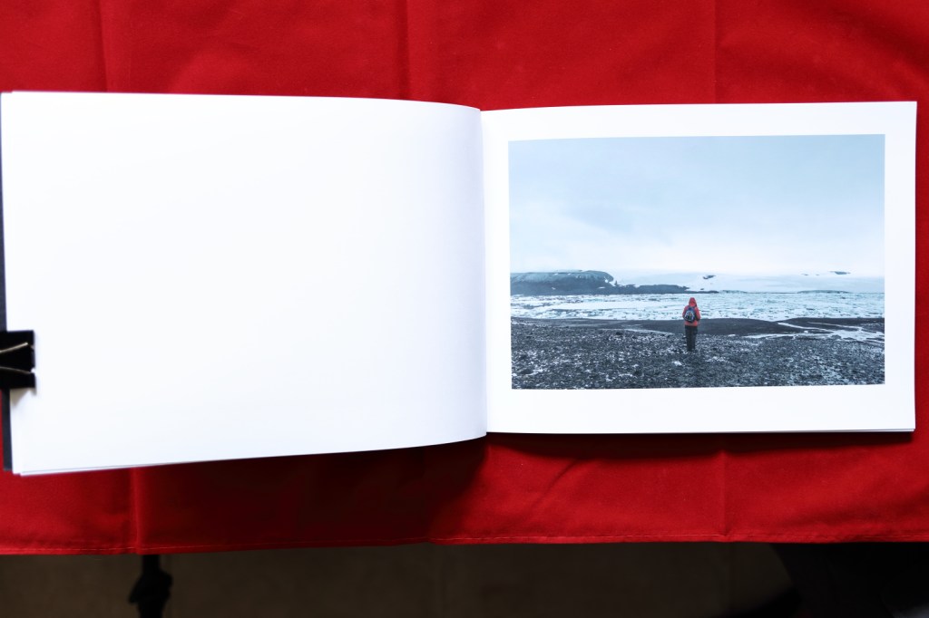
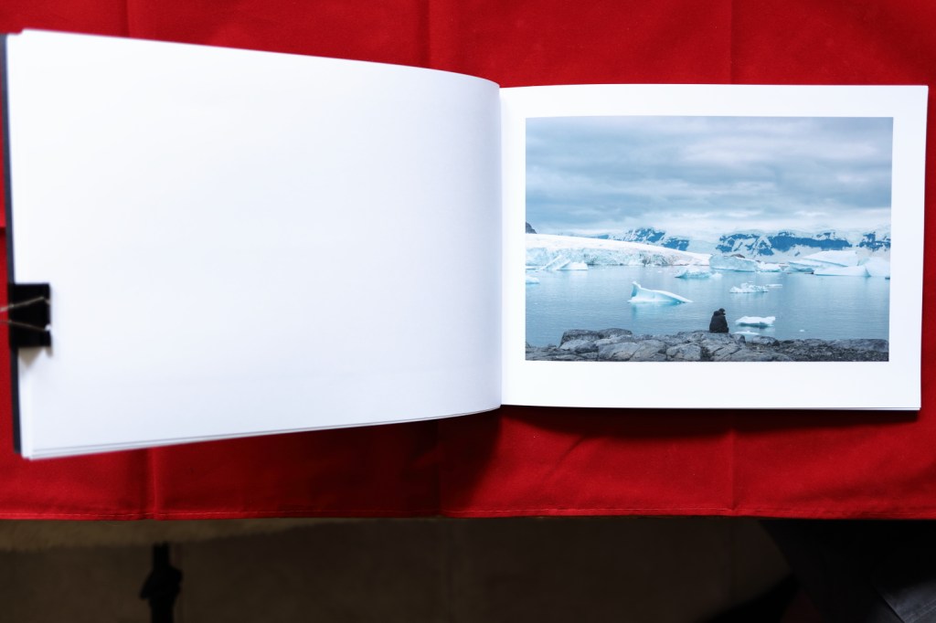
Thomas McEvilley writes the introdution of Brian O Doherty s book Inside the White Cube. O Doherty, Inside the White Cube. Below I consider the parts of the introduction that stood out when I read it. Then I want to answer three questions. 1 Where did the White Cube come from? 2 Why was it used? 3.How has it been used in recent times?

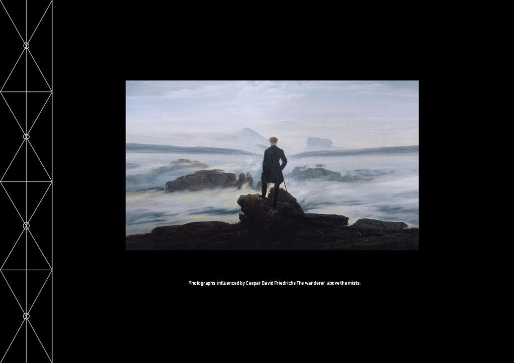
First McEvilley compares the space created to display art as a place of reverence. He writes “Constructed along laws as rigourous as those for building a medieval church”. I have experienced spaces like this they make me feel humble. Later he writes “The outside world must not come in, so windows are usually sealed off, the walls are painted white, the ceiling becomes the source of light”. Giving a spiritual almost religious experience. Next he takes a step back in time and discusses the art painted on the surface of caves. These spaces are generally difficult to get to with deep tunnels to traverse before you arrive at the art, so you make a journey to get to the art. Later Egyptian burial chambers are covered in vivid art however this structure is built to exclude all but the deceased from seeing it. Both of these galleries are difficult to enter and are linked by the dead and the visitor must be elite.

Secondly McEvilley writes about the eye and the spectator “The prescence before a body of art”. By this I believe he means we are reverent. No talking or laughing, no enjoyment just silent staring as if the eye as become disembodied and is staring blankly at the work with no feeling or emotion.

In the third section McEvilley talks about the thing, the piece of art and discusses a gallery that was empty and one that was full of rubbish. Whatever you think of this it has a message about the kind of art we place in our galleries. Both would have provoked thought and discussion around the relevance of art. Pythagorus and the Pythagorean’s said, “at the start there was nothing, a blank space,” much as in the White Cube.

So after reading this introduction I have several questions. I try to answer three of them below.

Early Flemish Gallery 17th Century.

1. Where did the White Cube come from? In time gone by galleries were cluttered with many pieces of art on the walls. They tended to be private collections held by the wealthy. Public Galleries were formed in numbers in the 17th century. They still remained cluttered with many pieces on the wall. In the late 19th century Galleries became more ordered with space dedicated to lesser number of pieces so you could see and study the work. The decor was considered with different galleries using sympathetic colours to compliment the works on display.

6JAM Whistler Symphony in White No3 1867 Birmingham Art Gallery.

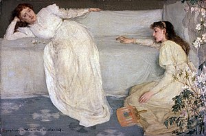
In 1867 the American artist James Abbott McNeil Whistler painted “Symphony in white no 3” Whistler, Symphony in White No3 the third painting in a series. People discussed what the ladies were. Are they ladies of the night or a bride and bridesmaid. Whistler only ever told his elite set of friends that it was just what the title stated a symphony in White and no more .American Art History and Culture 1993.Craven, American Art History and Culture.

Whistlers Chelsea White House 1879.

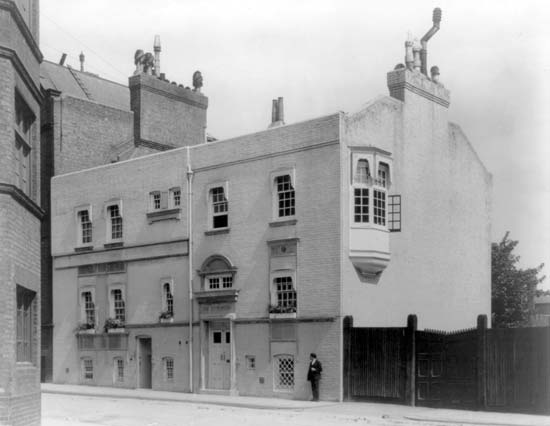
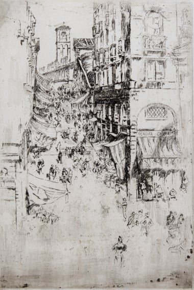
In May 1879 after losing a trial against John Ruskin who criticised his work. Plus carrying out expensive work on his house the White House. Whistler was made bankrupt. A friend gave him a contract to make views of Venice. He exhibited them at the London Fine Art Society. Craven, American Art History and Culture. This exhibition was totally different to any before. The room was White, the work was mainly white, the furniture was white even the attendants wore white uniforms. The pictures were displayed with large blank spaces between. The press wondered if some of the pictures were missing.

JAM Whistler etching of the Rialto Bridge 1879 Whistler, Rialto Bridge.

2. Why was the White room used? The critics didn’t like it saying it felt as if there was nothing to see in the room. The art world enjoyed it it made them feel elite and a cut above the rest. Whistler had an obsession with the purity of white dressing in white waistcoats, living in the White House in Chelsea and even having a white Quiff of hair. He used the White Room to impress his arty elite friends so they could have an art secret making them aloof from the public.

3 How has the White room been used in modern times? My feeling is that the White room style of gallery is used in mainly commercial galleries to encourage buyers of art convincing them they are buying into an elite world. This sterile environment is employed to show off the product a little like a car showroom. At least the car showroom as an excuse to be white, we wont buy a car that leaks oil onto the floor.

I have considered the Where, the why and the how after reading the introduction to the book. Galleries should be places where we can giggle, talk, smile or even laugh as we enjoy artists work. These sterile white spaces show work off in radiant light but the feeling and emotion is destroyed because we the viewer is stifled by the environment. John Saatchi called the White Cube style Cliched, Worryingly out dated and Anti-septic. Milner, “Saatchi Turns on Cliched Britart Rivals.” Could it have been sales that encouraged him to keep the White Cube open long after his article in the Telegraph? Whilst the White cube has its place it should be used sparingly and not as the normal way of displaying art.

My work projected into the White Cube.

Work Cited

Craven, William. American Art History and Culture. One. McGraw-Hill Education, 1993.

Hill, Matt. “Art in Three Colours (Whte).” Colour TV Broadcast. White. Various Sites: BBC, 2020. https://www.bbc.co.uk/iplayer/episode/b01lng0m/a-history-of-art-in-three-colours-3-white.

Milner, Catherine. “Saatchi Turns on Cliched Britart Rivals.” Telegraph. September 28, 2003. https://www.telegraph.co.uk/news/uknews/1442665/Saatchi-turns-on-cliched-Britart-rivals.html.

O Doherty, Brian. Inside the White Cube, n.d.

Whistler, James Abbott. Rialto Bridge. 1879. Etching Monochrome. London Fine Art Society. https://www.gardnermuseum.org/experience/collection/23901. ———.

Whistler, James Abbott. Symphony in White No3. 1867. Oil on Canvas. Birmingham Museum.

Assignment 5 Rework.

Whilst discussing my work for assignment 5 it was pleasing to hear my tutor liked the work and was great when we explored the work and found areas for improvement. After our video meeting I set to work completing the following work to fine tune the assignment.

First I corrected the spelling of Evaluation in the title this had been auto corrected to evolution and I had missed it when proofreading. This is my first learning to be more attentive to detail when checking my work so errors are eradicated.

I also added a short piece of writing about what I felt photography added to my work compared to painting.

My tutor asked me to look at the series and ensure all the photographs fit within it. After some time looking at the book I felt the photo of the man in football kit didn’t fit. It wasn’t spontaneous, the subject must have planned to take off his outer garments and be in his football strip. Therefore I removed this from the book.

I also reprinted the image of the man stood on the large rock. My tutor was correct I had burned the subject to show texture in his clothing, it detracted from the shot. So I included the original exposure in the re-stitched book. I feel it fits better within the series my tutor was right.

Making a video showing the work in the finished book was a new challenge. I made it from the point of view of my eyes looking at the book as the pages are turned showing each page being turned. This was a hard process, getting the angle of the book so it was parallel to the lens was vital. If this wasn’t achieved the perspective was off and detracted from the video I wanted to show the viewer. Using a tripod made the whole process easier to set up.

My learning log doesn’t allow video, so I will provide a link to it on my dropbox so anyone can see it. I will also include the video for assessment at the relevant time.

https://www.dropbox.com/s/r8bn30a9ym8f2vf/1080p.mov?dl=0

Looking at the Artist Statement I agreed that it could be more critical and added more work to the statement. I explained the urgency I had had to work. Not having the time to ponder before the critical moment passed. This was one of the hardest parts of producing this work. The moment lasted a few seconds and I had to be ready.

In the explanation of the process of Japanese Stab Binding I had included the photographs from Portsmouth University (Batey, 2014) I removed these photos and referred to them instead. Providing a link to the work so any reader can see the process I used. Experimenting with a gallery of me re-stitching the book proved difficult, my attempt is not as clear as the photos from Portsmouth University`s site.

Untitled Landscapes Trangmar 1985
Inside the view Sear 2014.

My tutor pointed me to the work of two artists first, Susan Trangmar and her work “Untitled Landscapes” (suetrangmar.com, 1985) shows women looking into the landscape. Each image invites us to look past the back of the viewer into the landscape. The subject is placed so the blind spot is emphasised. This makes me wonder what I am not seeing I start to make stories based on what I am shown and what I cant see. Intriguing and puzzling at the same time. I was unsure if the different scale of the subject worked within the series.

I looked at Helen Sears work focusing on “inside the view” (HelenSear.com, 2014). This work also shows people looking into a landscape., Sears shows two images combined into one, then she adds a third element a layer of fabric. Adding this fabric layer creates a different mood or feeling to each image. I have looked at these images in different mood and they make me feel different reflecting my mood.

Horizon Lennon 2012
Boundless Lennon 2012

Whilst looking at the work of these two artists I found work by Julian Lennon (Lennon, 2014). He showed many techniques in his work but two shots showed similar emphasis on the big landscape with people looking into it (Horizon, 2014) (Follow, 2014). A third though has the subject looking out of frame into the camera. (Boundless, 2014).  This was challenging to look at, I cannot decide whether I have become accustomed to seeing people looking into the frame. This image seems to bounce my gaze back out of the frame.

This assignment stretched my learning in many ways. I learnt new skills, looked at varied ways of approaching the same technique and considered my work in new ways. It was completely satisfying and most importantly enjoyable.

Work Cited

Batey, Jackie. “Portsmouth Universit Japanese Stab Binding.” Portsmouth Illustration Bookbinding Illustration, July 12, 2014. https://bookbindingtutorials.wordpress.com/2014/12/07/japanese-stab-binding-4-hole/.

Lennon, John. “Julian Lennon Photography,” 2014. https://www.julianlennon-photography.com/.

Lennon, Julian. Horizon. 2014. Silver Gelatin, 83x127cnm. https://www.julianlennon-photography.com/.

Lennon, Julian. Boundless. 2014. Silver Gelatin, 80x127cm. https://www.julianlennon-photography.com/Jula.

Sear, Helen. “Helen Sear.” Helen Sear, 2014. https://www.helensear.com/.

Trangmar, Susan. “Untitled Landscapes.” Susan Trangmar Art, 1985. http://susantrangmar.com/.

Assignment 5 Japanese Stab Binding.

My tutor suggested Japanese Stab Binding the book. I will be honest this technique was something I had never even heard of. However I like a challenge so accepted it with a little trepidation.

During my feedback of Assignment 4 my tutor discussed my approach to Assignment 5. As it was going to be impossible to send in prints of my photographs due to CoVid19 and the lock down he set me the challenge of completing a photobook. The goal of this book would be me taking control of the whole process. From inception through taking the images and finally producing the book.

After the conversation, I quickly logged onto Google researching what would be involved, on first reading filled the process filled me with dread. There seemed to be many skills that would stretch me to the limit. I liked the fact that I would learn a new skill and if applied efficiently I would produce something that should be tactile and pleasing to finish.

I considered what the outcome should be. I wanted the cover of the book to show the painting that had inspired this piece of work. I did not want to just stick the paper to the front cover, so researched creating a window in the cover to show it to its best advantage.

Next I considered the paper. Everything I read said not to use paper that is too thick and not to place too many pages in the book so it opens properly when the viewer looks at it. I wanted a decent quality print so decided to use 275g matte print paper and 250g black card for the cover.

I would need some tools so I read the list of tools on the website https://bookbindingtutorials.wordpress.com/2014/12/07/japanese-stab-binding-4-hole/

I tried to source the tools but the postage and packaging were prohibitive. Amazon came to the rescue with a bookbinding kit that included all the equipment I would need. I sourced the paper from a local art shop. I also purchased good quality paper glue from the art shop to construct the cover.

Book Binding Equipment needed to complete this project.

Whilst I waited for the tools to arrive I designed a stencil for A4 paper including the window for the cover. This involved measuring in publisher 1 1/2 inch border from the left edge. As I was producing a four hole bind I divided the edge into four sections. Then drawing two lines across the rectangles I placed the marks for the holes that would be punched later. when the tools arrived I printed this onto 300g photo paper. This stencil needs to be robust therefore I printed it on thicker paper to help it survive the process. This page will not go into the finished book.

I made the cover by using the stencil to mark the edges of the window on the black card. Then using a razor blade and being very careful I sliced the lines and cut the window in the cover. I trimmed the print of the painting ½ an inch bigger than the aperture I had just created. Using the glue I fixed the painting to the aperture. Then placed the second piece of Black card and glued that to the reverse being careful to align everything before pressing together. I left this under a weighted board overnight to fix it firmly into its position.

Stencil for the cover.

I printed the edited photos and set these aside until later, so they would be ready when the tools arrived.

Finally, the box tools arrived and I set aside a morning to stitch the book together. Using the bulldog clips to hold the pages together I made the holes in 5 pages at a time. I had to punch four holes in each page. With the covers and the map, I had 20 pages so I had to repeat this process four times.

My tutor had given me a tip to use a drill to make the holes in the pile. I wasnt confident enough to drill on our dining table. I liked using the traditional method of making the holes with the awl.

When this process was complete I began stitching the pages together. I have read many pages describing how to make these stitches. I did not understand many of the described techniques. I found it easier to follow the diagrams I found on the website of Portsmouth University written by Jackie Batey, these were very clear and illustrated (Batey, 2014). Here is the link to the page for you to follow her methods.

https://bookbindingtutorials.wordpress.com/2014/12/07/japanese-stab-binding-4-hole/

My finished book complete with painting in window.

When the stitches were finished I used the bone tool from the kit to tuck the final knot tidily away within the inner pages out of sight.

Finishing with a bit of tidying up and gentle cleaning of scuffs the book is finished. I was nervous before starting but found the whole process rewarding. The final product is very satisfying, holding the book, and looking at the pictures is wonderful.

Works Cited

Batey, J. (2014, December 7th). Portsmouth Illustration Bookbinding Tutorials. Retrieved May 26th, 2020, from University of Portsmouth: https://bookbindingtutorials.wordpress.com/2014/12/07/japanese-stab-binding-4-hole/

Assignment 5 Artist Statement.

01/06/2020.

Exercise 5.7 Landscape, Place and Environment.

Artist Statement

Michael Green.

For a self determined project. Work influenced by the work Casper David Friedrich.

My name is Michael Green I am a level 2 student with The Open College of the Arts. I have been interested in photography since attending college in my teens. I spent hours in the college library looking at photography books. The ones that interested me most linked photography with Art. This interest has led me to try to make images inspired by the artist Casper David Friedrich. Whilst Friedrich had the luxury of painting in a studio I had to work with alacrity. The moment my subject interacted with the sublime landscape lasted only a second meaning I had to be ready, in situ, camera set to capture the image within the second the subject reacts.

Recently I have been fortunate to visit Antarctica. I have endeavoured to capture the scale of the landscapes in Antarctica with varied success. Whilst thinking about these landscapes I saw people having a spiritual experience as they observe the scale of this place. These spiritual moments made me think of Casper David Friedrichs painting “The wanderer above the sea of fog”. This painting depicts a person having a reaction to the landscape before them. I see this same reaction in many of the people who witness the landscape in this polar place.

I find it fascinating watching people taking selfies as I did for a previous module in a past course. Equally beguiling is the way this landscape has the power to stop you in your tracks. I used my compact camera allowing me to carry it wherever I went and enabling me to quickly deploy it to capture these moments so I can share them with you.

Assignment 5 The Photos

Work inspired by the work of Caspar David Friedrich.

All the time I was away I planned on showing my work in a large book printed by Blurb. My tutor challenged me to learn Japanese Stab Binding and make my own book so taking control of the whole process from beginning to end.

I planned to send the finished book to my tutor but CoVid19 put a stop to this. As I returned from Antarctica the whole world was closing down. Buenos Aires and Sao Paulo were like scenes from a war film with coffee shops closing and people leaving as quickly as possible.

The problem I have of not being able to send my book to my tutor is a small one compared to the problems of others. I am glad I can find a solution to my insignificant problem by creating digital copies of my book.

My solution is to photograph the book I and send the images to show the book. I will also include the images as they are on my computer so you can see the images in more detail if you would like to. Finally, I include the contact sheets of the set of images I took with this project in mind.

For the other pages from my learning log here are the links to each page.

Proposal for assignment 5

https://wordpress.com/view/michaelgreenlevel2landscapeblog.photo.blog

Research for assignment 5

michaelgreenlevel2landscapeblog.photo.blog/2020/06/04/research-for-assignment-5-work-influenced-by-caspar-david-friedrich/

Evaluation of my work.

https://michaelgreenlevel2landscapeblog.photo.blog/2020/06/04/assignment-5-evalualtion-of-my-work/

First here are the photos of the bound book I made for this assignment.

Next are the photos as individual exposures for you to look at the detail.

Finally the contact sheet showing all the exposures I took for this project. Green means they are in the book red means they are not.

This image has an empty alt attribute; its file name is inkedassignment-5_li.jpg
Contact sheet showing my chosen and set aside exposures.

Assignment 5 Proposal.

Below is an wordpress friendly version of my proposal. The link below will take you to a PDF of the original.

Prepared by: Michael Green 515037

6 March 2020

Proposal number: 2020-001

Project Proposal.

The objective of my work is to show people affected by the polar landscape they are experiencing.

What

A series of photographs in which the subject is immersed in the landscape. These photographs will be inspired by Caspar David Friedrich’s work “Wanderer above the sea of fog”.

How and why

Through digital photography I will show people immersed in the landscapes of Antarctica. I want to show people who have been affected by the spectacular scenes in front of them. These people will have shown some kind of reaction to the vista, some stand, a lot are forced to sit and contemplate. All will have shown some kind of reaction to the big landscape they are part of, I will have to employ a degree of patience to obtain these images.

Wider Context

I have taken many photographs in this region and most don’t do justice to how the landscape makes you feel. Friedrich wanted to show the sublime in his landscapes, in fact, he wanted to display the moment the sublime effects a person. He captured the sublime in “The Sea of ice” and this painting was one of the first to depict a polar scene. It shows an untouched icy landscape so isn’t the same as the work I want to create. Later he employs a “Rückenfigur” a figure shown from behind looking into the scene, I will employ the same method as Friedrich’s to try to show how its splendour makes you feel.

Influences

Friedrich’s has to be the biggest influence on my work. However Ansel Adams, Alfred Stieglitz and Sebastian Salgado all have an influence on it as well. Adams captured images with great detail and gave a feeling of big spaces. Stieglitz showed winter scenes in the city and showed the difficulties of being cold and working in the snow. Salgado captured the landscape and the animals in the landscape of Antarctica. I want to add the element of a person or persons moved by either the landscape and/or animals they are experiencing.

Output

A book of 17 prints 15 of which will be the photos, plus 1 map of locations plus 1 page outlining the work. To complete this work I will need to study Japanese Stab Book Binding. Page layout using Microsoft Publisher or equivalent. Printing techniques with newly acquired printer (these hours are not included in the budget below).

As we are locked down due to CoVid 19 I will show this in either a short time lapse video or perhaps a slideshow. I may consider both one time lapse showing the production process and a slideshow presenting the work.

Budget To produce my photo-book. The cost to produce a single publication for assessment.

DescriptionQuantityUnit PriceCost
Book binding Equipment1£36.99£‎  36.99
Book binding Glue1£6.00£‎    6.00
Printing17£0.85£‎  14.45
Card for book covers2£0.20£‎    0.40
Time for binding, printing and video creation16£20.00£‎310.00
Total  £ 367.84

Exercise 5.7 Landscape, Place and Environment. Artist Statement

OCA Logo.png

01/06/2020.

Michael Green

A self determined project.

I am a level 2 student with Open College of the Arts. I have been interested in photography since attending college in Leeds in my teens. I spent hours in the college library looking at photography books showing varied subjects, history to autopsy photographs. The ones that interested me most linked photography with Art.

Recently I have been fortunate to visit Antarctica. I tried to capture the scale of the landscapes in Antarctica with varied success. Whilst thinking about these landscapes I saw people having a spiritual experience as they observe the scale of this place. These spiritual moments made me think of Caspar David Friedrich and his painting “The wanderer above the sea of fog”. This painting depicts a person having a reaction to the landscape before them. I see this same reaction in many of the people who witness the landscape in this polar place.

I find it fascinating watching people taking selfies as I did in a previous course. Equally beguiling is the way this landscape has the power to stop you in your tracks. I used my compact camera allowing me to carry it wherever I went and enabling me to quickly deploy it to capture these moments so I can share them with you.

Exercise 5.6 Context and Meaning.

John A Walker’s (Walker, 1980) essay was a revelation to me. I found it extremely interesting to think of the different contexts one photo can inhabit.

He starts talking about a wedding photograph and how its meaning changes just by taking it from a wedding album and placing it in a photographers window. This one photograph goes from a family memento to an image showing the skill of the photographer.

Then he writes about Jo Spence (Spence, 1978) and her photos taken over forty years and how these ordinary photos take on different meanings when shown in a feminist journal. It was interesting to look at these images and think about how the meaning of the images changes with a change of context. If you put them in a glossy magazine or a feminist journal. They go from strange and quirky to photos that make me consider the plight of the female. This is achieved by taking the photos from the private to the public context

Next he looks at Peter Marlows National Front Steward (Marlow, 1979) this photo shows a strong young man, defiant and aggressive. To the right-wing he appears as a warrior, to the left-wing these characteristics are turned against him. This type of image featured in the propaganda of the nazis in the 1930s.

Margaret Bourke-White. Kentucky Flood 1937

I found it refreshing to see Margaret Bourkes-White (Bourkes-White, 1937) Photo feature in the essays. I had found this photo in my research for assignment 4. I had seen the same messages that Walker discusses in his piece of writing..

Edward Burtynski Sawmills 01 Lagos 2016.

Reading all this essay made me think of the series of images I had used for my slideshow in the previous exercise. Let us take just one and consider the different contexts. First though what is the photograph of It shows a close up of a rock face. It is colourful and I compare it to Burtynsky’s work. He shows sawmills from above and the damage this industry does to the landscape. (Burtynski, 2016). My approach is to show the landscape before the industry destroys it.

Michael Green, Antarctic Rock Face 2020

So the contexts I see are, first it is just a picture of rock. Secondly in the slide show it becomes an image within a series showing more rock. Third, It is my Background image on my iPad it makes the program Icons stand out. Fourth in an environment publication it would highlight the vulnerability of Antarctica and encourage its protection. Fifth place this image in a geological publication and it could encourage mining and exploitation of this fragile place. Sixth place it in a gallery printed large and it becomes a piece of art with its form and colours.

One of the contexts mentioned above is of a slideshow. I saw how much ice is disappearing and thus how much rock is becoming exposed. This exposed rock is full of minerals. They are protected now but in 2038 the Antarctic Treaty is up for renegotiation. We should start to lobby now to prevent damage being done to this place to retrieve these minerals.

Six different contexts with very different meanings from one photograph. When I took the exposure I hadn’t thought about any of this.

As photographers we need to consider the different contexts but we must also be aware that we don’t control the contexts others place onto our work.

Works Cited

Bourke-White, M. The Kentucky Flood. Art and Artists. Whitney Museum of American Art, New York.

Burtynski, E. Saw Mills 01 (Lagos). Edward.Butynski.com. New York.

Marlow, P. National Front Steward. Camera Work. London.

Spence, J. Facing up to myself. Spare Rib. London.

Walker, J. A. (1980). Context as a determinant of photography. Camera Work, 5-6.

Exercise 5.5 Slideshow.

This exercise was great fun to complete. It felt to me like telling a story and supported my thought process out in the field.

On a visit to St Andrews Bay in South Georgia I saw a beach with 100,000 breeding pairs of King Penguin and 5000 seals. They arrive on this beach within a few days of one another and return to the sea just as quickly once they have all bred and raised young.

Earlier in the course I had read about Roger Fenton (Fenton, 1854) and had seen his photographs of the aftermath of the charge of the light brigade his photo shows cannonball on the road used for the charge. This started me to think of the aftermath of the visit of the animals at the site I was to visit.

Roger Fenton Valley of the shadow of death 1854.

So I started by creating an outline of the kind of shots I would like to tell the story of the aftermath. The shots will not be easy for the viewer to see as they show all the gruesome aftermath much as those used to depict a battle.

I will open with a shot of the site fully populated by the breeding birds and then later in the season look for shots showing the suffering the creation of the next generation produces. I took sixty photographs over the next three months.

On my return home I looked at these exposures and got the list of ones I wanted to use down to twenty. The extra forty are duplicates of the same shots so are not needed.

I looked at several slideshows including the one in the course work by Andy Adams (Adams, 2013). I didn’t want to subject my viewer to 18 minutes. The duration I could comfortably watch was around three minutes so that is my target duration.

Another that stood out was Hunter Noack (Noack, 2017) and the Slideshow entitled In a Landscape. This slideshow tells of a classical concert about the landscape. It shows photos of the concert and people enjoying music in the outdoors. It is two minutes long and I felt comfortable watching for this duration.

This means each exposure in the slideshow will be visible for four seconds. This gives a total run time of just over two minutes. This should leave my viewer wanting more. One of my key aims in producing this work.

I used Photoshop to edit the images and then transferred them to my iPad where I used movie maker to produce the show. The process was very easy to follow and the instructions were informative and helped me add titles where I wanted them.

Next I considered music. I tried Sinfonia Antarctica No 7 by Vaughn Williams (Williams, 1952). It worked to a degree but was too long and a little too dramatic. I had made a series of recordings of animal noises and the sound of the sea and wind on my iPad so I tried these. They work perfectly and will allow me to add commentary so the viewer understands what they are looking at.

Last I played with titles I kept this as short and simple as possible just giving the location at the beginning and ending with the words “Until next year” to make it clear this will repeat every year.

Below you will find a link to my work, click on the link and the file will open on your system,please feel free to comment and let me know if what you think of my approach to the subject.

Exercise 5.4 Online Exhibitions

I read the article written by Sharon Boothroyd (Boothroyd, 2020) and agreed with her observation that it was professional looking. I wondered though what I had gained and lost with the experience?

Andy Adams (Adams, 2012) has curated an interesting,beautiful and an entertaining slideshow. With some great images in recognizable styles.

I felt the slideshow was a little long at 18 minutes but stayed the course and overall enjoyed the experience. It certainly showcased many artists and their work. The accompanying words added to the experience and I noted quite a few names for me to look at after the show.

Not being able to spend more time with some shots and less time with others was frustrating at times. However I went back and paused to look with more detail at both shots I liked and liked less. However when paused the detail suffered and I wasn’t getting the best I could from the work being shown to me.

Therefore this would work well if accompanying another format say a book or as a trailer for an exhibition. It would work well to tease me to seeing more. I enjoyed it though. The different artists use of irony and humor made the show very watchable.

The film was lacking sound or commentary and the fact the film is so long made it feel a little sterile to me. Just a few sound effects or some words from the artist would have added a new dimension to the piece of work I watched.

I wonder about commentary but I am not sure if the world is ready for my Yorkshire accent but will experiment when I make my slideshow.

I think my slideshow will be called aftermath and will show the aftermath of a breeding season of a penguin colony. I will add sound and commentate over the images. I am looking forward to this one. However I will keep the time length down so my viewer wants more and is less inclined to become bored.

Andy Adams, 2012 Vimeo.

Boothroyd, Sharon, https://weareoca.com/subject/photography/online-exhibitions/?utm_ 2020.