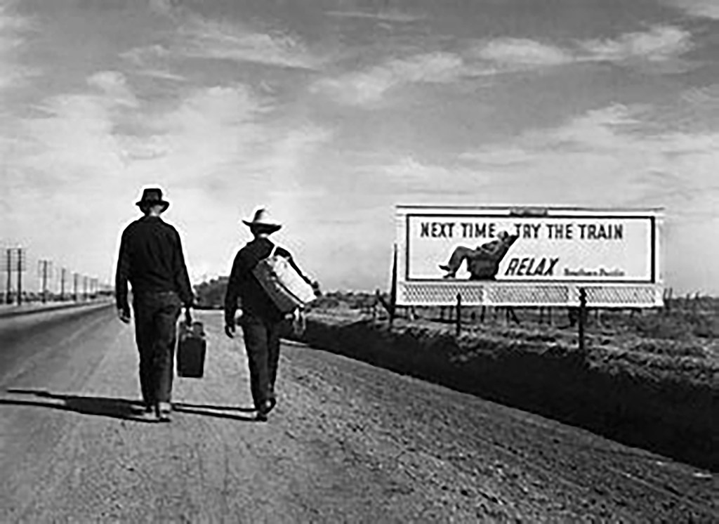
To complete this assignment I want to look at the photograph (1)“Towards Los Angeles” by Dorothea Lange. I chose this photograph as it is one of the lesser known works however to me it appeals showing pathos and humour in equal measure.
The photograph was taken in February 1936 during the Great Depression in the United States. It is a Silver Gelatin Print taken during her work around El Monte and San Fernando, California for the Farm Service Agency(FSA). It is taken on the road to Los Angeles.
The work is a landscape with a billboard and two men walking along a road lined with telegraph poles. The both carry luggage. The man on the left is carrying a suitcase in his left hand whilst the man on the right is carrying a canvass holdall on his right shoulder. They both look like Cowboys or at least farm hands. The luggage they carry looks to be in good condition and the clothes they are wearing appear to be in good order. The left mans right shoulder is drooping due to the weight of his luggage.
Both men`s necks and hands are visible and look well tanned from hard days working on the land that this road snakes across. Their feet are in different stages of walking the right mans left foot is off the ground and the man on the left has is right foot raised off the ground in a purposeful march into the future.
The road they are walking on is a tarmac road with a dusty verge and they are walking with the billboard to their right. The bill board says “Next time try the train”, with a line underneath that states “RELAX” accompanied by the name of the railroad placing the advert “Southern Pacific”. Underneath the billboard there is a trellis to finish off the billboard but it adds a new texture to the picture.
From the left edge of the picture run telegraph poles at least ten in number run along the verge of the road. On the right side a series of fence posts runs between the men and the billboard forming a barrier between the longed for better life and the walk. The surface of the dusty verge is indented with the treads of the cars which have pulled over off the tarmac for unknown purposes.
The billboard appears to be on land between the fence and open farmland the type of land these men are leaving. There is a second less prominent fence behind the billboard which emphasises the lead line it forms.
The sky makes me think it is blue and peppered with wispy clouds being blown into majestic lines which luckily add to the lead lines in the rest of the picture. It is a bright sunny day with little wind on a dry dusty day.
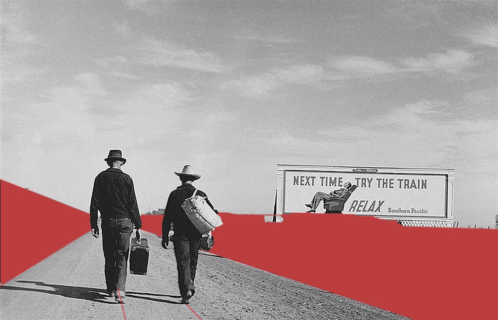
The line of telegraph poles and the fences form a great lead line into the picture and give it feel of great perspective emphasising the distance these men have yet to travel. The billboard makes a statement just in its presence. The lines of perspective are added to by the tire tracks and even the clouds being blown into shape in the air. The right hand verge adds a shadow which breaks up the photo and adds the strongest lead line in the photograph.
The photo whilst having these strong lead lines also follows the rules of thirds if you draw a line through the left shoulder of the left man from top to bottom you get the space for the telegraph poles, Do the same through the right shoulder of the man on the right you get a space for the men with a third segment for the billboard.
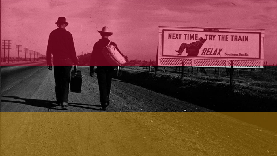
It also follows this rule horizontally the line of the horizon gives a large empty space, secondly a line across the picture level with the soles of the feet has all the detail in it. Finally the lower space has the tarmac road, dusty verge forming a second empty space.
The last observation I make looking at the photograph is that the men are taking no notice of the billboard they seem to be just focused on the task in hand the journey through this landscape to a hoped for better future.
Within the frame I see a triangle formed with the perspective of the road between the verge and the telegraph poles. Then two rectangles one is the obvious one in the billboard, the second one is formed by the sky. Finally I see a square around the two men walking?
At first glance the picture appears balanced and almost flat. However look further and you see the perspective formed by all the lines. Then the Billboard throws the picture out of balance and you see the writing this begins the questions and made me laugh when I read the words. The men throw the picture back into balance with all the action in the middle section.
The contrast is uniform in most of the picture, one element the dark verge to the right emphasises this lead line and takes your eye into the billboard.
The men’s feet walking into the scene give a sense of movement and hint at the long journey being completed. The lead lines emphasise this journey adding a sense that this walk is to be a long one which alternatively could be made by rail. The lines guide you into the photo and to the billboard. The sky and the land show that this is big country. Telegraph poles disappearing are the last element giving a sense of distance yet to travel.
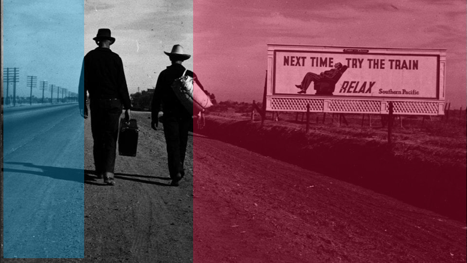
My eye goes to the centre of the photo to begin with but this area is empty between the men and the board. Sometimes my eye goes left to the men and sometimes to the right to the billboard. My eye does this as the two main subjects are balanced on the central line. Then my eye looks at the telegraph poles and gets the sense of distance. The two men are darker than the rest of the photo so stand out due to their darkness. Then the board stands out because it is brighter than the men.
This photo is unusual as Lange usually takes photographs showing serious scenes. This has satire and subtle humour whilst still having a serious message. Shadows leading from the men’s feet hint that it is late in the day and they have already travelled far whilst having far to go. Reclining on a seat a man has a easy time travelling this same route whilst our two heroes have to suffer a long walk.
This work was created to document the suffering of the workers in the USA caused by the Great Depression. The failure of the crops coupled with banks foreclosing on loans led to mass migration of people across the USA. This is summed up in one simple shot. In 1/15th of a second Lange has caught the migration of agricultural workers who can’t even afford a rail ticket. She has then presented it with humour showing how these people just got up and got on with it. What choice did they have?
We must remember one of Dorothea Langes favourite sayings was (2)“Grab a hunk of lightning” I think she did that here.
I find this work rewarding to look at, The song from Monty Pythons (3)Life of Brian (4)“Always look on the bright side of life” comes to mind when I see this photograph. These men are walking to a hoped for brighter future. I see the same thing in Walker Evans photograph (5) “Hitch hikers near Vicksburg Mississippi”, however Lange has added the billboard in her shot, this added element makes it more palatable but takes nothing away from the serious message.
This photograph has travelled well through the 80 years since it was taken. We have migrants across the world moving to find better futures for their families caused by financial institution and governmental mistakes. Different times same mistakes.
Looking at this exposure gives me a sense of hope for the future whilst dreading the past left behind. I wonder if these two men have left families behind who will join them once new hopeful lives have been created. Much like when I see the male refugees arriving on the shores of Europe today.
This work is poignant, funny, striking, timeless and disturbing all at the same time. It is a beautiful, simple depiction of an ugly subject. Much like some of the work we see in the media capturing the hope people have when they suffer indignities to get to a Promised Land.
This work is a huge success it makes me think. I want to know the stories behind the footsteps and I want to find out where the steps into the unknown led these two men. I want to understand what led to this 1/15th of a second. If I had seen the photo at the time it was taken I would have spent time to find out all I could and would be doing all I could to help. Whether it is beautiful or ugly is unimportant it is a success because it makes me care.
On first seeing this photograph I thought it was original, doing my research though led me to several examples where a similar scene was shown. August Sander shows a similar scene with (6)“Itinerant Basket Weavers (1929) as does Walker Evans in (5)“Hitchhikers near Vicksburg Mississippi” (1939). The difference is the billboard this adds a memorable element, at first funny then thought provoking. Interesting that Lange and Evans knew each other and took similar shots of the same subject in the same year did they compare and discuss their work?
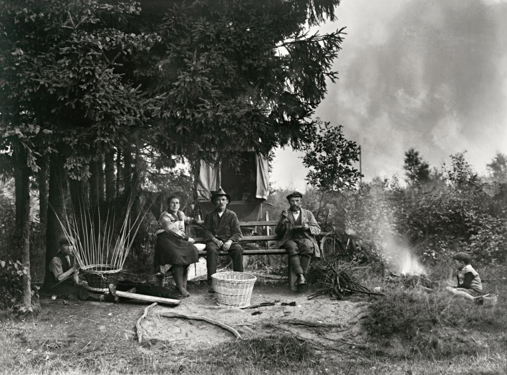
August Sanders (1920) 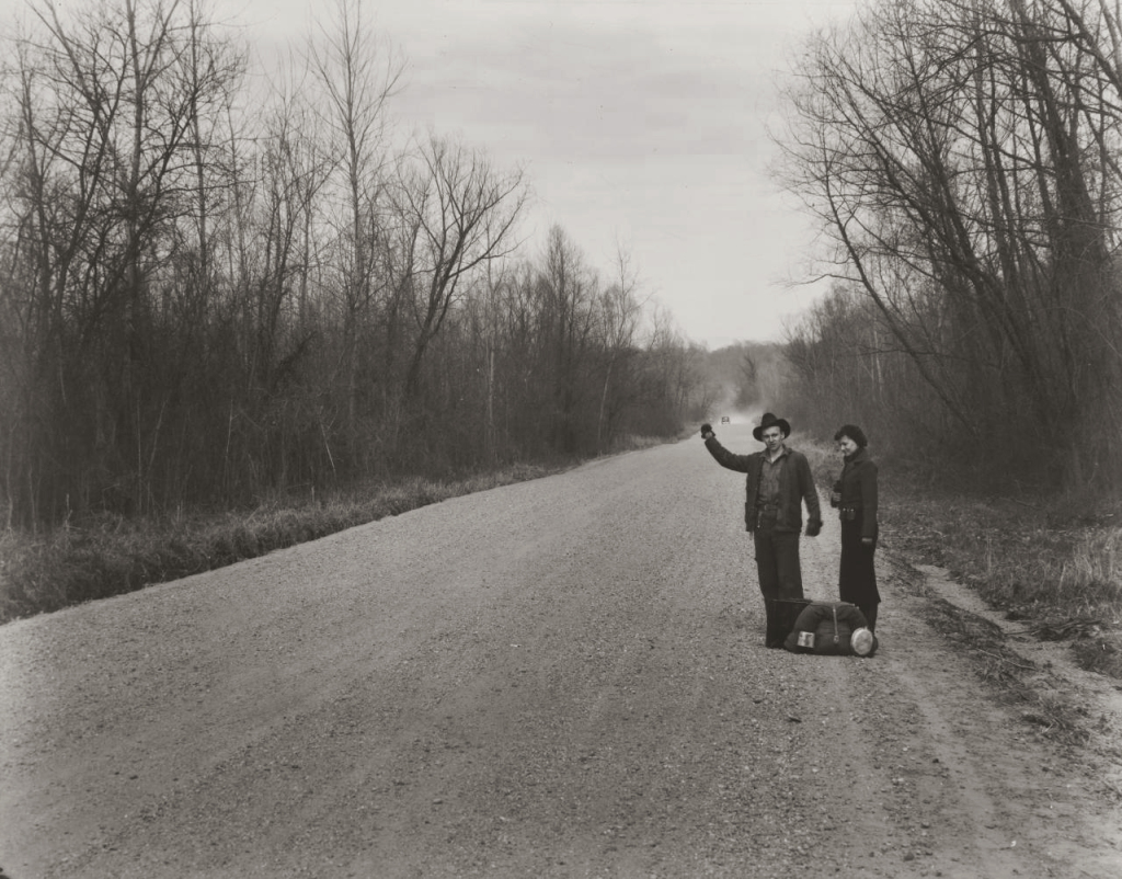
Walker Evans (1935)
Dorothea Lange used her camera well however she used her number one and number two instruments exquisitely, her eye and her brain. She will have had moments to see and set up this shot, she did it superbly.
In looking at this exposure I began by critiquing it as a photograph but have ended relishing it for the mood it creates. It captures the situation these people were forced into then shows the spirit of these two humans in dealing with their situation. Dorothea then shows us some humour and we empathise with these two men. We all enjoy a little humour even dark humour in times of trouble.
These individuals are going on a journey together, I am going with them. More than this I want to get involved not just with these individuals but with the struggle the farmers are suffering. Some critics of photography have pointed out that “privileged people” use their cameras to look down on poor subjects. I believe this work and others like it encourage us to find out more, when other organisations may not want us to see it at all.
All this from one photograph that at the outset looked like a simple, slightly humorous shot. If you set out with an interest and have an open mind it is amazing where these practitioners can take us.
Further Reading/recommended viewing.
Group f64 Mary Street Alinder published by Bloomsbury ISBN 978=1-420090-555-0.
Dorothea Lange: Grab a hunk of lightning American Masters video. Released 29th of August 2014.
References
(1)Lange, Dorothea. Towards Los Angeles. MoMA, Chicago.
(2)Grab a hunk of lightning. Directed by Dyanna Taylor. Performed by Dorothea Lange. 2014.
(3)The Life of Brian. Directed by Terry Jones. Performed by Monty Python. 1979.
(4)Python, Monty. Always look on the brightside of life. Comp. Eric Idle. 1979.
(5)Evans, Walker. Hitch hikers near Vicksburg Mississippi. FSA, San Francisco.
(6)Sander, August. Itinerant Basket Weavers. National Gallery of Victoria, Victoria.