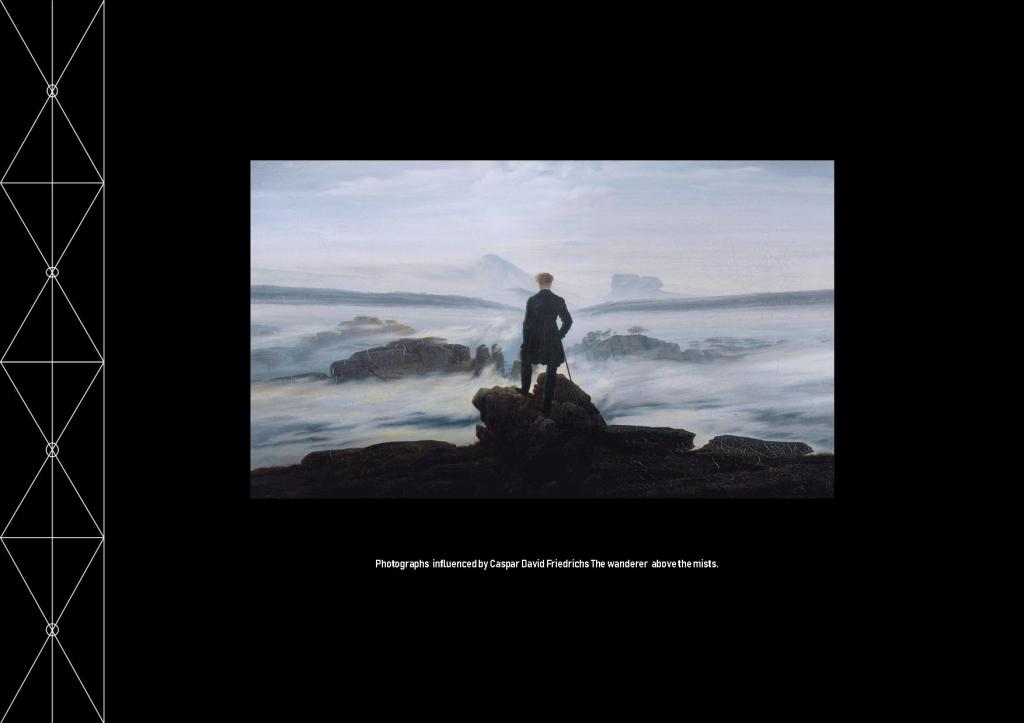
I felt it was appropriate after seeing David Hockney making Four Seasons in Warter Lane to do some research about what the work is about and how it will compare with my work.
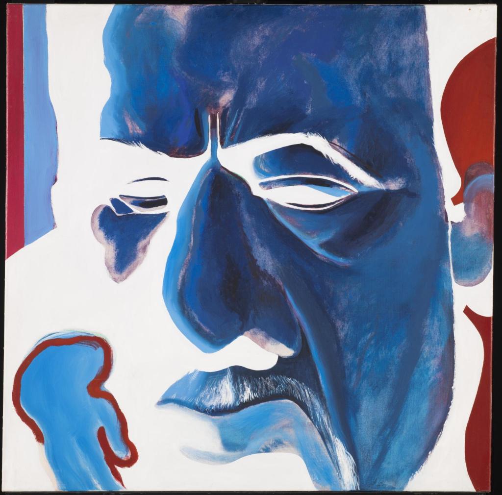
Oxtoby Mingus Deep Blue Redfern Gallery 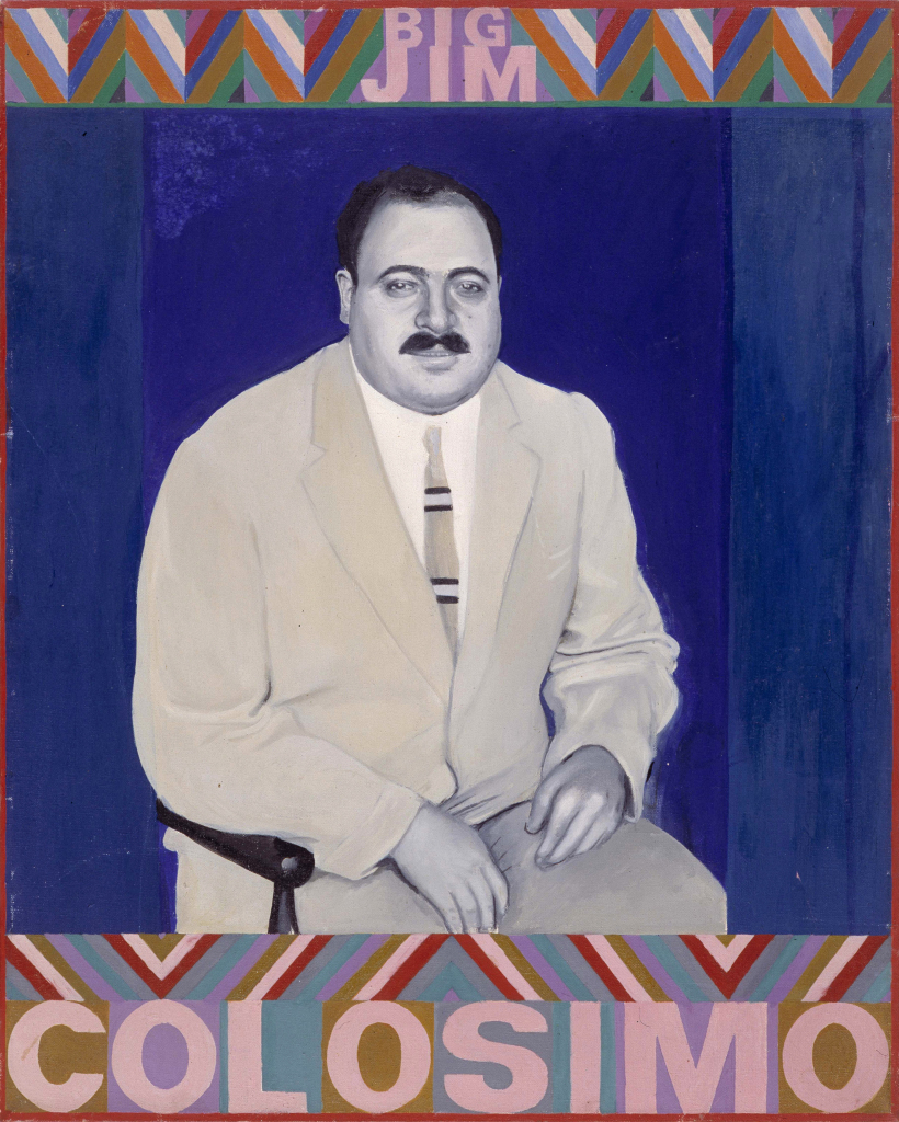
Boty Big Jim Colosimo. 1963 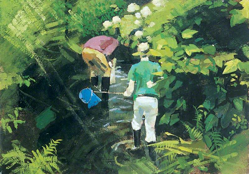
Lisle, Boys Fishing; Burton Gallery, University of Leeds.
David Hockney was born on July 9th 1937 in Heston Bradford. He went to Bradford Grammar School then into further education. He studied at Bradford College of Art where he was tutored by Frank Lisle his peers included Pauline Boty and David Oxtoby.
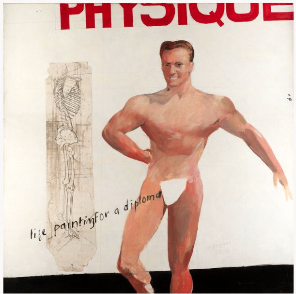
He progressed to the Royal Acadamy of the Arts in London. In 1962 the Royal Acadamy wouldn’t allow him to graduate until he produced a nude, life studyhe did calling it “Painting for a diploma”. Show both his rebellious side and his sense of playfulness. He proved to be an accomplished droughts man and artist with a keen interest in using new technology in his work. (BBC,2013).
He taught at Maidstone College for a short period before following his desire to be a stand alone artist. (BBC, 2013).
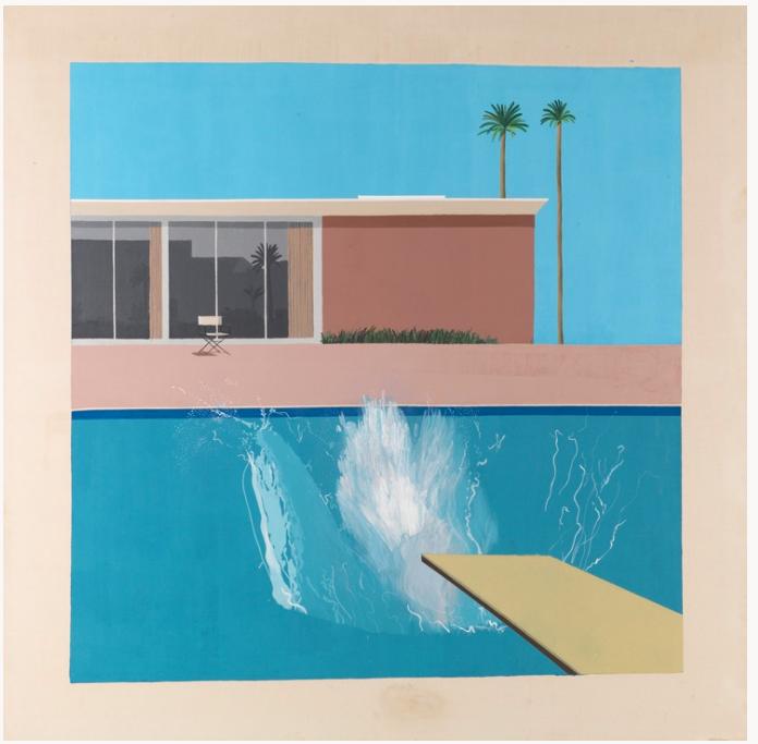
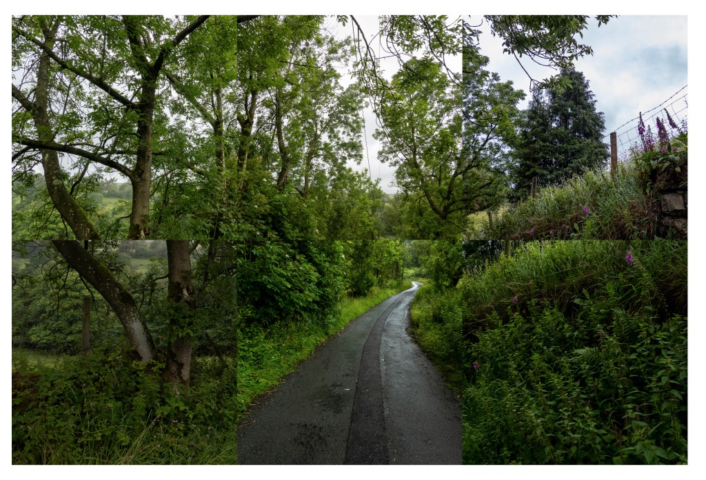
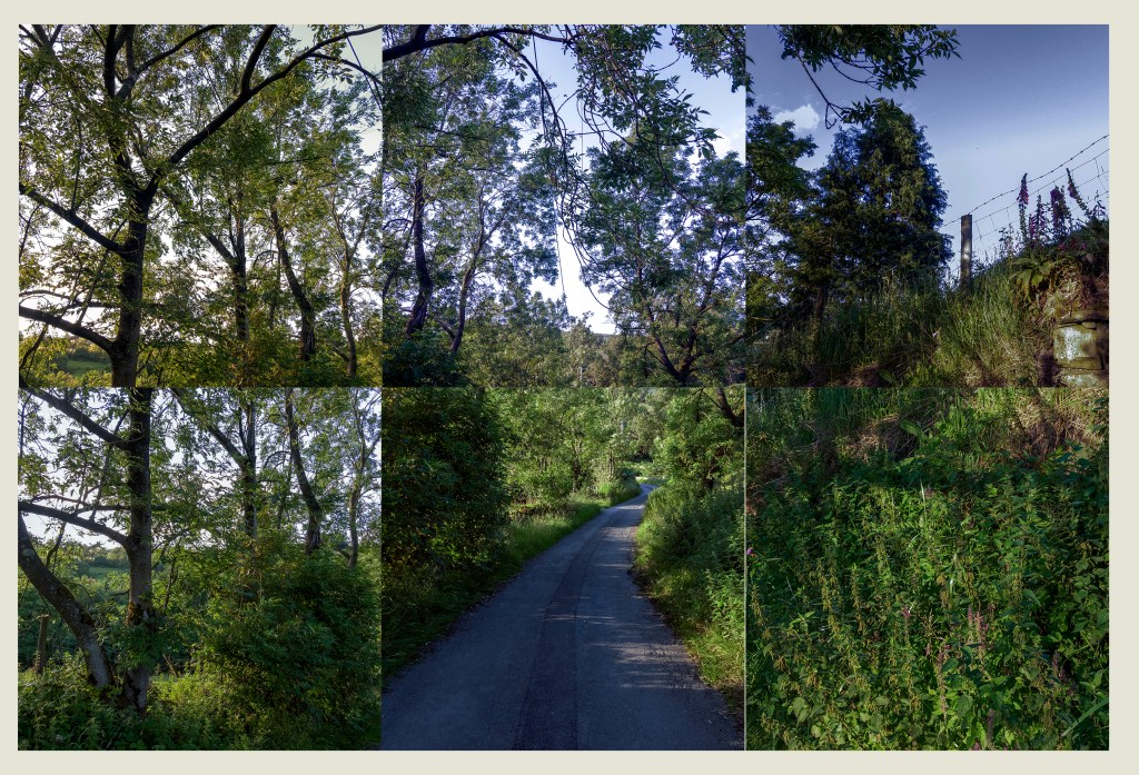
David Hockney then moved to Los Angeles and created a studio. He worked on projects including paintings, Lithographs and photographs. One of his most important works “A bigger Splash” was painted in his swimming pool. He experimented with photo collages making one of a blue balcony which subsequently led to the work Four Seasons which influenced my work for assignment 6.
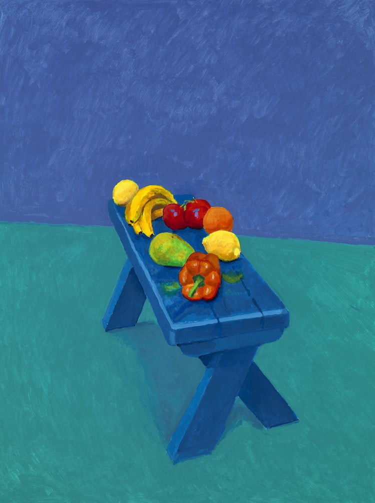
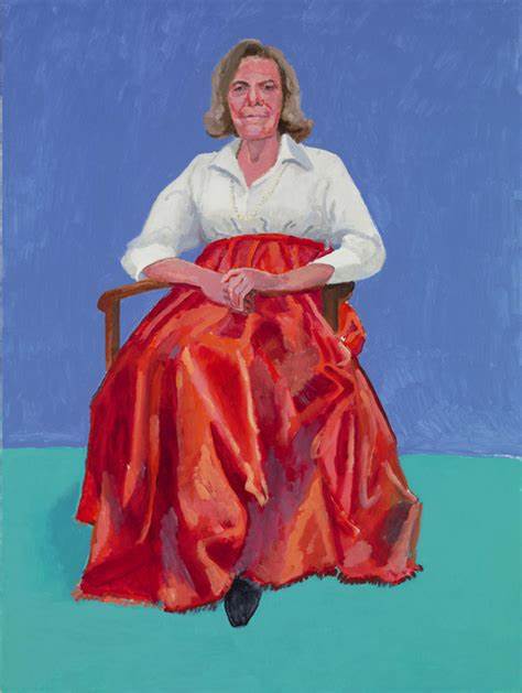
He exhibited 82 portraits and 1 still life at the Royal Acadamy in London. These portraits are in vibrant colours and have the subjects seated. It has one still life of fruit on a bench. Each portrait had to be completed in 3 days. All have the same background and the same chair. The still life has no meaning it is in the exhibition as an after thought.
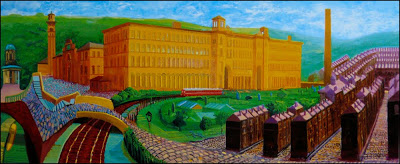
He support his friend Jonathan Silver who he had met at Grammar School to set up Gallery 1853 in Salts Mill, a building Silver saved, renovated and dedicated the Gallery to David Hockneys work. It houses one of the largest collections of his work in the UK. One being a painting of the mill in the entrance to the mill.
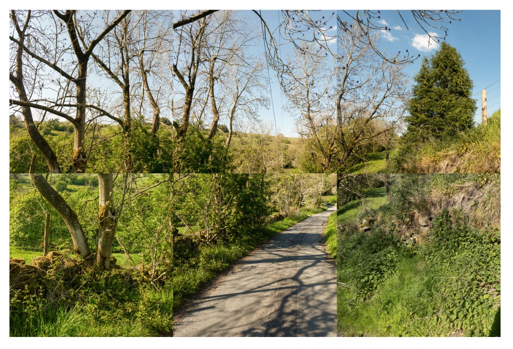
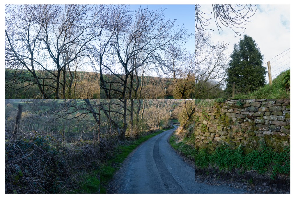
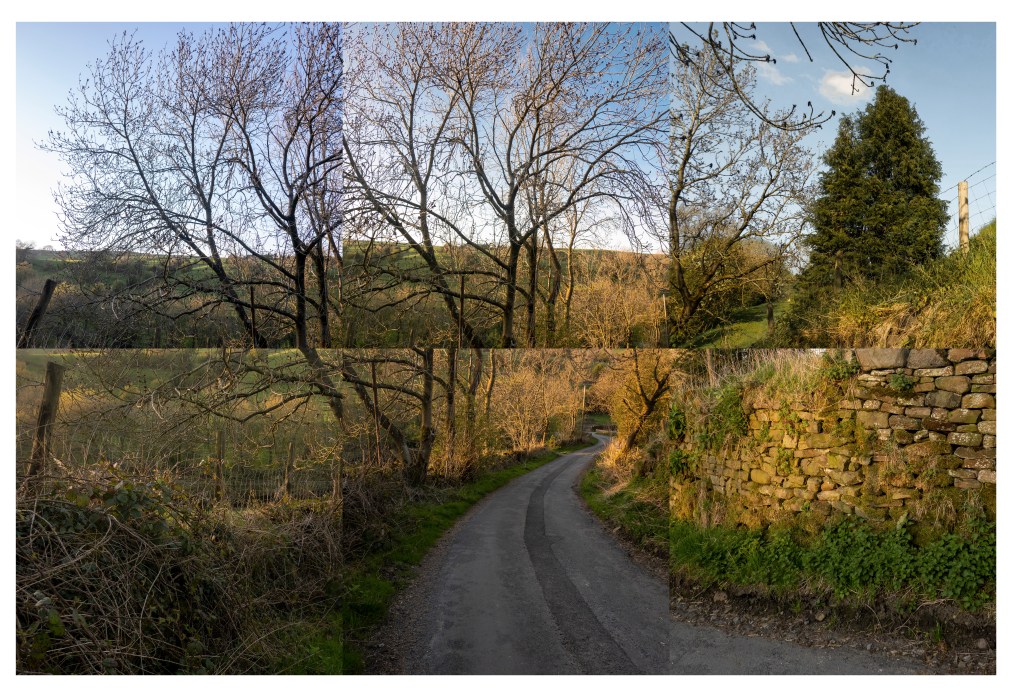
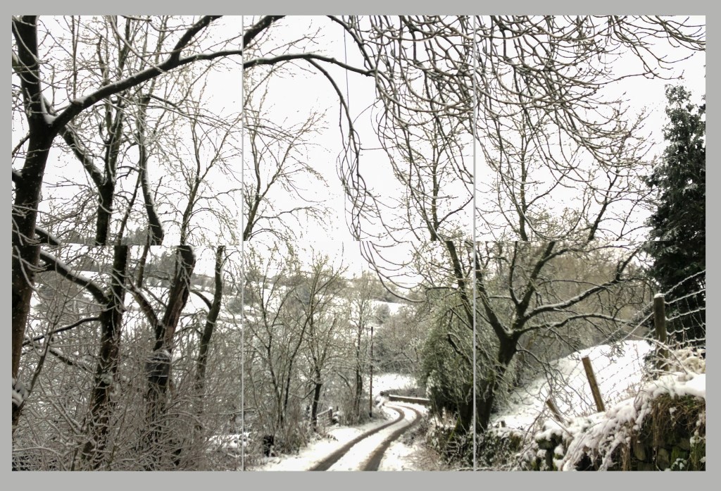
Some of that work is David Hockneys Ipad work drawn in the Yorkshire Wolds the setting for Warter Lane the inspiration for “Four Seasons”. Also set in the Wolds are the massive paintings of the landscape entitled “The arrival of spring showing his embrace for new technologies.
Using video he uses different technology to take us into the Wolds Landscape in a different way. He didnt do it at the time but he recorded a disappearing landscape as the copse shown was to be chopped down. David Hockney tried to save it to no avail (2011).
Here is the video of hockney discussing Four Seasons.
https://www.frieze.com/video/david-hockney-time-and-more-space-and-more
Hockney speaks about “Four Seasons” on the Frieze website he says “Bertie says Perspective is a window, So where are you as the viewer? In a room not the landscape, lots of pictures counter act perspective putting you in the landscape not in the room, most photographs are flat, by changing the perspective this work is about time and space and more….” (Frieze, 2018).
In another video he made for the Smithsonian Channel Hockney talks about “I realised a photo has no life, unlike a painting, a paint artist spends hours looking at the subject before making a picture”. He continues “A camera looks for a fraction of a second”. In the video he is discussing his collage work and the way he uses time and space to create perspective in his collages. My research on Time and Space is here.
https://michaelgreenlevel2landscapeblog.photo.blog/?p=1569
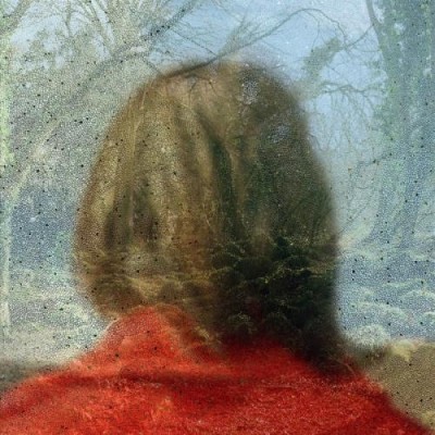
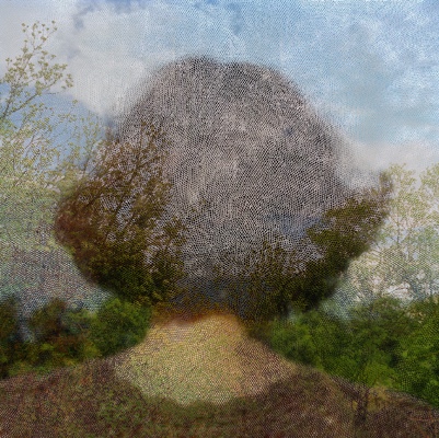
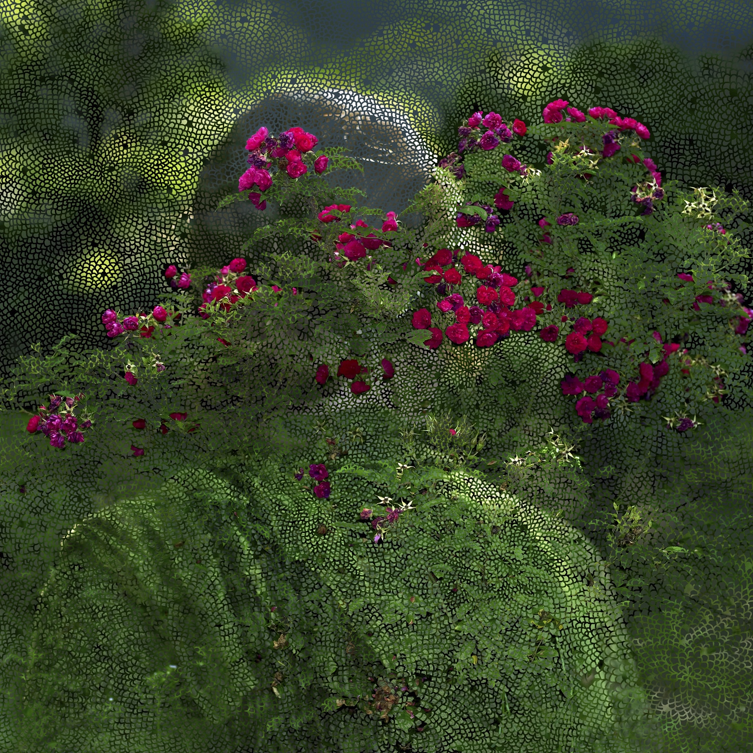
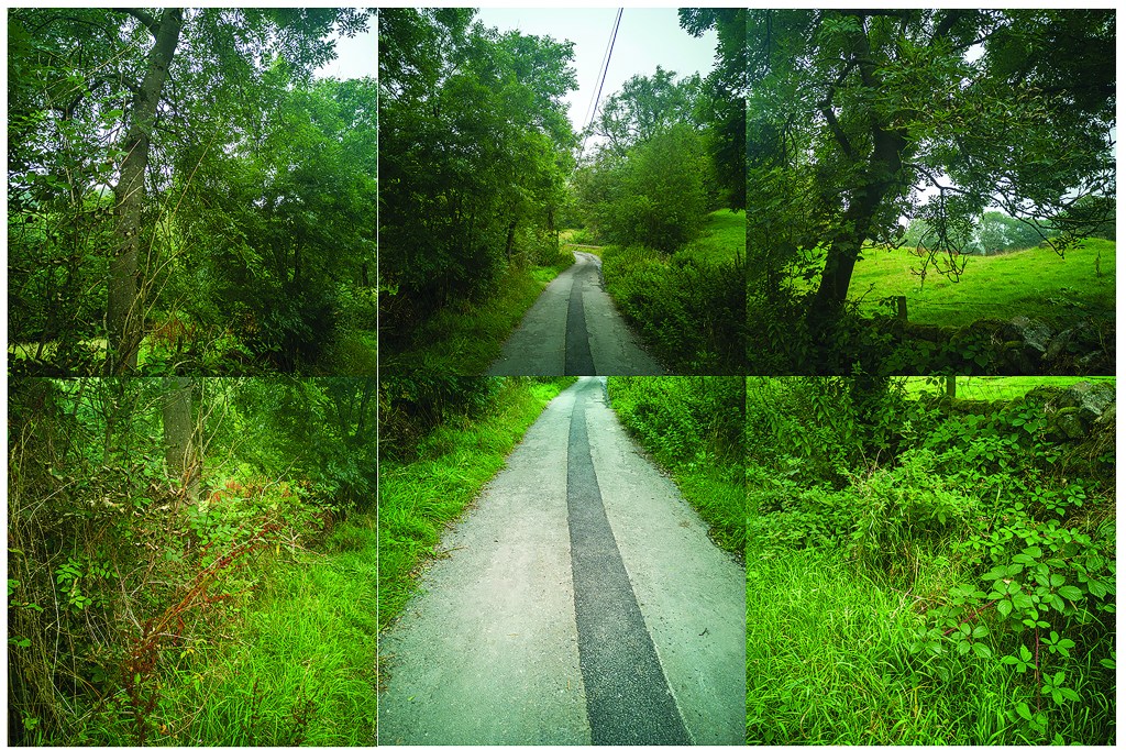
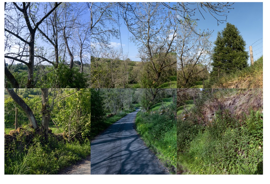
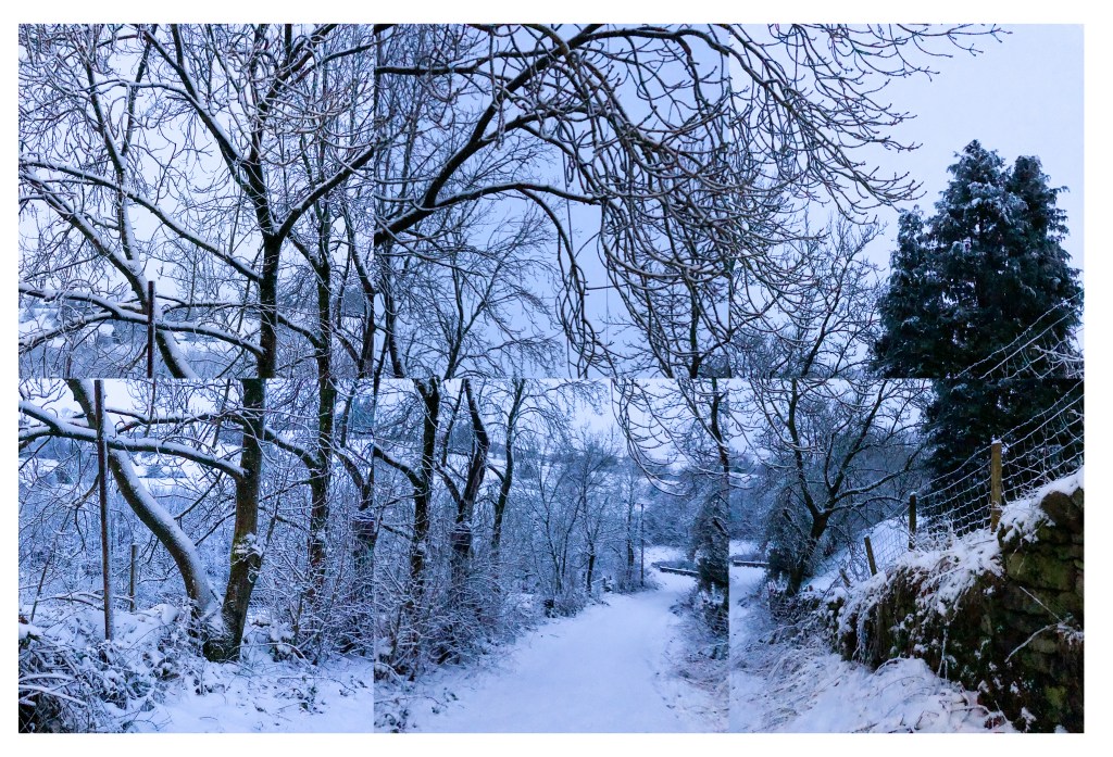
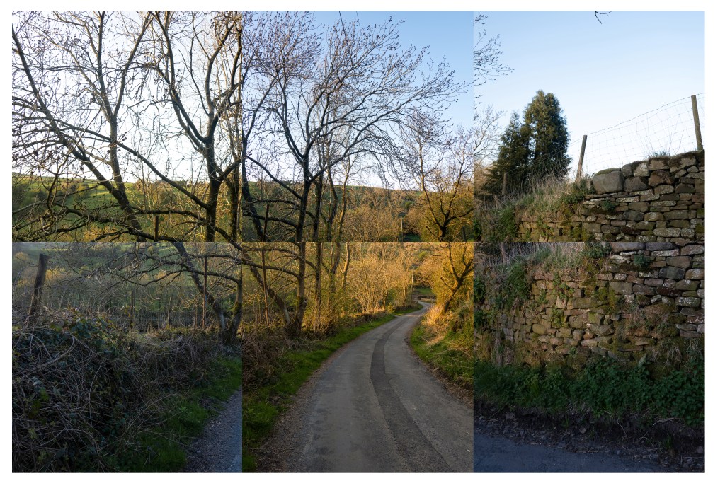
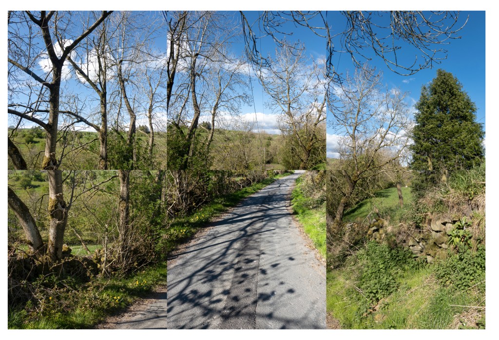
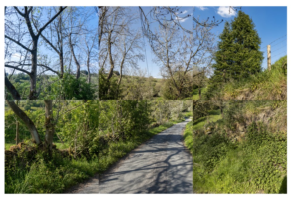
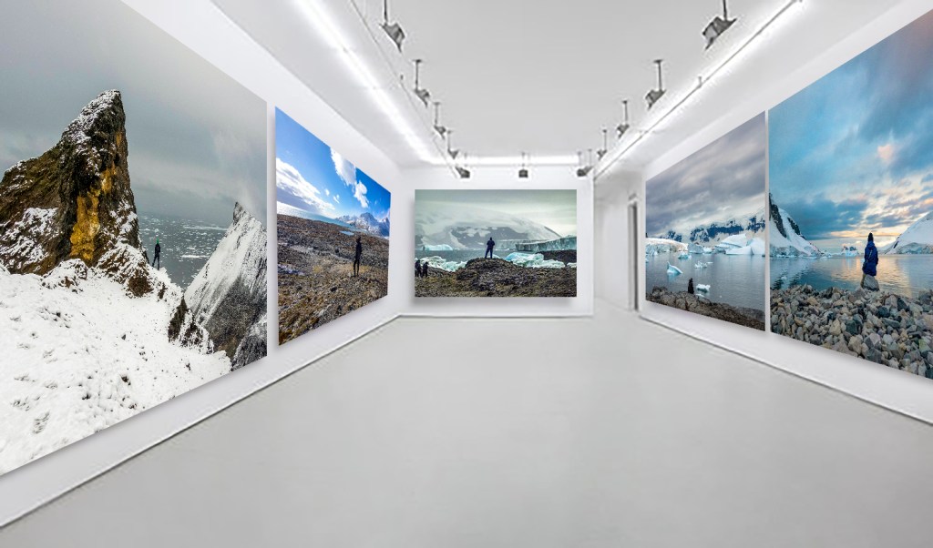
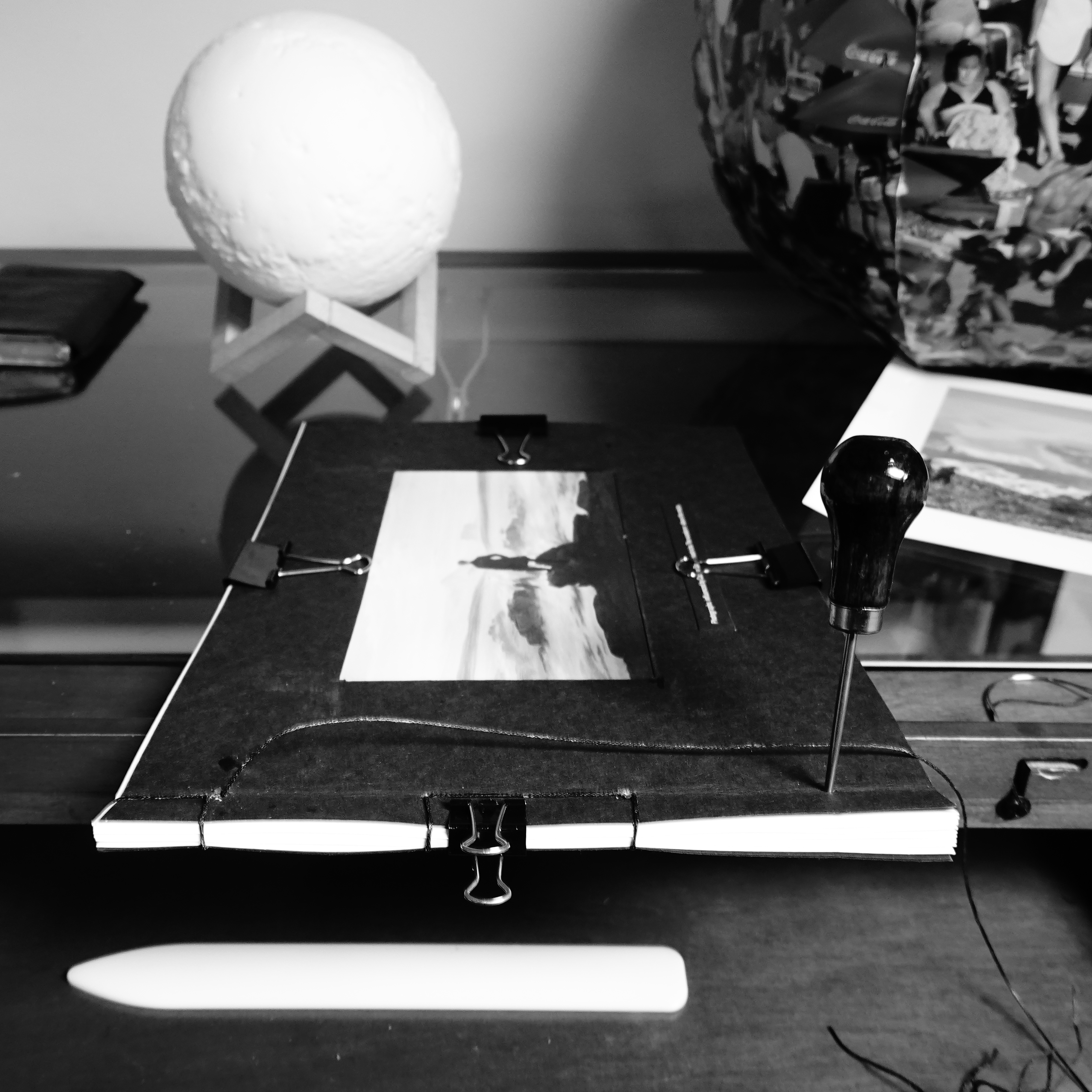
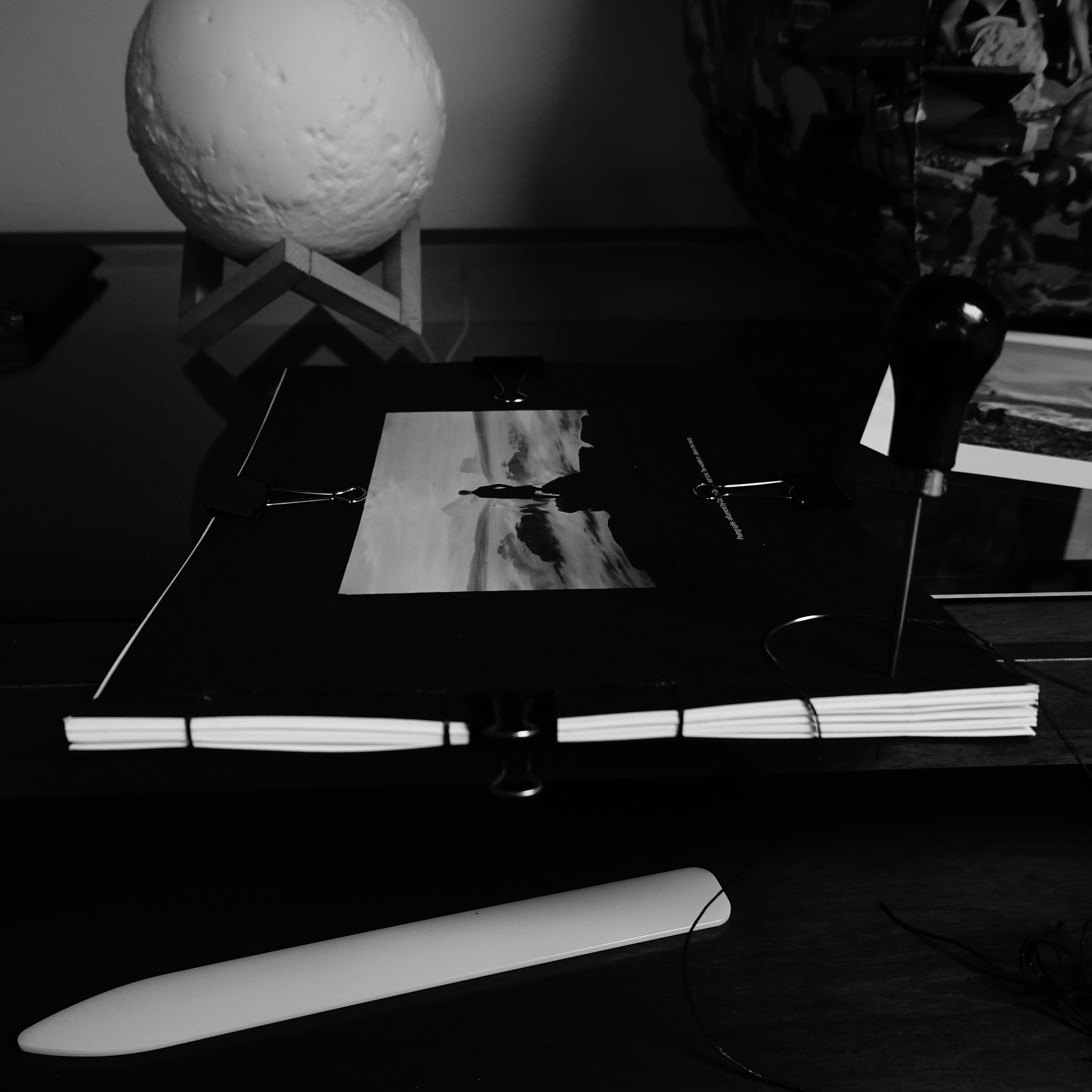
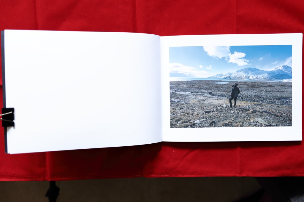
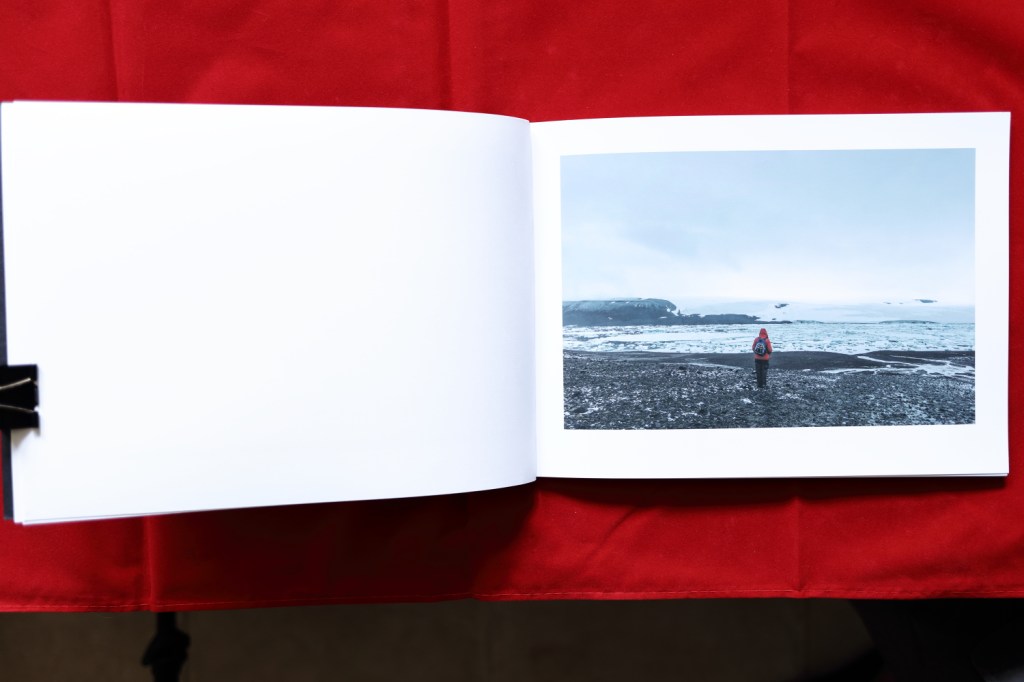
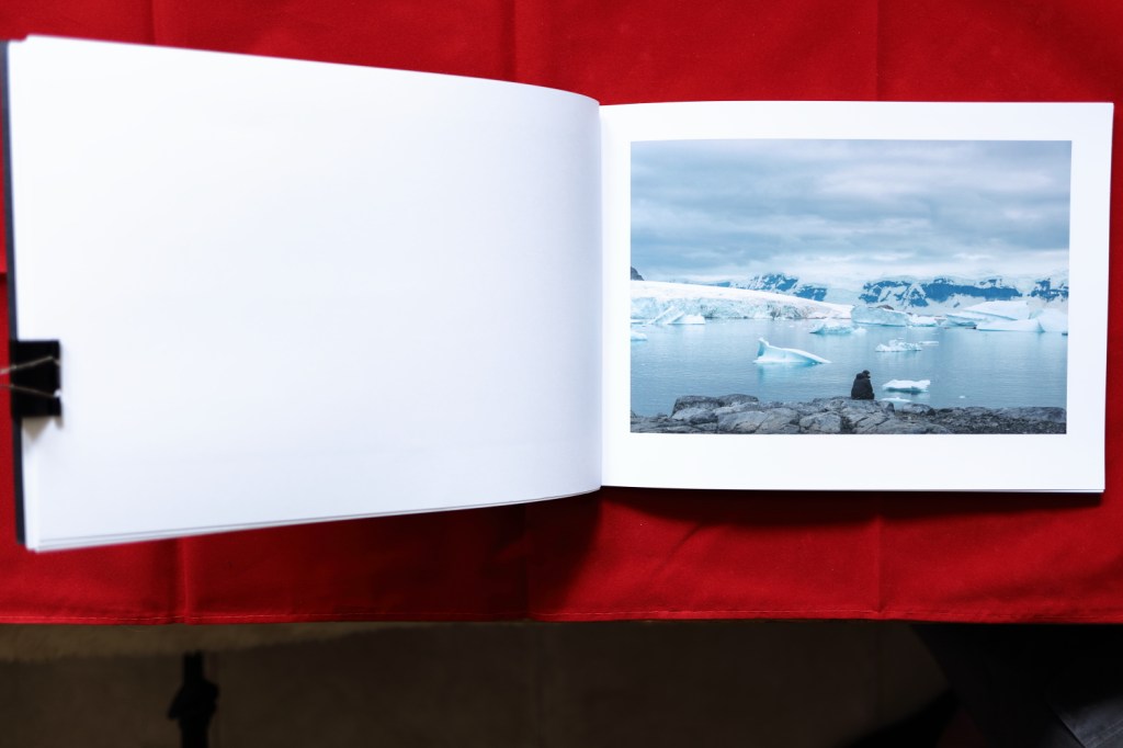
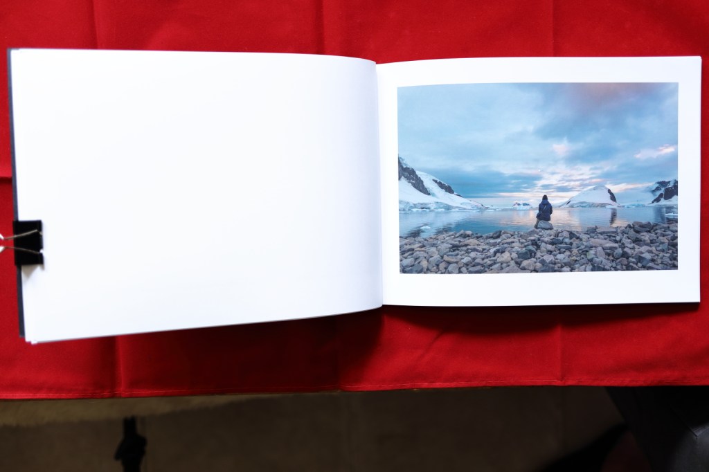
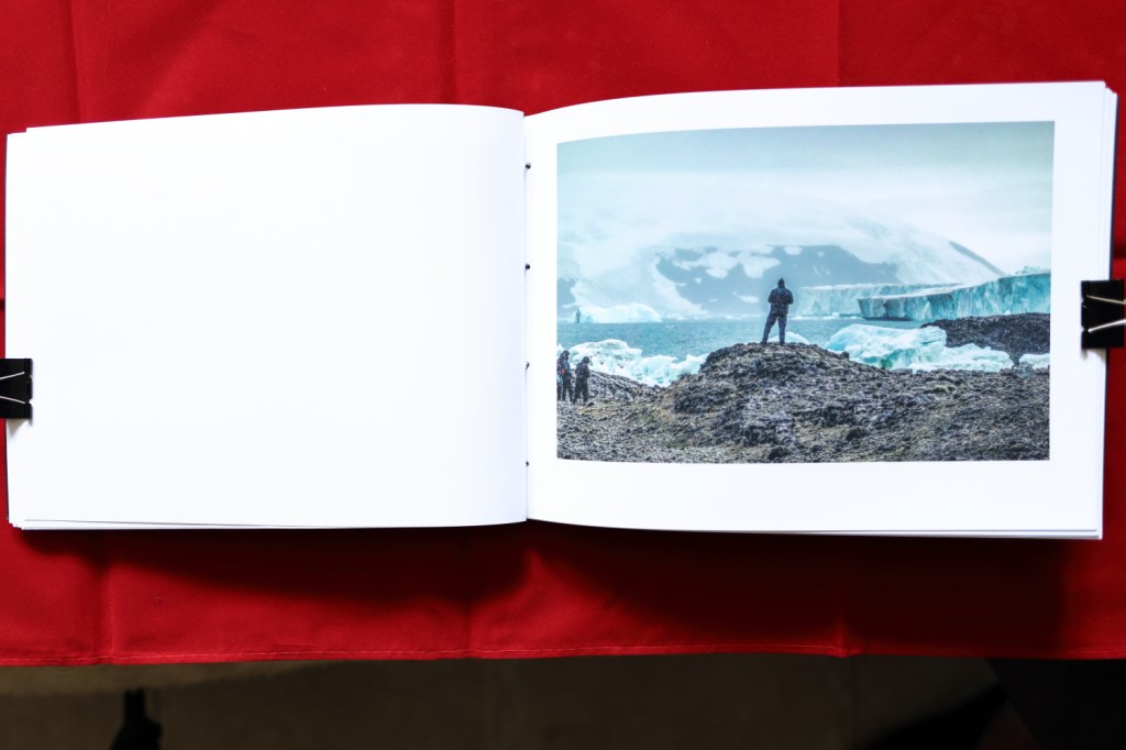
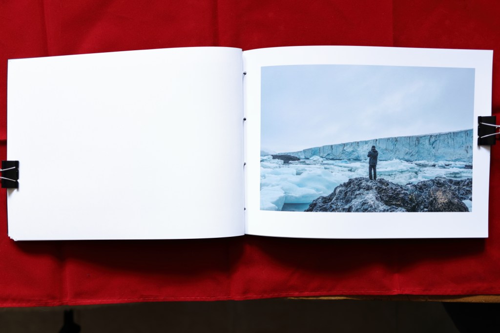
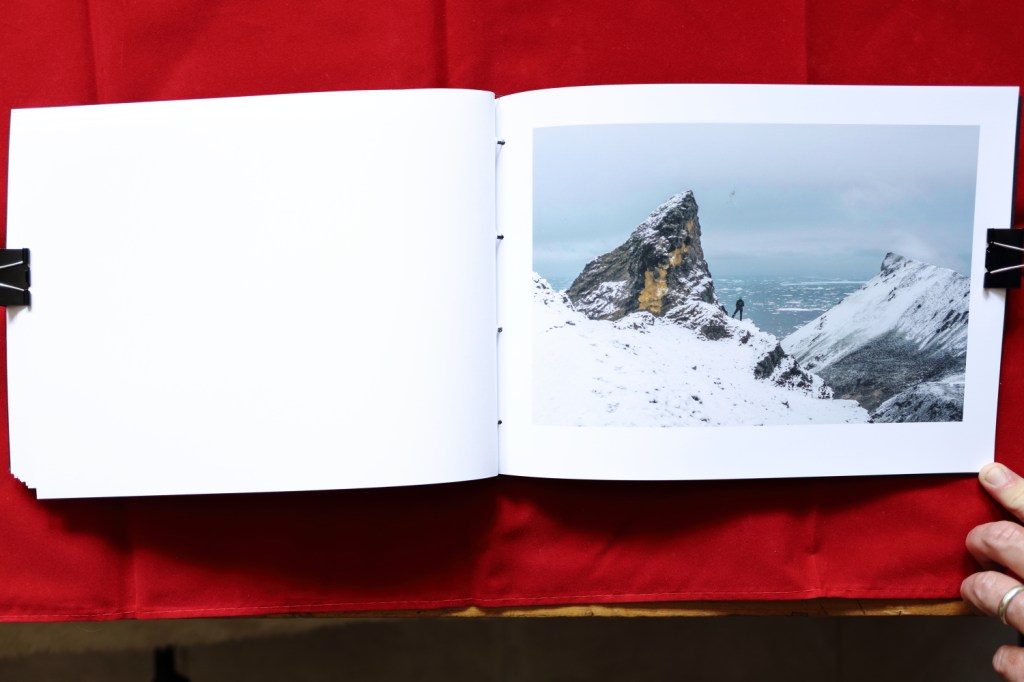
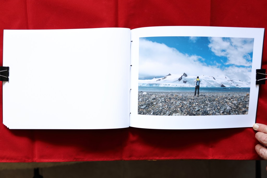
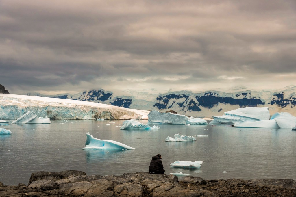
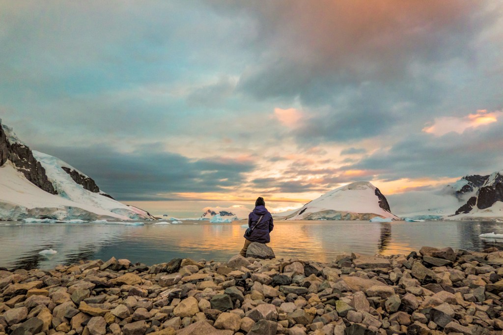
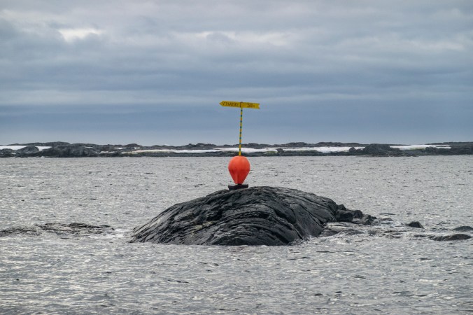
I want my work to put you in the landscape rather than just show a flat photograph. It is a dynamic living space that is there whatever is happening in the human world. I want to use still images so will have to take more images (12) in fact 72 to cover the year. I will change perspective by shooting images that are not stitches and will not align to make the viewer work harder to see the message.
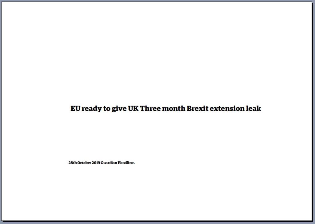
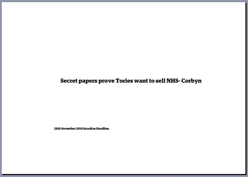
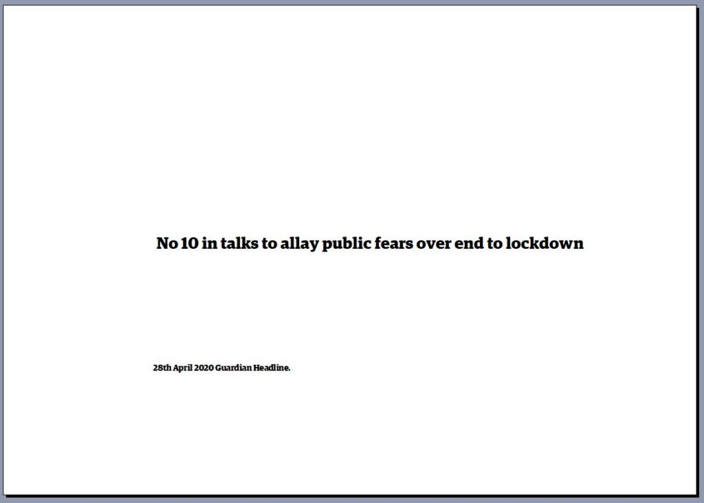
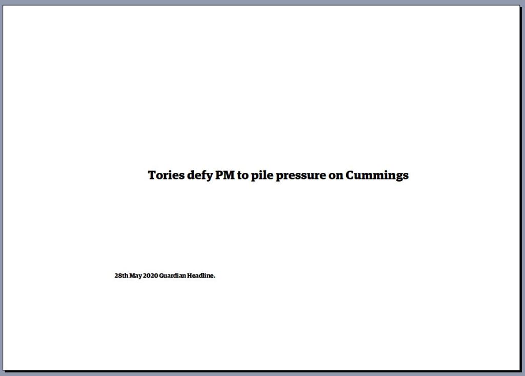
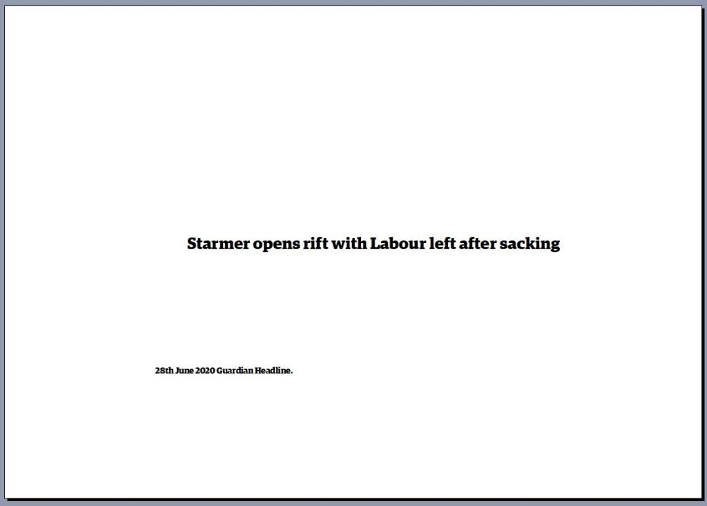
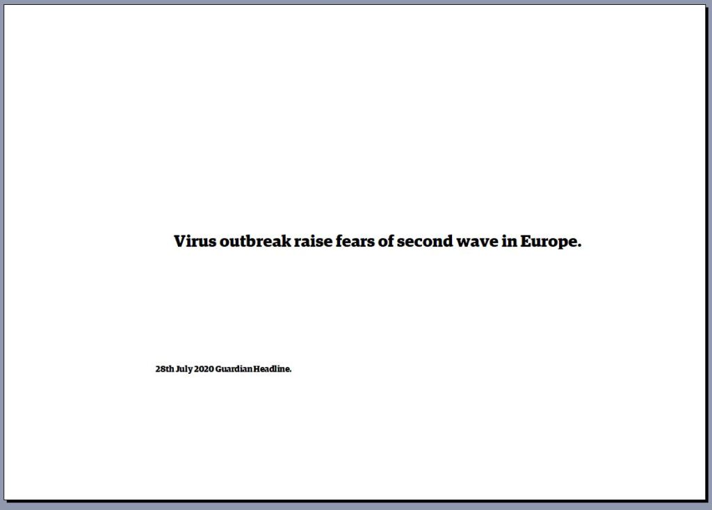
The headlines from the Guardian will make my work different to Hockneys. However it is a key part of what I want to say.
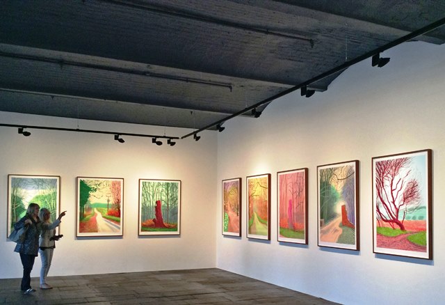
Sitting in a room with the four screens of nine is a soothing experience, more soothing than walking down Warter Lane. Being in the middle of the screens makes you feel totally immersed in this installation.
Work Cited
David, Hockney. One Still Life. 2014. Acrylic on Canvas. Royal Academy of the Arts London. Hockney, David. A Bigger Splash. 1967. Oil on Canvas, 95 1/4×96 inches. T03254. The David Hockney Collection. https://thedavidhockneyfoundation.org/chronology/1967. ———.
Four Seasons. 2017. Video Installation, 36 screens making four images. Frieze Video. ———.
Life Painting for a Diploma. 1962. Oil on Canvas. David Hockney Collection. https://thedavidhockneyfoundation.org/chronology/1962. ———.
Rita Pynoos. March 1, 2014. Acrylic on Canvas, 121.9×91.4cm. Royal Academy of the Arts London. ———.
The Arrival of Spring. 2011. Drawings on Ipad. Gallery 1853 Salts Mill Yorkshire. https://www.yorkshire.com/view/culture/saltaire/salts-mill-and-1853-gallery-125448.
Lisle, Frank. Boys Fishing. 1986 1916. Oli on Canvas. The Stanley and Audrey Burton Collection. http://www.artuk.org/artworks/boys-fishing-39157.
Unknown. “Artists in Their Own Words.” Radio 4 Broadcast. David Hockney. London: BBC, 1994. BBC Sounds. Https://BBC.co.uk. ———.
David Hockney: Time and More, Space and More … MPEG. Chicago USA: Richard Gray Gallery, 2018. https://www.frieze.com/video/david-hockney-time-and-more-space-and-more.