Below is the feedback I recieved from my tutor in regard to my critical review for Assignment 4. Since my feedback I have signed up and completed work with the Royal Literary Fund. This has started my journey towards mastering the skill of writing in an academic way.
I have begun to read Umberto Eco “How to write a thesis” and have read “Cite them rite”.
I have also completed an online course in Japanese Stab Binding and have ordered the materials and the tools to make a photobook with the control over the whole process.
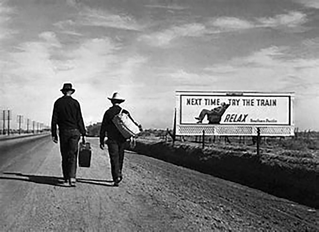
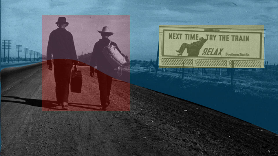
To complete this assignment I want to look at the photograph (1)“Towards Los Angeles” by Dorothea Lange. I chose this photograph as it is one of the lesser known works however to me it appeals showing pathos and humour in equal measure.
The photograph was taken in February 1936 during the Great Depression in the United States. It is a Silver Gelatin Print taken during her work around El Monte and San Fernando, California for the Farm Service Agency(FSA). It is taken on the road to Los Angeles.
The work is a landscape with a billboard and two men walking along a road lined with telegraph poles. The both carry luggage. The man on the left is carrying a suitcase in his left hand whilst the man on the right is carrying a canvass holdall on his right shoulder. They both look like Cowboys or at least farm hands. The luggage they carry looks to be in good condition and the clothes they are wearing appear to be in good order. The left mans right shoulder is drooping due to the weight of his luggage.
Both men`s necks and hands are visible and look well tanned from hard days working on the land that this road snakes across. Their feet are in different stages of walking the right mans left foot is off the ground and the man on the left has is right foot raised off the ground in a purposeful march into the future.
The road they are walking on is a tarmac road with a dusty verge and they are walking with the billboard to their right. The bill board says “Next time try the train”, with a line underneath that states “RELAX” accompanied by the name of the railroad placing the advert “Southern Pacific”. Underneath the billboard there is a trellis to finish off the billboard but it adds a new texture to the picture.
From the left edge of the picture run telegraph poles at least ten in number run along the verge of the road. On the right side a series of fence posts runs between the men and the billboard forming a barrier between the longed for better life and the walk. The surface of the dusty verge is indented with the treads of the cars which have pulled over off the tarmac for unknown purposes.
The billboard appears to be on land between the fence and open farmland the type of land these men are leaving. There is a second less prominent fence behind the billboard which emphasises the lead line it forms.
The sky makes me think it is blue and peppered with wispy clouds being blown into majestic lines which luckily add to the lead lines in the rest of the picture. It is a bright sunny day with little wind on a dry dusty day.
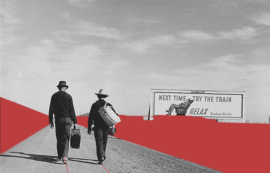
Leading lines.
The line of telegraph poles and the fences form a great lead line into the picture and give it feel of great perspective emphasising the distance these men have yet to travel. The billboard makes a statement just in its presence. The lines of perspective are added to by the tire tracks and even the clouds being blown into shape in the air. The right hand verge adds a shadow which breaks up the photo and adds the strongest lead line in the photograph.
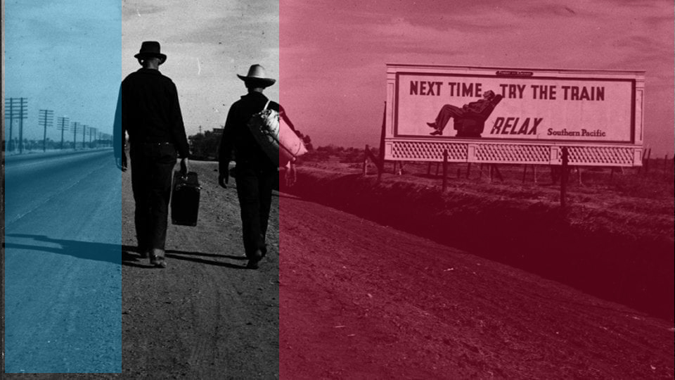
Rule of thirds vertically.
The photo whilst having these strong lead lines also follows the rules of thirds if you draw a line through the left shoulder of the left man from top to bottom you get the space for the telegraph poles, Do the same through the right shoulder of the man on the right you get a space for the men with a third segment for the billboard.
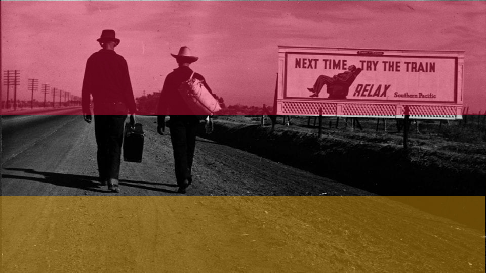
Rule of thirds horizontally.
It also follows this rule horizontally the line of the horizon gives a large empty space, secondly a line across the picture level with the soles of the feet has all the detail in it. Finally the lower space has the tarmac road, dusty verge forming a second empty space.
The last observation I make looking at the photograph is that the men are taking no notice of the billboard they seem to be just focused on the task in hand the journey through this landscape to a hoped for better future.
Colour boxes and lines my eye sees.
Within the frame I see a triangle formed with the perspective of the road between the verge and the telegraph poles. Then two rectangles one is the obvious one in the billboard, the second one is formed by the sky. Finally I see a square around the two men walking?
At first glance the picture appears balanced and almost flat. However look further and you see the perspective formed by all the lines. Then the Billboard throws the picture out of balance and you see the writing this begins the questions and made me laugh when I read the words. The men throw the picture back into balance with all the action in the middle section.
The contrast is uniform in most of the picture, one element the dark verge to the right emphasises this lead line and takes your eye into the billboard.
The men’s feet walking into the scene give a sense of movement and hint at the long journey being completed. The lead lines emphasise this journey adding a sense that this walk is to be a long one which alternatively could be made by rail. The lines guide you into the photo and to the billboard. The sky and the land show that this is big country. Telegraph poles disappearing are the last element giving a sense of distance yet to travel.
My eye goes to the centre of the photo to begin with but this area is empty between the men and the board. Sometimes my eye goes left to the men and sometimes to the right to the billboard. My eye does this as the two main subjects are balanced on the central line. Then my eye looks at the telegraph poles and gets the sense of distance. The two men are darker than the rest of the photo so stand out due to their darkness. Then the board stands out because it is brighter than the men.
This photo is unusual as Lange usually takes photographs showing serious scenes. This has satire and subtle humour whilst still having a serious message. Shadows leading from the men’s feet hint that it is late in the day and they have already travelled far whilst having far to go. Reclining on a seat a man has a easy time travelling this same route whilst our two heroes have to suffer a long walk.
This work was created to document the suffering of the workers in the USA caused by the Great Depression. The failure of the crops coupled with banks foreclosing on loans led to mass migration of people across the USA. This is summed up in one simple shot. In 1/15th of a second Lange has caught the migration of agricultural workers who can’t even afford a rail ticket. She has then presented it with humour showing how these people just got up and got on with it. What choice did they have?
We must remember one of Dorothea Langes favourite sayings was (2)“Grab a hunk of lightning” I think she did that here.
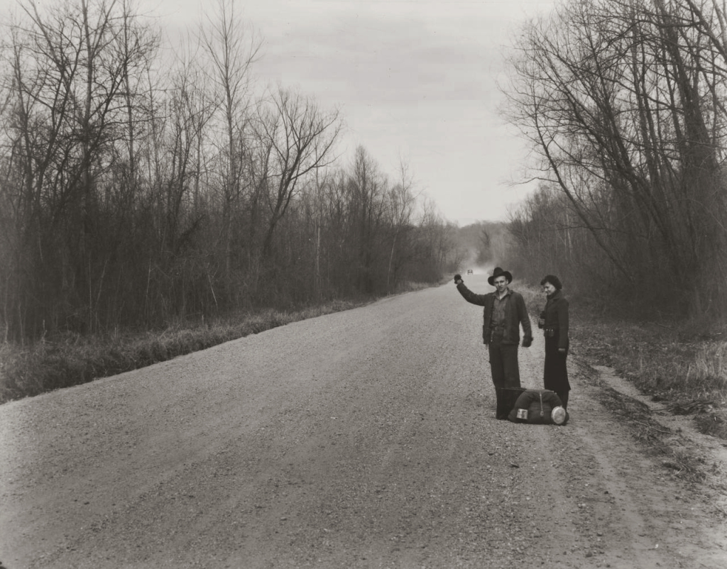
I find this work rewarding to look at, The song from Monty Pythons (3)Life of Brian (4)“Always look on the bright side of life” comes to mind when I see this photograph. These men are walking to a hoped for brighter future. I see the same thing in Walker Evans photograph (5) “Hitch hikers near Vicksburg Mississippi”, however Lange has added the billboard in her shot, this added element makes it more palatable but takes nothing away from the serious message.
This photograph has travelled well through the 80 years since it was taken. We have migrants across the world moving to find better futures for their families caused by financial institution and governmental mistakes. Different times same mistakes.
Looking at this exposure gives me a sense of hope for the future whilst dreading the past left behind. I wonder if these two men have left families behind who will join them once new hopeful lives have been created. Much like when I see the male refugees arriving on the shores of Europe today.
This work is poignant, funny, striking, timeless and disturbing all at the same time. It is a beautiful, simple depiction of an ugly subject. Much like some of the work we see in the media capturing the hope people have when they suffer indignities to get to a Promised Land.
This work is a huge success it makes me think. I want to know the stories behind the footsteps and I want to find out where the steps into the unknown led these two men. I want to understand what led to this 1/15th of a second. If I had seen the photo at the time it was taken I would have spent time to find out all I could and would be doing all I could to help. Whether it is beautiful or ugly is unimportant it is a success because it makes me care.
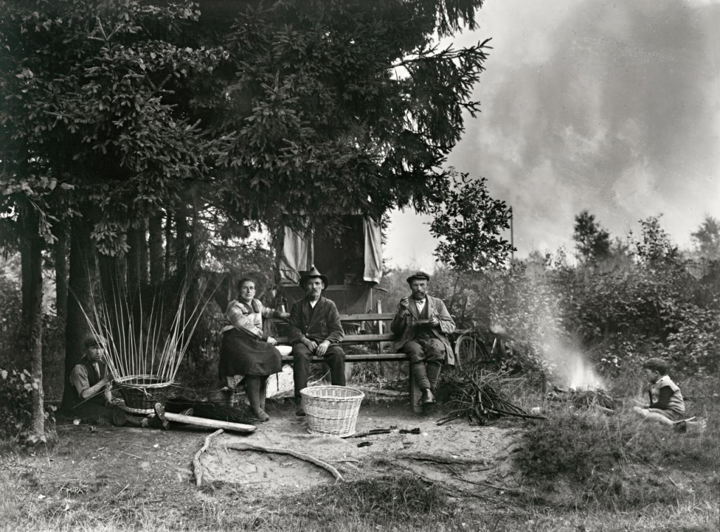
On first seeing this photograph I thought it was original, doing my research though led me to several examples where a similar scene was shown. August Sander shows a similar scene with (6)“Itinerant Basket Weavers (1929) as does Walker Evans in (5)“Hitchhikers near Vicksburg Mississippi” (1939). The difference is the billboard this adds a memorable element, at first funny then thought provoking. Interesting that Lange and Evans knew each other and took similar shots of the same subject in the same year did they compare and discuss their work?
August Sanders (1920)
Walker Evans (1935)
Dorothea Lange used her camera well however she used her number one and number two instruments exquisitely, her eye and her brain. She will have had moments to see and set up this shot, she did it superbly.
In looking at this exposure I began by critiquing it as a photograph but have ended relishing it for the mood it creates. It captures the situation these people were forced into then shows the spirit of these two humans in dealing with their situation. Dorothea then shows us some humour and we empathise with these two men. We all enjoy a little humour even dark humour in times of trouble.
These individuals are going on a journey together, I am going with them. More than this I want to get involved not just with these individuals but with the struggle the farmers are suffering. Some critics of photography have pointed out that “privileged people” use their cameras to look down on poor subjects. I believe this work and others like it encourage us to find out more, when other organisations may not want us to see it at all.
All this from one photograph that at the outset looked like a simple, slightly humorous shot. If you set out with an interest and have an open mind it is amazing where these practitioners can take us.
Further Reading/recommended viewing.
Group f64 Mary Street Alinder published by Bloomsbury ISBN 978=1-420090-555-0.
Dorothea Lange: Grab a hunk of lightning American Masters video. Released 29th of August 2014.
References
(1)Lange, Dorothea. Towards Los Angeles. MoMA, Chicago.
(2)Grab a hunk of lightning. Directed by Dyanna Taylor. Performed by Dorothea Lange. 2014.
(3)The Life of Brian. Directed by Terry Jones. Performed by Monty Python. 1979.
(4)Python, Monty. Always look on the brightside of life. Comp. Eric Idle. 1979.
(5)Evans, Walker. Hitch hikers near Vicksburg Mississippi. FSA, San Francisco.
(6)Sander, August. Itinerant Basket Weavers. National Gallery of Victoria, Victoria.
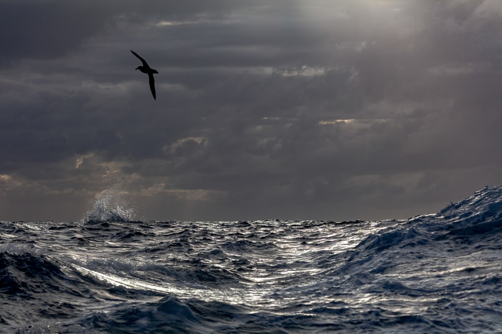
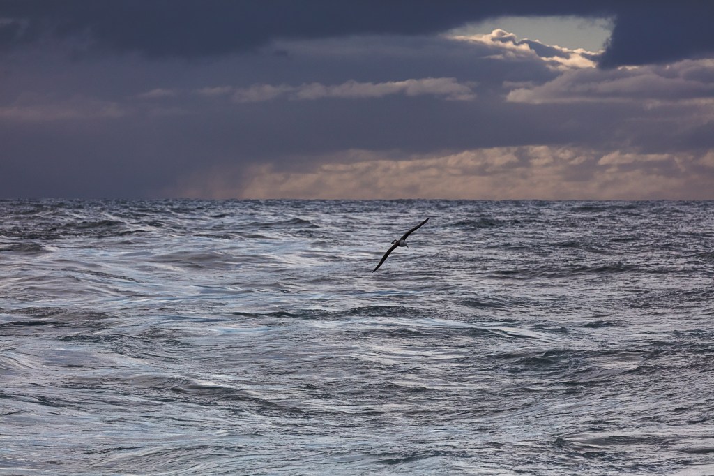
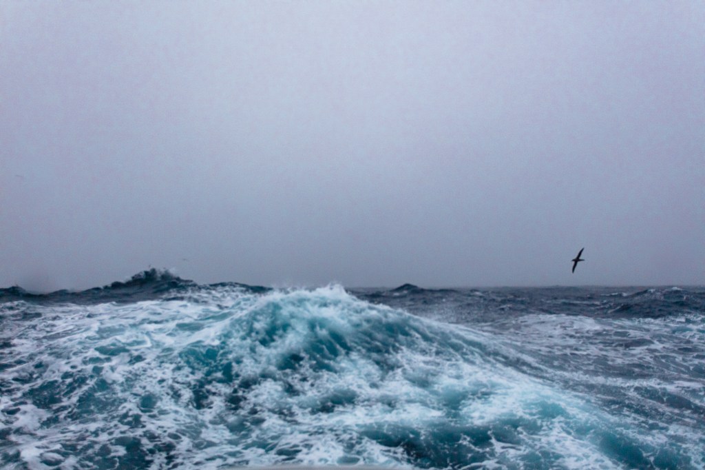
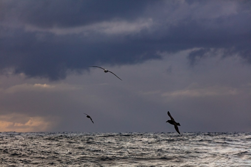
After completing my research and experiencing the end of our trip witnessing the indifference the place we were inhabiting showed to mankind I want to show the following things.
1. The many states of the sea.
2. The ease in which nature inhabits this space.
3. The indifference I feel this space shows to mankind.
This space becomes a place when someone or something passes through and briefly becomes part of its existence. Humans have technology that they rely on, This technology soon becomes useless when we over rely on it.
Helen Keller said “Science may have found a cure for most evils; but it has found no remedy for the worst of them all — the apathy of human beings.” (1903) We have GPS, EPIRB, Immersion suits not to mention ships and aircraft however when the elements want to take us they will.
When a wilderness takes us we use terms such as “Evil” or “Violent”. After my experience I think the best way to describe the conditions we encountered is indifference, it has no emotion it just is.
It seems strange now that I had been researching Peter Breugel the Elders painting “Landscape with the fall of Icarus”. (Breugel) A painting depicting the way humans show indifference to the suffering of others and how no matter what technologies we employ (Wings) we cannot master the elements we encounter.
The paintings I have researched show the sea in its different states and use it to embroider the story they are depicting.
Picasso described his art thus “The artist is a receptacle for emotions that come from all over the place: from the sky, from the earth, from a scrap of paper, from a passing shape, from a spider’s web” (1928).
I want to to show some of the emotions I experienced during the harrowing hours searching the sea for the 38 lost souls. Lost in a plane crash a few miles from the ship I was on. See my research here https://wordpress.com/post/michaelgreenlevel2landscapeblog.photo.blog/560 The inhabitants of this space were indifferent to the suffering of the poor people.
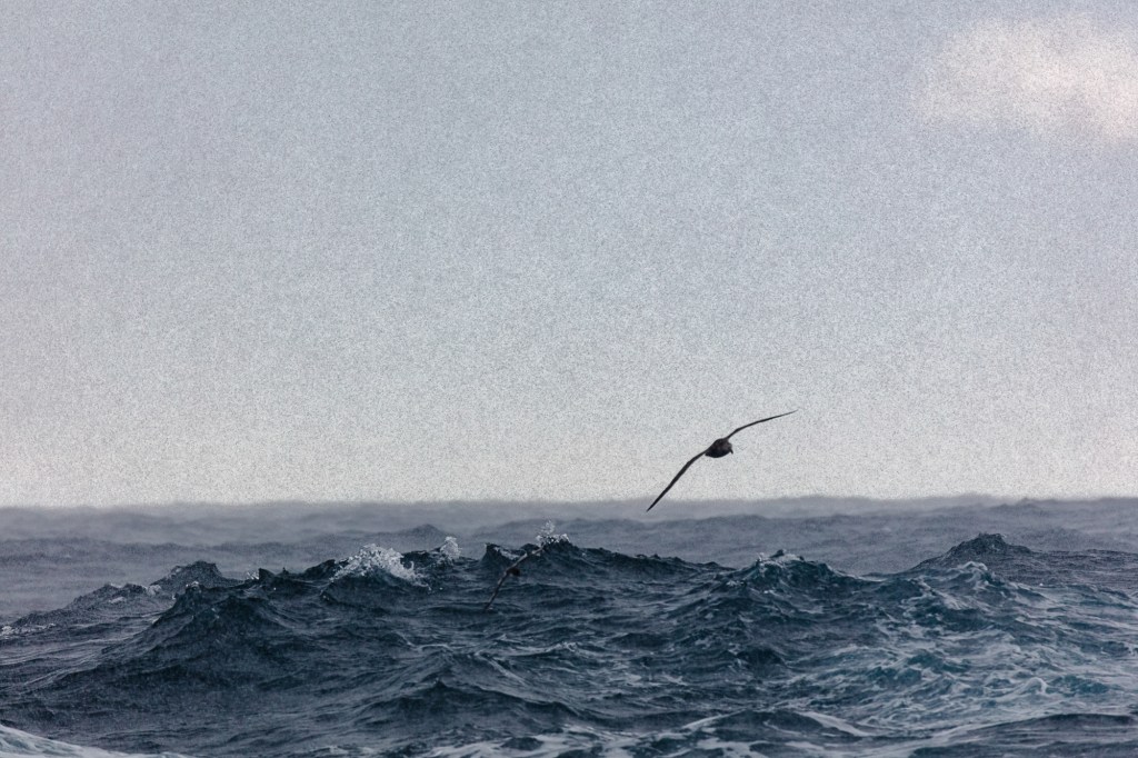
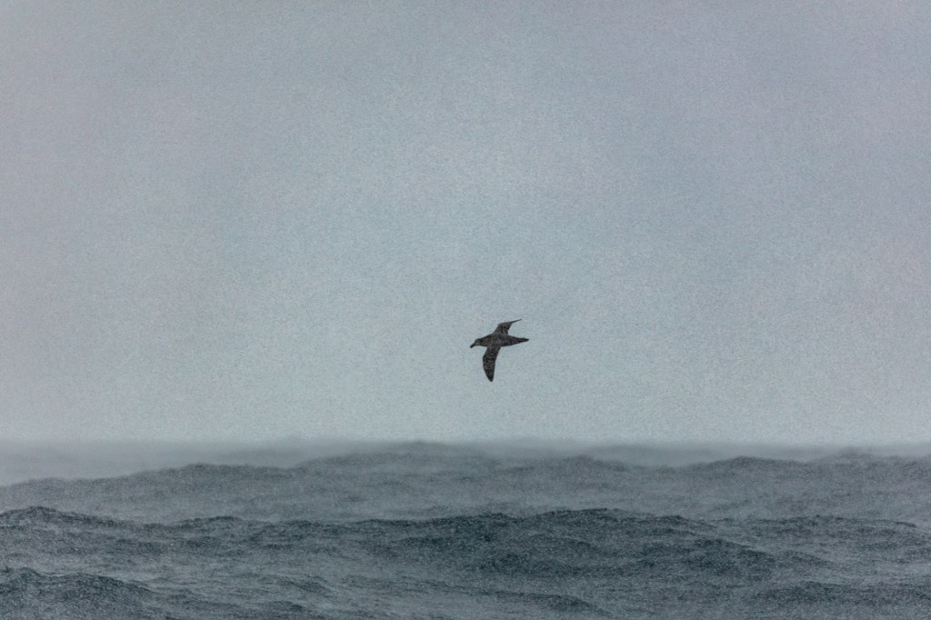
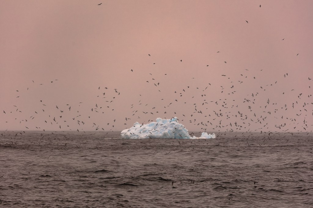
My twelve seascapes all show flight and mastery of the elements we humans with all our equipment, skills and endeavours can never hope to emulate.
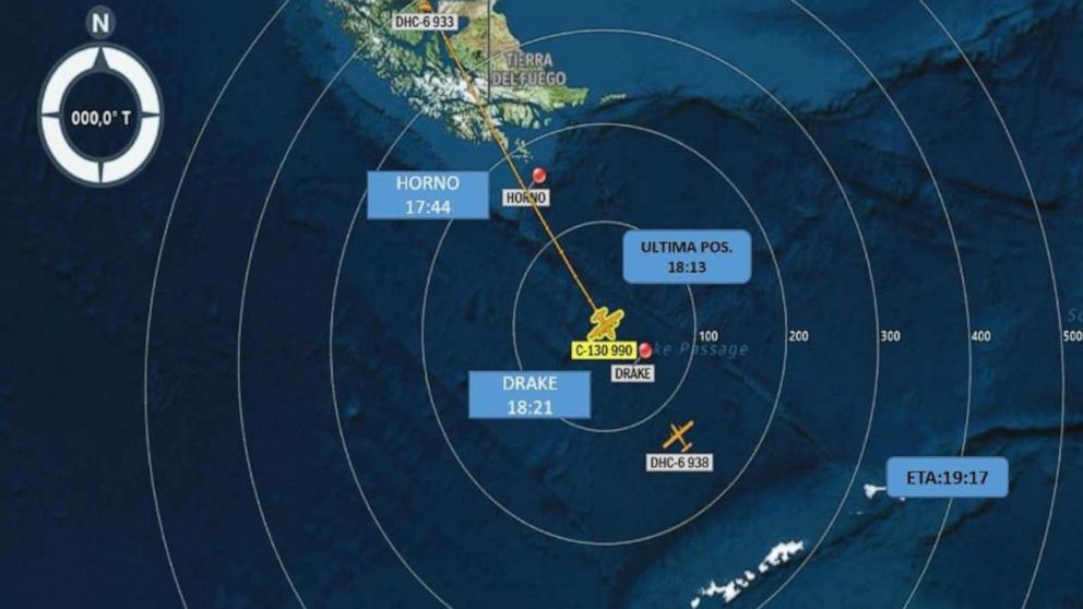
This space is one of the largest on the planet it is the Drake Passage part of Southern Ocean below the tip of South America called Cape Horn. Named not because it looks like a animals horn, but after the town in Holland that the explorer William Schouten came from Hoorn in 1616 (Schouten).
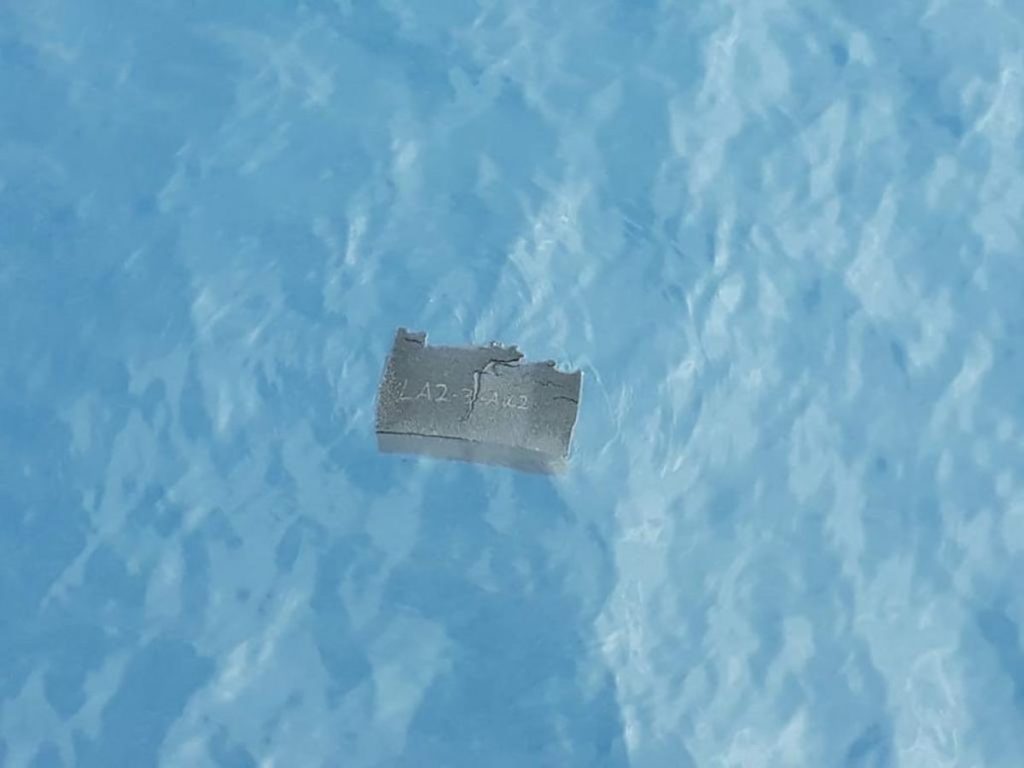
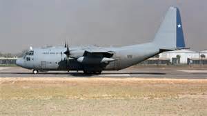
This massive space becomes a place when the planets animals including us inhabit it even the most fleeting moment. The position we inhabited on the fateful night of the 10th of December 2019 became the resting place for 38 souls when their C130 transport plane crashed on its way to King Edward Island, Antarctica. This work is a tribute to these lost people.
Bruegels painting shows the indifference of man to the suffering of others. I was amazed by the indifference the worlds media showed to this disaster. I could only find two small articles about the crash one on the BBC news website and one On the Chilean government site. Again showing the indifference of the suffering of others.
Words taken from William Carlos Williams Poem “Landscape with the fall of Icarus” (1962).
According to Breugel when Icarus fellIt was springA farmer was ploughing his fieldThe whole pagentaryOf the year was tingling nearThe edge of the sea concerned with itselfSweating in the sunThat melted the wings waxinsignificantly off the coast there wasA splash quite unnoticedthis was Icarus Drowning!
Work Cited
Keller, Helen. The story of my life. Tuscumbia Alabama: Ladies Home Journal, 1903
Elder, Peter Breugel The. Landscape with the fall of Icarus. Royal Museum of Fine Arts, Brussels.
Picasso, Pablo. “Quotation.” MoMA. Madrid, January 12, 1928.
“Cape Horn.” Cape Hoorn William Schouten. Amsterdam: Globe Press, 1618.
Williams, William Carlos. Landscape with the fall of Icarus. Performed by William Carlos Williams. Pictures from Breugel and other poems, New York. 1962.
For my research into this assignment I considered a journey I was about to make across the Drake Passage in the South Atlantic one of the biggest spaces on this planet. I thought there must be something about this space that could inspire me.
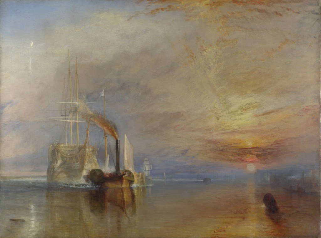
I looked at Maritime landscapes and liked three (1)JMW Turner The Fighting Temeraire. (2)Theodore Gericault The Raft of the Medusa and (3)Peter Breugel the Elder Landscape with the fall of Icarus
The Fighting Temeraire is a peaceful painting at first glance however on consideration it shows what must have a been troubling time for the Victorian people as sea travel transitted from sail to steam. The real scene should show two tugs but Turner showed this leviathan being towed into oblivion by just one. Hinting at the might of steam over the fragility of wind and sail. It is much smaller than the Temeraire which served Britain well at the Battle of Trafalgar. Turner was getting old when he painted it and it could show that Turner was thinking about his own mortality. Turner painted the Temeraire with its sails and masts when it fact it was a hulk with no masts. He wanted to depict her in all her glory. The painting clearly shows the end of the old system and the rise of a new industrial age. Depicting this with a setting Sun and a Rising moon. However this picture is too calm to inspire work from where I am heading. The sea is like a mirror reflecting the calm sky and the sunset.
JMW Turner The Fighting Temeraire.
The second picture I considered was painted by Theodore Gericault entitled The Raft of the Medusa. It shows the crew of the French Frigate Medusa at the moment of rescue. The survivors are deranged with thirst and starvation. Suffering so badly that they have resorted to canabilism. One suprising thing is the negro at the head of the mast leading the way to salvation. Gericault was showing that if you persevere you can move from despair and no hope to salvation rescue and hope. The sea is shown menacing, rough and the violent sky has menace also .One amusing thing clearly on show is the fact that the artist couldn’t paint feet so you will not find any in this painting unless its covered by another person or bandaged. If I was to pursue this for Assignment 3 I would need to use models and probably wont have time to pose them.
Theodore Gericault The Raft of the Medusa
The Third painting I looked at was purported to be by Peter Breugel the elder. Whether he painted it or not it is a superb painting with humour and a story.
Icarus the son of Daedlus stole his fathers wings made of feathers stuck with wax. He ignored his fathers warnings as he tried to climb higher than other men and crashed into the sea and drowned.
The painting shows the figure of a farmer in the foreground his red tunic hints at danger. Then you see a sheperd tending his flock. Your eye searches for Icarus but next you see a fisherman fishing from rocks on the shore and a ship with full sails and the crew working to control the ship. Where is Icarus? He should be by the setting sun the heat of which makes the drama unfold. Then under the ship you see a leg stuck out of the sea. At last Icarus and his demise are visible. A shock to find the main player shown as an insignifant bit player in a corner.
It is beautifully painted with strong colours and detail on every part of the canvas. It has humour all the people your eye sees are indifferent to the plight of Icarus. This is the paintings message it invites us to consider how we are indifferent to the suffering of others. With a second message of men who try to climb to higher levels than ordinary men usually take a tumble back to earth. The sea is depicted symbolically in a state of calm, it has played no part in Icarusses demise.
You can, I am sure think of men/women like this politicians, officials, colleagues at work. All try to climb to heights and most fail, then if we are not careful we are indifferent to their suffering even turning our backs on them.
The artist is extremely clever showing the whole story in one scene, (4)John Berger describes this process “In a painting all its elements are there to be seen simultaneously. The spectator may need time to examine each element of the painting but whenever he reaches a conclusion, the simultaneity of the whole painting is there to reverse or qualify his conclusion. The painting maintains its own authority”.
Landscape with the Fall of Icarus by Bruegel, Pieter the Elder (c.1525-69)
DISASTER
As I was considering this assignment onboard the ship a Chilean C130 Hercules crashed twelve miles from the ship. We spent the next 24 hours searching the sea in 60 mph wind and 5 metre waves in the pitch black of night and gloom of the Drake. We saw a light flash 4 times over a couple of minutes. 38 souls were lost in an instant. After the Chilean navy had taken over the search it seemed to fit into all my thoughts and research I had completed for this assignment.
Images showing detail of the disaster in the Drake Passage.
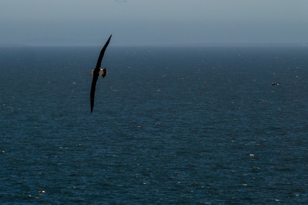
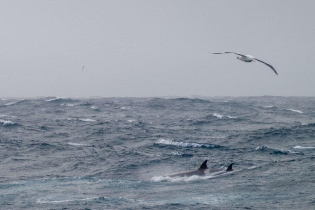
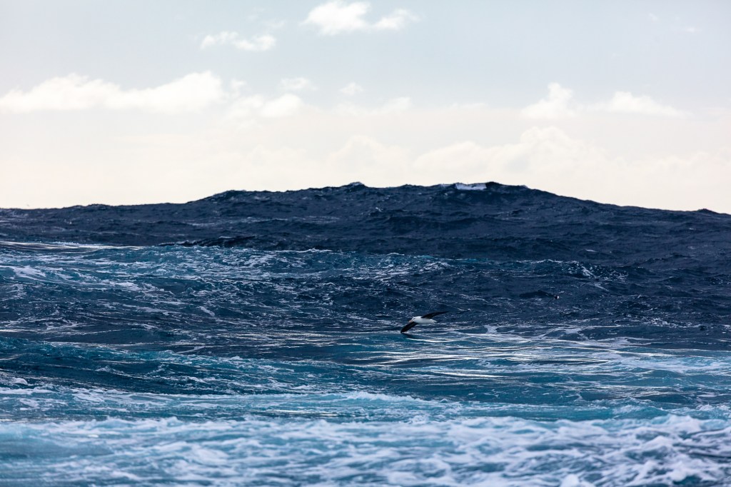
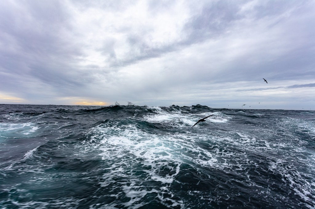
In my work I want show the space of the sea and how it becomes a place to the birds that inhabit it. The different states of the sea will show its different moods. Combining the two will show it is indifferent to human efforts and the technology we use to go into this space. These animals fly all their lives and look to be most relaxed when the elements are at there most extreme. I want it to be a tribute to these 38 lost souls.
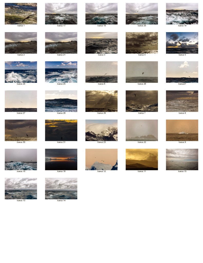
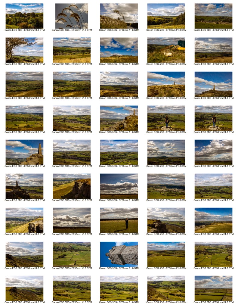
Below is my contact sheet of 30 exposures from which I chose 12 in tribute to these 38 lost souls.
Contact sheet for Icarus.
Bibliography
(1)Turner, JMW, and John William Turner. The Fighting Temeraire. National Gallery, London.
(2)Gericault, Theodore. The Raft of the Medusa. The Louvre, Paris.
(3)Elder, Peter Breugel The. Landscape with the fall of Icarus. Royal Museum of Fine Arts, Brussels.
(4)Berger, John. Ways of seeing. London: Penguin, 1972.
When I read
the brief for this assignment I wanted to show the separate components that
made up this module.
At the end
of the last assignment my tutor advised me to look in more detail and not to
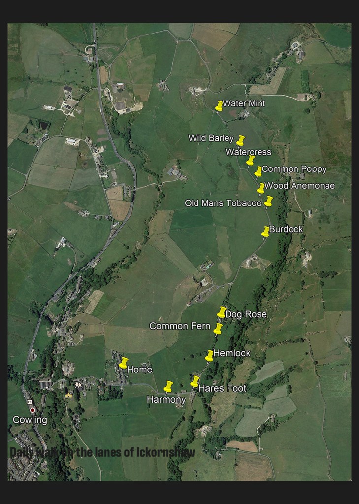
cover too much in my work. The title of the brief is “A Journey” so I completed
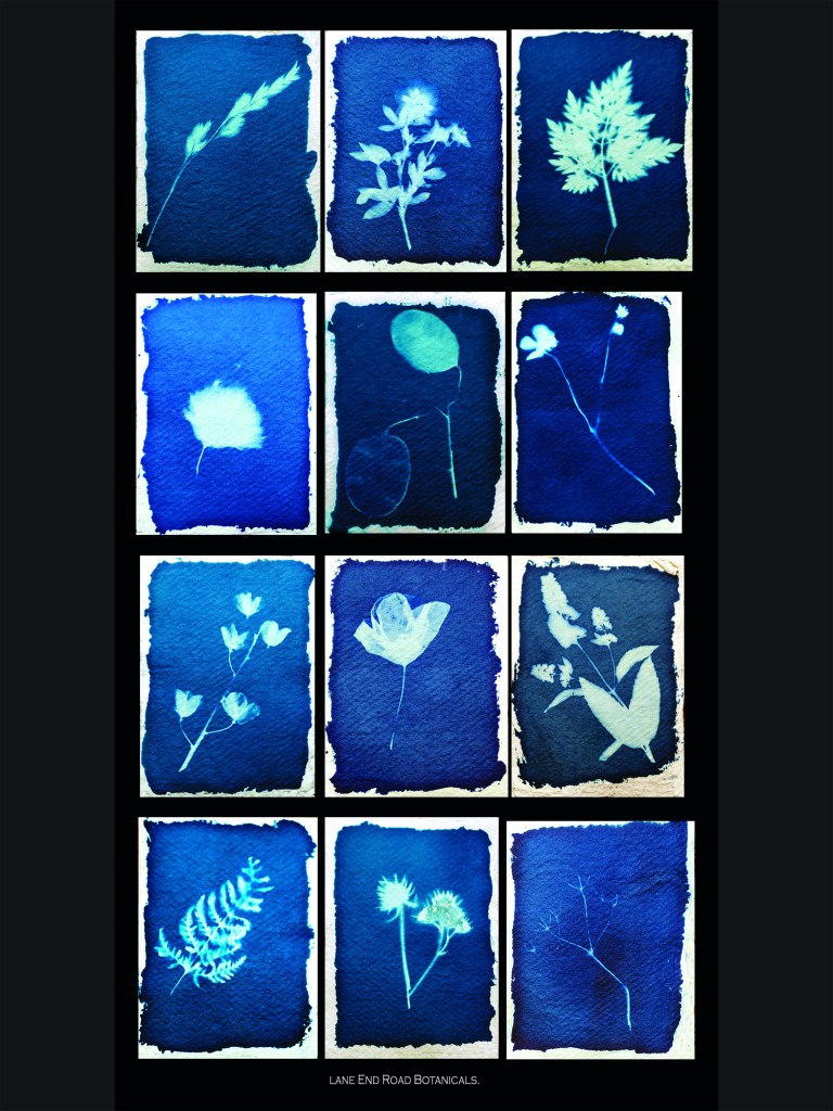
a couple of walks to focus my attention. My attention was drawn to the plants
in the hedgerow and verge along the way. These four things show my learning
journey and the physical journey I take daily.
My work
shows a pictorial depiction of our countryside, it uses an old technique
developed to capture the detail. After reading about and listing words on a
walk it seemed a good way to carry this practice into this assignment.
Completing this walk puts me in the Promised Land just like the returning soldiers
after the war. I see the vegetation on my walk, doing so makes it easier for me
to return.
The work
completed for this assignment shows the process (1)Anna Atkins used in her
work. My composition is good the left and right column point into the centre
column keeping the eye on the page. The map is taken from Google and pulls in
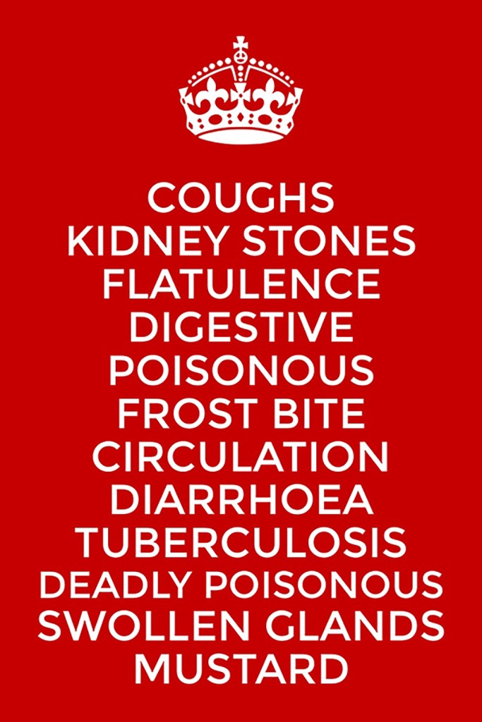
the appropriation discussed in the coursework. The list of ailments shows words
in art it is simple and visually fits in with the era of the soldiers return.
The cyanotypes are the main part of my response; they have good detail show the
plants in all their glory. The process made me get to know each of the
specimens extremely well. Finishing with the poster completing the journey and
pointing out you can choose a different path to complete any journey.
If I were
to develop this project further I would continue collecting specimens and would
place them in a book. To improve them I would work on exposures to get the
final colour even more consistent.
All the
decisions I made for this work had to include the work covered in the second
part of the course. I have already mentioned Anna Atkins however two other
artists influenced my work, (2)Washington Teasdale made cyanotypes in Leeds
different to Atkins in as much as they show scenes. Finally (3)Kinetta Hill
offered advice to me when I started learning the process. She helped me source
the chemicals needed. (4)Bernd and Hilla Becher influenced how I presented the
work and the war office poster (5)“Keep Calm and Carry” influenced the poster along
with the first world war poster (6)“Your Country wants you”.
My tutors
advice to focus, made my choices easier, I really wanted to zoom in on the
smallest detail. Doing this has helped me understand what I need to do when I get
to Assignment 4. This whole project has been a journey, taking me through many
new learning’s the most important one has been to look, really look and the subject
will jump out at you, with a little luck.
My Map, Poster of ailments and Choose your own path.Cyanotypes of plants found on my daily journey.
Works Cited
(1)Atkins,
Anna. “British Algae.”
Victoria and Albert Museum. British Algae. London , 1844.
(2)Teasdale,
Washington. Kirkstall Abbey. Museum of the history of science, Oxford.
(3)Hill, Kineta. Bristol
Cyanotype. Kineta Hill Gallery, Bristol.
(4)Becher, Bernd and
Hilla. Watertowers. MoMA, New York.
(5)Servant, Unknown Civil. “Keep Calm and Carry On.” MoI. Keep Calm and Carry On Poster. London, 1940.
(6)Leete, Alfred. “Your Country Wants You.” War Office. Your Country Wants You. London, 1914.
In
considering this brief I wanted to show what attracted me to live in this
landscape. With its rolling hills and big skies. In reading further through the
course materials and the books I wanted to get up high to get a perspective I
saw in a lot of the artists i looked at. I will explore this more, later in the
course.
In this
first part of the course we have looked at beauty and the sublime both words
are subjective but both have a language within landscape and the arts. I look
forward to developing new ways of looking to see this beauty in areas outside
of the norm. This language talks of capturing the peace of the landscape in
pastoral pictures or capture sublime pictures in untamed weather in a
wilderness.
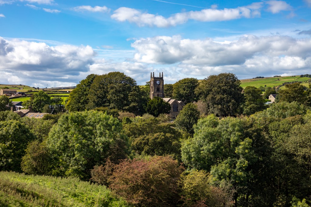
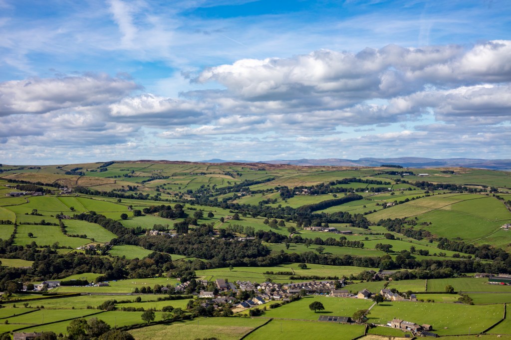
In looking
at these exposures i feel their strength is the sharpness showing the detail of
the cricket match to the distant hills of Pendle, Ingleborough or Pen y Ghent
in equal measure. To improve them I could have used a longer lens to get into
the detail however this would have changed the sublime element in the pictures.
I am going to develop this further by capturing some details of life for future
works.
Technically
I realised I wanted a wide shot. I have an 8mm fisheye but this would have been
too wide relegating the village to a small area of the exposure and making the
hills just a straight line. I also have a 400mm lens but this would have put me
into the detail which I felt didn’t fit the idea I had for the brief. So i
decided to use my 50mm prime whilst it can be opened to f1.8 this lens is at
its best at F5.6 this gives sharpness front to back.
I looked at
landscapes by Turner, Gainsborough, Friedrich`s and others but the one i liked
most was Paul Nash his work before the first world war is wonderful. It calms
me and sums up the English countryside. It has the rolling hills and then the
strange trees, wonderful. I looked at
his later work and you can see how the First World War changed him. However he
still used trees to tell his story. I see lots of trees in our landscape but
don’t want to just use one I want to use them to lead the eye through my shots.
In a lot of the paintings I looked at I could see that the eye of the artist was in midair (discounting Gainsborough) he painted portraits in a landscape. This perspective is possible because a painter uses his/her imagination. Edward Burtynsky puts his camera under a drone. I can do neither with my camera however I can climb a hill then up a pinnacle to gain even more height to achieve the same perspective. My outcome must be one which shows the whole but takes your eye through the picture seeing the details as you go.
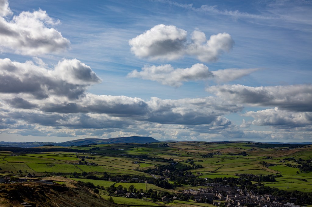
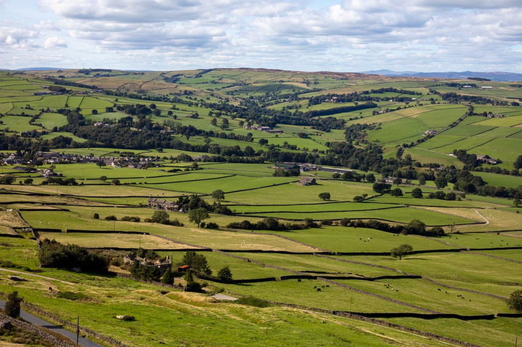
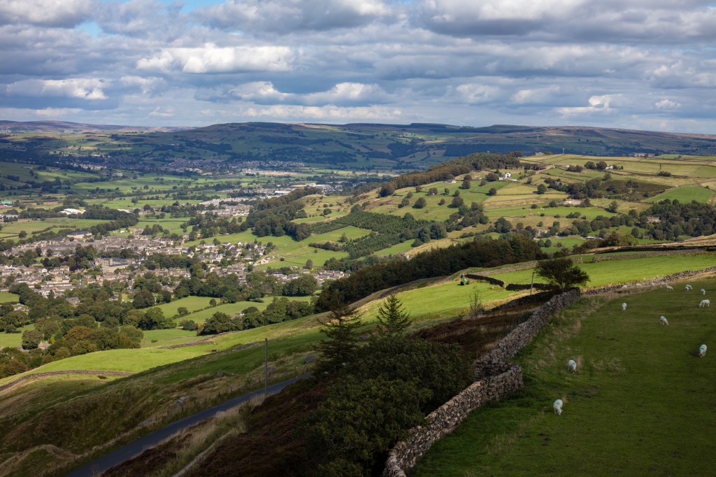
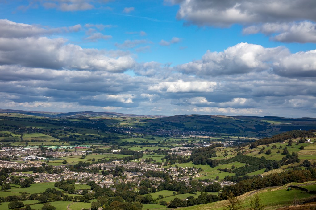
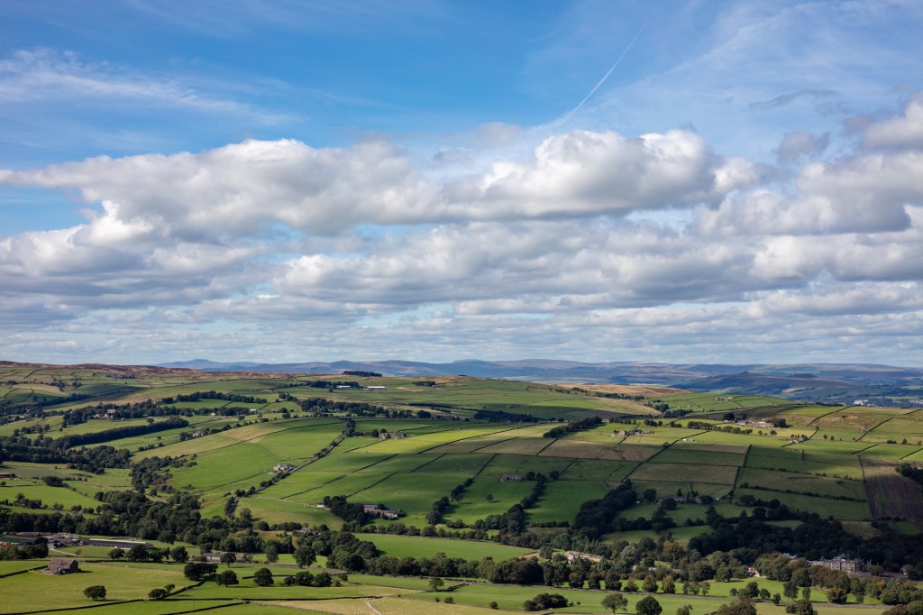
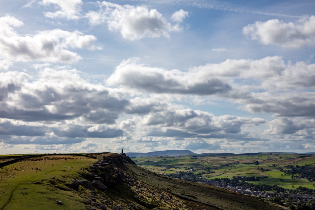
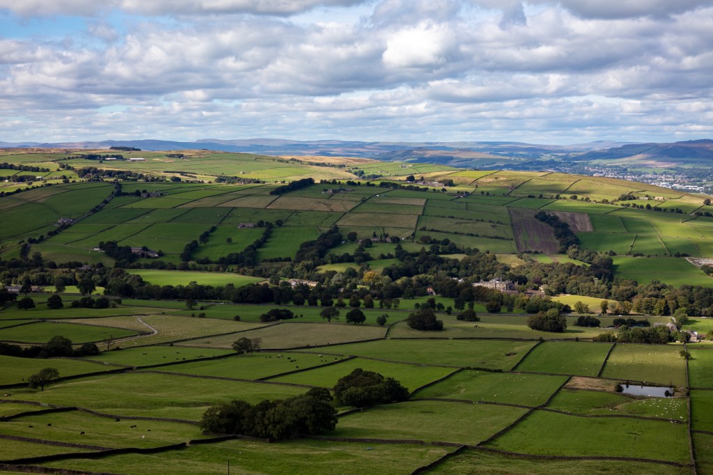
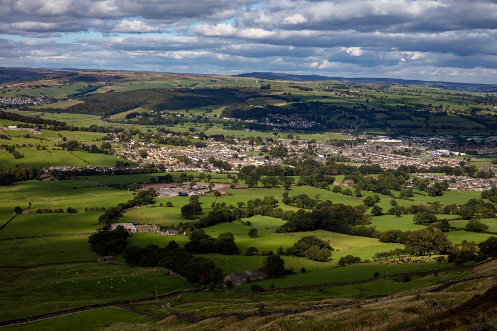
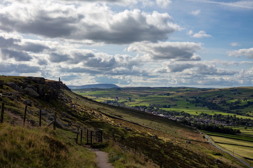
Cowling Church.Ascent of the crag with Pendle Hill.Cricket in the valley.Pendle HillAncient Field Boundaries.The White House.Sutton.Looking to Ingleborough and Pen y Ghent.Wainmans Pinnacle and Pendle Hill.Malpass House in ancient woodland.Crosshills in dappled light.The way home..
What is beauty or the sublime in respect to art. First what is the meaning of these two words. They are both often use in fact they are used too often. Football commentators scream “sublime shot”, I have described soup as sublime. And beauty is definitely in the eye of the beholder. What we see as beautiful in the west the east see the same thing differently.
So here the Oxford Concise Dictionary definition of the word beauty:
NOUN combination of qualities, such as shape, colour, or form, that pleases the aesthetic senses, especially the sight.
You can see straight away that this
code of beauty is already subjective you can start to add your interpretation
straight away. When you read these words what do you see? A person, a shape or
a scene. These seven letters create so much in our minds it is a powerful word
with different meaning between cultures, countries and people.
Here is the dictionary meaning of
the word sublime:
ADJECTIVE
Of very
great excellence or beauty.
VERB
elevate to a high degree of moral or spiritual
purity or excellence.
“let
your thoughts be sublimed by the spirit of God”
I
have included both the adjective and the verb as I felt both were relevant in
our art world. As an adjective it adds gravitas to the beauty of an object. I
find it interesting that I immediately put this together with female ideas. Is
this just me or is it in our society?
The
verb adds a spiritual connotation to the word which fits our use here on a
landscape course. When used it implies the presence of beauty to a level that
would please the gods.
Darvia. Julian Bell Tate London 2010
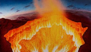
The word sublime has almost been overused In art I read an essay by Julian Bell on the Tate website entitled “contemporary art and the sublime”, in this essay Bell describes a painting he produced after visiting site at which the Russians had drilled into the ground prospecting for oil and gas. After deciding to burn off the excess gas they created an inferno which Bell saw as a vision of hell. He painted an 8 foot canvas. He compares what he has done to the work of (J Wright, Tate, 1776) . He compares the use of light in both pieces of work and says ‘such a light as that of the sun, immediately exerted on the eye, as it overpowers the sense, is a very great idea’. He means the light of the sun adds a sublime element to both works. When you look at both the bright sun of the infernos hits you like strong sunlight and overpowers the senses.
Vesuvius erupting with a view of Naples bay. Joseph Wright Tate 1776.
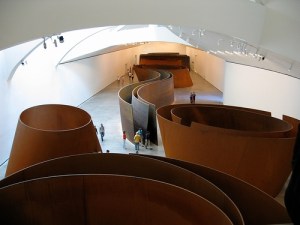
Next he discusses spaces that overpower the senses citing Richards Serras (Serras, R, Gugenheim Balboa, 2000) huge copper spaces in the Balboa Guggenheim Museum. You enter this installation and feel lost within it. The individual visitor is left to interpret the artwork for themselves. You must explore your feelings within this artwork.
Copper. Richard Serras (Balboa Gugenheim, 2000)
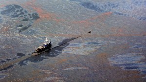
He looks at an artist I explored earlier Edward Burtynsky and takes his work “Oil Spill 2” (Tate, 2010) he calls this work “Industrial Sublime” and I understand why it overloads our vision and takes some understanding once you see what it is, it makes us question mans place in the sublime.
Edward Burtzynsky Oil Spill2Tate 2010
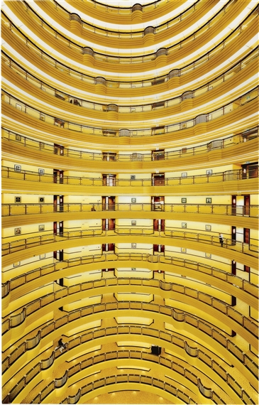
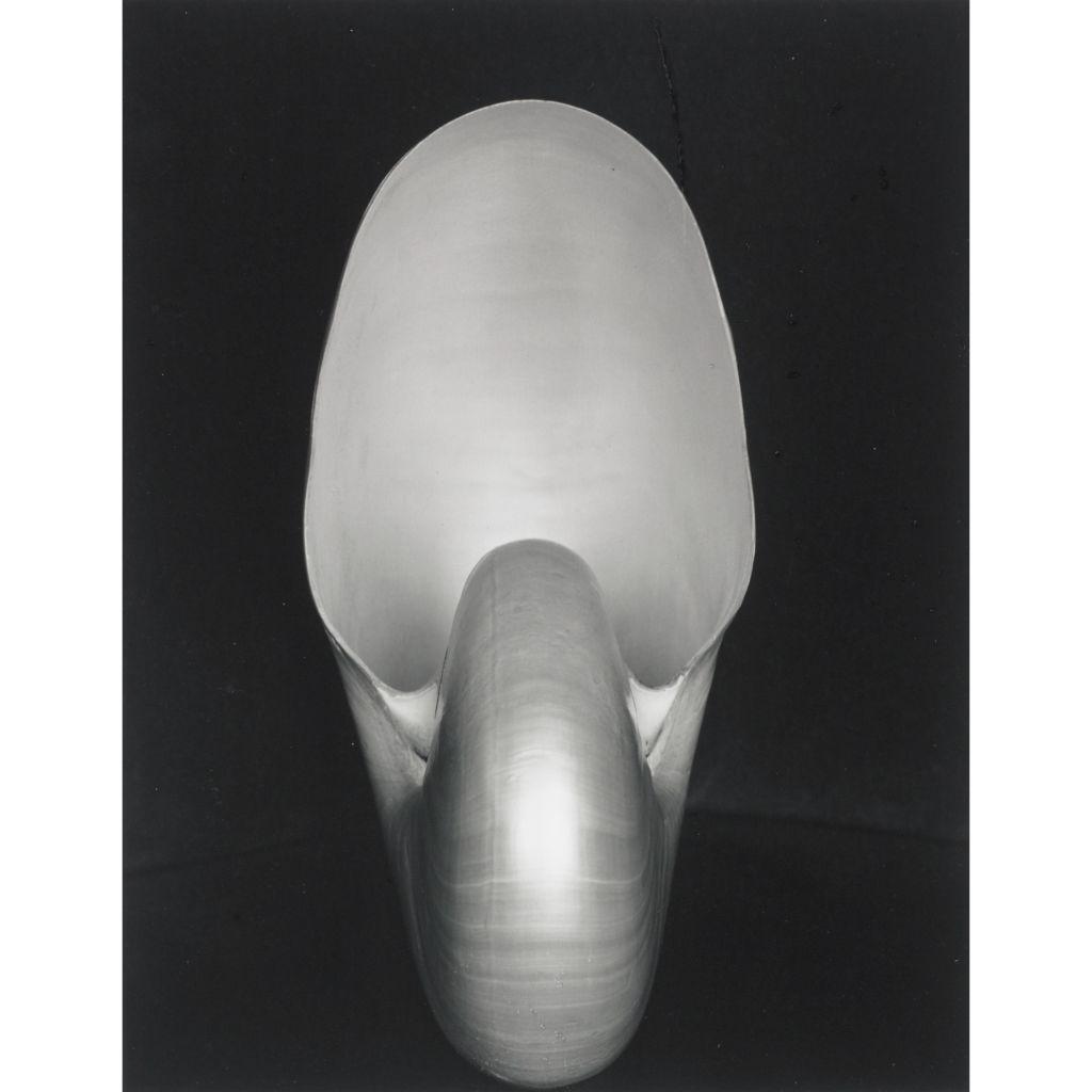
Next he looks at mathematical sublime and Andreas Gurskys (Gursky, Berlin, 2000), photograph “Shanghai 2000”. It is just a photograph of the inside of a building however it has just as much structure and sublime beauty as Edward Weston’s (Nautilus, MoMA, 1936) photograph of a Nautilus shell. It holds your eye and overwhelms your vision.
Andreas Gursky Shangai 2000
Edward Weston Nautilus MoMA 1936
This essay has made me realize that we can easily use this
word. But to get the best from it we need to challenge our senses. My challenge
to myself is to see if I can overload my senses in my local are and create some sublime photographs on an
ordinary day.
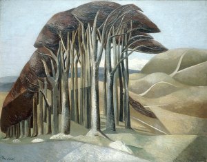
I like trees they add mystery to a landscape I am not the first to feel this Paul Nash said before the first world war tainted his eye “Trees are like beautiful people”. (P. Hendon, Art History) This might explain why his later paintings show broken trees maybe to represent the broken destroyed people he didn’t show. His trees add a sublime element to his paintings however they are painted.
Paul Nash Trees (PHendn, 2001)
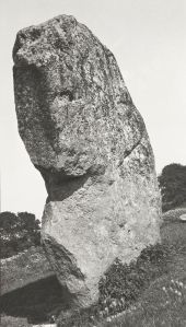
He also captured photographs one was of a stone at Avebury Circle called Avebury Sentinel )P Nash, Tate, 1936) He took his photographs with a Kodak type 2 camera. They were taken to be used as sketches for his later paintings. Looking at the this photograph I see the trees I see in his paintings they give even a photo taken to record a large stone a different element. He looked for hidden elements in his paintings and you can see it in his photographs too. He couldn’t help himself.
Paul Nash Avebury Sentinel .(Tate, 1933)
I want to capture the open space where I live with its big
skies and the trees of the area. These elements create a sublime landscape that
changes minute by minute and day by day.
I have been reading a book by David Matless entitled Landscape and Englishness. In it I have been reading about the landscape I have taken in my shots for this assignment. I found this quote apt “If those men and women who, as my letter-bag so cleverly proved, are starting out in their thousands to discover rural England will see it not merely as a pretty picture but as a living thing……”.
This is what I want to show in the 12 shots I present..
References
Bell, Julian. Darvia. 2010. Oil on Canvas. Tate London.
Burtzynsky, Edward. Oil Spill2. 2010. Digital Colour Photograph. Tate London. Gurskys, Andreas. Shanghai 2000. 2000. Digital Colour Photograph. Berlin.
Hendon, Paul. Paul Nash Outline The Immortality of I. 20, n.d.
Hornblower, S, A Spawforth, and E Eidinow. The Oxford Classical Dictionary. Oxford Press, 2012. Morton, HV. In Search of England. Methuen & Co Ltd London, n.d.
Paul, Nash. Avebury Sentinel. 1936. Oil on Wood. Tate London.