I felt it was appropriate after seeing David Hockney making Four Seasons in Warter Lane to do some research about what the work is about and how it will compare with my work.
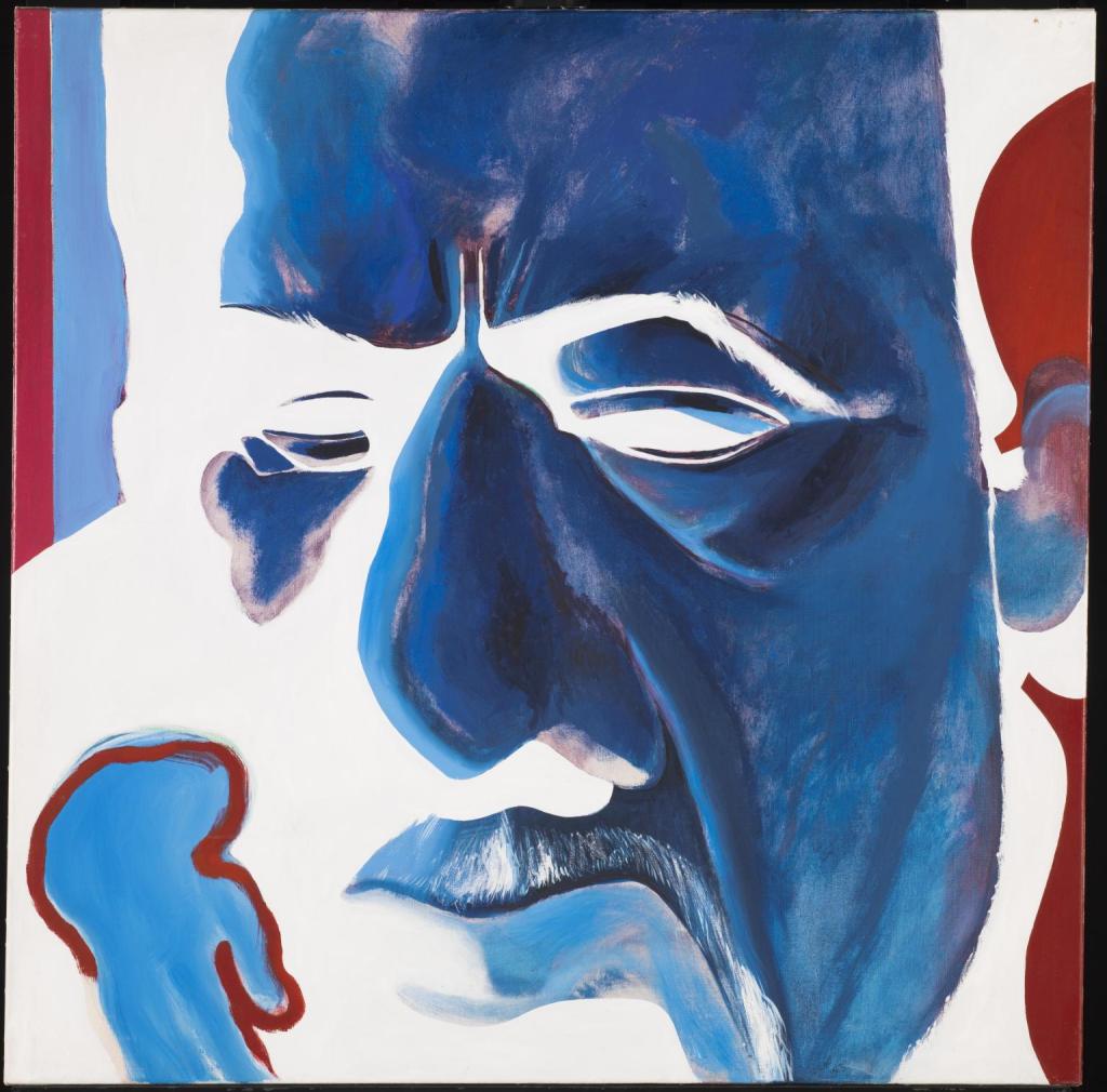
Oxtoby Mingus Deep Blue Redfern Gallery
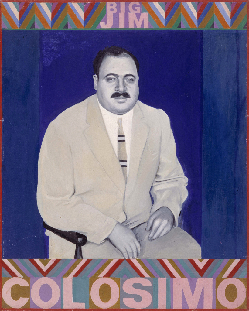
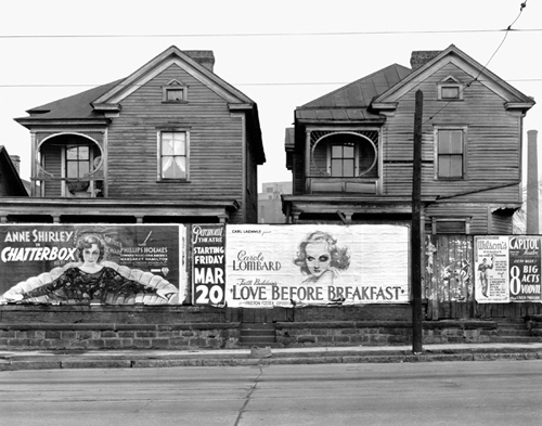
Boty Big Jim Colosimo. 1963
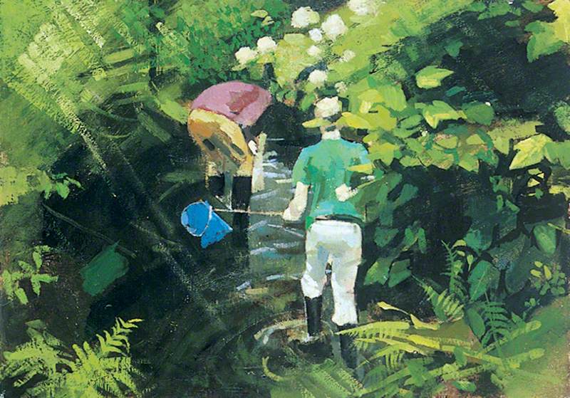
Lisle, Boys Fishing; Burton Gallery, University of Leeds.
Gallery of Works by David Hockneys fellow students at Bradford College.
David Hockney was born on July 9th 1937 in Heston Bradford. He went to Bradford Grammar School then into further education. He studied at Bradford College of Art where he was tutored by Frank Lisle his peers included Pauline Boty and David Oxtoby.
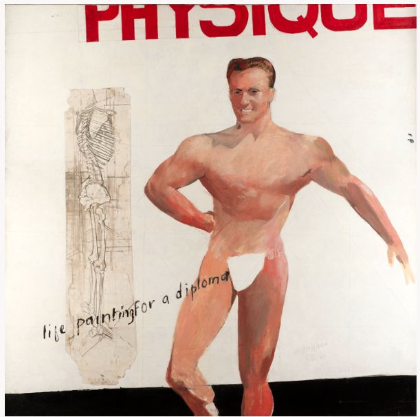
David Hockney Life Painting for a diplome Personal Collection 1962.
He progressed to the Royal Acadamy of the Arts in London. In 1962 the Royal Acadamy wouldn’t allow him to graduate until he produced a nude, life studyhe did calling it “Painting for a diploma”. Show both his rebellious side and his sense of playfulness. He proved to be an accomplished droughts man and artist with a keen interest in using new technology in his work. (BBC,2013).
He taught at Maidstone College for a short period before following his desire to be a stand alone artist. (BBC, 2013).
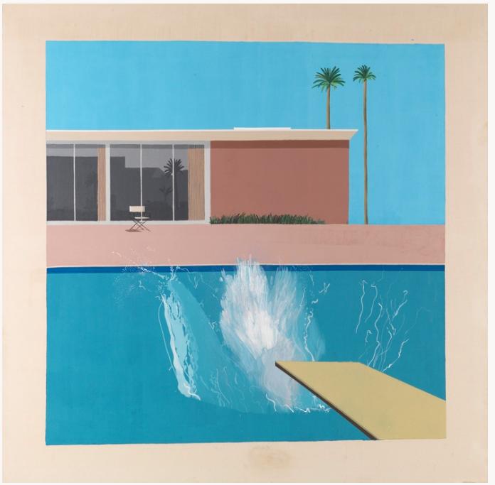
David Hockney “A Bigger Splash” 1967 Tate.
David Hockney then moved to Los Angeles and created a studio. He worked on projects including paintings, Lithographs and photographs. One of his most important works “A bigger Splash” was painted in his swimming pool. He experimented with photo collages making one of a blue balcony which subsequently led to the work Four Seasons which influenced my work for assignment 6.
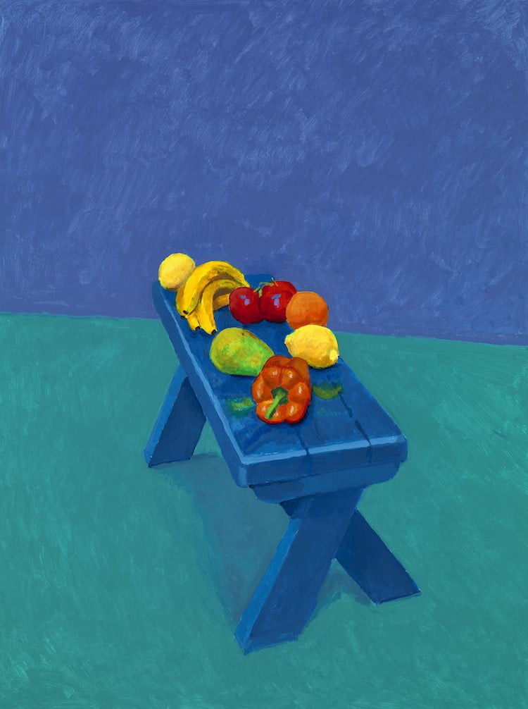
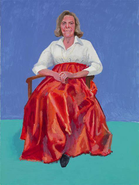
82 Portraits and 1 Still life David Hockny Royal Acadamy of the Arts.
He exhibited 82 portraits and 1 still life at the Royal Acadamy in London. These portraits are in vibrant colours and have the subjects seated. It has one still life of fruit on a bench. Each portrait had to be completed in 3 days. All have the same background and the same chair. The still life has no meaning it is in the exhibition as an after thought.
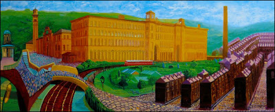
Salts Mill David Hockney Gallery 1853
He support his friend Jonathan Silver who he had met at Grammar School to set up Gallery 1853 in Salts Mill, a building Silver saved, renovated and dedicated the Gallery to David Hockneys work. It houses one of the largest collections of his work in the UK. One being a painting of the mill in the entrance to the mill.
The Arrival of Spring at Gallery 1853 Salts Mill (Hockney).
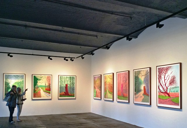
Some of that work is David Hockneys Ipad work drawn in the Yorkshire Wolds the setting for Warter Lane the inspiration for “Four Seasons”. Also set in the Wolds are the massive paintings of the landscape entitled “The arrival of spring showing his embrace for new technologies.
Using video he uses different technology to take us into the Wolds Landscape in a different way. He didnt do it at the time but he recorded a disappearing landscape as the copse shown was to be chopped down. David Hockney tried to save it to no avail (2011).
Here is the video of hockney discussing Four Seasons.
Hockney speaks about “Four Seasons” on the Frieze website he says “Bertie says Perspective is a window, So where are you as the viewer? In a room not the landscape, lots of pictures counter act perspective putting you in the landscape not in the room, most photographs are flat, by changing the perspective this work is about time and space and more….” (Frieze, 2018).
In another video he made for the Smithsonian Channel Hockney talks about “I realised a photo has no life, unlike a painting, a paint artist spends hours looking at the subject before making a picture”. He continues “A camera looks for a fraction of a second”. In the video he is discussing his collage work and the way he uses time and space to create perspective in his collages. My research on Time and Space is here.
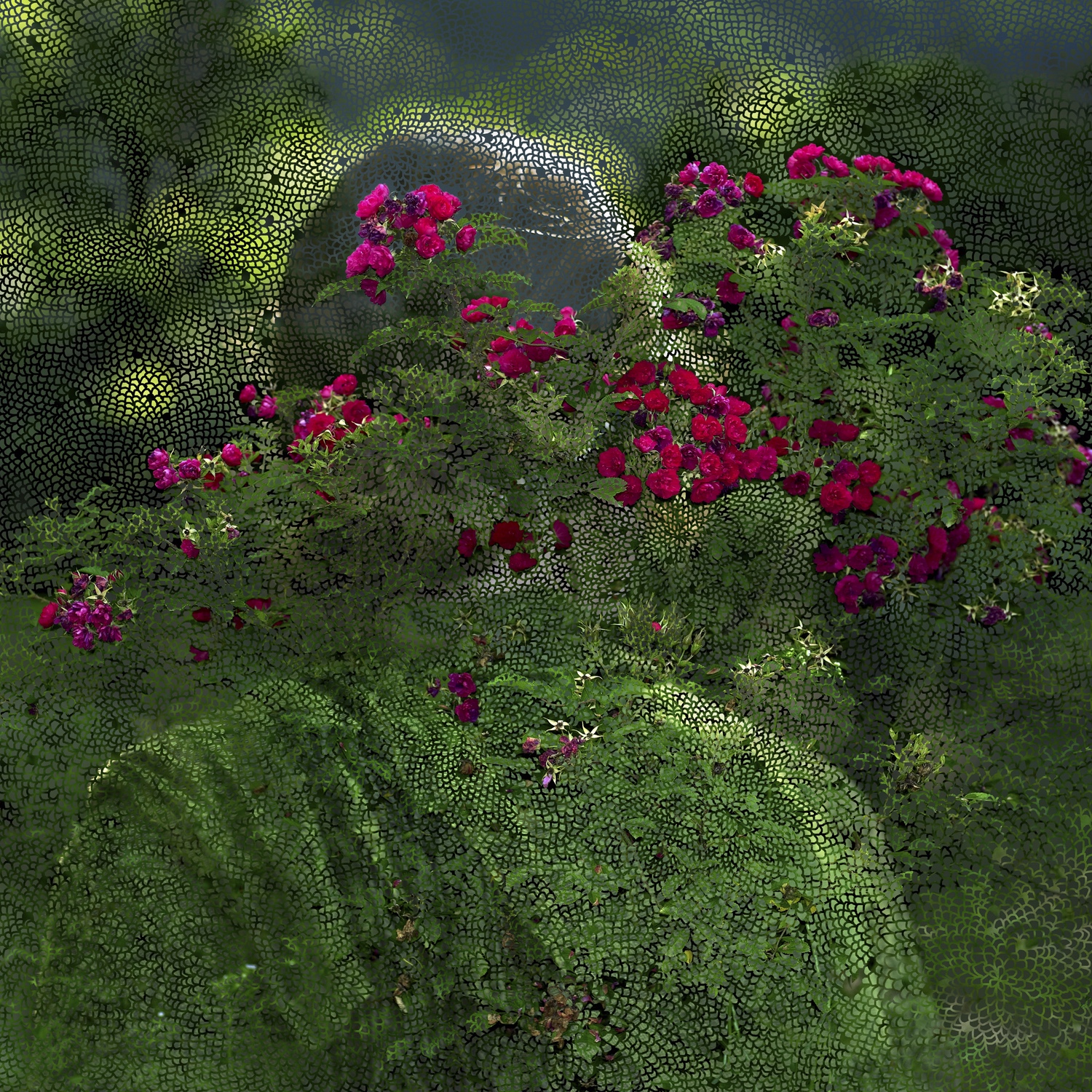
I want my work to put you in the landscape rather than just show a flat photograph. It is a dynamic living space that is there whatever is happening in the human world. I want to use still images so will have to take more images (12) in fact 72 to cover the year. I will change perspective by shooting images that are not stitches and will not align to make the viewer work harder to see the message.
The headlines from the Guardian will make my work different to Hockneys. However it is a key part of what I want to say.
Sitting in a room with the four screens of nine is a soothing experience, more soothing than walking down Warter Lane. Being in the middle of the screens makes you feel totally immersed in this installation.
Work Cited
David, Hockney. One Still Life. 2014. Acrylic on Canvas. Royal Academy of the Arts London. Hockney, David. A Bigger Splash. 1967. Oil on Canvas, 95 1/4×96 inches. T03254. The David Hockney Collection. https://thedavidhockneyfoundation.org/chronology/1967. ———.
Four Seasons. 2017. Video Installation, 36 screens making four images. Frieze Video. ———.
During my work for Assignment 5 I found Helen Sear. She is an artist who states she was influenced by David Casper Friedrichs. I couldn’t move on until I had completed some research into Helen and her work as she was unknown to me.
Helen was born in 1955 in Worcestershire in sight of Wales. She has made her reputation from her studio in Monmouthshire, Wales. As a small girl her father used to go on long walks with her where he taught her about the countryside and nature.
She came to prominence in 1991 when her work was included in the British Council exhibition “De-Composition Constructed Photography in Britain”, this exhibition was popular in Latin America and Eastern Europe (1997).
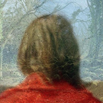
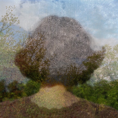
Artsy (2018) says of Sears work, “She explores her/our relationship with the natural world”. Her work “Inside out” (Sear) reminds me of Friedrichs work with the subject back to camera Helen adds elements to make the photo painterly and dreamlike.
Sear describes her work as a “Double time of image making” referring to the time between taking the initial image and the time during which she superimposes her photographic images (Artsy, 2018).
She was educated at:
1975-1979 Reading university, BA Hons.
1981-1983 Slade School London, HDFA.
2009 PhD University of Newport, Wales.
Jane Wainwright writing in says of her approach “I am trying to slow down the instantaneous of the camera” Wright continues about Sear “ She highlights the ordinary, making it extraordinary. Forcing the viewer to engage with the work and puzzle out the image”.
When Wainwright asked Sear if she had any particular artists or pictures that influenced her work she replied “I am interested in Romantic Painting particularly the work of Turner and perhaps the German romantics such as David Casper Friedrichs.
Pushed further she continues “The people who influenced me were in the end the ones who taught me at college. At the Slade artists like Tim Head and Helen Chadwick” (Wainwright, 2000).
Friedrich`s “Wanderer above a sea of fog” (1818) must have influenced Sear as it did me. However I can not find any specific reference to it doing so. When I look at Sears images I see a similar message as the one I wanted to portray however Sears images have added layers where mine are straight photographs. I want to experiment with this technique and will do so before I leave this research.
Three images from Helen Sears work “Inside the view” (Sear, 1997).
Valerie Reardon wrote off Sears’s body of work, “Sear draws on the Freud’s notion of the “unheimlich” the uncanny sense that what is hidden is also somehow ghastly. Jacques Lacan reworked this notion and came up with the term extemite a blurring of the line between interiority and exteriority which points to neither but is located where they coincide and become threatening”(1998).
This paragraph was challenging to me I didn’t understand the two words unheimlich and extemite. So I had to spend some time understanding them both. The former means Uncanny/weird and the latter means the lines become blurred and thus threatening. I can see this Angst in Sear’s images at first glance they look sweet but when you look and see the layers they take on new meaning which to me are somehow dark.
David Campany compares her work with Fox Talbot’s image of lace “Talbot placed black lace directly on to sensitised paper and exposed it to the sun, The lace appears white on a dark background it doesn’t look like a negative, the flat fabric is so well rendered by the simple technique. It is stoic and removed yet the light that touches the object then touches a receptive surface” (Campany, 2005). This is talking about the single layer Sear adds more layers to create her art.
Having looked at this work I thought that at first sight it seems simple. It is not, within the square frame are complex layers. The more I look and reflect the more the work asks me to think. I like Helen Sears work very much and I think I will have to explore the artists who influenced her.
Earlier I said I would experiment with how I see Sears’s images and here is that work.
In this research I will look at Towards Los Angeles a photograph by Dorothea Lange taken in the great depression in the USA. Before I critique this photograph I would like to discuss the journey the artist took to get to the point of taking this photo.
Dorothea Lane was born on the 26th of May 1895 in Hoboken New York her birth name was Dorothea Margareta Nutzhorn her parents were of German dissent and were named Heinrich Nutzhorn and her mother Johanna Lange. In 1907 her father abandoned the family who were completed by a boy, Martin. When this happened Dorothea dropped her middle name and took her mother’s surname becoming Dorothea Lange.
At age seven she contracted polio and while many would see this as a handicap Dorothea embraced it saying “It formed me, guided me, instructed me, helped me and humiliated me. (Lange, 1998)” After graduating from school she attended Columbia University where she was tutored by Clarence H. White. Leaving university she worked in several of the best photographic studios in New York.
Her wanderlust took her on a trip with her friend they planned to see the world but were robbed in San Francisco so they settled there. She worked in photo studios meeting several influential people who helped her set up a successful studio taking photos of the wealthy. In 1920 she married Maynard Dixon and over the next ten years had two sons.
During this period she completed several projects one being of the unemployed and homeless. She by chance took an exposure at the soup kitchen run by a widow nicknamed “The White Widow” (Lange, 1936). This photo naturally had the title “White Angel Breadline” (Lange, 1936). It was liked locally by influential practitioners’ and it led to work with the Resettlement Administration (RA) the forerunner of the Farm Security Administration (FSA).
FSA Logo (1936)
During 1935 she divorced Dixon and married the economist Paul Schuster Taylor. Taylor was a Professor of Economics at the University of Berkeley. They went onto record the poverty around the area where they lived. Taylor wrote pieces about the families encountered while Dorothea photographed them.
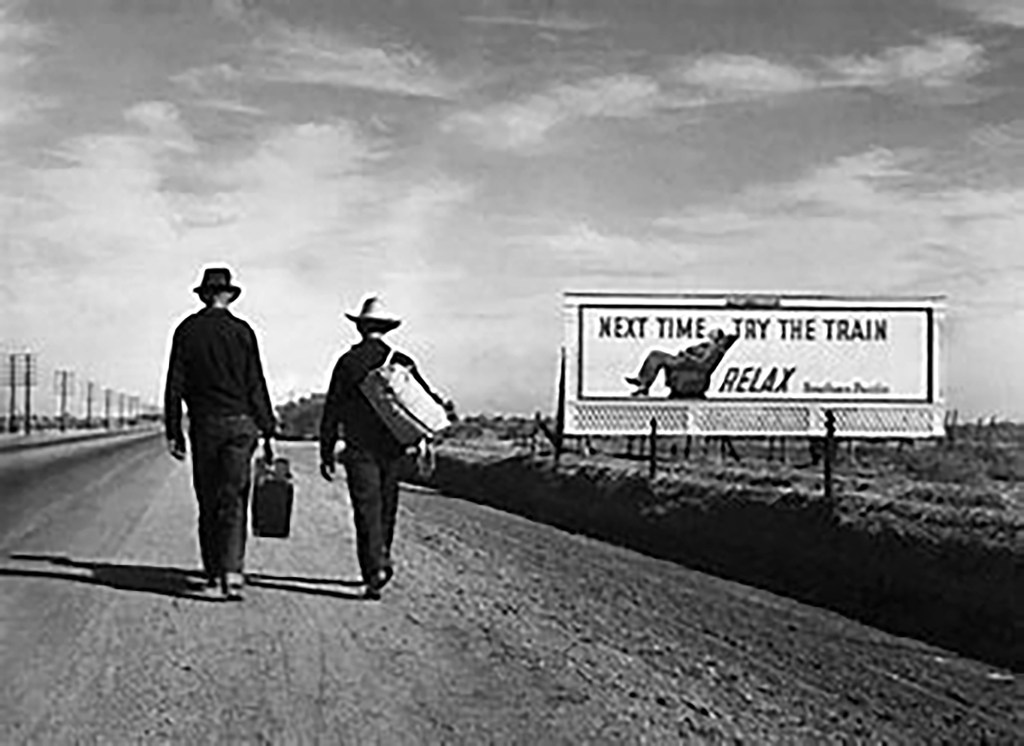
Towards Los Angeles Dorothea Lange 1937
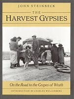
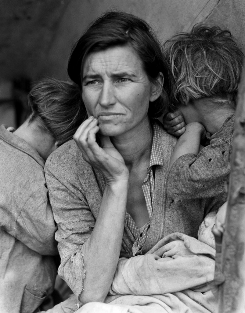
Working for the FSA allowed her to capture some of the most important photos of the time. “Migrant Mother” (Lange, 1937) is one of the most revered images of all time and was taken around the same time as “Towards Los Angeles.” (Lange, 1937) Many of her photos were printed by the “San Francisco News”, when they supported John Steinbeck’s work “The Harvest Gypsies” (Steinbeck, 1936), a collection of articles about the farmers suffering the depression supported by images including “Migrant Mother”.
John Steinbeck Pamphlet Harvest Gypsies 1938.
Her next big piece of work was documenting the lives of interred Japanese-Americans; this work was carried out for the War Relocation Authority. She applied herself to the plight of these people so well that the government wouldn’t let them be seen. They didn’t want any sympathy for the Japanese citizens.
In 1945 Ansell Adams asked Dorothea to teach at California School of Fine Arts. Their friend Imogen Cunninham from Group f.64 joined at the same time.
Life Magazine Logo
She Co-founded the magazine LIFE in 1952 and Dorothea did several pieces of work for this magazine including the damming of Berryessa and its effect on the residents. Again she documented the suffering warts and all.
Then in 1952 Dorothea Co-founded Aperture Magazine which is still in print today she had been familiar with Group f.64 and the magazine this group produced called “Camera Craft” (Lange, 1935).
Apperture Magazine Logo
John Szarkowski displayed her work at the MoMA between 26th January and 10th April 1966. He couldn’t believe the collection of work she held at home and how well they were indexed. She worked tirelessly even though her health was now failing.
From about this time until her death in San Francisco her health suffered. She died from Cancer on October 11th 1965. She must be remembered for her favourite saying “Grab a Hunk of Lightning”.
Susan Sontag (Sontag, 1979) says about privileged photographers hanging around the oppressed and even looking down on people. “Social misery has inspired the comfortably off with the urge to take photographs”. Susan Sontag On Photography ISBN 978-0-141-037678-9 Page 55 Par 1 Line 8. I don’t feel this with Lange. I see someone who wanted to tell the story visually whilst improving the lives of the people photographed and the ones who were not.
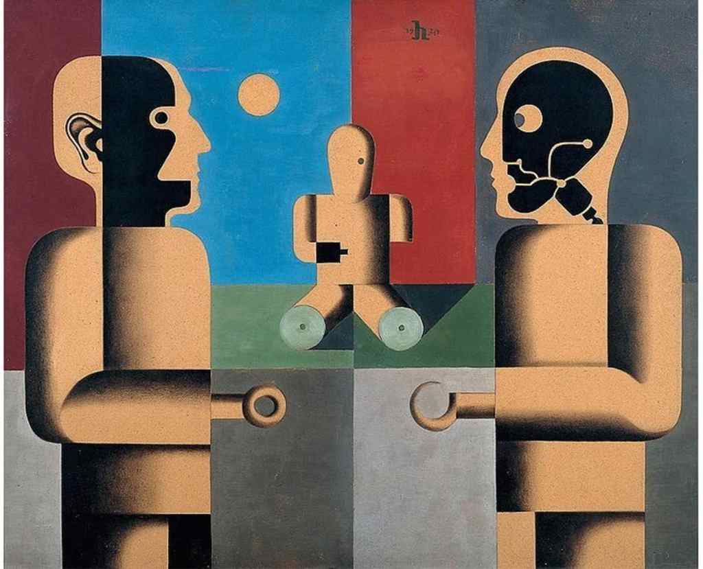
In it he discusses the returning German casualties being fitted with Prosthetic limbs. The Red Cross produced a book entitled “Reconstructing a man” in 1918. It acknowledges the fact that thousands of men were returning home and being “repaired” in fact made better than their pre-war selves by being fitted with prosthetic limbs. They even termed them “Homo Prostheticus”. These “Robots” could complete their work more efficiently than they could have before the war. Could this have been a driver for Sander to record the normal people who did these tasks less efficiently as well as recording the disappearing people pre metropolis? Was he afraid they would be taken over by man machines, and then later he may have seen the war coming with more “Homo Prostheticus” men to flood the county?
Heinrich Hoerle painted “Monument of the Unknown Prostheses’ (Denkmal der unbekannten Prothesen, 1930)”. To show how man had returned and being fitted with prosthetic limbs and had become an uber efficient machine a “better” version of himself. Hoerle wanted to questions this pointing to the anguish these individuals suffered due to their injuries. They were not “Uber Menschen” but victims of war injuries.
Heinrich Hoerle “Monument of the Unknown Prostheses’ (Denkmal der unbekannten Prothesen, 1930)”.
The photographers working for the FSA were doing much the same work. Sent out into the landscape to document the suffering of those people living on the land. These people were injured by the Great Depression and their injuries were mental, but just as damaging as losing a limb. You can see the mental anguish in the photograph “Migrant Mother” (Lange, 1936). Dorothea Lange captures it perfectly you can see the vulnerability of this woman at the same time seeing her pride, fear and concern for her offspring all in equal measure.
Migrant Mother (Lange, 1937).
In the “Great Depression” Franklin D Roosevelt set up several administrations to help show the state of the nation. Then to suggest and document any improvements carried out to improve the situation in the nation. One of these administrations was the Farm Security Administration (FSA).
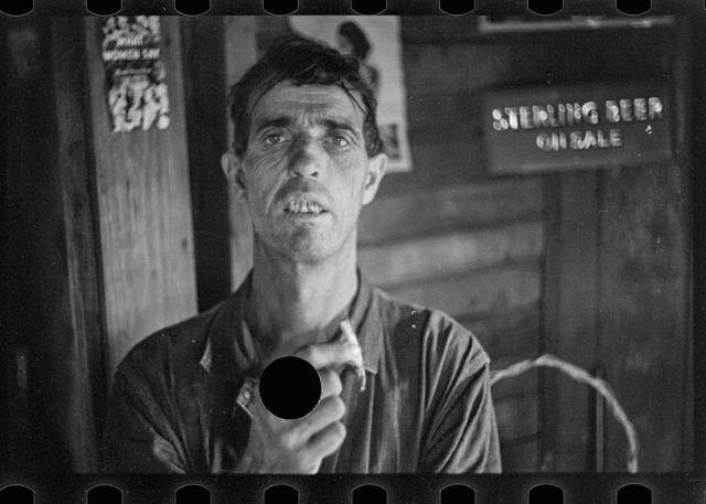
The man placed in charge of the FSA was Roy Stryker. He was an academic and a man who had served in the US Infantry in World War One. He was disciplined and intelligent so had the right characteristics to complete this huge task. He thought photography was excellent at supporting the written word so employed 13 proven photographers (Dorothea Lange, Arthur Rothstein, Walker Evans, Ben Shahn, John Vachon, Marion Post-Walcott, Russell Lee, Jack Delano, Gordon Parks, John Collier, Carl Mydans, Edwin Rosskam and Louise Rosskam) to capture images across the USA. At the end of the FSA work in 1942 when the FSA was incorporated into the Office of War Information Stryker used all of his discipline to catalogue and archive these exposures including many of the ones with holes punched in them. He was assisted by
This project was a huge undertaking and he would have needed all of his military experience of logistical organization coupled with his knowledge of the US to send these few out into the field to capture the images. He was dictatorial in his approach, giving exposure lists to each of the photographers. Some as detailed as “A white house, with a white fence”, He wouldn’t let the photographers stray from his scripts.
When the negatives came in to his office in Washington he would review each one and any Stryker didn’t like or were out of focus or off topic would be destroyed with a hole punch. Most of the photographers were dismayed to see their work treat in this manner and complained to Stryker. Later in the project he relaxed this practice.
Photo showing a hole punched in it (LoC, 1937).
I found it interesting to consider the time scale for each part of the project exposures were made then posted into Washington, Stryker reviewed and printed them and sent them back to be captioned then they were returned to the office for use. This could take two or three weeks. Lange kept detailed notes of what was said by her subjects so she could caption the photos, often with the words the subjects had spoken. These are all kept and shown in the Library of Congress in Washington and are available to all online.
The FSA created 77,000 negatives including 644 in colour they are a record of the conditions agricultural workers were enduring trying to support themselves and their families. Most are regular shots fulfilling Stryker’s lists but some are moving and works of art. I do wonder as I look at Towards Los Angeles if it was staged and looked at examples from before this time where photographs had been manipulated to understand how far photographers and organizations would go to put across a theme.
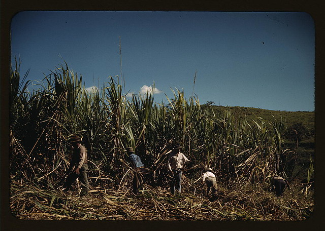
Farm Labourers in Sugar Cane Jack Delano 1941.
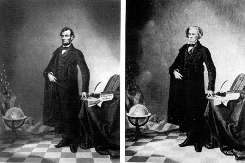
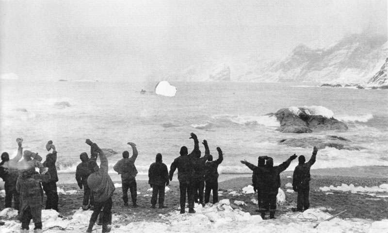
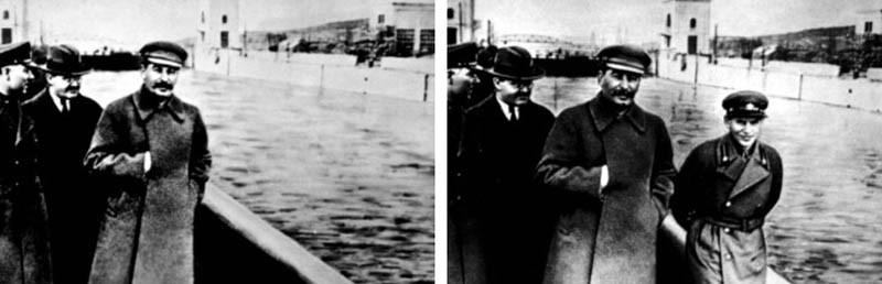
Joseph Stalin had people removed from photographs as they fell out of favour. One shows a young commissar stood in a group by a river he must have fallen from grace because in later versions he is missing. Frank Hurley who was the photographer on Shackleton`s ill fated expedition recorded all aspects of the journey, but in the rescue photo only one lifeboat rows to shore, he had scratched out the other to make the exposure more dramatic. He had manipulated earlier photos to create his postcard business in Australia. Even Abraham Lincoln had featured in a manipulated negative when his head was imposed on John Calhoun’s body to make a well-used image. So well before Lange took Towards Los Angeles images were being altered to project a message.
Lincolns head on Calhouns body
Scratched out boat
Missing Comissar
I can find no evidence for Lange having manipulated the exposure and do not think she would do so. However the photo does look as if some staging may have been employed. The fact it is so perfectly aligned to the rule of 3rds both in the horizontal and the vertical. The timing of the steps almost too perfect a decisive moment. The tracks in the dust on the road verge suggests someone pulling over and discussing the staging. Does it matter if it was staged?
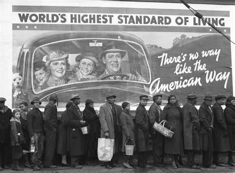
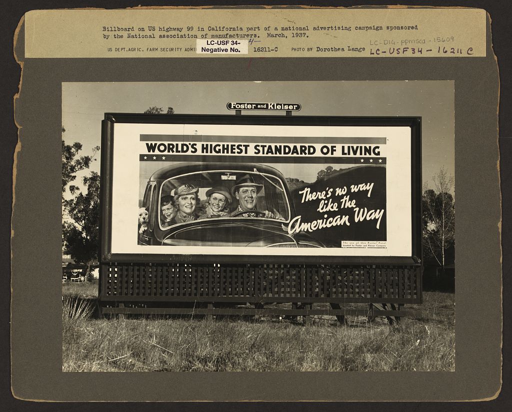
I considered the billboard in Lange’s photo and wondered if others had used them before her. I found that Walker Evans had shown billboards in “Billboards and houses in Atlanta 1936 (Evans, 1936). Lange was a colleague and friend of Evans so would have been aware of this shot. Then I found “Kentucky Flood” (Bourke-White, 1937) a photo, which depicts a group of people queuing for relief in front of a billboard with an all-American family driving a car under the slogan “Worlds highest standard of living”. This was taken just weeks before Lange took “Towards Los Angeles”. She would also have been aware of this image as it was featured across the press and was the cover of “Life” magazine. Evans earlier shot showed just billboards whilst Bourke-Whites image combined people with the billboard making a powerful image.
Kentucky Flood 1937
Kentucky Flood 1937
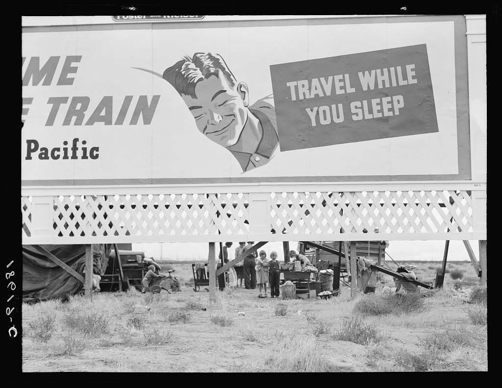
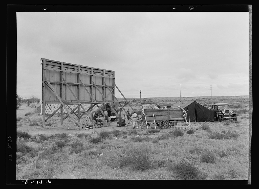
Pea Pickers behind billboard Lange 1937
Pea Pickers shelter Lange 1937
Billboard Route 99 1937
This research should enable me to review Lange’s photo and possibly expand further work describing the FSA and all that it achieved.
Bourke-White, Margaret. “The Kentucky Flood.” Whitney Museum of American Art. Art and Artists. New York.
Delano, Jack. “Farm Labourers in a sugar can field”. Library of Congress. Washington 1941.
Evans, Wlaker. “Houses and Billboards in Atlanta.” Museum of Modern Art. Art and Artists. New York, 1936.
Hoerle, Heinrich. Monument of the Unknown Prostheses. Berlin Museum of Art, Berlin.
Lange, Dorothea. Camera Craft. Camera Craft, 1935.
Grab a hunk of lightning. Directed by Dyanna Taylor. Performed by Dorothea Lange. 2014.
Lange, Dorothea. “Migrant Mother.” Library of Congress. Destitute pea pickers in California. Mother of seven children. Age thirty-two. Nipomo, California. Washington, 1936.
Lange, Dorothea. “The White Angell Bread Line.” MoMA. Chicago. 1936.
Lange, Dorothea. The White Widow. MoMA, Chicago.
“Library of Congress.” Washington USA: Library of Congress, 2020.
Definition: noun The attribution of human characteristics or behaviour to a god, animal or object.
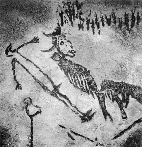
Earliest example I can find is of a god/mystic from a cave in France painted 40,000 years ago. Zeus Apollo and other Greek deities all had human characteristics too. Hindu animal gods all have human traits to enhance their mystic properties.
God or wizard from French cave art.
First recorded use of the word in western culture is 1745-55 for applying human traits to Christian god! Male image at that.
Aesop’s fables all show animals with human personalities and morals.
Literature has many examples mainly in children’s novels. Here are five fron just the last century.
1. 1865 Alice in wonderland Lewis Carroll.
2. 1894 The Jungle book Rudyard Kipling.
3. 1928 The house at Pooh corner A.A. Milne.
4. 1954 Lord of the rings J.R.R. Tolkien.
5. 1972 Watership Down Richard Adams.
All have been made into films mainly by Disney Studios. Most have some animation within them.
Recent films include Cars, Planes, and Toy Story 1, 2, 3, 4. which move away from showing animals to depicting objects.
Cars Animation of McQueen.
Car design itself is a science of face usage from Smart Car and its friendly face to Ferrari and its angry face. Even the Trabant has a face on its front. Online you can find pages of car face design tips.
Ferrari shows its anger beautifully.
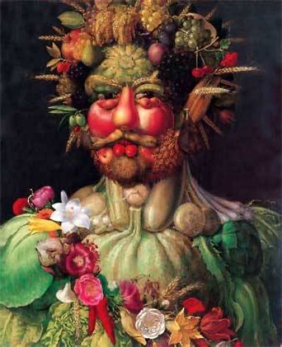
In art Giuseppe Arcimboldo uses inanimate fruit to form portraits the detail is sublime. Vegetables show the form and character of the subject. I wonder what they made of the images?
Giuseppe Arcemodi
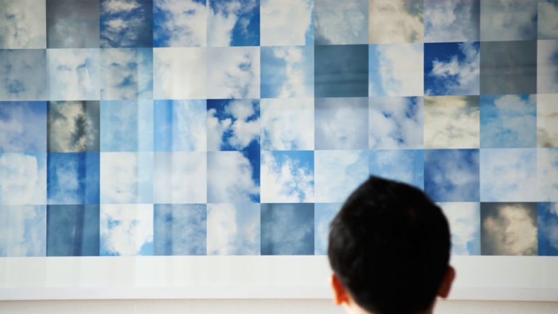
Shinseungback Kimyonghun used face recognition surveillance software to look at the clouds in the sky. From 40,000 captured images 1000 clearly show detailed faces. The images were displayed in Bradford. At first I didn’t see them but when you do it is amazing how much detail you see.
Shinseungback Kimyonghun cloud faces.
As children we do this, playing with our imaginations, we grow out of it! Let’s not, let us use our imagination like a child again, the world would be better for it.
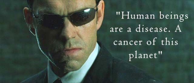
Finally…..for now! Agent Smith says in the Matrix “Humans are a disease Mr Anderson”. He is a Robot displaying feelings so even this pivotal scene in a film displays Anthropomorphism. It is everywhere look for yourself! What can you find?
For my research into this assignment I considered a journey I was about to make across the Drake Passage in the South Atlantic one of the biggest spaces on this planet. I thought there must be something about this space that could inspire me.
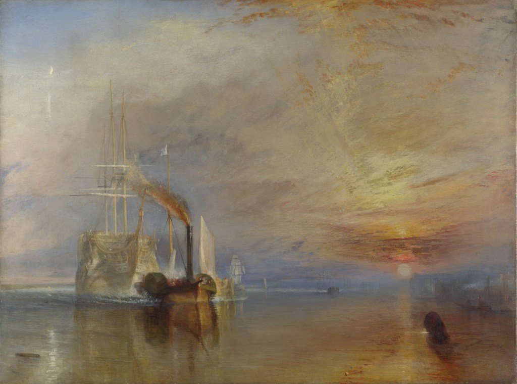
I looked at Maritime landscapes and liked three (1)JMW Turner The Fighting Temeraire. (2)Theodore Gericault The Raft of the Medusa and (3)Peter Breugel the Elder Landscape with the fall of Icarus
The Fighting Temeraire is a peaceful painting at first glance however on consideration it shows what must have a been troubling time for the Victorian people as sea travel transitted from sail to steam. The real scene should show two tugs but Turner showed this leviathan being towed into oblivion by just one. Hinting at the might of steam over the fragility of wind and sail. It is much smaller than the Temeraire which served Britain well at the Battle of Trafalgar. Turner was getting old when he painted it and it could show that Turner was thinking about his own mortality. Turner painted the Temeraire with its sails and masts when it fact it was a hulk with no masts. He wanted to depict her in all her glory. The painting clearly shows the end of the old system and the rise of a new industrial age. Depicting this with a setting Sun and a Rising moon. However this picture is too calm to inspire work from where I am heading. The sea is like a mirror reflecting the calm sky and the sunset.
JMW Turner The Fighting Temeraire.
The second picture I considered was painted by Theodore Gericault entitled The Raft of the Medusa. It shows the crew of the French Frigate Medusa at the moment of rescue. The survivors are deranged with thirst and starvation. Suffering so badly that they have resorted to canabilism. One suprising thing is the negro at the head of the mast leading the way to salvation. Gericault was showing that if you persevere you can move from despair and no hope to salvation rescue and hope. The sea is shown menacing, rough and the violent sky has menace also .One amusing thing clearly on show is the fact that the artist couldn’t paint feet so you will not find any in this painting unless its covered by another person or bandaged. If I was to pursue this for Assignment 3 I would need to use models and probably wont have time to pose them.
Theodore Gericault The Raft of the Medusa
The Third painting I looked at was purported to be by Peter Breugel the elder. Whether he painted it or not it is a superb painting with humour and a story.
Icarus the son of Daedlus stole his fathers wings made of feathers stuck with wax. He ignored his fathers warnings as he tried to climb higher than other men and crashed into the sea and drowned.
The painting shows the figure of a farmer in the foreground his red tunic hints at danger. Then you see a sheperd tending his flock. Your eye searches for Icarus but next you see a fisherman fishing from rocks on the shore and a ship with full sails and the crew working to control the ship. Where is Icarus? He should be by the setting sun the heat of which makes the drama unfold. Then under the ship you see a leg stuck out of the sea. At last Icarus and his demise are visible. A shock to find the main player shown as an insignifant bit player in a corner.
It is beautifully painted with strong colours and detail on every part of the canvas. It has humour all the people your eye sees are indifferent to the plight of Icarus. This is the paintings message it invites us to consider how we are indifferent to the suffering of others. With a second message of men who try to climb to higher levels than ordinary men usually take a tumble back to earth. The sea is depicted symbolically in a state of calm, it has played no part in Icarusses demise.
You can, I am sure think of men/women like this politicians, officials, colleagues at work. All try to climb to heights and most fail, then if we are not careful we are indifferent to their suffering even turning our backs on them.
The artist is extremely clever showing the whole story in one scene, (4)John Berger describes this process “In a painting all its elements are there to be seen simultaneously. The spectator may need time to examine each element of the painting but whenever he reaches a conclusion, the simultaneity of the whole painting is there to reverse or qualify his conclusion. The painting maintains its own authority”.
Landscape with the Fall of Icarus by Bruegel, Pieter the Elder (c.1525-69)
DISASTER
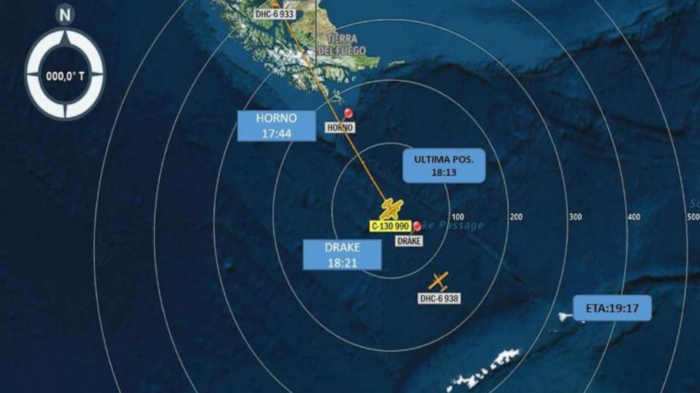
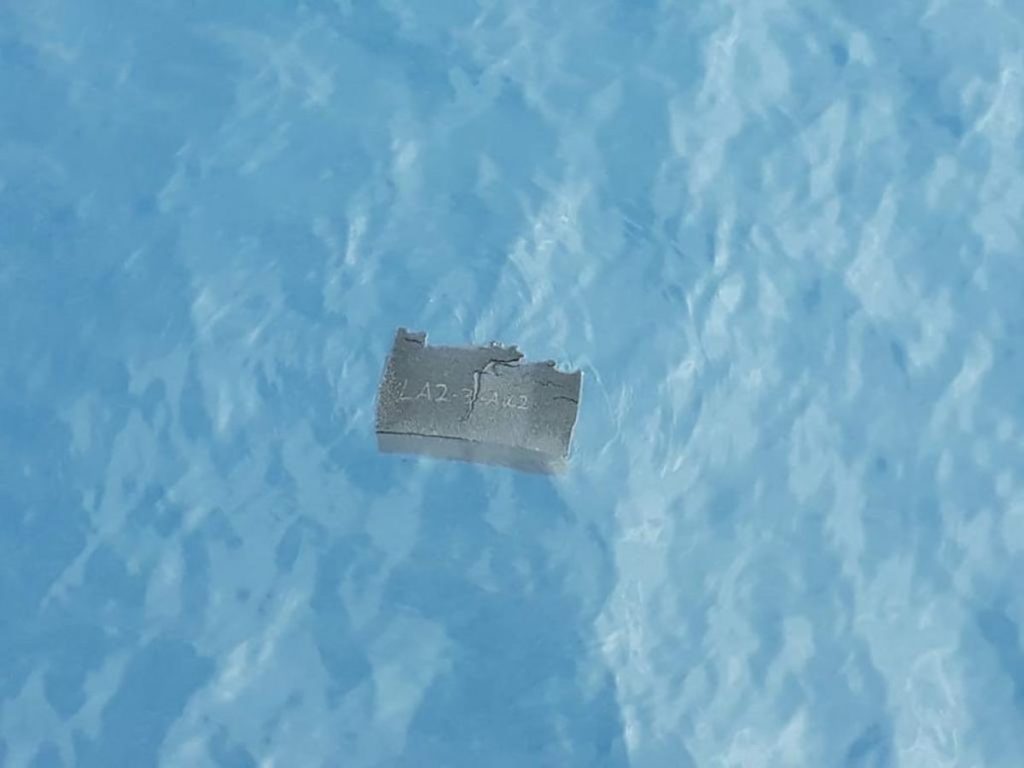
As I was considering this assignment onboard the ship a Chilean C130 Hercules crashed twelve miles from the ship. We spent the next 24 hours searching the sea in 60 mph wind and 5 metre waves in the pitch black of night and gloom of the Drake. We saw a light flash 4 times over a couple of minutes. 38 souls were lost in an instant. After the Chilean navy had taken over the search it seemed to fit into all my thoughts and research I had completed for this assignment.
Images showing detail of the disaster in the Drake Passage.
In my work I want show the space of the sea and how it becomes a place to the birds that inhabit it. The different states of the sea will show its different moods. Combining the two will show it is indifferent to human efforts and the technology we use to go into this space. These animals fly all their lives and look to be most relaxed when the elements are at there most extreme. I want it to be a tribute to these 38 lost souls.
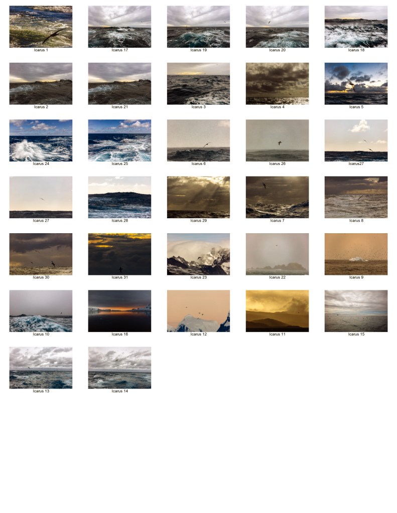
Below is my contact sheet of 30 exposures from which I chose 12 in tribute to these 38 lost souls.
Contact sheet for Icarus.
Bibliography
(1)Turner, JMW, and John William Turner. The Fighting Temeraire. National Gallery, London.
(2)Gericault, Theodore. The Raft of the Medusa. The Louvre, Paris.
(3)Elder, Peter Breugel The. Landscape with the fall of Icarus. Royal Museum of Fine Arts, Brussels.
(4)Berger, John. Ways of seeing. London: Penguin, 1972.
Researching
this assignment I want to consider the work of Anna Atkins, Washington Teasdale
and Bernd and Hilla Becher then I want to look at types of text I could use to
complete this work. I want to try to present all the subjects covered in this
second part of the course.
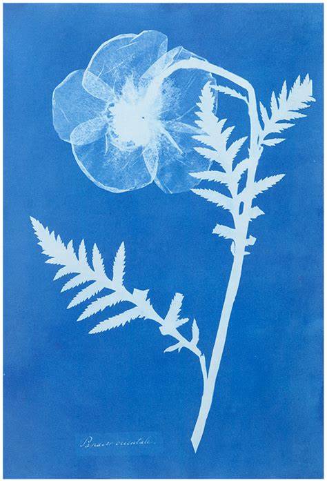
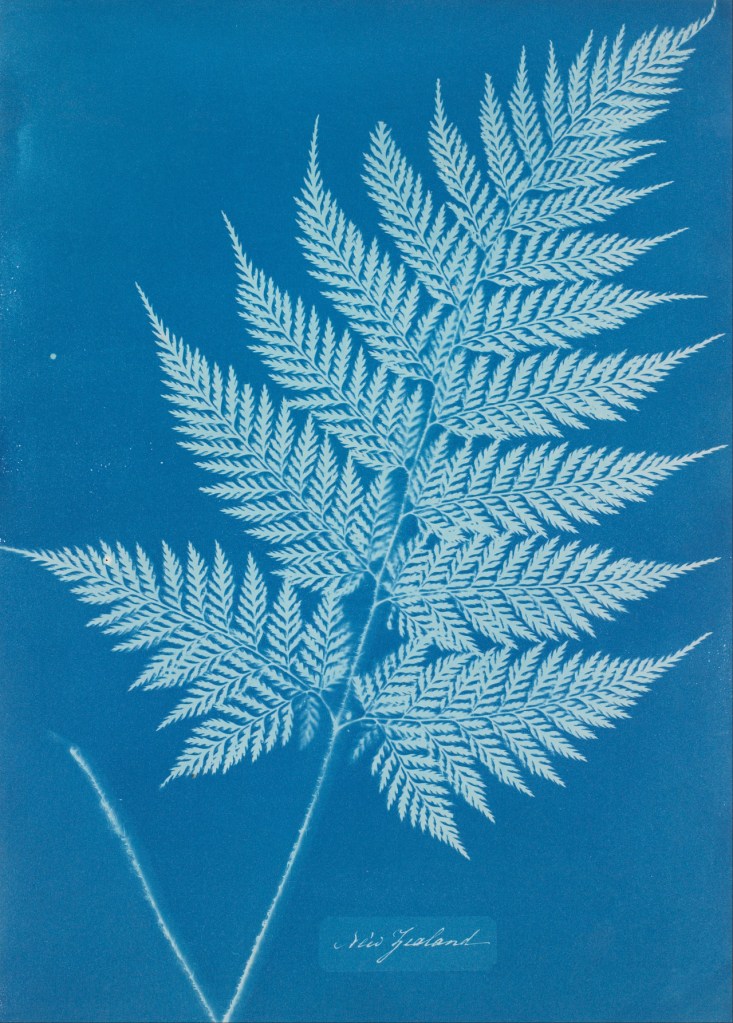
Anna Atkins
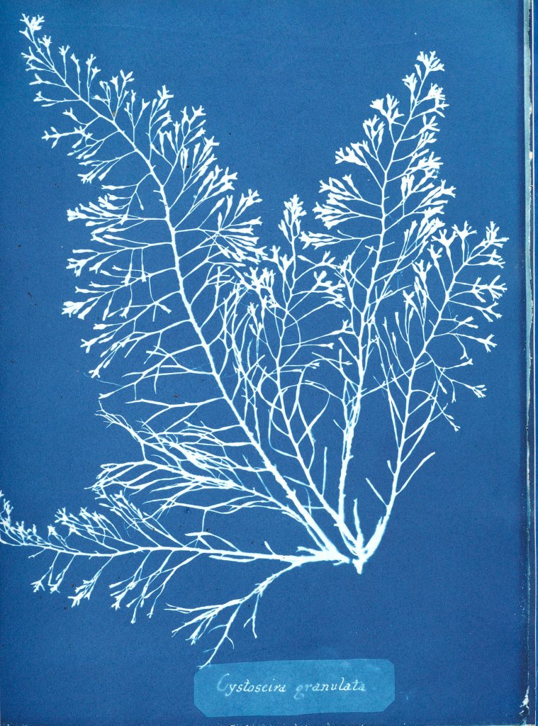
(1)Anna
Atkins was born in 1799 and was a botanist and photographer. She made
impressions of British algae using the cyanotype method in 1843. The detail in
these impressions is amazing almost looking three dimensional. She was a great
scientist and created work on algae, working mainly in biology but also
studying marine shells. Copies of her work on algae are kept in institutions
across the world and are still a great reference point both scientifically and
in the art world. Making her one of the few who have crossed across the two. Earlier
this year I saw one of the cyanotypes in the Victoria and Albert museum in
London and it was breathtaking. She worked closely with William Henry Fox
Talbot who was a close associate of her husband so both were at the forefront
of the new technology of photography.
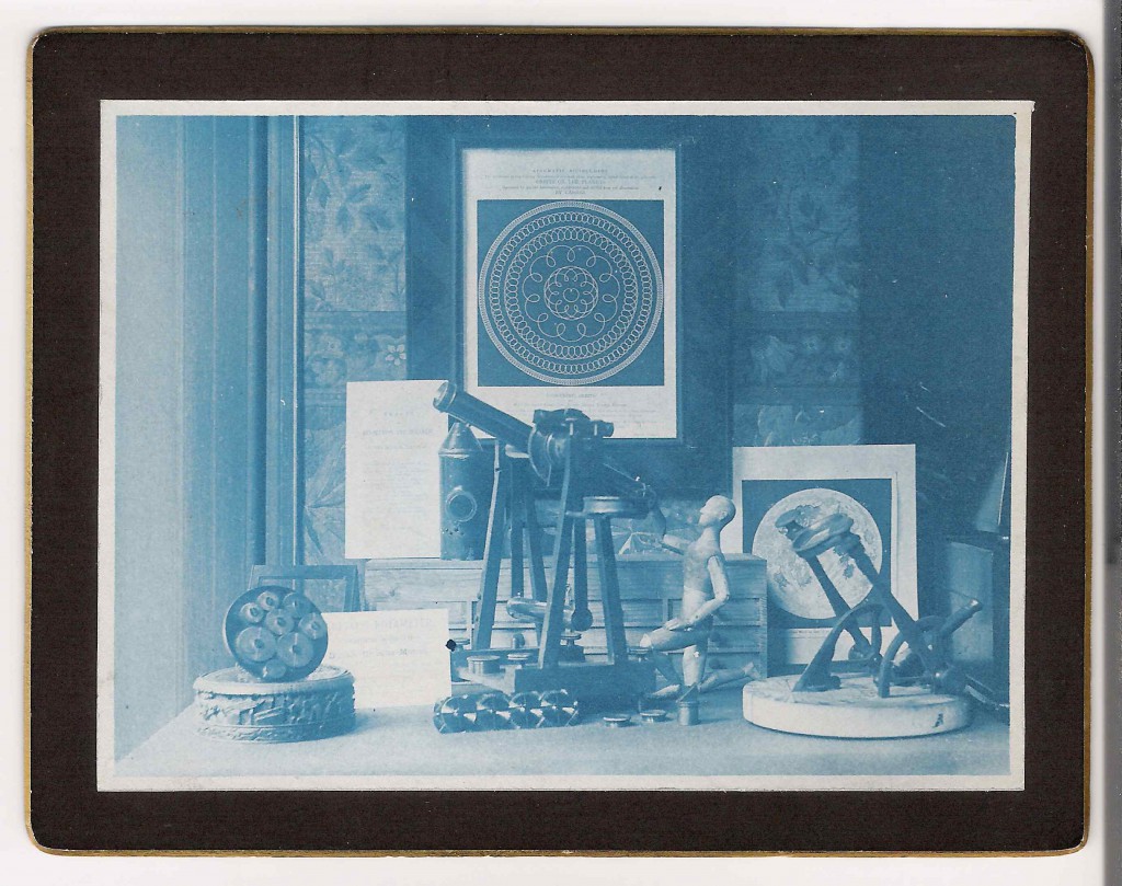
Anna Atkins Cyanotypes
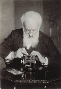
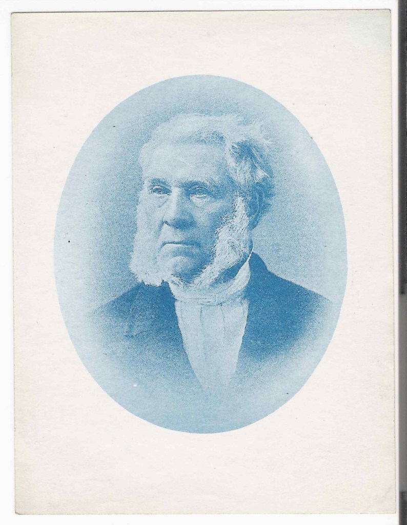
Washington Teasdale using his microscope.
(2)Washington
Teasdale was born in Leeds he worked in India developing the rail network. His
early photographic work was creating slides for magic lantern shows. He was
interested in cyanotypes and created high quality work. He was a founder member
of the Leeds Photographic Society. Familiar with many disciplines within
photography but specialising in three Cyanotypes, Silver Gelatin print and
Collotypes.
His
interest in lenses led him to develop an early field microscope and he
subsequently became a fellow of the Royal Astronomical Society.
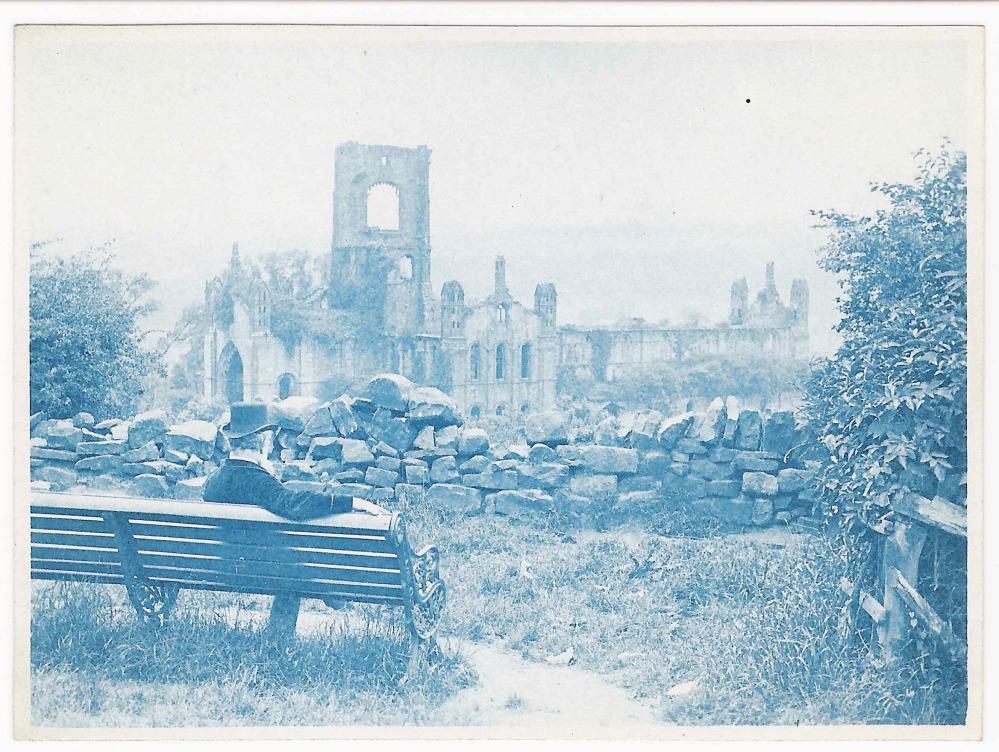
He took
several exposures at Kirkstall Abbey in Leeds these plates allowed him to make
a contact print using the cyanotype process. Whilst not as strong as Atkins
work they are still strong prints.
Washington Teasdale Cyanotypes.
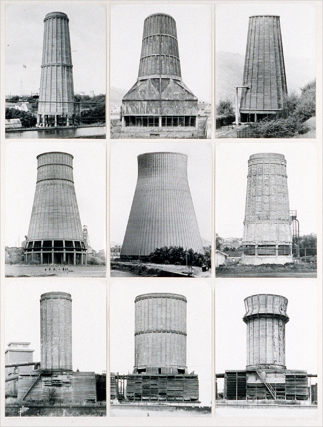
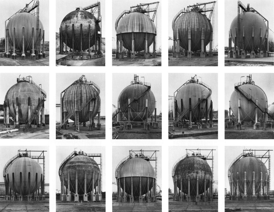
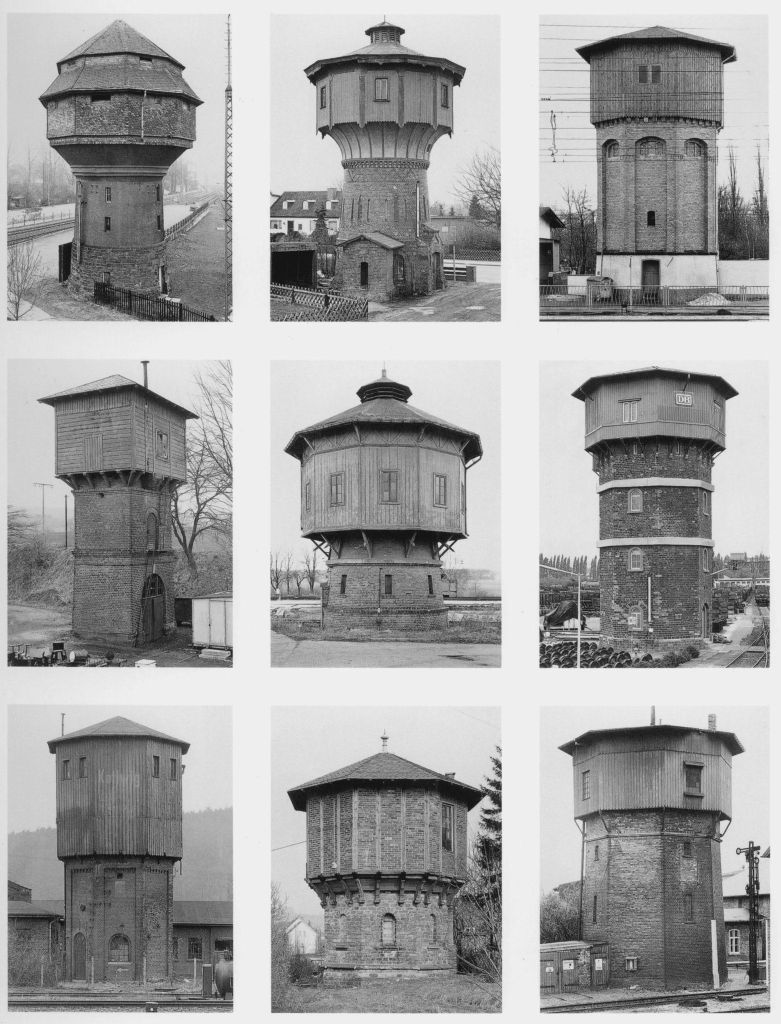
Hilla and Bernd Becher.
(3)Bernd
and Hilla Becher produced some of the greatest photos of the most mundane
subjects ever. The way they composed the separate components of the typological
works is mind blowing. Take the poster of photos of pit workings. They are all
exactly the same composition but showing separate sites. This must have been so
hard to achieve. The amount of work to capture each must have been immense.
They met in 1957 in Dortmund at the Kunstakadamie. They first worked together
taking exposures of mines and steelworks. They did this as their families had
worked in these industries.
They had
thought of everything they shot on cloudy days to stop shadows, but went
further by shooting only in the same season either spring or autumn. They moved
around the subject to ensure no distractions are in the frame. Whilst the shots
look simple you can see the attention to detail in the simplicity.
In 1965
they came to Britain for a six month project travelling around the country repeating
the process on the industrial sites here. In the seventies they repeated the
process in North America.
After Bernd
died Hilla worked mainly with the existing photos they had captured and
continued doing so until her death in 2015.
Bernd and Hilla Becher Typologies
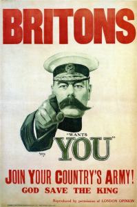
Creating a
poster is new to me so I thought of the four that came to my mind. First to pop
into my head is the First World War poster which just says (4)“wants you” with
Field Marshal Kitchener pointing right at you. This is a strong image with the
finger pointing right at you and the eyes looking straight into you. In 1914
how could it not call to whoever looked at it.
Your Country Wants You 1914.
Second I thought
of the posters used by (5)British Rail to show destinations to get the public
to use their leisure time to travel by rail for their holidays. One I have seen
shows Scarborough in all its sunny glory to entice you to spend some time at
the resort. They all show depictions of the landscape of the place and are
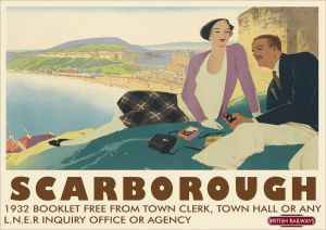
works of art in themselves. This one was produced in the 1930s.
Rail Holiday Poster 1932.
Next I
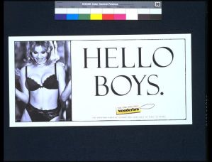
thought of the (6)Wonder Bra poster I remember this poster and the car crashes
it caused in 1994. It has a slogan of “Hello Boys” and was extremely
provocative. It was withdrawn not because it objectified women but because it
was causing lots of rear end shunts so damaging vehicles.
Wonderbra Billboard poster.
All of
these posters have an accompanying image; I don’t want this for this
assignment. The image will detract from the main part of the work offered. I
want to create just text on my poster so I looked at posters with only text.
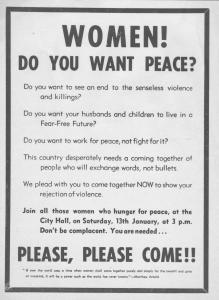
Poster inviting women to come to Belfast City Hall.
First I
found a poster from (7)Belfast University which was posted in Belfast in 1973
to recruit women to campaign against the troubles. It follows a very similar
format to the “Wants you” poster from the First World War. Without the image.
Sydney and Harriet Janis Collection Poster.
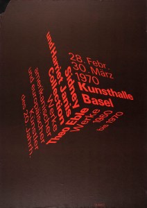
Next I
found a text only poster for the (8)“Sydney and Harriet Janis Collection” an
exhibition in 1970. This is a beautiful design. Simple but strong with just two
colours Black and Red. The words form a cube the clever part is the words still
work being easy to read. I don’t have the skills to do this…….Yet!
Second World War Poster for invasion use.
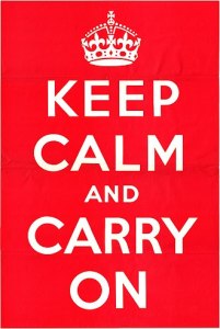
Finally I
thought of the (9)“Keep Calm” poster which has been popular on all kinds of
products from posters through t-shirts and mugs. One I have seen recently said
“Keep Calm, drink Gin. I wonder if the purchaser realised this was an
information poster used in WW2 by the ministry of information. It simply read “Keep calm and carry on”. What
many don’t realise is it was designed to be used if Britain was invaded as it
wasn’t, the public never got to see it until one was discovered in 2005.
This is the
design I will use I like its simplicity and it won’t detract from my main body
of work.
How do I
make the cyanotype process work. I learned the process from a (10)Thames and
Hudson Book it is simple but you need to follow each stage carefully.
So mixing
10g of Potassium Ferricyanide with 100ml of distilled water we create the first
solution called A.
Then mixing
in the cleaned glass bowl 25g of Ferric Ammonium Citrate with 100ml of
distilled water I create the second solution called B.
These
solutions can be kept in Brown bottles in a cool dark place for several weeks.
When I am ready to coat the paper I mix equal quantities of solution A and B.
The size or number of sheets of paper dictate how much I will need to mix. 5ml
of each will coat two postcard sized sheets of watercolour paper.
Then you
allow the paper to dry in a dark room. Again you can store the paper for a
couple of weeks once dry in a envelope or a black photo paper bag.
Then place
your paper with the subject on top of the paper. Place the glass on top and
ensure it holds the subject as tight as possible. Then expose to sunlight,
exposure time differs but on a cloudy day 20 minutes suffices. I look for the
coating to gain a metallic grey colour then I know it is exposed.
Rinse in
cold water under the tap until all the yellow coating has washed off and leave
to dry. If you want to change the tones now is the time to play. I have tried
Red wine, Tea, Coffee and Cocoa so far. The mid tones change slightly and
improve the detail in the exposure. Tea seems to work best of all.
One last
point is the finished print will change colour darkening and allowing detail to
sharpen as it dries. It will bend also as it dries so placing the dry paper
between kitchen paper under a large book this will help flatten it.
Works Cited
(1)Atkins, Anna.
“British Algae.” Victoria and Albert Museum. British Algae.
London , 1844.
(2)Teasdale,
Washington. Kirkstall Abbey. Museum of the history of science, Oxford.
(3)Becher, Bernd and
Hilla. Watertowers. MoMA, New York.
(4)Leete, Alfred.
“Your Country Wants You.” War Office. Your Country Wants You.
London, 1914.
(5)Broadhead, William
Smithson. “Scarborough LNER Poster.” LNER . Scarbororough Poster.
York, 1930-1955.
(6)Rose, Nigel.
“Wonderbra Poster.” Victoria and Albert Museum. Wonderbra Poster.
London, 1994.
(7)(?). “Women do
you want peace?” Belfast University. Women do you want peace?
Belfast, 1973.
(8)Arx, Peter Von.
“Kunsthalle Basel.” Theo Kabel. Sidney and Harriet Janis
Collection. New York, 1970.
(9)Servant, Unknown
Civil. “Keep Calm and Carry On.” MoI. Keep Calm and Carry On
Poster. London, 1940.
(10)Gomez, Anthonini
Minniti, and Lunganella Bendandi. Experimental Photography. London:
Thames and Hudson, 2015.
What is beauty or the sublime in respect to art. First what is the meaning of these two words. They are both often use in fact they are used too often. Football commentators scream “sublime shot”, I have described soup as sublime. And beauty is definitely in the eye of the beholder. What we see as beautiful in the west the east see the same thing differently.
So here the Oxford Concise Dictionary definition of the word beauty:
NOUN combination of qualities, such as shape, colour, or form, that pleases the aesthetic senses, especially the sight.
You can see straight away that this
code of beauty is already subjective you can start to add your interpretation
straight away. When you read these words what do you see? A person, a shape or
a scene. These seven letters create so much in our minds it is a powerful word
with different meaning between cultures, countries and people.
Here is the dictionary meaning of
the word sublime:
ADJECTIVE
Of very
great excellence or beauty.
VERB
elevate to a high degree of moral or spiritual
purity or excellence.
“let
your thoughts be sublimed by the spirit of God”
I
have included both the adjective and the verb as I felt both were relevant in
our art world. As an adjective it adds gravitas to the beauty of an object. I
find it interesting that I immediately put this together with female ideas. Is
this just me or is it in our society?
The
verb adds a spiritual connotation to the word which fits our use here on a
landscape course. When used it implies the presence of beauty to a level that
would please the gods.
Darvia. Julian Bell Tate London 2010
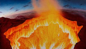
The word sublime has almost been overused In art I read an essay by Julian Bell on the Tate website entitled “contemporary art and the sublime”, in this essay Bell describes a painting he produced after visiting site at which the Russians had drilled into the ground prospecting for oil and gas. After deciding to burn off the excess gas they created an inferno which Bell saw as a vision of hell. He painted an 8 foot canvas. He compares what he has done to the work of (J Wright, Tate, 1776) . He compares the use of light in both pieces of work and says ‘such a light as that of the sun, immediately exerted on the eye, as it overpowers the sense, is a very great idea’. He means the light of the sun adds a sublime element to both works. When you look at both the bright sun of the infernos hits you like strong sunlight and overpowers the senses.
Vesuvius erupting with a view of Naples bay. Joseph Wright Tate 1776.
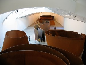
Next he discusses spaces that overpower the senses citing Richards Serras (Serras, R, Gugenheim Balboa, 2000) huge copper spaces in the Balboa Guggenheim Museum. You enter this installation and feel lost within it. The individual visitor is left to interpret the artwork for themselves. You must explore your feelings within this artwork.
Copper. Richard Serras (Balboa Gugenheim, 2000)
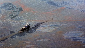
He looks at an artist I explored earlier Edward Burtynsky and takes his work “Oil Spill 2” (Tate, 2010) he calls this work “Industrial Sublime” and I understand why it overloads our vision and takes some understanding once you see what it is, it makes us question mans place in the sublime.
Edward Burtzynsky Oil Spill2Tate 2010
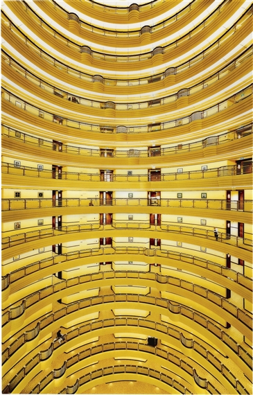
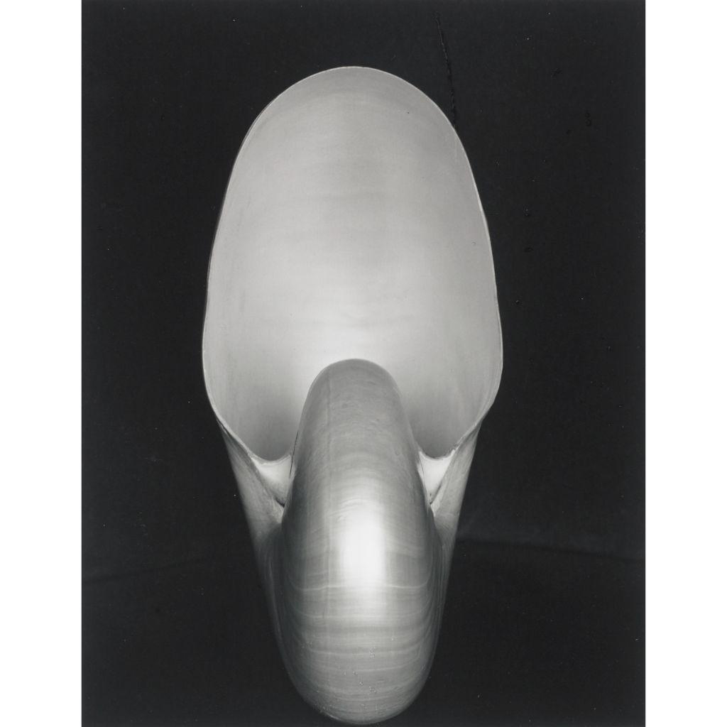
Next he looks at mathematical sublime and Andreas Gurskys (Gursky, Berlin, 2000), photograph “Shanghai 2000”. It is just a photograph of the inside of a building however it has just as much structure and sublime beauty as Edward Weston’s (Nautilus, MoMA, 1936) photograph of a Nautilus shell. It holds your eye and overwhelms your vision.
Andreas Gursky Shangai 2000
Edward Weston Nautilus MoMA 1936
This essay has made me realize that we can easily use this
word. But to get the best from it we need to challenge our senses. My challenge
to myself is to see if I can overload my senses in my local are and create some sublime photographs on an
ordinary day.
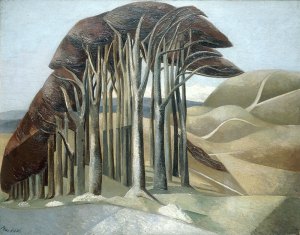
I like trees they add mystery to a landscape I am not the first to feel this Paul Nash said before the first world war tainted his eye “Trees are like beautiful people”. (P. Hendon, Art History) This might explain why his later paintings show broken trees maybe to represent the broken destroyed people he didn’t show. His trees add a sublime element to his paintings however they are painted.
Paul Nash Trees (PHendn, 2001)
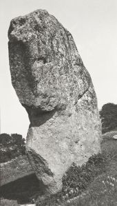
He also captured photographs one was of a stone at Avebury Circle called Avebury Sentinel )P Nash, Tate, 1936) He took his photographs with a Kodak type 2 camera. They were taken to be used as sketches for his later paintings. Looking at the this photograph I see the trees I see in his paintings they give even a photo taken to record a large stone a different element. He looked for hidden elements in his paintings and you can see it in his photographs too. He couldn’t help himself.
Paul Nash Avebury Sentinel .(Tate, 1933)
I want to capture the open space where I live with its big
skies and the trees of the area. These elements create a sublime landscape that
changes minute by minute and day by day.
I have been reading a book by David Matless entitled Landscape and Englishness. In it I have been reading about the landscape I have taken in my shots for this assignment. I found this quote apt “If those men and women who, as my letter-bag so cleverly proved, are starting out in their thousands to discover rural England will see it not merely as a pretty picture but as a living thing……”.
This is what I want to show in the 12 shots I present..
References
Bell, Julian. Darvia. 2010. Oil on Canvas. Tate London.
Burtzynsky, Edward. Oil Spill2. 2010. Digital Colour Photograph. Tate London. Gurskys, Andreas. Shanghai 2000. 2000. Digital Colour Photograph. Berlin.
Hendon, Paul. Paul Nash Outline The Immortality of I. 20, n.d.
Hornblower, S, A Spawforth, and E Eidinow. The Oxford Classical Dictionary. Oxford Press, 2012. Morton, HV. In Search of England. Methuen & Co Ltd London, n.d.
Paul, Nash. Avebury Sentinel. 1936. Oil on Wood. Tate London.