I was introduced to the landscape at the age of about eleven when I completed the Yorkshire Three Peaks walk. These three hills felt like Everest to me at this time.
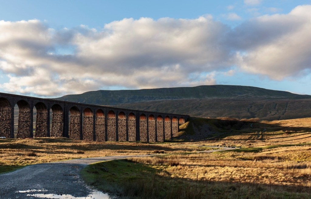
Whernside.
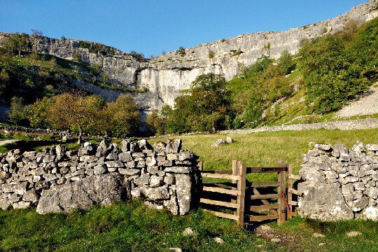
I went on to complete Duke of Edinburgh Bronze and Silver and had to complete proper hikes in both these awards. Navigating from Malham to Threshfield was a great introduction to using a compass.
Malham
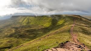
At Eighteen I joined the Navy and took part in the Ten Tor’s in Devon another real test. Then on to Four days survival training in the Brecon Beacons. Living from and with nature was a real test. I learnt so much about the landscape and myself through all of these experiences.
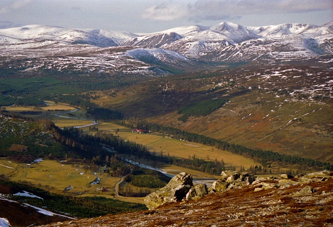
The Cairngorms
The Brecon Beacons
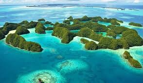
After leaving the navy I continued my diving and travelled all over the world pursuing diving. From the mountains of Scotland to the Rock Islands of Palau and countless landscapes and seascapes between I have seen some of this planets wonders. Note I say some.
Rock Islands Palau
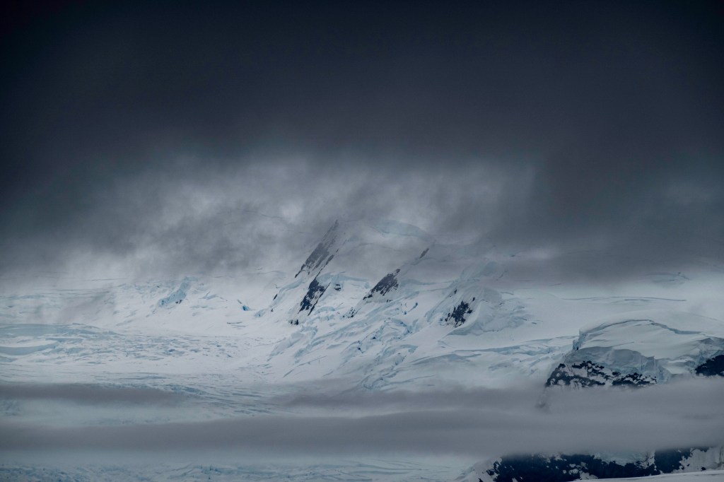
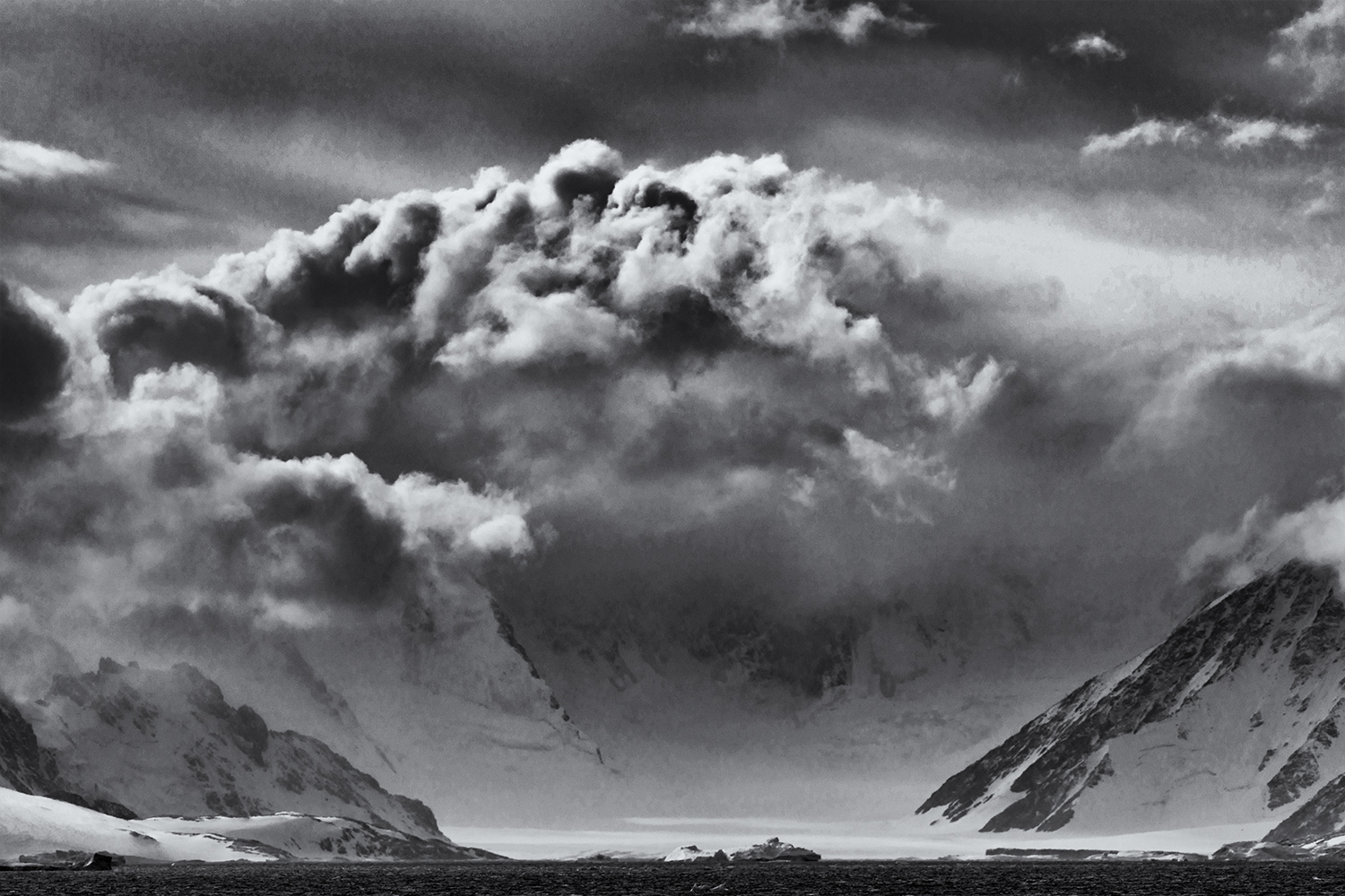
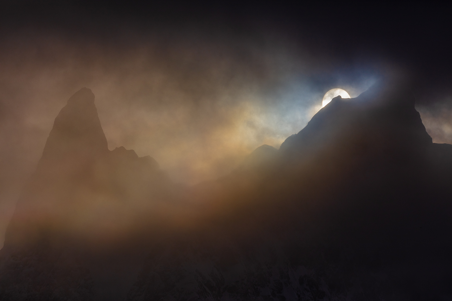
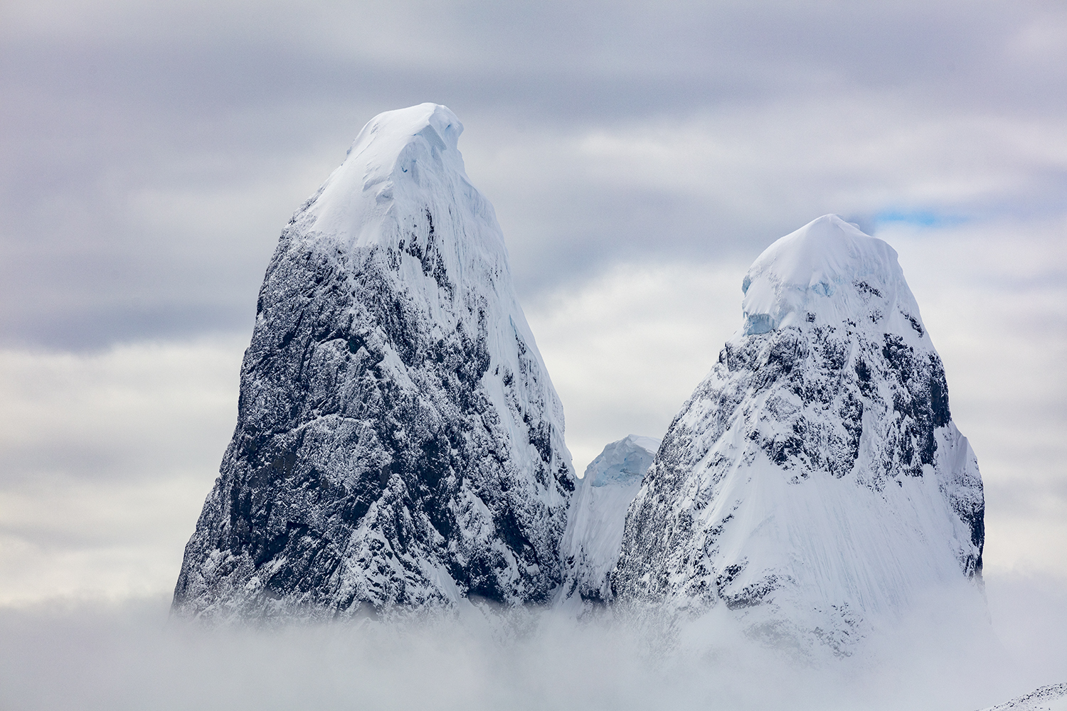
Recently I have been in Antarctica and the Arctic this takes me to the last wildernesses on our planet. These places have had a huge effect on my life, they are huge but oh so fragile.
Antarctica
I am no eco warrior but try to live my life to the best standards I can. Mending things rather than buying new. I walk to the shops instead of driving the car. I try to minimise the waste I produce to protect our fragile world.
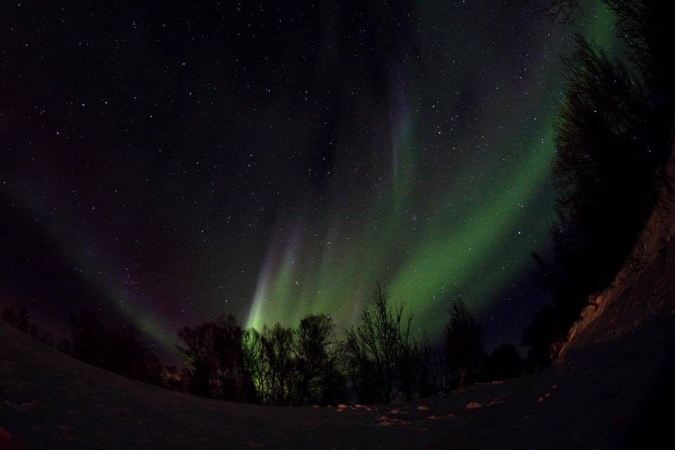
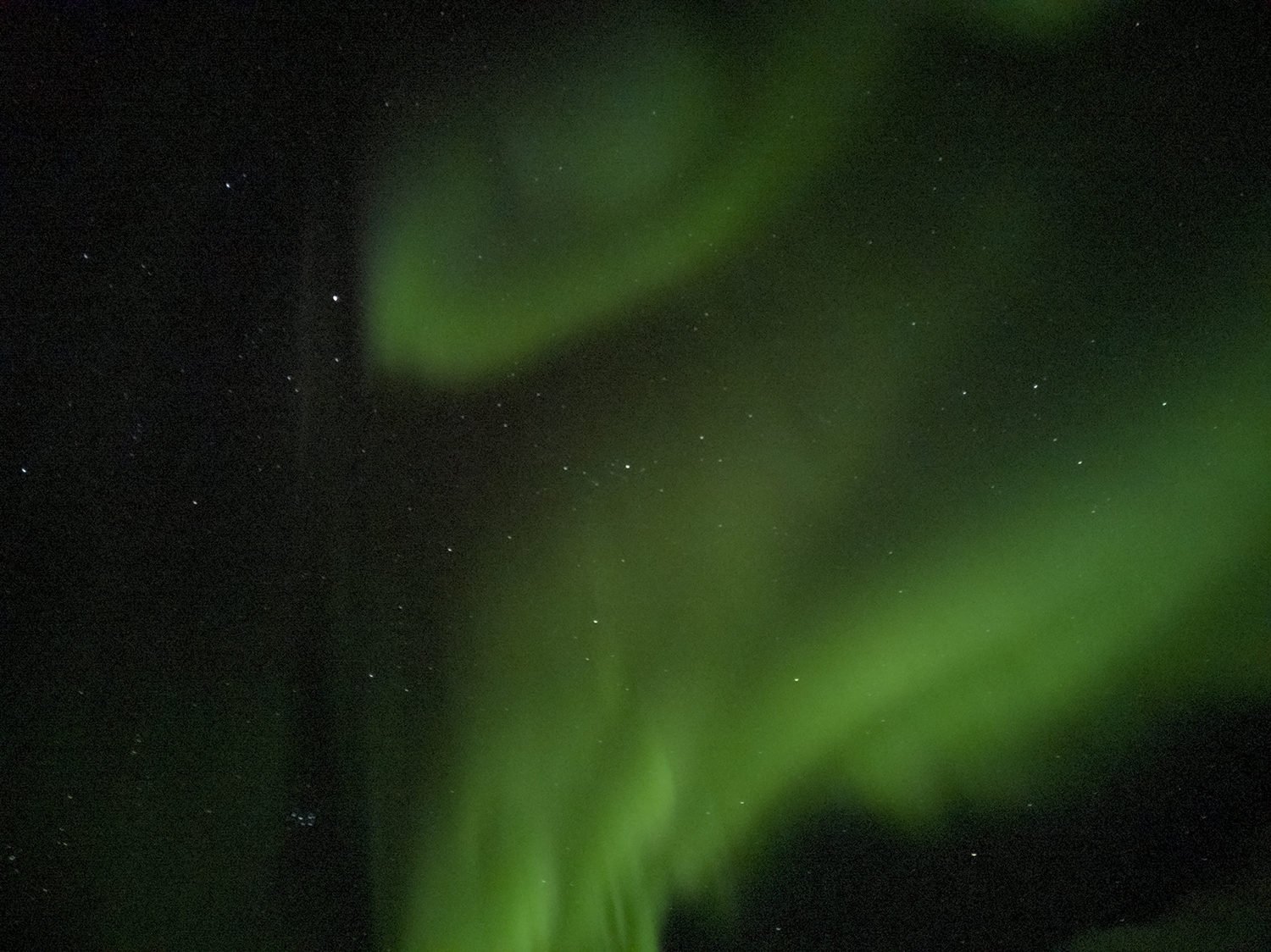
Northern lights.
Some of my best experiences have been sitting up, in my sleeping bag looking at a cloudless night sky. And watching the Northern lights in Norway and Greenland.
I am fascinated by the animals in these places but don’t want be a scientist. I just enjoy knowing they are out there.
The people I have met can teach us so much from the man in the jungle who knows which plant treats what, to the Micronesian sailors who use sticks to navigate the vast Pacific Ocean. I hate when good meaning westerners want to introduce air conditioning, Coca Cola and the internet they don’t need it……..in my opinion.
Landscape was a route to levels of emotion which were acceptable without being too nationalistic. These words sum up for me how we are in England fiercely proud without wanting to offend.
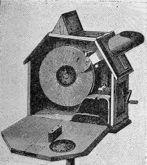
The Mutoscope imagined to look down on England’s history.
CFG Masteman wrote “looking down on England” in which he looks at landscape from the medieval jungle through the renaissance to the black blots of the industrial revolution. He uses a clever vehicle “the Mutoscope” for looking down on the landscape to see the changes in historic periods like a sped up film.
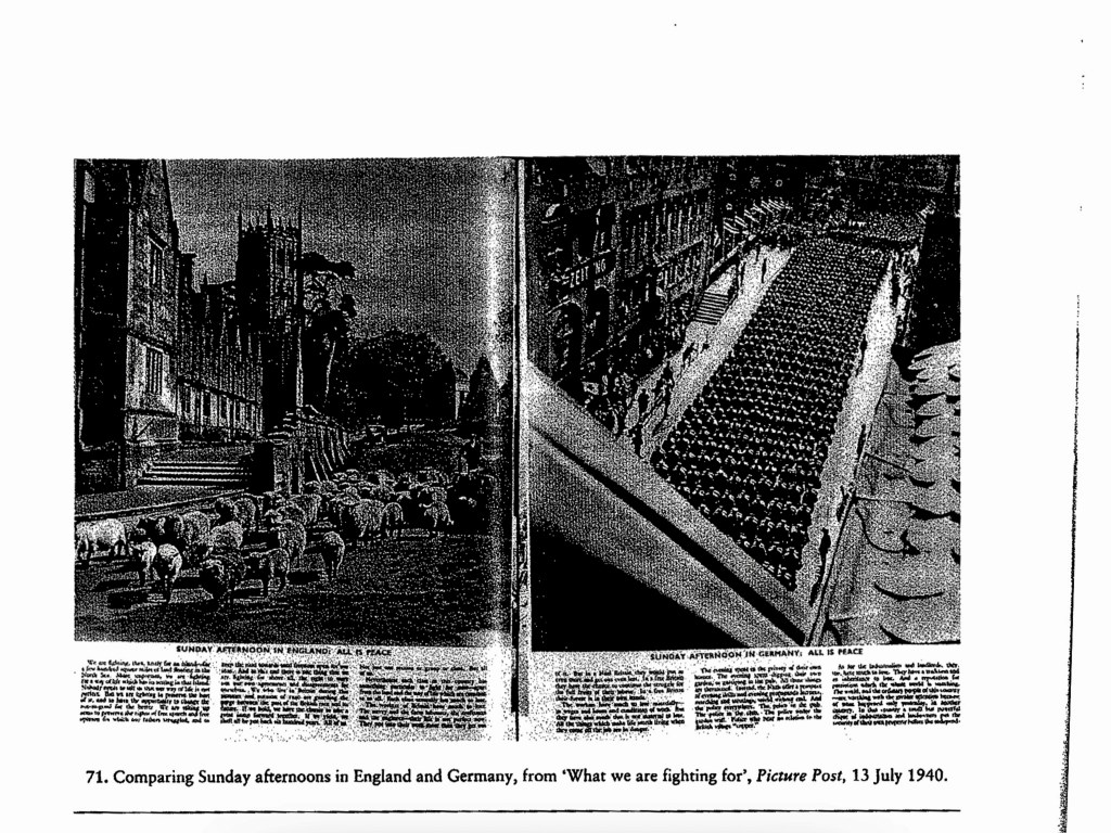
In 1940 the threat of invasion came from across the North Sea and Germany.
“Unconquered for a thousand years” is a phrase I find interesting as Germany talked about the Reich lasting a thousand years. We looked back they looked forward.
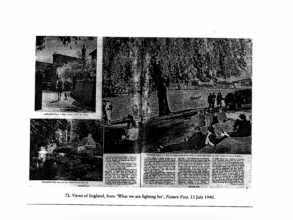
Patriotic propaganda talked about community in the village led by the Squire bringing people close to the past and nature. The inhabitants removed signposts and addresses from the scene to aid confusion to the enemy.
What are we fighting for.
The landscape became travelled through rather than enjoyed. Publishers such as the Pilgrim Library published books showing the idyll of previous landscape to remind people what they were were fighting for.
Picture Post juxtaposed photos showing a boy playing cricket in one then a young German boy in Hitler Youth uniform. Democracy against Militarianism. Another shows a half timbered cottage with the caption “England: Where a mans home becomes his castle”, all hint at what is being fought for.
What are we fighting for?
Civilians being bombed were shown with upturned faces showing their bravery and hinting at a brighter future once the turmoil had been endured.
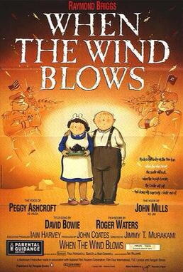
Completing this made me think of the illustrated book by Raymond Briggs called “When the wind blows”. The same emotions were used to show how a nuclear attack would effect our grandparents who were from a simpler time. This made me want to absolutely defend them.
After reading the two short essays Wire and I am struck by the endless possibilities this approach offers. The two essays cover such topics as Cooling stations, Wind Turbines, Cold War buildings and wire fences. All linked by being on the edge of Society in one way or another. Services that we want to keep close enough to use but distant enough to be not seen. The second link I saw was barriers, razor wire and pointy fences.
The work around Greenham Common and the Hush House were interesting to me. Making me think of textile mills locally that are now unused.
If I walk a mile through my local area noting these types of things I get the list below.
1. Walls (Drystone).
2. Walls (Mortared).
3. Waste bins.
4. Derelict farms.
5. Ancient boundaries.
6. Old industrial sites.
7. Wire fences.
8. Wind turbines.
9. Litter Bins.
So spending 20 minutes wandering around looking has produced eight topics that could easily be projects and long term ones at that.
Reading of the sites that were edgelands in the time of writing some of the ones I know such as Tinshill cooling tower are now not on the edge they are part of the town. It could be interesting to find old edgelands within our towns.
Work Cited
(1) Wire Farley, P. and Roberts, M.S. (2011) Edgelands, Journeys into England’s True Wilderness.
(2) Power Farley, P. and Roberts, M.S. (2011) Edgelands, Journeys into England’s True Wilderness. London: Vintage Books
I don’t want to give away my work for Assignment two so some of my explanation here may seem vague, stick with me all will be revealed later in the project.
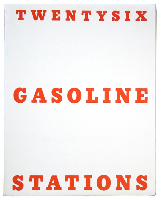
In the brief we are asked to look at the work of Ed Ruscha, Barbara Kruger and Mark Kitchener. I did so and was amazed to find I had seen their work around over the years in magazines and online. Below is an example of each artists work except Mark Kitchner whose work I couldn’t find.
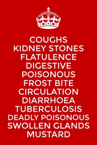
So looking at the work of these two artists I thought about my planned work for assignment 2. It works well together as I have 12 pieces I will display. The words relating to each work well displayed in an Ed Rusha Style. I thought completing the list with the recognised “Keep Calm” would add an official almost Health Department warning feel to it. The second one is my mock up of a poster to support the end of the project. You will have to wait for the assignment to be complete to see the outcome………SORRY!!! However the clues are all there on the posters just look and think.
After reading Joel Snyder essay (Landscape and Power, 2002) Territorial photography we are asked to review two photographs of our choice from two of the mentioned photographers.
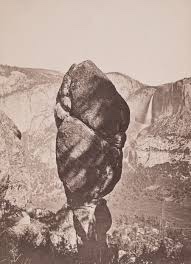
Agazzis rock with Yosemite Falls. Carleton Watkins 1851.
Carleton Watkins (Watkins, 1851)” Agassis Falls with Yosemite Falls” ,is an albumen Print on glass. It is high quality. The composition is obviously influenced by Watkins experience as a painter. The main subject, the rock is shadowed but shown with fine detail. The whole picture is sharp.
Thinking about Snyder, discussion of him taking photos to show that the wildernesses was being tamed whilst remaining untouched. You see this with the waterfall and the rock. However if you really look you can see roads, buildings and people.
It could be a high quality advert enticing you to go see. What you don’t see are the indigenous people, they are gone.
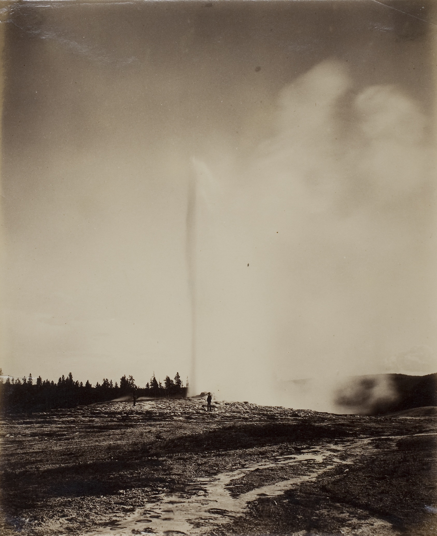
William H Jackson Old Faithful. 1871
William H Jackson, “Old Faithful” a huge Albumen Print 21cm x 17.5cm on paper. It is a high quality Print with good tone although some of the black tones are too dark. Jackson spent his time on surveys scientifically recording the central area of the USA. This photo was taken on Ferdinand Hayden’s Geographical Survey. It shows Old Faithful geyser erupting. steam blowing away from the main column of steam. He can’t resist though placing an assistant in Perl in front of the geyser. This adds scale and maybe is a reaction t being told his photos could not be used to provide measurements.
Neither Snyder nor Jackson were particularly celebrated at the time but are recognised as important practitioners now. They took similar photographs however they were for different purposes. Watkins showed the wildnerness being tamed and being used by the white man. Jackson wanted to show an untamed wilderness there to be explored and discovered.
I think I fall into the latter category.
References
Snyder, Joel. Territorial Photography. 2nd ed. Vol. Landscape and Power. University of Chicago Press, 2002.
Watkins, Carlton. Agazzis Rock with Yosemite Falls. 1871. Albumen Print from large glass plate. John Getty Collection.
William H Jackson. Old Faitful. 1871. Albumen Print from large glass plate. Art institute of Chicago.
What is beauty or the sublime in respect to art. First what is the meaning of these two words. They are both often use in fact they are used too often. Football commentators scream “sublime shot”, I have described soup as sublime. And beauty is definitely in the eye of the beholder. What we see as beautiful in the west the east see the same thing differently.
So here the Oxford Concise Dictionary definition of the word beauty:
NOUN combination of qualities, such as shape, colour, or form, that pleases the aesthetic senses, especially the sight.
You can see straight away that this
code of beauty is already subjective you can start to add your interpretation
straight away. When you read these words what do you see? A person, a shape or
a scene. These seven letters create so much in our minds it is a powerful word
with different meaning between cultures, countries and people.
Here is the dictionary meaning of
the word sublime:
ADJECTIVE
Of very
great excellence or beauty.
VERB
elevate to a high degree of moral or spiritual
purity or excellence.
“let
your thoughts be sublimed by the spirit of God”
I
have included both the adjective and the verb as I felt both were relevant in
our art world. As an adjective it adds gravitas to the beauty of an object. I
find it interesting that I immediately put this together with female ideas. Is
this just me or is it in our society?
The
verb adds a spiritual connotation to the word which fits our use here on a
landscape course. When used it implies the presence of beauty to a level that
would please the gods.
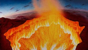
Darvia. Julian Bell Tate London 2010
The word sublime has almost been overused In art I read an essay by Julian Bell on the Tate website entitled “contemporary art and the sublime”, in this essay Bell describes a painting he produced after visiting site at which the Russians had drilled into the ground prospecting for oil and gas. After deciding to burn off the excess gas they created an inferno which Bell saw as a vision of hell. He painted an 8 foot canvas. He compares what he has done to the work of (J Wright, Tate, 1776) . He compares the use of light in both pieces of work and says ‘such a light as that of the sun, immediately exerted on the eye, as it overpowers the sense, is a very great idea’. He means the light of the sun adds a sublime element to both works. When you look at both the bright sun of the infernos hits you like strong sunlight and overpowers the senses.
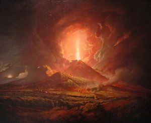
Vesuvius erupting with a view of Naples bay. Joseph Wright Tate 1776.
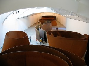
Next he discusses spaces that overpower the senses citing Richards Serras (Serras, R, Gugenheim Balboa, 2000) huge copper spaces in the Balboa Guggenheim Museum. You enter this installation and feel lost within it. The individual visitor is left to interpret the artwork for themselves. You must explore your feelings within this artwork.
Copper. Richard Serras (Balboa Gugenheim, 2000)
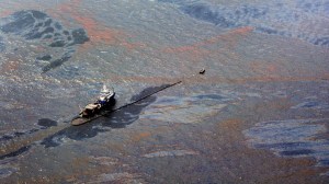
He looks at an artist I explored earlier Edward Burtynsky and takes his work “Oil Spill 2” (Tate, 2010) he calls this work “Industrial Sublime” and I understand why it overloads our vision and takes some understanding once you see what it is, it makes us question mans place in the sublime.
Edward Burtzynsky Oil Spill2Tate 2010
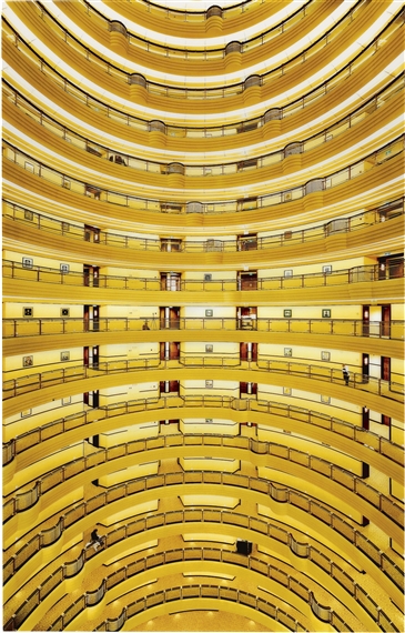
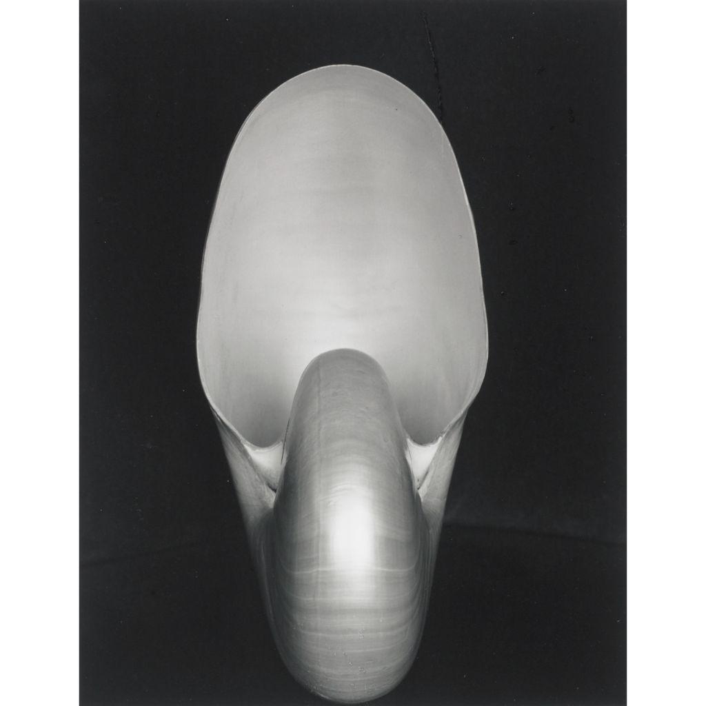
Next he looks at mathematical sublime and Andreas Gurskys (Gursky, Berlin, 2000), photograph “Shanghai 2000”. It is just a photograph of the inside of a building however it has just as much structure and sublime beauty as Edward Weston’s (Nautilus, MoMA, 1936) photograph of a Nautilus shell. It holds your eye and overwhelms your vision.
Andreas Gursky Shangai 2000
Edward Weston Nautilus MoMA 1936
This essay has made me realize that we can easily use this
word. But to get the best from it we need to challenge our senses. My challenge
to myself is to see if I can overload my senses in my local are and create some sublime photographs on an
ordinary day.
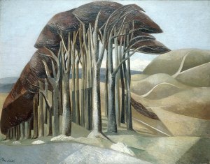
I like trees they add mystery to a landscape I am not the first to feel this Paul Nash said before the first world war tainted his eye “Trees are like beautiful people”. (P. Hendon, Art History) This might explain why his later paintings show broken trees maybe to represent the broken destroyed people he didn’t show. His trees add a sublime element to his paintings however they are painted.
Paul Nash Trees (PHendn, 2001)
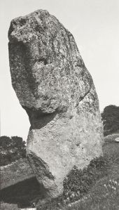
He also captured photographs one was of a stone at Avebury Circle called Avebury Sentinel )P Nash, Tate, 1936) He took his photographs with a Kodak type 2 camera. They were taken to be used as sketches for his later paintings. Looking at the this photograph I see the trees I see in his paintings they give even a photo taken to record a large stone a different element. He looked for hidden elements in his paintings and you can see it in his photographs too. He couldn’t help himself.
Paul Nash Avebury Sentinel .(Tate, 1933)
I want to capture the open space where I live with its big
skies and the trees of the area. These elements create a sublime landscape that
changes minute by minute and day by day.
I have been reading a book by David Matless entitled Landscape and Englishness. In it I have been reading about the landscape I have taken in my shots for this assignment. I found this quote apt “If those men and women who, as my letter-bag so cleverly proved, are starting out in their thousands to discover rural England will see it not merely as a pretty picture but as a living thing……”.
This is what I want to show in the 12 shots I present..
References
Bell, Julian. Darvia. 2010. Oil on Canvas. Tate London.
Burtzynsky, Edward. Oil Spill2. 2010. Digital Colour Photograph. Tate London. Gurskys, Andreas. Shanghai 2000. 2000. Digital Colour Photograph. Berlin.
Hendon, Paul. Paul Nash Outline The Immortality of I. 20, n.d.
Hornblower, S, A Spawforth, and E Eidinow. The Oxford Classical Dictionary. Oxford Press, 2012. Morton, HV. In Search of England. Methuen & Co Ltd London, n.d.
Paul, Nash. Avebury Sentinel. 1936. Oil on Wood. Tate London.
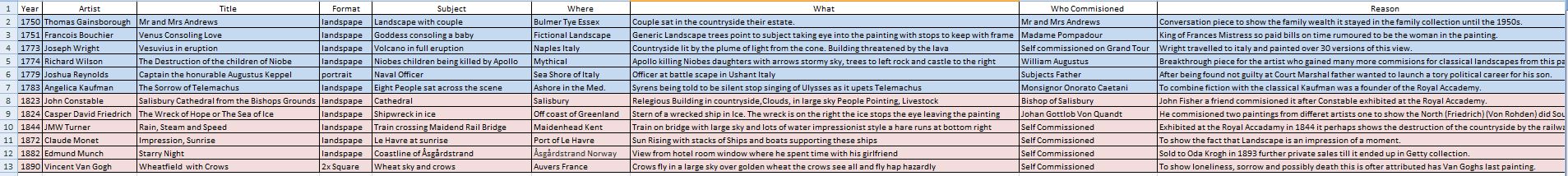
To approach this exercise I decided to organise my findings on a spreadsheet for easy analysis after I had finished my research. This helped me a lot.
The spreadsheet to help me see patterns.
The next
difficulty was choosing the work by the artists. I searched through several
books for ideas of who fits into each of the time periods given in the brief.
I tried to
find a mix of well known artists and lesser known ones too, all had to be known
to me. Then I started to look at the paintings all together after downloading
them from the internet.
The
majority have symmetry or follow the rule of thirds. Big skies proliferate, in
these skies there is all kinds of weather, lots of storms and choppy seas.
People are in many of the landscapes to give scale show land usage or just tell
a story. Colour is vital be it vibrant and strong or subtle.
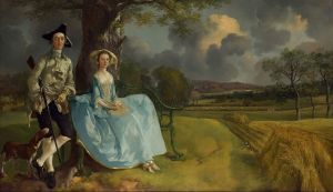
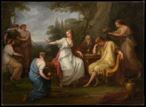
Mr and Mrs Andrews Gainsborough National Portrait Gallery 1780
The Sorrow of Telemachus A Kaufman NY Met 1783
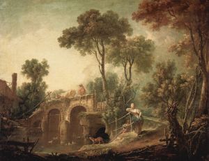
Vesuvius erupting from Portici The Huntington Museum 1775
The destruction of the children of Niobe R Wilson Yale Center for British Art 1760
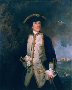
Commodore the honorable Augustus Keppel J Reynolds NPG London 1749
The bath of Venus F Boucher Washington National Gallery of Art 1751
In the early works of the period looked at the paintings either show people who have achieved great things such as(5) Joshua Reynolds “Captain the Honourable Keppel” who was accused of cowardice at the battle of Ushant and won his court martial so his father wanted to promote the fact. Or mythical stories set like a stage on a landscape most of which don’t match the setting of the story.
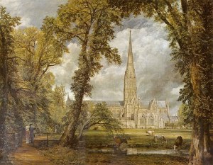
Salisbury Cathedral John Constable V&A London 1823
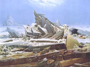
Sea of Ice CD Friedrichs Kunsthalle Hamburg 1823
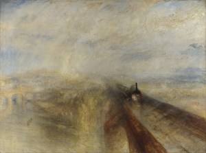
Rain, steam and speed JMW Turner National Gallery London 1844
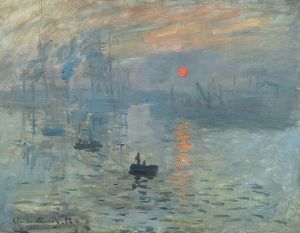
Impression, Sunrise Claude Monet Paris 1872
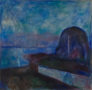
Starry Night. Edvard Munch Getty Museum 1893
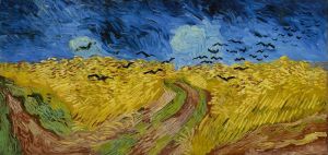
Wheat field with crows. V Van Gogh Van Gogh Museum 1890
Four out of the six are in Landscape format or the length of the top of the painting is longer than the side edge. The two that aren’t are Reynolds painting discussed above this is a portrait with a landscape, the second being (12)Van Gogh`s “Wheat, Sky and Crows this painting was painted on two square panels giving a 2:1 ratio which was unusual. This painting is possibly the last one he painted so all things were strange.
Within the
paintings the use of diagonal lines to take your eyes around the frame. Lines
of trees tend to stop before the edge of painting to stop your eyes leaving the
frame. All have a subject or focal point the lines lead our eyes to these
subjects.
Some have hidden messages such as the Hare in (9)JMW Turners “Rain, Steam and Speed” at the bottom right there is a Hare many think this depicts the destruction of the countryside as we “Hare” around.
Many of the
paintings use a curve to move your gaze, lots use a curved “S” to soften this
further. River shown going straight into the picture has less appeal than a
river or road that follows “S”. You can see this in (4)Munch depiction of the
coast in “Starry Night”. It helps you take a varied visual journey across a
blue night sky.
Thinking about who was responsible for the creation of the work I started by looking a little further back in history. Earlier artists such as Leonardo da Vinci and Michelangelo were funded by rich families such as the Medici family of Florence they then directed the artist as to what kind of work they wanted to commission. In the 18th Century artists tended to be commissioned for a single piece of work or a small series of paintings with a directed theme. Many were commissioned to show the subjects wealth with the painting even showing the type of animals farmed on an estate. This can be seen in (1)Thomas Gainsborough’s “Mr and Mrs Andrews”. You clearly see sheep and crops showing the type of farm they owned.
In the 19th century commissioned work became less popular with many artists completing work to further the chosen style of the artist. Many of the artists were not wealthy and their work became well known much later than the date it was created. Van Gogh died in poverty shortly after creating (12)“Wheat, Sky and Crows.
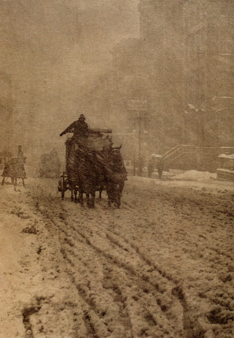
Winter Fifth Avenue, A Stieglitz 1893
Migrant boy. D Lange 1936 NY History in Photographs
Refugees arrive at Eftalou early in the morning on the Greek island of Lesvos M Honneger 2015
In photographic terms Stieglitz created many pictorial photos such as his photo of (13)“Winter” in New York. Dorothea Lange showed people in the fields in her work (14)“Migrants”. The landscape is populated with people struggling to fit in, in a new country. Bringing it right up to the present Michael S. Honneger shows the plight of Syrian refugees in his work for Amnesty International (15)“Refugees arrive at Eftalou early in the morning on the Greek island of Lesvos”, shown in Newsweek magazine. The last two landscapes have a political message which is strengthened by showing the portrait in its environment.
References
Boucher, F. The Bath of Venus. 1751. Oil on Canvas. Washington Gallery of Art USA.
Caspar David, Friedrich. The Sea of Ice. 1823. Oil on Canvas. Kunstehalle Hamburg Germany.
Constable, John. Salisbury Cathedral. 1823. Oil on Canvas. V&A Museum London.
Gainsborough. Mr and Mrs Andrews. 1780. Oil on Canvas. National Portrait Gallery London.
Honneger, M. Refugees Arrive at Eftalou Early in the Morning on the Greek Island of Lesvos. 2015. Digital Colour Photograph.
JMW, Turner. Rain, Steam and Speed. 1844. Oil on Canvas. National Gallery London.
Kaufman, A. The Sorrow of Telemachus. 1783. Oil on Canvas. NY Met.
Lange, Dorothea. Migrant Boy. 1936. Photograph.
Monet, Claude. Impression, Sunrise. 1873. Oil on Canvas. Museum of Art Paris France.
Munch, E. Starry Night. 1893. Oil on Canvas. Getty Museum USA.
Reynolds, John. Commodore the Honourable Augustus Keppel. 1749. Oil on Canvas. National Portrait Gallery London.
Stieglitz, Alfred. Winter-Fifth Avenue. 1893. Silver Gelatin. Public Domain.
Vincent, Van Gogh. Wheat Field with Crows. 1890. Oil on Canvas.
Wilson, Richard. The Destruction of the Children of Niobe. 1760. Oil on Canvas. Yale Centre of British Art. Wright,
J. Vesuvius Erupting from Portici. 1775. Oil on Canvas. The Huntington Museum USA..
Rosalind Krauss (Kraus, 2018) compares two versions of one photo O Sullivan’s Tufa Domes. She prefers the first version with its mystery and ephemeral feel. She describes the second version which has all the detail restored as being banal.
However once she considers the use of the second version being for a scientific journal the second version has to have the extra detail to show the structure of the portrayed volcanic strata. So the user dictates what the photo portrays. The discursive space is within the frame.
The next discursive frame is the gallery/museum. However whilst the two are similar they do have differences. The Gallery shows art, The museum shows academic photos however the wall space is virtually the same.
Work displayed in the gallery is deemed to be worthy whilst other work not. The work was made to fit to get on the wall so developed a clear language. This language is clearly in my sketch, learnt from all landscape pictures I have looked at. Work in Museums tends to document with an analytical eye on matte paper for science and exploration it gets a little flat in appearance.
This flatness stopped landscape being art, Peter Galassi (MoMA, 1981) said “The object is to show that photography was not a bastard left by science on the doorstep of art. It is a legitimate child of the western pictorial tradition.” Krauss and Galassi think landscape is worthy in its own right.
Describing it as needing to move from analytical to synthetic so getting away from the technical aspects of the chemistry and documenting the view in a straight way., but to look think and show the emotion in the landscape so create art.
However O Sullivan’s (Getty Library, 1867) work was not shown in galleries he had to show it via Stereoscopic viewers. Over 500,000 were sold with 100;000 views to look at so this popular medium was a great place to showcase his work.
It is interesting to note that at this time 1850s the term landscape wasn’t used but view was. Work was still needed to gain acceptance in the art world. this was the start of it.
The essay made me realise that I have a way to go get to this level of writing. However I would like to write more like this but keep my personal voice. The piece was thought provoking and made me think of the struggle the early photographers had getting work accepted as art.
My father has a stereoscopic camera and viewer I must borrow it sometime to better understand the process.
Work Cited
Galassi, Peter. “Photography: Painting and the Invention of Photograph.” The Museum of Modern Art, 1981, 11–18. Kraus, Rosalind. “Photography’s Discursive Spaces: Landscape/View.” Art Journal 42, no. 4 (1982): 311–19. O Sullivan, Timothy. Tula Domes. 1867. Silver Gelatin, 22.4×27.8cm. Getty Library.
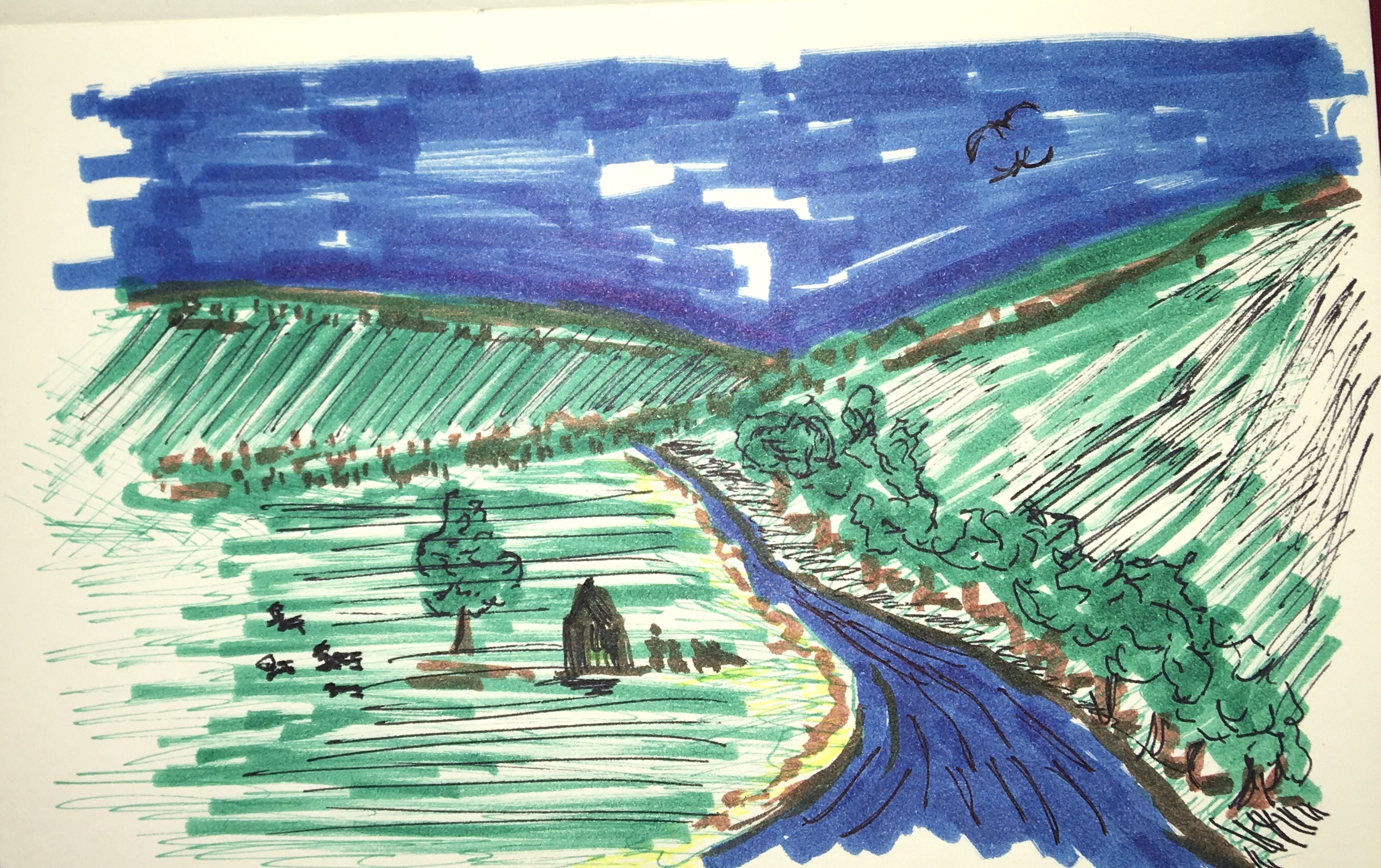
Beginning this course we are asked to draw/sketch our response to a landscape. It doesn’t have to a real landscape just our response to the word Landscape. This is my response.
Looking at my drawing I see certain things, some of the things have been learnt during my early life. My landscape could be from a chocolate box, pictorial and cliched.
Here is a list of what I see when looking at my sketch.
1. Represents where I live (vaguely).
2. Follows rule of thirds.
3. Diagonal lines move your eye around the scene.
4. River gives depth taking the eye into the picture.
5. Building shows the landscape was used.
6. People give scale and show the land was worked.
The most interesting thing to me is I have drawn where I live. Did I choose the landscape or did it choose me?
The picture is drawn in the accepted norm of Landscape format which has the longest edge at the top. How would landscape look in square frames, how could portrait format be used in landscape?
The terrain shown is a river in a rural valley. Large areas of green and blue. People were added to highlight that the land is being utilised.
The picture is divided into zones by the lines of the land and the river. I have used the rule of thirds automatically. Already I see some rules embedded within my psychi. How can I break these rules to get better pictures?
The mood of the picture is calm, tranquil and is non threatening. Flood the river and the scene changes completely. It is the british countryside we all think of when we see car adverts I wonder if it exists?
Over the years I have looked at paintings, drawings, photographs in galleries, magazines, books and on people’s walls. For several years I subscribed to the magazine “Outdoor photography”. In fact it was an advert in this magazine that started my adventure with OCA.
Throughout my life I have always loved big places, wilderness. This shows in my sketch. This keenness to show the landscape has led me to this course. Now I am here I want to develop new ways to see and think about the landscape to help me depict it in very different and more dynamic ways.
Whilst this Excercise felt frivolous it has been extremely useful to start me thinking, looking and questioning the things I have learned over the years.
The first question comes straight from this exercise……..Why did I sketch what I did?
My name is Michael Green I live in Yorkshire England and am studying with the Open College of the Arts for a degree.
I enjoy diving and have done this all over the world in places such as Bikini Atol, Palau and Antarctica. My favourite place is still the UK waters and her shipwrecks.
My degree will be a Bachelor of the Arts and I am just starting Level 2 with the module Landscape.
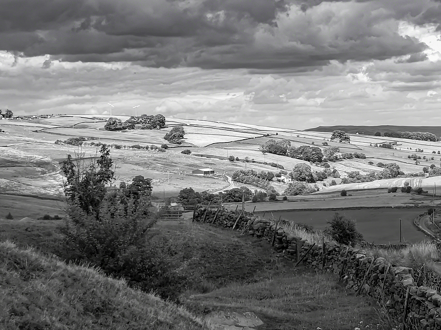
I live just outside the Yorkshire Dales National Park and so I look forward to exploring this place to complete work for this part of my studies. However I am findings lots of interesting potential for projects right here on my doorstep.
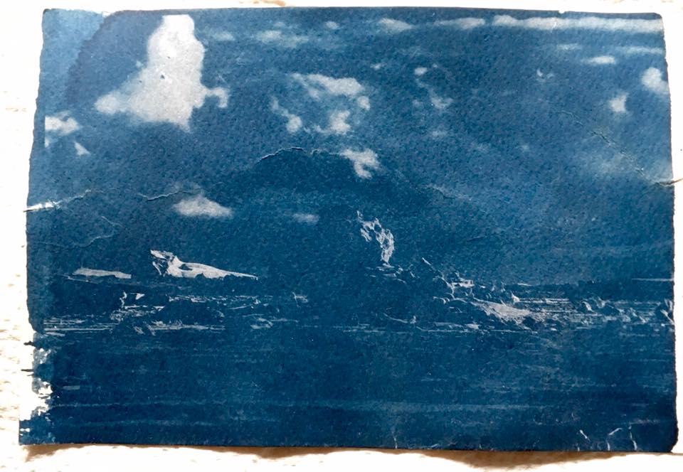
I enjoy all aspects of Photography however I am developing a real interest in the old techniques used in the past to produce pictures of light. I am learning Cyanotypes at the moment and will post some, soon.
If you like my work let me know, if you are learning too let me know. I enjoy working with others and if you are doing something else I would love to hear about it.
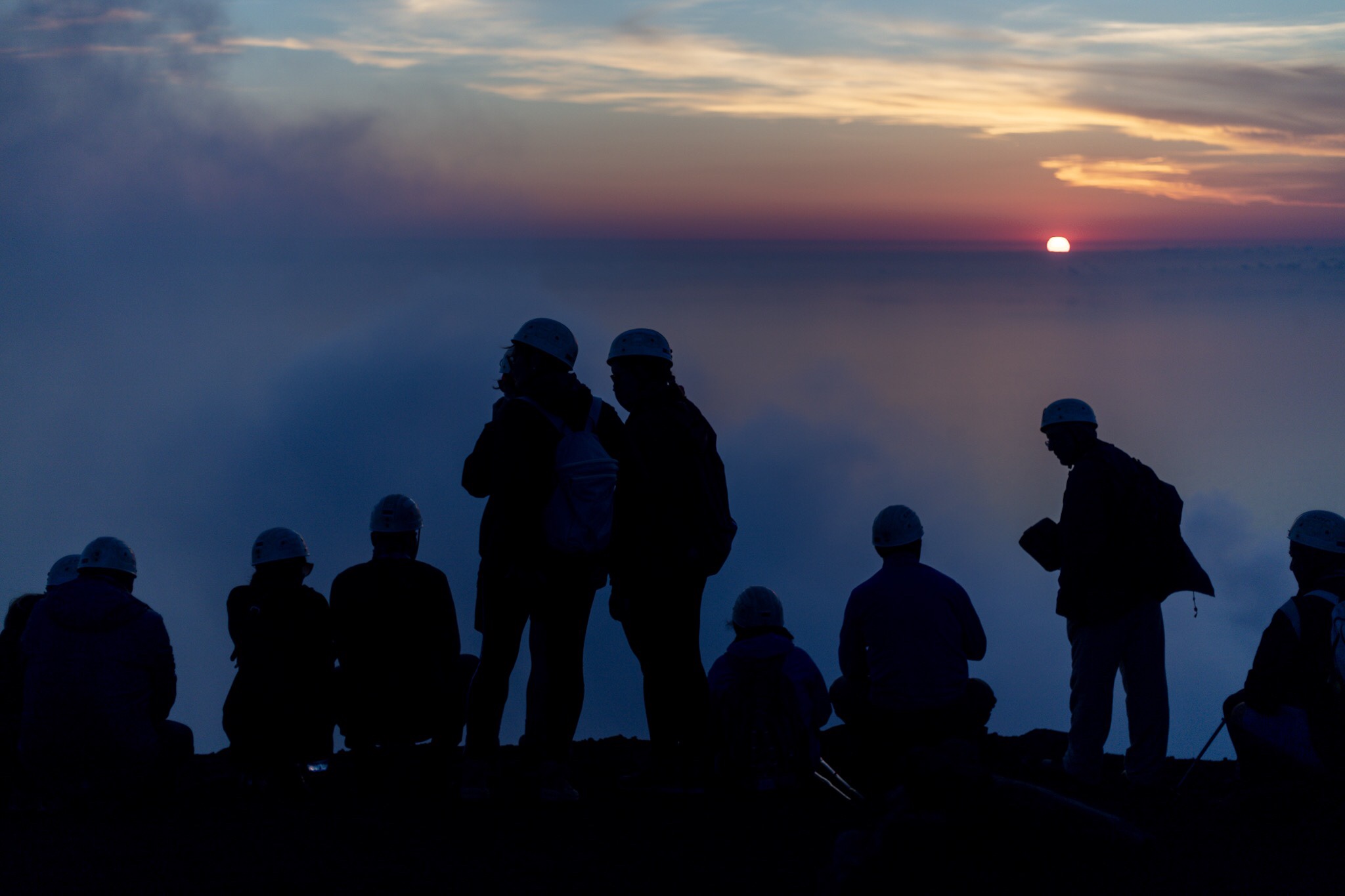
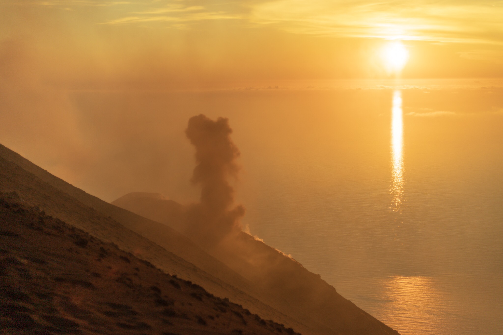
AntarcticaPeople watching the sunset on Stromboli.Stromboli erupting.Cyanotype of IceStorm cell explodesSunriseSnow and IceHome.