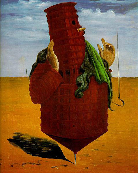
I felt it was appropriate after seeing David Hockney making Four Seasons in Warter Lane to do some research about what the work is about and how it will compare with my work.
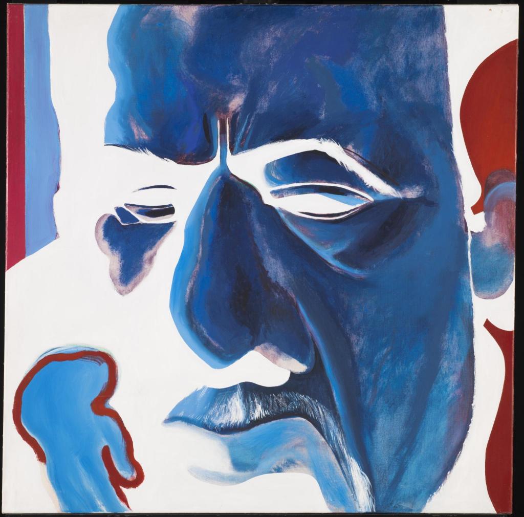
Oxtoby Mingus Deep Blue Redfern Gallery
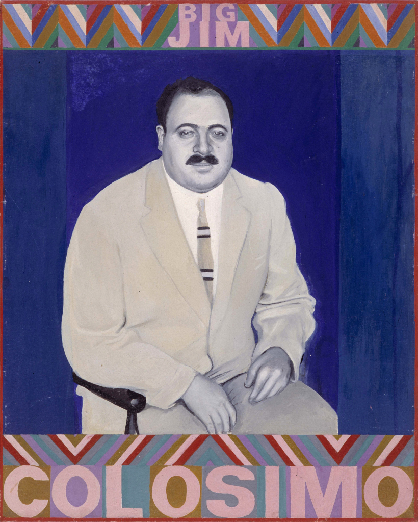
Boty Big Jim Colosimo. 1963
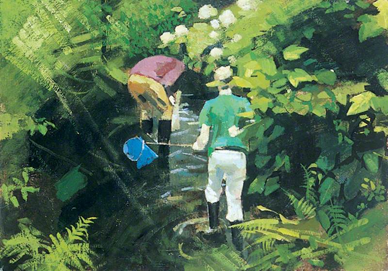
Lisle, Boys Fishing; Burton Gallery, University of Leeds.
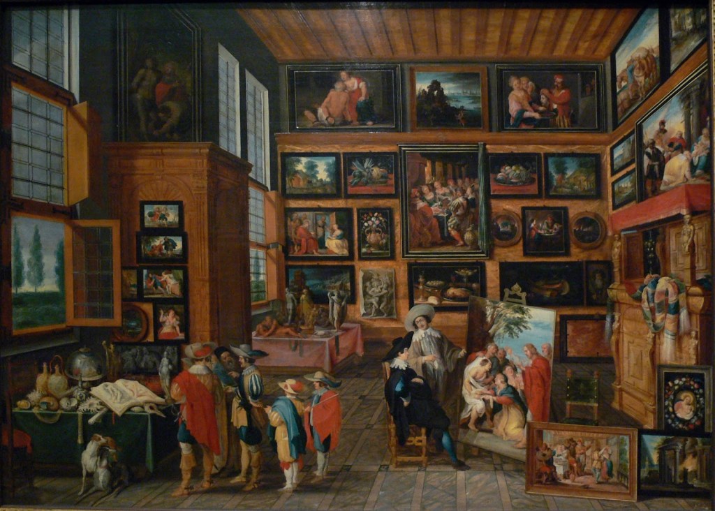
Gallery of Works by David Hockneys fellow students at Bradford College.
David Hockney was born on July 9th 1937 in Heston Bradford. He went to Bradford Grammar School then into further education. He studied at Bradford College of Art where he was tutored by Frank Lisle his peers included Pauline Boty and David Oxtoby.
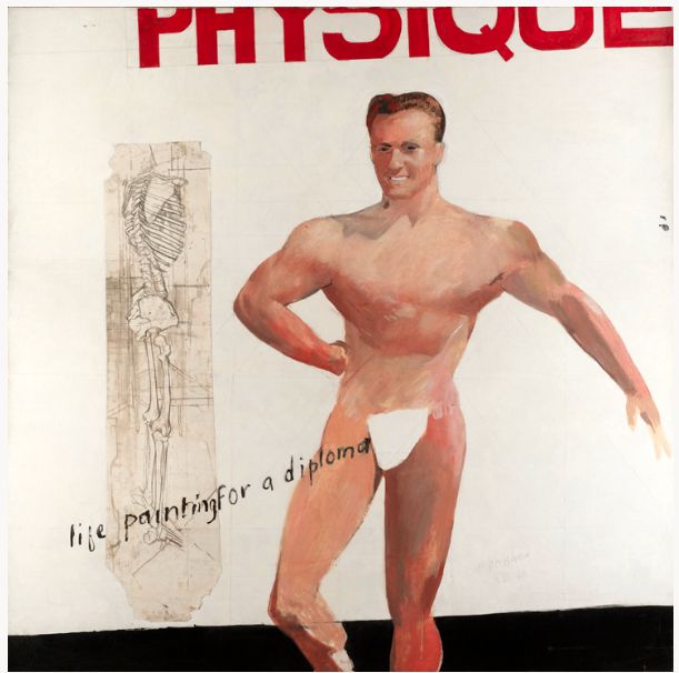
David Hockney Life Painting for a diplome Personal Collection 1962.
He progressed to the Royal Acadamy of the Arts in London. In 1962 the Royal Acadamy wouldn’t allow him to graduate until he produced a nude, life studyhe did calling it “Painting for a diploma”. Show both his rebellious side and his sense of playfulness. He proved to be an accomplished droughts man and artist with a keen interest in using new technology in his work. (BBC,2013).
He taught at Maidstone College for a short period before following his desire to be a stand alone artist. (BBC, 2013).
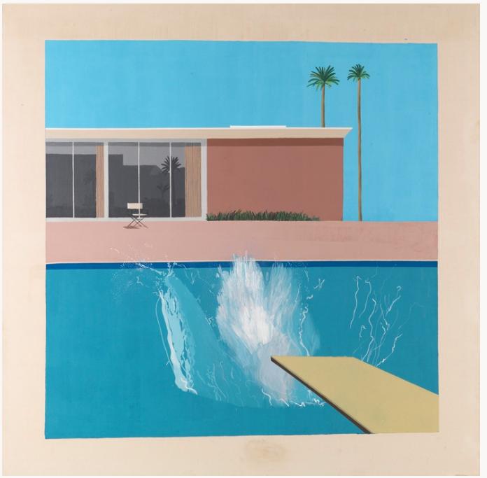
David Hockney “A Bigger Splash” 1967 Tate.
David Hockney then moved to Los Angeles and created a studio. He worked on projects including paintings, Lithographs and photographs. One of his most important works “A bigger Splash” was painted in his swimming pool. He experimented with photo collages making one of a blue balcony which subsequently led to the work Four Seasons which influenced my work for assignment 6.
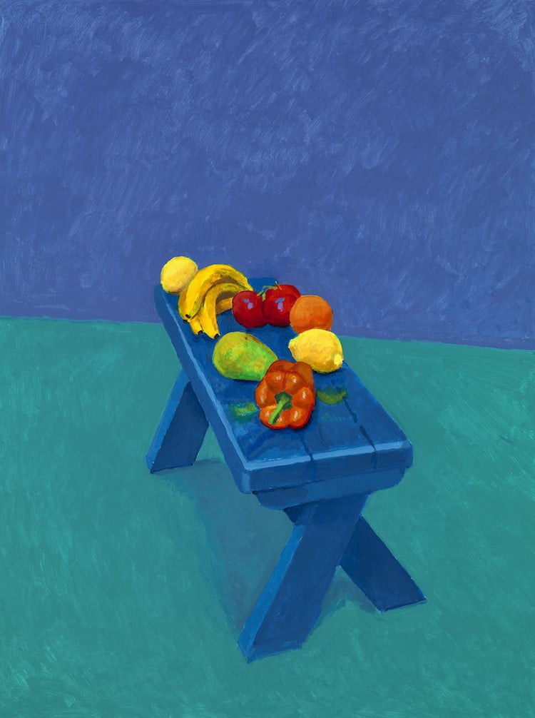
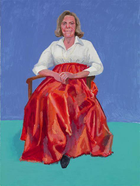
82 Portraits and 1 Still life David Hockny Royal Acadamy of the Arts.
He exhibited 82 portraits and 1 still life at the Royal Acadamy in London. These portraits are in vibrant colours and have the subjects seated. It has one still life of fruit on a bench. Each portrait had to be completed in 3 days. All have the same background and the same chair. The still life has no meaning it is in the exhibition as an after thought.
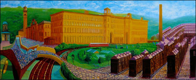
Salts Mill David Hockney Gallery 1853
He support his friend Jonathan Silver who he had met at Grammar School to set up Gallery 1853 in Salts Mill, a building Silver saved, renovated and dedicated the Gallery to David Hockneys work. It houses one of the largest collections of his work in the UK. One being a painting of the mill in the entrance to the mill.
The Arrival of Spring at Gallery 1853 Salts Mill (Hockney).
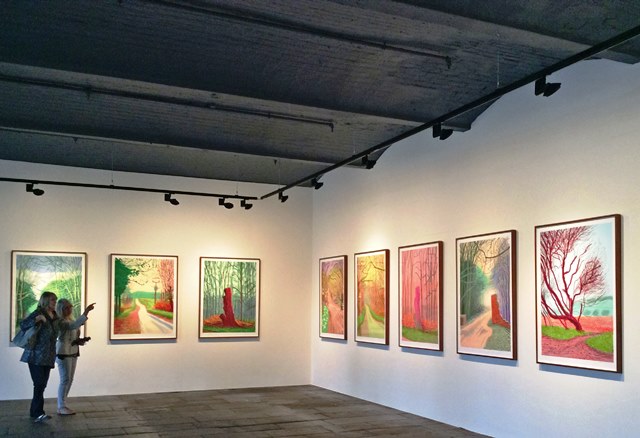
Some of that work is David Hockneys Ipad work drawn in the Yorkshire Wolds the setting for Warter Lane the inspiration for “Four Seasons”. Also set in the Wolds are the massive paintings of the landscape entitled “The arrival of spring showing his embrace for new technologies.
Using video he uses different technology to take us into the Wolds Landscape in a different way. He didnt do it at the time but he recorded a disappearing landscape as the copse shown was to be chopped down. David Hockney tried to save it to no avail (2011).
Here is the video of hockney discussing Four Seasons.
Hockney speaks about “Four Seasons” on the Frieze website he says “Bertie says Perspective is a window, So where are you as the viewer? In a room not the landscape, lots of pictures counter act perspective putting you in the landscape not in the room, most photographs are flat, by changing the perspective this work is about time and space and more….” (Frieze, 2018).
In another video he made for the Smithsonian Channel Hockney talks about “I realised a photo has no life, unlike a painting, a paint artist spends hours looking at the subject before making a picture”. He continues “A camera looks for a fraction of a second”. In the video he is discussing his collage work and the way he uses time and space to create perspective in his collages. My research on Time and Space is here.
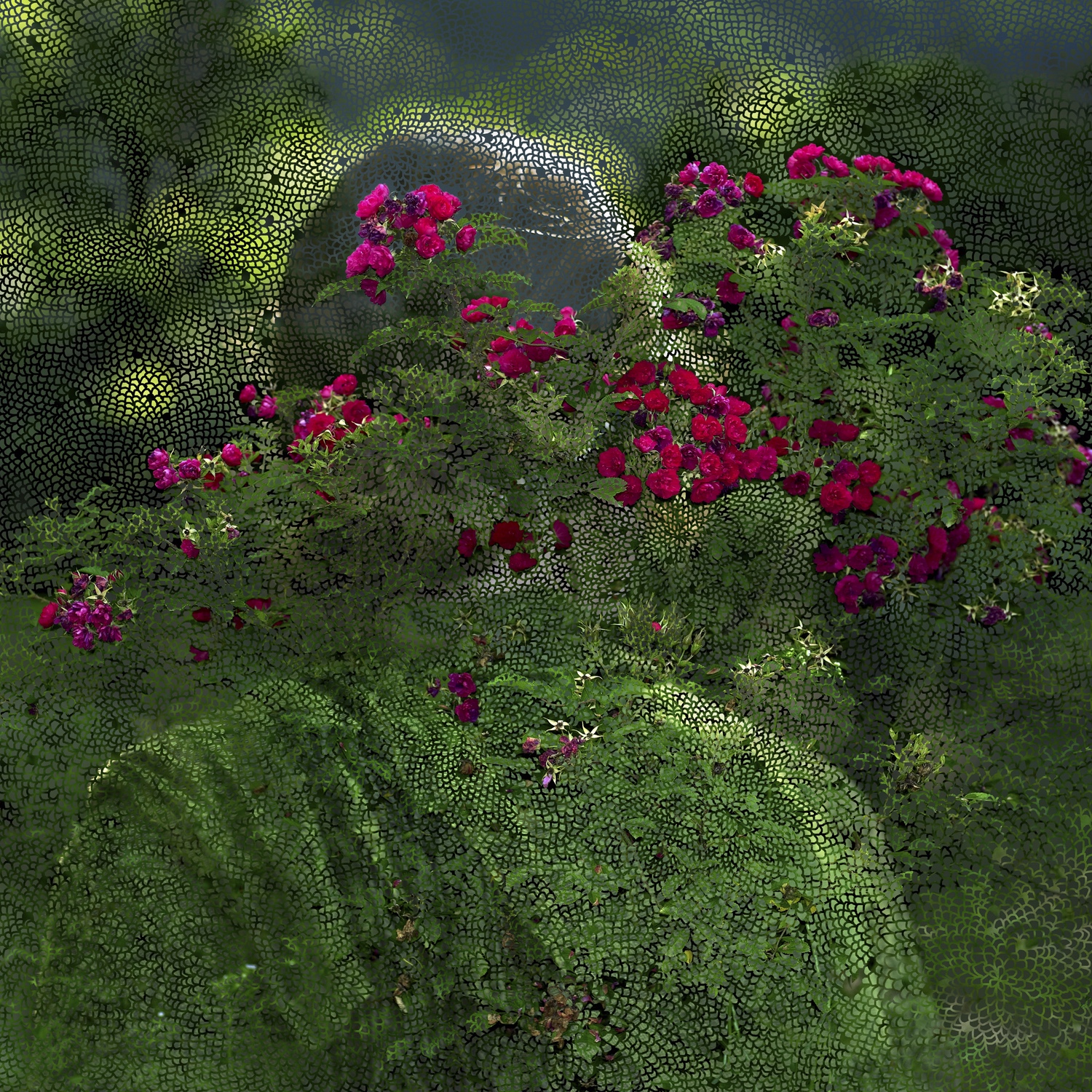
I want my work to put you in the landscape rather than just show a flat photograph. It is a dynamic living space that is there whatever is happening in the human world. I want to use still images so will have to take more images (12) in fact 72 to cover the year. I will change perspective by shooting images that are not stitches and will not align to make the viewer work harder to see the message.
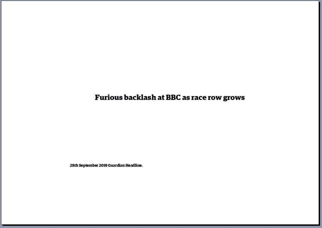
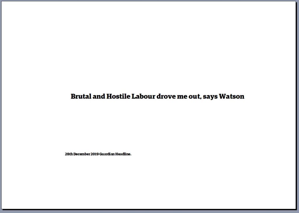
The headlines from the Guardian will make my work different to Hockneys. However it is a key part of what I want to say.
Sitting in a room with the four screens of nine is a soothing experience, more soothing than walking down Warter Lane. Being in the middle of the screens makes you feel totally immersed in this installation.
Work Cited
David, Hockney. One Still Life. 2014. Acrylic on Canvas. Royal Academy of the Arts London. Hockney, David. A Bigger Splash. 1967. Oil on Canvas, 95 1/4×96 inches. T03254. The David Hockney Collection. https://thedavidhockneyfoundation.org/chronology/1967. ———.
Four Seasons. 2017. Video Installation, 36 screens making four images. Frieze Video. ———.
During my work for Assignment 5 I found Helen Sear. She is an artist who states she was influenced by David Casper Friedrichs. I couldn’t move on until I had completed some research into Helen and her work as she was unknown to me.
Helen was born in 1955 in Worcestershire in sight of Wales. She has made her reputation from her studio in Monmouthshire, Wales. As a small girl her father used to go on long walks with her where he taught her about the countryside and nature.
She came to prominence in 1991 when her work was included in the British Council exhibition “De-Composition Constructed Photography in Britain”, this exhibition was popular in Latin America and Eastern Europe (1997).
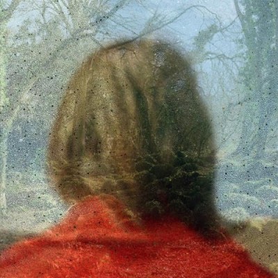
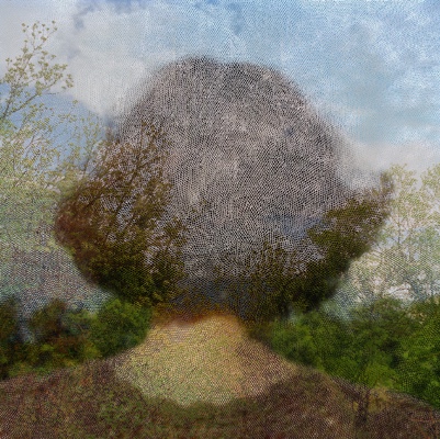
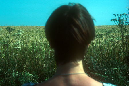
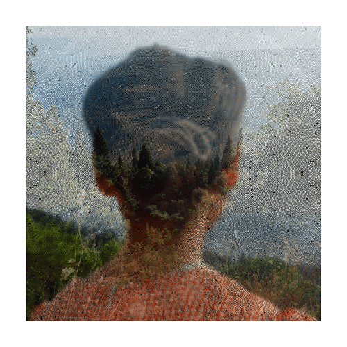
Artsy (2018) says of Sears work, “She explores her/our relationship with the natural world”. Her work “Inside out” (Sear) reminds me of Friedrichs work with the subject back to camera Helen adds elements to make the photo painterly and dreamlike.
Sear describes her work as a “Double time of image making” referring to the time between taking the initial image and the time during which she superimposes her photographic images (Artsy, 2018).
She was educated at:
1975-1979 Reading university, BA Hons.
1981-1983 Slade School London, HDFA.
2009 PhD University of Newport, Wales.
Jane Wainwright writing in says of her approach “I am trying to slow down the instantaneous of the camera” Wright continues about Sear “ She highlights the ordinary, making it extraordinary. Forcing the viewer to engage with the work and puzzle out the image”.
When Wainwright asked Sear if she had any particular artists or pictures that influenced her work she replied “I am interested in Romantic Painting particularly the work of Turner and perhaps the German romantics such as David Casper Friedrichs.
Pushed further she continues “The people who influenced me were in the end the ones who taught me at college. At the Slade artists like Tim Head and Helen Chadwick” (Wainwright, 2000).
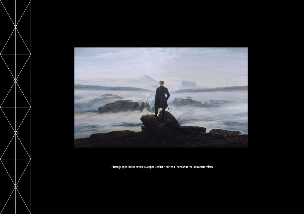
Friedrich`s “Wanderer above a sea of fog” (1818) must have influenced Sear as it did me. However I can not find any specific reference to it doing so. When I look at Sears images I see a similar message as the one I wanted to portray however Sears images have added layers where mine are straight photographs. I want to experiment with this technique and will do so before I leave this research.
Three images from Helen Sears work “Inside the view” (Sear, 1997).
Valerie Reardon wrote off Sears’s body of work, “Sear draws on the Freud’s notion of the “unheimlich” the uncanny sense that what is hidden is also somehow ghastly. Jacques Lacan reworked this notion and came up with the term extemite a blurring of the line between interiority and exteriority which points to neither but is located where they coincide and become threatening”(1998).
This paragraph was challenging to me I didn’t understand the two words unheimlich and extemite. So I had to spend some time understanding them both. The former means Uncanny/weird and the latter means the lines become blurred and thus threatening. I can see this Angst in Sear’s images at first glance they look sweet but when you look and see the layers they take on new meaning which to me are somehow dark.
David Campany compares her work with Fox Talbot’s image of lace “Talbot placed black lace directly on to sensitised paper and exposed it to the sun, The lace appears white on a dark background it doesn’t look like a negative, the flat fabric is so well rendered by the simple technique. It is stoic and removed yet the light that touches the object then touches a receptive surface” (Campany, 2005). This is talking about the single layer Sear adds more layers to create her art.
Having looked at this work I thought that at first sight it seems simple. It is not, within the square frame are complex layers. The more I look and reflect the more the work asks me to think. I like Helen Sears work very much and I think I will have to explore the artists who influenced her.
Earlier I said I would experiment with how I see Sears’s images and here is that work.
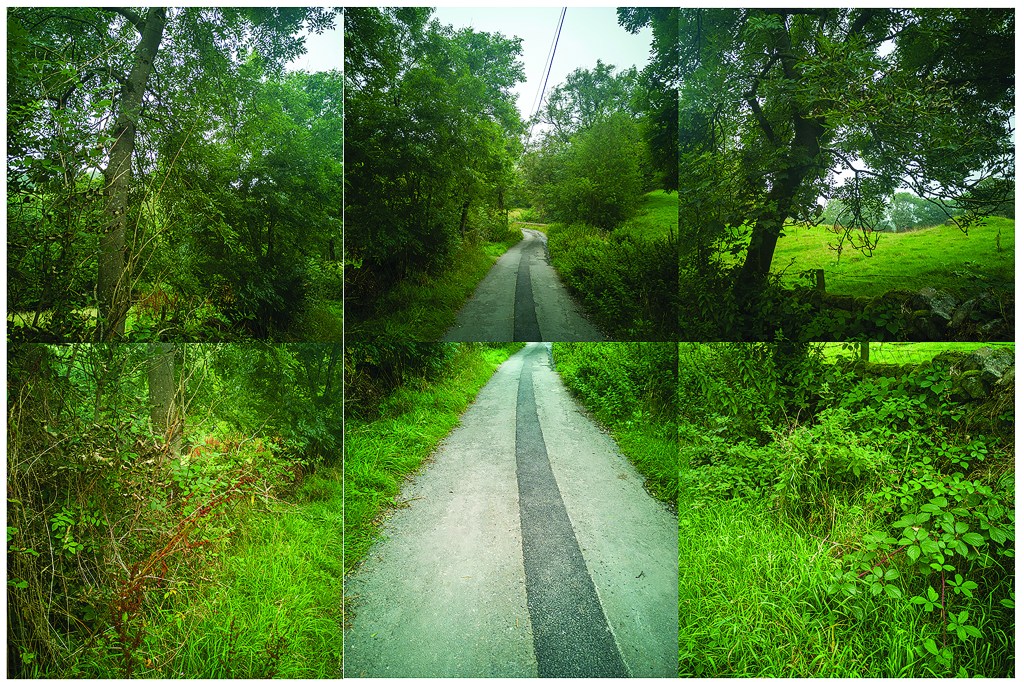
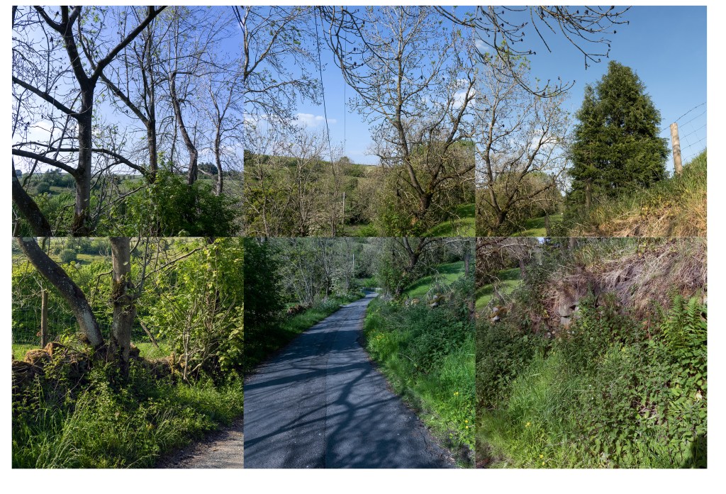
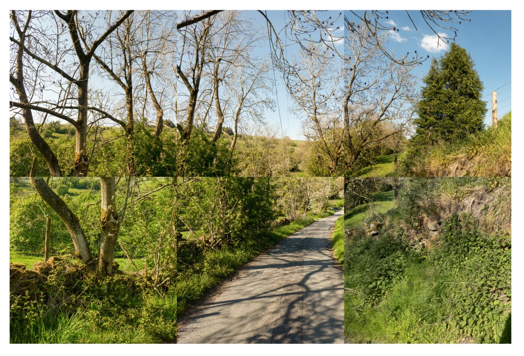
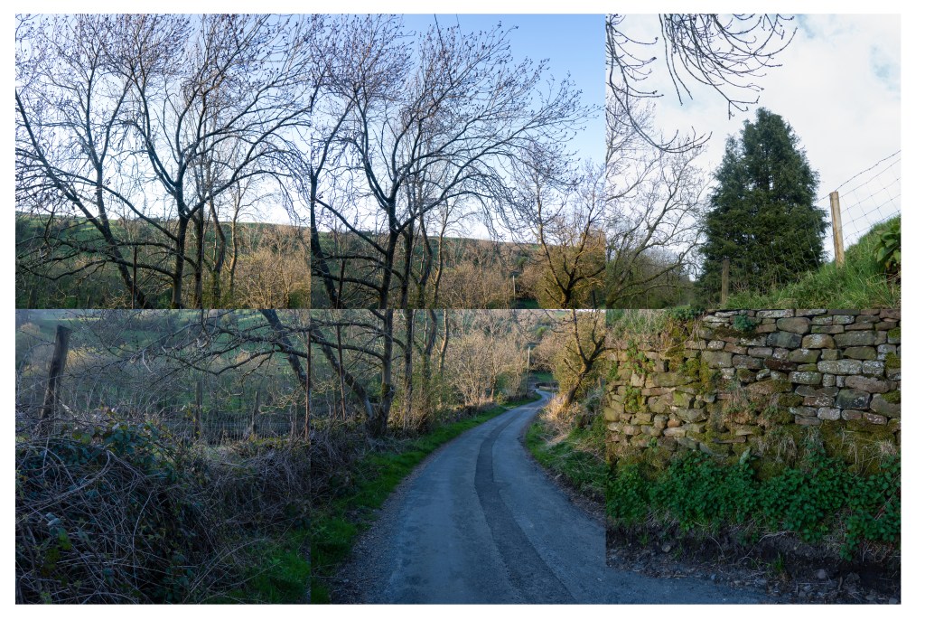
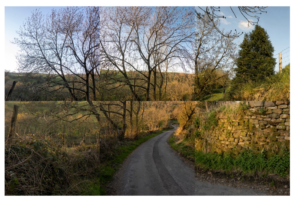
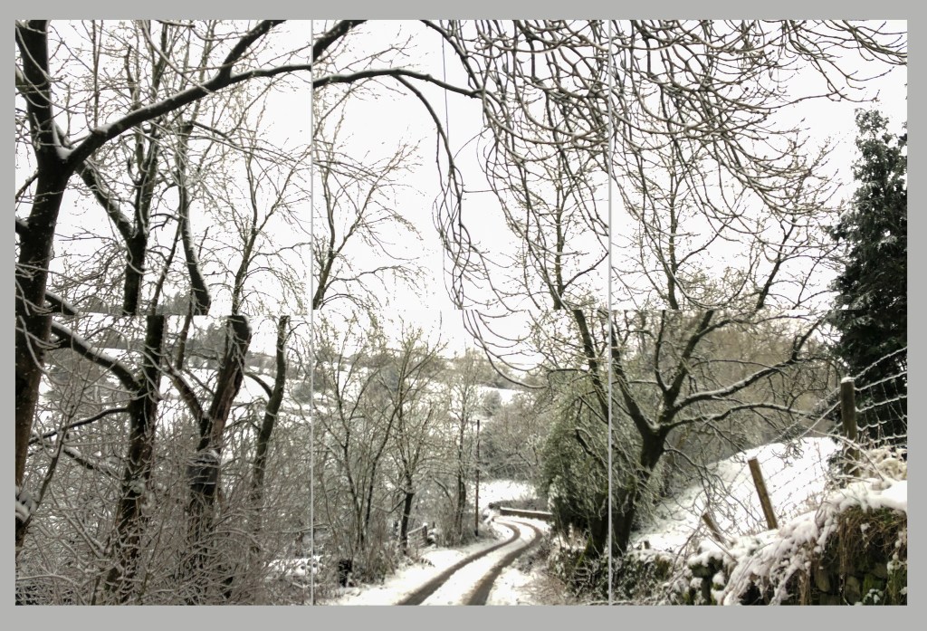
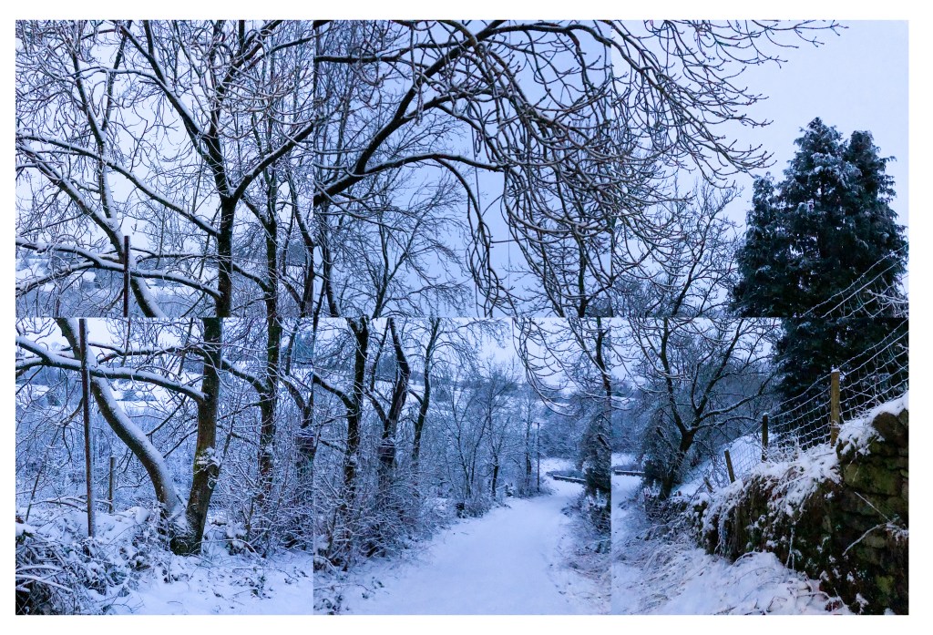
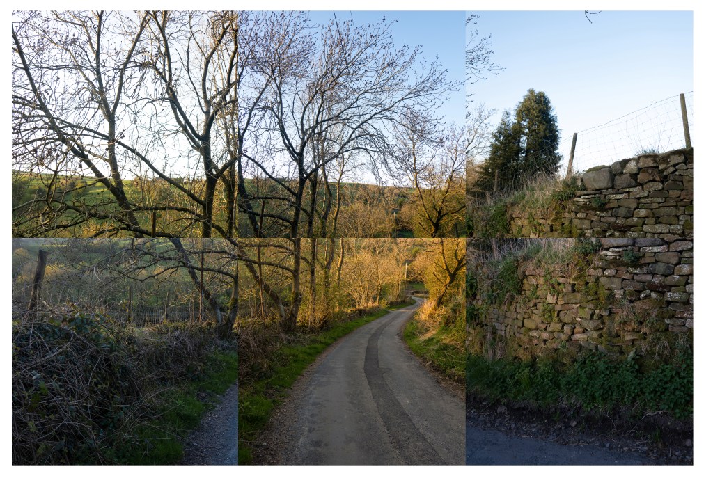
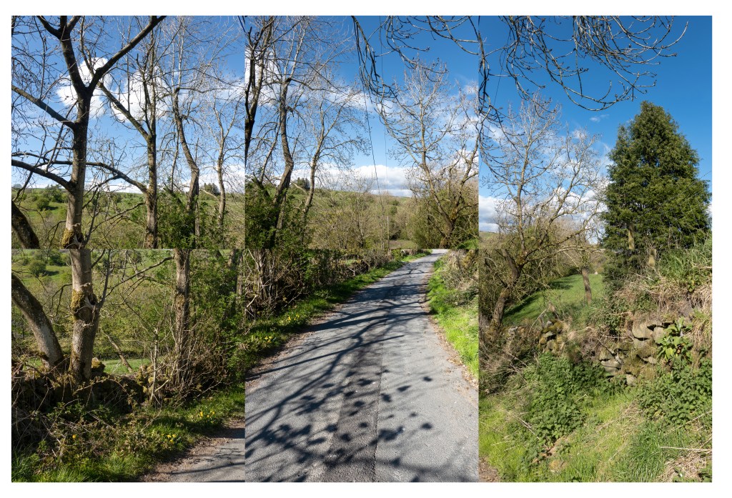
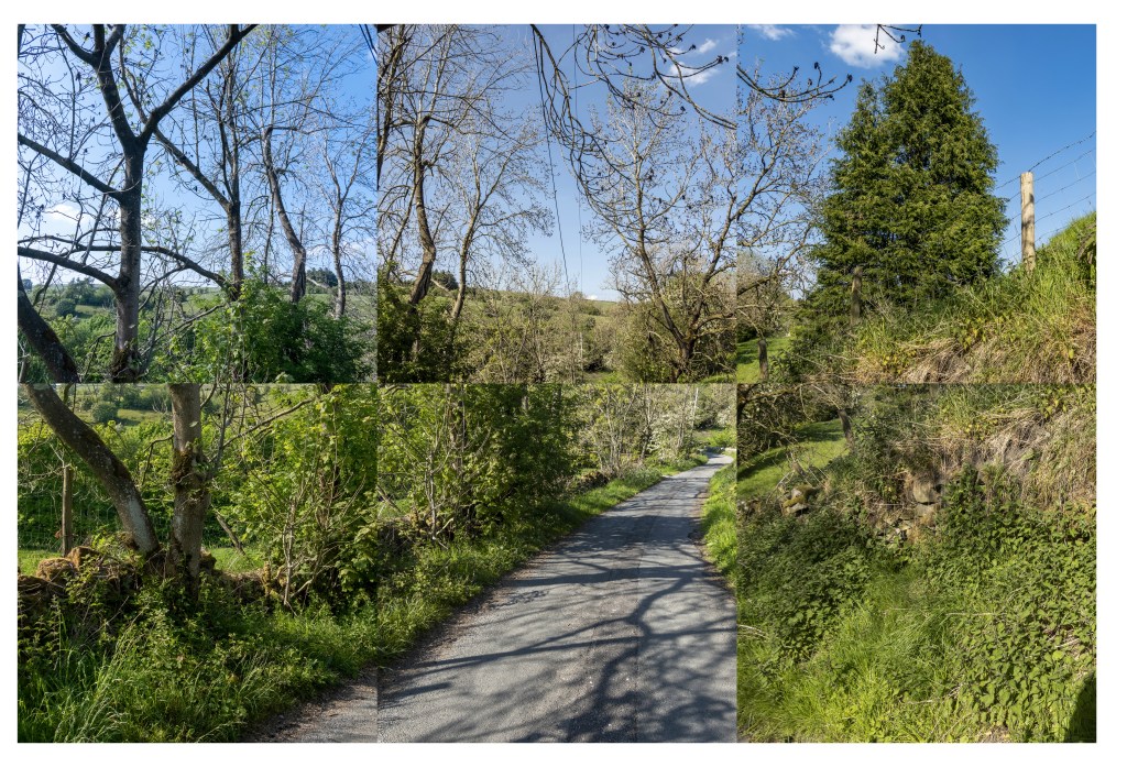
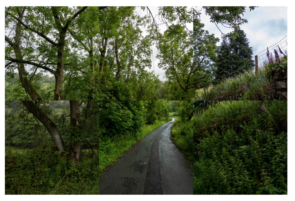
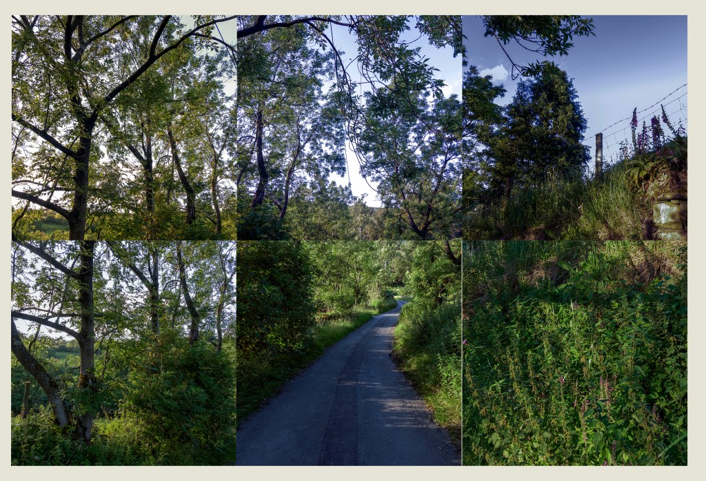
Transitions is a good title for this piece of work as I feel there have been many transitions in the months I have spent creating this work. Here I will think about some of these transitions, both in me and the landscape I chose to show. I would like to begin by writing about the reasons I chose Shop Lane for the work I completed.
Shop Lane is about a quarter of a mile from home so easily reachable from home. I walk along it almost every day and I see the changes on a daily basis. It has many features which would allow me to work from the same perspective for each exposure. It is part of a dynamic system both naturally and shows its position in a man made environment which nature alters. Shop Lane has existed through all the traumas man has made since it was built in the mid 1800s but remains as a constant. This was the main reason I chose it, it says to me whatever the world is experiencing this road is present, constant and reassuring.
First the transition within the landscape. At the outset I had visions of showing the four seasons our nation is renowned for. Whilst my photos show the dynamic changes within the landscape they are not the four equal and distinct seasons I was expecting to capture. The weather was mild through the Autumn even into December, the leaves fell from the trees and blew away but the foliage in the undergrowth took advantage of the mild weather and stayed around. We had two spells of cold weather in January and February but not the prolonged spells I remember as a boy. This set of images shows just one year it is not enough time to make any conclusions so it may be interesting to continue this project for several years.
Next the transition within me. I have changed a lot throughout the period of time I have spent on transitions. The biggest change has to be the way I now write. I knew I would struggle with Assignment 4. I used a lot of time reading and practising writing and referencing. There is still room for me to improve and I will be working hard to do so. I read Umberto Eco, How to write a thesis, Eco, “How to Write a Thesis”. and Cite them rite, Pears, “Cite them Rite”, whilst spending time reading and practising writing with the Royal Literary Fund Unknown, “Royal Literary Fund”, an informative website for learning and practising writing.
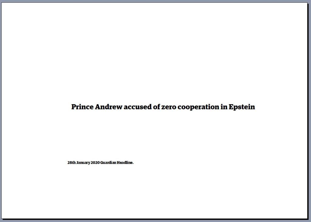
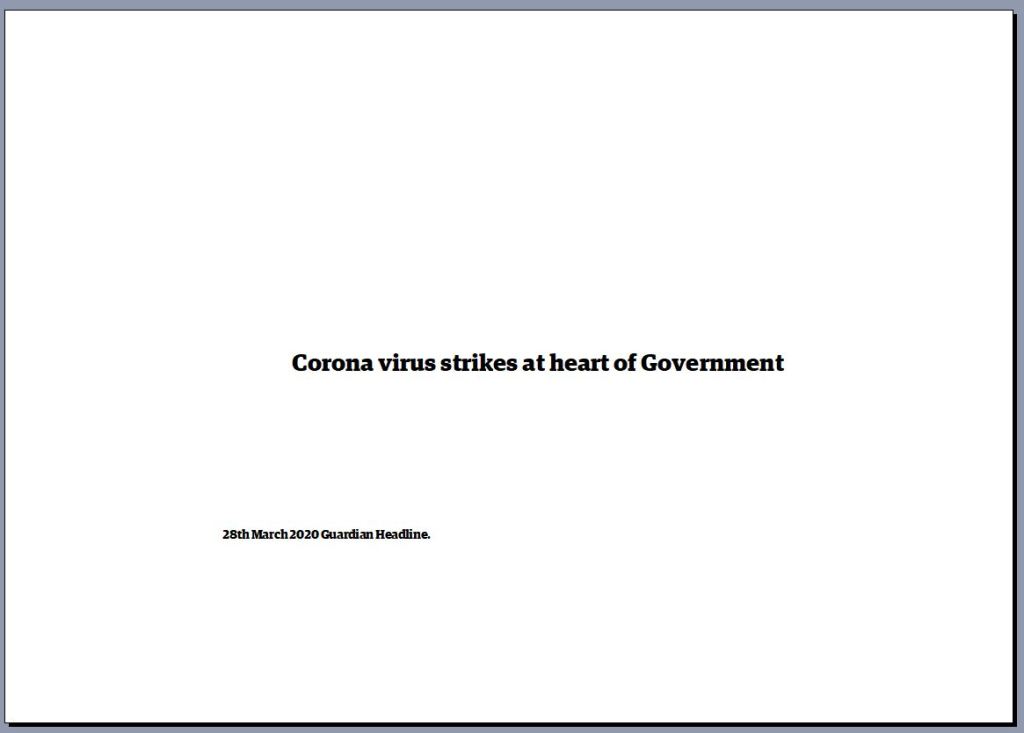
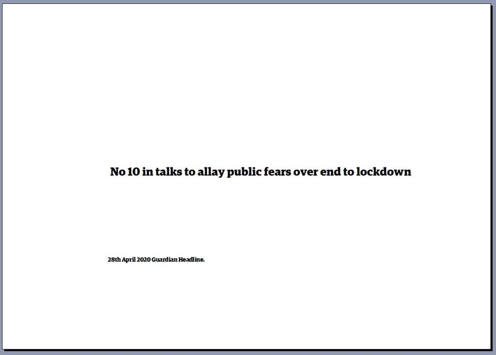
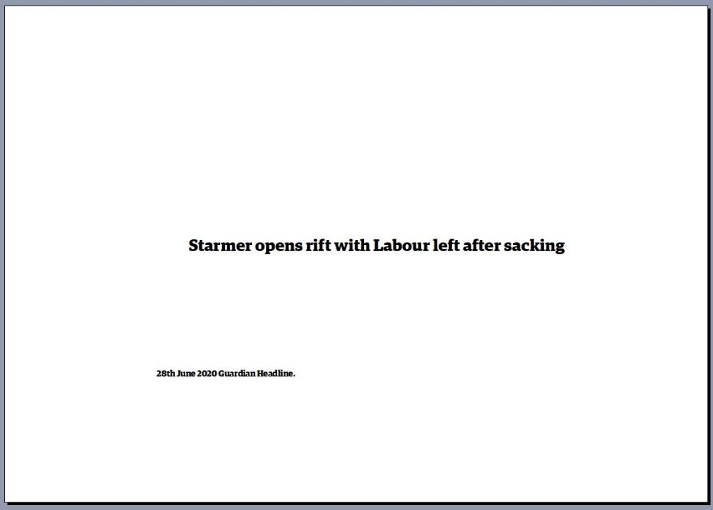
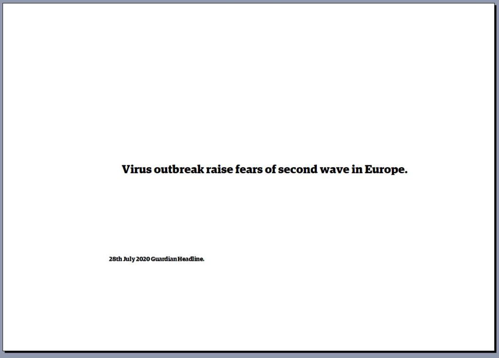
Finally the transition in the political world evidenced by the headlines I took from the Guardian newspaper Unknown, “The Guardian”, on the 28th of each month or if the 28th was a Sunday I show the headline from the previous Friday. When I started out I expected the main topic in the headlines to be Brexit with the odd curve ball such as a scandal or a disaster. It is no surprise that Covid 19 has been the main headline. In fact Brexit is only mentioned in one Headline with scandals in the Houses of Parliament and another announcing Prince Andrew not co-operating in the Epstein enquiry. The world is enduring a huge transition which I could not have foreseen at the begining. However the reassurance that places like shop lane endure, and all will return to equilibrium eventually is visible to me looking at the landscape all around
Taking these photographs has taught me to think how I can portray a message differently. A photograph iS a snapshot of time. Limited by the space in the frame.Taking the images monthly allowed me to show this dynamic system and how it changes. Using multiple views allows more space to be shown. With the outcome being this work shows the superficial change however my main message of reassurance is also their reinforced by the headlines. A single image would have been more difficult to show this message. I feel these images have allowed me to show the viewer time and space. Altering the perspective of both.
Thomas McEvilley writes the introdution of Brian O Doherty s book Inside the White Cube. O Doherty, Inside the White Cube. Below I consider the parts of the introduction that stood out when I read it. Then I want to answer three questions. 1 Where did the White Cube come from? 2 Why was it used? 3.How has it been used in recent times?
First McEvilley compares the space created to display art as a place of reverence. He writes “Constructed along laws as rigourous as those for building a medieval church”. I have experienced spaces like this they make me feel humble. Later he writes “The outside world must not come in, so windows are usually sealed off, the walls are painted white, the ceiling becomes the source of light”. Giving a spiritual almost religious experience. Next he takes a step back in time and discusses the art painted on the surface of caves. These spaces are generally difficult to get to with deep tunnels to traverse before you arrive at the art, so you make a journey to get to the art. Later Egyptian burial chambers are covered in vivid art however this structure is built to exclude all but the deceased from seeing it. Both of these galleries are difficult to enter and are linked by the dead and the visitor must be elite.
Secondly McEvilley writes about the eye and the spectator “The prescence before a body of art”. By this I believe he means we are reverent. No talking or laughing, no enjoyment just silent staring as if the eye as become disembodied and is staring blankly at the work with no feeling or emotion.
In the third section McEvilley talks about the thing, the piece of art and discusses a gallery that was empty and one that was full of rubbish. Whatever you think of this it has a message about the kind of art we place in our galleries. Both would have provoked thought and discussion around the relevance of art. Pythagorus and the Pythagorean’s said, “at the start there was nothing, a blank space,” much as in the White Cube.
So after reading this introduction I have several questions. I try to answer three of them below.
Early Flemish Gallery 17th Century.
1. Where did the White Cube come from? In time gone by galleries were cluttered with many pieces of art on the walls. They tended to be private collections held by the wealthy. Public Galleries were formed in numbers in the 17th century. They still remained cluttered with many pieces on the wall. In the late 19th century Galleries became more ordered with space dedicated to lesser number of pieces so you could see and study the work. The decor was considered with different galleries using sympathetic colours to compliment the works on display.
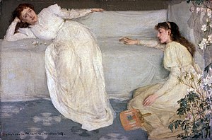
6JAM Whistler Symphony in White No3 1867 Birmingham Art Gallery.
In 1867 the American artist James Abbott McNeil Whistler painted “Symphony in white no 3” Whistler, Symphony in White No3 the third painting in a series. People discussed what the ladies were. Are they ladies of the night or a bride and bridesmaid. Whistler only ever told his elite set of friends that it was just what the title stated a symphony in White and no more .American Art History and Culture 1993.Craven, American Art History and Culture.
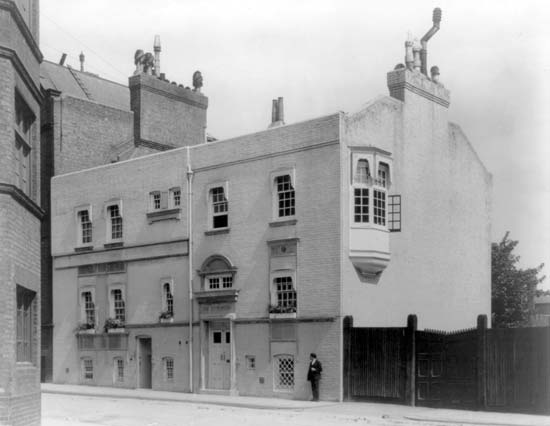
Whistlers Chelsea White House 1879.
In May 1879 after losing a trial against John Ruskin who criticised his work. Plus carrying out expensive work on his house the White House. Whistler was made bankrupt. A friend gave him a contract to make views of Venice. He exhibited them at the London Fine Art Society. Craven, American Art History and Culture. This exhibition was totally different to any before. The room was White, the work was mainly white, the furniture was white even the attendants wore white uniforms. The pictures were displayed with large blank spaces between. The press wondered if some of the pictures were missing.
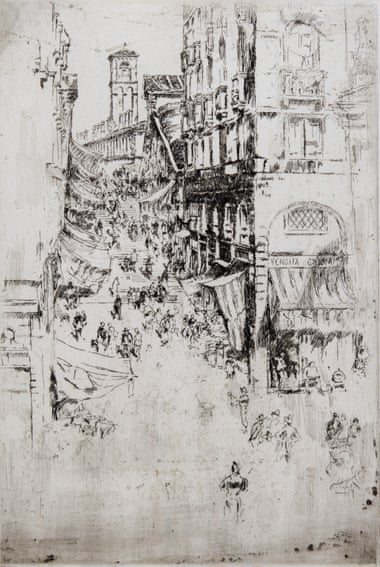
JAM Whistler etching of the Rialto Bridge 1879 Whistler, Rialto Bridge.
2. Why was the White room used? The critics didn’t like it saying it felt as if there was nothing to see in the room. The art world enjoyed it it made them feel elite and a cut above the rest. Whistler had an obsession with the purity of white dressing in white waistcoats, living in the White House in Chelsea and even having a white Quiff of hair. He used the White Room to impress his arty elite friends so they could have an art secret making them aloof from the public.
3 How has the White room been used in modern times? My feeling is that the White room style of gallery is used in mainly commercial galleries to encourage buyers of art convincing them they are buying into an elite world. This sterile environment is employed to show off the product a little like a car showroom. At least the car showroom as an excuse to be white, we wont buy a car that leaks oil onto the floor.
I have considered the Where, the why and the how after reading the introduction to the book. Galleries should be places where we can giggle, talk, smile or even laugh as we enjoy artists work. These sterile white spaces show work off in radiant light but the feeling and emotion is destroyed because we the viewer is stifled by the environment. John Saatchi called the White Cube style Cliched, Worryingly out dated and Anti-septic. Milner, “Saatchi Turns on Cliched Britart Rivals.” Could it have been sales that encouraged him to keep the White Cube open long after his article in the Telegraph? Whilst the White cube has its place it should be used sparingly and not as the normal way of displaying art.
My work projected into the White Cube.
Work Cited
Craven, William. American Art History and Culture. One. McGraw-Hill Education, 1993.
Whilst discussing my work for assignment 5 it was pleasing to hear my tutor liked the work and was great when we explored the work and found areas for improvement. After our video meeting I set to work completing the following work to fine tune the assignment.
First I corrected the spelling of Evaluation in the title this had been auto corrected to evolution and I had missed it when proofreading. This is my first learning to be more attentive to detail when checking my work so errors are eradicated.
I also added a short piece of writing about what I felt photography added to my work compared to painting.
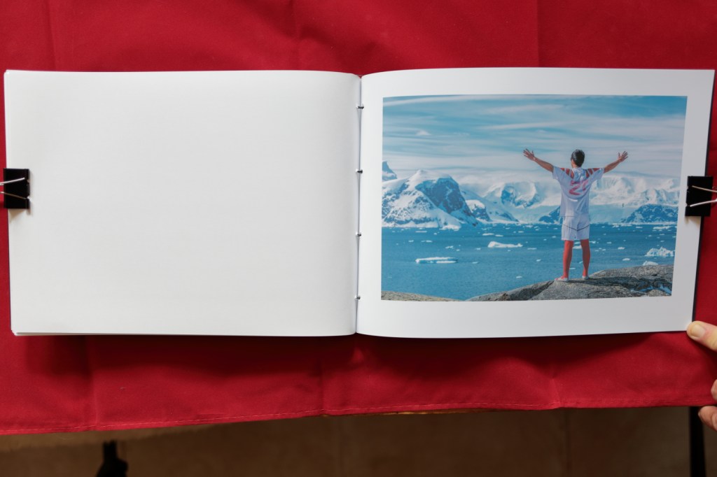
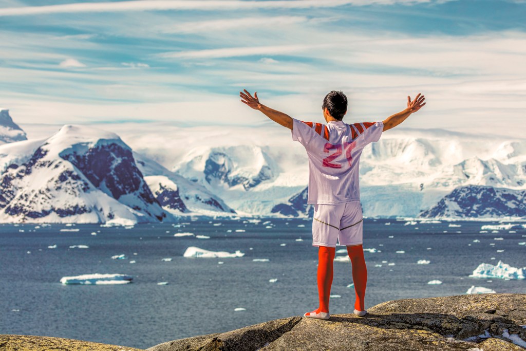
My tutor asked me to look at the series and ensure all the photographs fit within it. After some time looking at the book I felt the photo of the man in football kit didn’t fit. It wasn’t spontaneous, the subject must have planned to take off his outer garments and be in his football strip. Therefore I removed this from the book.
I also reprinted the image of the man stood on the large rock. My tutor was correct I had burned the subject to show texture in his clothing, it detracted from the shot. So I included the original exposure in the re-stitched book. I feel it fits better within the series my tutor was right.
Making a video showing the work in the finished book was a new challenge. I made it from the point of view of my eyes looking at the book as the pages are turned showing each page being turned. This was a hard process, getting the angle of the book so it was parallel to the lens was vital. If this wasn’t achieved the perspective was off and detracted from the video I wanted to show the viewer. Using a tripod made the whole process easier to set up.
My learning log doesn’t allow video, so I will provide a link to it on my dropbox so anyone can see it. I will also include the video for assessment at the relevant time.
Looking at the Artist Statement I agreed that it could be more critical and added more work to the statement. I explained the urgency I had had to work. Not having the time to ponder before the critical moment passed. This was one of the hardest parts of producing this work. The moment lasted a few seconds and I had to be ready.
In the explanation of the process of Japanese Stab Binding I had included the photographs from Portsmouth University (Batey, 2014) I removed these photos and referred to them instead. Providing a link to the work so any reader can see the process I used. Experimenting with a gallery of me re-stitching the book proved difficult, my attempt is not as clear as the photos from Portsmouth University`s site.
Untitled Landscapes Trangmar 1985
Inside the view Sear 2014.
My tutor pointed me to the work of two artists first, Susan Trangmar and her work “Untitled Landscapes” (suetrangmar.com, 1985) shows women looking into the landscape. Each image invites us to look past the back of the viewer into the landscape. The subject is placed so the blind spot is emphasised. This makes me wonder what I am not seeing I start to make stories based on what I am shown and what I cant see. Intriguing and puzzling at the same time. I was unsure if the different scale of the subject worked within the series.
I looked at Helen Sears work focusing on “inside the view” (HelenSear.com, 2014). This work also shows people looking into a landscape., Sears shows two images combined into one, then she adds a third element a layer of fabric. Adding this fabric layer creates a different mood or feeling to each image. I have looked at these images in different mood and they make me feel different reflecting my mood.
Horizon Lennon 2012Boundless Lennon 2012
Whilst looking at the work of these two artists I found work by Julian Lennon (Lennon, 2014). He showed many techniques in his work but two shots showed similar emphasis on the big landscape with people looking into it (Horizon, 2014) (Follow, 2014). A third though has the subject looking out of frame into the camera. (Boundless, 2014). This was challenging to look at, I cannot decide whether I have become accustomed to seeing people looking into the frame. This image seems to bounce my gaze back out of the frame.
This assignment stretched my learning in many ways. I learnt new skills, looked at varied ways of approaching the same technique and considered my work in new ways. It was completely satisfying and most importantly enjoyable.
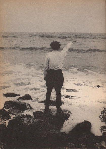
Caspar David Friedrich The wanderer above a sea of fog 1818.
Caspar David Friedrichs was born on 5th September 1774 and died on 7th August 1840. He was a German Romantic landscape painter. He is known for allegorical paintings showing people in a landscape from behind, contemplating the glory of nature.
He studied in Copenhagen, Denmark and after his studies, he settled in Dresden.
Friedrichs felt disillusioned with the materialist world that was being created at this time. J.M.W Turner and John Constable felt some of the same and painted with this in mind showing nature as a divine creation. Constable said of Turner “Turner . . . seems to paint with tinted steam, so evanescent and so airy” (Frist, 2019). Steam was produced by nearly everything in the industrial revolution.
The sculpture David D`Angers said of Friedrichs “He has discovered the tragedy of landscape”, (Vaughn, 2004). Maybe Friedrichs felt this when he witnessed his brothers drowning in an icy lake as a teenager. His mother and two sisters died around the same time of ill health this could have been a catalyst for the tragedy in his work.
Friedrich won the Weimar competition in 1805 a competition organized by the writer and academic Johan Wolfgang von Goethe this competition had lost its way a little, attracting less skillful artists than Friedrichs. Winning this competition ensured his name was made locally and then his reputation grew. He completed watercolours and etchings completing very little work in oil at this time. Friedrich did draw and paint the local landscape in a divine sort of way.
Goethe said “We must praise the artist’s resourcefulness in this picture fairly. The drawing is well done the procession is ingenious and appropriate. His treatment combines a great deal of firmness, Diligence, and neatness” (Siegel, 1974).
Part of his education was at the Academy of Copenhagen this educational institution allowed him external visits to draw. On one of these outings he met and was later schooled by the theologian “Ludwig Gottard Kossgarten”, who worked with the Lutheran church preaching to a poor congregation of herring fishermen and women. Here Kossgarten preached “Where beauty is understood a metaphysical and related to the divine”. (Raisbeck, 2018). Listening to this would link the divine and Friedrichs landscapes.
In Copenhagen, Friedrichs had studied under Jens Juel who was part of the movement “Sturm and Drang” (Storm and Stress). This movement painted storms at sea or on the coast and often showed shipwrecks in a pre-romantic way. In the 2010 Radio 4 program (BBC, 2010) presented by Melvyn Bragg explored the whole of Sturm and Drang. This program looked at each part of the arts and discussed their part in this Romantic Movement.
In music composers, Mozart and Haydn are huge names within the movement writing soaring pieces of music that have stood the test of time. More angry young men producing art to counter the destruction of industry.
Henri Fuseli Falstaff Kunsthalle Hamburg 1792
Claude Vernet Storm on the Mediteranean Coast J.P. Getty Museum 1798.
Jens Juels Joseph Greenaway National Gallery London 1786
Jens Juel The dance in the glade at Sorgenfri Statens Museum For Kunst Copenhagen 1800.
Jens Juel Landscape with Northern Lights NY Glypotek 1790.
In Painting, Henri Fuseli was painting scenes from Shakespeare’s plays such as Falstaff (Fuseli 1792). Claude Joseph Vernet painted shipwrecks one being “A storm on the Mediterranean Coast” (Vernet, 1767). Jens Juel painted Joseph Greenaway (Juel, 1789) a portrait of a man who doesn’t quite fit the romantic movement but he then produced “The dancing glade at Sorenfri” (Juel, 1800) a painting of a glade just north of Copenhagen painted with the divine in mind. Later he painted “Landscape with Northern Lights” (Juel, 1836) a painting that connects the divine with natural phenomena and the land.
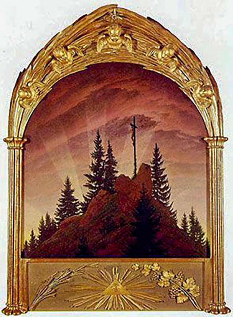
Casper David Friedrich Cross in the Mountain Gallery Nieu Dresden 1808.
Friedrichs completed his first major work in 1808. Cross in the Mountain (Friedrich, 1808). The painting shows the crucifixion of Christ in a different way. Before paintings of the crucifixion had the human figures as the main subject of the painting. Here the landscape is the main part with the crucifixion being smaller. It is the divine within the landscape. Siegel says “Logical climax of many other drawings of his in which he depicted a cross in nature’s world” (Siegel, 1978).
The German Lawyer and Art Critic Bascilus Von Ramdohr (Zeitung die elegant Walt, 1809), questioned landscape entering the church stating “Indeed it is a truly presumptuous thing, that Landscape Painting should try to slither into our churches and clamber onto our altars,”. Friedrichs counters this with “The ray of sunlight compares to the Light of the holy father”. This is the one and only time I can find Friedrich explaining his art?
In 1810 the Crown Prince of Prussia purchased several of Friedrichs work, shortly after these purchases Friedrich was elected a member of the Berlin Academy. This relationship and election reinforced his position within Germanic art.
In 1816 Friedrich applied for citizenship of Saxony this was a surprise as Saxony was pro-French. He acquired this citizenship in the same year sponsored by his friend Graf Virthum von Eckstart.
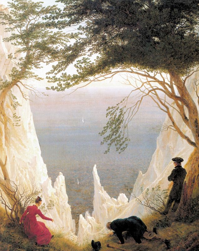
Casper David Friedrich Chalk Cliffs on Rugen Museum Oskar Reinhart Stuttgarten 1818.
Friedrich married Caroline Bummer with whom he had three children. At this point, he began showing more human figures in his work such as “Chalk cliffs on Rugen” (Friedrich, 1818). This painting is playful and shows three characters on the cliff perhaps retrieving a lost hat that has blown over the cliff. It shows the people from the back. This style is called Rückenfigur or figure from the rear. The painting was painted on their honeymoon and celebrates their marriage.
In later life, he met the Poet Vasily- Zukovsky who tutored Alexander II. They became good friends Alexander said of Friedrichs work “They please us by their precision, each awakening a memory in our mind” (Vaughn, 1980).
In 1835 Friedrich suffered a major stroke which left him paralyzed. He sold earlier works to allow him to convalesce in Czechoslovakia. He died on May 7th, 1840.
That covers his life now let’s consider his work.
Friedrich moved the landscape to the backdrop to human behavior. He employed the Rückenfigur to do this.
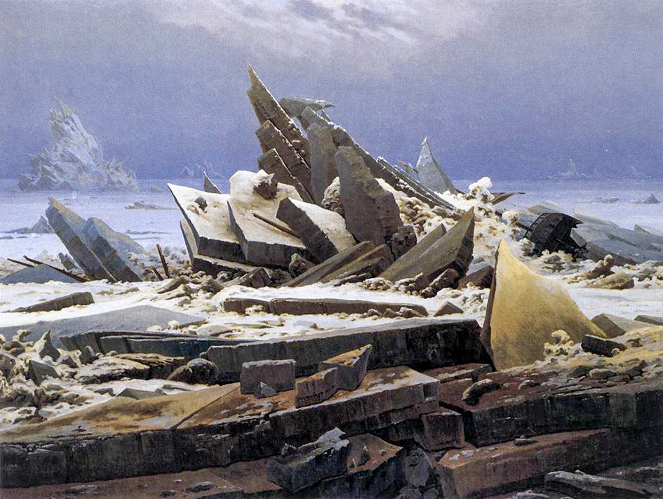
Casper David Friedrich Sea of Ice Kunsthalle Hamburg 1824.
This puts the viewer of the painting, in the painting, understanding what the Rückenfigur is seeing. “The sublime potential of nature, understanding that the scene is as perceived and idealized by a human”
(Prettejohn, 2005). Friedrich filled his landscapes with romantic meaning. “Die Romantische Stimmongscansschaft” (Beenken, 1938). His life experiences with death and loss meant his work reflected these losses. Perhaps he was thinking of his own mortality it would not be a surprise when you look at “Sea of Ice” to think of his brother falling through the ice to drown.
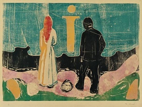
Max Ernst Ubu Imperator, Musee d Art Moderne Paris 1923
Edvard Munch The Lonely Ones Munch Museum Oslo 1935.
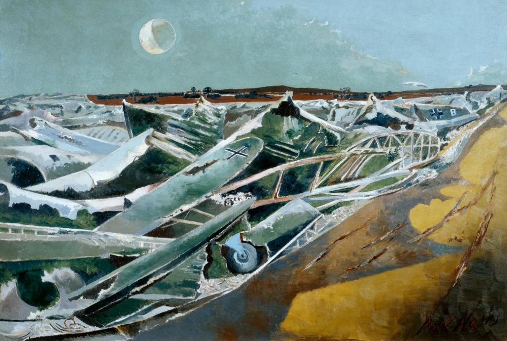
His work was influential notably to Johan Christian Dahl, Arnold Bocklin, Max Ernst and Edvard Munch. If you see Paul Nash work “Totes Mares” (Nash, 1940) a sea formed by Nazi warplanes you can see the influence of Friedrichs work “Sea of Ice”.
Anslem Keifer Fig 4 Occupations Tate Modern London 1969.
The Nazis claimed Friedrichs work and used it to reflect Germanic ideals. Hitler under his slogan “Blood and Soil” connected Nazism with the landscapes of many German artists. This meant Friedrichs work lost its popularity and didn’t regain recognition until the 1970s. In summer and autumn 1969 Anslem Kiefer completed a series of photographs showing ruined places with Keifer performing a Sieg Heil salute. This was controversial at the time as it would be now. One photo “Occupations” (Keifer, 1969) clearly reflects Friedrichs “Wanderer above a sea of fog”. This work helped regain public attention.
If the Nazis had understood the hidden meaning of the painting, Friedrich was showing someone in awe of the divine light feeling beneath the divine. The Nazis saw someone in uniform above Nature in control. This is the danger when you release work with subtle meaning it is left open to interpretation.
Caspar David Friedrich Wanderer above the sea of fog Kusthalle Hamburg 1800
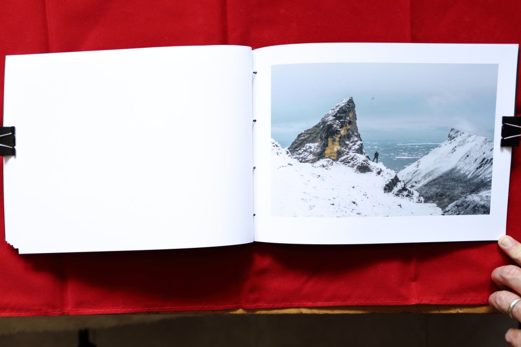
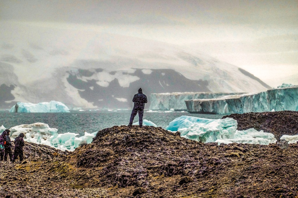
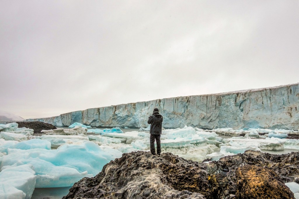
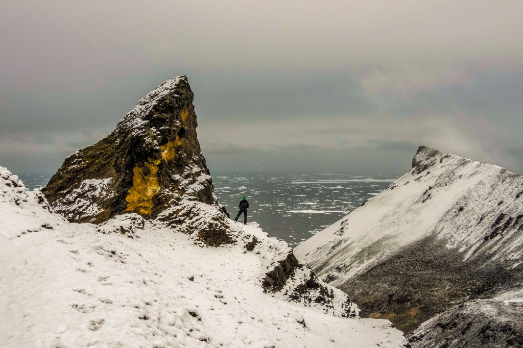
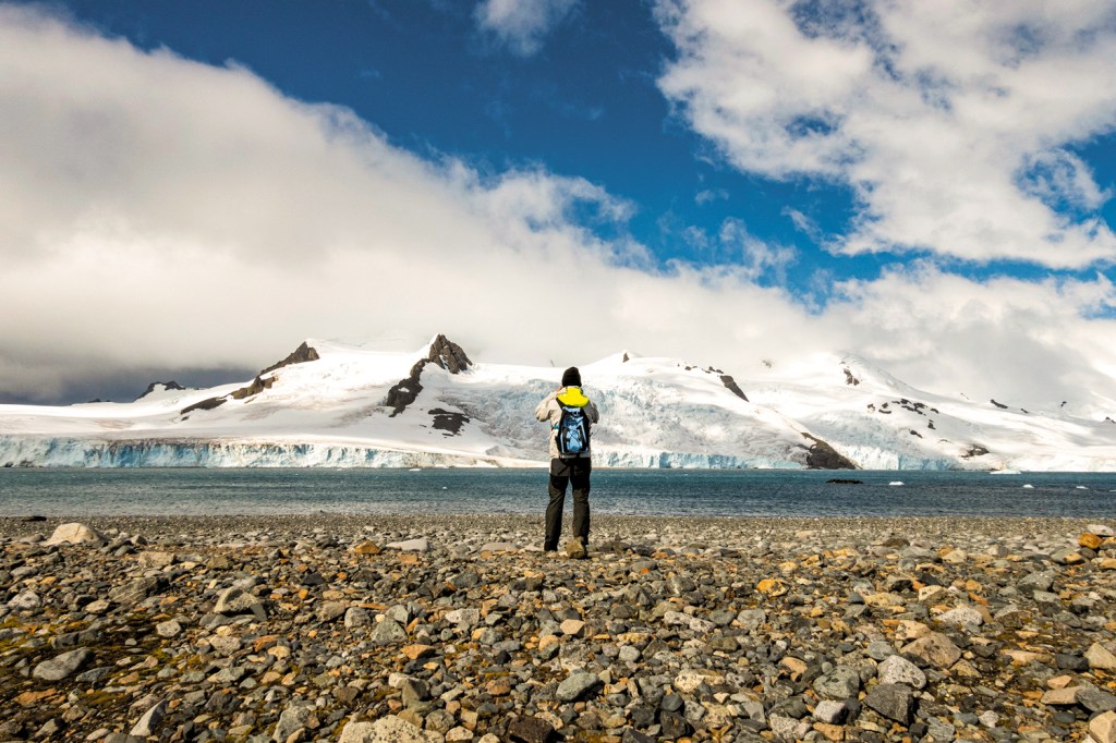
The “Wanderer above a sea of fog” Shows a man on a rocky crag looking at trees shrouded by fog with an air of confidence. His hair is blown by the wind. He leans on a stick to support himself against the wind. The man wears the uniform of the volunteer rangers of the Saxony Army. This uniform was banned at the time as it was the uniform of the opposing army of Napoleon.
I see a man contemplating an uncertain future. Others think he is contemplating the divine. I think he has seen beauty in nature and he has frozen for a moment to take it all in. At first glance, it appears the painting locks us out with the figure showing us his back. However, this draws the eye into the picture as I want to explore the scene he is looking at.
The painting is unusual as it is painted in a portrait format this is done to emphasize the height of the man and the landscape. The landscape is shown with pinks and blues, the light in the valley seems to be from below this would be unusual almost divine. The green coat on the man repeats the green in the trees.
It makes the painting more mysterious, I want to know who he is? What he has seen? What is out of the frame? I have looked at this painting hundreds of times and I still don’t see the answers which makes me want to look again.
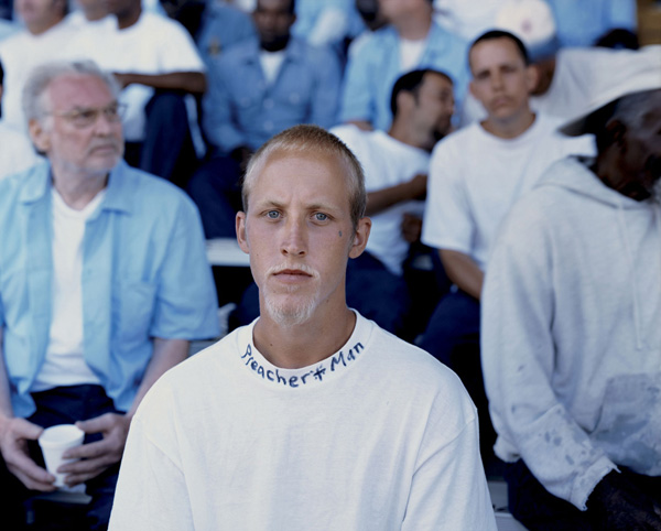
I see Friedrichs influence in the work of Alec Soth he puts a lone figure in the center of a lot of his work. In an environment that makes the person. Showing them having a divine moment. Whilst they are not taken from behind the person the influence is there to see. Soth wants to identify the person more, so shows them from the front looking straight at you.
Alec Soth, Joshua, Angola Prison, LA 2002
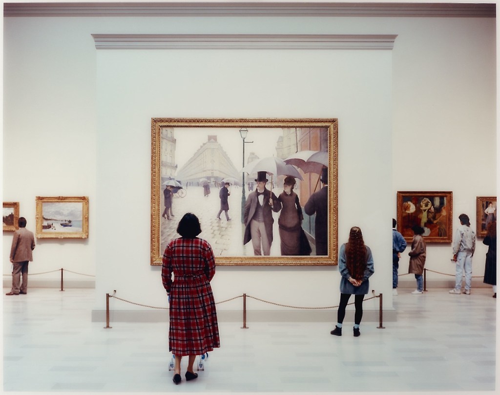
Thomas Struth took a series of large photos in Art Galleries across Europe in the 1980s (Struth, 1990). He had seen a photo of an art critic who was looking at a book of Art images. The photo spoke about peoples reaction to art and Struth went to his local gallery and started to take images of members of the public starting at paintings in a gallery all from behind. He wanted to show the connection between the almost religious reaction we have when we engage with art. His work shows the relationship between the Photographer and the viewer, The viewer and the art work and the camera and the whole scene. Whilst my images are of the scenery of Antarctica the premise is much the same.
Thomas Struth Art Institute of Chicago II 1990,
Works Cited
BBC (Composer). (2010). Sturm und Drung. [M. Bragg, Conductor] London, UK.
Beenken, H. (1938). Romantic Meaning. The Burlington magazine for connoseurs , 171-175.
Ernst, M. Ubu Imperator. Musee d Art Moderne, Paris. 1923.
Friedrich, C. D. Cross in the mountains. Galerie Nieu, Dresden, Germany.
Juel, J. Joseph Greenaway. National Gallery , London, UK.
Juel, J. Landscape with Northern Lights. Carlsberg Glypotek, Copenhagen, DK.
Juel, J. The Dancing Glade at Sorenfri. Staten Museum for Kunst, Copenhagen.
Kiefer, A. Occupations. Tate Modern, London.
Munch, E. The Lonely Ones, Munch Museum Oslo 1935.
Nash, P. Totes Mares. Tate Modern, London, England.
Prettejohn, E. (2005). Beauty and art (1750-2000). In E. Prettejohn, Beauty and art (pp. pp54-56). Oxford, England: Oxford University Press.
Ramdohr, B. V. (1809). Article criticising Cross in the mountain. Zeitung für die elegante , 17-21.
Rasbeck, J. (n.d.). University of Oxford. Retrieved 05 21, 2020, from Boydell and Brewer: HTTPS://dot.org/10.1017/9781787444379.013
Siegel, L. (1978). Casper David Friedrich and the age of German romanticism. In L. Siegel, Casper David Friedrich and the age of German romanticism (pp. p55-56). Boston: Branden Publishing Co.
Soth, A. (2002). Joshua, Angola Prison, LA, 2002. Sleeping by Mississippi. Mack Publishing 2004.
Struth, T. 1990 Thomas Struth.MoMA New York. Art Institute of Chicago 1990.
Vaughn, W. (2004). Friedrich. In W. Vaughn. London: Oxford Phaidon Press.
Vaughn, W. (1980). German Romantic Painting. Yale, USA: New Haven, Yale University Press.
Vernet, C. J. A Storm on the Mediteranian Coast. JP Getty Museum, Los Angeles, USA.
My tutor suggested Japanese Stab Binding the book. I will be honest this technique was something I had never even heard of. However I like a challenge so accepted it with a little trepidation.
During my feedback of Assignment 4 my tutor discussed my approach to Assignment 5. As it was going to be impossible to send in prints of my photographs due to CoVid19 and the lock down he set me the challenge of completing a photobook. The goal of this book would be me taking control of the whole process. From inception through taking the images and finally producing the book.
After the conversation, I quickly logged onto Google researching what would be involved, on first reading filled the process filled me with dread. There seemed to be many skills that would stretch me to the limit. I liked the fact that I would learn a new skill and if applied efficiently I would produce something that should be tactile and pleasing to finish.
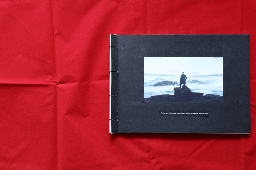
I considered what the outcome should be. I wanted the cover of the book to show the painting that had inspired this piece of work. I did not want to just stick the paper to the front cover, so researched creating a window in the cover to show it to its best advantage.
Next I considered the paper. Everything I read said not to use paper that is too thick and not to place too many pages in the book so it opens properly when the viewer looks at it. I wanted a decent quality print so decided to use 275g matte print paper and 250g black card for the cover.
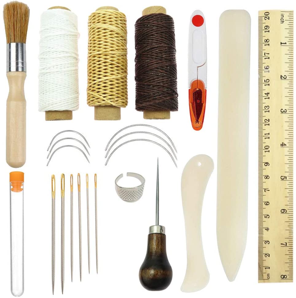
I tried to source the tools but the postage and packaging were prohibitive. Amazon came to the rescue with a bookbinding kit that included all the equipment I would need. I sourced the paper from a local art shop. I also purchased good quality paper glue from the art shop to construct the cover.
Book Binding Equipment needed to complete this project.
Whilst I waited for the tools to arrive I designed a stencil for A4 paper including the window for the cover. This involved measuring in publisher 1 1/2 inch border from the left edge. As I was producing a four hole bind I divided the edge into four sections. Then drawing two lines across the rectangles I placed the marks for the holes that would be punched later. when the tools arrived I printed this onto 300g photo paper. This stencil needs to be robust therefore I printed it on thicker paper to help it survive the process. This page will not go into the finished book.
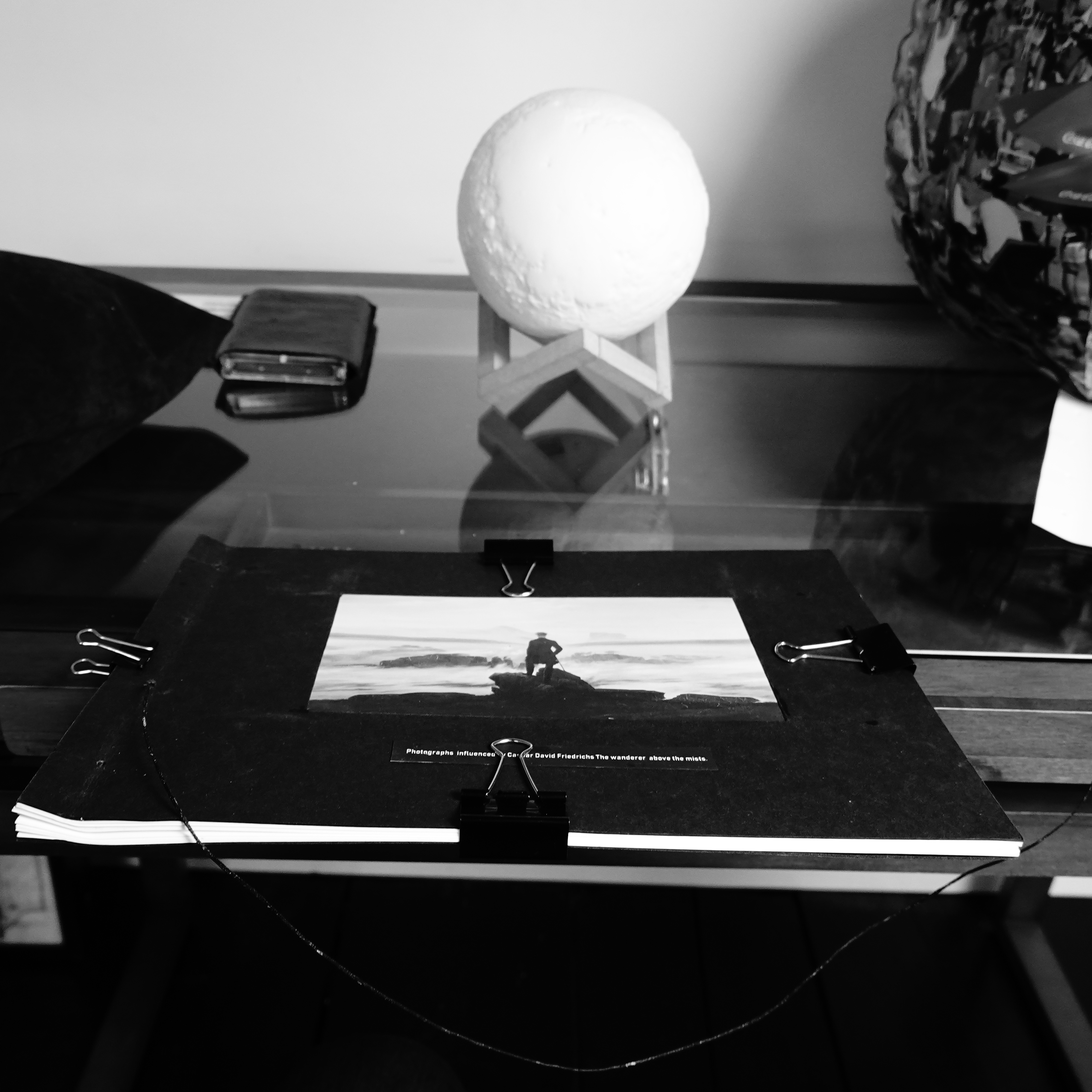
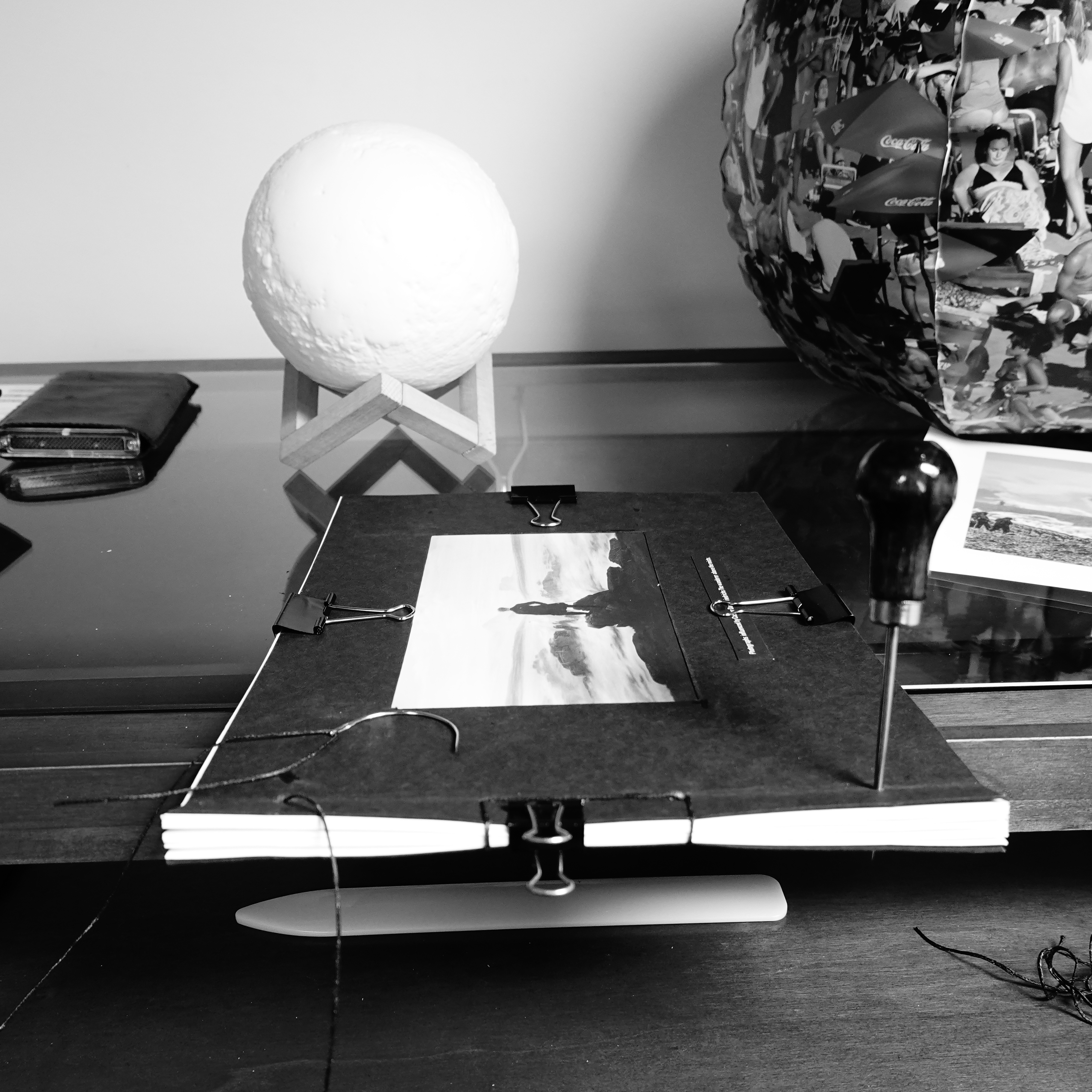
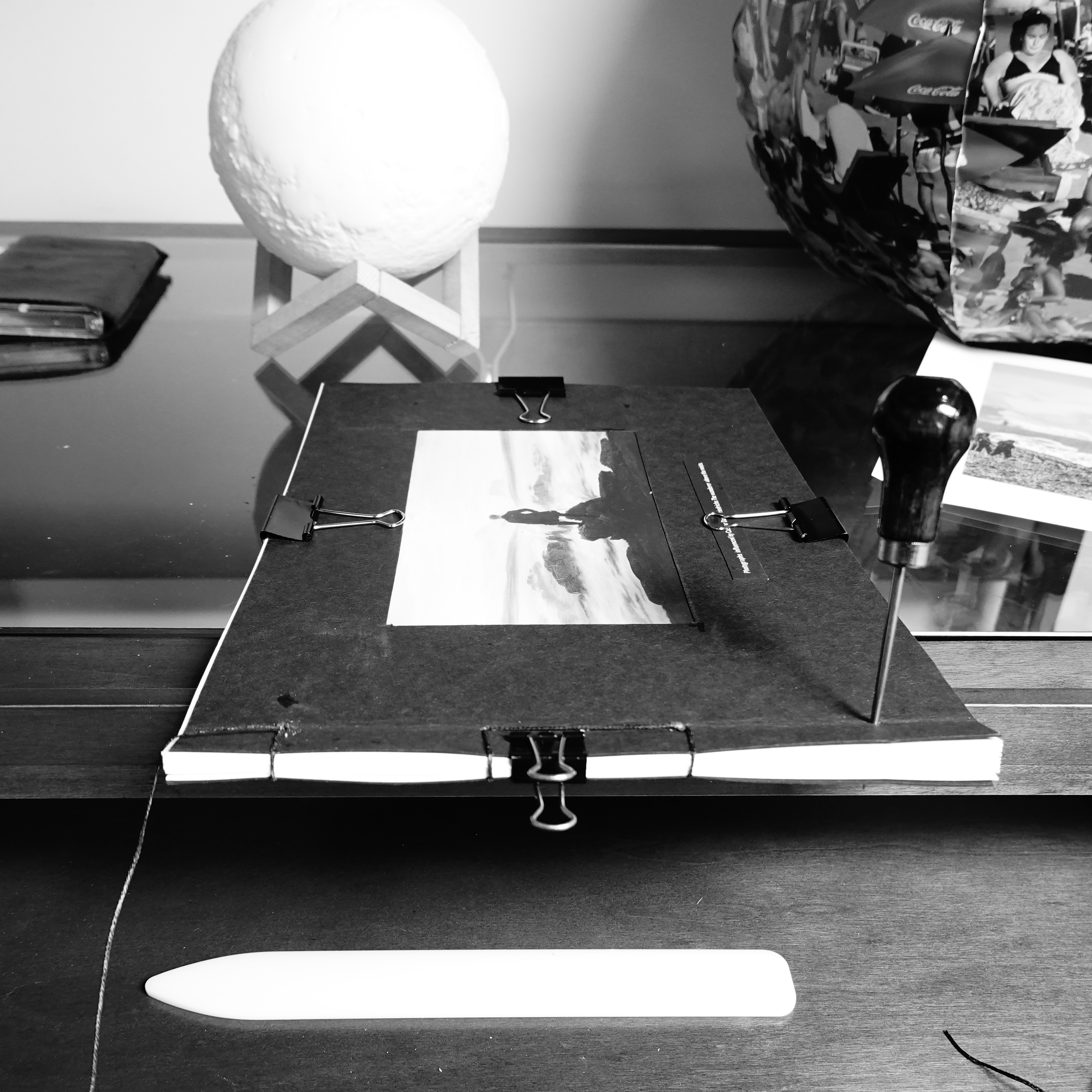
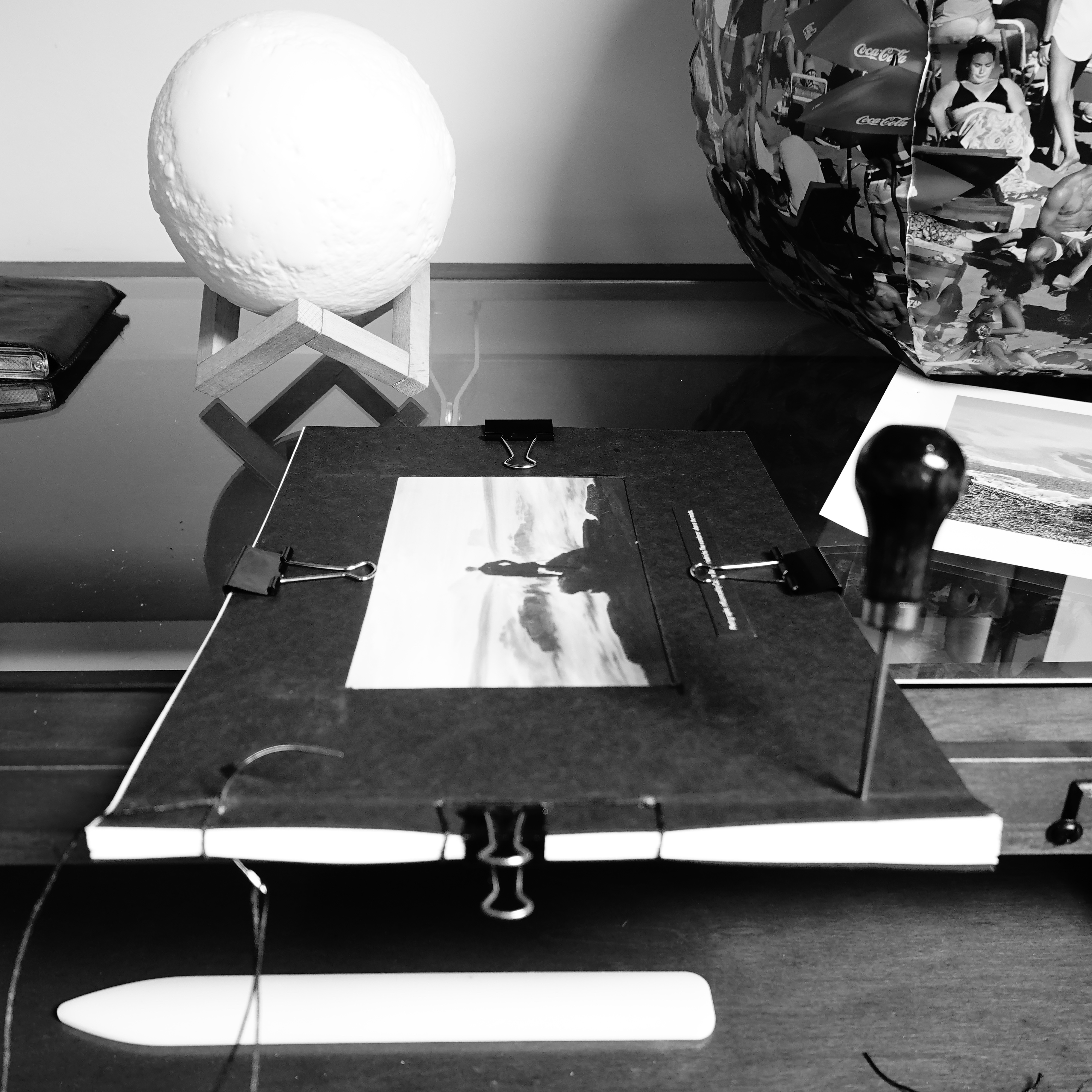
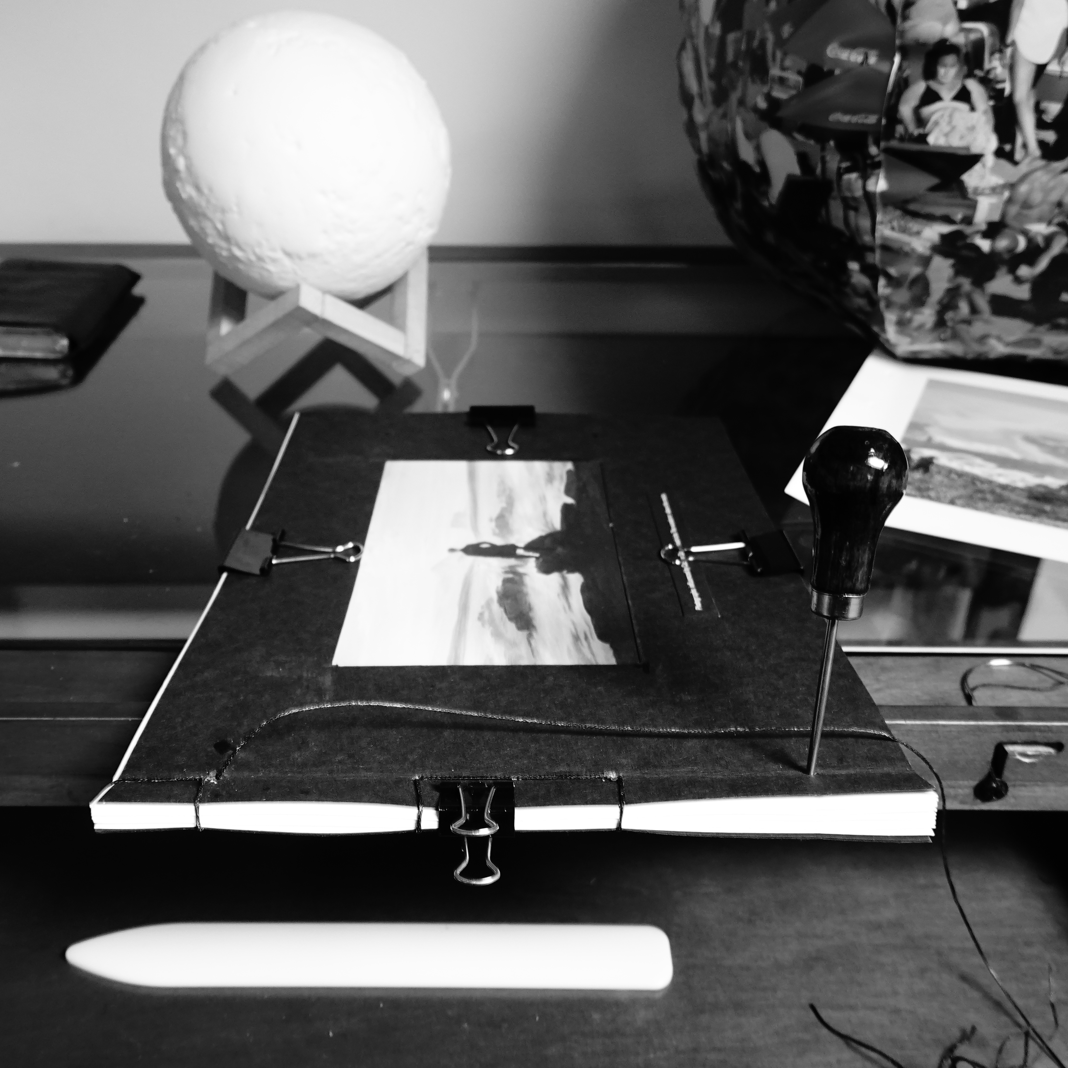
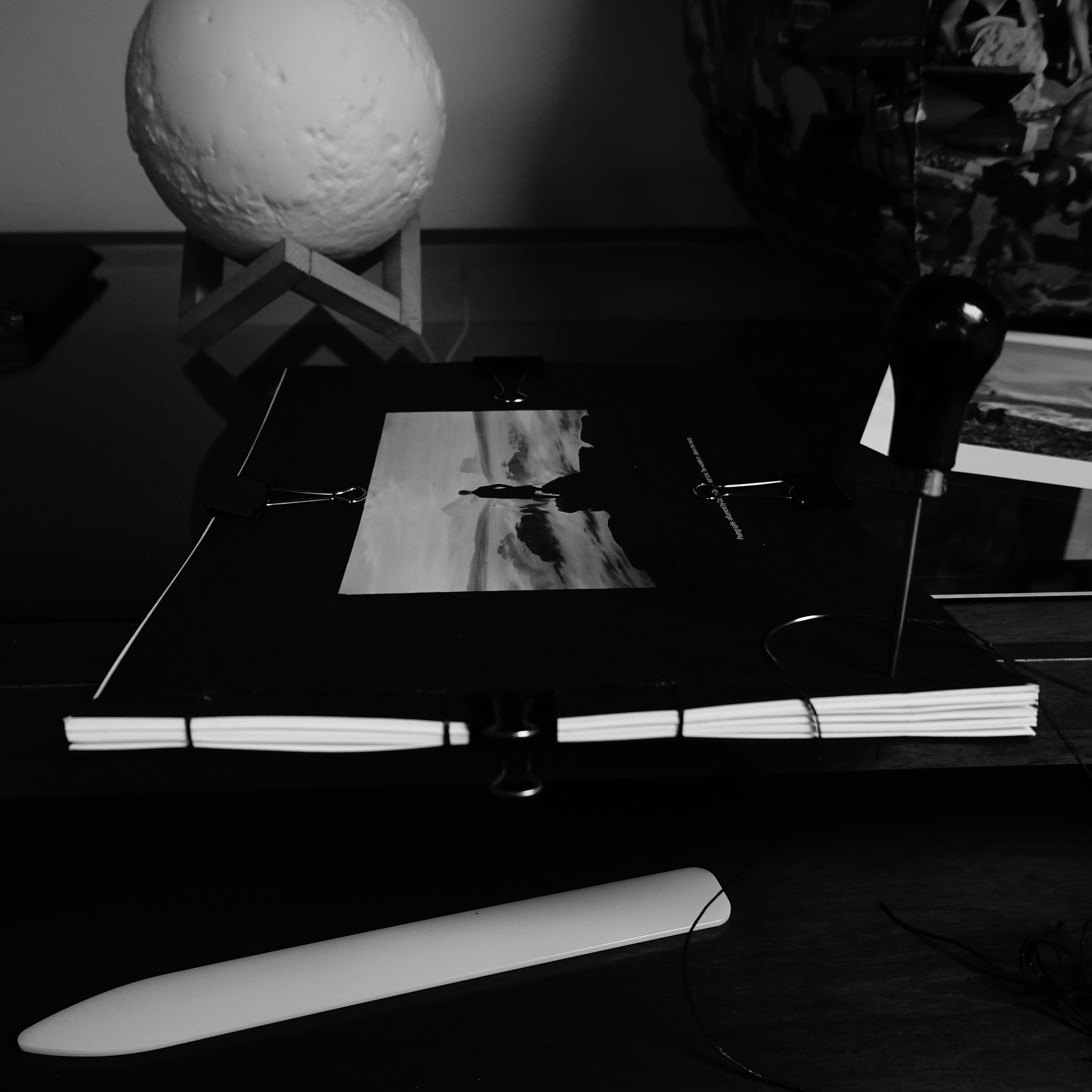
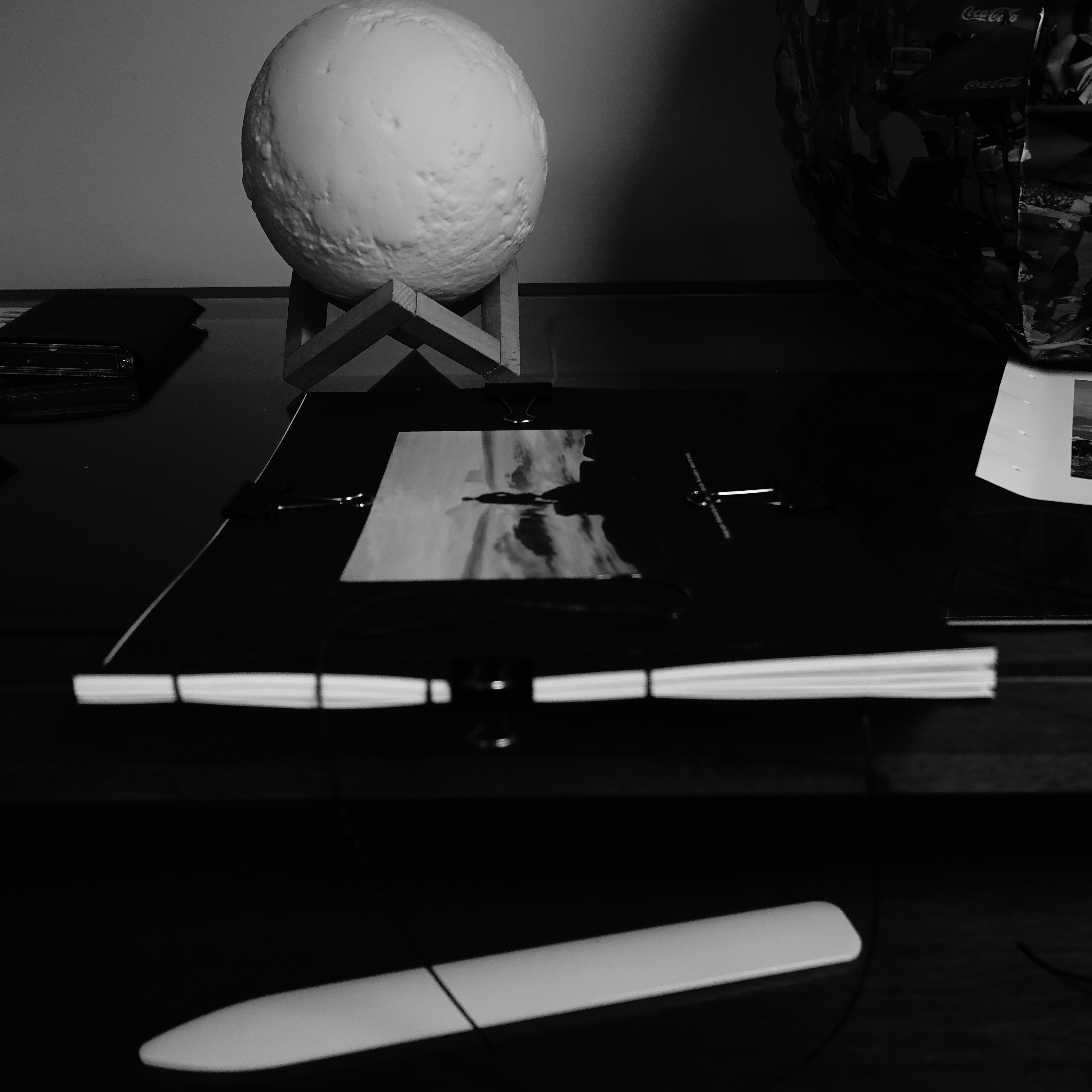
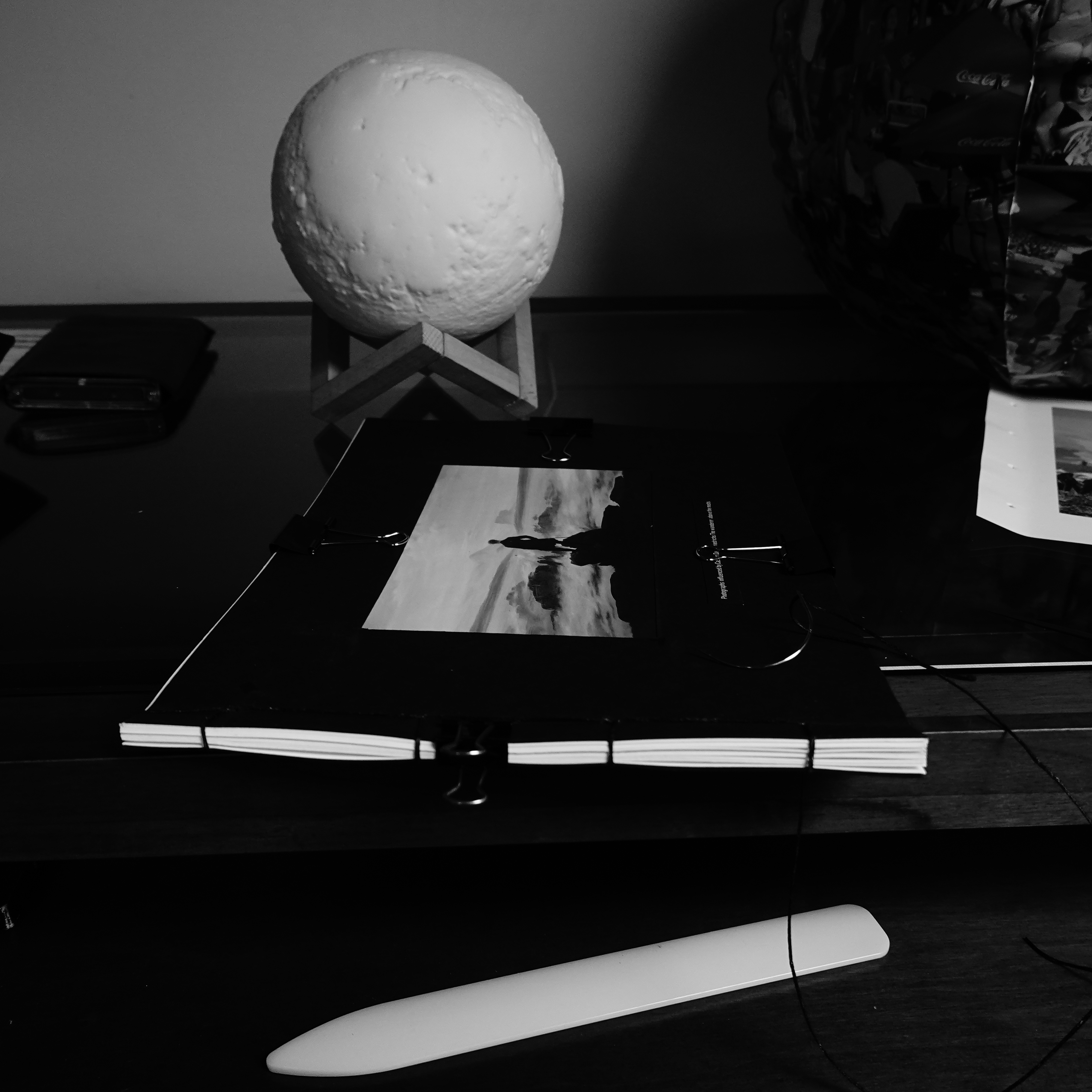
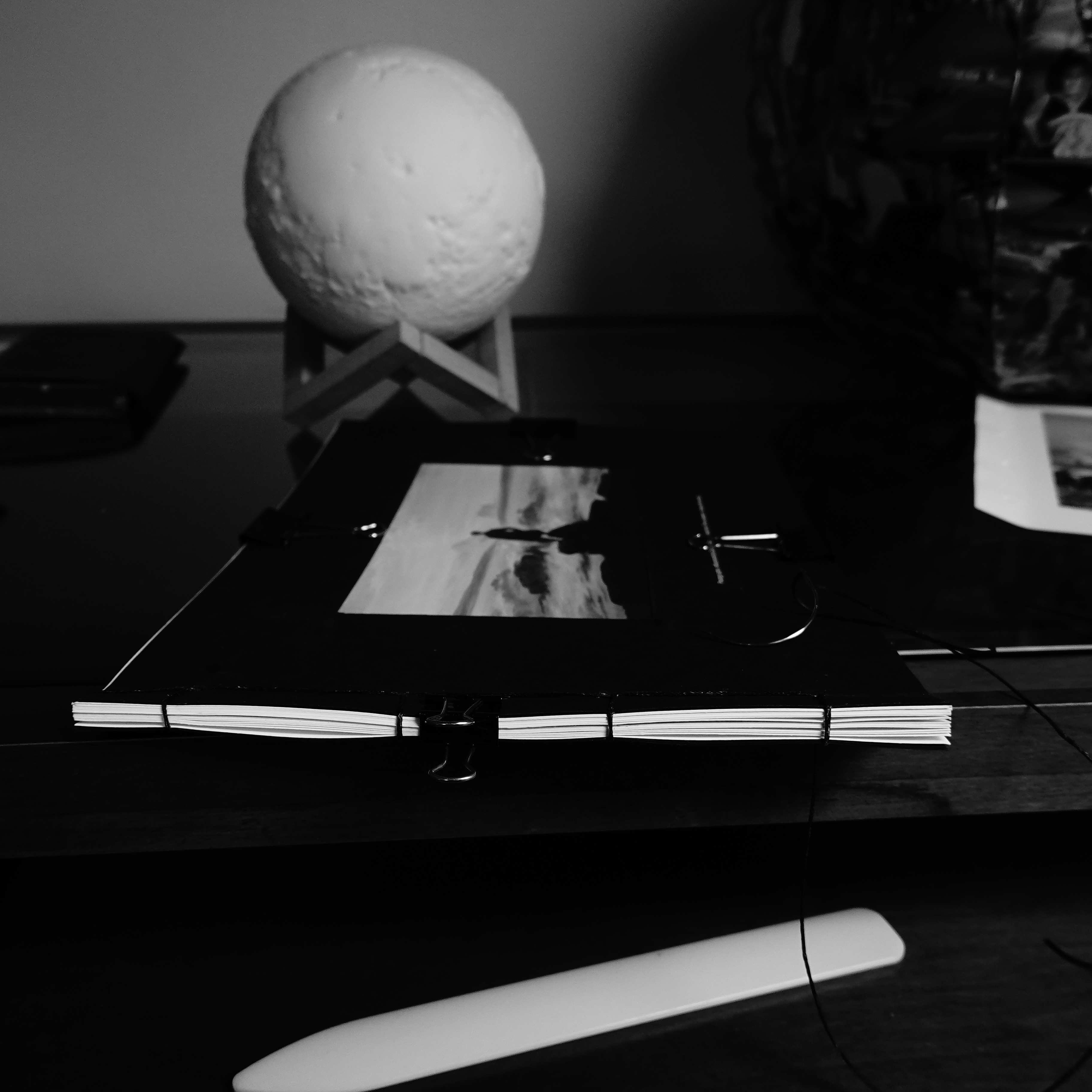
I made the cover by using the stencil to mark the edges of the window on the black card. Then using a razor blade and being very careful I sliced the lines and cut the window in the cover. I trimmed the print of the painting ½ an inch bigger than the aperture I had just created. Using the glue I fixed the painting to the aperture. Then placed the second piece of Black card and glued that to the reverse being careful to align everything before pressing together. I left this under a weighted board overnight to fix it firmly into its position.
Stencil for the cover.
I printed the edited photos and set these aside until later, so they would be ready when the tools arrived.
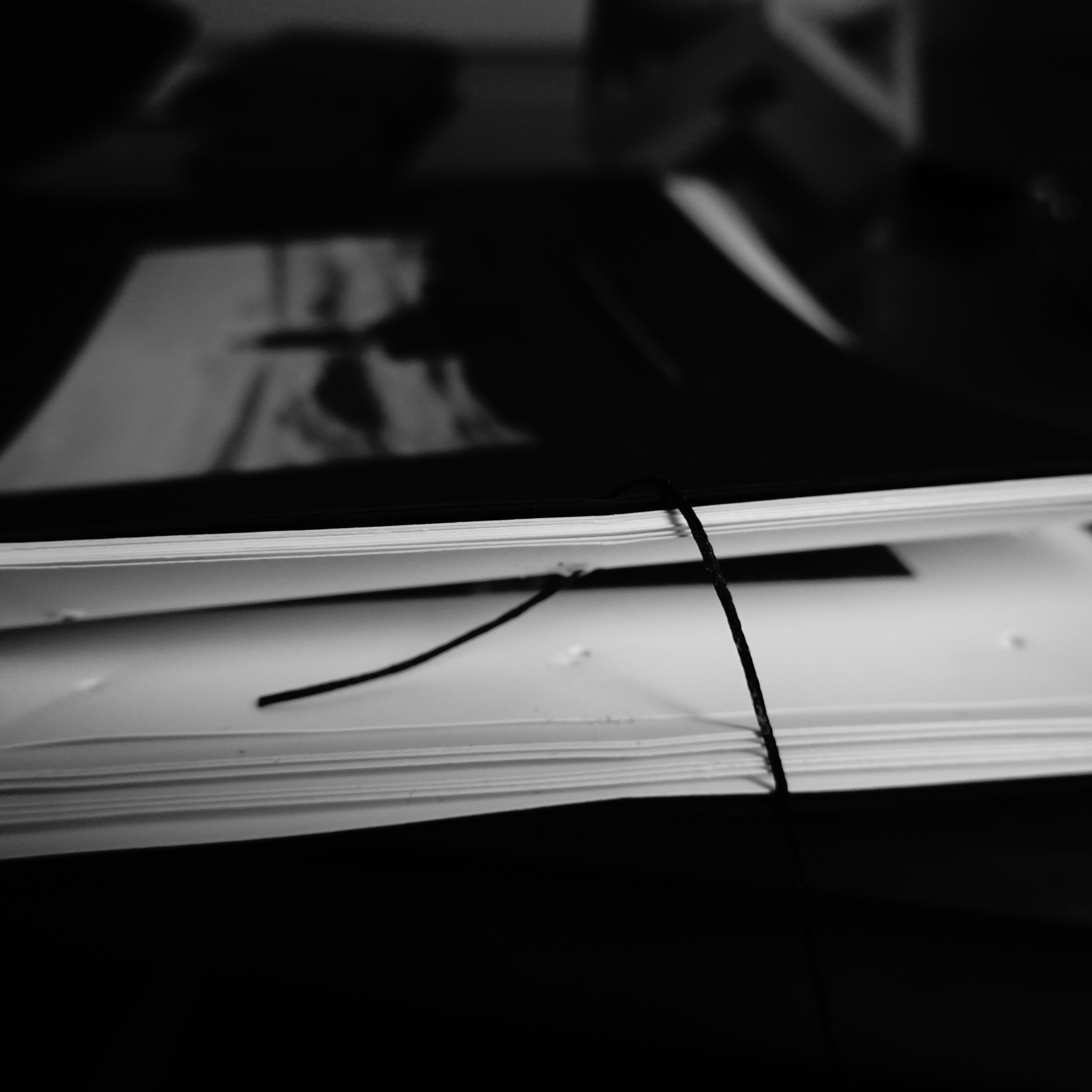
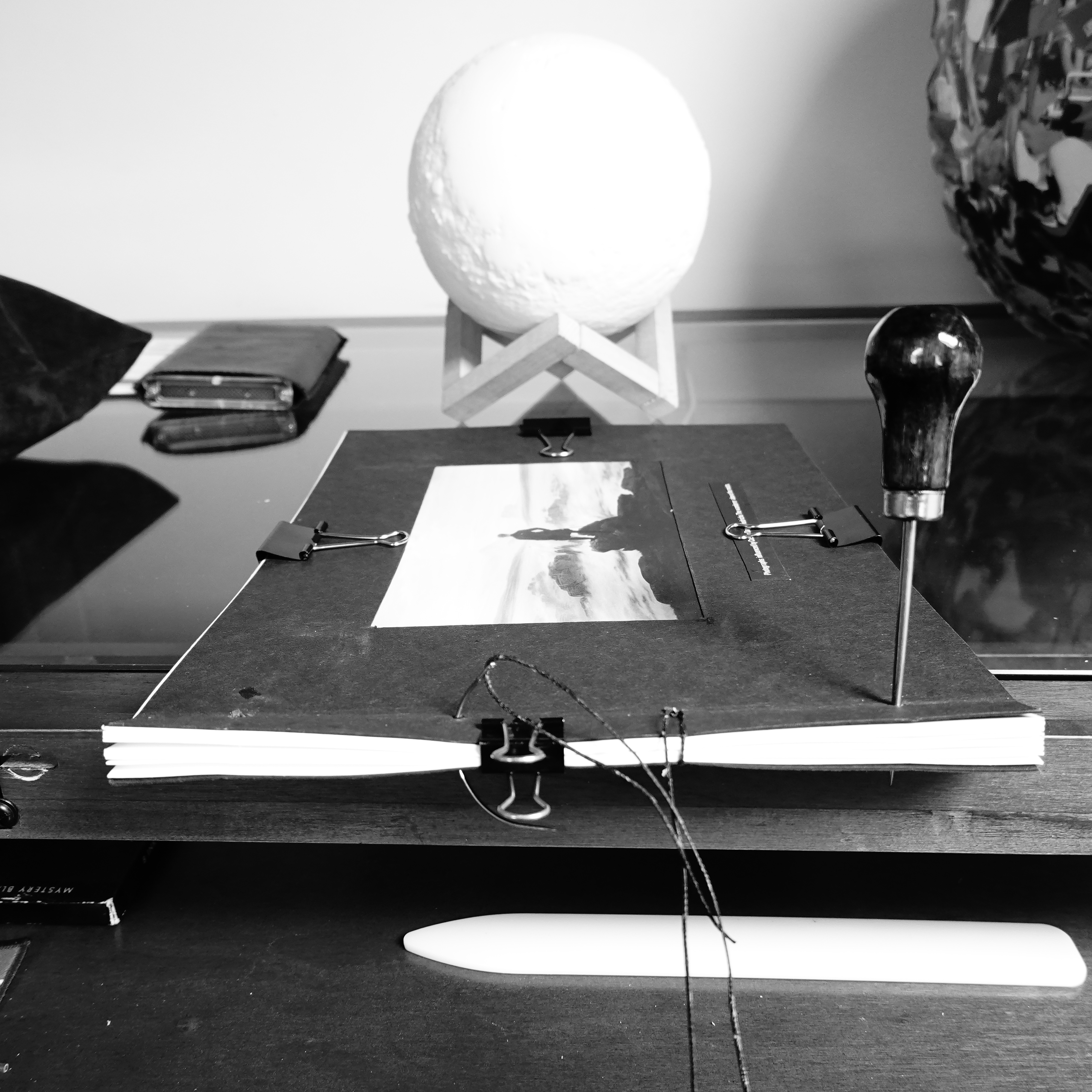
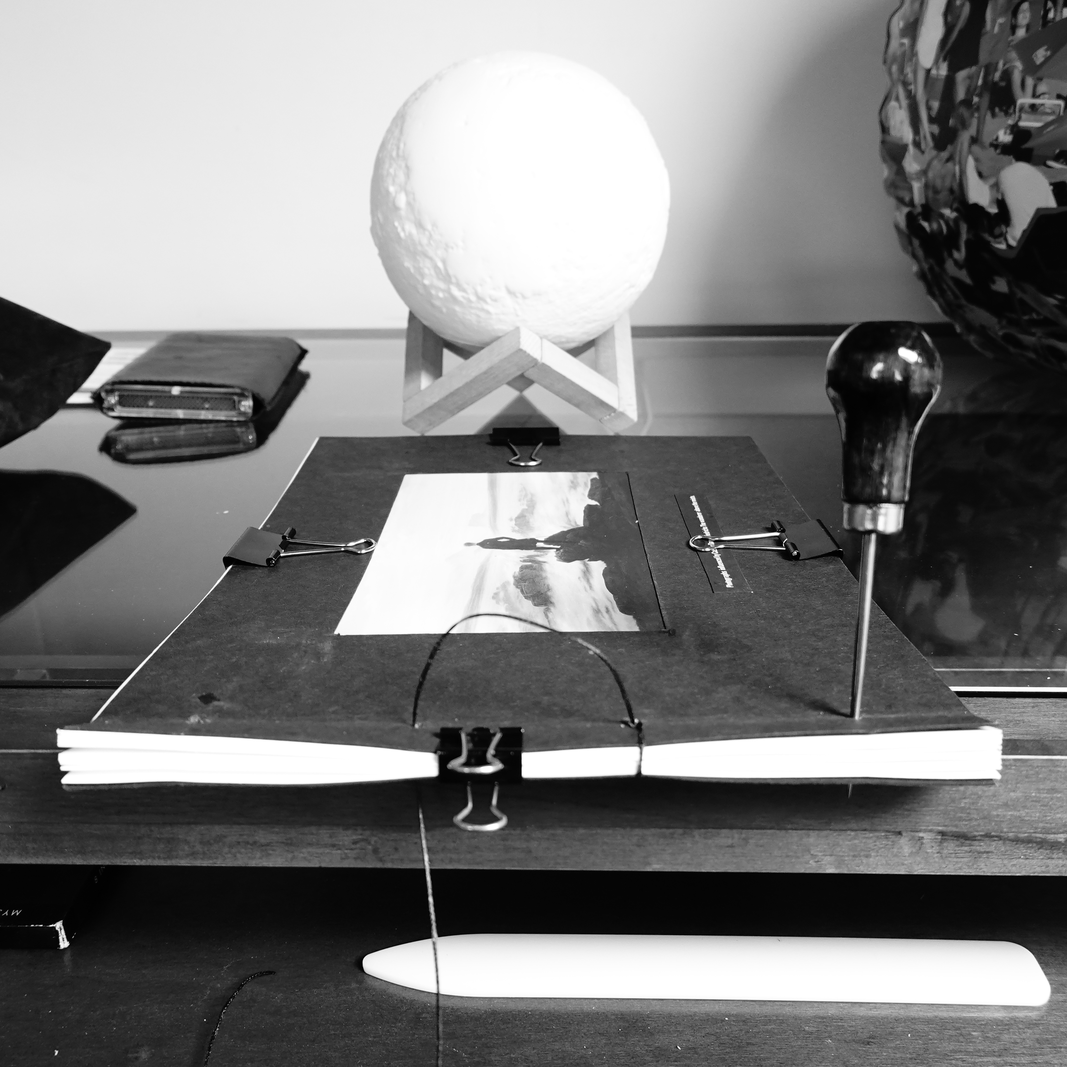
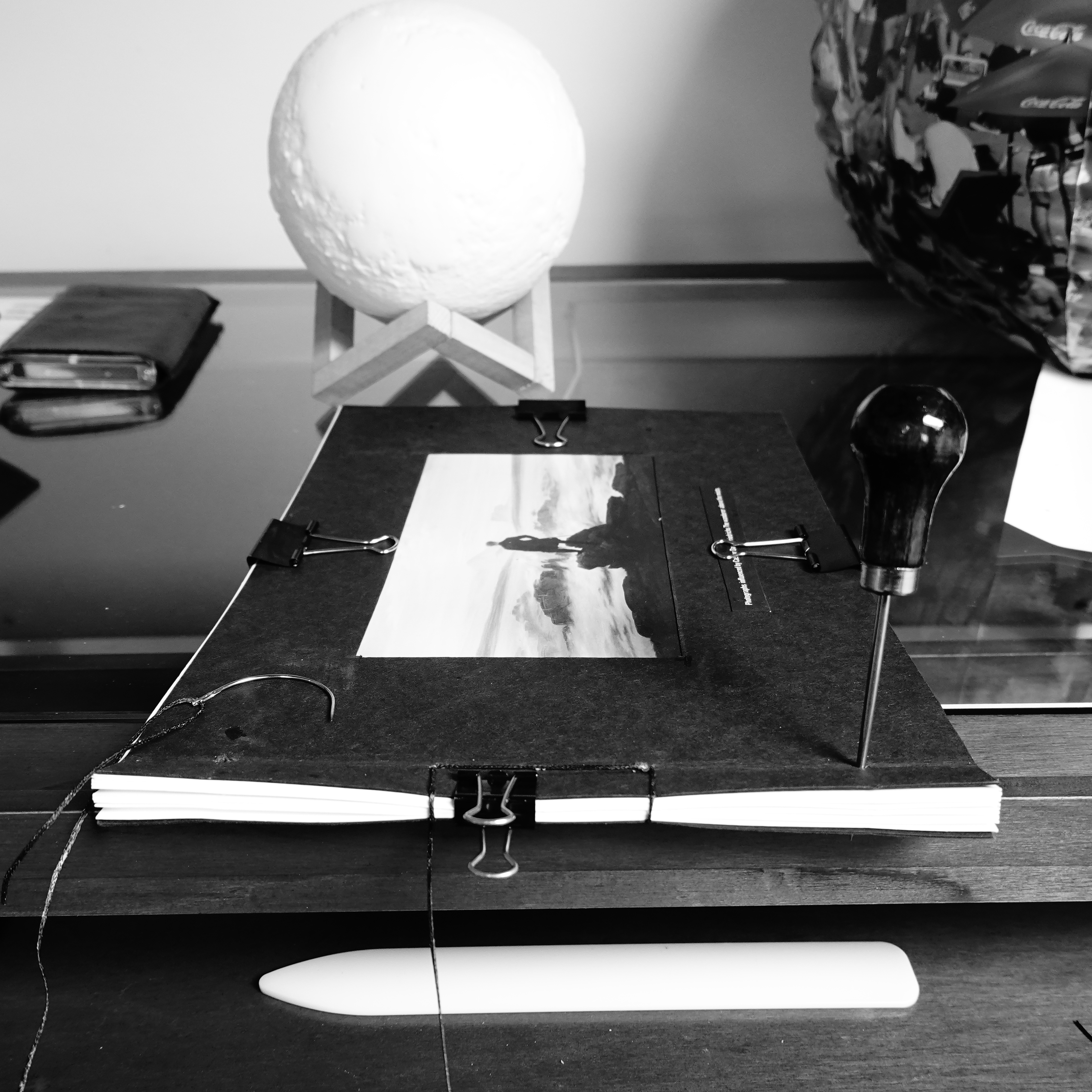
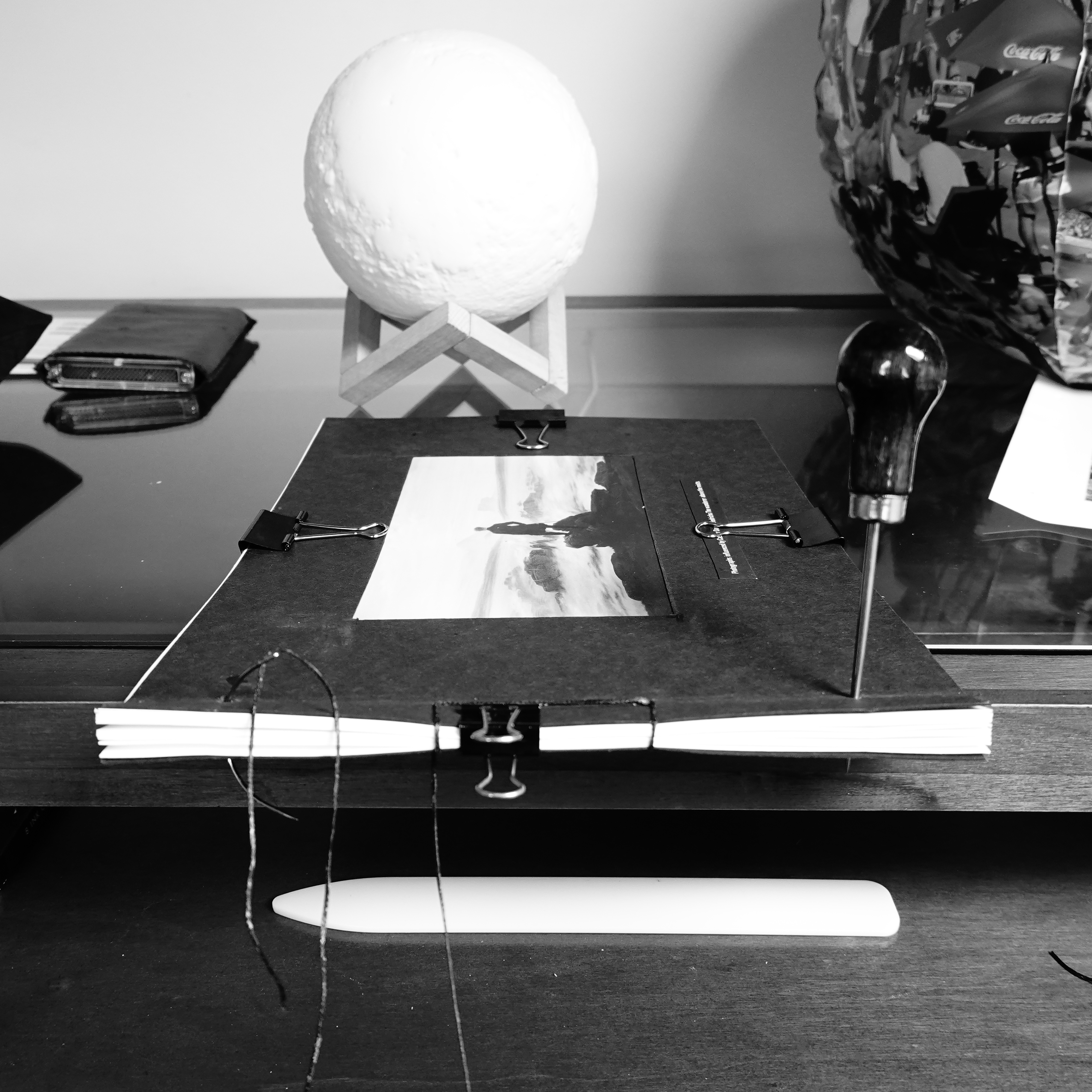
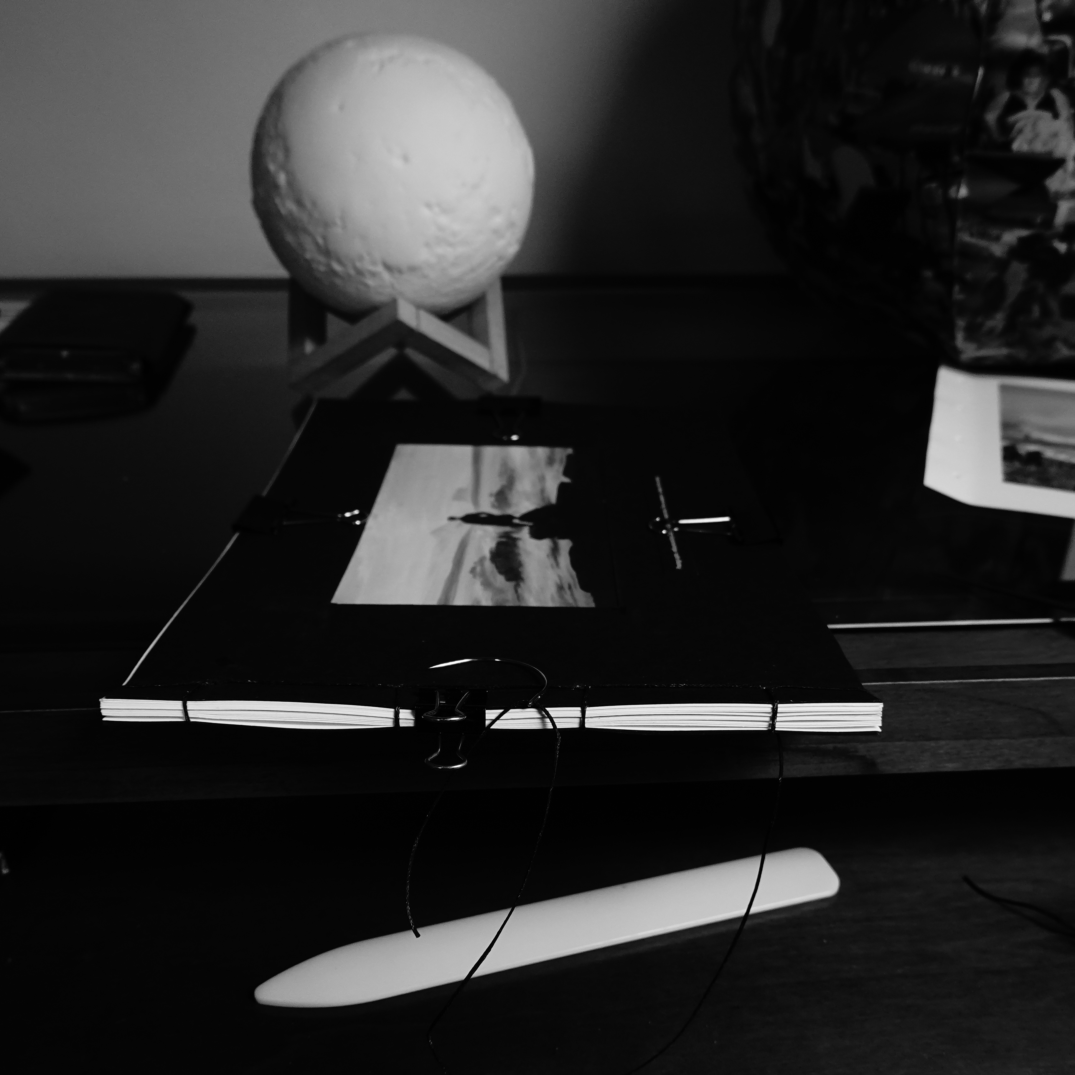
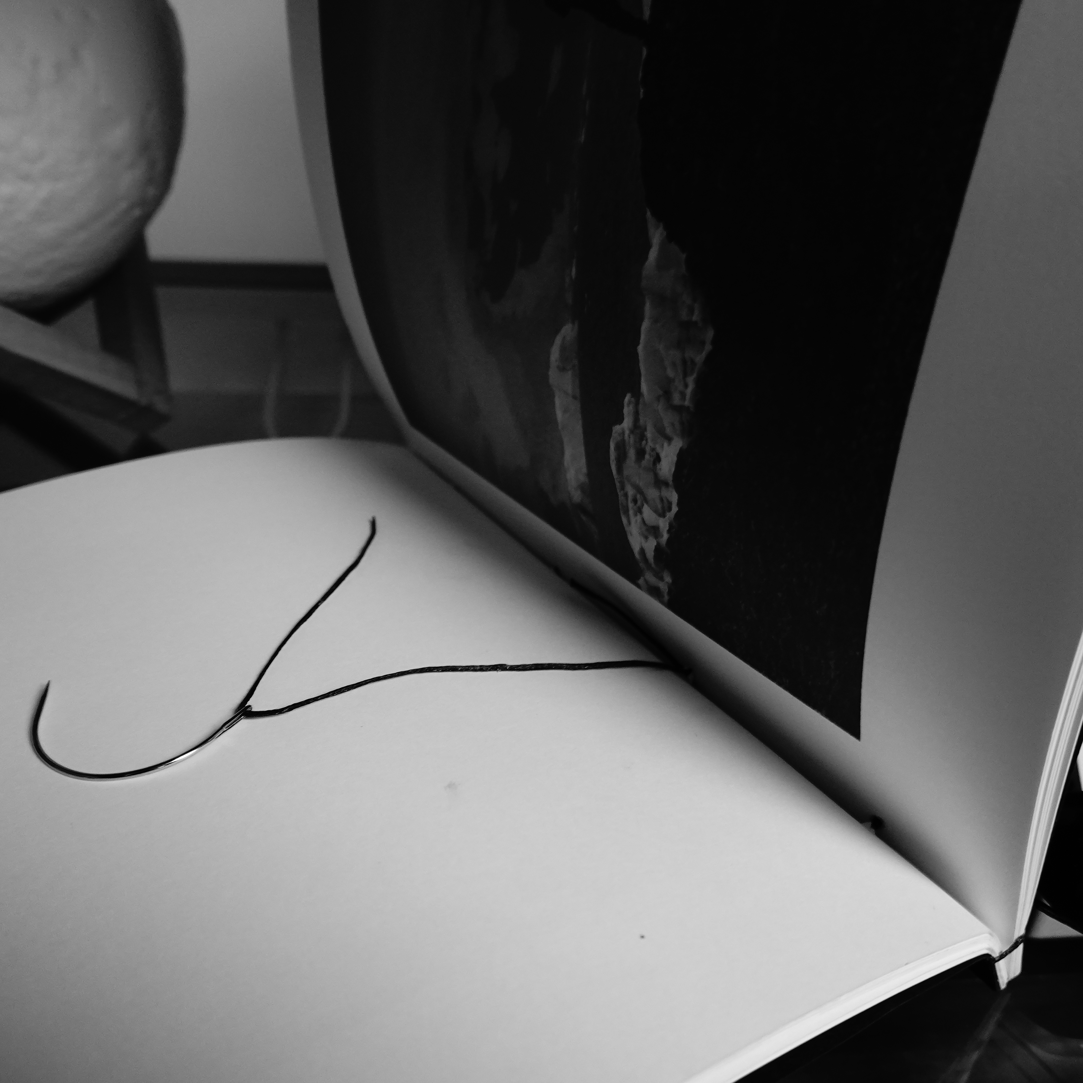
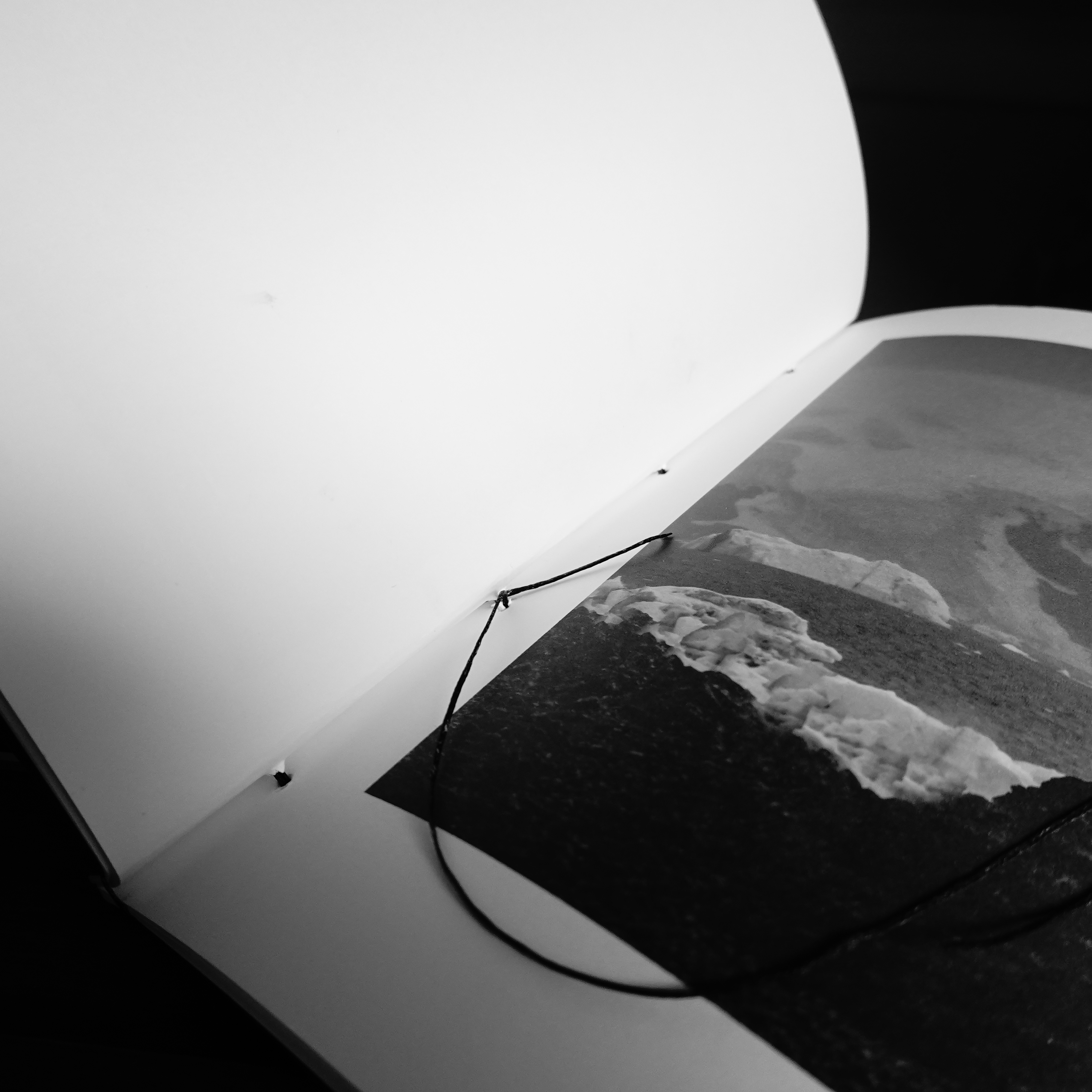
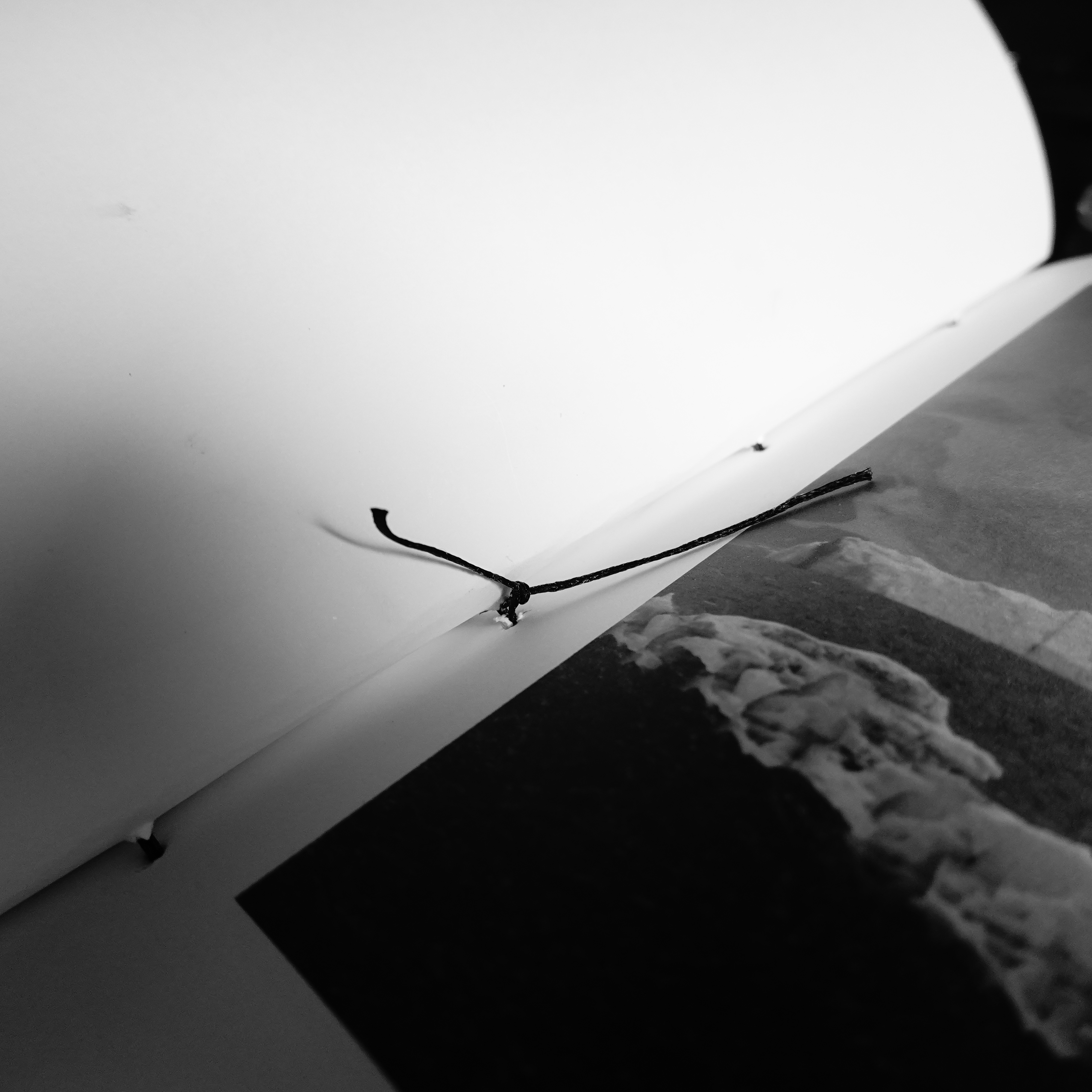
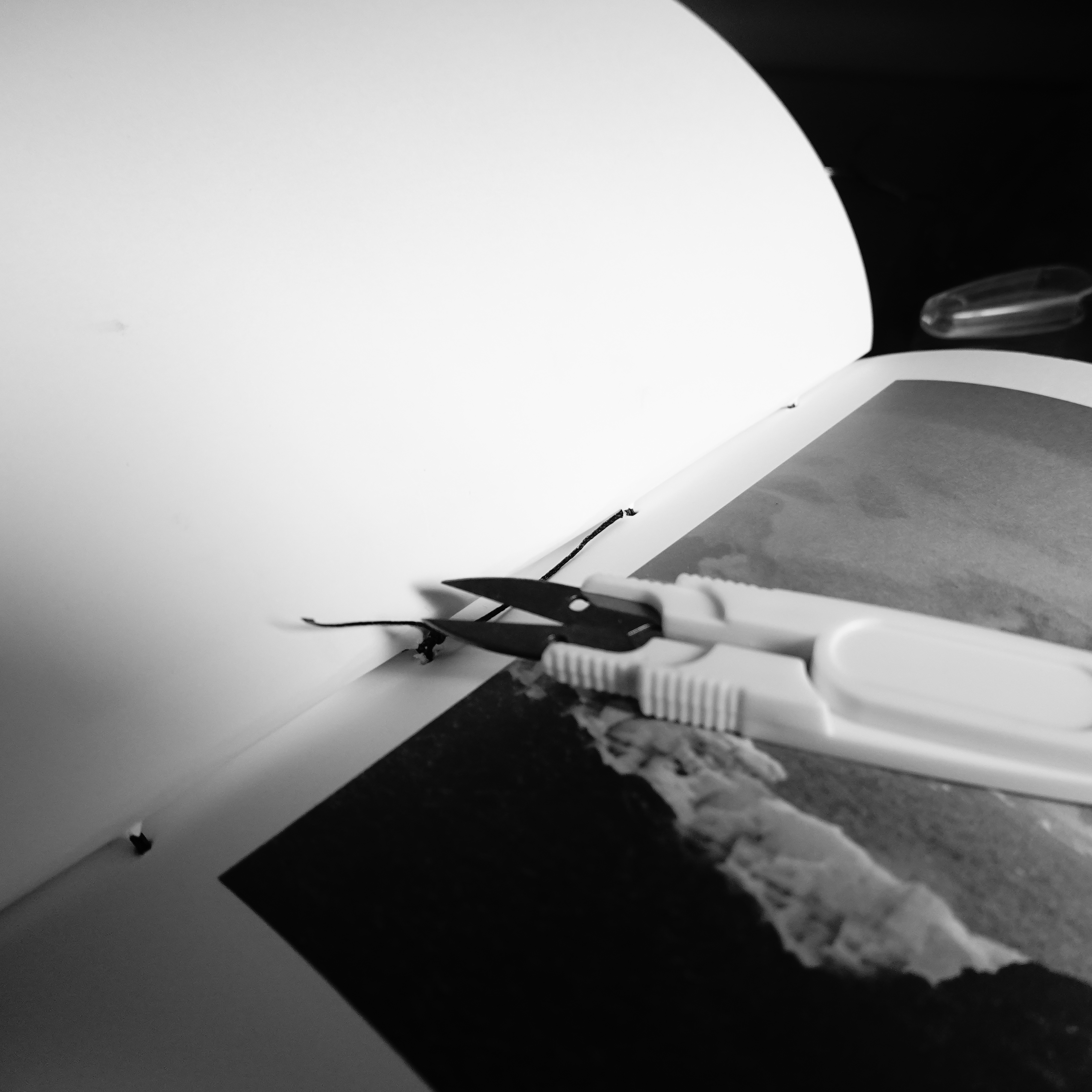
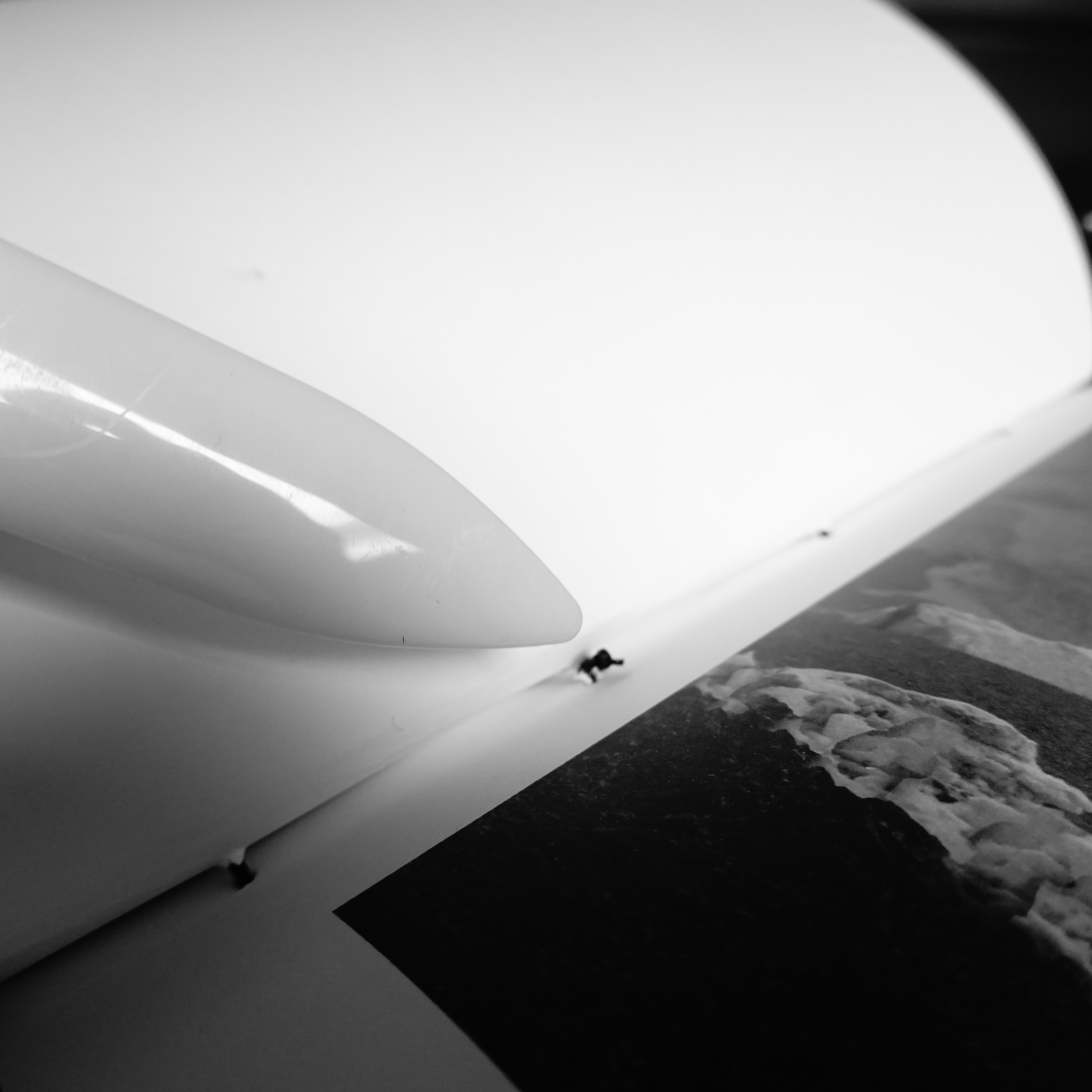
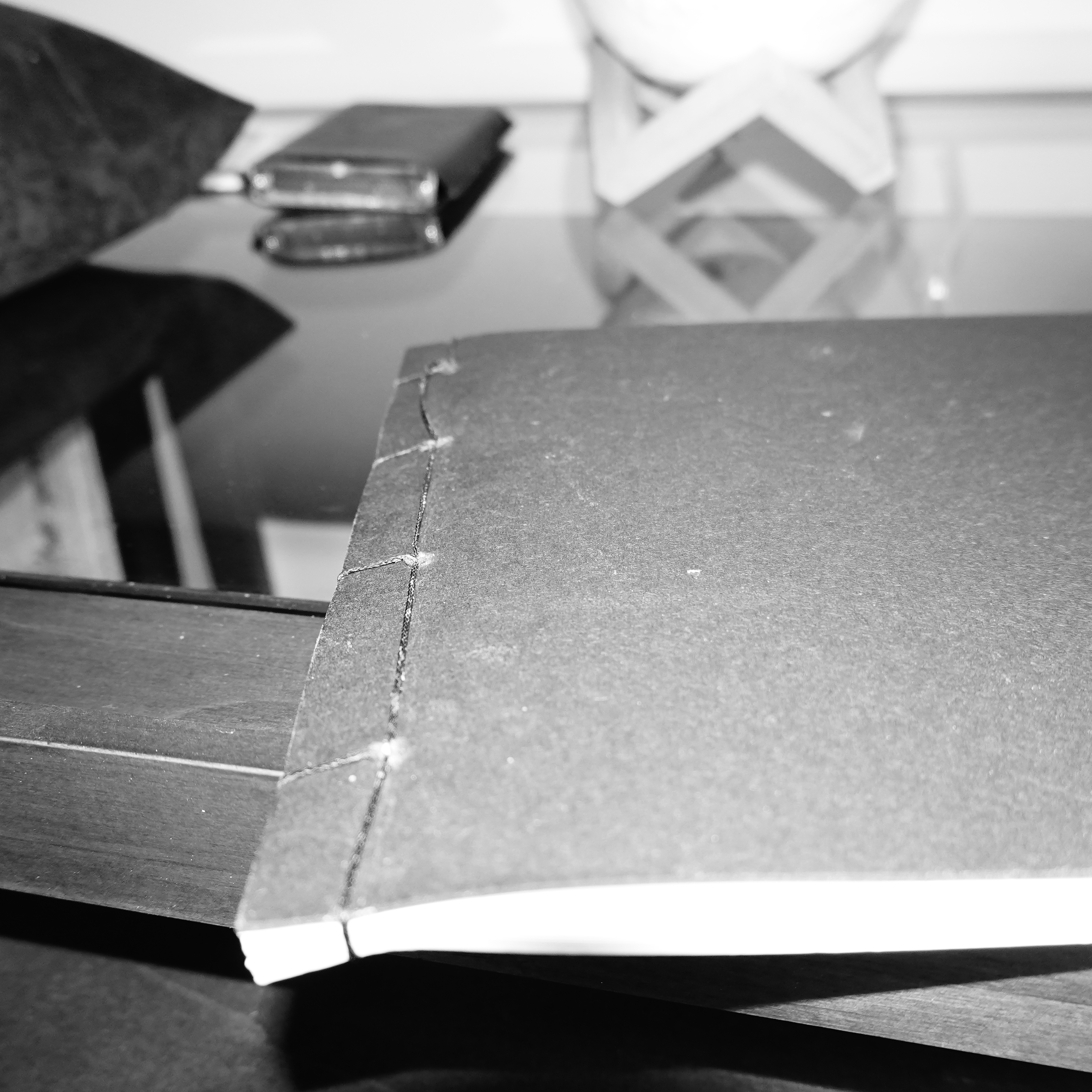
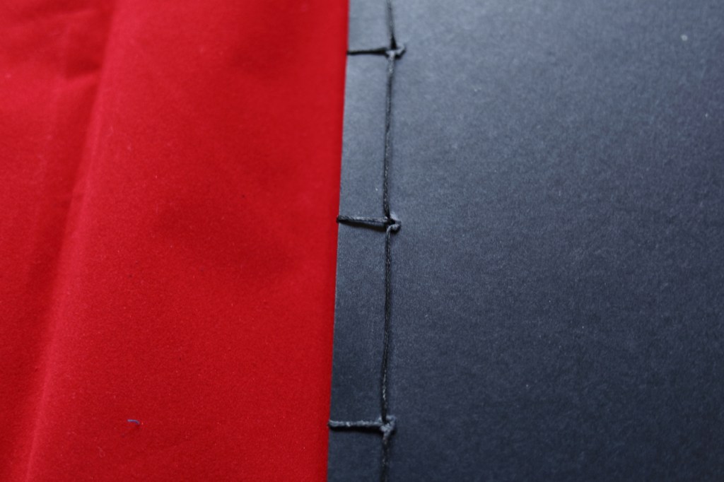
Finally, the box tools arrived and I set aside a morning to stitch the book together. Using the bulldog clips to hold the pages together I made the holes in 5 pages at a time. I had to punch four holes in each page. With the covers and the map, I had 20 pages so I had to repeat this process four times.
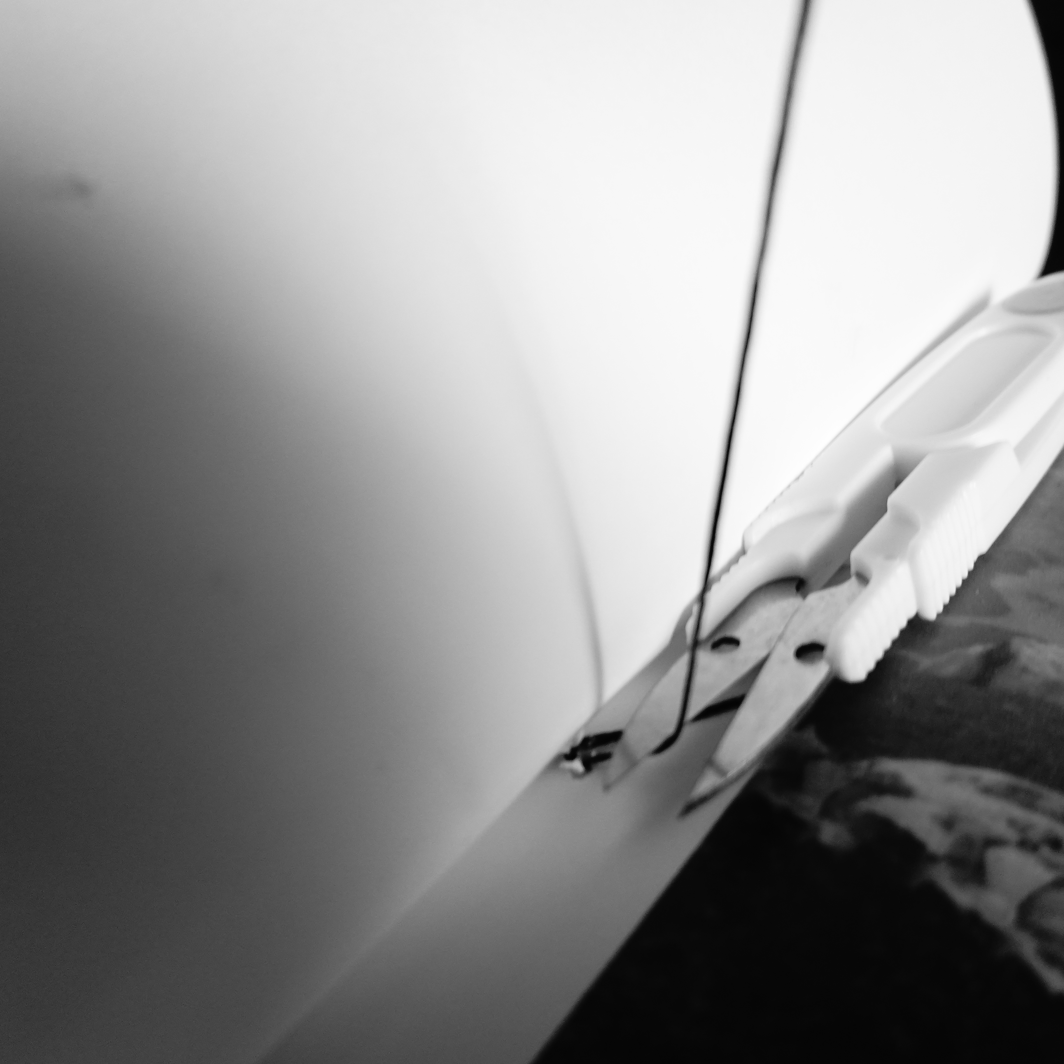
My tutor had given me a tip to use a drill to make the holes in the pile. I wasnt confident enough to drill on our dining table. I liked using the traditional method of making the holes with the awl.
When this process was complete I began stitching the pages together. I have read many pages describing how to make these stitches. I did not understand many of the described techniques. I found it easier to follow the diagrams I found on the website of Portsmouth University written by Jackie Batey, these were very clear and illustrated (Batey, 2014). Here is the link to the page for you to follow her methods.
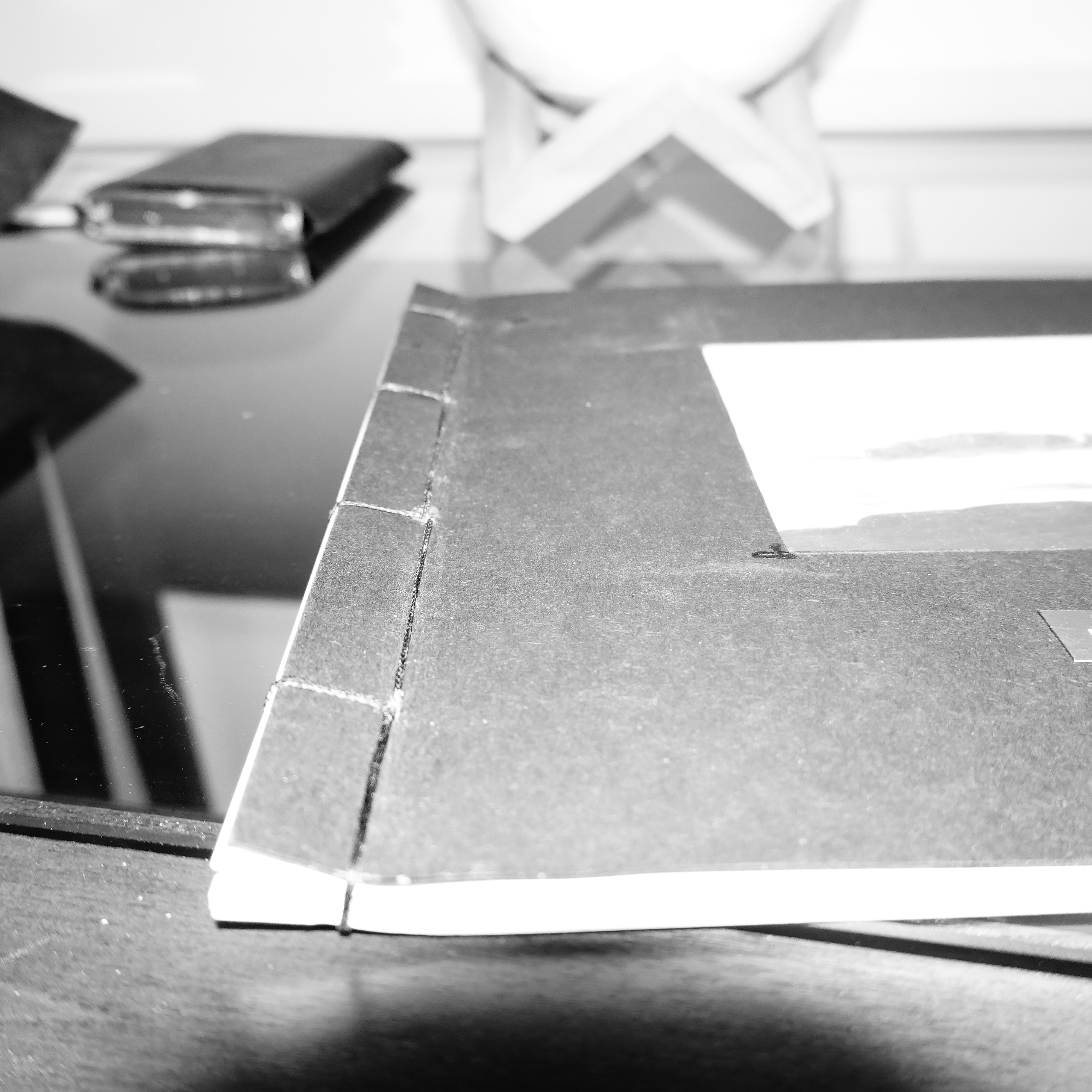
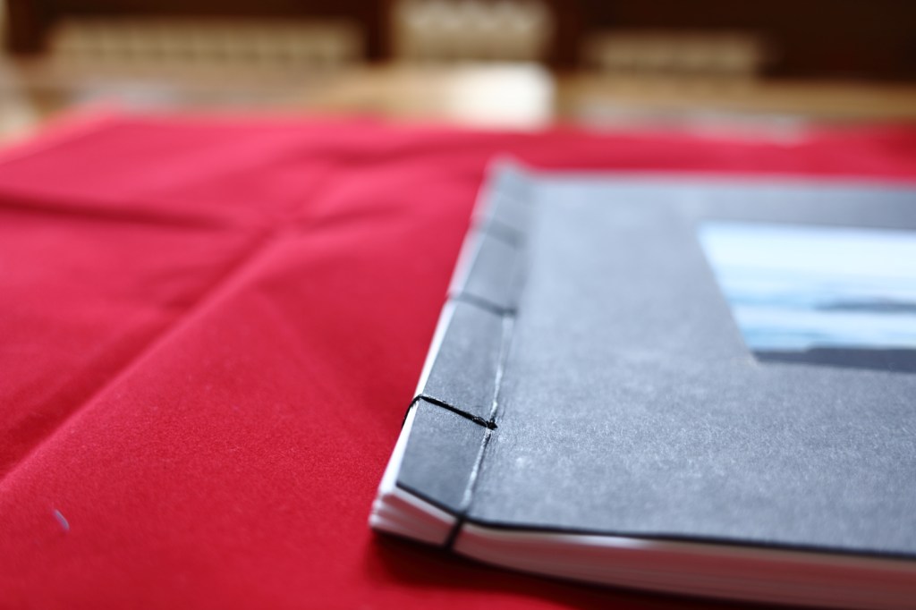
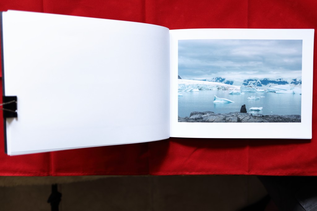
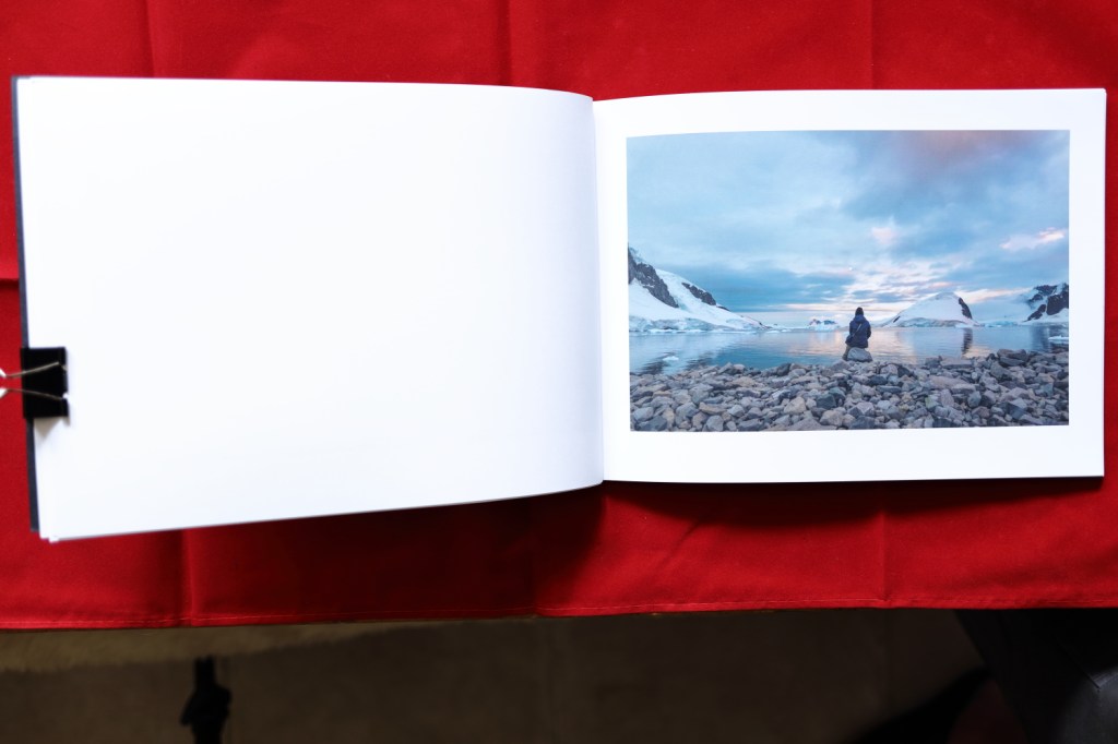
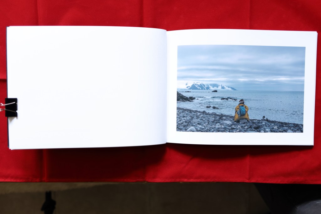
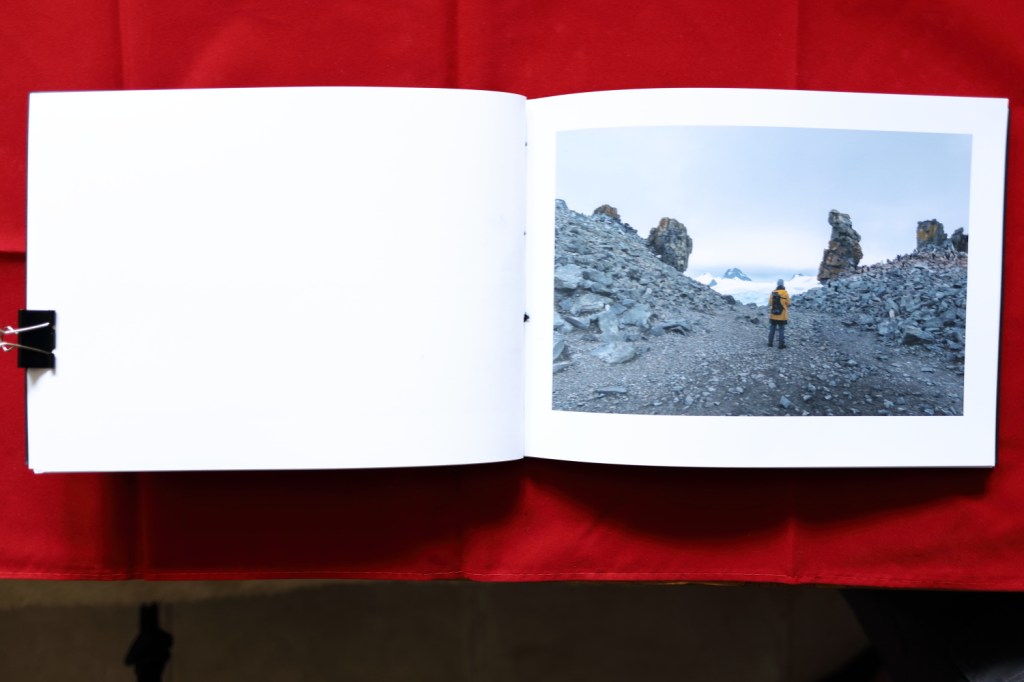
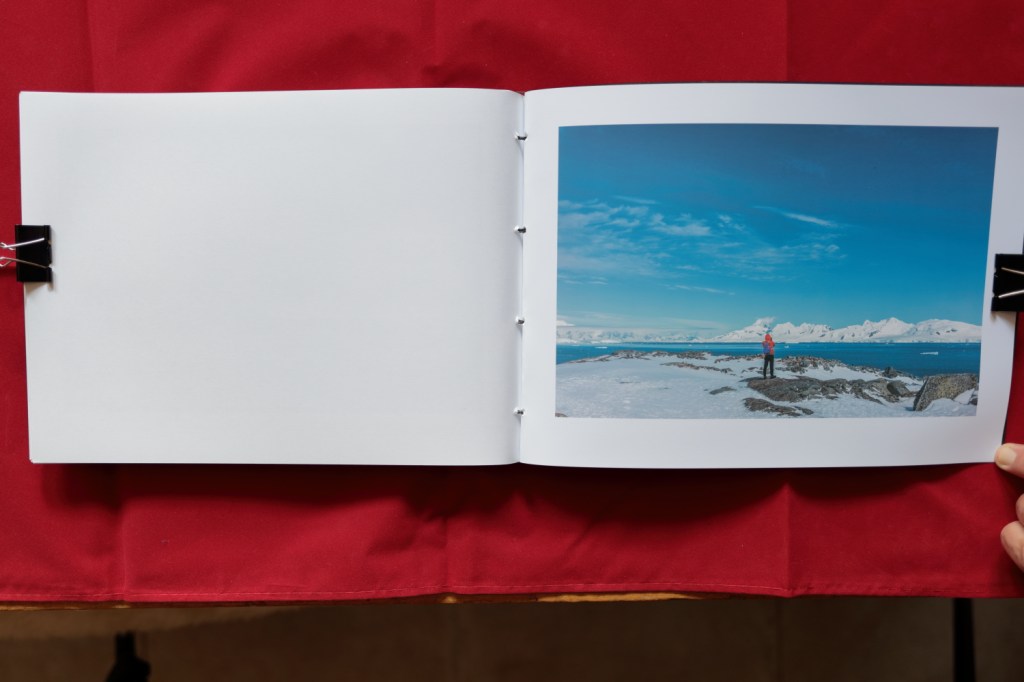
Here are the photos of the process of making my book.My finished book complete with painting in window.
When the stitches were finished I used the bone tool from the kit to tuck the final knot tidily away within the inner pages out of sight.
Finishing with a bit of tidying up and gentle cleaning of scuffs the book is finished. I was nervous before starting but found the whole process rewarding. The final product is very satisfying, holding the book, and looking at the pictures is wonderful.
Work inspired by the work of Caspar David Friedrich.
All the time I was away I planned on showing my work in a large book printed by Blurb. My tutor challenged me to learn Japanese Stab Binding and make my own book so taking control of the whole process from beginning to end.
I planned to send the finished book to my tutor but CoVid19 put a stop to this. As I returned from Antarctica the whole world was closing down. Buenos Aires and Sao Paulo were like scenes from a war film with coffee shops closing and people leaving as quickly as possible.
The problem I have of not being able to send my book to my tutor is a small one compared to the problems of others. I am glad I can find a solution to my insignificant problem by creating digital copies of my book.
My solution is to photograph the book I and send the images to show the book. I will also include the images as they are on my computer so you can see the images in more detail if you would like to. Finally, I include the contact sheets of the set of images I took with this project in mind.
For the other pages from my learning log here are the links to each page.
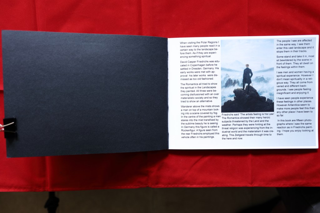
Response to Caspar David Friedrichs The wanderer above a sea of fog (Friedrich,
Photography is different to painting as the instrument captures what is in front of the lens, editing allows you to bring out the features within the photographs. Painting allows the artist to add features or change perspectives to apply the sublime to a drawing or painting. I tried to capture peoples reaction to a sublime scene in front of them. Friedrich could add people to the scene back in his studio. Creating rather than recording.
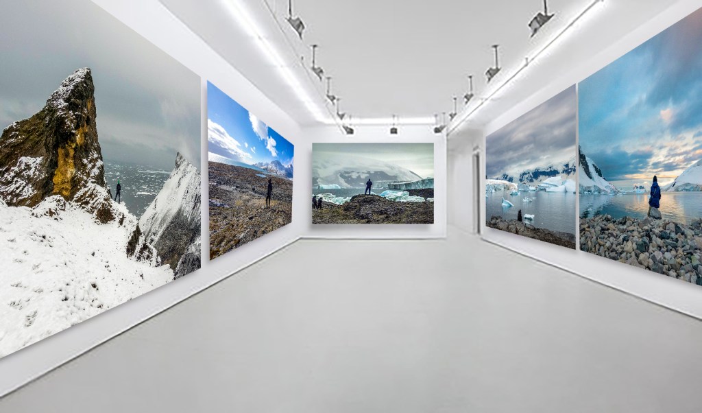
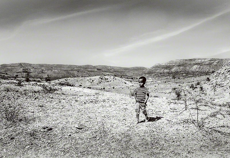
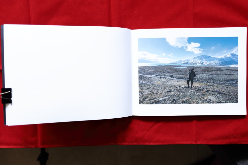
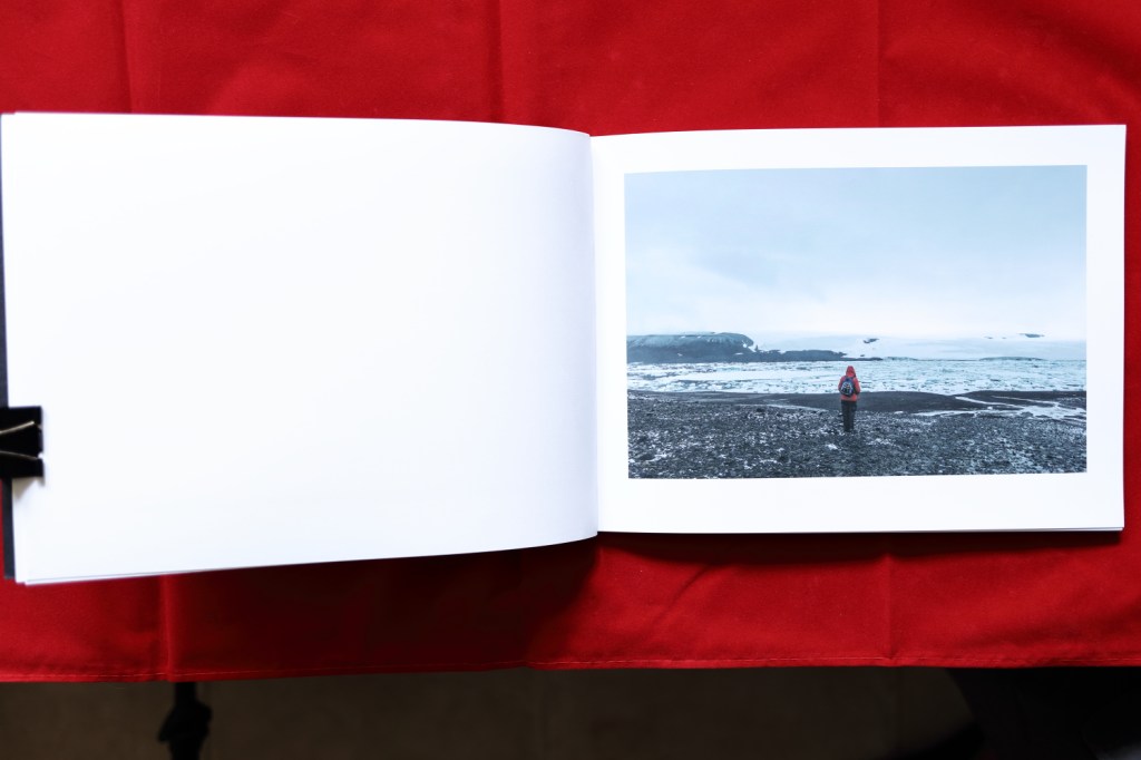
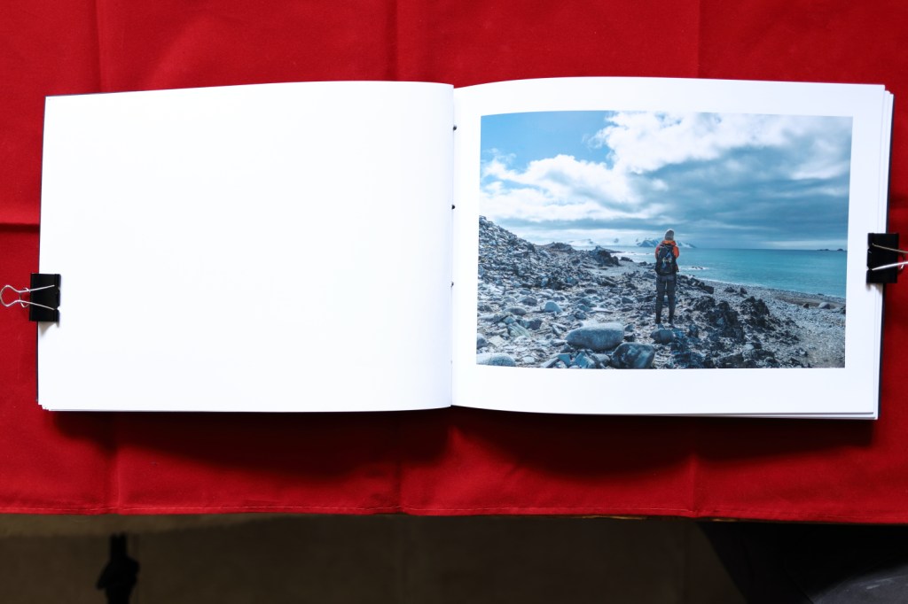
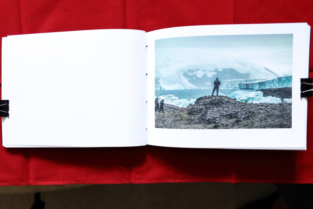
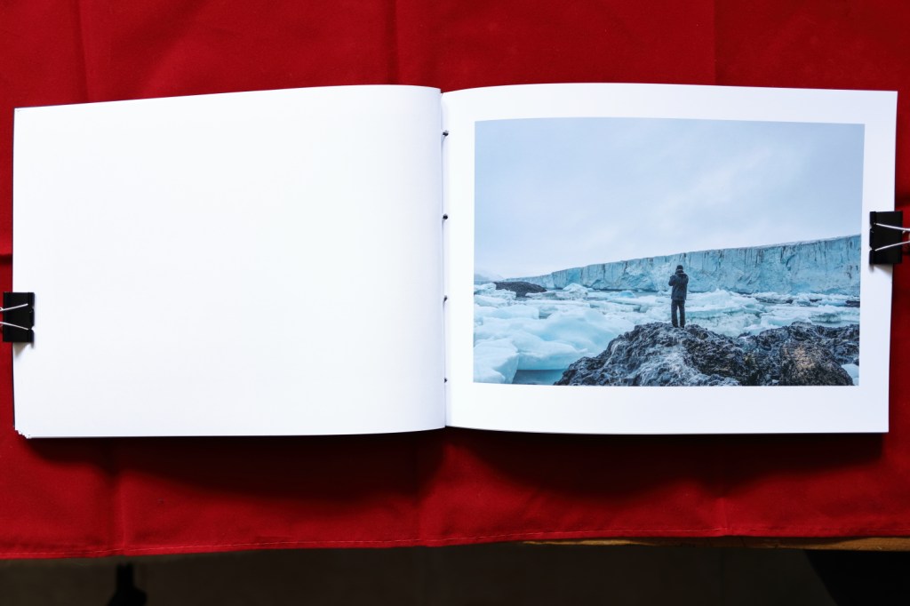
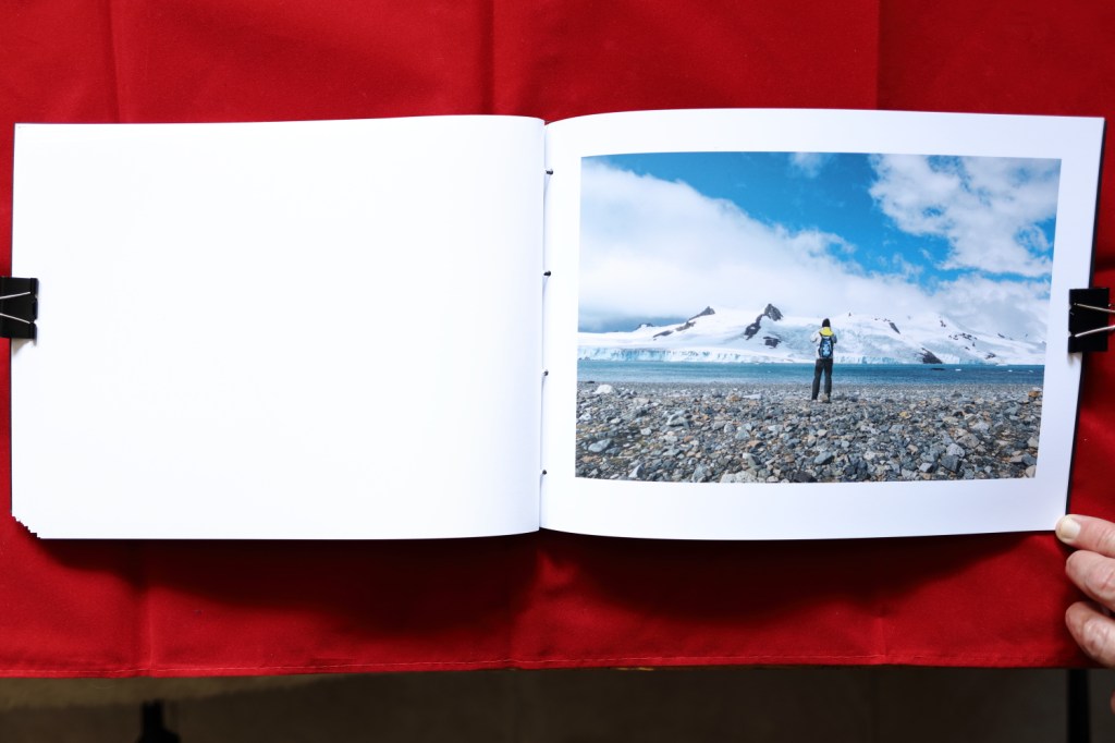
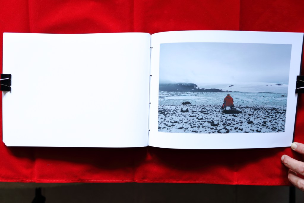
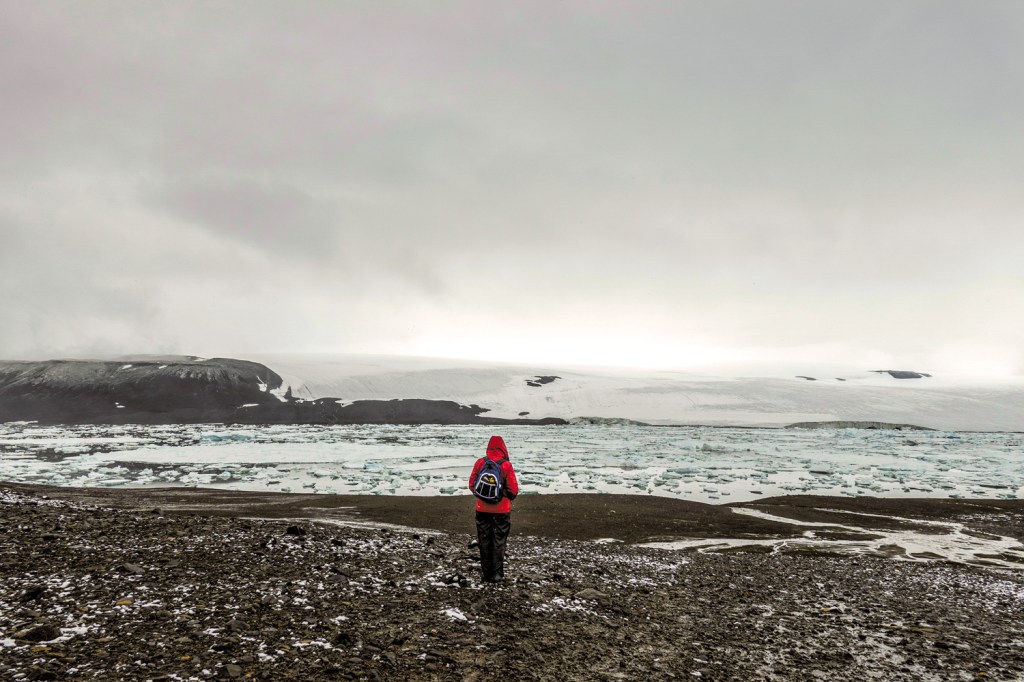
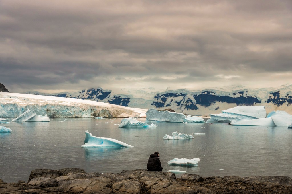
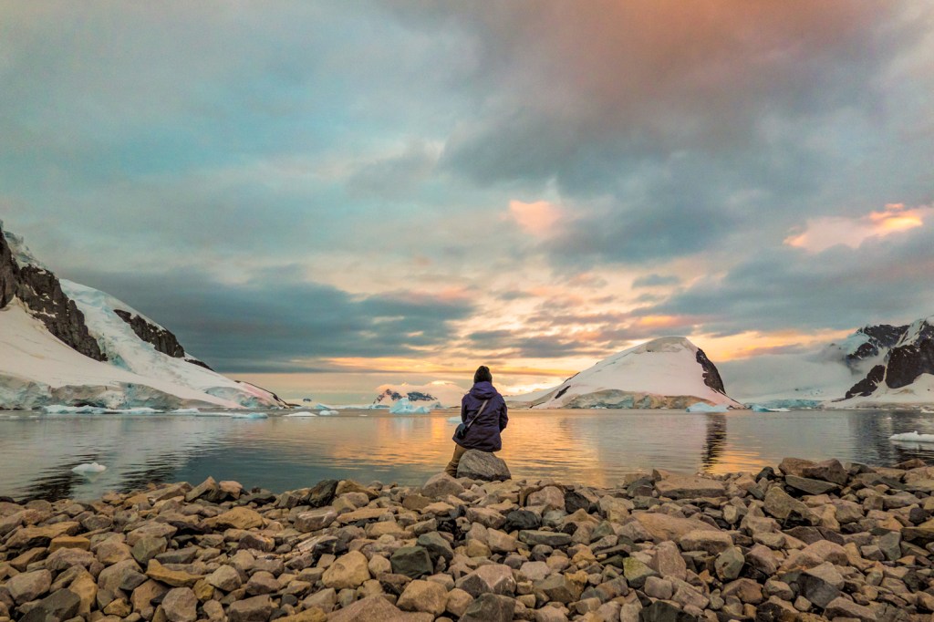
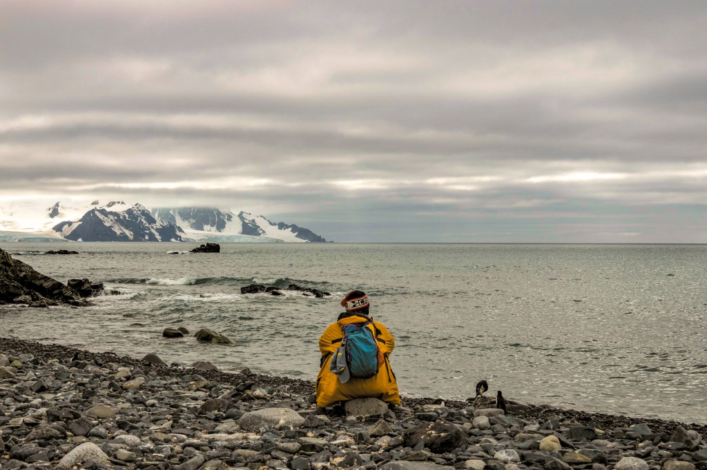
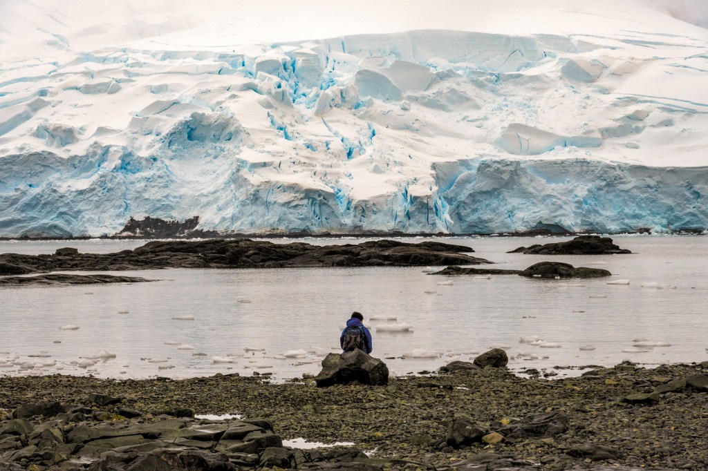
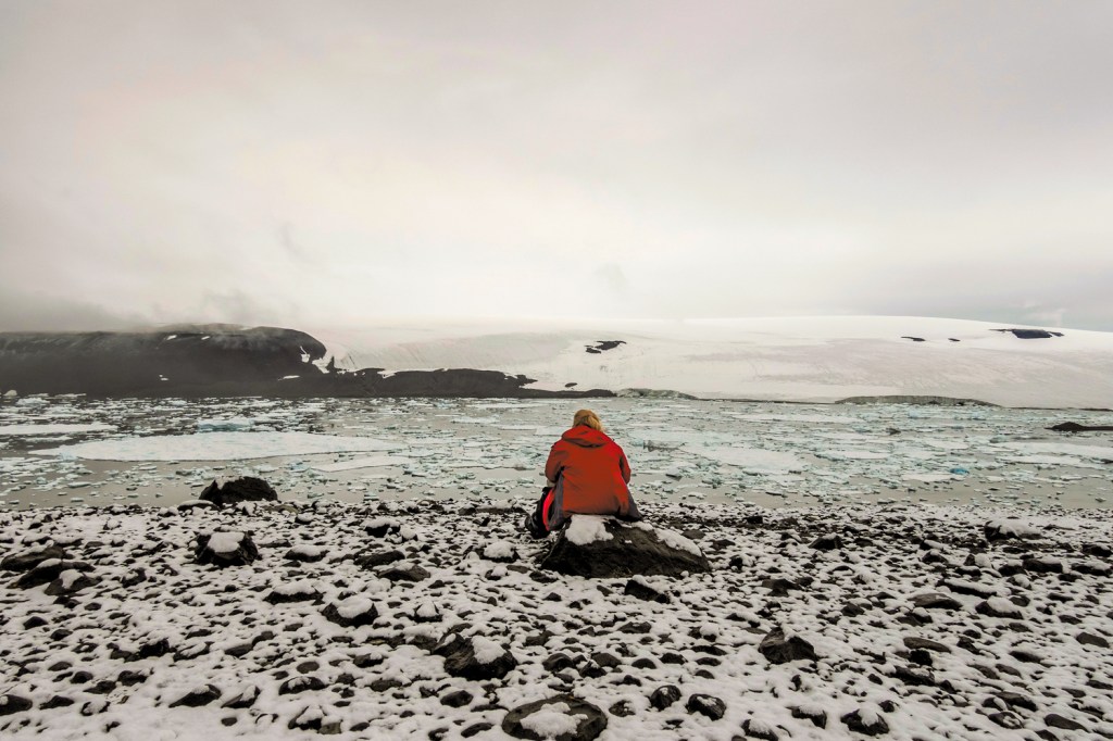
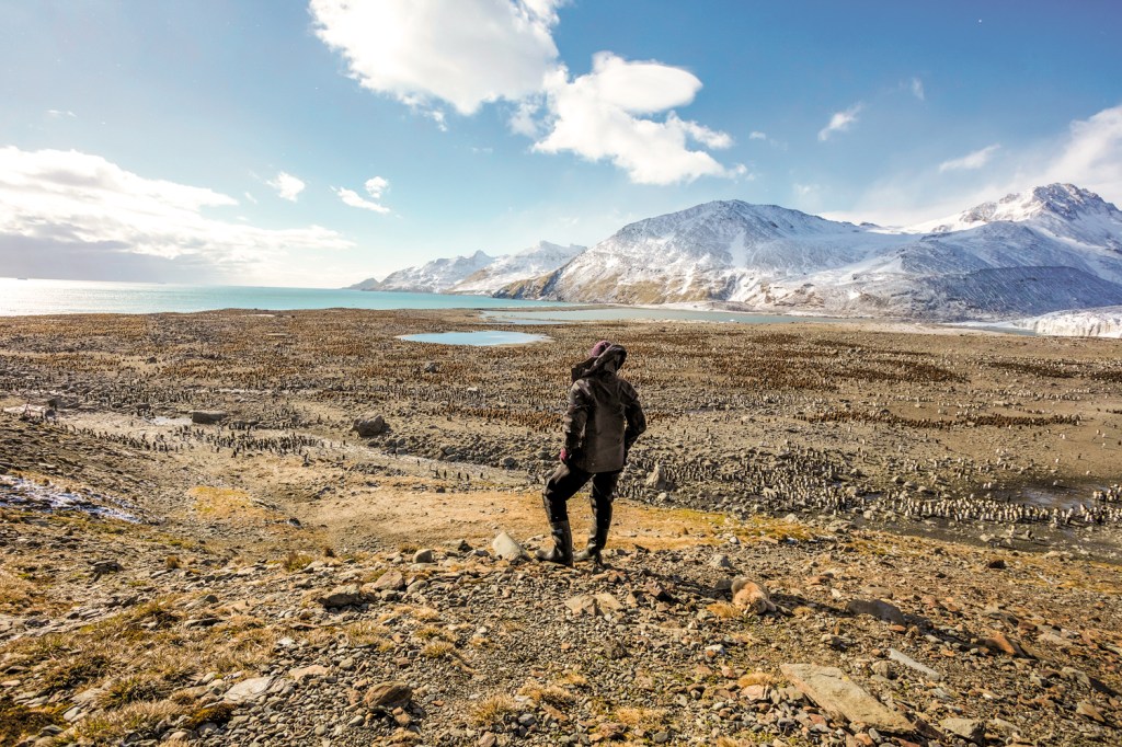
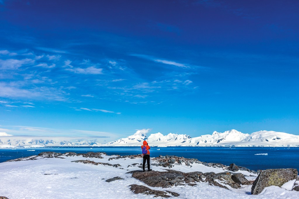
I have seen a spiritual reaction to the landscape in Antarctica. Not a religious spirituality but people in a wilderness setting being stopped in their tracks and responding to it by sitting or standing then staring, spending time taking in their feelings.
I have spoken to many of these people after they enjoyed their experience. People from all parts of the globe and of different faiths. They all use words that are related, insignificant, small, overwhelmed, amazed, moved and best of all transcendent. The way they just stop and stare makes me think of Friedrichs painting of the wanderer. One person who had terminal cancer and had only a short time to live said this experience had given their whole life meaning. They could leave this life now fully enlightened.
Friedrich said “All authentic art is conceived at a sacred moment and nourished in a blessed hour, an inner impulse creates it, often without the artist being aware of it”. (Friedrich, 1837). The painting certainly shows a sacred moment captured in time, I have certainly missed many of these moments just has the quote says.
The Theologian Ludwig Gothard Kosegarten who influenced Friedrich said “Nature is Christ’s Bible” (Kosegarten, 1815) again a religious connotation which I tried not to portray in my work.
Anslem Kiefer. Fig 4 Occupations Tate Modern London 1969.
It was easy for the Nazis to hijack Friedrichs work he showed Germanic themes, Aryan people looking at the distant horizon was employed to show Germany looking across difficult times to a brighter horizon. In the 1960s Anselm Kiefer completed “Occupations” (Kiefer, 1969) a body of work based on the Sieg Heil salute used by the Nazis. He posed at various relevant sites including one at the German coast which echoes “The Wanderer above the fog” (Friedrick, 1818). Keifer who had seen the romantic in the ruined cities after the war countered what the Nazis brought to Germany. I certainly didn’t want to portray these ideals.
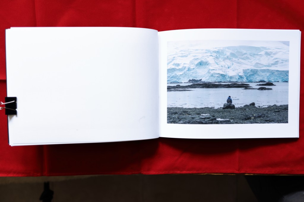
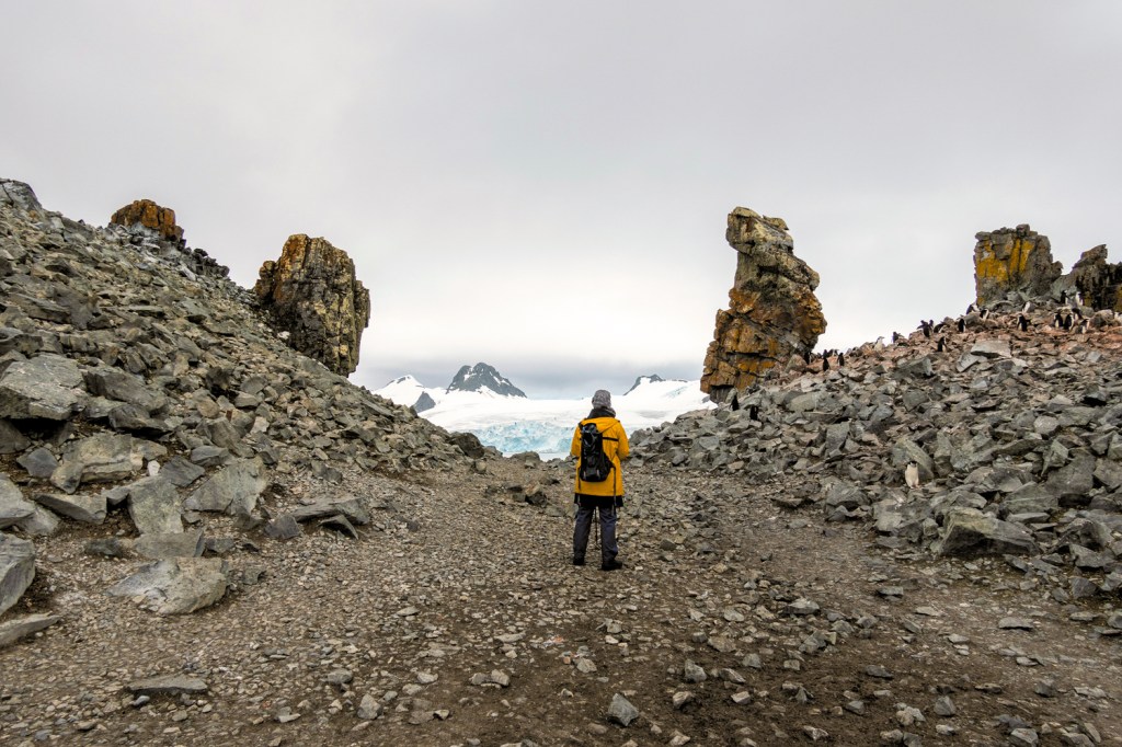
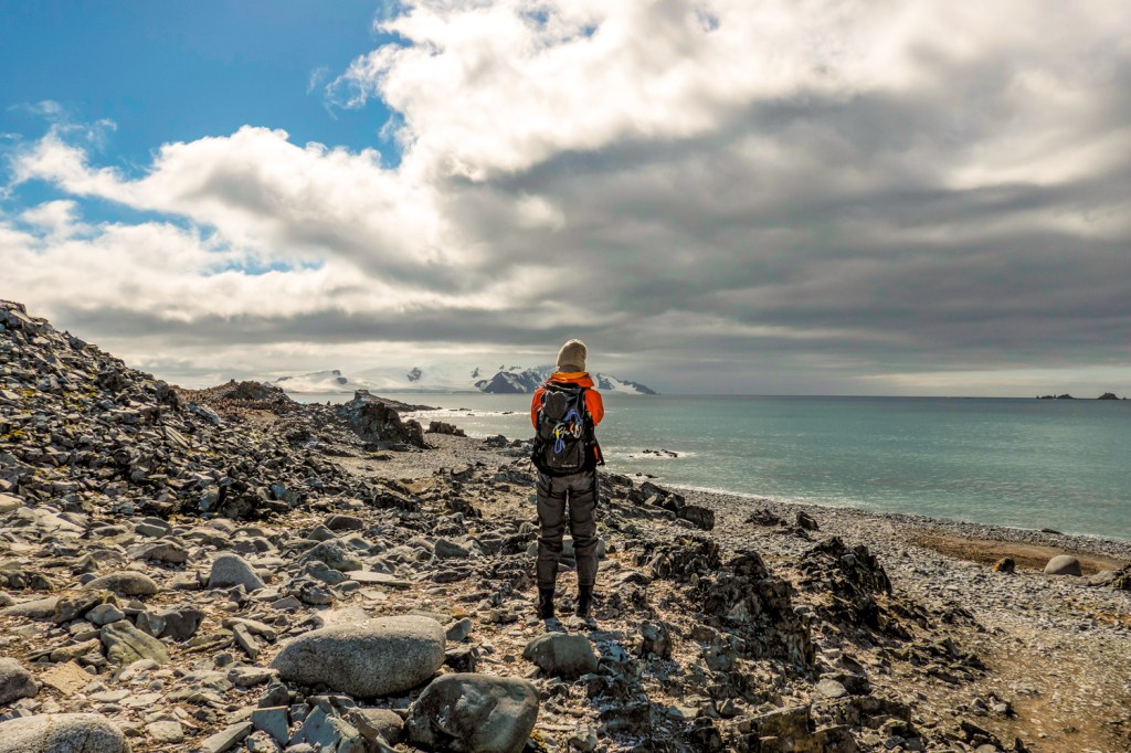
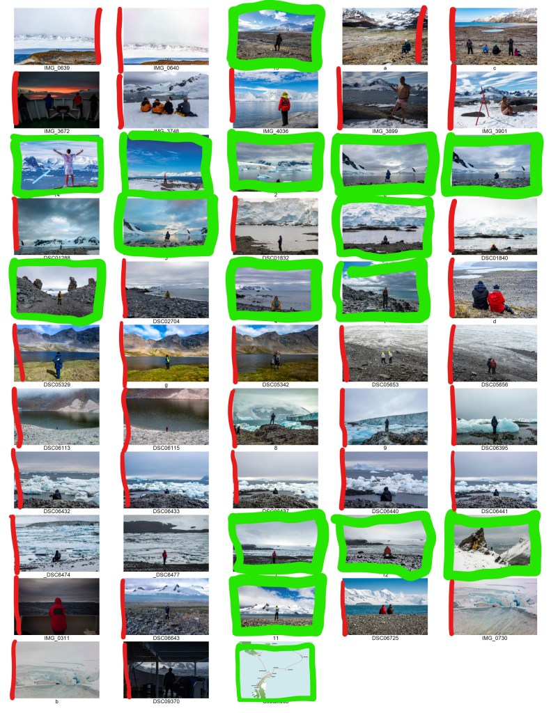
My work consists of 15 exposures taken from 60 shots taken. They are influenced by Friedrichs work but not copies of it. I wanted to capture the feeling not the painting. When I proposed this work initially my tutor encouraged me not to produce a photobook but to take control of the whole process. He suggested Japanese Stab Binding.
This meant I had to learn a new skill and after practising by making a small notebook I progressed to producing the A4 book for this assignment. I enjoyed this learning immensely and I like the finished book. I even made a window for Caspar David Friedrichs painting to feature.
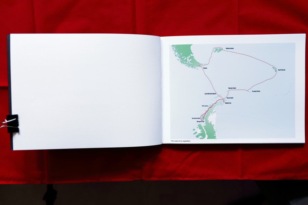
Both my tutor and I like maps so it seemed sensible to include a map of where the images were taken. I added a page of text to give the viewer some idea of where the inspiration for the work had come from before they looked at the finish result.
I enjoyed the whole process but seeing people experiencing the landscape was the most enjoyable. Placing myself where I thought people would stop and then waiting made me think of Henri Cartier Bresson and the decisive moment. Then back at home, the process of producing the book was extremely satisfying.
If I was to approach this work again I would think more about lighting. The weather was not kind to me with many overcast skies. However with the right setting on my camera they add a mood to the exposures. I didn’t include the exposures that showed a man who stripped to his underpants and sat down in the snow and cried. Or the skateboarder who got out his board and did jumps from a rock. They didn’t fit the brief of the Rucksfigur. Finally I change the painting on the cover by changing it from a portrait layout to a 3:2 Landscape format, this takes away from the height Caspar David Friedrich wanted to portray in his painting.
If I was to change anything I would change the weight of the paper I used to a lighter figure. The thickness of the paper restricts opening the book. It doesn’t restrict when observing the book normally. However when I photographed the pages it was hard to get the paper to lay flat meaning the photographs of the work have a distortion. This is only a small thing caused by not being able to send the work in for looking at normally.
I feel the finished work achieves the things I set out to achieve. Showing the spiritual experience that nature gives. Without affecting the adventure the subject was enjoying. The finished book feels right and shows the exposures as I envisioned at the start. Opening each page shows a new experience, a new reaction or a new adventure.
Works Cited
Friedrich, C. D. The Wanderer above the sea of fog. Kunsthalle, Hamburg.