Exercise 1.6 Staring into the Abyss.

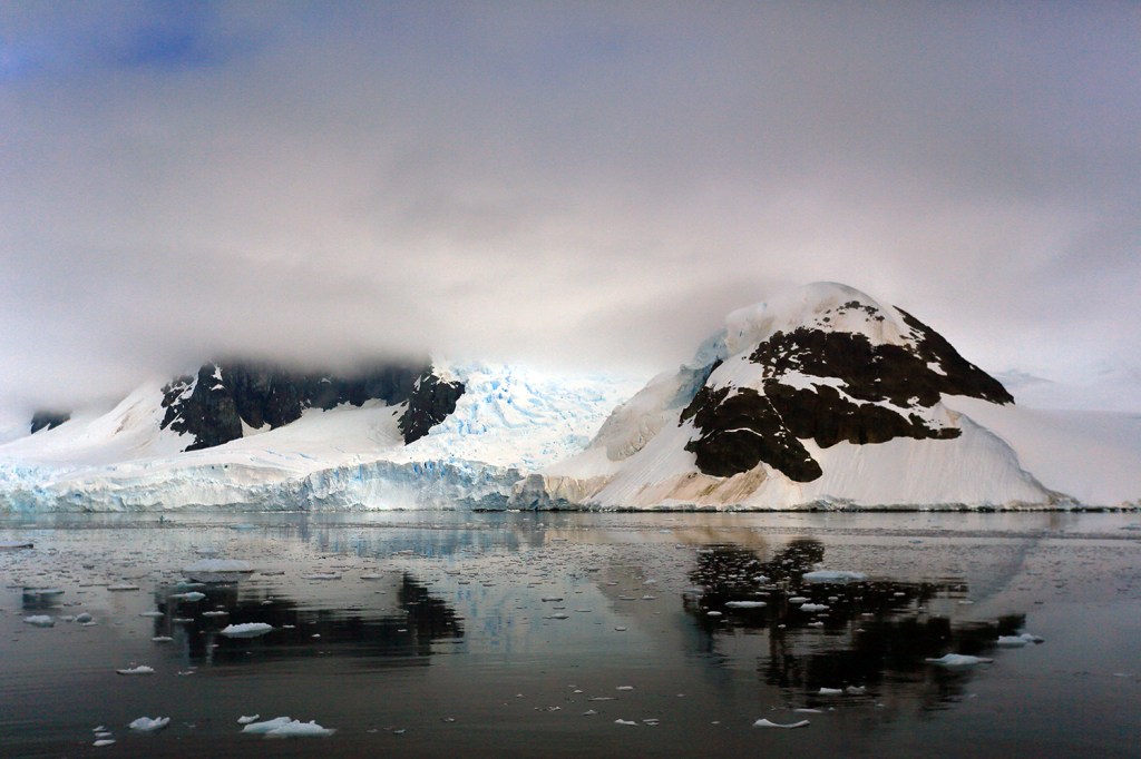
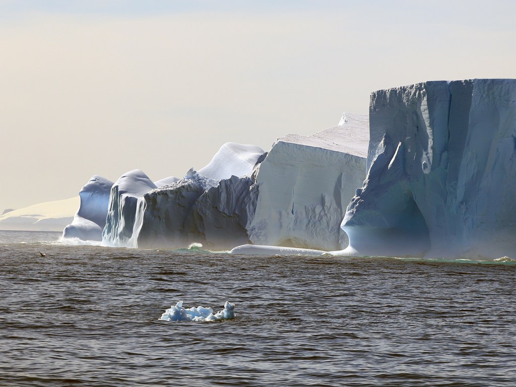
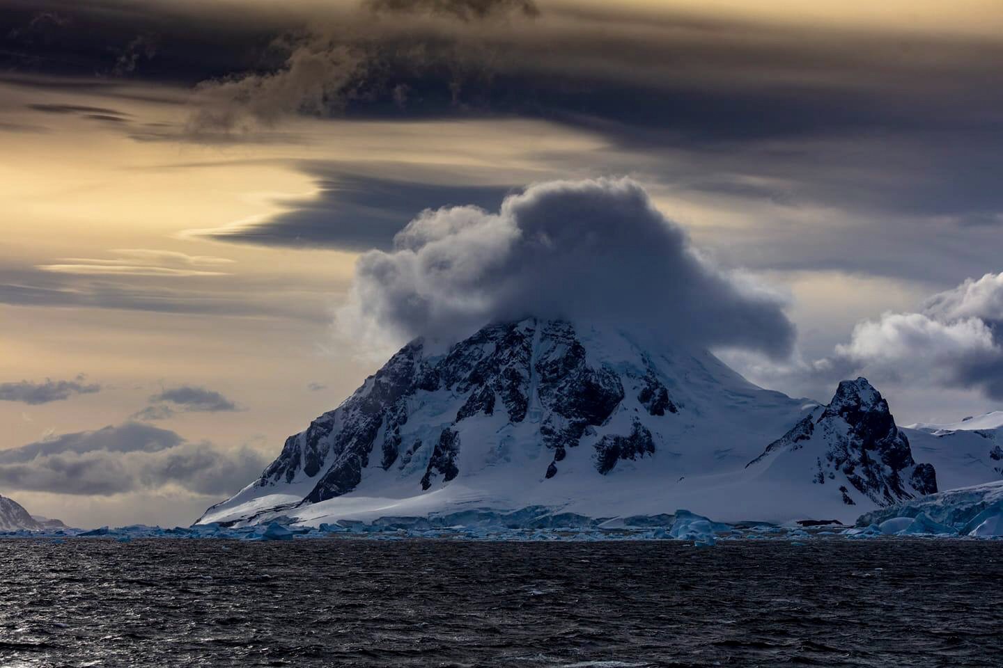
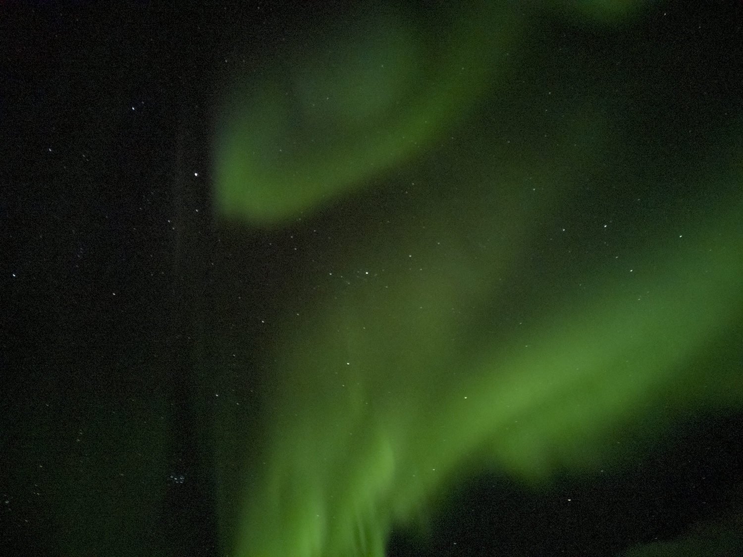
Staring into the Abys is something I have actually done many times. I have been a diver for 30 years and have swum in the Marianas Trench in the pacific. This is the deepest abyss on our planet. I understand the feeling described in (1)Frederich Nietzche “if you stare into the abyss, the abyss stares back at you”? This feeling is sublime because you get taken right up to limit and the simple act of looking makes you feel uneasy, small and vulnerable.

In this essay I want to explore who and how certain artist have nearly achieved this feeling in their art.

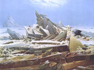
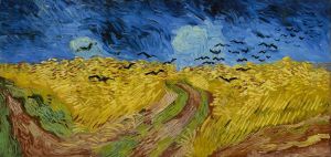
In exercise 1.1 I showed (2)Casper David Friedrichs painting “Wanderer and the sea of fog”. This painting shows Friedrichs looking into the abyss. He gives us a glimpse of what is there but shrouds it in fog. His left leg is higher than his right and I wonder if he is going to step into the abyss and cause his own oblivion? The lead lines in the painting go all over and make me feel uneasy. My eye doesn’t go left to right as it should in the west or right to left. It goes all over the place following mountain ridges to nothing (well in fact fog). In my opinion a sublime painting indeed. Art Historian (3)Robert Rosenblum said of this abstract art “as revealing feelings of vision and feeling”. I certainly like looking at this painting and enjoy how it makes me feel.

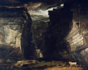
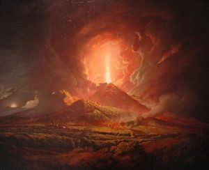
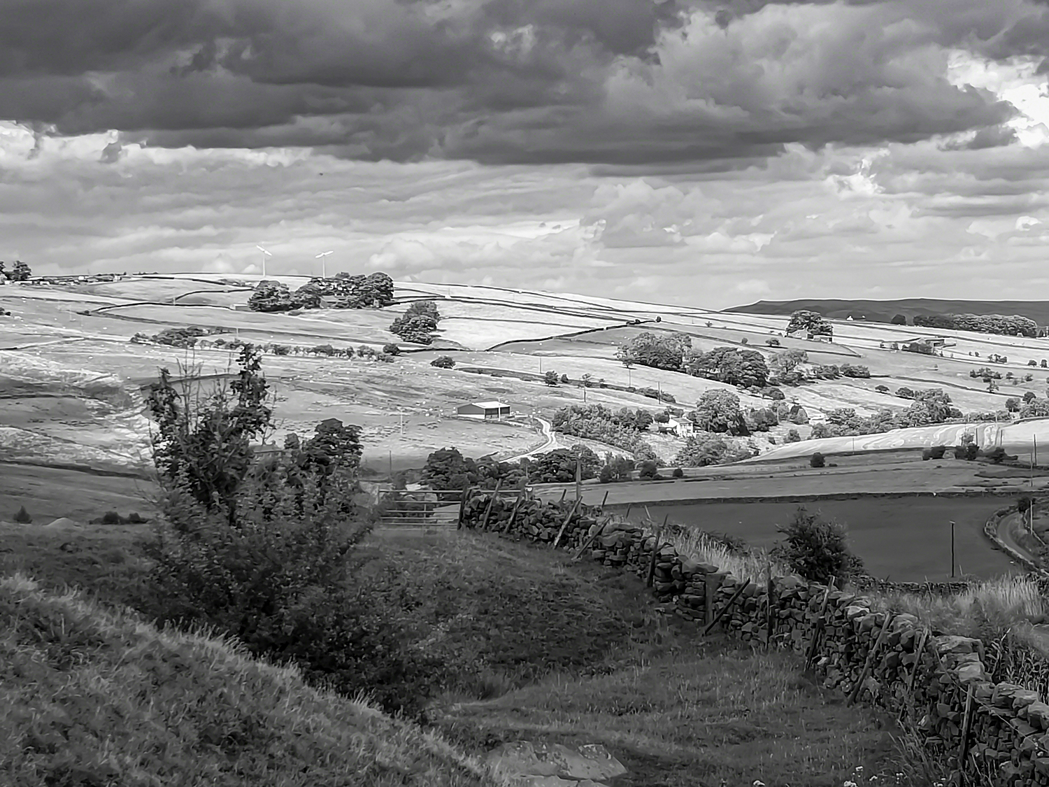
(4)James Wards painting “Gordale Scar” gives me the same feeling of looking into the abyss. I know Gordale Scar well it is only 8 miles from where I live and I often walk there. The painting is dark with well painted light areas. It has depth and whenever I walk and climb the waterfall I feel as if I am walking into this painting. It has emotion far above the visual on display in the gallery. The sky has a foreboding feel of doom or even danger nature is in full control.

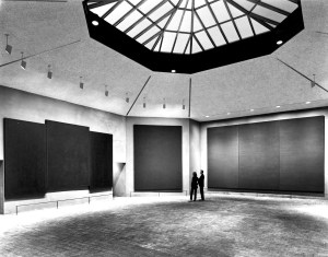
In 1964 (5)John Rothko was commissioned to complete an installation. He made an octaganol chapel in which he placed 14 paintings. All dark hues some triptych implying altar pieces all were just dark spaces. In the mid 80s I visited the chapel and at first didn’t get it. Slowly I found myself being drawn into the abyss. Then slowly I felt the paintings in front of me were looking back at me. It made me feel a strange emotion and very uneasy.

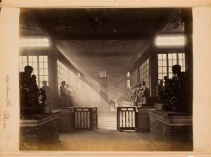
In photography (6)John Thompson has an image “Buddhist Temple” evokes the same feeling. It is just a room with statues of buddisst monks. The light which is beautiful gives the exposure emotion. It also takes the eye through the picture. However it is the light that makes this image sublime to me.

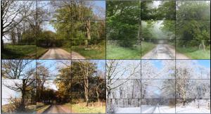
In (7)Liz Wells book Photography A Critical introduction I read “An experienced photographer knows intuitively where to place the camera and which lens to use for the best effect. Much in the same way a pianist arrives at proper pitch and touch through daily rehearsal it is a matter of fluency and assurance”. This is what I want to develop through this course so I can capture the emotion in sublime scenery.

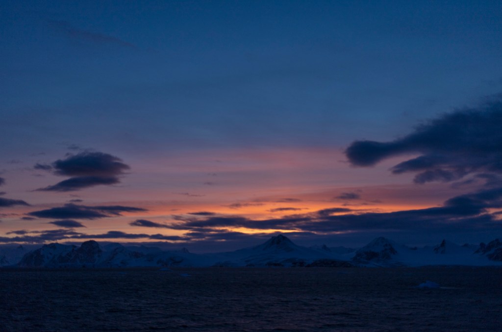
I have felt this emotion in the sea on a few occasions one being in the Marianas Trench. The feeling of the abyss looking back at me meant I didn’t need to go to the bottom of the trench I already knew what was there. I did feel uneasy, small and vulnerable, nature was in control.

References

(1)Nietzche, F. (1886). Aphorism 146. In: F. Nietzche, ed., Beyond good and evil. Leipzig, p.146.

(2)Friedrich, C. (1818). Wanderer above the sea of fog. [Oil on canvas] Hamburg: Kunsthalle Hamburg.

(3)Rosenblum, R. (1994). Modern painting and the northern romantic tradition. London: Thames and Hudson.

(4)Ward, J. (1818). Got dale Scar. [Oil on canvas] London: Tate.

(5)Rothko, J. (1964). Rothko Chapel. [Oil in installation] Houston, Texas, USA: Rothko Chapel.

(6)Thompson, J. (1869). Lah alum Chu Canton. [Albumen Print] Rochester, USA: George Eastman Museum

(7)Wells, L. (2015). Photography A Critical Introduction. London: Taylor & Francis.

Exercise 1.5 Visualise Transitions.

A number of years ago I was walking down a leafy country lane near Warter in East Yorkshire when a car approached me driving very slowly. The car had a very odd bull horn on the front. The apparition approached and past at a snails pace. I glanced in the car and thought I recognized the passenger.

Turns out this was David Hockney making a piece of film for the Royal Acadamy. The strange apparatus on the front was in fact a rack of cameras. Nine in total all catching a different perspective of the same scene which when combined fools your brain into seeing one image.

Hockney then presented the video on 36 55 inch screens. I don’t have those resources so will have to change my version.

David Hockney’s Four Seasons 2011 http://www.hockney.com

This experience came back to me when I read the brief for this exercise. We have a very picturesque wooded lane near to where we live. This lane appears to be stable so I would be interested in its transition through the year. A year which will be massive in Europe’s history. Whatever happens within our exit from Europe the lane will stay the same.

I spend my spare time Diving and doing so we use transits to ensure we return to the correct area of seabed. I can use these to ensure I take my exposures from the same place. I took three transits and noted them in my notebook.

Landscapes are usually 3:2 ratio so if I take my shots as square it will give a unit of 1. So 3 along the top with 3 along the bottom will give the 3:2 ratio required. Each completed photo will take 6 exposures. I aim to completed one every month so 12×6=72 photos to complete the set.

Format for my Transitions work.

Whilst they are of the same scene they are not a stitch so wont be exact. Hopefully this will make the brain fill in the scene giving a similar effect to the one Hockney achieved in his work.

Thinking about presenting the work for assessment it may work in a high quality photobook format. Printed as large as possible. I usually put captions with my work however it may be interesting to use the headline of the day to record what happened in the media on the day each exposure was completed.

So below is my first attempt at this work eleven to go.

Shop Lane August 2019..

References

Hockney, David. Four Seasons 2011. 2011. Digital Colour Video. Royal Academy London.

Exercise 1.4 What is a photographer?

Marius De Zayas(1880-1961). “Photography is not art, but can be made to be art”.

What did he mean by this? At first read I was affronted by this statement however reading on I got to understand De Zayas thoughts and found myself seeing my photography thought process in his work.

This essay comes from a piece he wrote for issue 41 of Stieglitz led magazine Camera Work in 1913.

De Zayas was allied to Gallery 291 in New York this gallery is so named as it was on 5th Avenue in New York at number 291. It was know as the little galleries of the phot secession. Stieglitz created and managed this gallery.

After reading the essay I understood that De Zayas was saying there are two types of photography, 1 Photography and Art Photography.

I shall consider the two, first Photography. This shows form in its true state, the camera is placed in front of the subject and it records what it sees. You could say it is showing knowledge. The photograph is mainly produced right in camera. Little alteration in post processing.

Secondly Art photography, this show different conceptions of form. The truth(subject) is their but you have to work a little harder to understand what is being shown. Form is suggested to you. You may need more research to help you think, see and understand. This type of photo is for pleasure.

This thought process was evident in John Szarkowski exhibition Window and Mirrors when he explored truth and manipulated photographs in 1970s art.

Both work and neither is over the other, I use both to show my work to my viewers.

When De Zayas says “The first is the fixing of an actual state of Form, the other is the representation of the objectivity of Form.” It makes me think of rock art I have seen. Both are depicting the form of man however one shows the form in a straight here’s a man way. Whilst the second shows the impression we leave if we blow pigment on our hand. The shape is left behind but I know both are showing a human.

My thoughts on this are confirmed later in the work when the writer says this “Subjectivity is a natural characteristic of man. Representation began by the simple expression of the subject. In the development of the evolution of representation, man has been slowly approaching the object. The History of Art proves this statement”.

Both are photography both can be art, a camera is only an instrument like a twig dipped in pigment.

Exercise 1.3 Establishing Conventions.

To approach this exercise I decided to organise my findings on a spreadsheet for easy analysis after I had finished my research. This helped me a lot.

The spreadsheet to help me see patterns.

The next difficulty was choosing the work by the artists. I searched through several books for ideas of who fits into each of the time periods given in the brief.

I tried to find a mix of well known artists and lesser known ones too, all had to be known to me. Then I started to look at the paintings all together after downloading them from the internet.

The majority have symmetry or follow the rule of thirds. Big skies proliferate, in these skies there is all kinds of weather, lots of storms and choppy seas. People are in many of the landscapes to give scale show land usage or just tell a story. Colour is vital be it vibrant and strong or subtle.

In the early works of the period looked at the paintings either show people who have achieved great things such as(5) Joshua Reynolds “Captain the Honourable  Keppel” who was accused of cowardice at the battle of Ushant and won his court martial so his father wanted to promote the fact. Or mythical stories set like a stage on a landscape most of which don’t match the setting of the story.

Four out of the six are in Landscape format or the length of the top of the painting is longer than the side edge. The two that aren’t are Reynolds painting discussed above this is a portrait with a landscape, the second being (12)Van Gogh`s “Wheat, Sky and Crows this painting was painted on two square panels giving a 2:1 ratio which was unusual. This painting is possibly the last one he painted so all things were strange.

Within the paintings the use of diagonal lines to take your eyes around the frame. Lines of trees tend to stop before the edge of painting to stop your eyes leaving the frame. All have a subject or focal point the lines lead our eyes to these subjects.

Some have hidden messages such as the Hare in (9)JMW Turners “Rain, Steam and Speed” at the bottom right there is a Hare many think this depicts the destruction of the countryside as we “Hare” around.

Many of the paintings use a curve to move your gaze, lots use a curved “S” to soften this further. River shown going straight into the picture has less appeal than a river or road that follows “S”. You can see this in (4)Munch depiction of the coast in “Starry Night”. It helps you take a varied visual journey across a blue night sky.

Thinking about who was responsible for the creation of the work I started by looking a little further back in history. Earlier artists such as Leonardo da Vinci and Michelangelo were funded by rich families such as the Medici family of Florence they then directed the artist as to what kind of work they wanted to commission. In the 18th Century artists tended to be commissioned for a single piece of work or a small series of paintings with a directed theme. Many were commissioned to show the subjects wealth with the painting even showing the type of animals farmed on an estate. This can be seen in (1)Thomas Gainsborough’s “Mr and Mrs Andrews”. You clearly see sheep and crops showing the type of farm they owned.

In the 19th century commissioned work became less popular with many artists completing work to further the chosen style of the artist. Many of the artists were not wealthy and their work became well known much later than the date it was created. Van Gogh died in poverty shortly after creating (12)“Wheat, Sky and Crows.

In photographic terms Stieglitz created many pictorial photos such as his photo of (13)“Winter” in New York. Dorothea Lange showed people in the fields in her work (14)“Migrants”. The landscape is populated with people struggling to fit in, in a new country. Bringing it right up to the present Michael S. Honneger shows the plight of Syrian refugees in his work for Amnesty International  (15)“Refugees arrive at Eftalou early in the morning on the Greek island of Lesvos”, shown in Newsweek magazine. The last two landscapes have a political message which is strengthened by showing the portrait in its environment.

References

Boucher, F. The Bath of Venus. 1751. Oil on Canvas. Washington Gallery of Art USA.

Caspar David, Friedrich. The Sea of Ice. 1823. Oil on Canvas. Kunstehalle Hamburg Germany.

Constable, John. Salisbury Cathedral. 1823. Oil on Canvas. V&A Museum London.

Gainsborough. Mr and Mrs Andrews. 1780. Oil on Canvas. National Portrait Gallery London.

Honneger, M. Refugees Arrive at Eftalou Early in the Morning on the Greek Island of Lesvos. 2015. Digital Colour Photograph.

JMW, Turner. Rain, Steam and Speed. 1844. Oil on Canvas. National Gallery London.

Kaufman, A. The Sorrow of Telemachus. 1783. Oil on Canvas. NY Met.

Lange, Dorothea. Migrant Boy. 1936. Photograph.

Monet, Claude. Impression, Sunrise. 1873. Oil on Canvas. Museum of Art Paris France.

Munch, E. Starry Night. 1893. Oil on Canvas. Getty Museum USA.

Reynolds, John. Commodore the Honourable Augustus Keppel. 1749. Oil on Canvas. National Portrait Gallery London.

Stieglitz, Alfred. Winter-Fifth Avenue. 1893. Silver Gelatin. Public Domain.

Vincent, Van Gogh. Wheat Field with Crows. 1890. Oil on Canvas.

Wilson, Richard. The Destruction of the Children of Niobe. 1760. Oil on Canvas. Yale Centre of British Art. Wright,

J. Vesuvius Erupting from Portici. 1775. Oil on Canvas. The Huntington Museum USA..


Exercise 1.2 Photography in the Gallery or Museum.

Rosalind Krauss (Kraus, 2018) compares two versions of one photo O Sullivan’s Tufa Domes. She prefers the first version with its mystery and ephemeral feel. She describes the second version which has all the detail restored as being banal.

However once she considers the use of the second version being for a scientific journal the second version has to have the extra detail to show the structure of the portrayed volcanic strata. So the user dictates what the photo portrays. The discursive space is within the frame.

The next discursive frame is the gallery/museum. However whilst the two are similar they do have differences. The Gallery shows art, The museum shows academic photos however the wall space is virtually the same.

Work displayed in the gallery is deemed to be worthy whilst other work not. The work was made to fit to get on the wall so developed a clear language. This language is clearly in my sketch, learnt from all landscape pictures I have looked at. Work in Museums tends to document with an analytical eye on matte paper for science and exploration it gets a little flat in appearance.

This flatness stopped landscape being art, Peter Galassi (MoMA, 1981) said “The object is to show that photography was not a bastard left by science on the doorstep of art. It is a legitimate child of the western pictorial tradition.” Krauss and Galassi think landscape is worthy in its own right.

Describing it as needing to move from analytical to synthetic so getting away from the technical aspects of the chemistry and documenting the view in a straight way., but to look think and show the emotion in the landscape so create art.

However O Sullivan’s (Getty Library, 1867) work was not shown in galleries he had to show it via Stereoscopic viewers. Over 500,000 were sold with 100;000 views to look at so this popular medium was a great place to showcase his work.

It is interesting to note that at this time 1850s the term landscape wasn’t used but view was. Work was still needed to gain acceptance in the art world. this was the start of it.

The essay made me realise that I have a way to go get to this level of writing. However I would like to write more like this but keep my personal voice. The piece was thought provoking and made me think of the struggle the early photographers had getting work accepted as art.

My father has a stereoscopic camera and viewer I must borrow it sometime to better understand the process.

Work Cited

Galassi, Peter. “Photography:  Painting and the Invention of Photograph.” The Museum of Modern Art, 1981, 11–18. Kraus, Rosalind. “Photography’s Discursive Spaces: Landscape/View.” Art Journal 42, no. 4 (1982): 311–19. O Sullivan, Timothy. Tula Domes. 1867. Silver Gelatin, 22.4×27.8cm. Getty Library.

Excercise 1.1 Thinking about Landscape Preconceptions.

Beginning this course we are asked to draw/sketch our response to a landscape. It doesn’t have to a real landscape just our response to the word Landscape. This is my response.

Looking at my drawing I see certain things, some of the things have been learnt during my early life. My landscape could be from a chocolate box, pictorial and cliched.

Here is a list of what I see when looking at my sketch.

1. Represents where I live (vaguely).

2. Follows rule of thirds.

3. Diagonal lines move your eye around the scene.

4. River gives depth taking the eye into the picture.

5. Building shows the landscape was used.

6. People give scale and show the land was worked.

The most interesting thing to me is I have drawn where I live. Did I choose the landscape or did it choose me?

The picture is drawn in the accepted norm of Landscape format which has the longest edge at the top. How would landscape look in square frames, how could portrait format be used in landscape?

The terrain shown is a river in a rural valley. Large areas of green and blue. People were added to highlight that the land is being utilised.

The picture is divided into zones by the lines of the land and the river. I have used the rule of thirds automatically. Already I see some rules embedded within my psychi. How can I break these rules to get better pictures?

The mood of the picture is calm, tranquil and is non threatening. Flood the river and the scene changes completely. It is the british countryside we all think of when we see car adverts I wonder if it exists?

Over the years I have looked at paintings, drawings, photographs in galleries, magazines, books and on people’s walls. For several years I subscribed to the magazine “Outdoor photography”. In fact it was an advert in this magazine that started my adventure with OCA.

Throughout my life I have always loved big places, wilderness. This shows in my sketch. This keenness to show the landscape has led me to this course. Now I am here I want to develop new ways to see and think about the landscape to help me depict it in very different and more dynamic ways.

Whilst this Excercise felt frivolous it has been extremely useful to start me thinking, looking and questioning the things I have learned over the years.

The first question comes straight from this exercise……..Why did I sketch what I did?

Feelings at the start of Landscape Level 2.

I look forward to this course I have been fortunate enough to travel to Antarctica and have seen some astounding things whilst there. Looking through the course workbook I see many new things where I know I will learn new things and develop new skills.

I have always loved and been inspired by the work in Antarctica of Herbert Pontin and Frank Hurley. Pontin went on Scotts expedition and took many photographs working in Landscape, Scientific and even early advertising photography. Frank Hurley did much the same but was with Shackleton when Endurance sank and recorded the disaster and the rescue.

Hurley had taken over a thousand exposures on glass plates during the Shackleton voyage. I cant imagine his disappointment when he had to sit with Shackleton and break 900 plates sat on the ice. They are still out there somewhere.

I have been inspired by the work of Ansel Adams and Sebastiao Selgado, Both present detailed work with stunning clarity. I have tried to do the same I look forward to trying again with new skills gained in the coming months.

So I thought I would show 12 of my landscapes from the South to show where I start from. I must say they have been captured over the last five years and all before I started the landscape 2 course. I hope you enjoy seeing them.

Sunrise over the Brabant Strait.

Let me introduce myself.

My name is Michael Green I live in Yorkshire England and am studying with the Open College of the Arts for a degree.

I enjoy diving and have done this all over the world in places such as Bikini Atol, Palau and Antarctica. My favourite place is still the UK waters and her shipwrecks.

My degree will be a Bachelor of the Arts and I am just starting Level 2 with the module Landscape.

I live just outside the Yorkshire Dales National Park and so I look forward to exploring this place to complete work for this part of my studies. However I am findings lots of interesting potential for projects right here on my doorstep.

I enjoy all aspects of Photography however I am developing a real interest in the old techniques used in the past to produce pictures of light. I am learning Cyanotypes at the moment and will post some, soon.

If you like my work let me know, if you are learning too let me know. I enjoy working with others and if you are doing something else I would love to hear about it.

Antarctica
People watching the sunset on Stromboli.
Stromboli erupting.
Cyanotype of Ice
Storm cell explodes
Sunrise
Snow and Ice
Home.