Research for Assignment 2 A Journey.

Researching this assignment I want to consider the work of Anna Atkins, Washington Teasdale and Bernd and Hilla Becher then I want to look at types of text I could use to complete this work. I want to try to present all the subjects covered in this second part of the course.

Anna Atkins

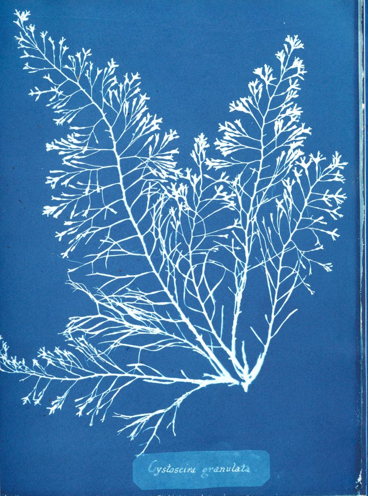
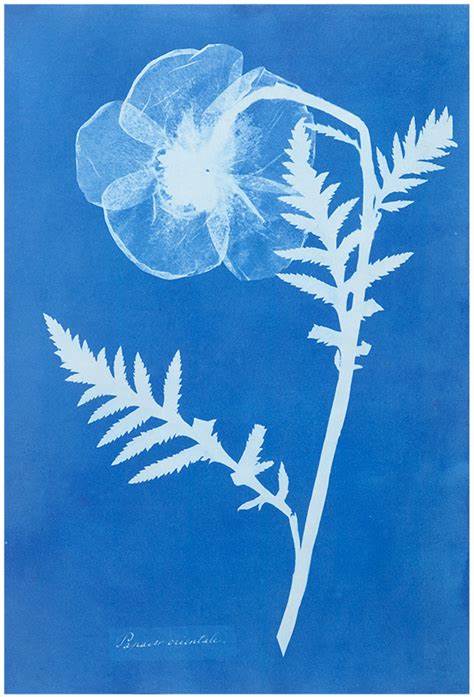
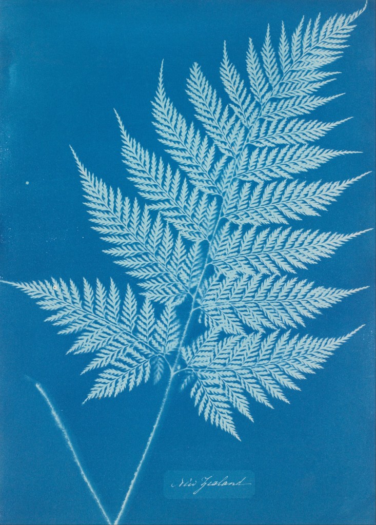
(1)Anna Atkins was born in 1799 and was a botanist and photographer. She made impressions of British algae using the cyanotype method in 1843. The detail in these impressions is amazing almost looking three dimensional. She was a great scientist and created work on algae, working mainly in biology but also studying marine shells. Copies of her work on algae are kept in institutions across the world and are still a great reference point both scientifically and in the art world. Making her one of the few who have crossed across the two. Earlier this year I saw one of the cyanotypes in the Victoria and Albert museum in London and it was breathtaking. She worked closely with William Henry Fox Talbot who was a close associate of her husband so both were at the forefront of the new technology of photography.

Washington Teasdale using his microscope.

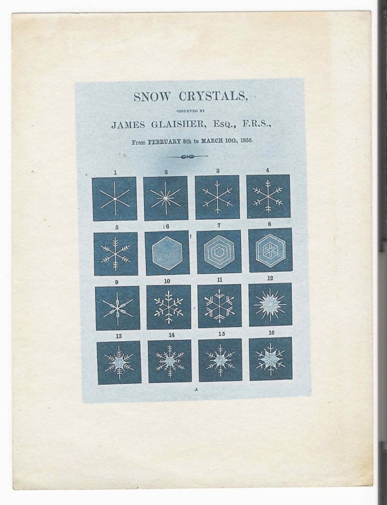
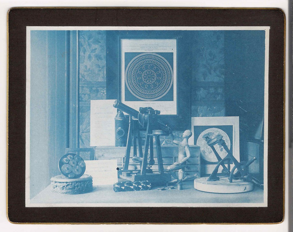
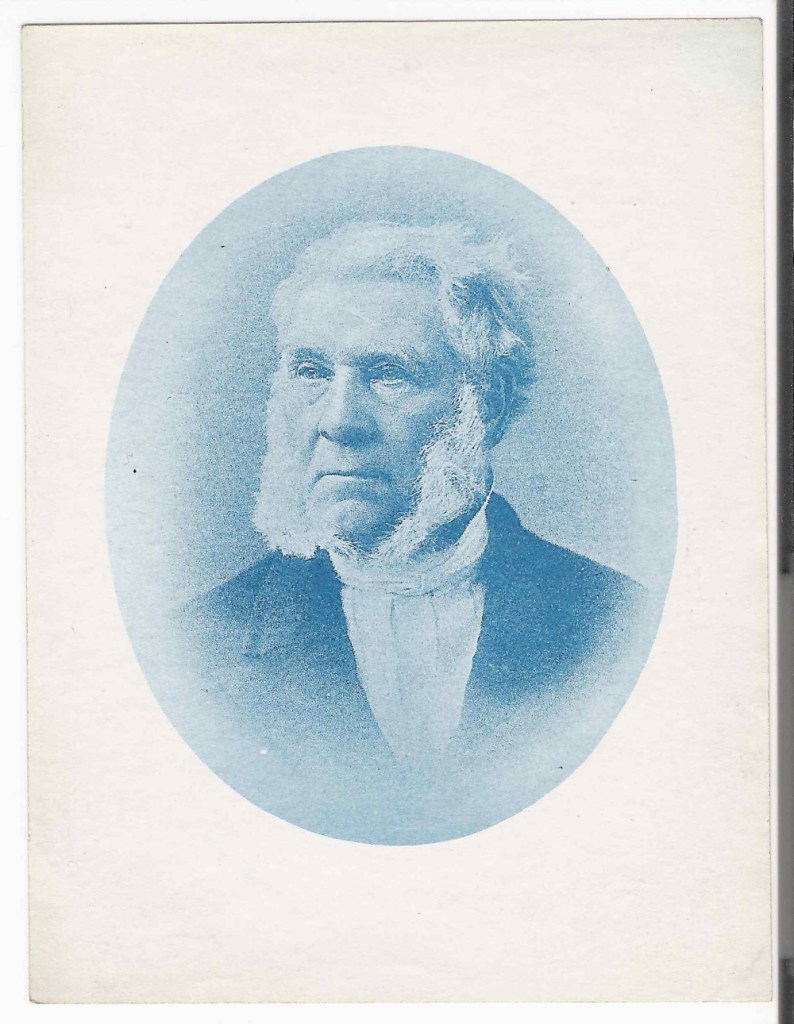
(2)Washington Teasdale was born in Leeds he worked in India developing the rail network. His early photographic work was creating slides for magic lantern shows. He was interested in cyanotypes and created high quality work. He was a founder member of the Leeds Photographic Society. Familiar with many disciplines within photography but specialising in three Cyanotypes, Silver Gelatin print and Collotypes.

His interest in lenses led him to develop an early field microscope and he subsequently became a fellow of the Royal Astronomical Society.

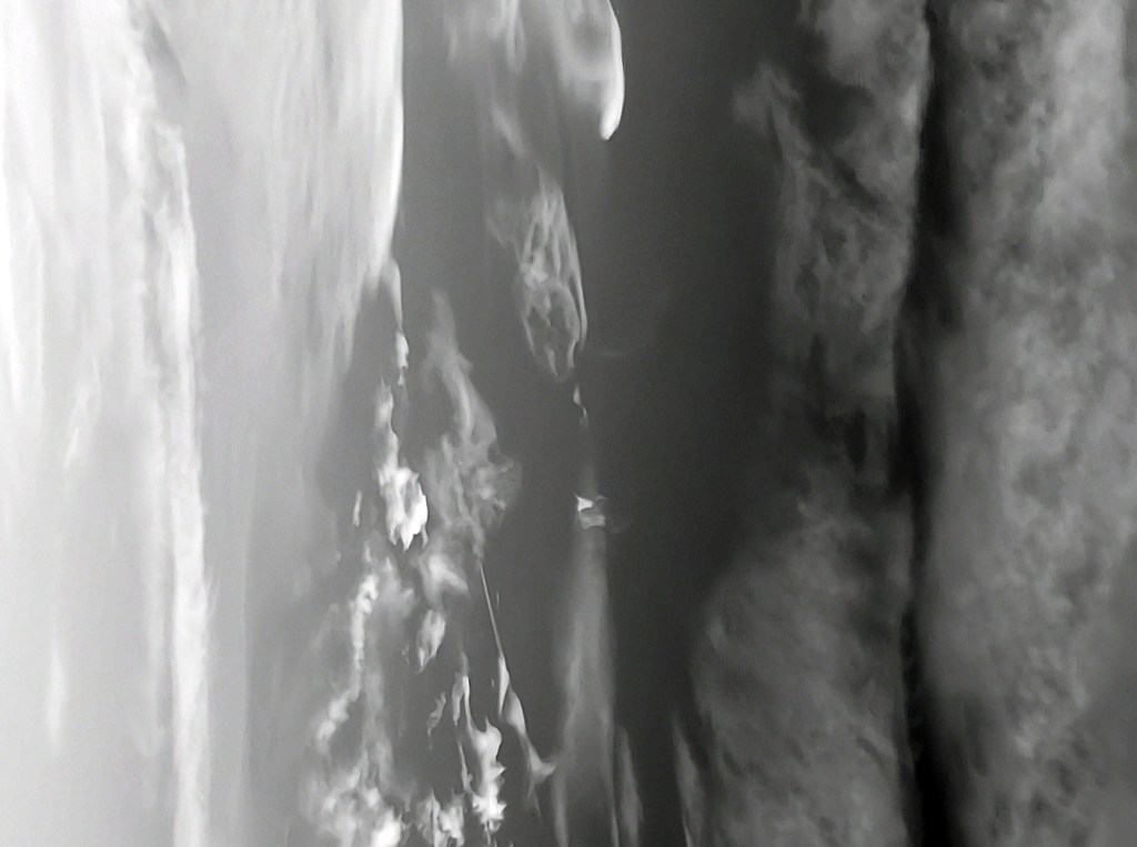
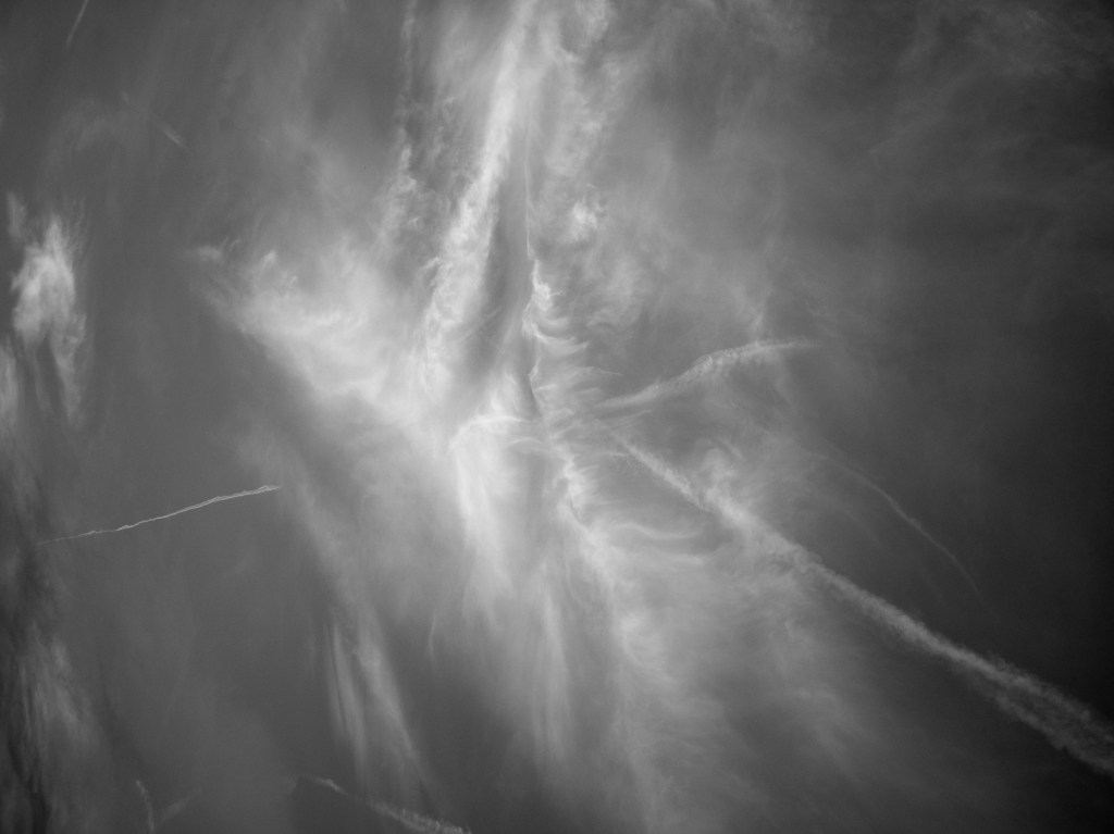
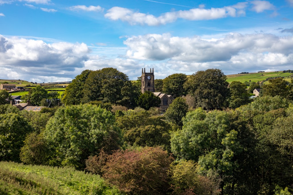
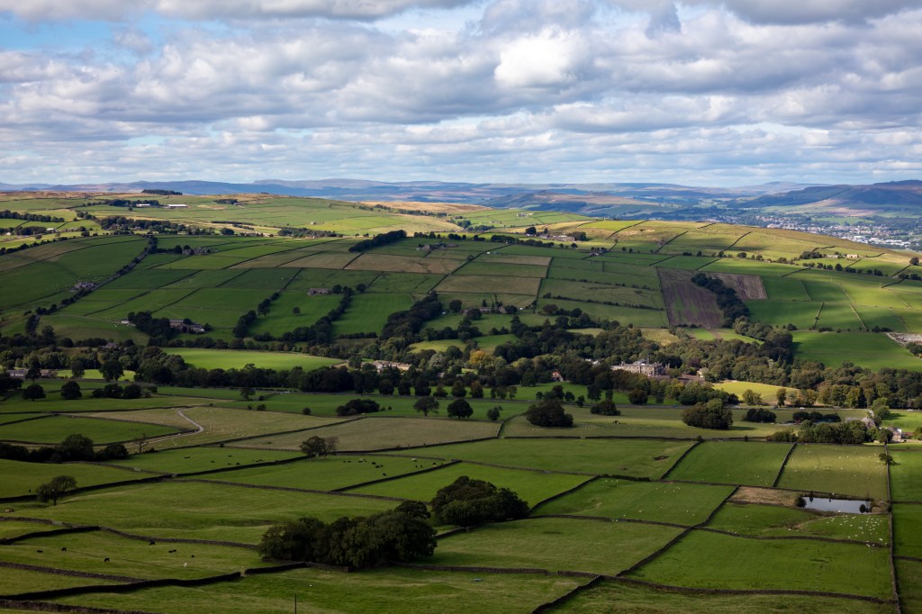
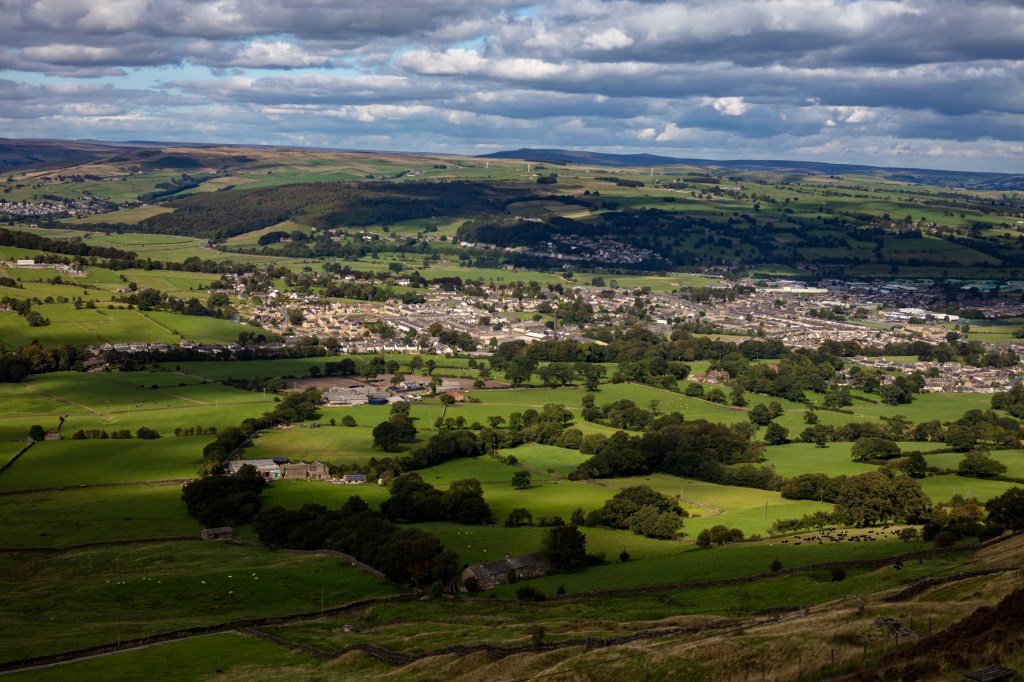
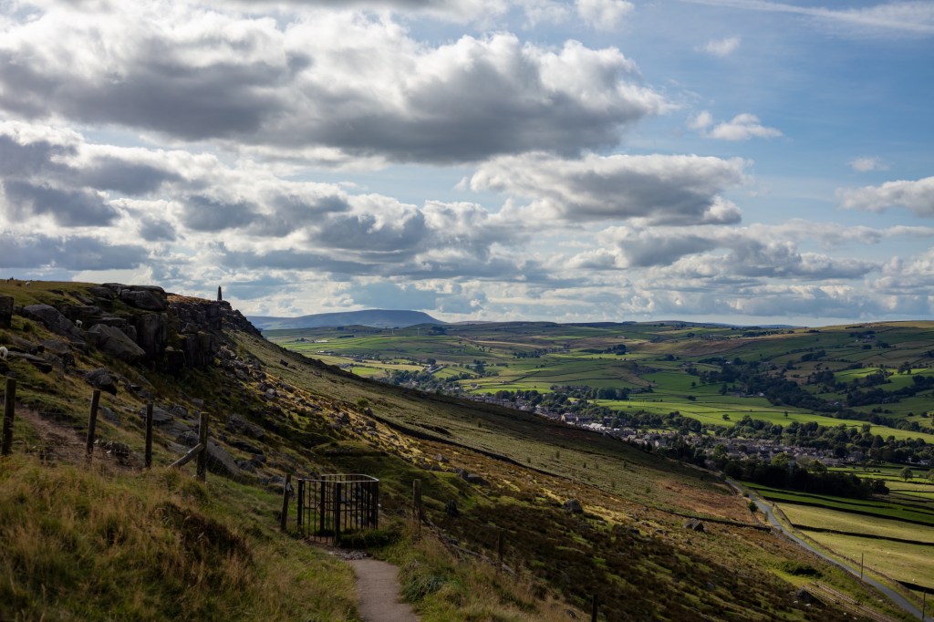
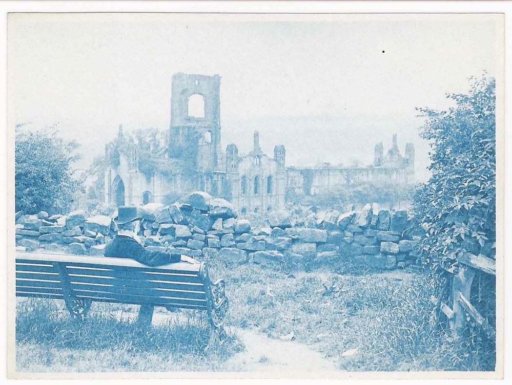
He took several exposures at Kirkstall Abbey in Leeds these plates allowed him to make a contact print using the cyanotype process. Whilst not as strong as Atkins work they are still strong prints.

Hilla and Bernd Becher.

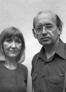
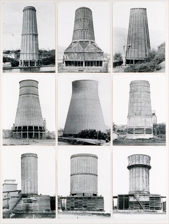
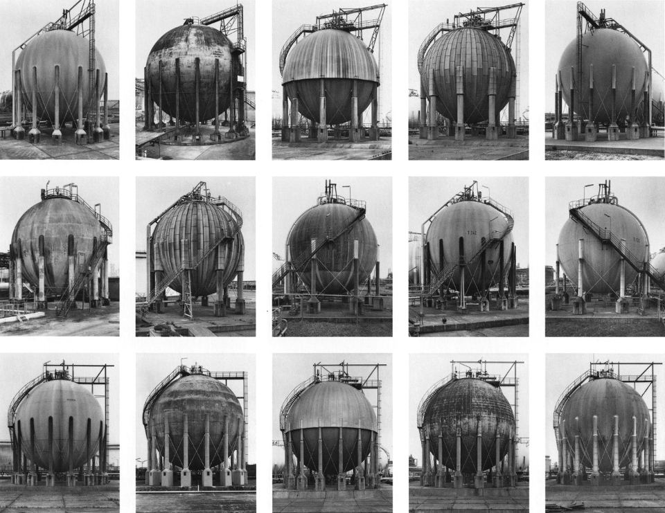
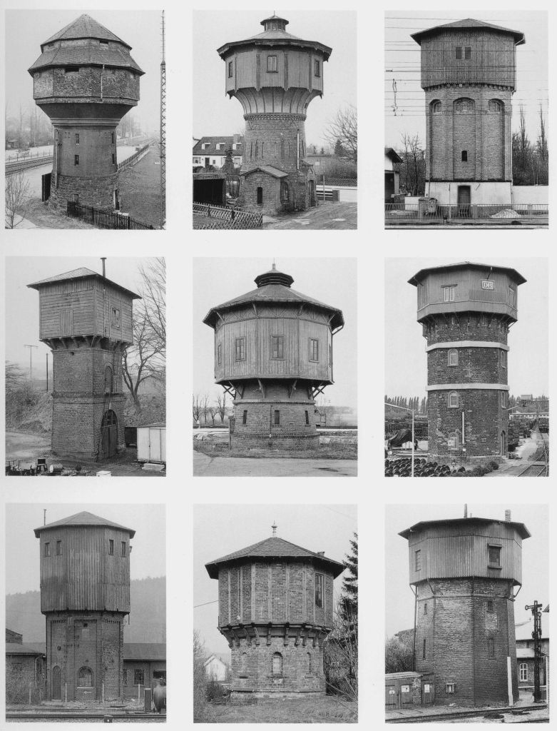
(3)Bernd and Hilla Becher produced some of the greatest photos of the most mundane subjects ever. The way they composed the separate components of the typological works is mind blowing. Take the poster of photos of pit workings. They are all exactly the same composition but showing separate sites. This must have been so hard to achieve. The amount of work to capture each must have been immense. They met in 1957 in Dortmund at the Kunstakadamie. They first worked together taking exposures of mines and steelworks. They did this as their families had worked in these industries.

They had thought of everything they shot on cloudy days to stop shadows, but went further by shooting only in the same season either spring or autumn. They moved around the subject to ensure no distractions are in the frame. Whilst the shots look simple you can see the attention to detail in the simplicity.

In 1965 they came to Britain for a six month project travelling around the country repeating the process on the industrial sites here. In the seventies they repeated the process in North America.

After Bernd died Hilla worked mainly with the existing photos they had captured and continued doing so until her death in 2015.

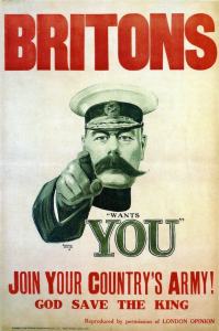
Creating a poster is new to me so I thought of the four that came to my mind. First to pop into my head is the First World War poster which just says (4)“wants you” with Field Marshal Kitchener pointing right at you. This is a strong image with the finger pointing right at you and the eyes looking straight into you. In 1914 how could it not call to whoever looked at it.

Your Country Wants You 1914.

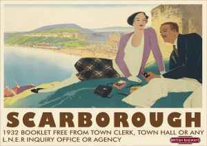
Second I thought of the posters used by (5)British Rail to show destinations to get the public to use their leisure time to travel by rail for their holidays. One I have seen shows Scarborough in all its sunny glory to entice you to spend some time at the resort. They all show depictions of the landscape of the place and are works of art in themselves. This one was produced in the 1930s.

Rail Holiday Poster 1932.

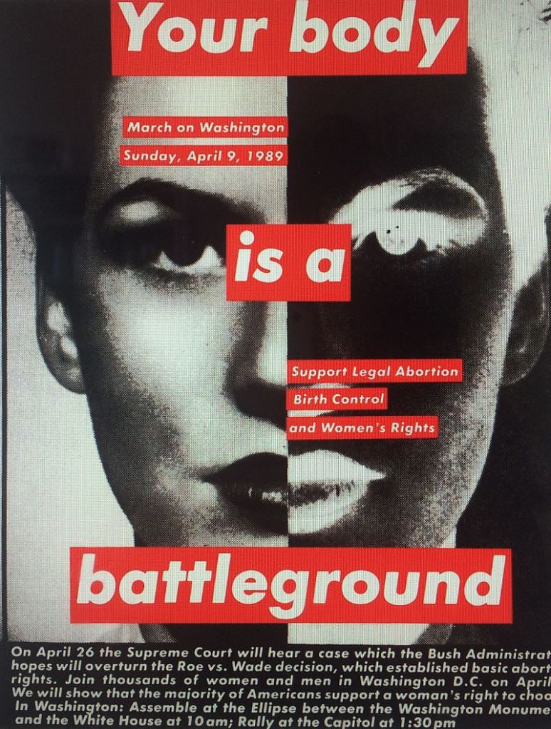
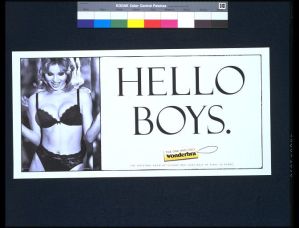
Next I thought of the (6)Wonder Bra poster I remember this poster and the car crashes it caused in 1994. It has a slogan of “Hello Boys” and was extremely provocative. It was withdrawn not because it objectified women but because it was causing lots of rear end shunts so damaging vehicles.

Wonderbra Billboard poster.

All of these posters have an accompanying image; I don’t want this for this assignment. The image will detract from the main part of the work offered. I want to create just text on my poster so I looked at posters with only text.

Poster inviting women to come to Belfast City Hall.

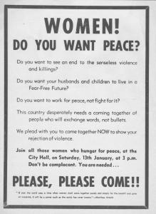
First I found a poster from (7)Belfast University which was posted in Belfast in 1973 to recruit women to campaign against the troubles. It follows a very similar format to the “Wants you” poster from the First World War. Without the image.

Sydney and Harriet Janis Collection Poster.

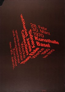
Next I found a text only poster for the (8)“Sydney and Harriet Janis Collection” an exhibition in 1970. This is a beautiful design. Simple but strong with just two colours Black and Red. The words form a cube the clever part is the words still work being easy to read. I don’t have the skills to do this…….Yet!

Second World War Poster for invasion use.

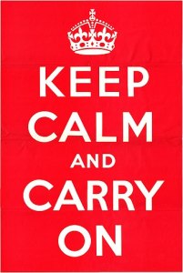
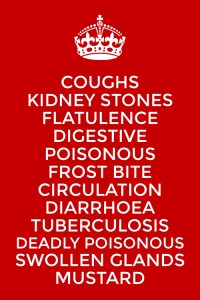
Finally I thought of the (9)“Keep Calm” poster which has been popular on all kinds of products from posters through t-shirts and mugs. One I have seen recently said “Keep Calm, drink Gin. I wonder if the purchaser realised this was an information poster used in WW2 by the ministry of information.  It simply read “Keep calm and carry on”. What many don’t realise is it was designed to be used if Britain was invaded as it wasn’t, the public never got to see it until one was discovered in 2005.

This is the design I will use I like its simplicity and it won’t detract from my main body of work.

How do I make the cyanotype process work. I learned the process from a (10)Thames and Hudson Book it is simple but you need to follow each stage carefully.

So mixing 10g of Potassium Ferricyanide with 100ml of distilled water we create the first solution called A.

Then mixing in the cleaned glass bowl 25g of Ferric Ammonium Citrate with 100ml of distilled water I create the second solution called B.

These solutions can be kept in Brown bottles in a cool dark place for several weeks. When I am ready to coat the paper I mix equal quantities of solution A and B. The size or number of sheets of paper dictate how much I will need to mix. 5ml of each will coat two postcard sized sheets of watercolour paper.

Then you allow the paper to dry in a dark room. Again you can store the paper for a couple of weeks once dry in a envelope or a black photo paper bag.

Then place your paper with the subject on top of the paper. Place the glass on top and ensure it holds the subject as tight as possible. Then expose to sunlight, exposure time differs but on a cloudy day 20 minutes suffices. I look for the coating to gain a metallic grey colour then I know it is exposed.

Rinse in cold water under the tap until all the yellow coating has washed off and leave to dry. If you want to change the tones now is the time to play. I have tried Red wine, Tea, Coffee and Cocoa so far. The mid tones change slightly and improve the detail in the exposure. Tea seems to work best of all.

One last point is the finished print will change colour darkening and allowing detail to sharpen as it dries. It will bend also as it dries so placing the dry paper between kitchen paper under a large book this will help flatten it.

Works Cited

(1)Atkins, Anna. “British Algae.” Victoria and Albert Museum. British Algae. London , 1844.

(2)Teasdale, Washington. Kirkstall Abbey. Museum of the history of science, Oxford.

(3)Becher, Bernd and Hilla. Watertowers. MoMA, New York.

(4)Leete, Alfred. “Your Country Wants You.” War Office. Your Country Wants You. London, 1914.

(5)Broadhead, William Smithson. “Scarborough LNER Poster.” LNER . Scarbororough Poster. York, 1930-1955.

(6)Rose, Nigel. “Wonderbra Poster.” Victoria and Albert Museum. Wonderbra Poster. London, 1994.

(7)(?). “Women do you want peace?” Belfast University. Women do you want peace? Belfast, 1973.

(8)Arx, Peter Von. “Kunsthalle Basel.” Theo Kabel. Sidney and Harriet Janis Collection. New York, 1970.

(9)Servant, Unknown Civil. “Keep Calm and Carry On.” MoI. Keep Calm and Carry On Poster. London,   1940.

(10)Gomez, Anthonini Minniti, and Lunganella Bendandi. Experimental Photography. London: Thames and Hudson, 2015.

Excercise 2.6 Edgelands

After reading the two short essays Wire and I am struck by the endless possibilities this approach offers. The two essays cover such topics as Cooling stations, Wind Turbines, Cold War buildings and wire fences. All linked by being on the edge of Society in one way or another. Services that we want to keep close enough to use but distant enough to be not seen. The second link I saw was barriers, razor wire and pointy fences.

The work around Greenham Common and the Hush House were interesting to me. Making me think of textile mills locally that are now unused.

If I walk a mile through my local area noting these types of things I get the list below.

1. Walls (Drystone).

2. Walls (Mortared).

3. Waste bins.

4. Derelict farms.

5. Ancient boundaries.

6. Old industrial sites.

7. Wire fences.

8. Wind turbines.

9. Litter Bins.

So spending 20 minutes wandering around looking has produced eight topics that could easily be projects and long term ones at that.

Reading of the sites that were edgelands in the time of writing some of the ones I know such as Tinshill cooling tower are now not on the edge they are part of the town. It could be interesting to find old edgelands within our towns.

Work Cited

(1) Wire Farley, P. and Roberts, M.S. (2011) Edgelands, Journeys into England’s True Wilderness.

(2) Power Farley, P. and Roberts, M.S. (2011) Edgelands, Journeys into England’s True Wilderness. London: Vintage Books

Response to Feedback for Assignment 1. Look UP!

In considering my first assignment in the Landscape course I have been pondering why my shots are sublime to me. I look at the photos I took and I still see the sublime in them. What am I seeing?

I agree with my tutors comments in his feedback and fully understand the difference between the picturesque and the sublime. Do my offered photos have that wildness and savagery that it needs to be sublime?

Listening to (1)Radio 4 I heard a piece about (2)John Constable and his cloud sketches which he completed in 1821. He drew and painted these sketches as practise for his paintings to come. He did the majority of these sketches from Hampstead Heath as his wife recovered from illness. Constable was so successful at depicting the clouds that one member of the Royal Academy said “When I see Constables clouds I reach for my raincoat”. They range from simple sketches through watercolours and then full oil paint.

(3)Alfred Stieglitz also created a series of photographs entitled “Equivalents”. He did it to show his technical ability at capturing a difficult subject whilst making art. These works are considered by some to be the first abstract depiction of photographic art having no real subject. Viewers found this fact challenging to see. Stieglitz knew precisely what effect he had created saying to one viewer who asked “is this water?” he replied “Why does it matter”. Knowing he had created the question in the man’s mind.

(4)Ansell Adams said in 1948 seeing “Equivalents was his first intense experience in photography”.

I have been taking pictures of the sky in monochrome for the last few months not knowing of Constables sketches but being aware of Stieglitz work and in fact responding to it.

My tutor in Identity and place had told me to look in completing one the exercises; this was an inspiration for me starting recording these photographs. Contemplating the photos offered in response to assignment one of this course I realised I was trying to show this big sky, however I had let the physical landscape overpower the sublime element. I had tried to show too much. I should have captured just the sky and its amazing clouds. They are natural and wild and make me feel small.

This lesson is invaluable thinking about the fourth assignment writing a 2000 word essay. I must be on my guard and ensure I don’t try to cover too much but narrow my sights onto a smaller target and complete the essay well.

Works Cited

(1)Blatchford, Sir Ian. Art of inovation. Performed by Dr Tilly Blyth. Radio 4, London. 26 September 2019.

(2)Constable, John. “Cloud Sketches.” Royal Academy. Constable Clouds above Hampstead Heath. London, 1821.

(3)Phillips, Sandra. Art in America. New York, 2008.

(4)Stieglitz, Alfred. “The Equivalents.” MoMA. Equivalents. New York, 1921.

Exercise 2.5 Text in Art

I don’t want to give away my work for Assignment two so some of my explanation here may seem vague, stick with me all will be revealed later in the project.

In the brief we are asked to look at the work of Ed Ruscha, Barbara Kruger and Mark Kitchener. I did so and was amazed to find I had seen their work around over the years in magazines and online. Below is an example of each artists work except Mark Kitchner whose work I couldn’t find.

So looking at the work of these two artists I thought about my planned work for assignment 2. It works well together as I have 12 pieces I will display. The words relating to each work well displayed in an Ed Rusha Style. I thought completing the list with the recognised “Keep Calm” would add an official almost Health Department warning feel to it. The second one is my mock up of a poster to support the end of the project. You will have to wait for the assignment to be complete to see the outcome………SORRY!!! However the clues are all there on the posters just look and think.

Excercise 2.1 Territorial Photography

After reading Joel Snyder essay (Landscape and Power, 2002) Territorial photography we are asked to review two photographs of our choice from two of the mentioned photographers.

Agazzis rock with Yosemite Falls. Carleton Watkins 1851.

Carleton Watkins (Watkins, 1851)” Agassis Falls with Yosemite Falls” ,is an albumen Print on glass. It is high quality. The composition is obviously influenced by Watkins experience as a painter. The main subject, the rock is shadowed but shown with fine detail. The whole picture is sharp.

Thinking about Snyder, discussion of him taking photos to show that the wildernesses was being tamed whilst remaining untouched. You see this with the waterfall and the rock. However if you really look you can see roads, buildings and people.

It could be a high quality advert enticing you to go see. What you don’t see are the indigenous people, they are gone.

William H Jackson Old Faithful. 1871

William H Jackson, “Old Faithful” a huge Albumen Print 21cm x 17.5cm on paper. It is a high quality Print with good tone although some of the black tones are too dark. Jackson spent his time on surveys scientifically recording the central area of the USA. This photo was taken on Ferdinand Hayden’s Geographical Survey. It shows Old Faithful geyser erupting. steam blowing away from the main column of steam. He can’t resist though placing an assistant in Perl in front of the geyser. This adds scale and maybe is a reaction t being told his photos could not be used to provide measurements.

Neither Snyder nor Jackson were particularly celebrated at the time but are recognised as important practitioners now. They took similar photographs however they were for different purposes. Watkins showed the wildnerness being tamed and being used by the white man. Jackson wanted to show an untamed wilderness there to be explored and discovered.

I think I fall into the latter category.

References

Snyder, Joel. Territorial Photography. 2nd ed. Vol. Landscape and Power. University of Chicago Press, 2002.

Watkins, Carlton. Agazzis Rock with Yosemite Falls. 1871. Albumen Print from large glass plate. John Getty Collection.

William H Jackson. Old Faitful. 1871. Albumen Print from large glass plate. Art institute of Chicago.

Assignment One The Sublime.

In considering this brief I wanted to show what attracted me to live in this landscape. With its rolling hills and big skies. In reading further through the course materials and the books I wanted to get up high to get a perspective I saw in a lot of the artists i looked at. I will explore this more, later in the course.

In this first part of the course we have looked at beauty and the sublime both words are subjective but both have a language within landscape and the arts. I look forward to developing new ways of looking to see this beauty in areas outside of the norm. This language talks of capturing the peace of the landscape in pastoral pictures or capture sublime pictures in untamed weather in a wilderness.

In looking at these exposures i feel their strength is the sharpness showing the detail of the cricket match to the distant hills of Pendle, Ingleborough or Pen y Ghent in equal measure. To improve them I could have used a longer lens to get into the detail however this would have changed the sublime element in the pictures. I am going to develop this further by capturing some details of life for future works.

Technically I realised I wanted a wide shot. I have an 8mm fisheye but this would have been too wide relegating the village to a small area of the exposure and making the hills just a straight line. I also have a 400mm lens but this would have put me into the detail which I felt didn’t fit the idea I had for the brief. So i decided to use my 50mm prime whilst it can be opened to f1.8 this lens is at its best at F5.6 this gives sharpness front to back.

I looked at landscapes by Turner, Gainsborough, Friedrich`s and others but the one i liked most was Paul Nash his work before the first world war is wonderful. It calms me and sums up the English countryside. It has the rolling hills and then the strange trees,  wonderful. I looked at his later work and you can see how the First World War changed him. However he still used trees to tell his story. I see lots of trees in our landscape but don’t want to just use one I want to use them to lead the eye through my shots.

In a lot of the paintings I looked at I could see that the eye of the artist was in midair (discounting Gainsborough) he painted portraits in a landscape. This perspective is possible because a painter uses his/her imagination. Edward Burtynsky puts his camera under a drone. I can do neither with my camera however I can climb a hill then up a pinnacle to gain even more height to achieve the same perspective. My outcome must be one which shows the whole but takes your eye through the picture seeing the details as you go.

Cowling Church.
Ascent of the crag with Pendle Hill.
Cricket in the valley.
Pendle Hill
Ancient Field Boundaries.
The White House.
Sutton.
Looking to Ingleborough and Pen y Ghent.
Wainmans Pinnacle and Pendle Hill.
Malpass House in ancient woodland.
Crosshills in dappled light.
The way home..

Contact Sheets for this assignment.

Exercise 1.9 Visual Research and analysis-social contrasts.

Thinking about photographs showing two sides to a place I immediately remembered the preparation for the world cup in Rio, Brazil. I saw and heard that many favellas were being moved or destroyed. These favellas were full of life and people. However when football comes to town they must show the right front to the cameras of TV.

Favella in Rio De Janeiro (Favela Hotel, 2019)

In the photo above we are shown the colour from one of Rios favellas. These places team with life and all aspects of society are evident. They even have their own judicial system that helps to bring cohesion and order to the place. I would have loved to see these places as a backdrop to the world cup. The powers that be thought differently.

Villa built on site of Favella Rio during world cup. (Favela Hotel, 2019)

Compare the second shot this shows a luxury apartment built on the site of one of the removed favellas. However when you look at this luxury consider how many family homes were removed to build this one luxury dwelling. The misery must have been immense.

The next world cup is in Qatar and the stadia are being built in the deserts so no people need to be moved. Good news however it is interesting to look online whilst completing this research to read of the suffering of the people in the construction workers villages. There are many reports of poor and dangerous conditions however there are photos of the construction of stadiums but very few of the workers dwellings.

Football stadia in Qatar being built for world cup(Fox Sport, 2019).

Not wanting to restrict my research to faraway places and football I looked at my home town of Leeds I found photos of the area of Holbeck where my great grandparents lived. The area is being demolished to make way for better dwellings for families.

Terraced houses being demolished in Holbeck Leeds (Leodis, 2019)

The houses my family brought up four children in are being replaced with houses like the ones in the photo below. It is interesting to see the footprint of one dwelling in the new houses is much larger than the footprint of the older dwellings much like the favellas of Rio. Plus the streets are wider due to the traffic. I wonder how the community will develop in these new areas.

Then looking for a photograph which shows both the affluent and the deprived areas in one exposure i found the following shot. It shows people’s homes next to a rail track under an overpass in Bangkok Thailand. Contrasting the position of the wealthy and the less well off.

Street dwellings in Bangkok Thailand.

A second one shows a similar scene in Mumbai India, The wealth needs to be shared a little more equally across society in these places. India after all is pursuing putting a man the moon on which costs billions of pounds. It may be a better use of resources to help these people into better homes.

Lots of homes squeezed into and Indian city. (samarthsingh.com, 2019)

Both of these photos are of Asian cities I think i need to ensure I show a balanced picture the photo below is in Brooklyn New York. It is amazing that within four miles of Manhattan we can find such squalor. This poverty is everywhere seldom talked about in the media.

Tenaments in New York. (NYCH, 2019)

When asked to look at these kind of photographs we can find them anywhere. We must be careful not to overlook the state of the whole planet poverty is everywhere across all creed on the planet.

Thinking about two photographers who showed this kind of shot in their work I thought of Vivian Maier (http://https//:www.vivianmaier.com) and Eugene Atget (http://https//www.atgetphotography.com) . Vivian Maier took photos whilst she wandered around New York. Her work was unknown until recently and was found and has been received with great interest. She shows all aspects of New York and didn’t shy away from showing the full spectrum of life from the wealthy and famous such as Kirk Douglas to buildings falling down and people suffering in the streets. Below are six of her photos that show her skills in showing New York in all its “glory”.

Eugene Atget recorded scenes that at first glance seem mundane. He captured them to help theatre set painters complete their work. However in capturing these photos he also captured the sumptuous areas of Paris and the squalid back streets in equal measure. He also took many photos of the characters he came across in the street again thinking they could be sold to theatres or maybe used as postcards. Both sets show the wealthy and the poor which helps put them into place when we look now.

In creating these images we also need to be careful that we don’t dilute the suffering of the people depicted. “The more images of violence we see—of war; of victims of hunger or famine; or other injustices—the more immune to them we become”. As Susan Sontag said in her book “Susan Sontag On Photography” (Sontag, 1973 Book).

References

AAP. “Bangladeshi Man Who Worked on 2022 World Cup Stadiums in Qatar Suing FIFA for Unfair Treatment,” n.d. https://www.foxsports.com.au/football/world-cup/bangladeshi-man-who-worked-on-2022-world-cup-stadiums-in-qatar-suing-fifa-for-unfair-treatment/news-story/6cf79d62bae0b6fd71ff199035db5c74.

Atget, Eugene. “Photography.” Atget Photography, 2019. http://Https//www.atgetphotography.com.

Capt Sam. “MUMBAI AIRPORT SLUMS: THE REASONS WHY THEY EXIST!” samarthsingh.com, 2018. http://www.samarthsingh.com/mumbai-city-airport-slums-dharavi-why.

Maiar, Vivian. “Portfolio Street.” Vivian Mayar, 2019. http://Https//:www.vivianmaier.com.

Sontag, Susan. Susan Sontag on Photography. New York: Penguin, 1973.

Unknown. Favella Rio de Janeiro. n.d. Digital Colour Photograph. Favela Hotel Rio. ———.

“New York City Housing.” Council. Improving Lives, n.d. https://www1.nyc.gov/site/nycha/index.page. ———.

“Old Photos of Leeds.” Education. Old Photos of Leeds, n.d. www.leodis.net. ———.

“Rich and Poor Housing Thailand.” Council. Bangkok Housing, n.d. http:\www.bankokcfh.com.

Excercise 1.8 Zone System in Practise.

In this excercise I am tasked with demonstrating my understanding of the Zone system whilst showing I can take light readings.

In an earlier course I was asked to look at histograms from within the camera. I thought it may be useful to repeat this exercise but take light readings. So I took two photos separated by an hour. I looked for 10 different points within the photo then took light readings from each. I left the ISO at 100 to keep things simple.

Ansel Adams Great Dome in winter (Adams, 1938) Adams Gallery

Ansel Adams used 10 zones to capture his images. So the darkest black would be zone 1 and the lightest zone 10. The light in the bottom and the top of this scale are too distant from one another. So he aimed for exposure between zone 3 and zone 7. The aim of work in the digital is to get good exposure where nothing is over exposed or blown out or under exposed too dark. Plus getting the colour as it looks in the scene. Here in one of Adams photos called Half Dome he shows what can be achieved..

Our cameras use electronics to meter and expose for mid gray which for most people and most shots works just fine. However if we want to take our photography up a notch we need to think around the average reflectance of 18% our cameras are set to. Using the table below we can override our cameras to over or under expose to get the affects we desire.

Override our cameras exposures.
10 Zones.
Zoning for colour.

Below is one of my final three showing how I set up the 10 zones in my head based on light and colour. You may not agree with it that doesn’t matter what matters is you are thinking deeper about your shots. You will see an change and the zone systems will get quicker and easier with practise I am sure.

Below I show the two photos along with readings I took.i have shown them in a spreadsheet as this enabled me to understand the facts shown. I took Lumens figures too and the difference in illumination in one hour is quite staggering.

Reading from light meter.

Looking at the figures if I set my camera for a well exposed sky I would lose lots of detail in the room. If I set the camera based on the readings of the chest I would let the sky whiteout. Neither would be good. I would get a better photo if I looked around the middle settings so set the camera at F8 for 1/200ths of a second.

Sunny Conditions.

The first thing I noticed completing the second shot was The was lumens figure had shot up with the light. Colour will be brighter and therefore much easier to capture. However easier to lose detail if the camera is set up wrong. I would be setting at around F6 with a shutter speed of around 1/450th second.

These settings would give nearly the best exposure for across the shot. But once you start to think as an artist you see the zone system would allow you to make different parts of the scene the subject. Out in the landscape with more space this could really help to capture great exposures.

Below are three of my first attempts at using the zone system. The light was difficult as there was a mix of light sky and dark ground so I used my camera to take some light readings. Then I set the camera for the mid tones which meant I had to have the camera open at F1.8 the hard part was getting detail whilst capturing the colour in the sky.

The four farm sign.
Sunset over the drive.
The glowing Field.

References

Adams, Ansel. Great Dome in Winter. 1938. Silver Gelatin. https://shop.anseladams.com/collections/ansel-adams-exclusives2/products/half-dome-merced-river-winter-3?variant=31415622008899.

Eftaiha, Diana. “Understanding & Using Ansel Adam’s Zone System.” Envatotut+, March 20, 2013. https://photography.tutsplus.com/tutorials/understanding-using-ansel-adams-zone-system–photo-5607.

Exercise 1.7 Assignment Preperation.

This is the email I sent to my tutor outlining my plans for the first assignment of this course. I will add his response when it arrives.

Dear David

I hope you are well? I am finding the course very interesting and enjoying walking the hills around home taking photos and thinking.

I have some ideas for my assignment 1 work I would like to share with you.

I have been reading about and looking at works by Julian Bell, Joseph Wright of Derby, along with Burtynsky and Gurtsky. In looking at works with trees I found Paul Nash. His work before the first world war is something special. Then his work in WW! still using trees but to show the casualties is even more so.

I live in an area with many trees and want to show them in my work. However I don’t want to show individual trees  I want to get up high and show the trees in the landscape. They make great features and also create lead lines into pictures.

I plan to get up high on a sunny day with clouds to add texture to the local landscape I want to create a picturly set of photos almost like postcards. However they must have great clarity with focus front to back. I think at this part of my learning this is what i must achieve before I start to try other things.

Being up high will help me record the land at present as building is beginning so the landscape is going to change in the coming years. I can document this change.

For this first submission I plan to put it on my learning log at pixel count of 3000 with a setting of 300pi to ensure detail for you to see.

I trust this meets with your approval and look forward to your input if you would like a different way to see the photos please just ask.
Yours Sincerely

Michael Green.515037.