After reading Barthes Rhetoric of image I had a couple of goes at using his method to look at photographs. I looked at a bill board advert and then just chose a photograph from my own collection. Doing this was enlightening. I look at pictures differently after doing so.
He likes structure so puts what he sees into boxes in a table. It makes looking at images and or text easier to break down. Doing this helped focus my mind on even the initially simple image as shown below.
For this exercise I have chose an image that doesn’t have a photograph at all. I did this as I was interested if the technique would work for a simple piece of typology. I think it does. I chose Coca Cola`s advert “You don’t have to stay between the lines”.
It is a bold image that leaps out of the page and appears very simple at first glance. However when you look it is a sophisticated image with a number of signs and signifiers. The table below shows the ones I saw. Maybe you may see more.
Sign
Signifier
Red and White
Company colours recognised the world over.
Bottle Shape
Instantly recognised even though most product delivered in cans.
Usual Simple lines broken.
Implies you can break the rules. Hint at other products available.
Bottle shape made of dashed lines.
Subtle hint at lines crossed rules broken edgy and maybe risky.
Hint at choice
Made me think of other options or alternative products in the range.
Vignetting
Focussed the eye on the product in the center of the image.
Definition: noun The attribution of human characteristics or behaviour to a god, animal or object.
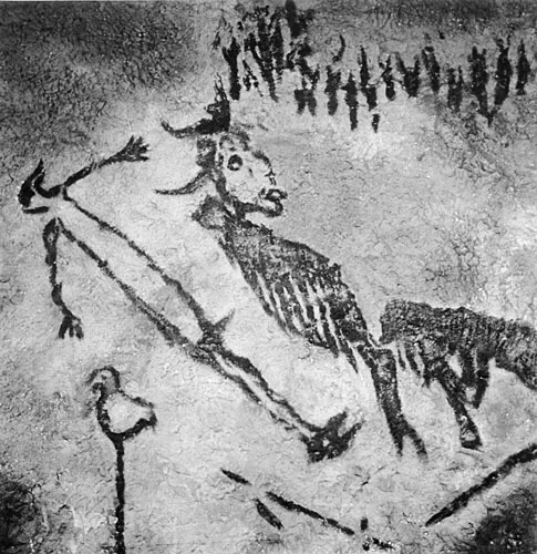
Earliest example I can find is of a god/mystic from a cave in France painted 40,000 years ago. Zeus Apollo and other Greek deities all had human characteristics too. Hindu animal gods all have human traits to enhance their mystic properties.
God or wizard from French cave art.
First recorded use of the word in western culture is 1745-55 for applying human traits to Christian god! Male image at that.
Aesop’s fables all show animals with human personalities and morals.
Literature has many examples mainly in children’s novels. Here are five fron just the last century.
1. 1865 Alice in wonderland Lewis Carroll.
2. 1894 The Jungle book Rudyard Kipling.
3. 1928 The house at Pooh corner A.A. Milne.
4. 1954 Lord of the rings J.R.R. Tolkien.
5. 1972 Watership Down Richard Adams.
All have been made into films mainly by Disney Studios. Most have some animation within them.
Recent films include Cars, Planes, and Toy Story 1, 2, 3, 4. which move away from showing animals to depicting objects.
Cars Animation of McQueen.
Car design itself is a science of face usage from Smart Car and its friendly face to Ferrari and its angry face. Even the Trabant has a face on its front. Online you can find pages of car face design tips.
Ferrari shows its anger beautifully.
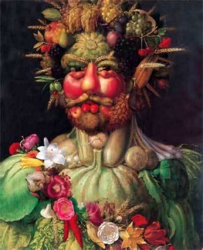
In art Giuseppe Arcimboldo uses inanimate fruit to form portraits the detail is sublime. Vegetables show the form and character of the subject. I wonder what they made of the images?
Giuseppe Arcemodi
Shinseungback Kimyonghun used face recognition surveillance software to look at the clouds in the sky. From 40,000 captured images 1000 clearly show detailed faces. The images were displayed in Bradford. At first I didn’t see them but when you do it is amazing how much detail you see.
Shinseungback Kimyonghun cloud faces.
As children we do this, playing with our imaginations, we grow out of it! Let’s not, let us use our imagination like a child again, the world would be better for it.
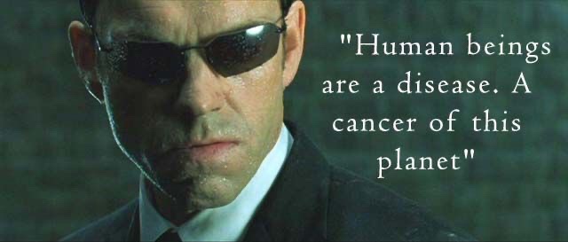
Finally…..for now! Agent Smith says in the Matrix “Humans are a disease Mr Anderson”. He is a Robot displaying feelings so even this pivotal scene in a film displays Anthropomorphism. It is everywhere look for yourself! What can you find?
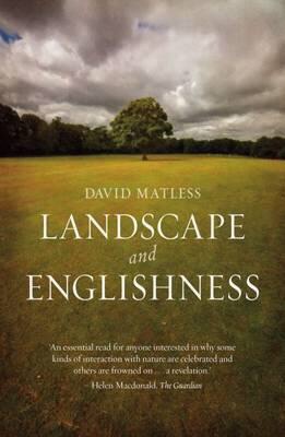
This book looks at what influences the landscape has had on the English being English in the post war years. The author has drawn from many sources, Art, History, Literature, Town Planning and Architecture to name just a few.
The book has many illustrations to support the written word, these are invaluable in helping the reader understand the visualisation which triggered the thought. An early example is the punch cartoon showing the ideal landscape sold to the soldier against the reality he returned to.
He draws from many sources even the AA road books from the 1950s. He discusses the way roads spread across the land then fill in with workplaces and homes. This made me think of the agent in the matrix movie who states “Humans are a disease, Mr Anderson”. (read about anthromophorcism here…………………………….).
Even the general fitness of the population is covered. Hiking and rambling being an ideal way to gain fitness and explore our landscapes. Related to this is a chapter on diet where the diet of Indians is examined at length comparing the varied diet of the healthy Indian with the poorer diet of Europeans with too much bread and processed food. Nothing changes.
All our landscapes are covered from the rural with Morris dancers and travellers to urban with its sprawl and centres of life.
This book is thought provoking and enlightening, I had never realised how much outside sources had influenced the way I see and use the English landscape. Plus the way that has been turned right around to influence what I will do to protect it.
David Matless has written with an easy to read style, with well informed sections that invite more in-depth research to explore the areas discussed. I am scouring second hand bookstores to find some of his source materials. This is a great book just to sit on a train and read.
Work Cited
(1) David Matless “Landscape and Englishness Reaktion Books London 1998.
At the beginning of Deborah Brights essay Of “Mother Natre and Marlboro Men” she states that middle America think landscape is generally conceived of as an upbeat and wholesome sort of subject which, like mom and apple pie, stands indisputably beyond politics and ideology and appeals to ‘timeless values.”
The taxonomic comes from European art history and refers to a painterly practice that gathered pace in the 17th and 18th centuries. They were either fields for noble actions or cultivated gardens inhabited by gods and or heroes.
In Holland new wealth celebrated property ownership. The English art world soon followed suit.
There were four types of landscape painting.
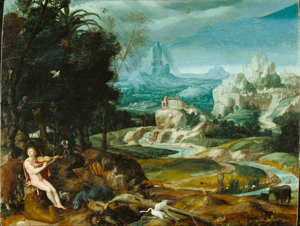
Noble
Landscape with Orpheus (Unknown c1570)
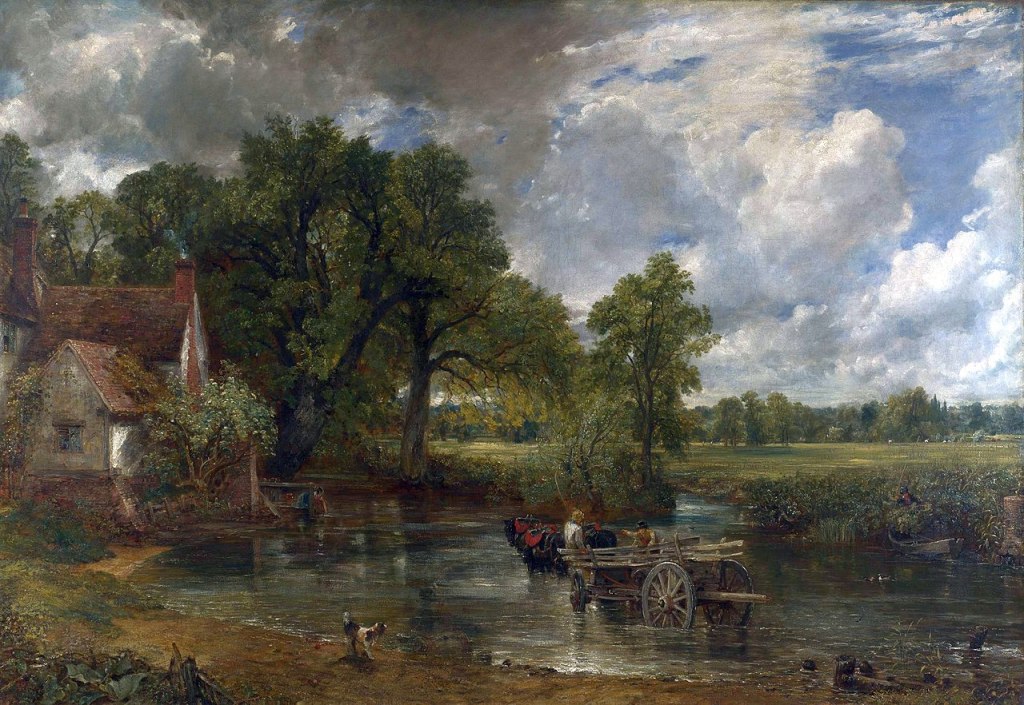
2. Picturesque.
John Constable Haywain 1821
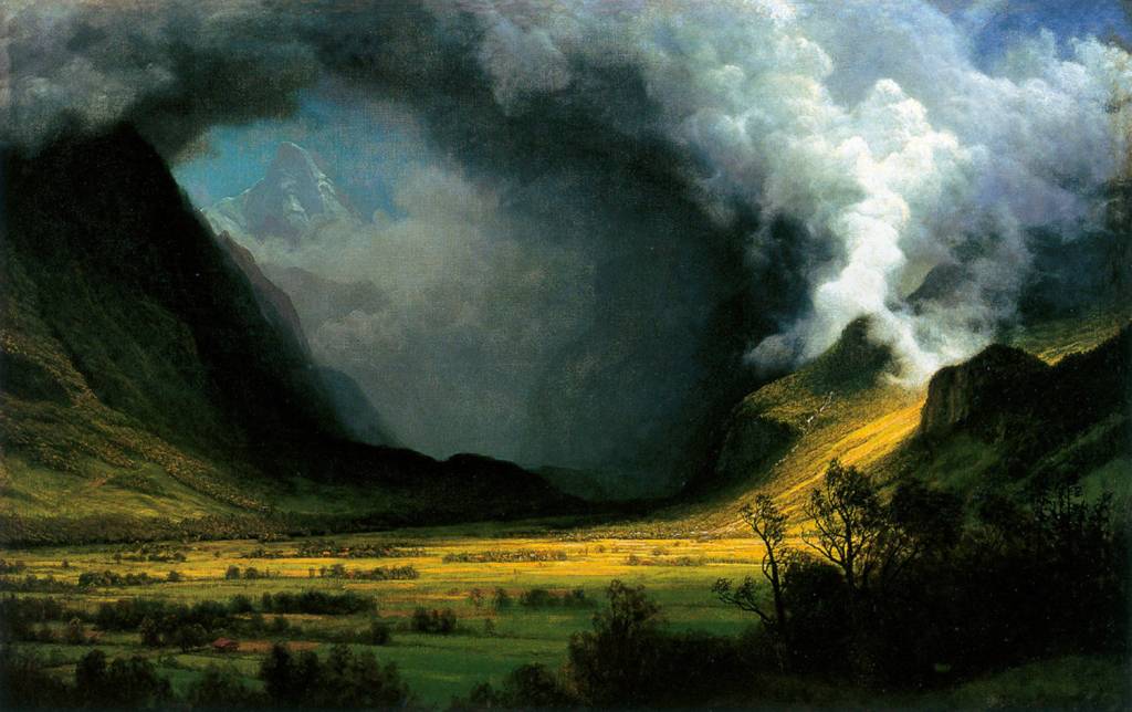
3.Sublime.
Storm in the mountains Albert Bierstadt (1870).
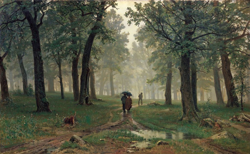
4.Mundane.
Rain in the Oak Grove Ivan Shishkin (1891)
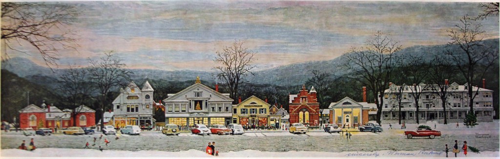
Later in America (6)Norman Rockwell painted a main street showing “small town America”. Middle America the ruling mercantile masses want to show their identity in a national context. LS Lowry did the same in the UK but for the working classes. It excludes minorities only showing “normal”, straight people, excluding many from this idyll. This progressive era shows the antidote is a nature experience over the unhealthy urban life.
Stocksbridge Main Street at Christmas Norman Rockwell (1967 Norman Rockwell Collection)
Wild places began to be seen as god’s gift to the American (White people) to be preserved as a gift for future generations. Kenneth Erikson points out these places are ceremonial with codes of conduct (Park rules).
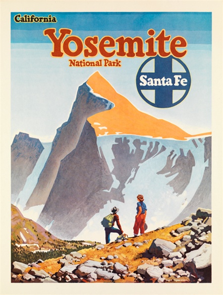
In 1908 69000 tourists went to worship in the eleven national parks by 1928 this had soared to 3,000,000. They were attracted by Posters, Postcards, Railroad adverts, Magazines and landscape art, not by the wilderness itself. The indigenous people were never shown as part of this landscape if they were they were a conquered novelty.
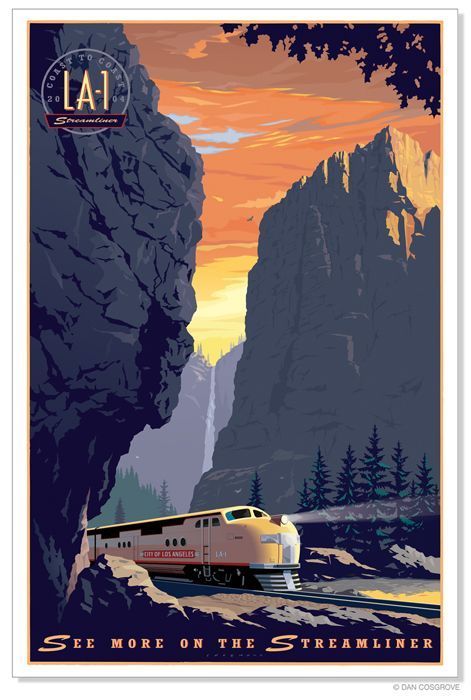
Railroads trumpeted their own individual routes as better than others using lavish posters and claims to do so. The demand for material to support this gave a boom to photography. Huge posters encouraged city dwellers to go out into the country to find the “Real Thing”.
Collection of Rail Posters from 1960s.
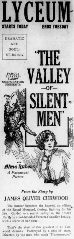
Cowboy movies used the wild landscape as a backdrop to the onscreen action. “A man must be a man just to survive”, read the poster for the film the “valley of the silent men (1922).” This countryside was used to sell things as diverse as cigarettes to presidents.
Newspaper Advert for screening of a film at the Lyceum (1922).
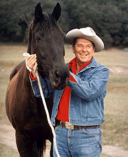
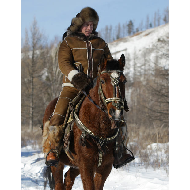
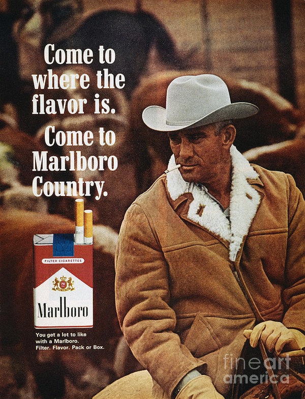
Like Marlboro Men posters used to sell tobacco Ronald Reagan in White Stetson rode horses and chopped wood to show he was a man of the nation. Putin does the same sort of thing in Russia riding horses with his shirt off or in furs in mountains.
Ronald Reagan
President Putin
Marlboro Advert
Comparison of Politicians using the Marlboro look.
Liberal ownership sells too, Camping equipment, Holidays, Walks, Bikes and Boots along with all the other paraphernalia we need to go into the wilderness. Even today you only have to look at Windermere to see city dwellers venturing out in Kagools and boots around the town some venture no further than the towns streets.
US art photography developed from the “straight photography” of Stieglitz and Weston. Ansell Adams took it one level further portraying a primordial Eden. Minor White reviewed Stieglitz work “Equivalence”; he said “a photograph is a metaphor for the feelings of the artist”.
Aperture school was overwhelmed by the curatorship of John Swarkowski. (Here is that name again). He respected the work of Timothy O Sullivan in the civil war. He didn’t show straight images but the feeling in the scene. He curatted “American Landscapes”, in this work he included two women Laura Gilpin and Dorothea Lange even though many more women were practising at the time. He used one image from each woman whilst using four each from Edward Weston and Harry Callahan.
New Topographics tried to capture the feel of a scene. Old tyres, broken concrete, Jet plane contrails and Oil installations. Showing the chaos that underlines the ordinary lives of Americans.
In the 1970s photographers tried to hold the companies back who were exploiting the landscape by destroying their resources. However the big galleries and museums were funded by the same companies that were exploiting the land. Making funding of Art projects difficult to obtain and muting any dissident voice which spoke against them. Landscapes contain resource does the re-landscaping after the resource is taken make taking them right?
Lucy Lewent Three Mile Island Calendar (1964)
Images showing views “Three Mile Island” nuclear power plant and putting on a well researched calendar is a superb idea photographed by Lisa Lewenz. Selling the calendar for $6 made it available to all and bypassed the major sponsors of art. The voice wasn’t silenced.
The exclusion of women from the art world at this time wasn’t the same sort of prejudice. If we remove the big company sponsorship from art would it remove this censorship of art projects? The work should be on show for being good enough not because of who produced it. After all excellence has no race or gender.
However does running an all female issue of a magazine or competition put these old errors right. I think all the practitioners wanted their photographs accepted because of the merit of the work not because of the exclusion of others.
I chose to review Dorothea Lange’s photograph “Towards Los Angeles” in assignment four not because she is a woman but because it is a superb image.
Work Cited
Bierstadt, Albert. Gathering Storm in the Valley. 1891. Oil on Canvas. Nordsee Museum Husum.
Borzage, Frank. The Valley of the Silent Men. Black and White Cellulose, Western. Paramount Pictures, 1922.
Bright, Deborah. “‘Of Mother Nature and Marlboro Men.’” Accessed September 15, 2020.
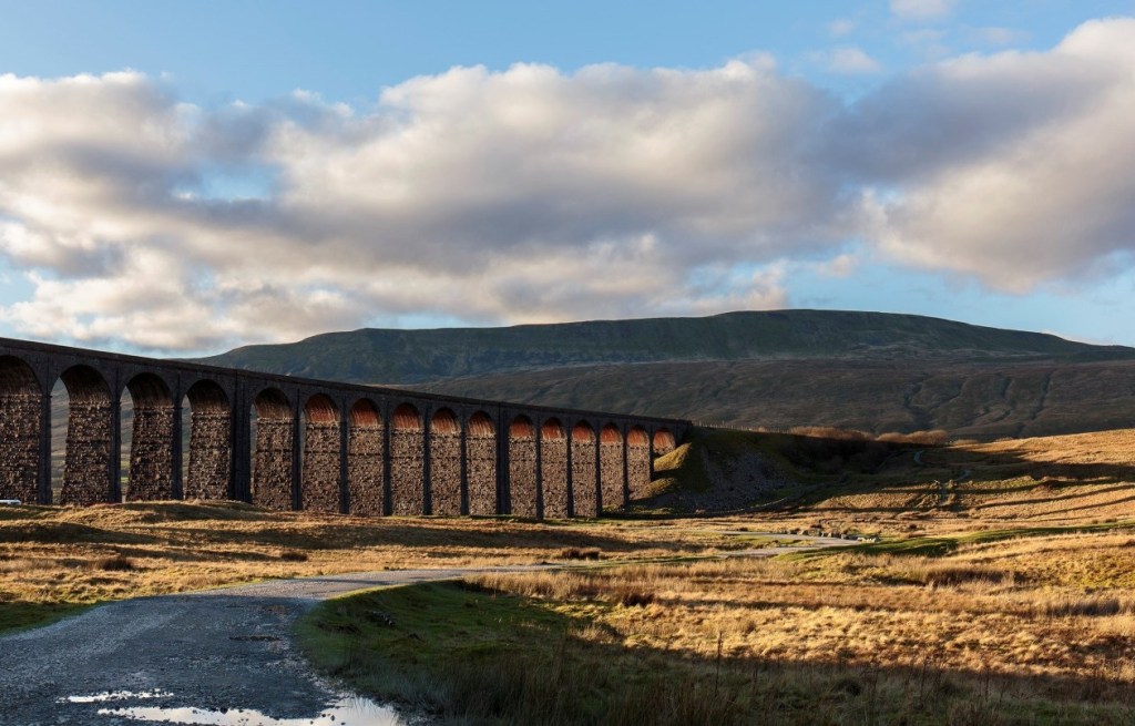
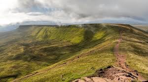
I was introduced to the landscape at the age of about eleven when I completed the Yorkshire Three Peaks walk. These three hills felt like Everest to me at this time.
Whernside.
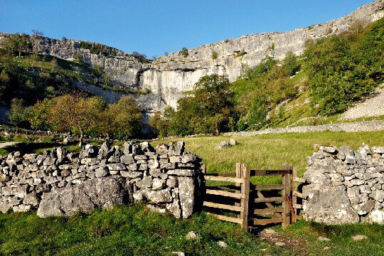
I went on to complete Duke of Edinburgh Bronze and Silver and had to complete proper hikes in both these awards. Navigating from Malham to Threshfield was a great introduction to using a compass.
Malham
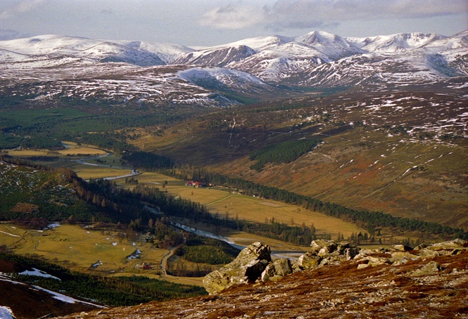
At Eighteen I joined the Navy and took part in the Ten Tor’s in Devon another real test. Then on to Four days survival training in the Brecon Beacons. Living from and with nature was a real test. I learnt so much about the landscape and myself through all of these experiences.
The Cairngorms
The Brecon Beacons
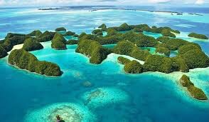
After leaving the navy I continued my diving and travelled all over the world pursuing diving. From the mountains of Scotland to the Rock Islands of Palau and countless landscapes and seascapes between I have seen some of this planets wonders. Note I say some.
Rock Islands Palau
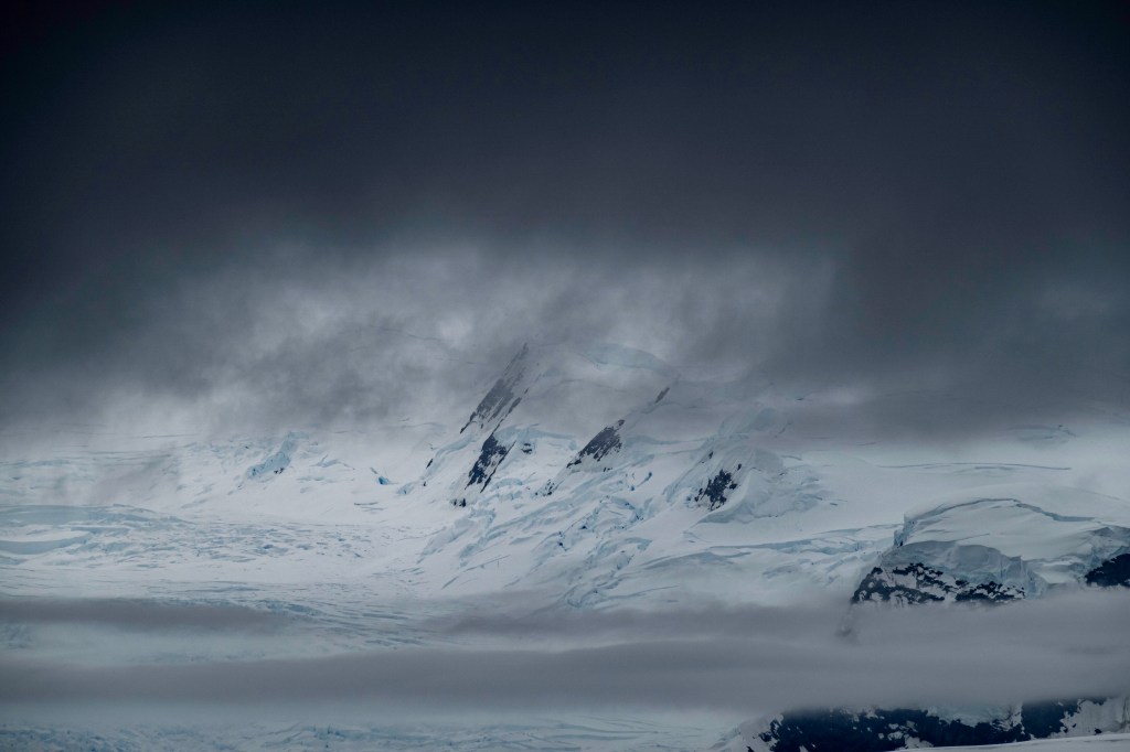
Recently I have been in Antarctica and the Arctic this takes me to the last wildernesses on our planet. These places have had a huge effect on my life, they are huge but oh so fragile.
Antarctica
I am no eco warrior but try to live my life to the best standards I can. Mending things rather than buying new. I walk to the shops instead of driving the car. I try to minimise the waste I produce to protect our fragile world.
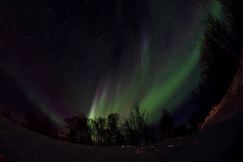
Northern lights.
Some of my best experiences have been sitting up, in my sleeping bag looking at a cloudless night sky. And watching the Northern lights in Norway and Greenland.
I am fascinated by the animals in these places but don’t want be a scientist. I just enjoy knowing they are out there.
The people I have met can teach us so much from the man in the jungle who knows which plant treats what, to the Micronesian sailors who use sticks to navigate the vast Pacific Ocean. I hate when good meaning westerners want to introduce air conditioning, Coca Cola and the internet they don’t need it……..in my opinion.
Landscape was a route to levels of emotion which were acceptable without being too nationalistic. These words sum up for me how we are in England fiercely proud without wanting to offend.
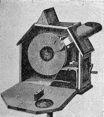
The Mutoscope imagined to look down on England’s history.
CFG Masteman wrote “looking down on England” in which he looks at landscape from the medieval jungle through the renaissance to the black blots of the industrial revolution. He uses a clever vehicle “the Mutoscope” for looking down on the landscape to see the changes in historic periods like a sped up film.
In 1940 the threat of invasion came from across the North Sea and Germany.
“Unconquered for a thousand years” is a phrase I find interesting as Germany talked about the Reich lasting a thousand years. We looked back they looked forward.
Patriotic propaganda talked about community in the village led by the Squire bringing people close to the past and nature. The inhabitants removed signposts and addresses from the scene to aid confusion to the enemy.
What are we fighting for.
The landscape became travelled through rather than enjoyed. Publishers such as the Pilgrim Library published books showing the idyll of previous landscape to remind people what they were were fighting for.
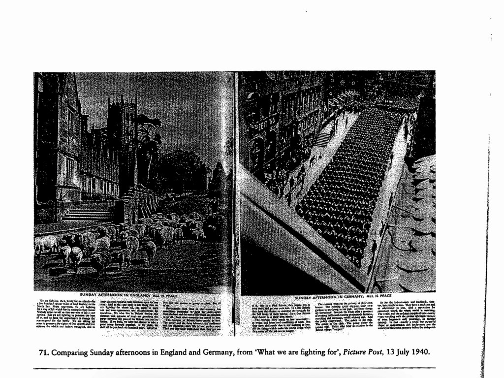
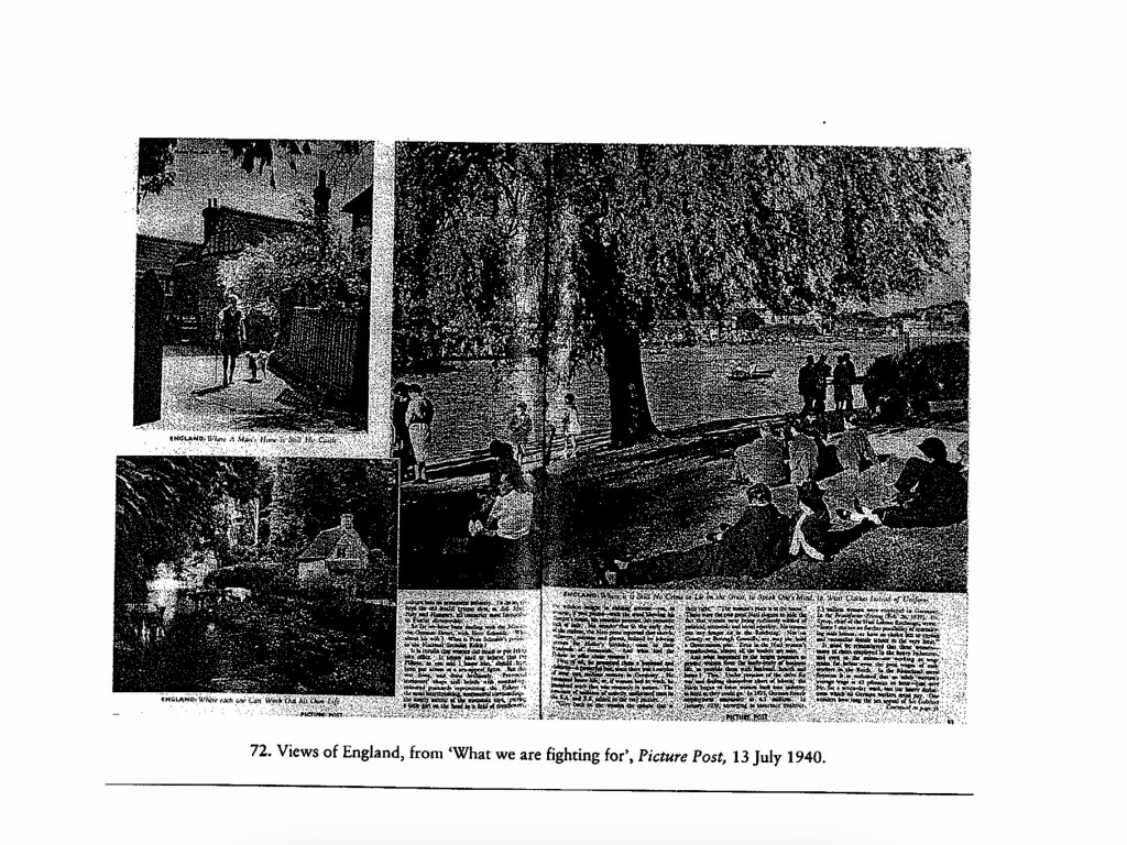
Picture Post juxtaposed photos showing a boy playing cricket in one then a young German boy in Hitler Youth uniform. Democracy against Militarianism. Another shows a half timbered cottage with the caption “England: Where a mans home becomes his castle”, all hint at what is being fought for.
What are we fighting for?
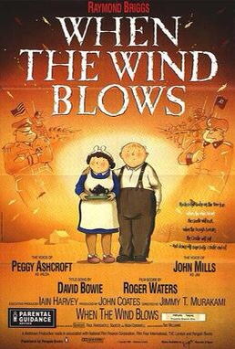
Civilians being bombed were shown with upturned faces showing their bravery and hinting at a brighter future once the turmoil had been endured.
Completing this made me think of the illustrated book by Raymond Briggs called “When the wind blows”. The same emotions were used to show how a nuclear attack would effect our grandparents who were from a simpler time. This made me want to absolutely defend them.
After a delay when my tutor and I kept missing each other due to my adventures down South. I finally received an email from him with some areas to work on.
1. Research Anthropomorphism.
2. Add reference to environments having no emotions.
3. Identity of the birds in my photos.
4. Replace the shots for “That melted the wings wax”, “It was spring” and “A farmer was ploughing his field.
5. Read Derek Gregory “Between the book and the lamp”.
6. Write about the books I have been reading to research the course so far.
7. Add reference to other posts to link my work.
Over all my tutor liked my work and his suggestions added to the overall effect of the images and the words.
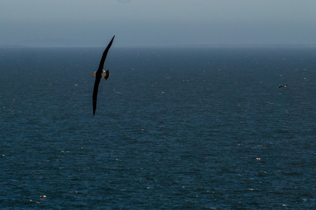
At first I didn’t agree with changing the image for the farmer ploughs his field. But on looking through my images and reviewing the painting again I realised that this line has to have the third element. So I replaced with a shot with a bird and a whale. The whale being the third element (The Farmer).
My work clearly states that things don’t have feelings so I am a little unsure what my tutor wants me to add. I will take this up with him on my return.
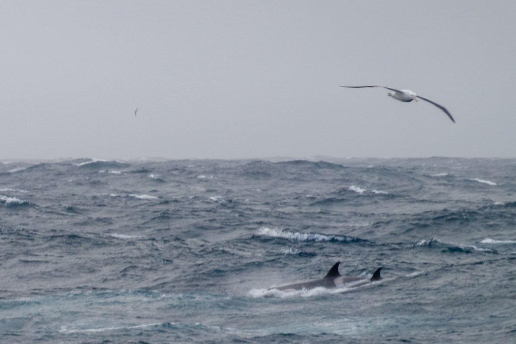
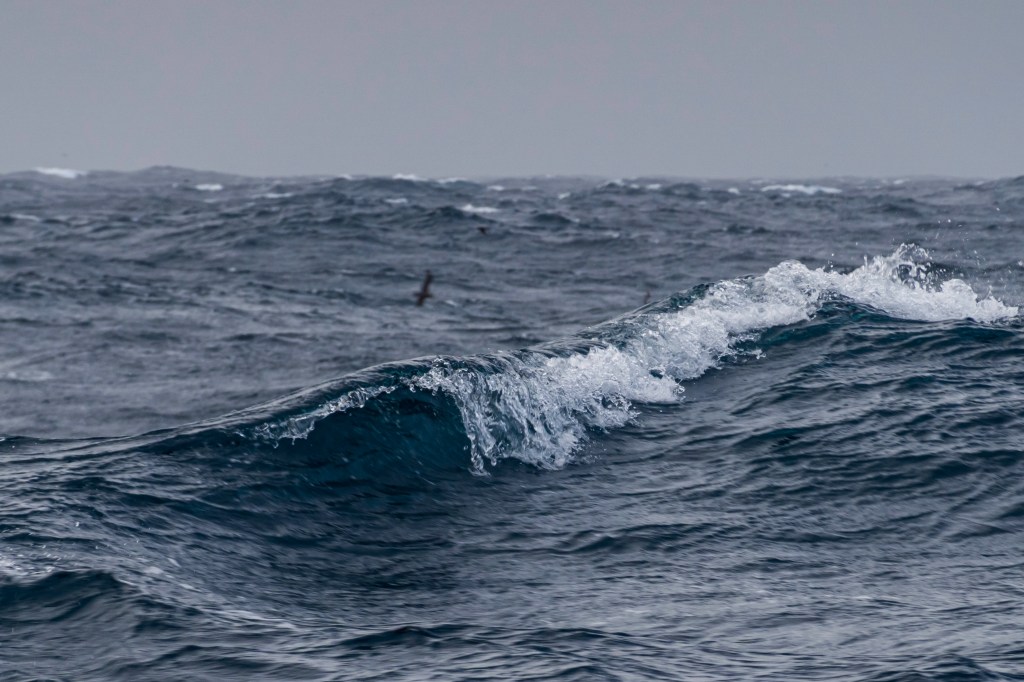
The birds in the shots are all either Petrels or Albatross. The final shot shows Wilson’s Storm Petrels which are the size of swallows and amaze how they survive in such a inhospitable place.
I have downloaded Gregory’s essay and will read and review it shortly.
Likewise I will add general reviews over the coming weeks of the books and such like I have researched to help my work develop. These I will publish shortly.
I added a link to my work so viewers can find background information about the events that inspired this assignment.
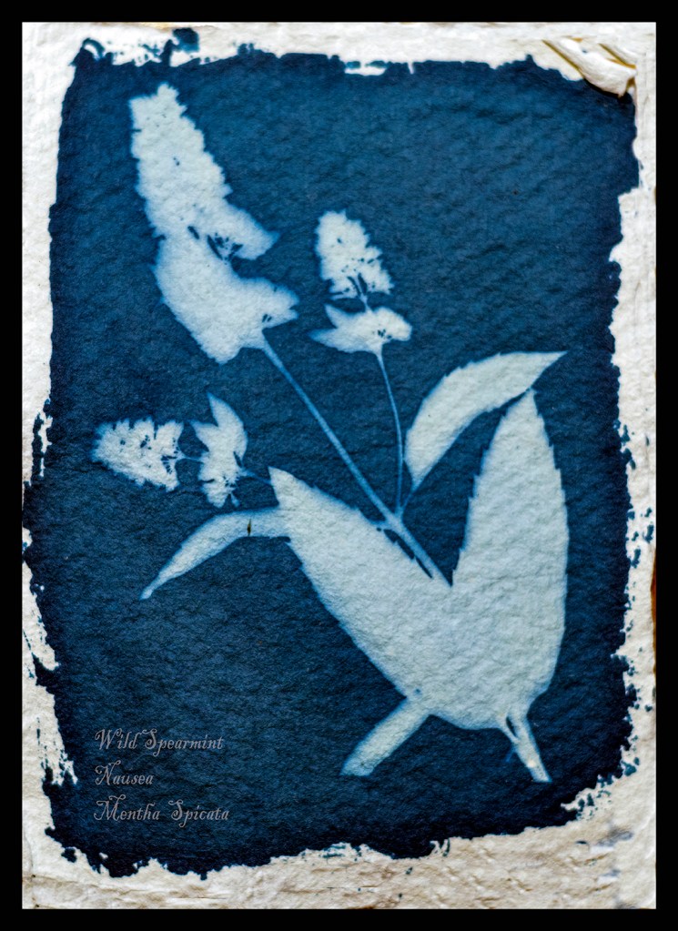
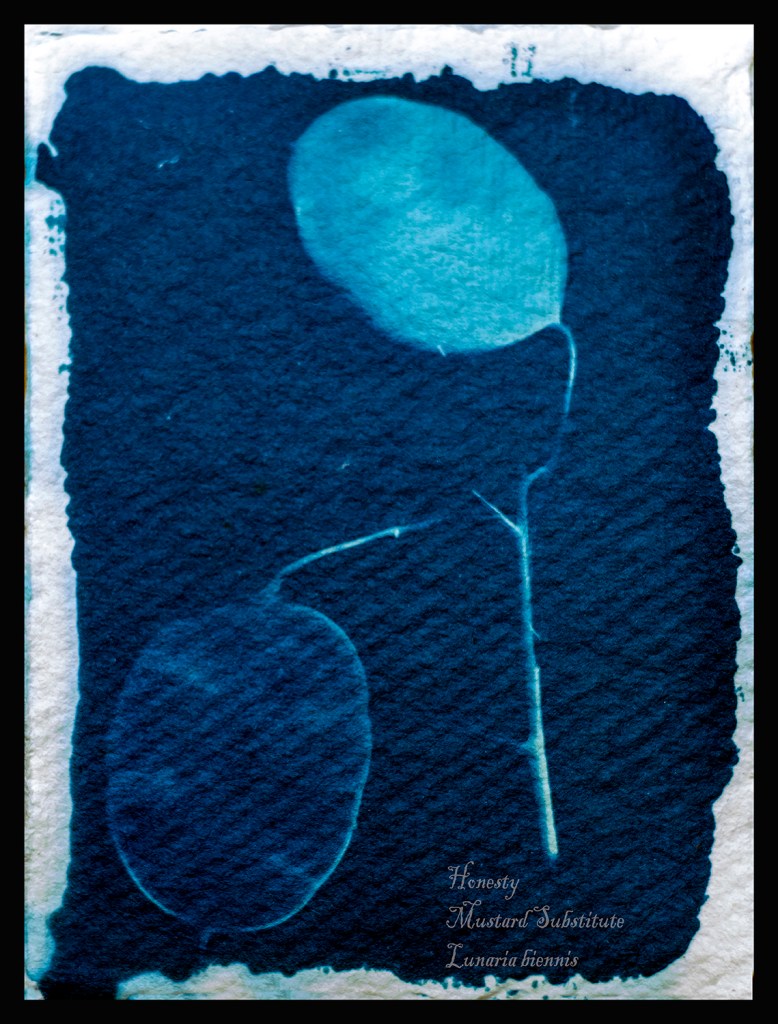
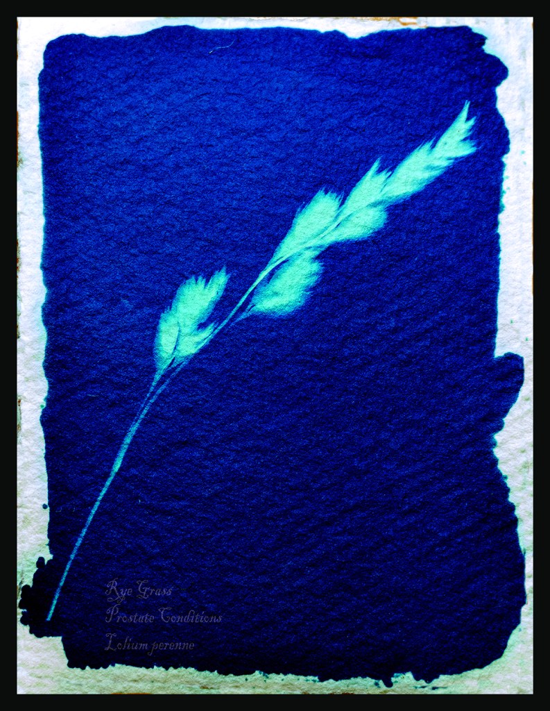
Below are the three pictures I added in response to my tutor feedback.
Below is my email to my tutor to announce my plan for my critical review. I will now start to work on this review for publication in April 2020.
Hi David I hope you are well and had a good break at Christmas and the New Year. I am now ready to leave for my part 2 of my epic trip down South this time I am Assistant Expedition Leader to South Georgia, Falklands and Antarctic peninsular. You obviously didnt have time to respond to my Assignment 3 but not to worry I will be taking all the stuff i need to continue with part four. My critical review will be on Dorothea Langes photo “Towards Los Angeles”, I will be able to see this on my trip to Route 66 in October. However my work will be with you in April when I return. I will get email from time to time so would be grateful to read your thoughts on the work I have completed recently. I also reran Assignment 2 taking your suggestions in to my work. Thanks for your help and guidance. Yours sincerely Michael Green.515037 — My Websites for my Blogs are: https://michaelgreenoca.wordpress.com https://michaelgreenidentityandplace.wordpress.comhttps://michaelgreencandn.wordpress.comhttp://michaelgreenlevel2landscapeblog.photo.blog
The most important thing I have learnt through completing this work is not to cram too much into the assignment. Keep it simple was great advice from my tutor.
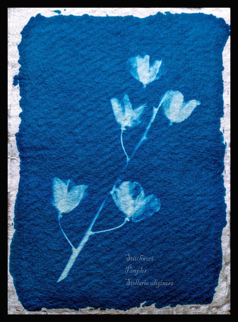
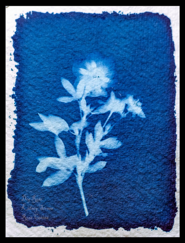
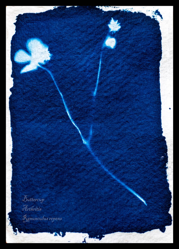
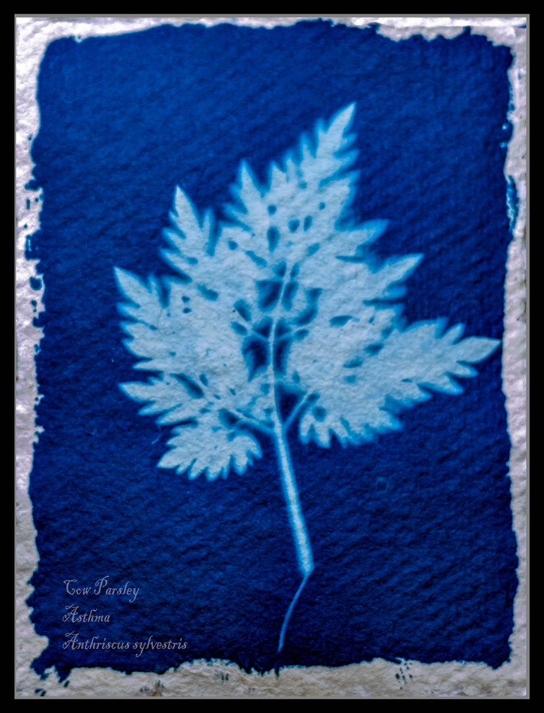
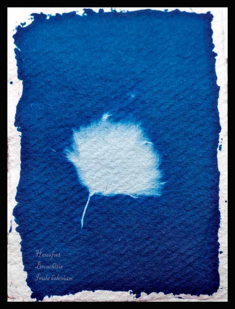
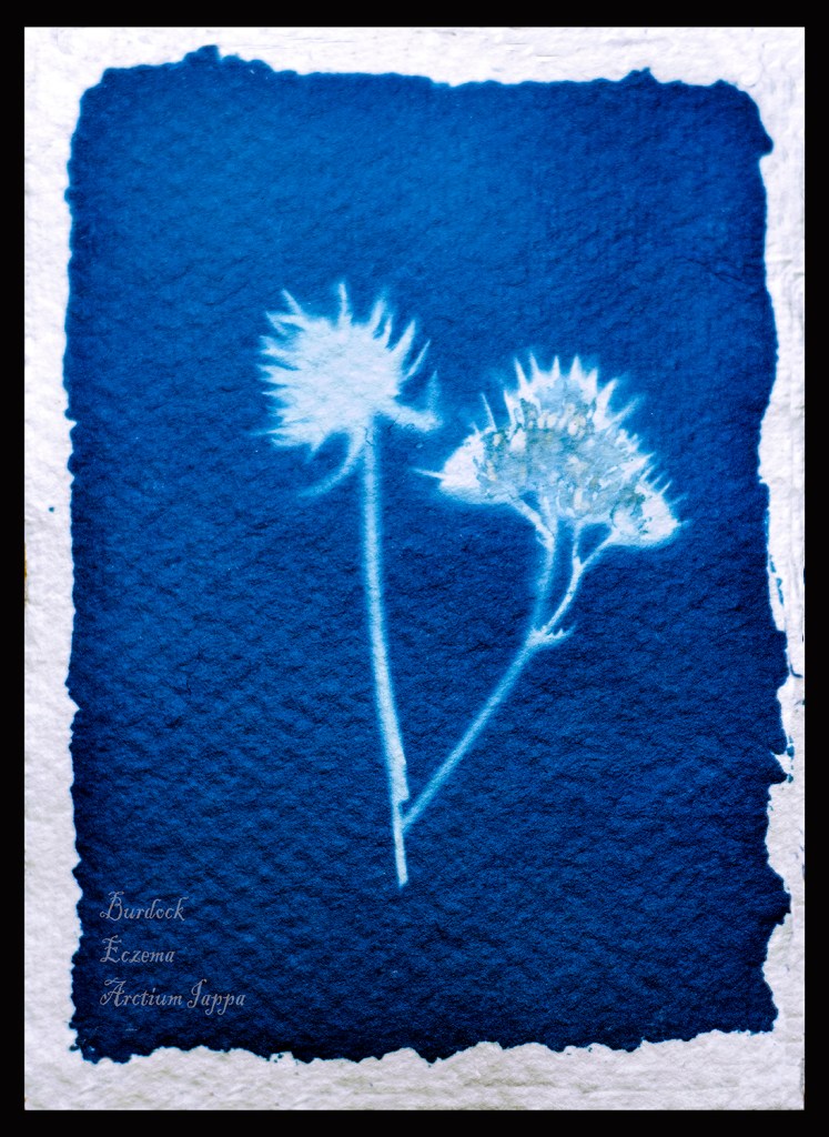
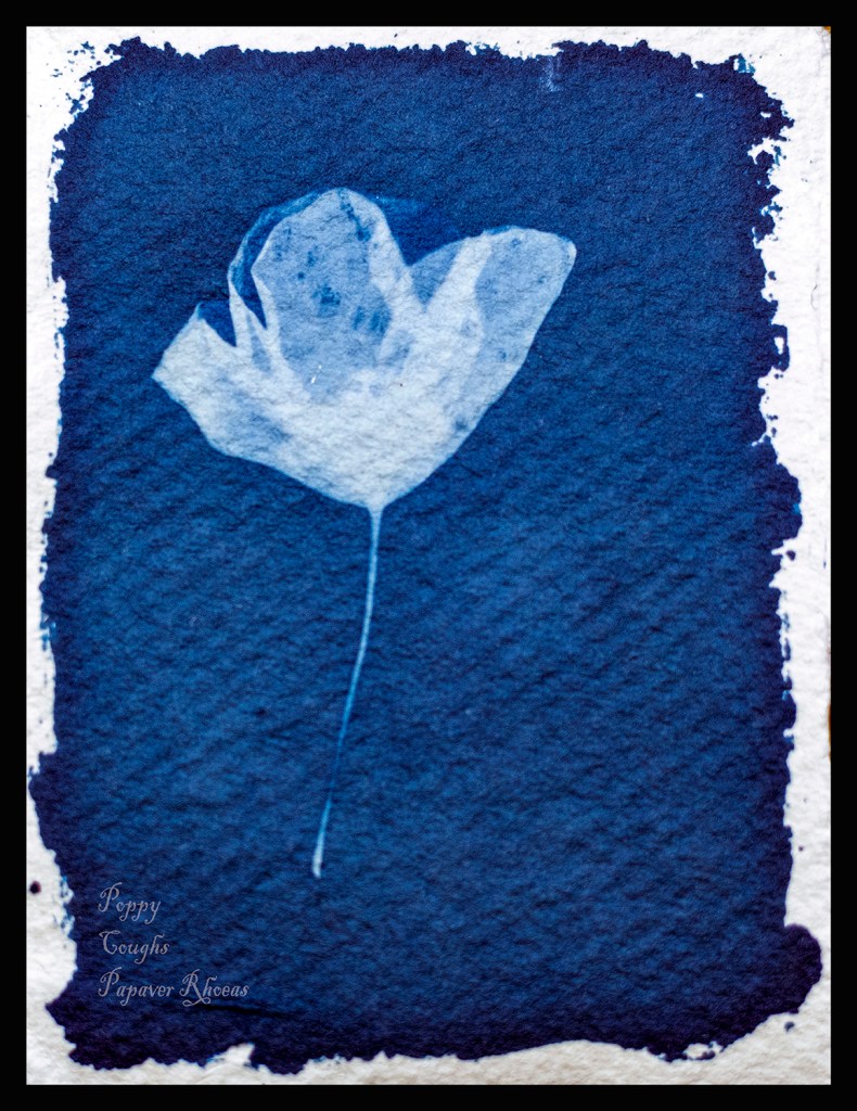
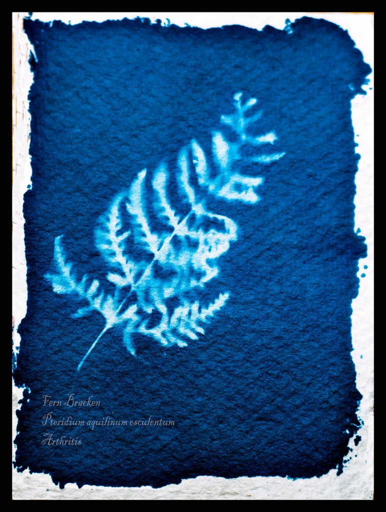
He wanted me to discuss a little more of the technicalities in producing this work. I started by making paper which involved using a blender to pulp fibres from wood and old drawing paper until it was a smooth paste. then I placed this onto a frame with fine filter mesh stretched taut. I then let this air dry before lifting the paper with a scalpel. One out of three sheets failed and were re-pulped to form the next batch. I didn’t bleach or stain the paper it came out the colour I wanted. This method produced paper strong enough to survive the rigours of the washing process later.
I used a metal ruler and rough tore the paper to the size I wanted for my Cyanotypes.
For the solutions I mixed two solutions mix A is 10g of Potassium Ferricyanide which is mixed in 100ml of distilled water.
Solution B is 25g of Ferric Ammonium Citrate with 100ml of distilled water.
These two solutions are kept separate in brown bottles in a cool dark place till I want to coat the paper. Kept like this they will keep for several months.
Next when I want to coat my paper with sensitizer I mix equal quantities of the solution in dim light, Taking care to only mix the amount I will need in the clean mixing bottle. When the two solutions are mixed the resulting solution is light sensitive and has an intense yellow colour. (1)I used the recipe from Thames and Hudsons Book Experimental Photography A Handbook of Techniques.
Next I chose my subjects on my walks along the lane at the back of my home. It was always in the back of my mind that I was in the shadow of Pendle Hill and if it were the 1600s I would be in danger of being called a witch and burnt at the stake.
To make the exposure I placed the sensitized paper on top of a card and then placed a clear piece of Perspex on top of the subject securing with bulldog clips to keep everything tight and in place. The exposure time varied from 5 to 20 minutes depending on the strength of the sunlight. I read my tutors comments about striving for continuity and will do more of this in future. However I agree that as this is more organic work I should leave as is.
Finally I placed the exposed paper in a tray to wash the paper however I rinsed each for three minutes in gently running cold water to start the cleaning process. Then I hung them to dry in air, the cyanotypes change as they dry and in fact continue to dry for several weeks after as they react with the air.
Whilst the process is lengthy it is extremely rewarding and I plan to experiment with larger versions and prints in the coming months.
I read the methods to colour match in Photoshop and experimented with them. I am pleased with the results and the finished results are a nearer colour to the original work. I also read and carried out work to frame the work, thinking about how to present it to a viewer.
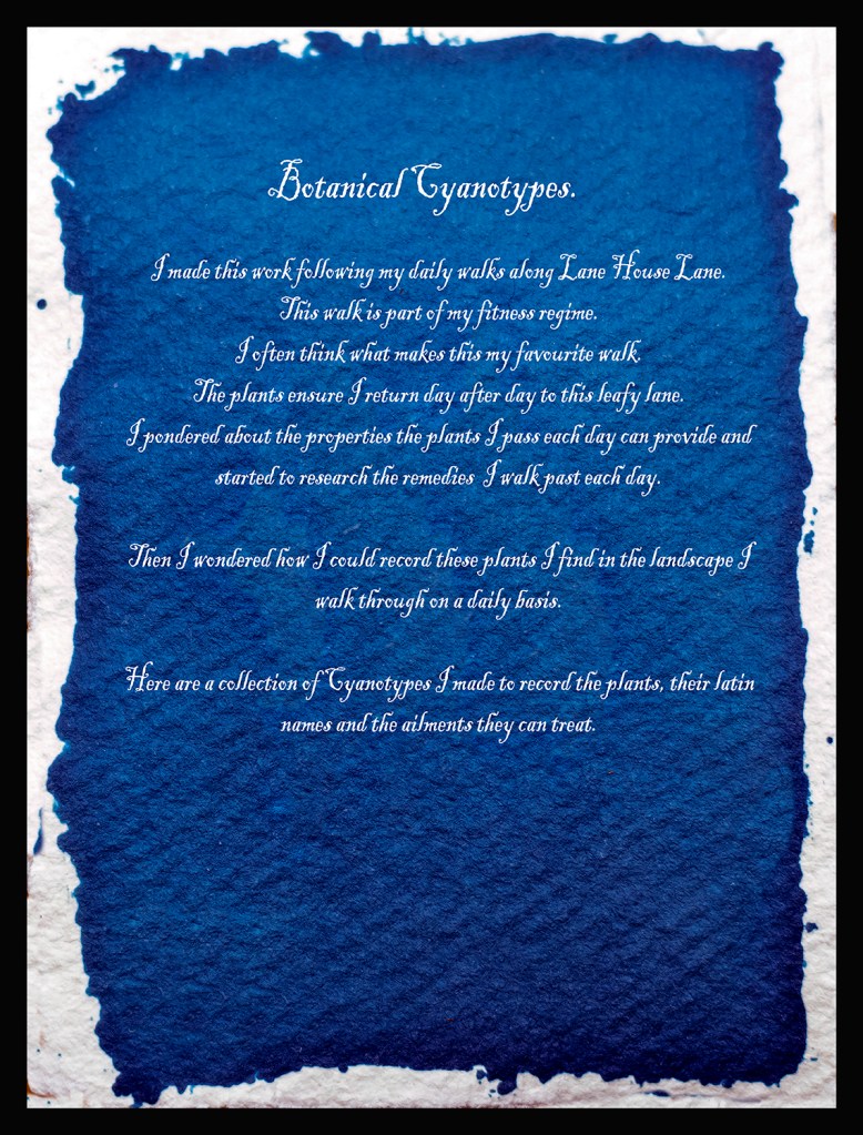
I think the work needs a starting point to set the scene. However a poster, map and description is just too much. I have narrowed this down to a one page description of why I completed the work.
I have started to read about critical writing and will add sections to my posts in the near future. I also looked at the suggested work by Laurie Snyder and Liz Nicol.
(2)Snyders work is more precise than mine and makes me realise I must use this process more to master it to her high standards. I plan to make some very large prints of full plants in the near future. However I am pleased with this work as an early starting point. (3)Liz Nicols work with Rubber Bands her daughter found dropped by the postman. This word made me think of a future body of using cyanotypes give a feeling of some part of this landscape others effect.
I have reworked my Cyanotypes and have dropped the Poster and the Map to replace them with a brief description of why I made this work. This is presented in the style of a cyanotype although I manipulated an existing cyanotype in Photoshop. I see them now on a white wall in a gallery next to each other in a level straight line so that each image is equal.
(1)Gomez, Anthonini Minniti, and Lunganella Bendandi. Experimental Photography. London: Thames and Hudson, 2015.