I wonder if any viewer would look at this series and understand its message. That is why I included the headlines to help the viewer see my intent. This intent was to show that our landscape should be seen as stalwart in our lives. Whatever the media discusses our landscape, a landscape we create is a constant. There to nurture and succour in good times and bad.
Each individual image has little impact alone although some do more than others. The series however has impact as you see the dynamic elements of the landscape change through the year. Whilst I didn’t quite hit the bull’s eye in every image the overall project hits the mark.
In making the 12 composite images that make Transitions I was keen to have consistency in each image. So I ensured I was in the same place for every one. Whilst I didn’t want the images to stitched panoramas they needed to show the same image.
I think I achieved this with accuracy.
I ensured the light was coming from the left hand side as we in the west expect to see it from this direction. Then perspective of the road takes the eye into the picture taking you past the changes in the landscape. Contrast and Colour also show the eye these changes, from stark leaves to full bloom.
My voice shows through the images I could have made straight 4:3 images but thinking of David Hockneys work “Four Seasons” (Hockney, 2017) made me adapt my work to get and series of images that emphasise areas of the scene and make my eye work as I look around the images. I like the way your eye sees separate images but your brain makes a composition from what is on show. To me it makes the story a challenge to get to.
Using the rule of 1/3rds and the road for leading lines allowed the basic frame of the photo. This helped make the twelve images follow a standard composition even though each image is slightly different it makes the series consistent.
I chose to use manual settings as I knew that auto would alter the settings and so the photos too much making each series too varied. Doing this allowed me to finish with consistency of exposure, contrast and detail. I could have used a reflector to direct light into the shadow. This would have been difficult to keep aligned across the twelve images.
My first thoughts around presentation were to create a book of large images. Covid 19 means no sending in of physical work. This has meant a rethink and I have created a slideshow of the work. I like the fact I can control the amount of time each image is visible. The viewer can loupe the video if they want to see the images again. Also the music adds to the project helping with the flow.
I have enjoyed this project and will be carrying it on into the future.
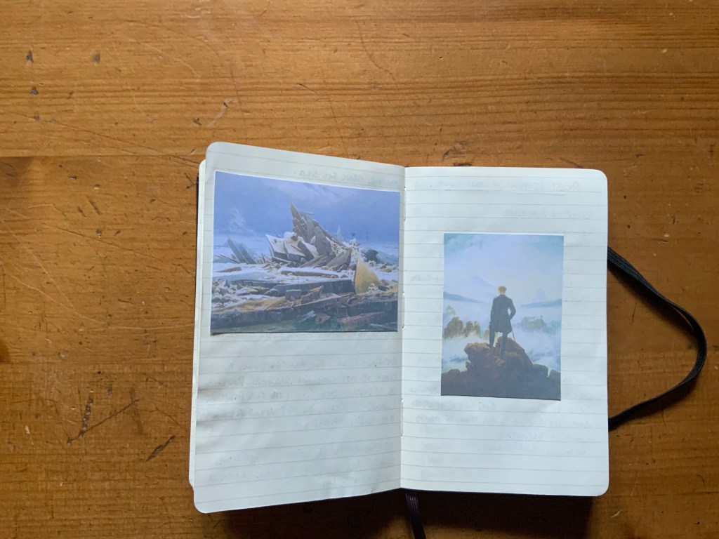
David Caspar Friedrichs painting “Wanderer above a sea of Ice” (1818) is the inspiration for this assessment. I like the relationships shown in the painting me with the landscape, me with the person and the person with landscape all in one scene.
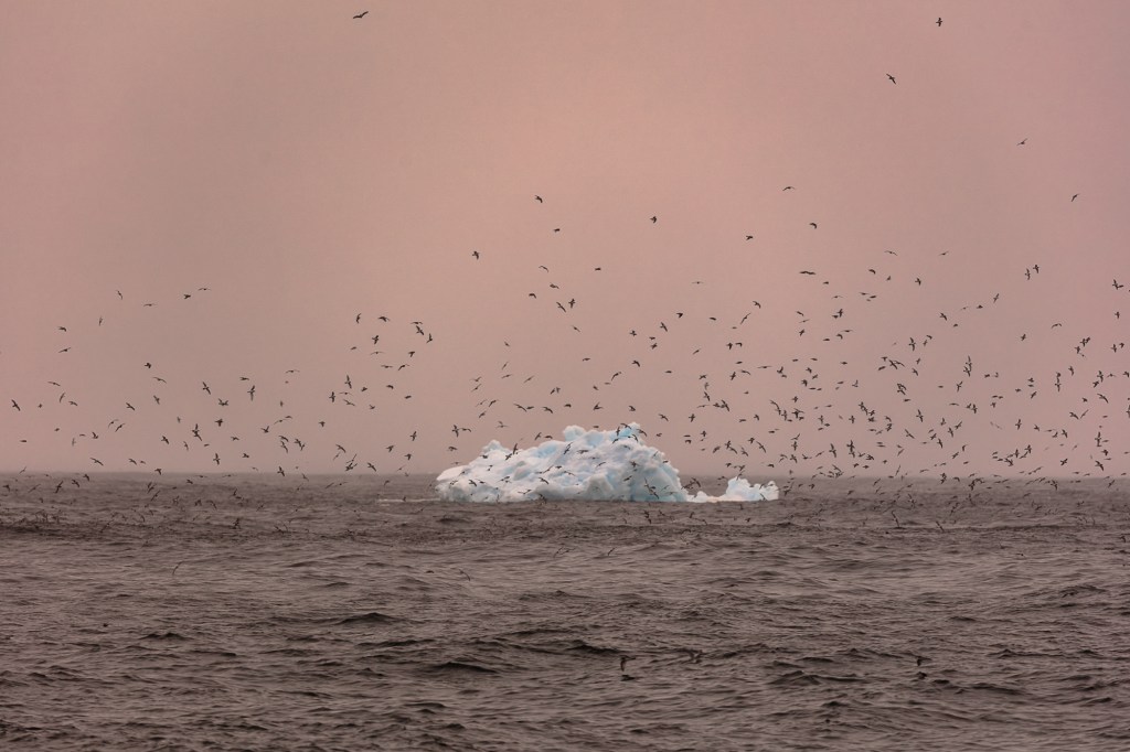
I wanted to show the reaction people have when they see the landscape in Antarctica not all will get to see this wonderful place. So I think it is important to show this reaction so people may comprehend how special this place is.
This critique is in two parts one part working in the field and then creating the method to present it as a finished piece of work.
The fieldwork went well I knew how to set myself up to get the perspective I wanted to show the subject in the landscape. I had to work fast as I wanted to show a reaction that lasted a fraction of a moment. This meant I missed some shots and so had to take many to get these 12 exposures that make the book. The work sits well together as a series and in my opinion shows what I set out to show the way the scenery effects people who see it. I captured the three way relationship shown in Friedrichs painting.
The second part of the critique is of the book itself. Here I had to learn a new skill Japanese Stab Binding was suggested by my tutor. I enjoyed the process of making this book immensely. The finished piece of work is extremely professional and shows the work very well. I was pleased I took the time to make a window for the cover but I could have improved it if I had shown Friedrichs painting in the format he meant it to be shown.
I believe this is the best piece of work I have created within this course.
Work Cited
David Caspar, Friedrich. Wanderer above a Sea of Fog. 1818. Oil on Canvas. Kunst Museum.
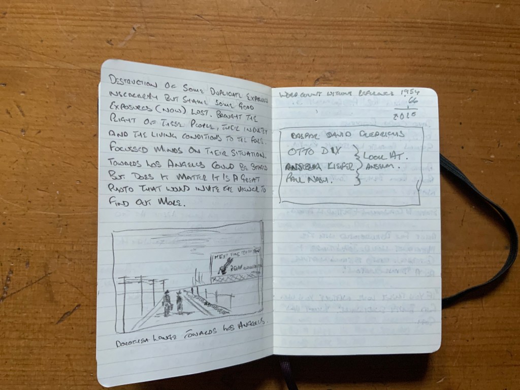
This piece of work was always going to be the biggest challenge for me. I haven’t written any kind of essay since leaving college in 1979. My tutor advised me to pick a topic with a small focus so I chose one photograph taken by Dorothea Lange entitled “Towards Los Angeles”.
I completed research into the photo and Dorothea Lange which led to Roy Stryker and the FSA. The research was primarily into the photograph.
When I got the initial feedback from my first effort and my tutor said I had produced a good blog post I felt deflated and went to read my post again. After doing so I agreed with my tutor and felt disappointed in my self. I revisited the work following the annotations my tutor had sent to me. On re-reading this I still felt I could do better. So I stayed up all night reading how to write an academic piece of work.
Also I realised I had to do more research into the background of the photo and also Roy Stryker. This research gave me the data to write an essay and the work I did reading the website of the “Royal Literary Fund” (2020) meant I could start again. My tutor was great going the extra mile allowing me to resubmit and re-reading and re-assessing this work.
In the first piece I wrote, the vocabulary was sloppy, not academic at all, in fact bloglike. Also I had only focussed on the photograph I needed to expand the work to look at the whole picture. The second piece was much better and although I realise I need to carry on the improvement I am happy with this second piece of work.
In previous course I had referenced the work I had read and was surprised to be told I had been doing it wrong. I read “Cite them right” (2005), a book by Pears and Shield which corrected my referencing to the Harvard method of reference.
I feel in the end I created a good piece of writing about a great photograph and its context. However more importantly I realised my inadequacies and have started the journey to putting things right. However I realise there are many more miles to put in to keep the improvement moving forward.
Considering assignment 3 A space that becomes a place work I made earlier this year has to begin by discussing how it came about. I had attended a lecture about seascapes and had listened to a description of Peter Breugel the elders “Landscape with the fall of Icarus”.
As I started make images I wanted to make the point Breugel had in regard to mans folly, both technologically and politically. I thought the Poem written by William Carlos (1962) would be an appropriate accompaniment. Near completion of the work a Chilean Navy C130 aircraft crashed ten miles in front of our vessel taking 38 maintenance engineers and crew with it. This changed the whole context of my work instantly.
I fought with the ethical position of the work but decided it was fitting to carry on after all we think we have over come nature every time we fly in an aircraft. So I continued.
My camera was set with a quick shutter speed to freeze the water and the Albatross, even the snow would add to the image. To get the correct image I chose a bird and followed it panning with it until it was in position in regard to a wave. The project is made of 12 images accompanied by the words of the poem. I feel the work shows exactly what I set out to capture, in fact what happened strengthens the purpose.
The images are strong and clear showing the different aspects of the sea. I like the varied colour and the varied moods of the ocean. The bird adds a second element with its fragility in before the elements.
I could have captured a bird on the water to finish the project but wasn’t lucky enough to see this so could not capture this. I am pleased I resisted using a zoom to get detail the wider images show space and hint at the precarious nature of these birds and this place.
In Breugel`s painting he clearly shows the indifference of man to the suffering of others. This tragedy in the frigid water was all but ignored by the worlds press. It took me hours to find any information when I got back home. So these souls and their plight were ignored just like Icarus.
Overall I am pleased with this project and how it was constructed I dedicate it to the lost people from the aircraft.
Breugel, Peter. Landscape with the Fall of Icarus. 1560. Oil on Wood, 73.5 by 112 centimetres. Royal Museums of Fine Arts of Belgium, Brussels, Belgium.
Carlos, William. Landscape with the Fall of Icarus, 1962.
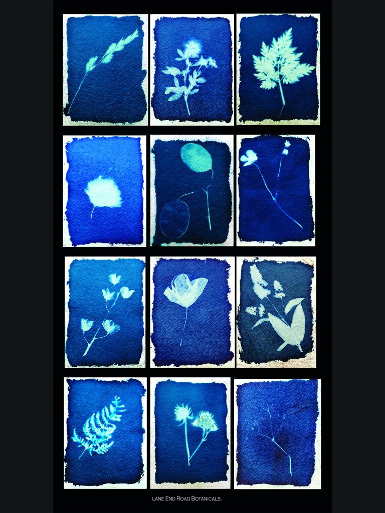
My aim at the start of this project was to explore the landscape in a different way, looking at the detail rather than the whole. Then I had to teach myself a new process. The process I chose was influenced by the work of Anna Atkins and her book “Photographs of British Algae, Cyanotype impressions” (1843). The ultimate goal for the work was to highlight we walk past lost knowledge every time we visit our local paths and hedgerows.
To complete this work I had to learn how to make cotton rag paper, it had to be strong enough to survive the washing process needed to fix the image. Next I learnt the technique of mixing the chemicals to paint onto the paper to capture sunlight or draw with light the literal meaning of photograph. I read the book “Experimental Photography” (2015) to learn the technique.
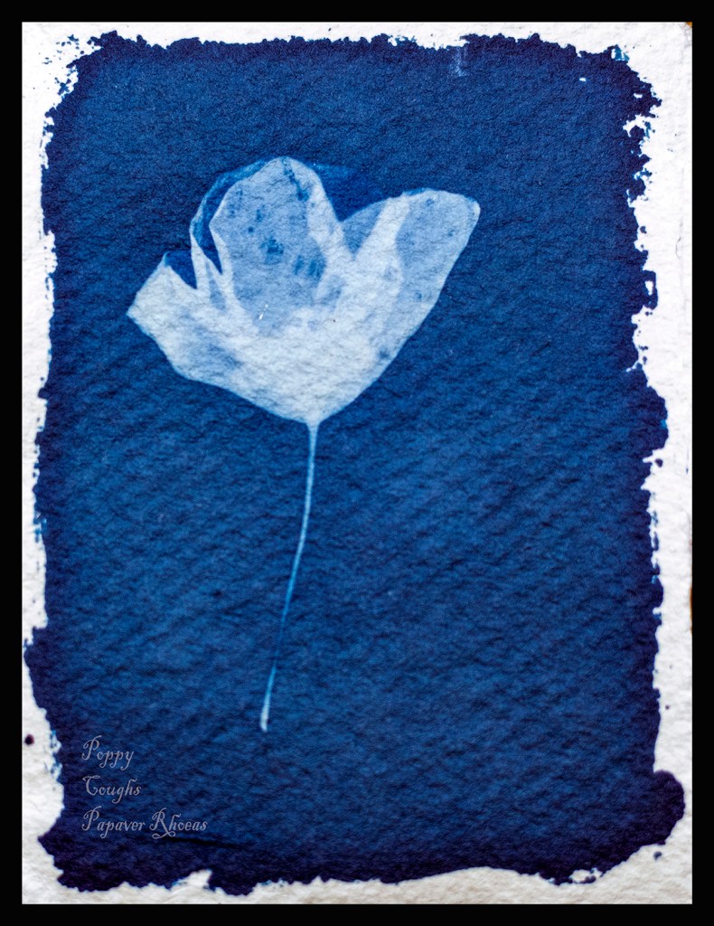
In the initial work I sent for assessment I had done too much including a map and a poster. My tutor said the cyanotypes were strong enough to stand on their own. So after a rethink I included the words as Atkins had on each image. This was an important part of the work as far as I was concerned.
My initial montage of cyanotypes of the plants I collected on my walks.2nd atempt with the words on the cyanotype
The overall effect of the work is pleasing; the detail the Cyanotype process captures is amazing. However exposure using the autumn sun is difficult. Some of the exposures are overexposed but are still a good record of the plant. The set of images shows 12 of the plants that make up the hedgerows I walk past everyday and represent them well.
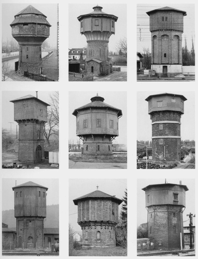
Hilda and Bernd Becher montage of water towers (1967-2010).
Initially I presented the images on one poster as the Bechers had presented water towers in their work “Typologie Wassersturme” (1967-2010). This worked well however when I added the text presentation needed to change to 12 individual pieces of work otherwise the word became lost.
When I got the exposure right the detail is almost a 3d image when I didn’t the plant is just a silhouette. I need to create a better understanding of exposure by creating exposure test strips. This will improve with experience.
I feel the project worked as it shows I see the detail and is able to learn new ways of capturing this detail. I tend to put too much into the finished project and my tutor’s advice of less is more certainly worked here. The finished images are pleasing to me.
Atkins, Anna. Photographs of British Algae, Cyanotype Impressions. 1st ed. Vol. 1. London: Steidl, 1843.
Becher, Hilda, and Bernd Becher. Typologie Wassersturme. 2010 1967. Black and White Photograph Montage, 40 × 30 cm. Konrad Fischer Gallerie.
Bendandi, Luca, and Marco Antonini. Experimental Photography. London: Thames and Hudson, 2015.
Alan Browning says on the rear cover of “Elmet” Fay Godwin book of photographs to support Ted Hughes poetry “Fay Godwin has caught the icy, brooding quality of this landscape with astonishing skill” (1979).
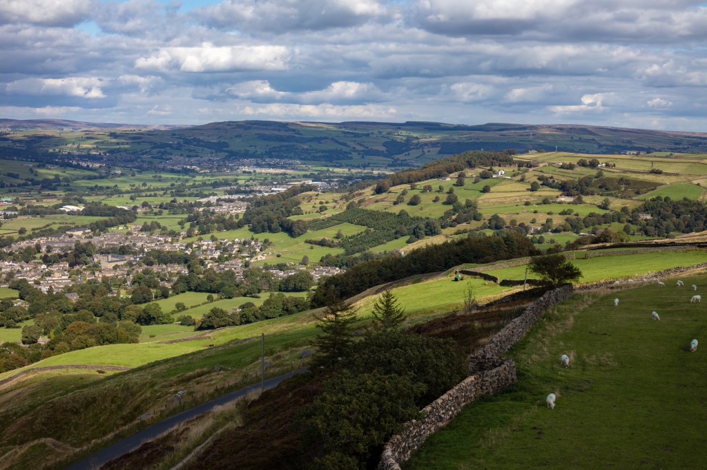
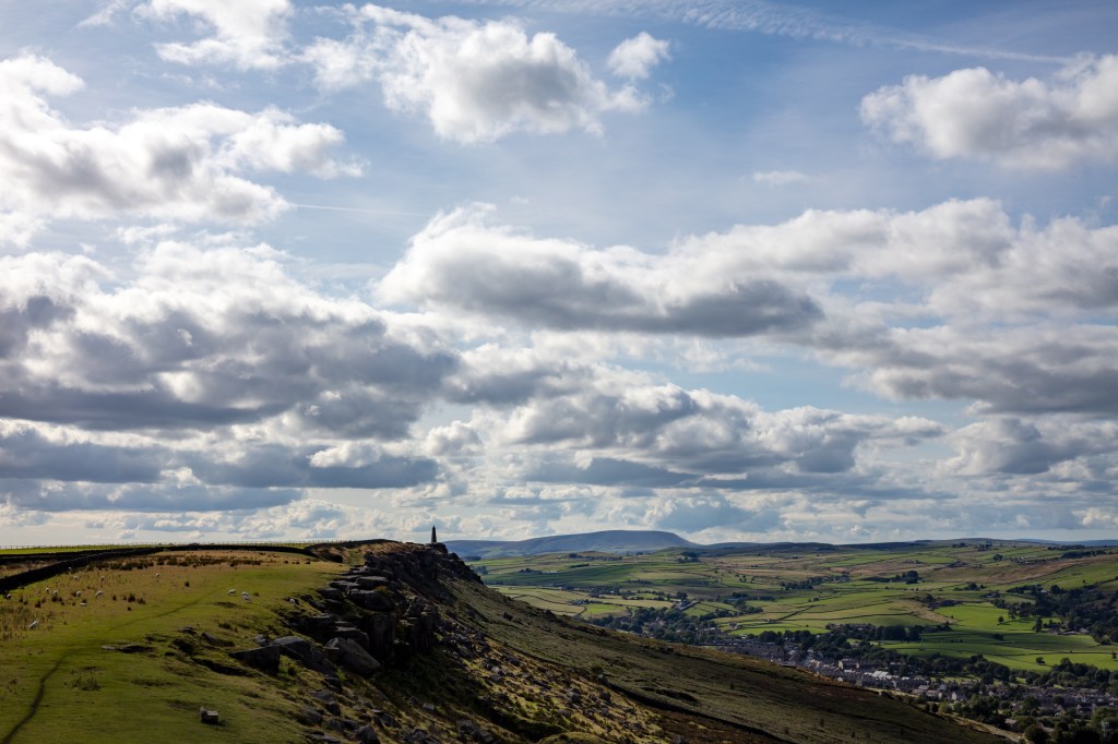
My work for this Assignment is a starting point guided by the word Sublime. I want to show the area I have recently moved into in a Sublime way. The big skies the green land and the open space from a different vantage point.
I chose to climb a pinnacle on a local hill to achieve the vantage point I wanted and to allow me an all round view. This enabled me to get up high to paint a picture of the landscape I live in.
Looking to Pendle Hill
Some of the views worked better than others but they do show where I live which has elements of the sublime. The view of Pendle Hill with the Farm and the truck is the best image to as it hints at the work and life that this place enjoys. The view of Cowling Church whilst a nice image does not work as well, the elevation of the lens is not as strong. The images do paint the picture of the dale I have moved to and certainly show the green and pleasant land. The skies whilst big and blue was not quite sublime however I captured it well demonstrating I can use the instrument of choice.
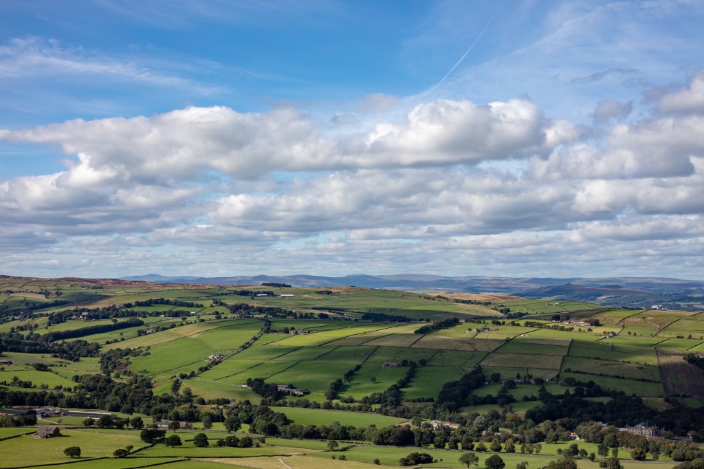
My aim was to show the landscape I have moved into I feel I achieved this but didn’t quite show the sublime. Some of the shots with strong leading lines work whilst others are a little flat with lines across the shot rather than leading into the scene.
Strong lead lines take you into the picture
This is a little flat.
The majority of the exposures capture the scene in the way I set out to achieve, the choice of day and therefore light could have been better as the brief was to capture the sublime. Some days the sky is filled with threatening clouds and amazing light if I were to do this exercise again I would wait for one of these days.
I still like this set of images and feel it does hint at the sublime place and the lives led here. This was what I wanted to achieve at the outset but could improve on it in the future.
Work Cited
Hughes, Ted, and Fay Godwin. Elmet. Faber and Faber, 1994.
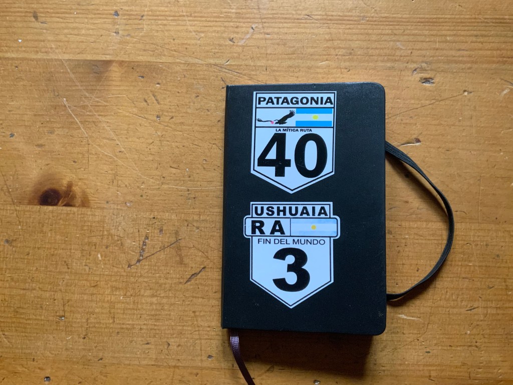
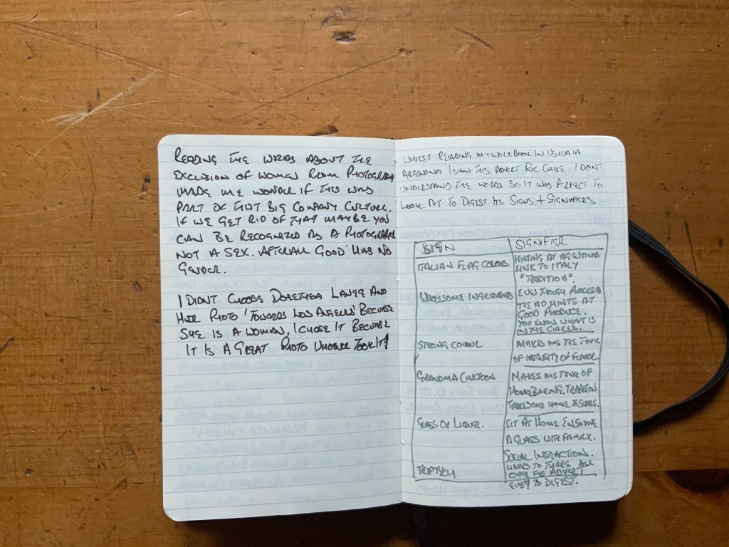
During each of my courses I could not have worked without a notepad. I keep it with me all the time (you never know when an idea will arrive).
I note everything down, some things become work others just form ideas that haven’t been produced, yet. They are all important and although scruffy it works for me.
Here is a slideshow of some of the pages from my latest notebook to show how it works for me. I recommend using one to any photographer they are great to refer to later.
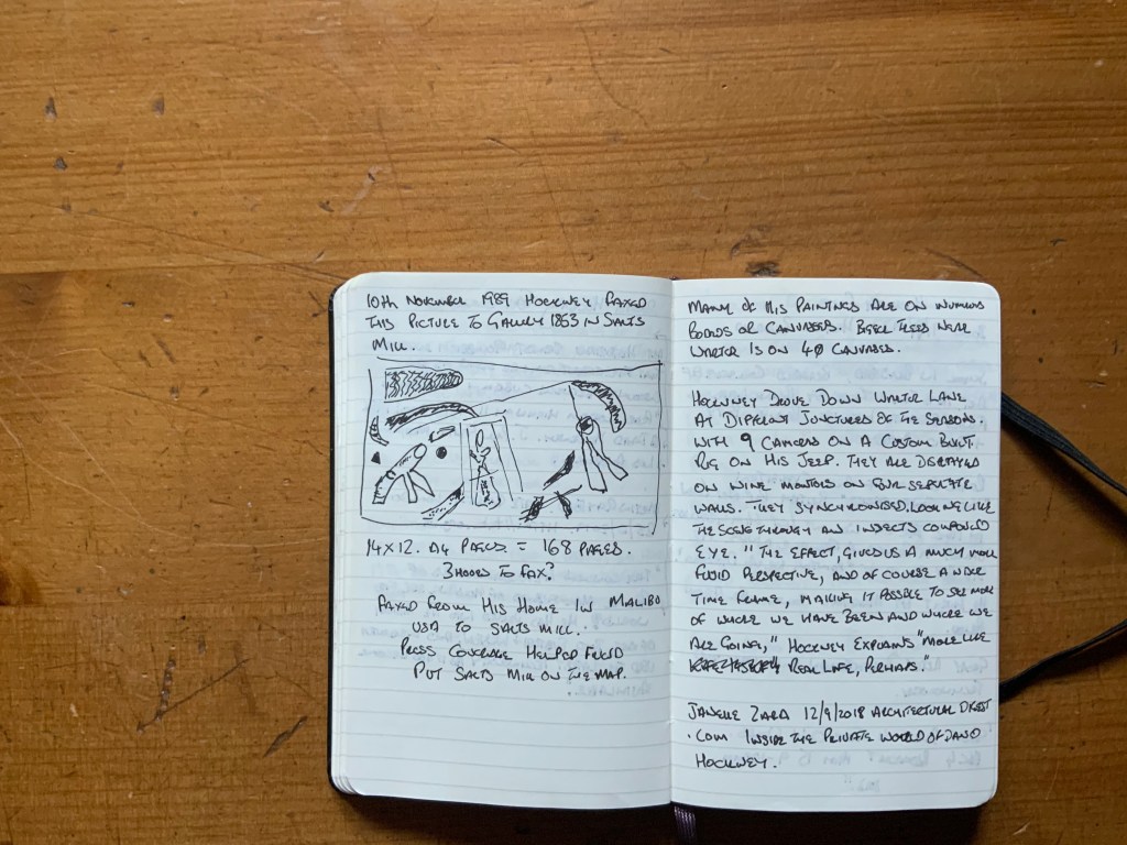
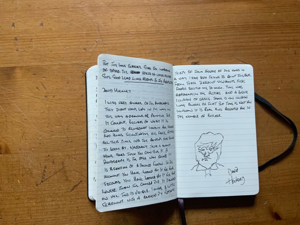
When I was researching David Hockney I found this video of him discussing the background to his collage photographs. I found it thought provoking and relevant to the work I was completing for transitions (Assignment 6). This work shows elements of both time and space. In this piece I want to look a little deeper at David Hockneys thoughts but start with a transcript taken straight from the video I found.
In the video David Hockney says “I was very aware of the photographs they didn’t have life in the way a drawing or painting did. It couldn’t, because of what it is. Compared to Rembrandt looking for hours and hours scrutinising his face putting all this time into the painting you are going to look at. Naturally their is many more hours than you can give it. A photograph is the other way round; it is a fraction of a second, frozen. So the moment you have looked at if for four seconds you have looked at it for far longer than the camera did. It dawned on me this is visible. I made a little experiment with a Polaroid by putting thirty of them together of this in a way I had been trying to paint this house from three different viewpoints. These photos excited me so much. Time was appearing in the picture and a bigger illusion space. Space is an illusion, I was aware of that but time is not an illusion, it is real and accounted for in the number of pictures” (Smithsonian, 2020).
This is a lengthy transcript but when I tried to extract segments the words no longer made sense so I include it all. The video is worth watching and you can find it here.
I wanted to consider what David Hockneys words said to me and look at some examples of pictures that convey my reaction to them.
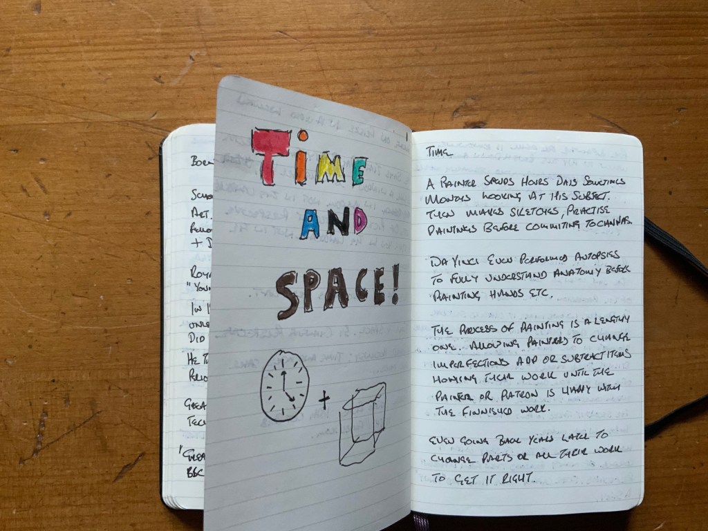
Time.
A painter spends hours, day sometimes months looking at his subject. Then they make sketches, practise paintings before committing to canvas.
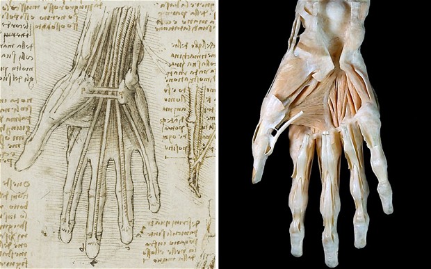
Leonardo Da Vinci Anomatical Drawing of a hand 1500. (Mail, 2013)
Leonardo Da Vinci performed autopsies to fully understand anatomy before painting hands etc. The process of painting is a lengthy one. Allowing painters to change imperfections add or subtract items honing their work until the painter or patron is happy with the finished work. Sometimes going back years later to change parts or all of the work to get the painting right. (Mail, 2013).
For a painter the skill is knowing when to put down the brush and stop. For the photographer who works in seconds it’s knowing the correct amount of time is needed to portray the story. My work in assignment 6 will show a year in one location but the exposures will be done in several seconds.
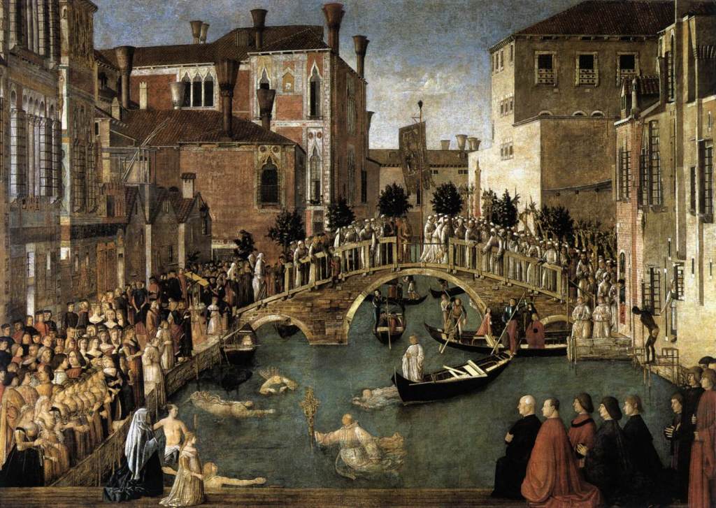
Bellini The Miracle of the true cross near San Lorenzon Bridge (Bellini, 1500).
Some paintings show a period of time and include a full story, Bellini in the “The miracle of the true cross near San Lorenzo Bridge” (Bellini, 1500), shows the story of the procession of the cross. From arriving in a gondola to delivery at the dock. In one image it captures several moments and depicts a story, I look and see what has happened here.
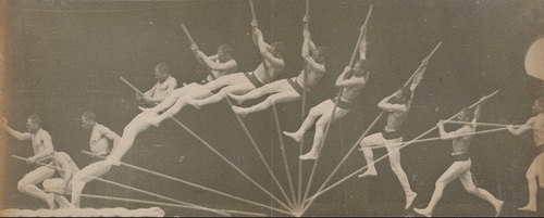
Etienne Jules Marey “Chronographic study of a man pole vaulting (1891)
Etienne Jules Marey “Chronophotographic study of a man pole vaulting (Marey,1891) shows the second it takes to pole vault but splits the second into ten images and then superimposes them so the story is shown in one image.
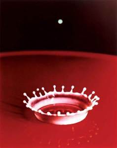
William Edgerton Milk Drop 1936.
With photography we can choose many ways to show time. Short exposures freeze time such as in Harold E. Edgerton’s “Milk drop” (1936). This photograph shows the fraction of a second a drop of milk hits the surface in a saucier forming a perfect crown. The whole story is visible from drop to crown in one image.
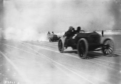
Nathan Lazarnick Autos racing on the beach 1916.
Long exposures show speed or movement. Nathan Lazarnick (1916) uses a longer shutter speed to depict the speed of a racing car. Blurring it within the frame, the tyre tracks give good leading lines whilst the background is sharp emphasising space. I can see the speed the cars have passed the spectators and that this is a race.
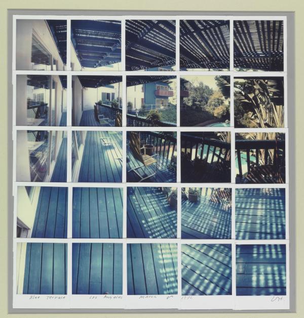
Hockney chooses to tell the story with a collage of many Polaroid images taken from different perspectives. These capture more time and create the space for him to “paint” a story. The experiment has speaks of in the video shows just a blue balcony however it shows the balcony in the same way the eye works darting around. The scene isn’t flat it shows us the space and the number of shots tells us that time has passed whilst he worked emphasised by the changing shadows and light cast onto the scene.
Space
Both photographers and painters are limited by space. The space created by what is before them is constrained and by the frame both need to be considered in regard to the message they want to convey.
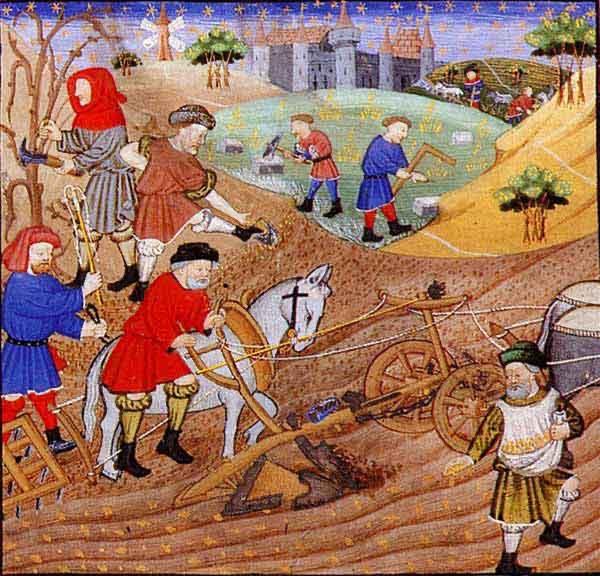
Unknown A 13th Century Farming Scene La Regime de Princes 1279. The Grainger Collection.
Early paintings are two dimensional and appear flat however they still have great artistic merit. Later linear perspective added depth and changes the reality of the work. Non linear perspective use colour, light and dark areas to create depth and perspective to a picture. Haze in the distance does much the same. Both tools are important to a painter and a photographer when creating the space for our stories. When used correctly they make the work more interesting and hold the viewers gaze for longer.
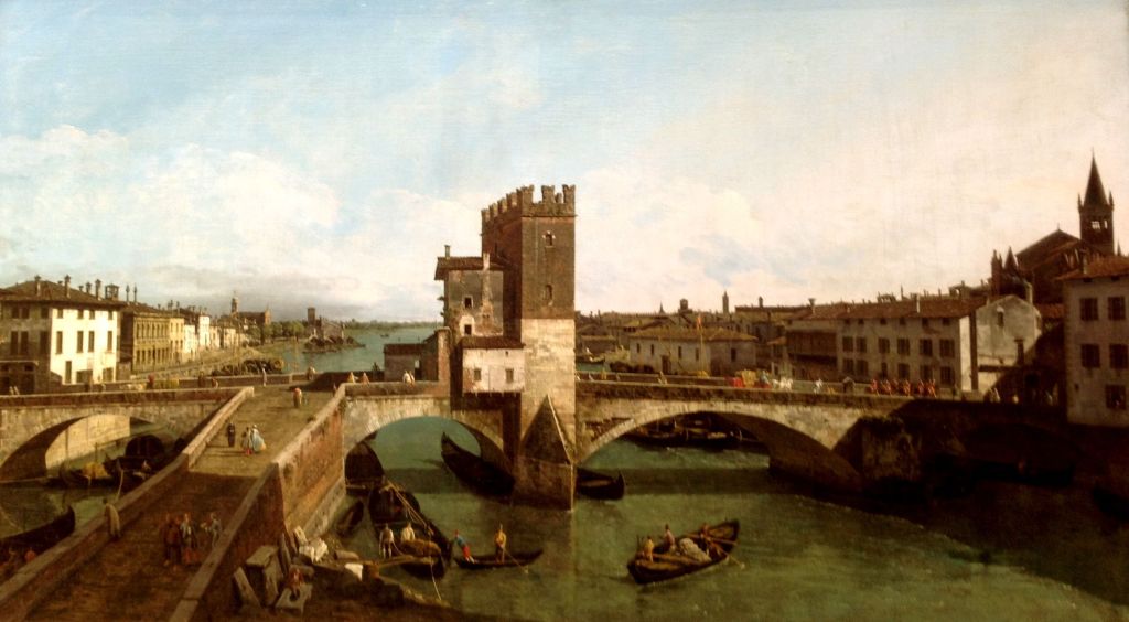
Bellotto View of the Ponte Della Navi 1745 (Bellotto, 1745).
Berado Bellotto “View of the Ponte Della Navi, Venice” (Bellotto, 1745) shows a bridge over the canal. His use of leading lines and the vanishing point give depth to the image. The detail must have taken months to paint but the linear perspective holds the eye and makes a painting of a bridge compelling.
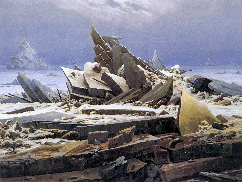
David Casper Friedrich “The Wreck of Hope” (1824).
Caspar David Friedrich “The wreck of Hope”, (Friedrich, 1824) shows a ship wrecked in the ice. The lines create mayhem but no perspective. The perspective derives form the delicate portrayal of ice in the distance hidden by mist. Also the delicate cloud with a finely painted horizon hints at the depth and cold.
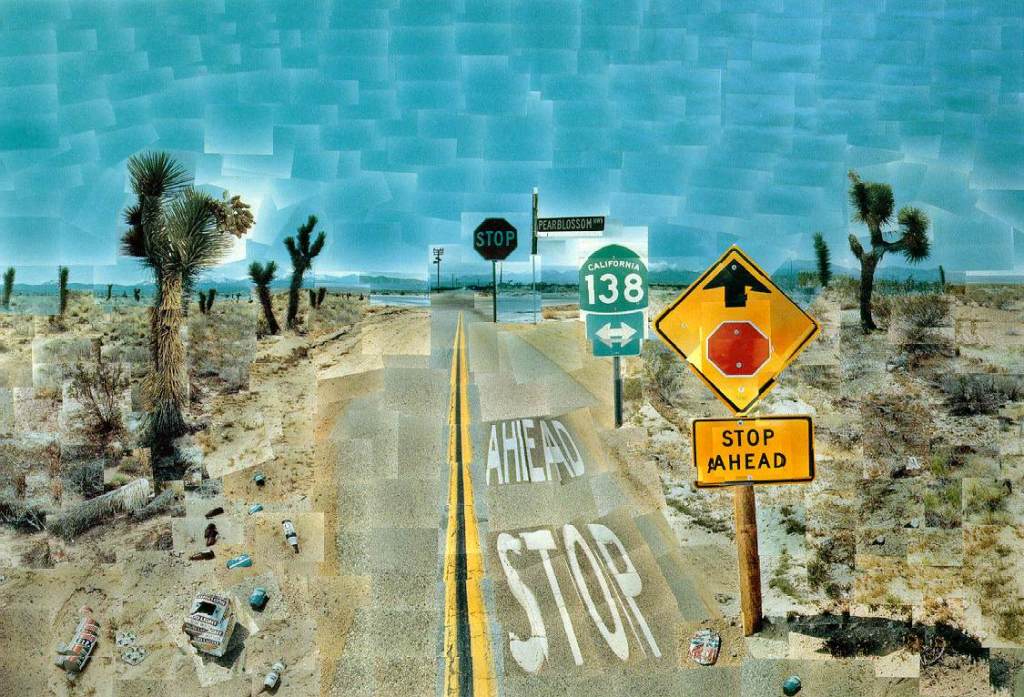
David Hockney Pearl Blossom Highway (1986).
David Hockney shows us this use of time and space in photos such as “Pearl Blossom Highway” (1986) he uses hundreds of exposures to build a collage creating a huge space. In doing this he shows the time passing through the day with the Change of colour in the sky and the change in the shadows. This gives a different view than a single photo it brings the image to life.
In my work I will create space by increasing the area covered by the nine exposures in each image whilst the time naturally appears in the images I will use to complete Transitions.
Work Cited
Bellini, Gentile. The Miracle of the True Cross near San Lorenzo Bridge. 1500. Oil on canvas. Galleria Del Academia Vezezia.
Bellotto, Berado. View of Verona with the Ponte Delle Navi. 1745. Oil on Canvas, 132x233cm. Private collection on loan to the national gallery of Scotland.
Hockney, David. Pearblossom Highway 2. April 18, 1986. Collage of Polaroid Images. John Getty Collection.
Hockney, David. Blue Terrace Los Angeles March 8th 1982. August 3, 1982. Polaroid Collage, Photographs.
Marey, Etienne Jules. Chronophotographic Study of a Man Pole Vaulting. 1891 1890. Albumen Print. 88:0795:001. Museum Collection by Exchange.
Nathan, Lazarnick. Autos Racing on a Beach 1916. 1916. Gelatin on Nitrocellulose. 81:3051:0754. Gift of George Lazarnick. “Smithsonia Channel What David Hockneys Collages Reveal about Photography.” Accessed June 29, 2020. https://www.facebook.com/watch/?v=3079256612155771&extid=ZB4HtuZiUc4PUZjP
Unknown. 13th Century Famers using a wheeled plough in France 1279. Manuscript. “The Grainger Collection”. Accessed 2020.
I wonder if any viewer would look at this series and understand its message. That is why I included the headlines to help the viewer see my intent. This intent was to show that our landscape should be seen as stalwart in our lives. Whatever the media discusses our landscape, a landscape we create is a constant. There to nurture and succour in good times and bad.
Each individual image has little impact alone although some do more than others. The series however has impact as you see the dynamic elements of the landscape change through the year. Whilst I didn’t quite hit the bull’s eye in every image the overall project hits the mark.
In making the 12 composite images that make Transitions I was keen to have consistency in each image. So I ensured I was in the same place for every one. Whilst I didn’t want the images to stitched panoramas they needed to show the same image.
I think I achieved this with accuracy.
I ensured the light was coming from the left hand side as we in the west expect to see it from this direction. Then perspective of the road takes the eye into the picture taking you past the changes in the landscape. Contrast and Colour also show the eye these changes, from stark leaves to full bloom.
My voice shows through the images I could have made straight 4:3 images but thinking of David Hockneys work “Four Seasons” (Hockney, 2017) made me adapt my work to get and series of images that emphasise areas of the scene and make my eye work as I look around the images. I like the way your eye sees separate images but your brain makes a composition from what is on show. To me it makes the story a challenge to get to.
Using the rule of 1/3rds and the road for leading lines allowed the basic frame of the photo. This helped make the twelve images follow a standard composition even though each image is slightly different it makes the series consistent.
I chose to use manual settings as I knew that auto would alter the settings and so the photos too much making each series too varied. Doing this allowed me to finish with consistency of exposure, contrast and detail. I could have used a reflector to direct light into the shadow. This would have been difficult to keep aligned across the twelve images.
My first thoughts around presentation were to create a book of large images. Covid 19 means no sending in of physical work. This has meant a rethink and I have created a slideshow of the work. I like the fact I can control the amount of time each image is visible. The viewer can loupe the video if they want to see the images again. Also the music adds to the project helping with the flow.
I have enjoyed this project and will be carrying it on into the future.
First I added a short describing why I decided on Shop Lane and what kind of a dynamic system it is. I considered removing the headlines but felt the work would lose its message. I therefore changed how they are presented from seperate slides to including the headlines on the slide with colours that blend in to the shot.
I had copied the links to the pages whilst editing the pages on WordPress which meant that when clicked the link took you to the edit page. So I spent some time checking all links take you to the intended destination.
Then I re-read Cite me (2005) and went back to my work simplifying my citations so as to ensure they don’t make reading the piece complicated. I also read online how to set up footnotes and have had a practise. I will use this shortly to see how it aids my work.
I have begun reading Greider, T and Garkovich, L (1994) Landscapes: The Social Construction of Nature and the Environment. Rural Sociology, 59, 1-24 It is interesting to read about what we are looking at when we look at a landscape.
I Looked at the book Yosemite in time book which was written by Rebecca Solnitt and the photographs taken by Mark Klett and Byron Wolf. In the book the colour photos have been superimposed with the old images of Adams, Weston and Muybridge they are accompanied by Solnitts words the images reminded me of the photos I took and imposed press images on in the Falklands, (See them here).
I am awaiting Raymond Williams book “the country and the city” (2011) to arrive from Amazon I have watched the video and it is another comparison between town and country over 200 years fascinating. Another way to look at things in the urban and rural areas of our nation to then compare them.
Next we discussed getting ready for assessment, it seems we now write about our learning’s measured against the objectives. This seems fair to me we will see.
Work Cited
Pears, Richard. Cite Them Rite. 6th ed. Pear Tree Books, 2005
Greider, T and Garkovich, L (1994) Landscapes: The Social Construction of Nature and the Environment. Rural Sociology, 59, 1-24