I wonder if any viewer would look at this series and understand its message. That is why I included the headlines to help the viewer see my intent. This intent was to show that our landscape should be seen as stalwart in our lives. Whatever the media discusses our landscape, a landscape we create is a constant. There to nurture and succour in good times and bad.
Each individual image has little impact alone although some do more than others. The series however has impact as you see the dynamic elements of the landscape change through the year. Whilst I didn’t quite hit the bull’s eye in every image the overall project hits the mark.
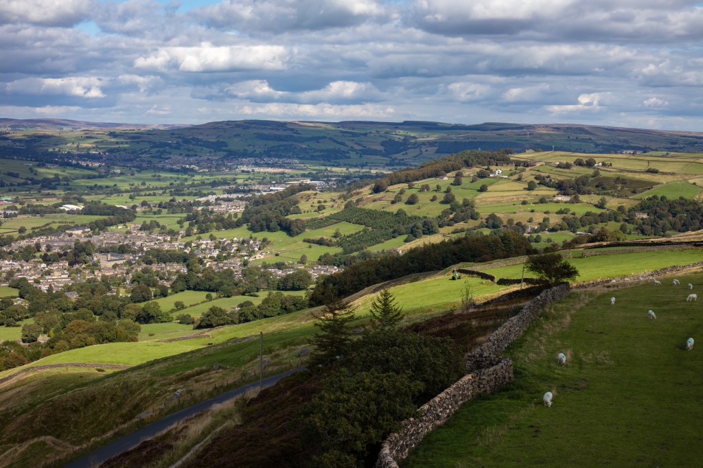
In making the 12 composite images that make Transitions I was keen to have consistency in each image. So I ensured I was in the same place for every one. Whilst I didn’t want the images to stitched panoramas they needed to show the same image.
I think I achieved this with accuracy.
I ensured the light was coming from the left hand side as we in the west expect to see it from this direction. Then perspective of the road takes the eye into the picture taking you past the changes in the landscape. Contrast and Colour also show the eye these changes, from stark leaves to full bloom.
My voice shows through the images I could have made straight 4:3 images but thinking of David Hockneys work “Four Seasons” (Hockney, 2017) made me adapt my work to get and series of images that emphasise areas of the scene and make my eye work as I look around the images. I like the way your eye sees separate images but your brain makes a composition from what is on show. To me it makes the story a challenge to get to.
Using the rule of 1/3rds and the road for leading lines allowed the basic frame of the photo. This helped make the twelve images follow a standard composition even though each image is slightly different it makes the series consistent.
I chose to use manual settings as I knew that auto would alter the settings and so the photos too much making each series too varied. Doing this allowed me to finish with consistency of exposure, contrast and detail. I could have used a reflector to direct light into the shadow. This would have been difficult to keep aligned across the twelve images.
My first thoughts around presentation were to create a book of large images. Covid 19 means no sending in of physical work. This has meant a rethink and I have created a slideshow of the work. I like the fact I can control the amount of time each image is visible. The viewer can loupe the video if they want to see the images again. Also the music adds to the project helping with the flow.
I have enjoyed this project and will be carrying it on into the future.
Link to the work.
https://michaelgreenlevel2landscapeblog.photo.blog/2020/08/06/assignment-6-transitions/
Work Citied
Hockney , David Four Seasons Video Installation Royal Academy of the Arts London.