Research Helen Sear

Helen Sear.

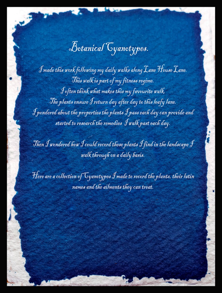
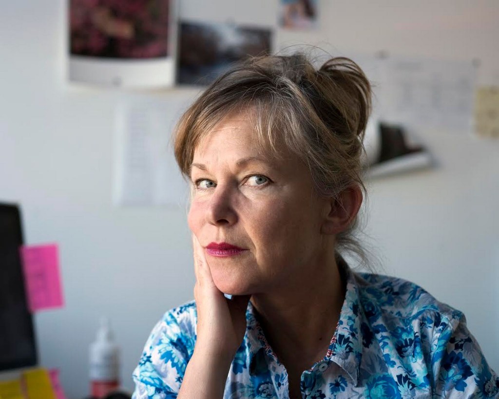
During my work for Assignment 5 I found Helen Sear. She is an artist who states she was influenced by David Casper Friedrichs. I couldn’t move on until I had completed some research into Helen and her work as she was unknown to me.

Helen was born in 1955 in Worcestershire in sight of Wales. She has made her reputation from her studio in Monmouthshire, Wales. As a small girl her father used to go on long walks with her where he taught her about the countryside and nature.

She came to prominence in 1991 when her work was included in the British Council exhibition “De-Composition Constructed Photography in Britain”, this exhibition was popular in Latin America and Eastern Europe (1997).

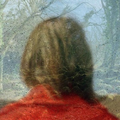
Artsy (2018) says of Sears work, “She explores her/our relationship with the natural world”.  Her work “Inside out” (Sear) reminds me of Friedrichs work with the subject back to camera Helen adds elements to make the photo painterly and dreamlike.

Sear describes her work as a “Double time of image making” referring to the time between taking the initial image and the time during which she superimposes her photographic images (Artsy, 2018).

She was educated at:

1975-1979 Reading university, BA Hons.

1981-1983 Slade School London, HDFA.

          2009 PhD University of Newport, Wales.

Jane Wainwright writing in says of her approach “I am trying to slow down the instantaneous of the camera” Wright continues about Sear “ She highlights the ordinary, making it extraordinary. Forcing the viewer to engage with the work and puzzle out the image”.

When Wainwright asked Sear if she had any particular artists or pictures that influenced her work she replied “I am interested in Romantic Painting particularly the work of Turner and perhaps the German romantics such as David Casper Friedrichs.

Pushed further she continues “The people who influenced me were in the end the ones who taught me at college. At the Slade artists like Tim Head and Helen Chadwick” (Wainwright, 2000).

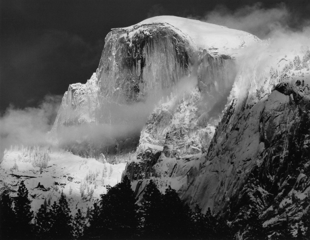
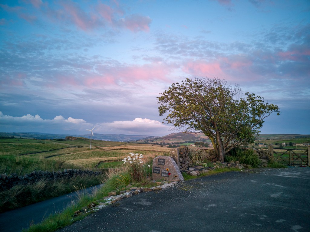
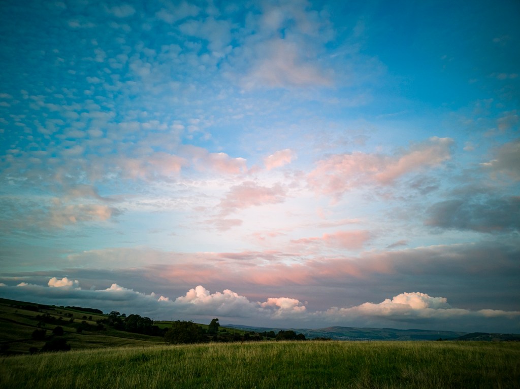
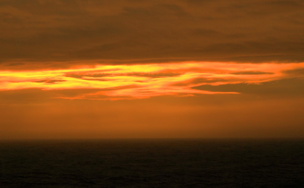
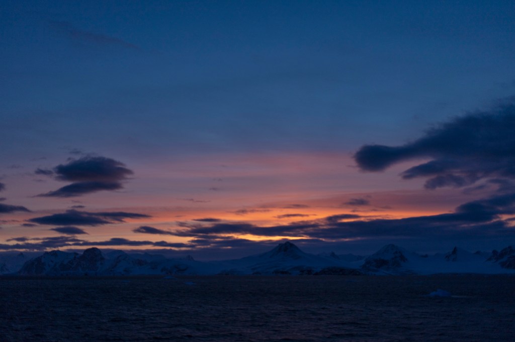
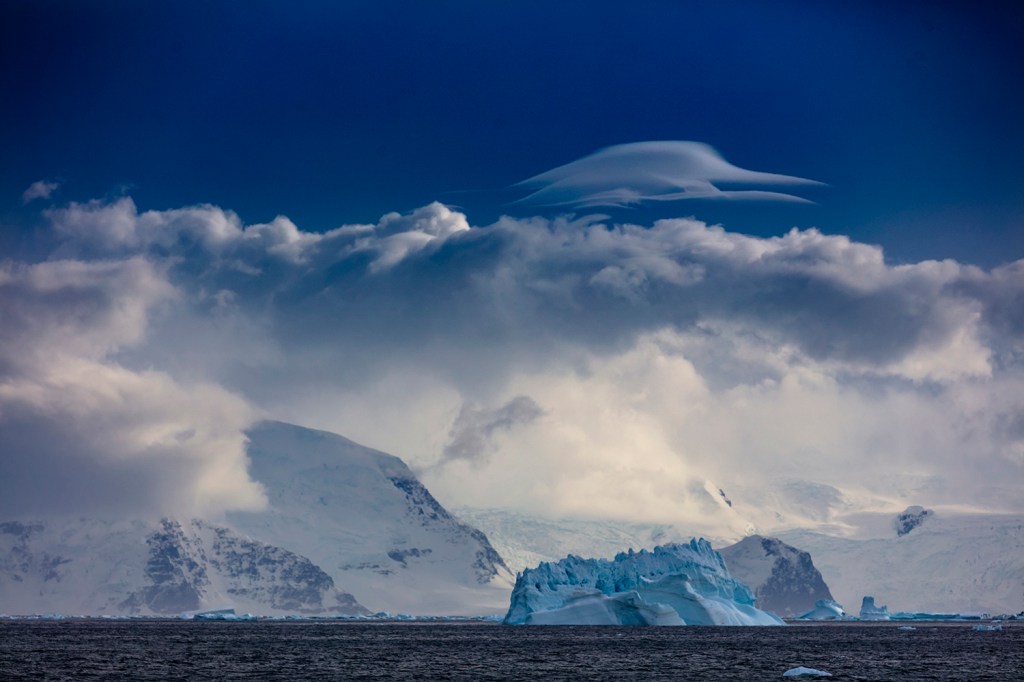
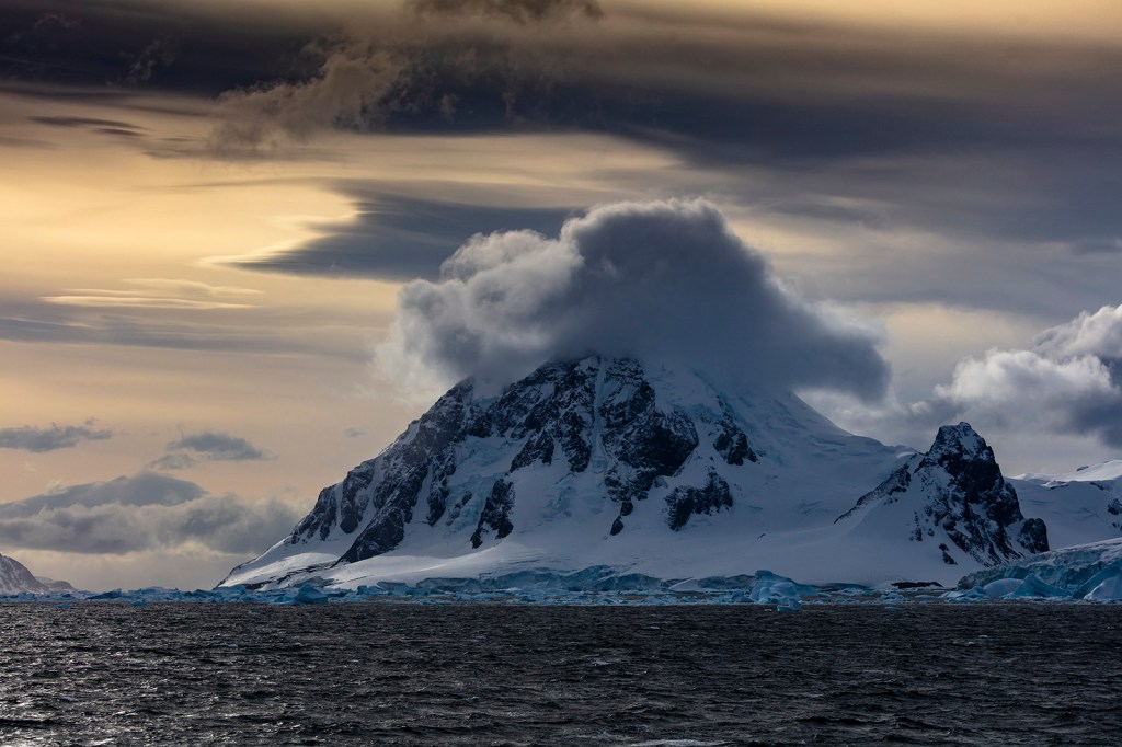
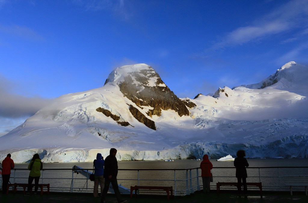
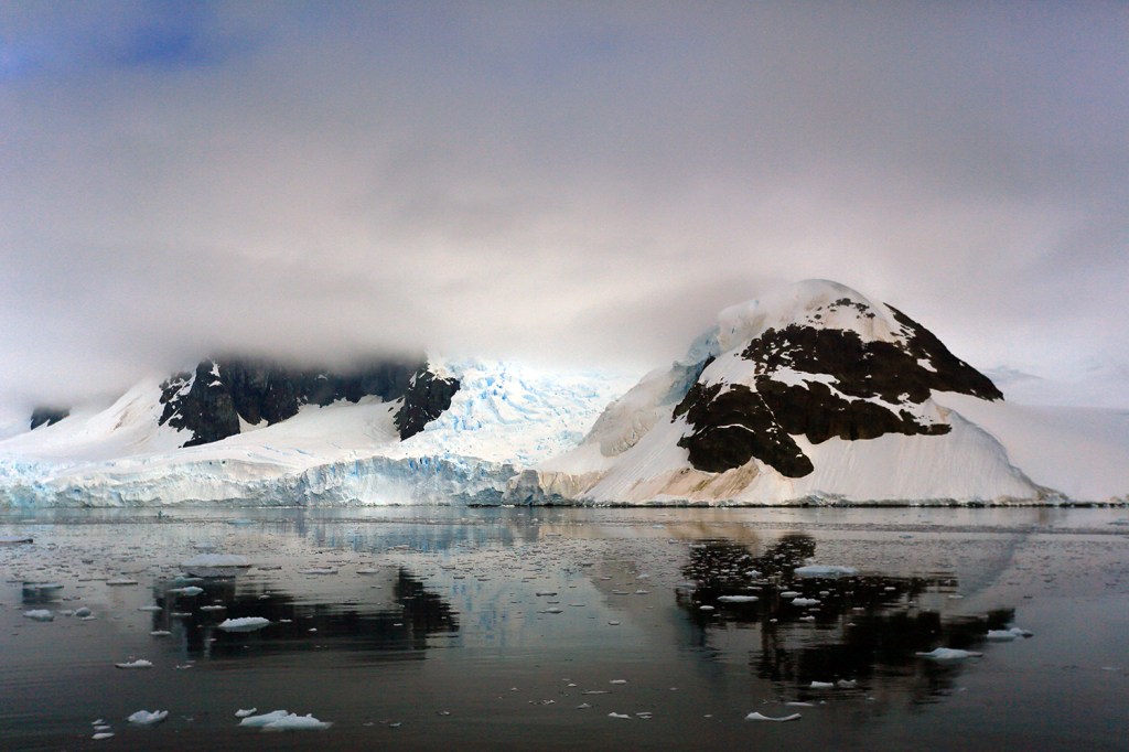
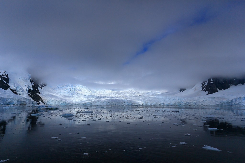
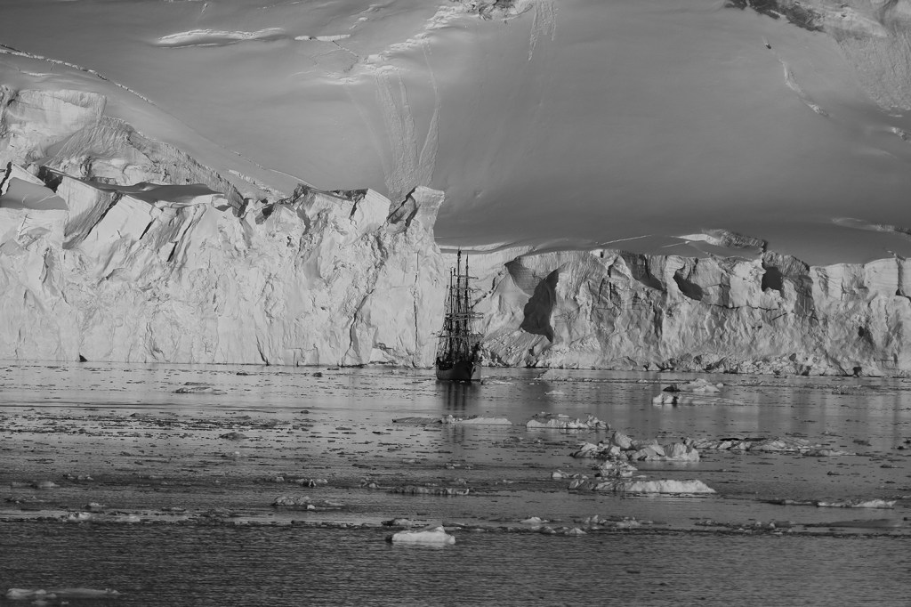
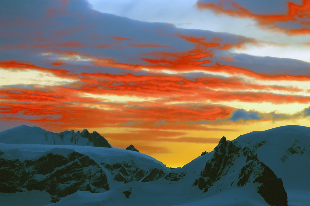
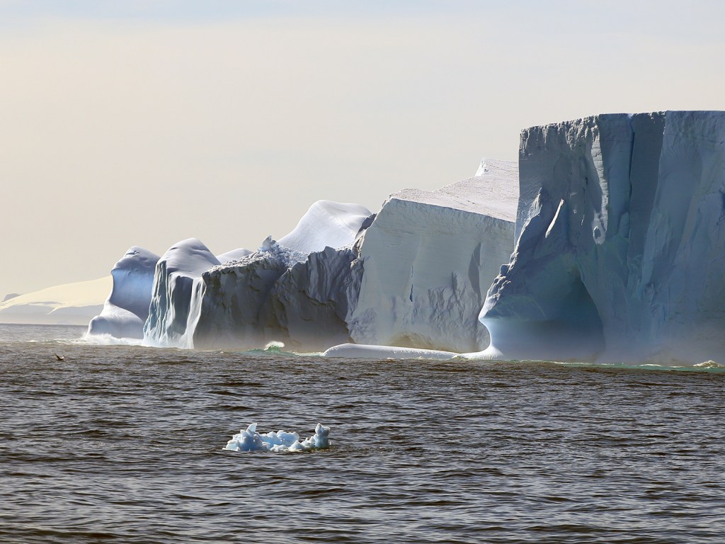
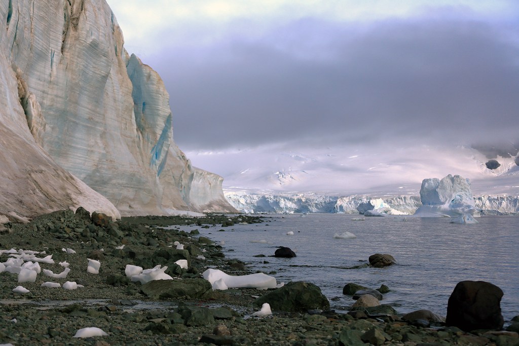
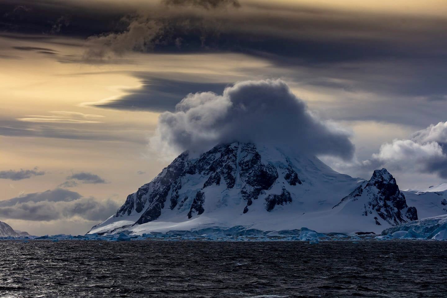
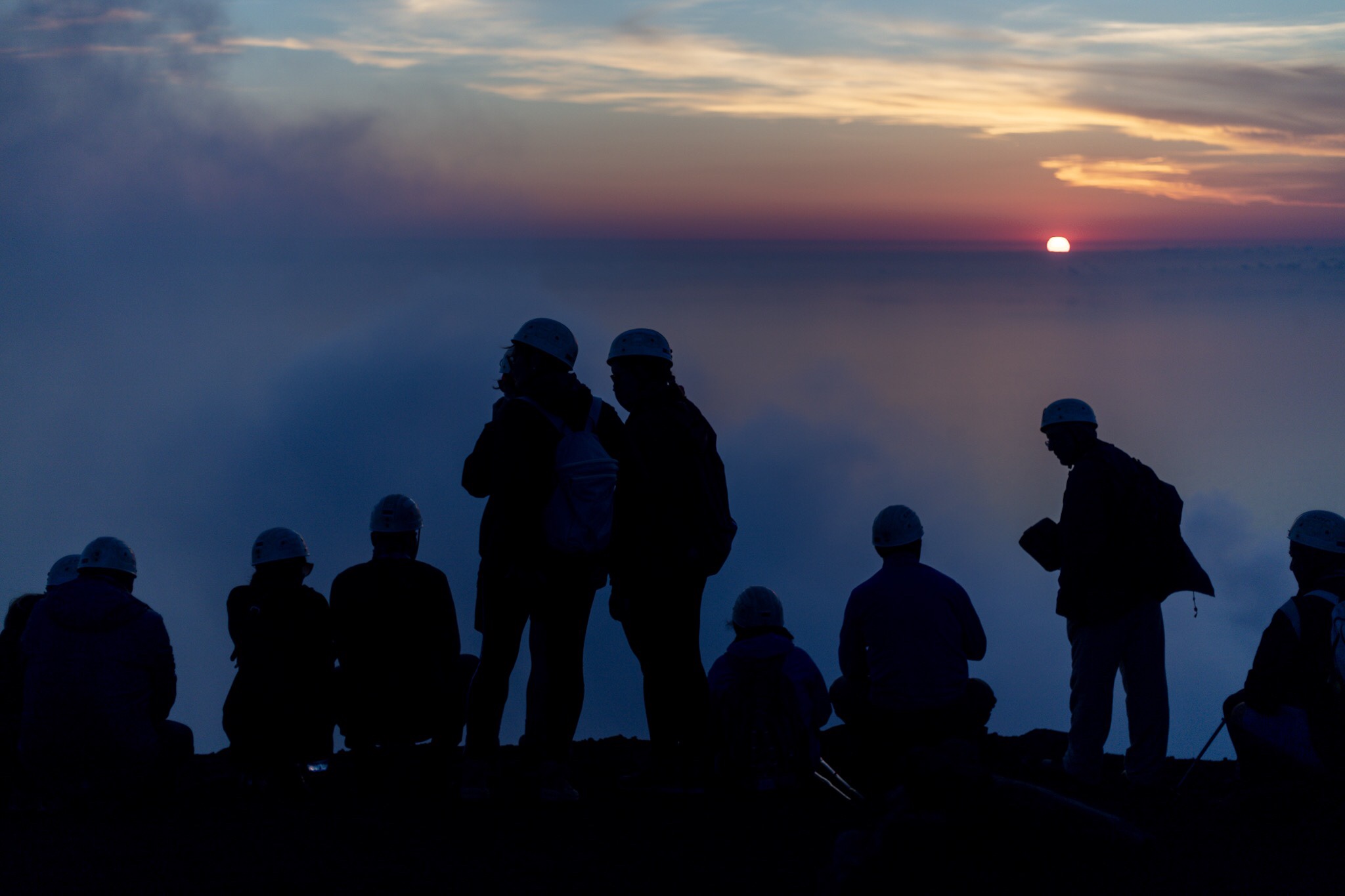
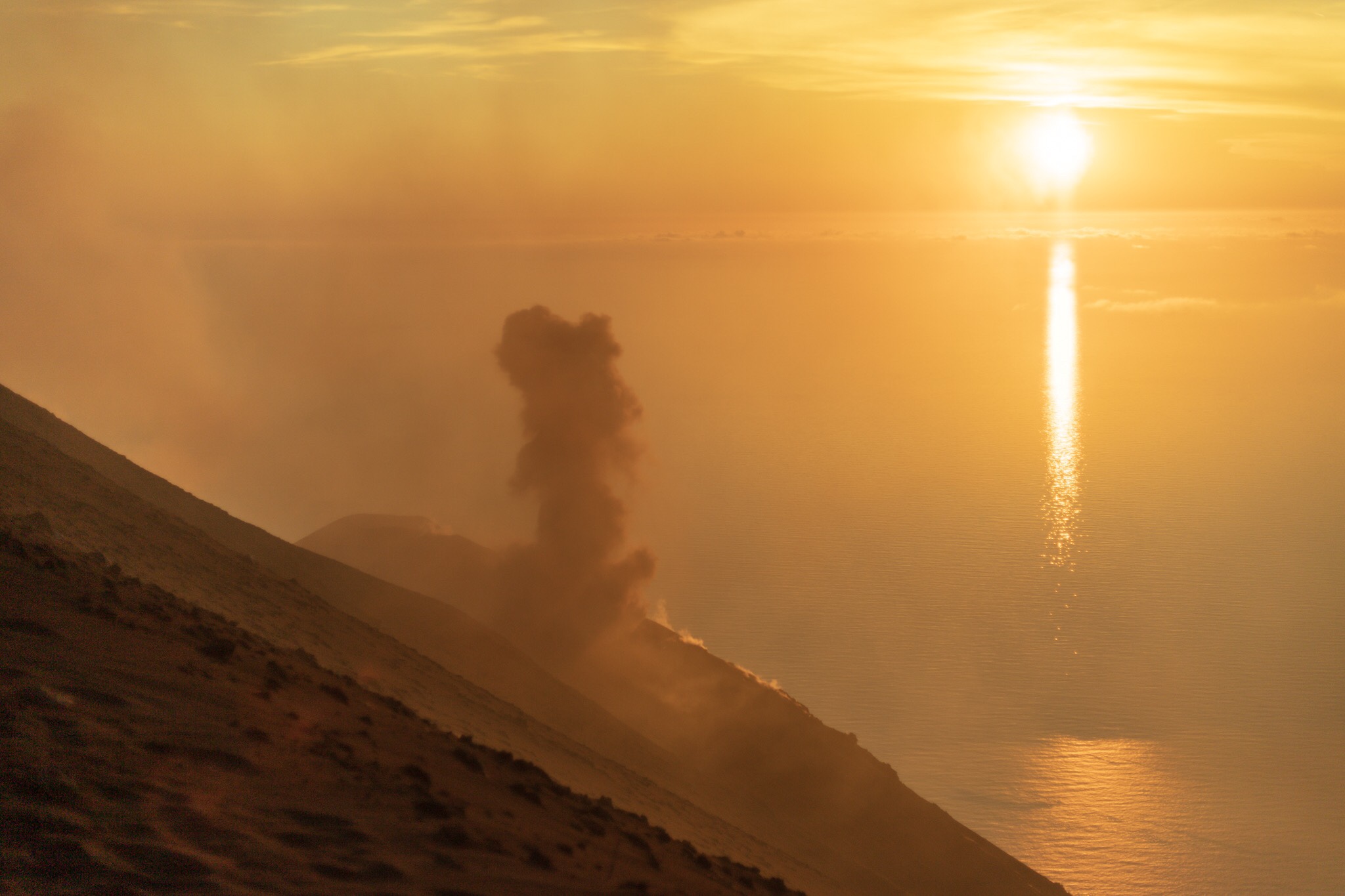
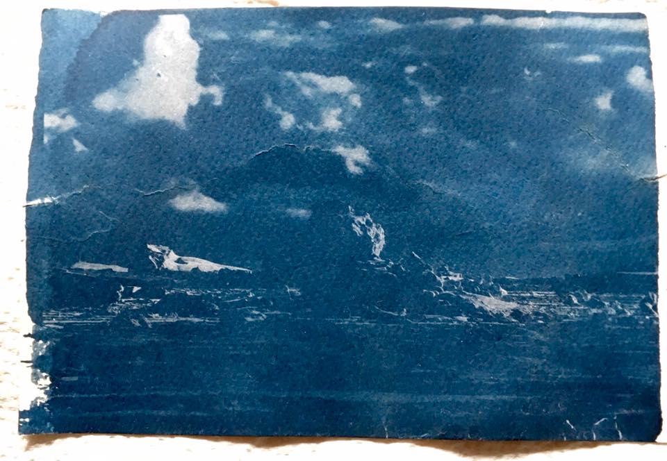
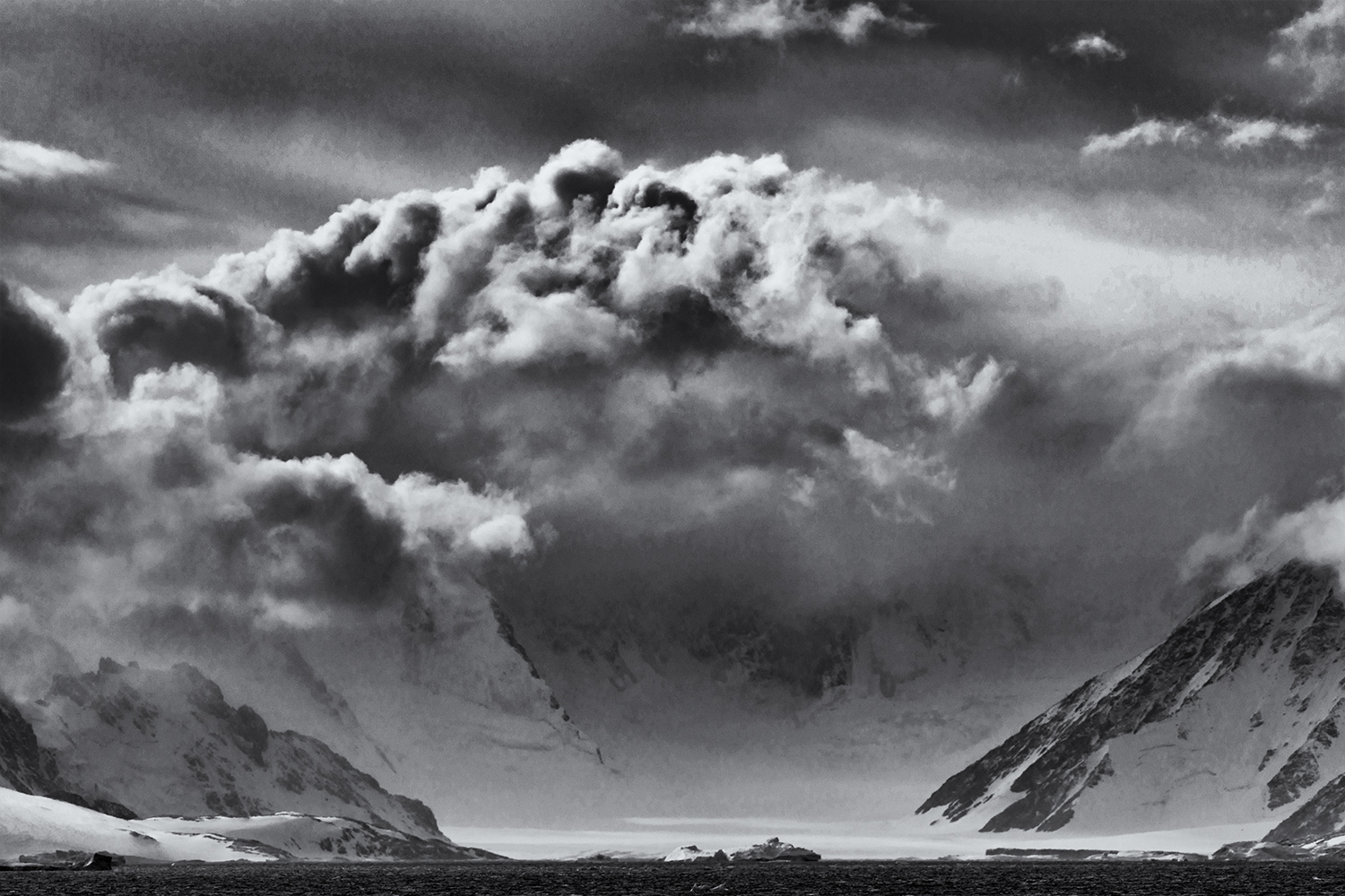
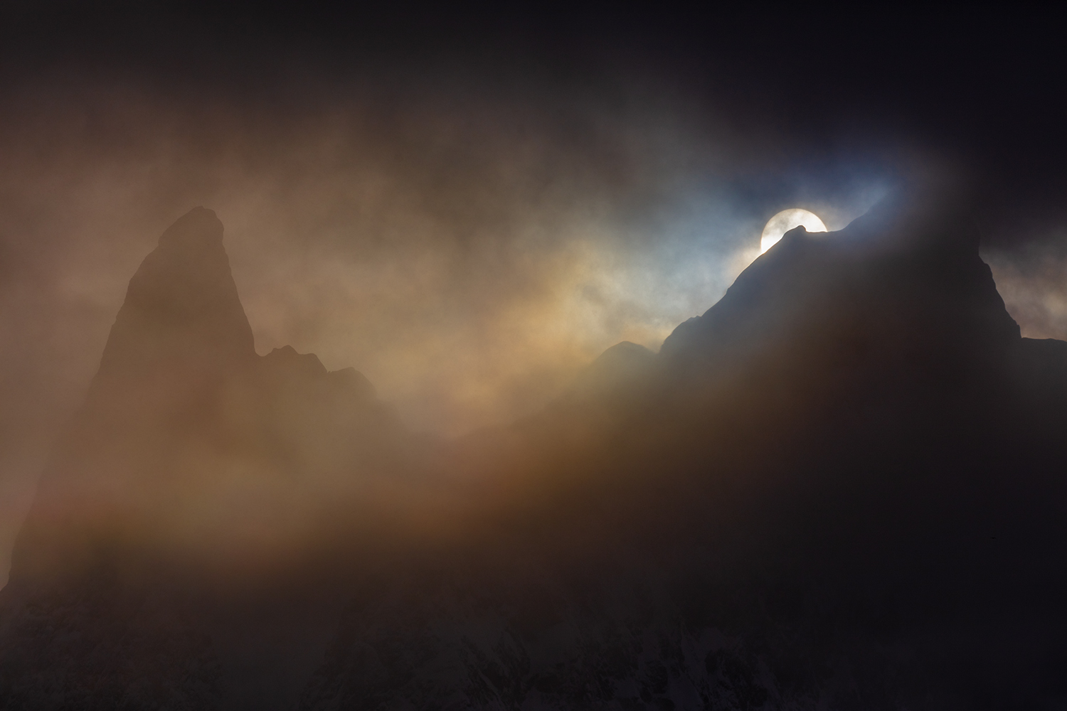
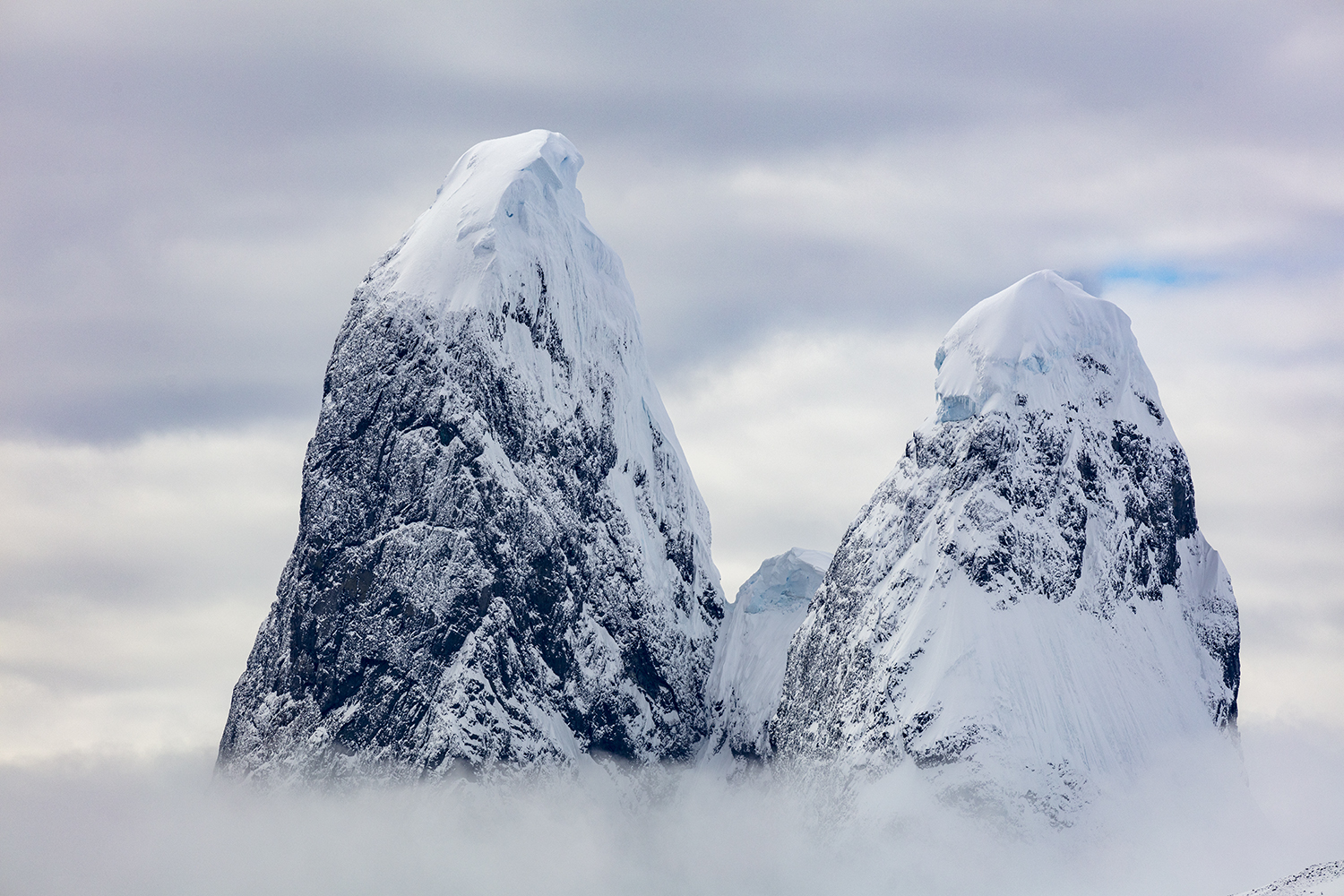
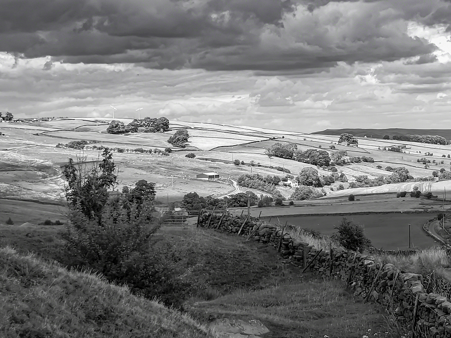
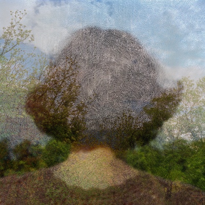
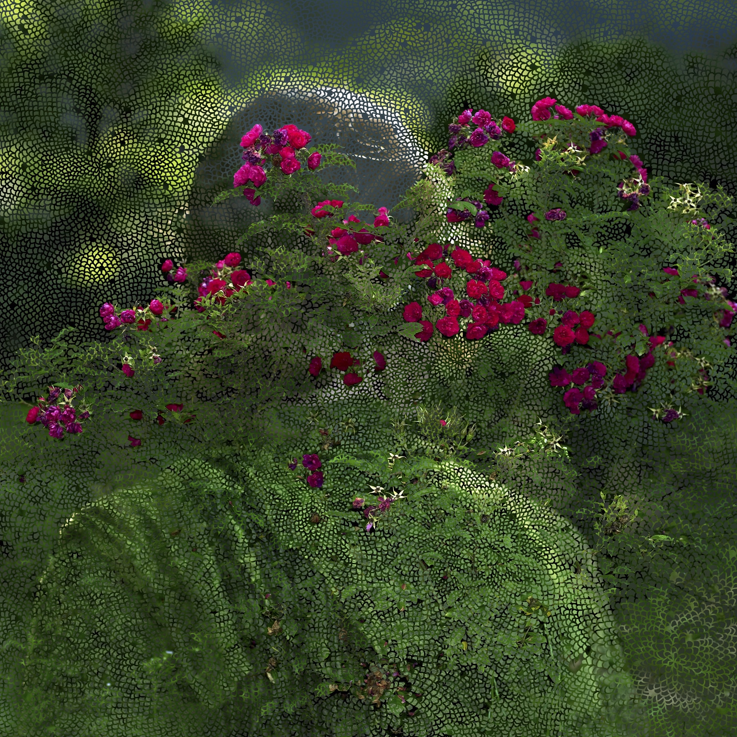
Friedrich`s “Wanderer above a sea of fog” (1818) must have influenced Sear as it did me. However I can not find any specific reference to it doing so. When I look at Sears images I see a similar message as the one I wanted to portray however Sears images have added layers where mine are straight photographs. I want to experiment with this technique and will do so before I leave this research.

Valerie Reardon wrote off Sears’s body of work, “Sear draws on the Freud’s notion of the “unheimlich” the uncanny sense that what is hidden is also somehow ghastly. Jacques Lacan reworked this notion and came up with the term extemite a blurring of the line between interiority and exteriority which points to neither but is located where they coincide and become threatening”(1998).

This paragraph was challenging to me I didn’t understand the two words unheimlich and extemite. So I had to spend some time understanding them both. The former means Uncanny/weird and the latter means the lines become blurred and thus threatening. I can see this Angst in Sear’s images at first glance they look sweet but when you look and see the layers they take on new meaning which to me are somehow dark.

David Campany compares her work with Fox Talbot’s image of lace “Talbot placed black lace directly on to sensitised paper and exposed it to the sun, The lace appears white on a dark background it doesn’t look like a negative, the flat fabric is so well rendered by the simple technique. It is stoic and removed yet the light that touches the object then touches a receptive surface” (Campany, 2005). This is talking about the single layer Sear adds more layers to create her art.

Having looked at this work I thought that at first sight it seems simple. It is not, within the square frame are complex layers. The more I look and reflect the more the work asks me to think. I like Helen Sears work very much and I think I will have to explore the artists who influenced her.

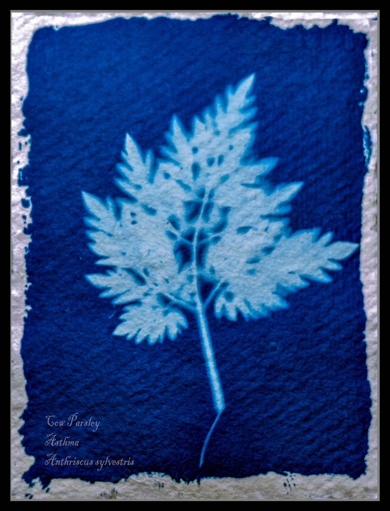
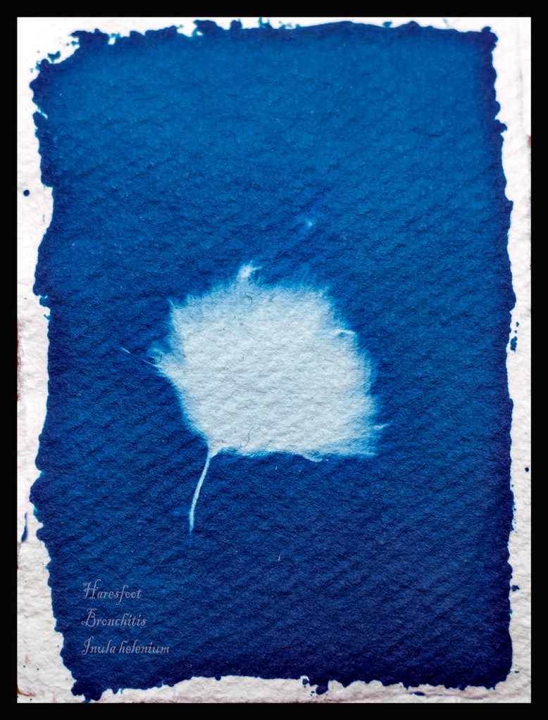
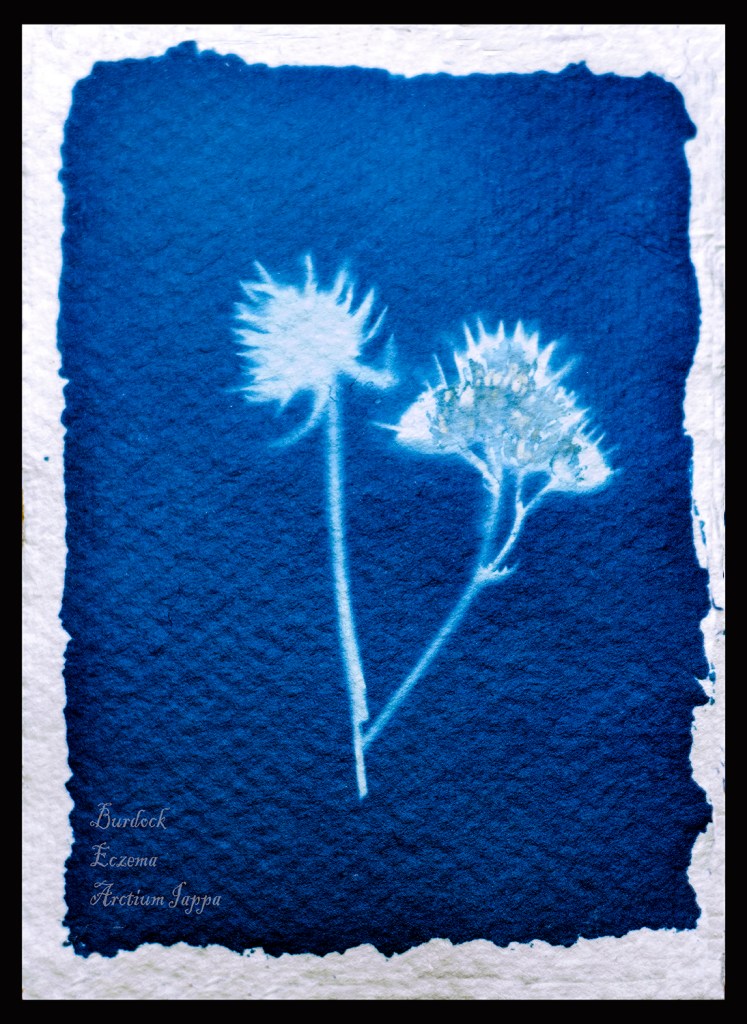
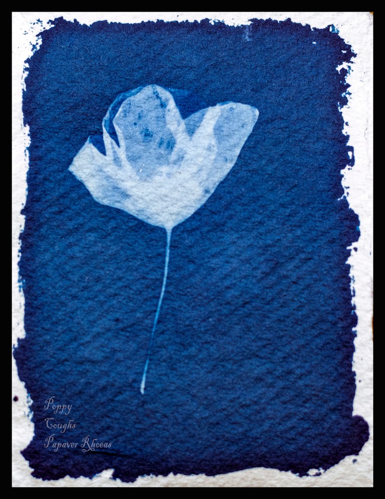
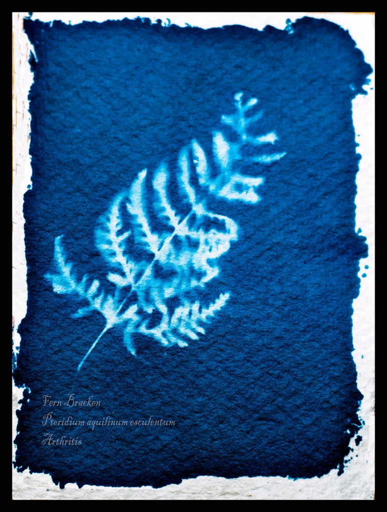
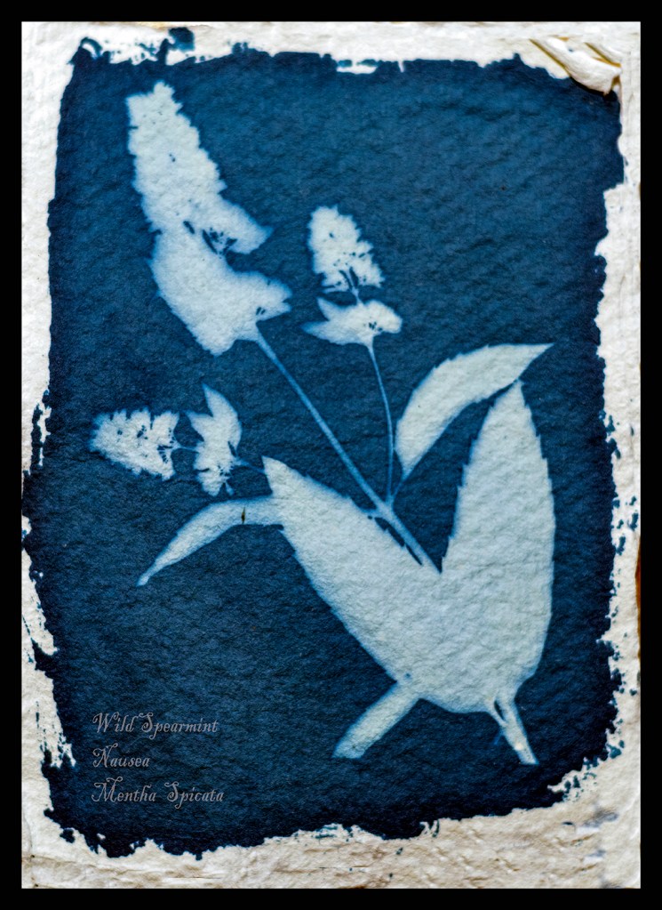
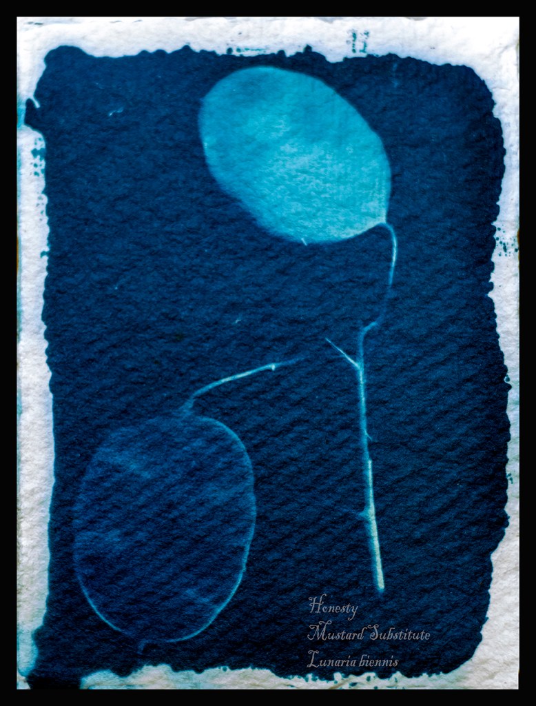
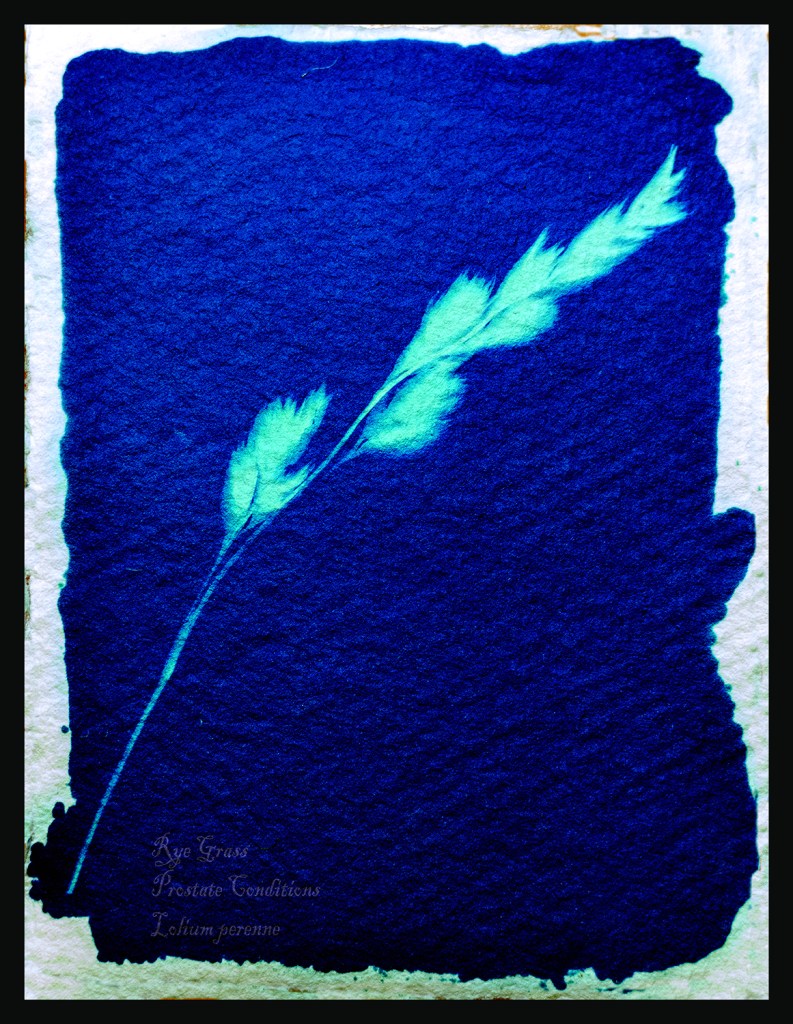
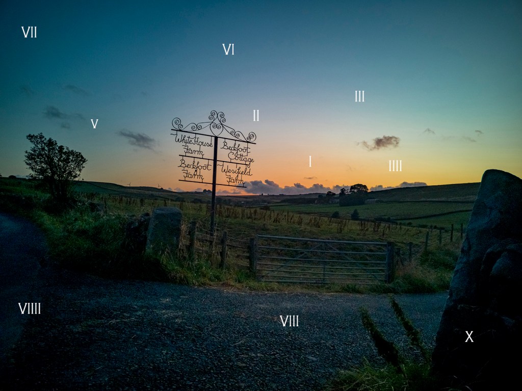
Earlier I said I would experiment with how I see Sears’s images and here is that work.

Work Cited

        Campany, David. “Helen Sear Inside View.” Photoworks, 2005. http://94.136.40.103/~helensear.com/wp-content/uploads/2016/02/Net-Effects-David-Campany-text-for-Photoworks-AutumnWinter-2005-2006.pdf.

        David Caspar, Friedrich. Wanderer above a Sea of Fog. 1818. Oil on Canvas. Kunst Museum.

        Reardon, Valerie. “Helen Sear.” Art Monthly, 1998. http://94.136.40.103/~helensear.com/wp-content/uploads/2016/02/art-monthly.pdf.

        Sear, Helen. Decomposition Constructed Photography from Great Britain. 1997. Photographic Exhibtion. Ludwig Museum Budapest.

        Inside Out. 1997. Photograph.

        Unknown. “Helen Sear.” Art. Artsy, 2007. https://www.artsy.net/artist/helen-sear.

        Wainwright, jean. “Romantic and Wholly Illusory, the Mythical Landscapes of Helen Sear.” Hotshoe, 2000. http://94.136.40.103/~helensear.com/wp-content/uploads/2016/02/helen-sear-hotshoe1.pdf.

Assignment 2 Rework “A Journey”

The most important thing I have learnt through completing this work is not to cram too much into the assignment. Keep it simple was great advice from my tutor.

He wanted me to discuss a little more of the technicalities in producing this work. I started by making paper which involved using a blender to pulp fibres from wood and old drawing paper until it was a smooth paste. then I placed this onto a frame with fine filter mesh stretched taut. I then let this air dry before lifting the paper with a scalpel. One out of three sheets failed and were re-pulped to form the next batch. I didn’t bleach or stain the paper it came out the colour I wanted. This method produced paper strong enough to survive the rigours of the washing process later.

I used a metal ruler and rough tore the paper to the size I wanted for my Cyanotypes.

For the solutions I mixed two solutions mix A is 10g of Potassium Ferricyanide which is mixed in 100ml of distilled water.

Solution B is 25g of Ferric Ammonium Citrate with 100ml of distilled water.

These two solutions are kept separate in brown bottles in a cool dark place till I want to coat the paper. Kept like this they will keep for several months.

Next when I want to coat my paper with sensitizer I mix equal quantities of the solution in dim light, Taking care to only mix the amount I will need in the clean mixing bottle. When the two solutions are mixed the resulting solution is light sensitive and has an intense yellow colour. (1)I used the recipe from Thames and Hudsons Book Experimental Photography A Handbook of Techniques.

Next I chose my subjects on my walks along the lane at the back of my home. It was always in the back of my mind that I was in the shadow of Pendle Hill and if it were the 1600s I would be in danger of being called a witch and burnt at the stake.

To make the exposure I placed the sensitized paper on top of a card and then placed a clear piece of Perspex on top of the subject securing with bulldog clips to keep everything tight and in place. The exposure time varied from 5 to 20 minutes depending on the strength of the sunlight. I read my tutors comments about striving for continuity and will do more of this in future. However I agree that as this is more organic work I should leave as is.

Finally I placed the exposed paper in a tray to wash the paper however I rinsed each for three minutes in gently running cold water to start the cleaning process. Then I hung them to dry in air, the cyanotypes change as they dry and in fact continue to dry for several weeks after as they react with the air.

Whilst the process is lengthy it is extremely rewarding and I plan to experiment with larger versions and prints in the coming months.

I read the methods to colour match in Photoshop and experimented with them. I am pleased with the results and the finished results are a nearer colour to the original work. I also read and carried out work to frame the work, thinking about how to present it to a viewer.

I think the work needs a starting point to set the scene. However a poster, map and description is just too much. I have narrowed this down to a one page description of why I completed the work.

I have started to read about critical writing and will add sections to my posts in the near future. I also looked at the suggested work by Laurie Snyder and Liz Nicol.

(2)Snyders work is more precise than mine and makes me realise I must use this process more to master it to her high standards. I plan to make some very large prints of full plants in the near future. However I am pleased with this work as an early starting point. (3)Liz Nicols work with Rubber Bands her daughter found dropped by the postman. This word made me think of a future body of using cyanotypes give a feeling of some part of this landscape others effect.

I have reworked my Cyanotypes and have dropped the Poster and the Map to replace them with a brief description of why I made this work. This is presented in the style of a cyanotype although I manipulated an existing cyanotype in Photoshop. I see them now on a white wall in a gallery next to each other in a level straight line so that each image is equal.

(1)Gomez, Anthonini Minniti, and Lunganella Bendandi. Experimental Photography. London: Thames and Hudson, 2015.

(2)Snyder, Laurie. “Ferns.” Laurie Snyder.com. WWW.Laurie.Snyder.com. Chicago, 1997.

(3)Nicolls, Liz. “The Rubber Band Project.” Liz Nicolls .com. London, 1997..

Excercise 1.8 Zone System in Practise.

In this excercise I am tasked with demonstrating my understanding of the Zone system whilst showing I can take light readings.

In an earlier course I was asked to look at histograms from within the camera. I thought it may be useful to repeat this exercise but take light readings. So I took two photos separated by an hour. I looked for 10 different points within the photo then took light readings from each. I left the ISO at 100 to keep things simple.

Ansel Adams Great Dome in winter (Adams, 1938) Adams Gallery

Ansel Adams used 10 zones to capture his images. So the darkest black would be zone 1 and the lightest zone 10. The light in the bottom and the top of this scale are too distant from one another. So he aimed for exposure between zone 3 and zone 7. The aim of work in the digital is to get good exposure where nothing is over exposed or blown out or under exposed too dark. Plus getting the colour as it looks in the scene. Here in one of Adams photos called Half Dome he shows what can be achieved..

Our cameras use electronics to meter and expose for mid gray which for most people and most shots works just fine. However if we want to take our photography up a notch we need to think around the average reflectance of 18% our cameras are set to. Using the table below we can override our cameras to over or under expose to get the affects we desire.

Override our cameras exposures.
10 Zones.
Zoning for colour.

Below is one of my final three showing how I set up the 10 zones in my head based on light and colour. You may not agree with it that doesn’t matter what matters is you are thinking deeper about your shots. You will see an change and the zone systems will get quicker and easier with practise I am sure.

Below I show the two photos along with readings I took.i have shown them in a spreadsheet as this enabled me to understand the facts shown. I took Lumens figures too and the difference in illumination in one hour is quite staggering.

Reading from light meter.

Looking at the figures if I set my camera for a well exposed sky I would lose lots of detail in the room. If I set the camera based on the readings of the chest I would let the sky whiteout. Neither would be good. I would get a better photo if I looked around the middle settings so set the camera at F8 for 1/200ths of a second.

Sunny Conditions.

The first thing I noticed completing the second shot was The was lumens figure had shot up with the light. Colour will be brighter and therefore much easier to capture. However easier to lose detail if the camera is set up wrong. I would be setting at around F6 with a shutter speed of around 1/450th second.

These settings would give nearly the best exposure for across the shot. But once you start to think as an artist you see the zone system would allow you to make different parts of the scene the subject. Out in the landscape with more space this could really help to capture great exposures.

Below are three of my first attempts at using the zone system. The light was difficult as there was a mix of light sky and dark ground so I used my camera to take some light readings. Then I set the camera for the mid tones which meant I had to have the camera open at F1.8 the hard part was getting detail whilst capturing the colour in the sky.

The four farm sign.
Sunset over the drive.
The glowing Field.

References

Adams, Ansel. Great Dome in Winter. 1938. Silver Gelatin. https://shop.anseladams.com/collections/ansel-adams-exclusives2/products/half-dome-merced-river-winter-3?variant=31415622008899.

Eftaiha, Diana. “Understanding & Using Ansel Adam’s Zone System.” Envatotut+, March 20, 2013. https://photography.tutsplus.com/tutorials/understanding-using-ansel-adams-zone-system–photo-5607.

Exercise 1.4 What is a photographer?

Marius De Zayas(1880-1961). “Photography is not art, but can be made to be art”.

What did he mean by this? At first read I was affronted by this statement however reading on I got to understand De Zayas thoughts and found myself seeing my photography thought process in his work.

This essay comes from a piece he wrote for issue 41 of Stieglitz led magazine Camera Work in 1913.

De Zayas was allied to Gallery 291 in New York this gallery is so named as it was on 5th Avenue in New York at number 291. It was know as the little galleries of the phot secession. Stieglitz created and managed this gallery.

After reading the essay I understood that De Zayas was saying there are two types of photography, 1 Photography and Art Photography.

I shall consider the two, first Photography. This shows form in its true state, the camera is placed in front of the subject and it records what it sees. You could say it is showing knowledge. The photograph is mainly produced right in camera. Little alteration in post processing.

Secondly Art photography, this show different conceptions of form. The truth(subject) is their but you have to work a little harder to understand what is being shown. Form is suggested to you. You may need more research to help you think, see and understand. This type of photo is for pleasure.

This thought process was evident in John Szarkowski exhibition Window and Mirrors when he explored truth and manipulated photographs in 1970s art.

Both work and neither is over the other, I use both to show my work to my viewers.

When De Zayas says “The first is the fixing of an actual state of Form, the other is the representation of the objectivity of Form.” It makes me think of rock art I have seen. Both are depicting the form of man however one shows the form in a straight here’s a man way. Whilst the second shows the impression we leave if we blow pigment on our hand. The shape is left behind but I know both are showing a human.

My thoughts on this are confirmed later in the work when the writer says this “Subjectivity is a natural characteristic of man. Representation began by the simple expression of the subject. In the development of the evolution of representation, man has been slowly approaching the object. The History of Art proves this statement”.

Both are photography both can be art, a camera is only an instrument like a twig dipped in pigment.

Feelings at the start of Landscape Level 2.

I look forward to this course I have been fortunate enough to travel to Antarctica and have seen some astounding things whilst there. Looking through the course workbook I see many new things where I know I will learn new things and develop new skills.

I have always loved and been inspired by the work in Antarctica of Herbert Pontin and Frank Hurley. Pontin went on Scotts expedition and took many photographs working in Landscape, Scientific and even early advertising photography. Frank Hurley did much the same but was with Shackleton when Endurance sank and recorded the disaster and the rescue.

Hurley had taken over a thousand exposures on glass plates during the Shackleton voyage. I cant imagine his disappointment when he had to sit with Shackleton and break 900 plates sat on the ice. They are still out there somewhere.

I have been inspired by the work of Ansel Adams and Sebastiao Selgado, Both present detailed work with stunning clarity. I have tried to do the same I look forward to trying again with new skills gained in the coming months.

So I thought I would show 12 of my landscapes from the South to show where I start from. I must say they have been captured over the last five years and all before I started the landscape 2 course. I hope you enjoy seeing them.

Sunrise over the Brabant Strait.

Let me introduce myself.

My name is Michael Green I live in Yorkshire England and am studying with the Open College of the Arts for a degree.

I enjoy diving and have done this all over the world in places such as Bikini Atol, Palau and Antarctica. My favourite place is still the UK waters and her shipwrecks.

My degree will be a Bachelor of the Arts and I am just starting Level 2 with the module Landscape.

I live just outside the Yorkshire Dales National Park and so I look forward to exploring this place to complete work for this part of my studies. However I am findings lots of interesting potential for projects right here on my doorstep.

I enjoy all aspects of Photography however I am developing a real interest in the old techniques used in the past to produce pictures of light. I am learning Cyanotypes at the moment and will post some, soon.

If you like my work let me know, if you are learning too let me know. I enjoy working with others and if you are doing something else I would love to hear about it.

Antarctica
People watching the sunset on Stromboli.
Stromboli erupting.
Cyanotype of Ice
Storm cell explodes
Sunrise
Snow and Ice
Home.