I read Sean O Hagan article from the Guardian newspaper. I like Topographic photography and like most humans love collecting things.
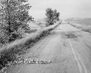
27 Roads Robert Adams.
I like Robert Adams work he takes a small simple subject and creates a collection such as 27 Roads created in the late 1960s it is a collection of monochrome photographs of old American roads before the concrete highways. Taken at the time as a curiosity they become important historic records as time passes.
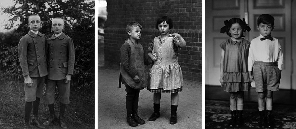
August Sandler work recording the German public.
Much as August Sandler`s work in Germany had in the 1930s. His collection of photographs of all aspects of German working life is a superb record of the German people at the time just before the Nazis and the war which changed the country forever.
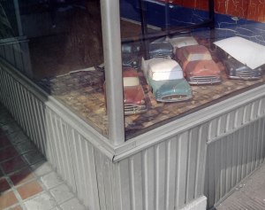
Steven Shore “Uncommon Places”.
Stephen Shore created some amazing photographs in his topographical collection “Uncommon Places” in 1974. He takes shots of all things strange in the USA. Window displays, Cars and streets are all taken and recorded with good light and great colour. I see his influence in Martin Parrs work and on TV in the likes of “stranger things”.
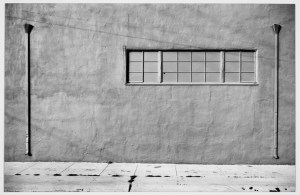
Lewis Baltz “New Topographic`s, photographs of a man altered landscape.
Lewis Baltz is well know for his work “New Topographic`s, photographs of a man altered landscape”, influenced all these artists and continues to do so right to the present day. Windows you cant see through is a great series making me think of the pointlessness of certain things in life.
This style of the work can be used for all sorts of applications. Entertainment, Education or sales of a product. All can be approached using a topographic approach. One of the best I have seen is of chopped chocolate bars made by Rachel Been. However I have also seen work in the National Geographic recording every species of animal on the planet by Joel Satore.
Making collections with a theme appeals to Humans we like collecting and enjoy putting things into boxes so this style of work has great appeal to us all.
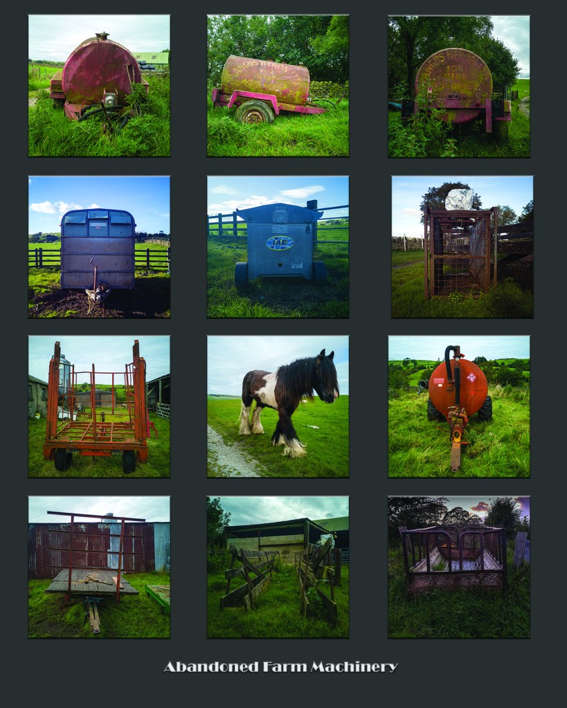
I thought I would have a go at putting together a quick Topographical series of photos of my own. Around where I live are lots of pieces of what appears to be abandoned pieces of farm machinery. It may seem unloved and unused but it isn’t. It is waiting for the season when it is useful. Ferilizing, Lambing, Worming or pulling just because it isn’t useful today doesn’t mean it wont be tomorrow.
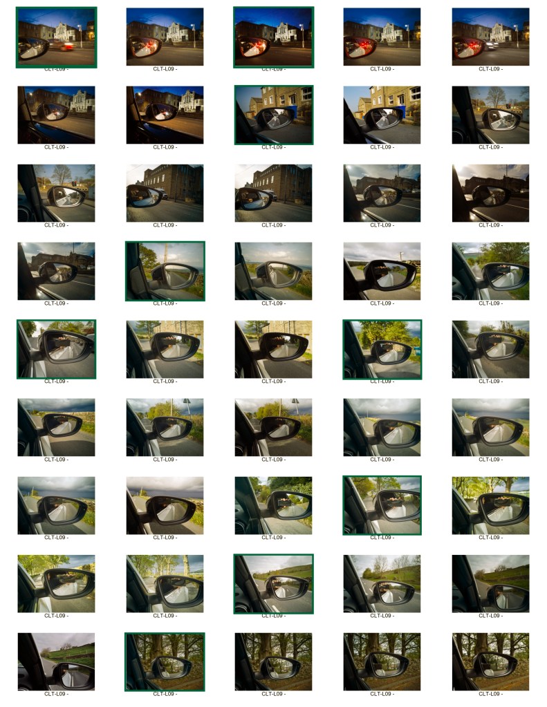
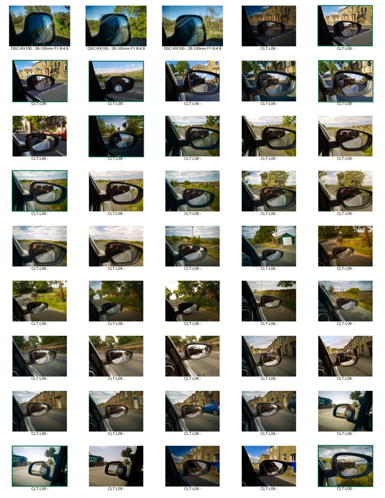
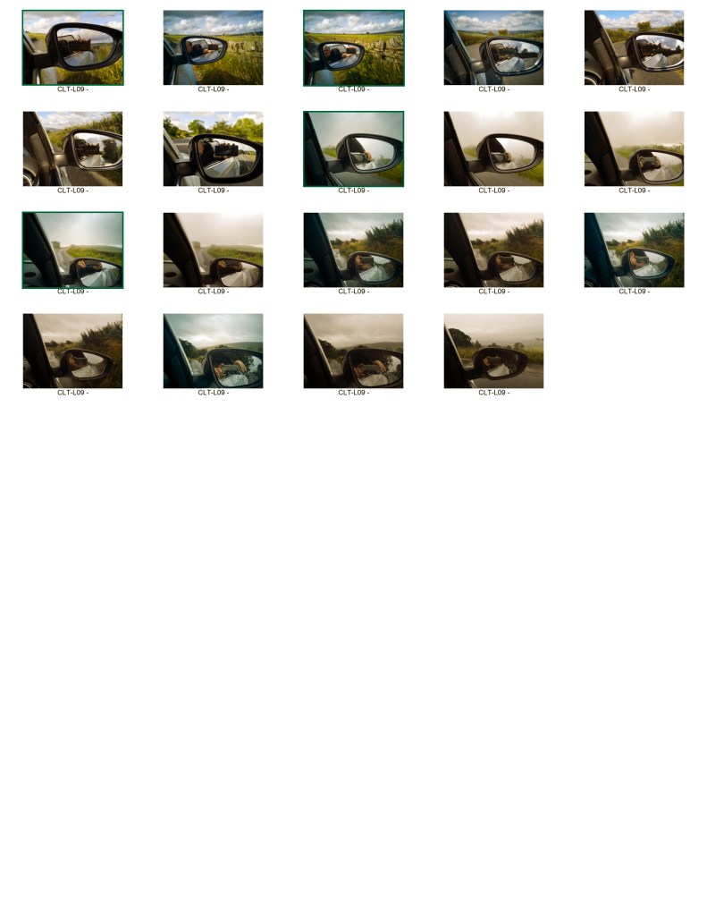
Several months ago I borrowed a copy of Dennis Hoppers book (1)Photographs 1961-1967. In it are great shots taken around Los Angeles in the states. Some of them show the view through the windscreen of his car and include the rear view mirror of his car driving on Sunset Strip. I thought about capturing shots of my journey between home and Skipton. I make this journey every Thursday. So here are the contact sheets for this road journey.
I set the camera so that I could whistle to trigger the shutter this meant I could drive and take shots when I chose in a safe manner. I wanted to get shots of where I was going and where I had been this is difficult in one shot.
Looking at the exposures I like the ones in town as they have lots going on in them. But my favourites are the ones out in the narrow lanes that lead to Skipton. On the contact sheets there are 109 exposures only around 10% are interesting in so much as they show where I am going and where I have been. The triggering by sound definitely worked.
To improve the work I would try to make a bracket to hold the camera in the same position. However this may make them all the same and render them sterile.
Cowling to Skipton.
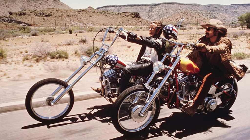
In the brief for this exercise we are asked to review a road movie. I had thought of Dennis Hopper earlier so why not review (2)Easy Rider which is most definitely a great road journey.
The movie was released in 1969 at a time when the USA was suffering from lots of areas of social, civil and foreign unrest. Assassanations of both Martin Luther King and Bobby Kennedy had shocked the country, Woodstock was held with a back drop or civil unrest and segregation for the young.
What is it about? The movies starts with a drug deal at the end of which Wyatt (Peter Fonda} breaks his watch. Whilst Billy (Dennis Hopper) watches on laughing. The two hippies then leave to have several adventures on the journey from Los Angeles to New Orleans. This journey has the promise of a better life at the end of it bought by the proceeds of breaking the law.
They travel across country to a great soundtrack of music. The country they travel through is typical mid America scenery. With lots of Gas Stations, Deserts, Billboard and Sunsets.
Sleeping outdoors or on one occasion on a farm which leads to an interlude with a commune where drugs and free love are freely available. After a break our riders get back in the saddle and back on the road.
Our two desperados enter a town and join a parade on their motorbikes. This leads to them to be arrested for “Parading without a permit”. After a night in jail they awaken to find they have been joined by a drunk in a suit. George Hanson (Jack Nicolson) turns out to be a lawyer who soon has them released on he joins them on the journey. He sees the business card he has for a brothel in New Orleans as an omen.
Again out on the road they are now three riders on the open road. They go to eat before leaving the town and engage in conversation with some young ladies in the diner. This upsets the local males who fall out with the three who decide to leave.
After sunset with a belly full of food and some recreational drug consumption the three fall asleep. Later in the night the local men attack the three killing Jack Nicolson. Our two protaganists leave the body wrapped in a blanket and take his belongings to return to his family.
They then arrive in New Orleans and have an advernture/experience with tow ladies of the night. This experience taking LSD in a grave yard. This part of the film is a challenge to watch and is quite disturbing. During this psycodelic piece a flash forward appears showing a motorbike on fire.
The pair are now in sight of their Nirvana and are horsing around when a truck with some rednecks passes them by. Billy has an argument with the Rednecks who produces a shot gun and kills him. Wyatt goes after the rednecks for revenge, he too his shot and the scene shown earlier as a flash forward is revealed as the end of the film.
I think this film is about an end of an era within the United States, the 1960s are fast coming to an end. The seventies are approaching fast. The American Dream of the land of the free is promised every where. However when people decide to break free they are not accepted in fact they are in peril.
This film is a modern cowboy film, it has many similarities to the cowboy films of old. Riders out in the wilds around campfires meeting many people friends and foe. Even the names Wyatt and Billy refer to characters in the old wild west. Being on the wrong side of the law chancing everything for a better future as Wyatt says by the fire on the last night “We Blew it”. Is he making this statement for America?
The first cut was going to be four hours long. What would it have done if we had been shown all the road trip bits. I like the fact we aren’t shown all the story. We are left to fill in the bits we aren’t shown after been shown the bits that lead us to the conclusion, we don’t have to know everything to experience a story.
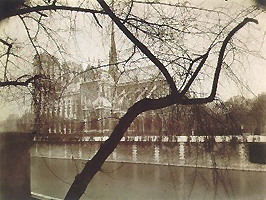
After reading Joel Snyder essay (Landscape and Power, 2002) Territorial photography we are asked to review two photographs of our choice from two of the mentioned photographers.
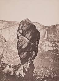
Agazzis rock with Yosemite Falls. Carleton Watkins 1851.
Carleton Watkins (Watkins, 1851)” Agassis Falls with Yosemite Falls” ,is an albumen Print on glass. It is high quality. The composition is obviously influenced by Watkins experience as a painter. The main subject, the rock is shadowed but shown with fine detail. The whole picture is sharp.
Thinking about Snyder, discussion of him taking photos to show that the wildernesses was being tamed whilst remaining untouched. You see this with the waterfall and the rock. However if you really look you can see roads, buildings and people.
It could be a high quality advert enticing you to go see. What you don’t see are the indigenous people, they are gone.
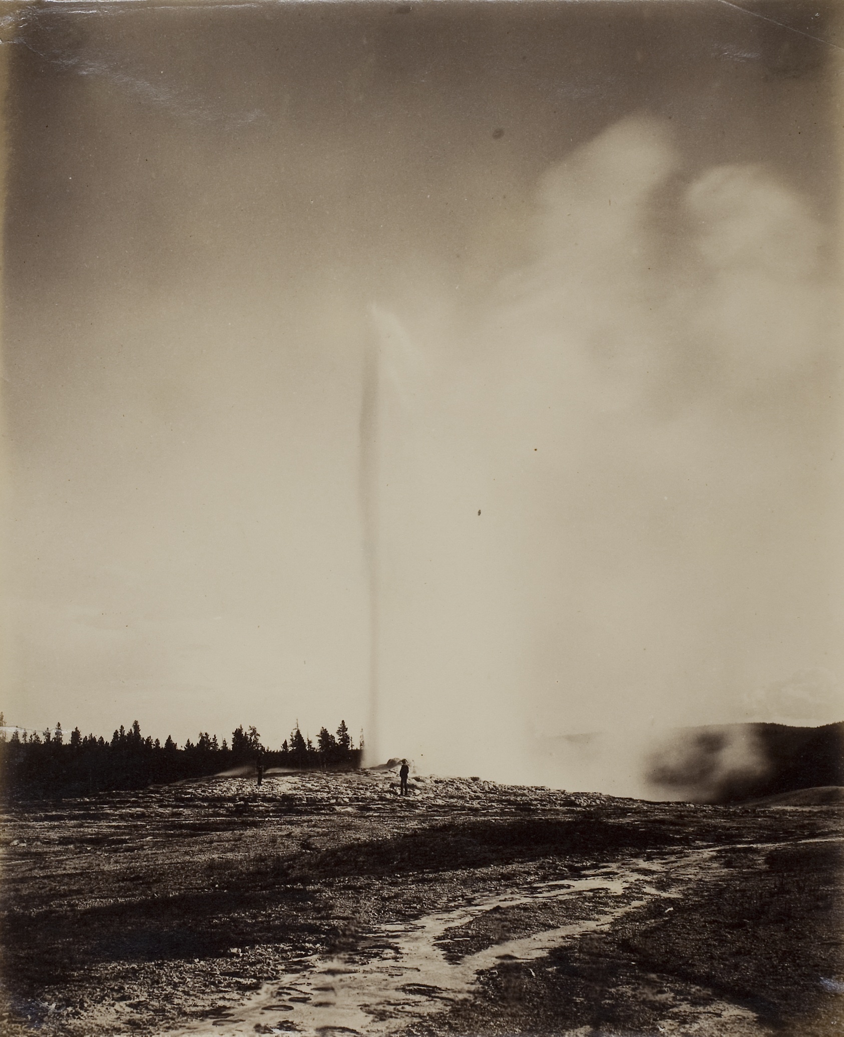
William H Jackson Old Faithful. 1871
William H Jackson, “Old Faithful” a huge Albumen Print 21cm x 17.5cm on paper. It is a high quality Print with good tone although some of the black tones are too dark. Jackson spent his time on surveys scientifically recording the central area of the USA. This photo was taken on Ferdinand Hayden’s Geographical Survey. It shows Old Faithful geyser erupting. steam blowing away from the main column of steam. He can’t resist though placing an assistant in Perl in front of the geyser. This adds scale and maybe is a reaction t being told his photos could not be used to provide measurements.
Neither Snyder nor Jackson were particularly celebrated at the time but are recognised as important practitioners now. They took similar photographs however they were for different purposes. Watkins showed the wildnerness being tamed and being used by the white man. Jackson wanted to show an untamed wilderness there to be explored and discovered.
I think I fall into the latter category.
References
Snyder, Joel. Territorial Photography. 2nd ed. Vol. Landscape and Power. University of Chicago Press, 2002.
Watkins, Carlton. Agazzis Rock with Yosemite Falls. 1871. Albumen Print from large glass plate. John Getty Collection.
William H Jackson. Old Faitful. 1871. Albumen Print from large glass plate. Art institute of Chicago.
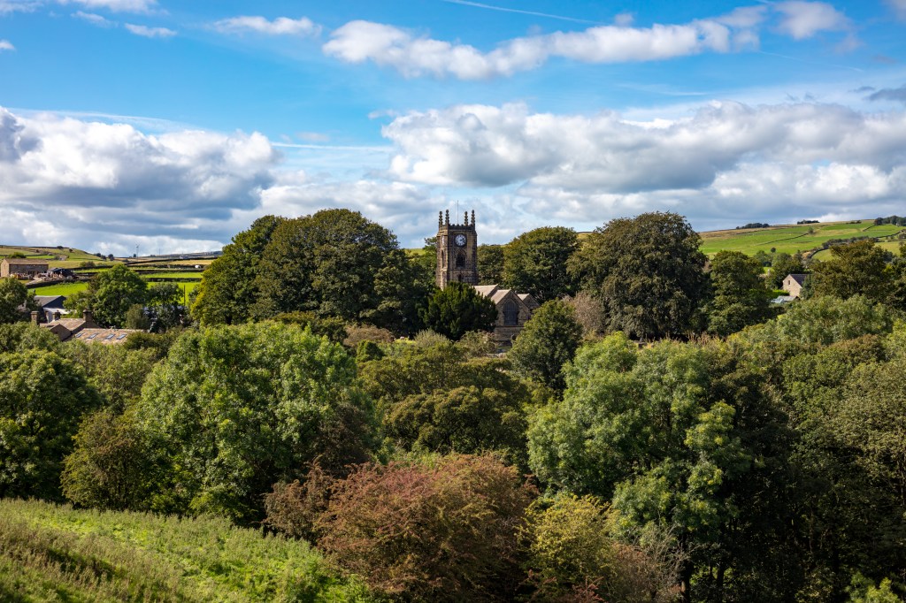
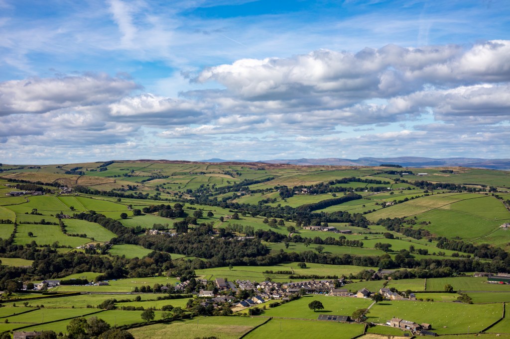
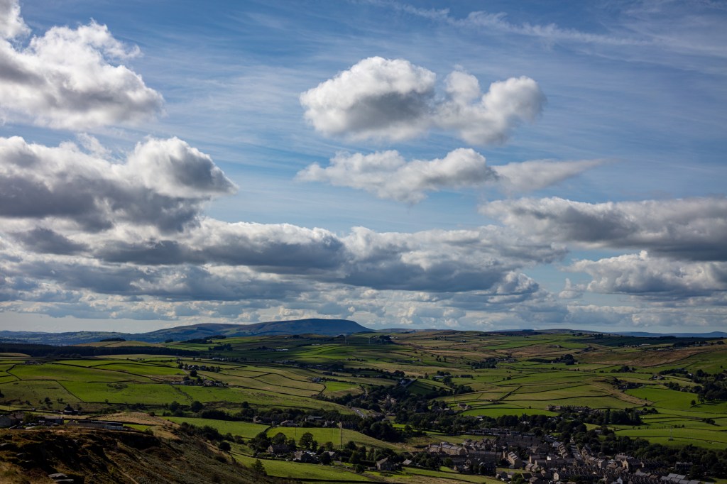
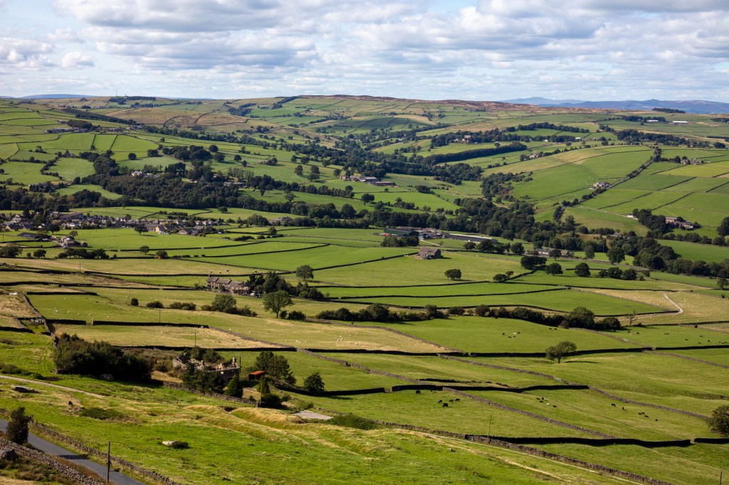
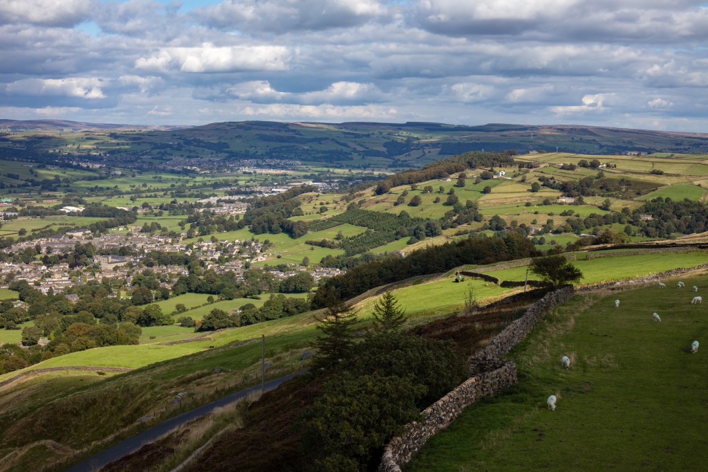
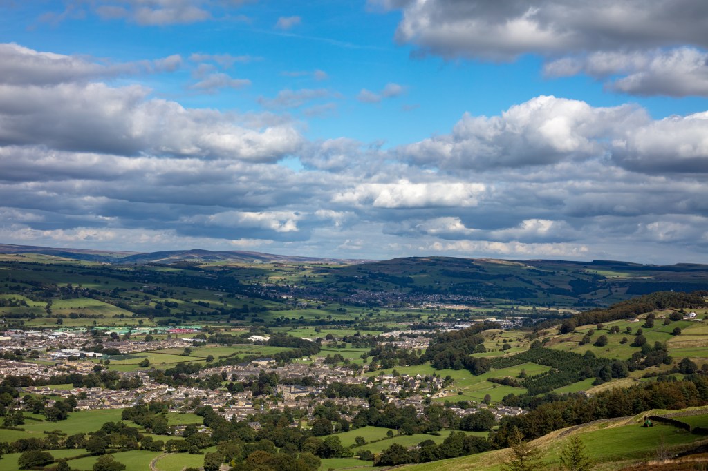
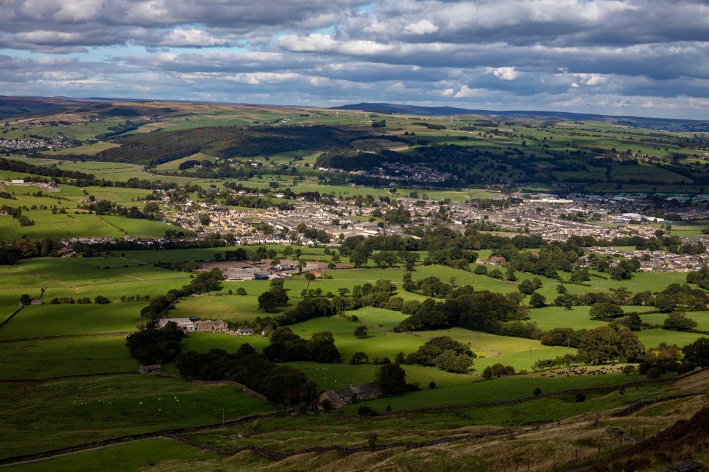
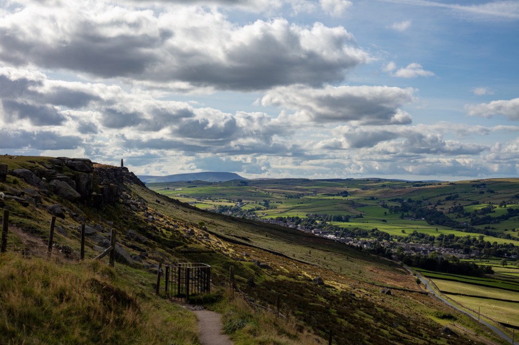
In
considering this brief I wanted to show what attracted me to live in this
landscape. With its rolling hills and big skies. In reading further through the
course materials and the books I wanted to get up high to get a perspective I
saw in a lot of the artists i looked at. I will explore this more, later in the
course.
In this
first part of the course we have looked at beauty and the sublime both words
are subjective but both have a language within landscape and the arts. I look
forward to developing new ways of looking to see this beauty in areas outside
of the norm. This language talks of capturing the peace of the landscape in
pastoral pictures or capture sublime pictures in untamed weather in a
wilderness.
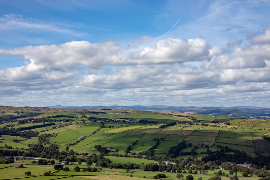
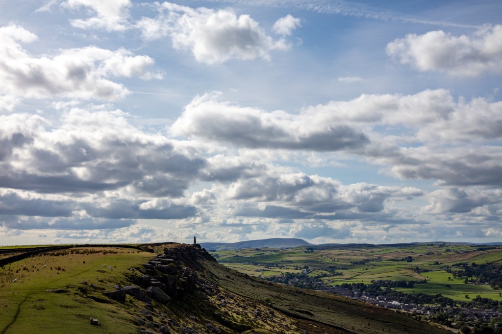
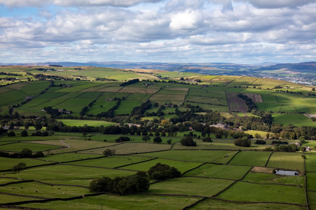
In looking
at these exposures i feel their strength is the sharpness showing the detail of
the cricket match to the distant hills of Pendle, Ingleborough or Pen y Ghent
in equal measure. To improve them I could have used a longer lens to get into
the detail however this would have changed the sublime element in the pictures.
I am going to develop this further by capturing some details of life for future
works.
Technically
I realised I wanted a wide shot. I have an 8mm fisheye but this would have been
too wide relegating the village to a small area of the exposure and making the
hills just a straight line. I also have a 400mm lens but this would have put me
into the detail which I felt didn’t fit the idea I had for the brief. So i
decided to use my 50mm prime whilst it can be opened to f1.8 this lens is at
its best at F5.6 this gives sharpness front to back.
I looked at
landscapes by Turner, Gainsborough, Friedrich`s and others but the one i liked
most was Paul Nash his work before the first world war is wonderful. It calms
me and sums up the English countryside. It has the rolling hills and then the
strange trees, wonderful. I looked at
his later work and you can see how the First World War changed him. However he
still used trees to tell his story. I see lots of trees in our landscape but
don’t want to just use one I want to use them to lead the eye through my shots.
In a lot of the paintings I looked at I could see that the eye of the artist was in midair (discounting Gainsborough) he painted portraits in a landscape. This perspective is possible because a painter uses his/her imagination. Edward Burtynsky puts his camera under a drone. I can do neither with my camera however I can climb a hill then up a pinnacle to gain even more height to achieve the same perspective. My outcome must be one which shows the whole but takes your eye through the picture seeing the details as you go.
Cowling Church.Ascent of the crag with Pendle Hill.Cricket in the valley.Pendle HillAncient Field Boundaries.The White House.Sutton.Looking to Ingleborough and Pen y Ghent.Wainmans Pinnacle and Pendle Hill.Malpass House in ancient woodland.Crosshills in dappled light.The way home..
What is beauty or the sublime in respect to art. First what is the meaning of these two words. They are both often use in fact they are used too often. Football commentators scream “sublime shot”, I have described soup as sublime. And beauty is definitely in the eye of the beholder. What we see as beautiful in the west the east see the same thing differently.
So here the Oxford Concise Dictionary definition of the word beauty:
NOUN combination of qualities, such as shape, colour, or form, that pleases the aesthetic senses, especially the sight.
You can see straight away that this
code of beauty is already subjective you can start to add your interpretation
straight away. When you read these words what do you see? A person, a shape or
a scene. These seven letters create so much in our minds it is a powerful word
with different meaning between cultures, countries and people.
Here is the dictionary meaning of
the word sublime:
ADJECTIVE
Of very
great excellence or beauty.
VERB
elevate to a high degree of moral or spiritual
purity or excellence.
“let
your thoughts be sublimed by the spirit of God”
I
have included both the adjective and the verb as I felt both were relevant in
our art world. As an adjective it adds gravitas to the beauty of an object. I
find it interesting that I immediately put this together with female ideas. Is
this just me or is it in our society?
The
verb adds a spiritual connotation to the word which fits our use here on a
landscape course. When used it implies the presence of beauty to a level that
would please the gods.
Darvia. Julian Bell Tate London 2010
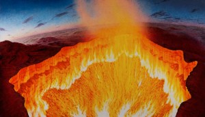
The word sublime has almost been overused In art I read an essay by Julian Bell on the Tate website entitled “contemporary art and the sublime”, in this essay Bell describes a painting he produced after visiting site at which the Russians had drilled into the ground prospecting for oil and gas. After deciding to burn off the excess gas they created an inferno which Bell saw as a vision of hell. He painted an 8 foot canvas. He compares what he has done to the work of (J Wright, Tate, 1776) . He compares the use of light in both pieces of work and says ‘such a light as that of the sun, immediately exerted on the eye, as it overpowers the sense, is a very great idea’. He means the light of the sun adds a sublime element to both works. When you look at both the bright sun of the infernos hits you like strong sunlight and overpowers the senses.
Vesuvius erupting with a view of Naples bay. Joseph Wright Tate 1776.
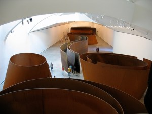
Next he discusses spaces that overpower the senses citing Richards Serras (Serras, R, Gugenheim Balboa, 2000) huge copper spaces in the Balboa Guggenheim Museum. You enter this installation and feel lost within it. The individual visitor is left to interpret the artwork for themselves. You must explore your feelings within this artwork.
Copper. Richard Serras (Balboa Gugenheim, 2000)
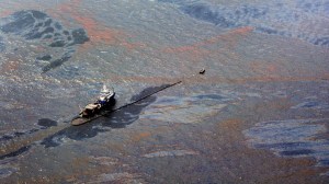
He looks at an artist I explored earlier Edward Burtynsky and takes his work “Oil Spill 2” (Tate, 2010) he calls this work “Industrial Sublime” and I understand why it overloads our vision and takes some understanding once you see what it is, it makes us question mans place in the sublime.
Edward Burtzynsky Oil Spill2Tate 2010
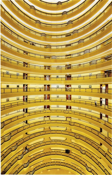
Next he looks at mathematical sublime and Andreas Gurskys (Gursky, Berlin, 2000), photograph “Shanghai 2000”. It is just a photograph of the inside of a building however it has just as much structure and sublime beauty as Edward Weston’s (Nautilus, MoMA, 1936) photograph of a Nautilus shell. It holds your eye and overwhelms your vision.
Andreas Gursky Shangai 2000
Edward Weston Nautilus MoMA 1936
This essay has made me realize that we can easily use this
word. But to get the best from it we need to challenge our senses. My challenge
to myself is to see if I can overload my senses in my local are and create some sublime photographs on an
ordinary day.
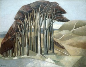
I like trees they add mystery to a landscape I am not the first to feel this Paul Nash said before the first world war tainted his eye “Trees are like beautiful people”. (P. Hendon, Art History) This might explain why his later paintings show broken trees maybe to represent the broken destroyed people he didn’t show. His trees add a sublime element to his paintings however they are painted.
Paul Nash Trees (PHendn, 2001)
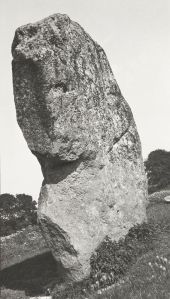
He also captured photographs one was of a stone at Avebury Circle called Avebury Sentinel )P Nash, Tate, 1936) He took his photographs with a Kodak type 2 camera. They were taken to be used as sketches for his later paintings. Looking at the this photograph I see the trees I see in his paintings they give even a photo taken to record a large stone a different element. He looked for hidden elements in his paintings and you can see it in his photographs too. He couldn’t help himself.
Paul Nash Avebury Sentinel .(Tate, 1933)
I want to capture the open space where I live with its big
skies and the trees of the area. These elements create a sublime landscape that
changes minute by minute and day by day.
I have been reading a book by David Matless entitled Landscape and Englishness. In it I have been reading about the landscape I have taken in my shots for this assignment. I found this quote apt “If those men and women who, as my letter-bag so cleverly proved, are starting out in their thousands to discover rural England will see it not merely as a pretty picture but as a living thing……”.
This is what I want to show in the 12 shots I present..
References
Bell, Julian. Darvia. 2010. Oil on Canvas. Tate London.
Burtzynsky, Edward. Oil Spill2. 2010. Digital Colour Photograph. Tate London. Gurskys, Andreas. Shanghai 2000. 2000. Digital Colour Photograph. Berlin.
Hendon, Paul. Paul Nash Outline The Immortality of I. 20, n.d.
Hornblower, S, A Spawforth, and E Eidinow. The Oxford Classical Dictionary. Oxford Press, 2012. Morton, HV. In Search of England. Methuen & Co Ltd London, n.d.
Paul, Nash. Avebury Sentinel. 1936. Oil on Wood. Tate London.
Thinking
about photographs showing two sides to a place I immediately remembered the preparation
for the world cup in Rio, Brazil. I saw and heard that many favellas were being
moved or destroyed. These favellas were full of life and people. However when
football comes to town they must show the right front to the cameras of TV.
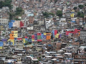
Favella in Rio De Janeiro (Favela Hotel, 2019)
In the
photo above we are shown the colour from one of Rios favellas. These places
team with life and all aspects of society are evident. They even have their own
judicial system that helps to bring cohesion and order to the place. I would
have loved to see these places as a backdrop to the world cup. The powers that
be thought differently.
Villa built on site of Favella Rio during world cup. (Favela Hotel, 2019)
Compare the
second shot this shows a luxury apartment built on the site of one of the
removed favellas. However when you look at this luxury consider how many family
homes were removed to build this one luxury dwelling. The misery must have been
immense.
The next
world cup is in Qatar and the stadia are being built in the deserts so no
people need to be moved. Good news however it is interesting to look online whilst
completing this research to read of the suffering of the people in the
construction workers villages. There are many reports of poor and dangerous
conditions however there are photos of the construction of stadiums but very
few of the workers dwellings.
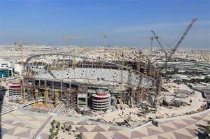
Football stadia in Qatar being built for world cup(Fox Sport, 2019).
Not wanting
to restrict my research to faraway places and football I looked at my home town
of Leeds I found photos of the area of Holbeck where my great grandparents
lived. The area is being demolished to make way for better dwellings for families.
Terraced houses being demolished in Holbeck Leeds (Leodis, 2019)
The houses
my family brought up four children in are being replaced with houses like the
ones in the photo below. It is interesting to see the footprint of one dwelling
in the new houses is much larger than the footprint of the older dwellings much
like the favellas of Rio. Plus the streets are wider due to the traffic. I
wonder how the community will develop in these new areas.
Then
looking for a photograph which shows both the affluent and the deprived areas
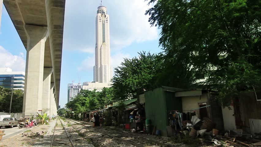
in one exposure i found the following shot. It shows people’s homes next to a rail
track under an overpass in Bangkok Thailand. Contrasting the position of the
wealthy and the less well off.
Street dwellings in Bangkok Thailand.
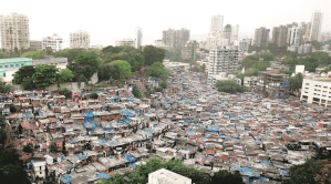
A second one shows a similar scene in Mumbai India, The wealth needs to be shared a little more equally across society in these places. India after all is pursuing putting a man the moon on which costs billions of pounds. It may be a better use of resources to help these people into better homes.
Lots of homes squeezed into and Indian city. (samarthsingh.com, 2019)
Both of
these photos are of Asian cities I think i need to ensure I show a balanced
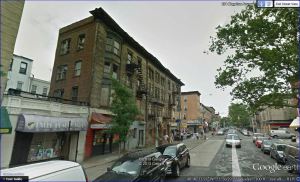
picture the photo below is in Brooklyn New York. It is amazing that within four
miles of Manhattan we can find such squalor. This poverty is everywhere seldom
talked about in the media.
Tenaments in New York. (NYCH, 2019)
When asked to look at these kind of photographs we can find them anywhere. We must be careful not to overlook the state of the whole planet poverty is everywhere across all creed on the planet.
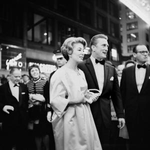
Thinking about two photographers who showed this kind of shot in their work I thought of Vivian Maier (http://https//:www.vivianmaier.com) and Eugene Atget (http://https//www.atgetphotography.com) . Vivian Maier took photos whilst she wandered around New York. Her work was unknown until recently and was found and has been received with great interest. She shows all aspects of New York and didn’t shy away from showing the full spectrum of life from the wealthy and famous such as Kirk Douglas to buildings falling down and people suffering in the streets. Below are six of her photos that show her skills in showing New York in all its “glory”.
Vivian Maier photographs in New York (maier.com, 2019)
Eugene
Atget recorded scenes that at first glance seem mundane. He captured them to help
theatre set painters complete their work. However in capturing these photos he
also captured the sumptuous areas of Paris and the squalid back streets in
equal measure. He also took many photos of the characters he came across in the
street again thinking they could be sold to theatres or maybe used as
postcards. Both sets show the wealthy and the poor which helps put them into
place when we look now.
Photos of Paris by Eugene Atget (Atget.com, 2019)
In creating these images we also need to be careful that we don’t dilute the suffering of the people depicted. “The more images of violence we see—of war; of victims of hunger or famine; or other injustices—the more immune to them we become”. As Susan Sontag said in her book “Susan Sontag On Photography” (Sontag, 1973 Book).
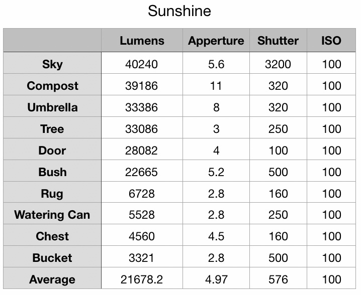
In this excercise I am tasked with demonstrating my understanding of the Zone system whilst showing I can take light readings.
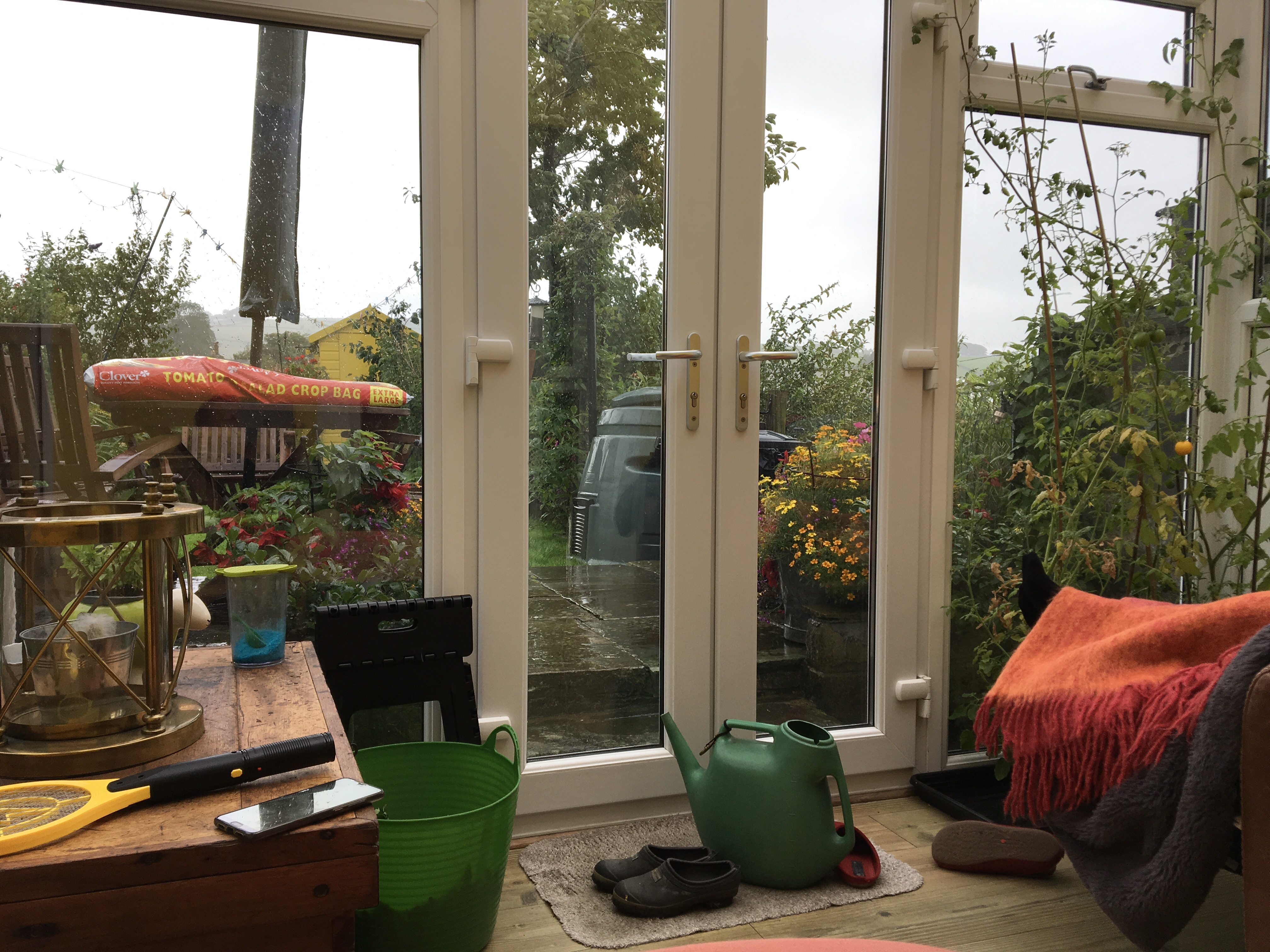
In an earlier course I was asked to look at histograms from within the camera. I thought it may be useful to repeat this exercise but take light readings. So I took two photos separated by an hour. I looked for 10 different points within the photo then took light readings from each. I left the ISO at 100 to keep things simple.
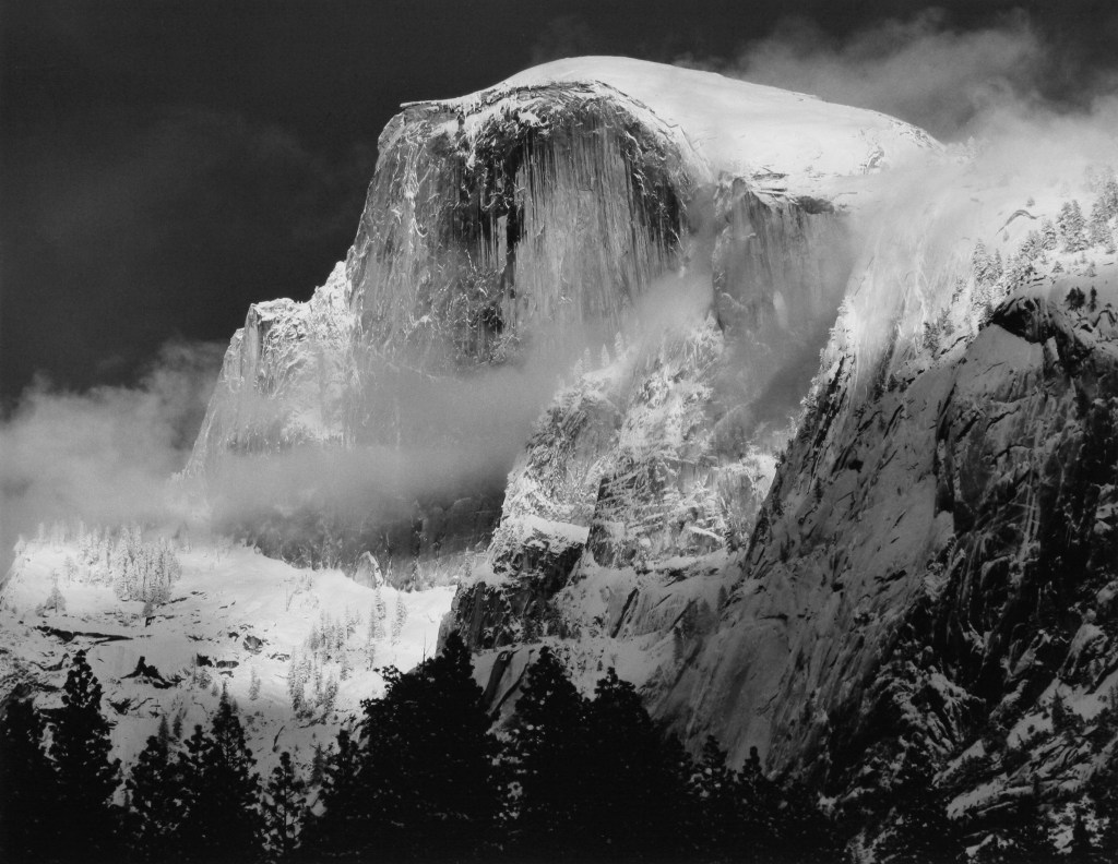
Ansel Adams Great Dome in winter (Adams, 1938) Adams Gallery
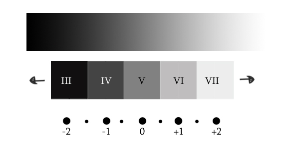
Ansel Adams used 10 zones to capture his images. So the darkest black would be zone 1 and the lightest zone 10. The light in the bottom and the top of this scale are too distant from one another. So he aimed for exposure between zone 3 and zone 7. The aim of work in the digital is to get good exposure where nothing is over exposed or blown out or under exposed too dark. Plus getting the colour as it looks in the scene. Here in one of Adams photos called Half Dome he shows what can be achieved..
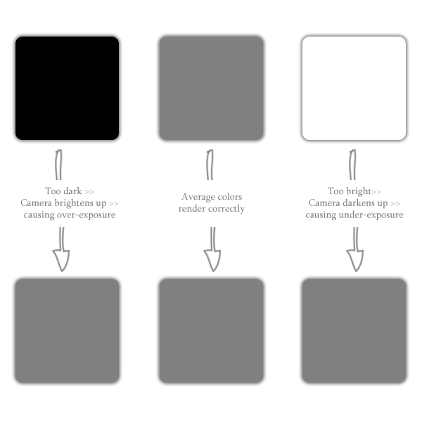
Our cameras use electronics to meter and expose for mid gray which for most people and most shots works just fine. However if we want to take our photography up a notch we need to think around the average reflectance of 18% our cameras are set to. Using the table below we can override our cameras to over or under expose to get the affects we desire.
Override our cameras exposures.
10 Zones.
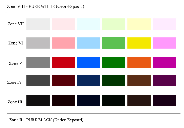
Zoning for colour.
Below is one of my final three showing how I set up the 10 zones in my head based on light and colour. You may not agree with it that doesn’t matter what matters is you are thinking deeper about your shots. You will see an change and the zone systems will get quicker and easier with practise I am sure.
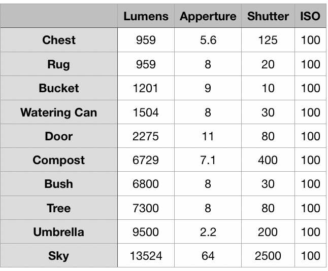
Below I show the two photos along with readings I took.i have shown them in a spreadsheet as this enabled me to understand the facts shown. I took Lumens figures too and the difference in illumination in one hour is quite staggering.
Reading from light meter.
Looking at the figures if I set my camera for a well exposed sky I would lose lots of detail in the room. If I set the camera based on the readings of the chest I would let the sky whiteout. Neither would be good. I would get a better photo if I looked around the middle settings so set the camera at F8 for 1/200ths of a second.
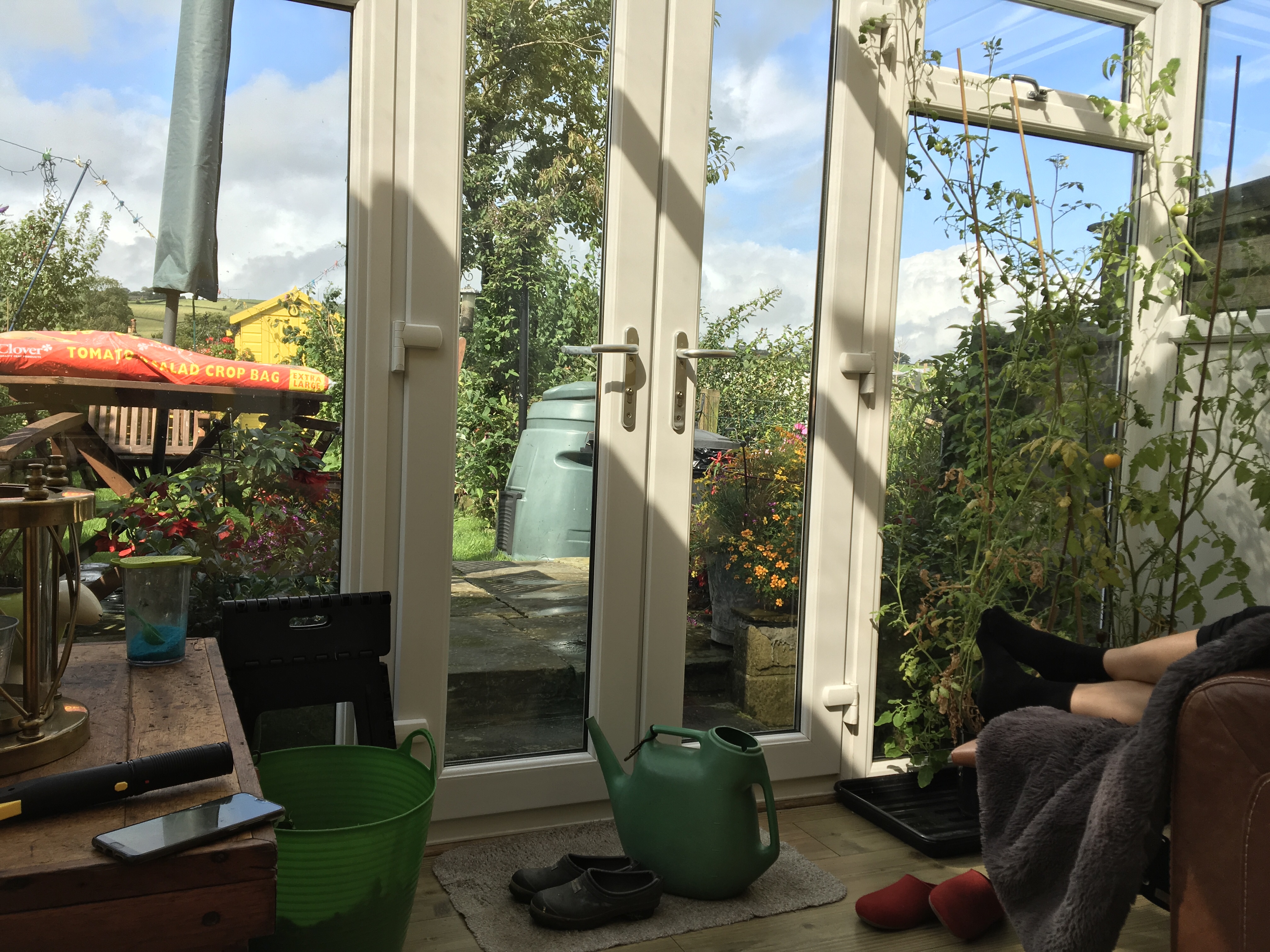
Sunny Conditions.
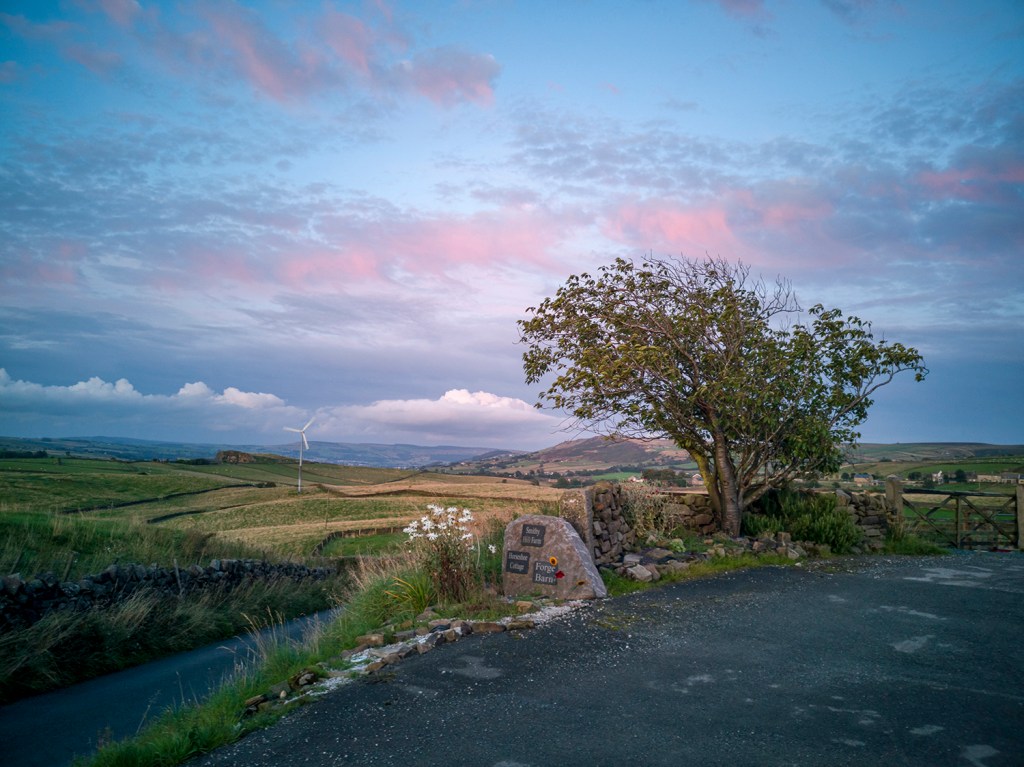
The first thing I noticed completing the second shot was The was lumens figure had shot up with the light. Colour will be brighter and therefore much easier to capture. However easier to lose detail if the camera is set up wrong. I would be setting at around F6 with a shutter speed of around 1/450th second.
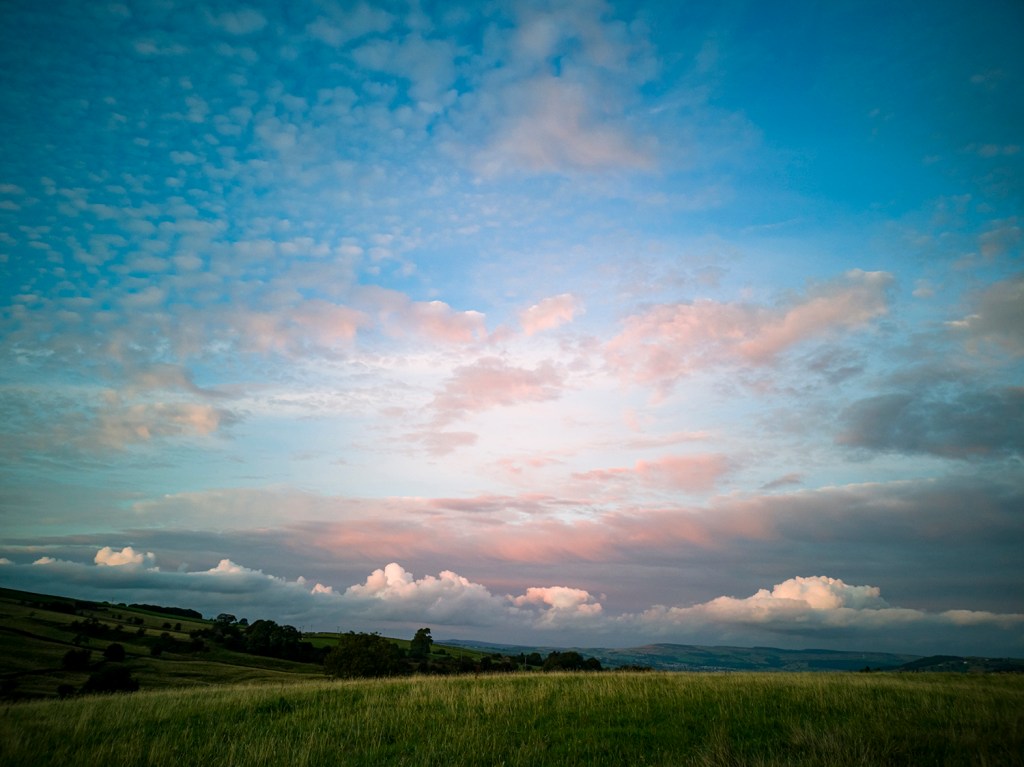
These settings would give nearly the best exposure for across the shot. But once you start to think as an artist you see the zone system would allow you to make different parts of the scene the subject. Out in the landscape with more space this could really help to capture great exposures.
Below are three of my first attempts at using the zone system. The light was difficult as there was a mix of light sky and dark ground so I used my camera to take some light readings. Then I set the camera for the mid tones which meant I had to have the camera open at F1.8 the hard part was getting detail whilst capturing the colour in the sky.
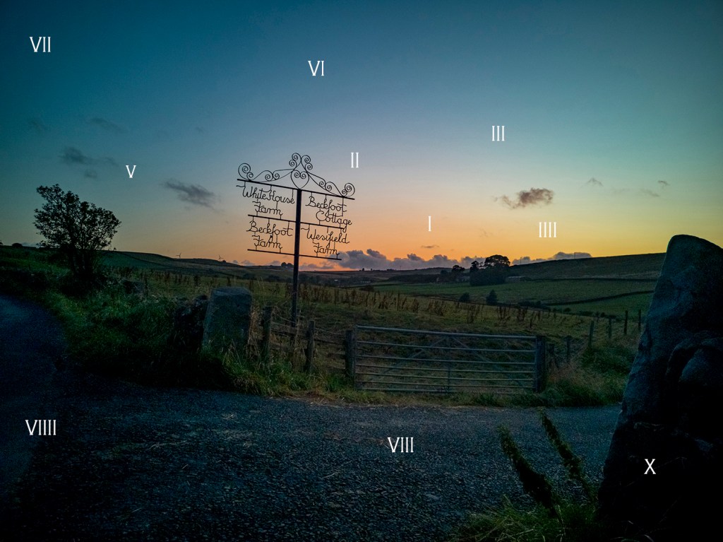
The four farm sign.Sunset over the drive.The glowing Field.
This is the email I sent to my tutor outlining my plans for the first assignment of this course. I will add his response when it arrives.
Dear David
I hope you are well? I am finding the course very interesting and enjoying walking the hills around home taking photos and thinking.
I have some ideas for my assignment 1 work I would like to share with you.
I have been reading about and looking at works by Julian Bell, Joseph Wright of Derby, along with Burtynsky and Gurtsky. In looking at works with trees I found Paul Nash. His work before the first world war is something special. Then his work in WW! still using trees but to show the casualties is even more so.
I live in an area with many trees and want to show them in my work. However I don’t want to show individual trees I want to get up high and show the trees in the landscape. They make great features and also create lead lines into pictures.
I plan to get up high on a sunny day with clouds to add texture to the local landscape I want to create a picturly set of photos almost like postcards. However they must have great clarity with focus front to back. I think at this part of my learning this is what i must achieve before I start to try other things.
Being up high will help me record the land at present as building is beginning so the landscape is going to change in the coming years. I can document this change.
For this first submission I plan to put it on my learning log at pixel count of 3000 with a setting of 300pi to ensure detail for you to see.
I trust this meets with your approval and look forward to your input if you would like a different way to see the photos please just ask. Yours Sincerely
Staring into the Abys is something I have actually done many times. I have been a diver for 30 years and have swum in the Marianas Trench in the pacific. This is the deepest abyss on our planet. I understand the feeling described in (1)Frederich Nietzche “if you stare into the abyss, the abyss stares back at you”? This feeling is sublime because you get taken right up to limit and the simple act of looking makes you feel uneasy, small and vulnerable.
In this essay I want to explore who and how certain artist have nearly achieved this feeling in their art.
In exercise 1.1 I showed (2)Casper David Friedrichs painting “Wanderer and the sea of fog”. This painting shows Friedrichs looking into the abyss. He gives us a glimpse of what is there but shrouds it in fog. His left leg is higher than his right and I wonder if he is going to step into the abyss and cause his own oblivion? The lead lines in the painting go all over and make me feel uneasy. My eye doesn’t go left to right as it should in the west or right to left. It goes all over the place following mountain ridges to nothing (well in fact fog). In my opinion a sublime painting indeed. Art Historian (3)Robert Rosenblum said of this abstract art “as revealing feelings of vision and feeling”. I certainly like looking at this painting and enjoy how it makes me feel.
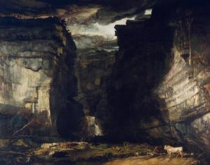
(4)James Wards painting “Gordale Scar” gives me the same feeling of looking into the abyss. I know Gordale Scar well it is only 8 miles from where I live and I often walk there. The painting is dark with well painted light areas. It has depth and whenever I walk and climb the waterfall I feel as if I am walking into this painting. It has emotion far above the visual on display in the gallery. The sky has a foreboding feel of doom or even danger nature is in full control.
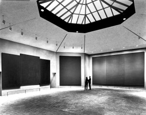
In 1964 (5)John Rothko was commissioned to complete an installation. He made an octaganol chapel in which he placed 14 paintings. All dark hues some triptych implying altar pieces all were just dark spaces. In the mid 80s I visited the chapel and at first didn’t get it. Slowly I found myself being drawn into the abyss. Then slowly I felt the paintings in front of me were looking back at me. It made me feel a strange emotion and very uneasy.
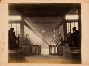
In photography (6)John Thompson has an image “Buddhist Temple” evokes the same feeling. It is just a room with statues of buddisst monks. The light which is beautiful gives the exposure emotion. It also takes the eye through the picture. However it is the light that makes this image sublime to me.
In (7)Liz Wells book Photography A Critical introduction I read “An experienced photographer knows intuitively where to place the camera and which lens to use for the best effect. Much in the same way a pianist arrives at proper pitch and touch through daily rehearsal it is a matter of fluency and assurance”. This is what I want to develop through this course so I can capture the emotion in sublime scenery.
I have felt this emotion in the sea on a few occasions one being in the Marianas Trench. The feeling of the abyss looking back at me meant I didn’t need to go to the bottom of the trench I already knew what was there. I did feel uneasy, small and vulnerable, nature was in control.
References
(1)Nietzche, F. (1886). Aphorism 146.
In: F. Nietzche, ed., Beyond good and evil. Leipzig, p.146.
(2)Friedrich, C. (1818). Wanderer
above the sea of fog. [Oil on canvas] Hamburg: Kunsthalle Hamburg.
(3)Rosenblum, R. (1994). Modern
painting and the northern romantic tradition. London: Thames and Hudson.
(4)Ward, J. (1818). Got dale Scar.
[Oil on canvas] London: Tate.
(5)Rothko, J. (1964). Rothko Chapel.
[Oil in installation] Houston, Texas, USA: Rothko Chapel.
(6)Thompson, J. (1869). Lah alum Chu Canton. [Albumen Print] Rochester, USA: George Eastman Museum
(7)Wells, L. (2015). Photography A Critical Introduction. London: Taylor & Francis.
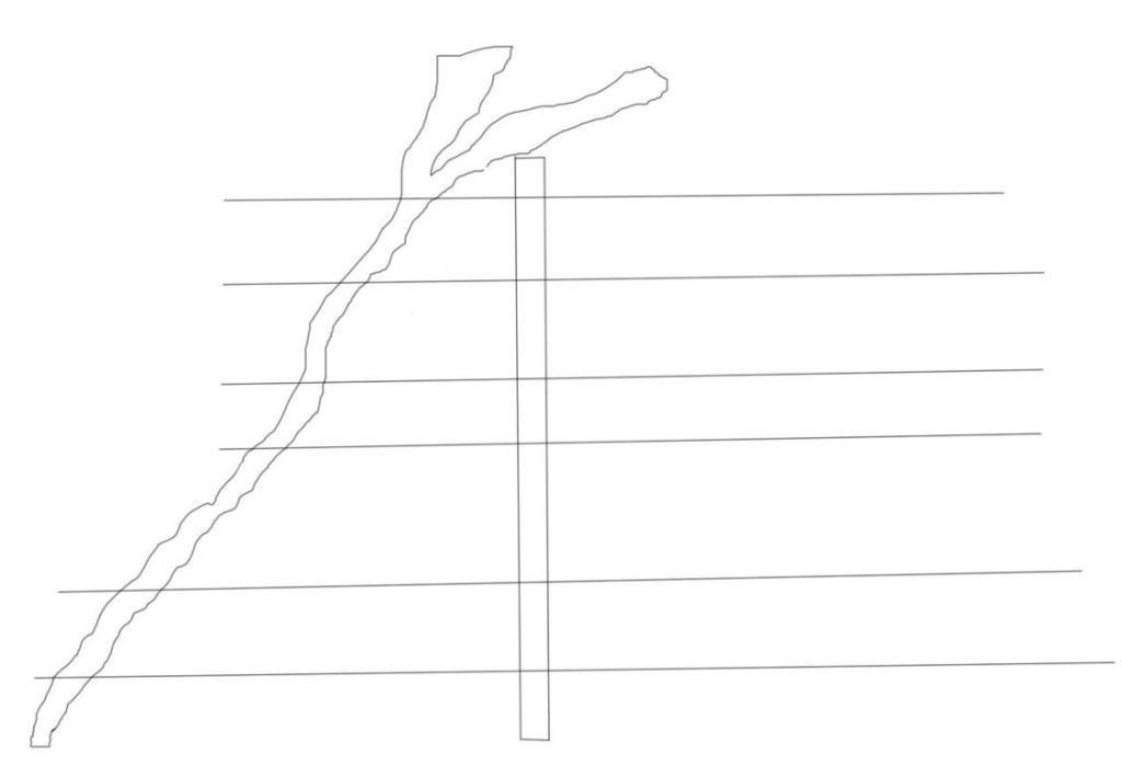
A number of years ago I was walking down a leafy country lane near Warter in East Yorkshire when a car approached me driving very slowly. The car had a very odd bull horn on the front. The apparition approached and past at a snails pace. I glanced in the car and thought I recognized the passenger.
Turns out this was David Hockney making a piece of film for the Royal Acadamy. The strange apparatus on the front was in fact a rack of cameras. Nine in total all catching a different perspective of the same scene which when combined fools your brain into seeing one image.
Hockney then presented the video on 36 55 inch screens. I don’t have those resources so will have to change my version.
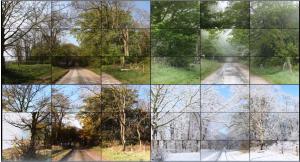
This experience came back to me when I read the brief for this exercise. We have a very picturesque wooded lane near to where we live. This lane appears to be stable so I would be interested in its transition through the year. A year which will be massive in Europe’s history. Whatever happens within our exit from Europe the lane will stay the same.
I spend my spare time Diving and doing so we use transits to ensure we return to the correct area of seabed. I can use these to ensure I take my exposures from the same place. I took three transits and noted them in my notebook.
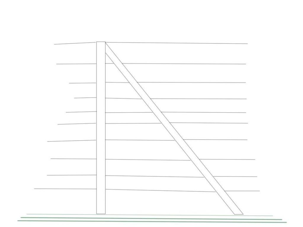
Left Hand 5th Fencepost
Right Hand 4th Fencepost
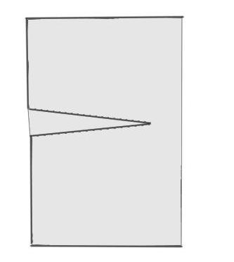
Landscapes are usually 3:2 ratio so if I take my shots as square it will give a unit of 1. So 3 along the top with 3 along the bottom will give the 3:2 ratio required. Each completed photo will take 6 exposures. I aim to completed one every month so 12×6=72 photos to complete the set.
Format for my Transitions work.
Whilst they are of the same scene they are not a stitch so wont be exact. Hopefully this will make the brain fill in the scene giving a similar effect to the one Hockney achieved in his work.
Thinking about presenting the work for assessment it may work in a high quality photobook format. Printed as large as possible. I usually put captions with my work however it may be interesting to use the headline of the day to record what happened in the media on the day each exposure was completed.
So below is my first attempt at this work eleven to go.
Shop Lane August 2019..
References
Hockney, David. Four Seasons 2011. 2011. Digital Colour Video. Royal Academy London.