Assignment Three A space that becomes a place.
After completing my research and experiencing the end of our trip witnessing the indifference the place we were inhabiting showed to mankind I want to show the following things.
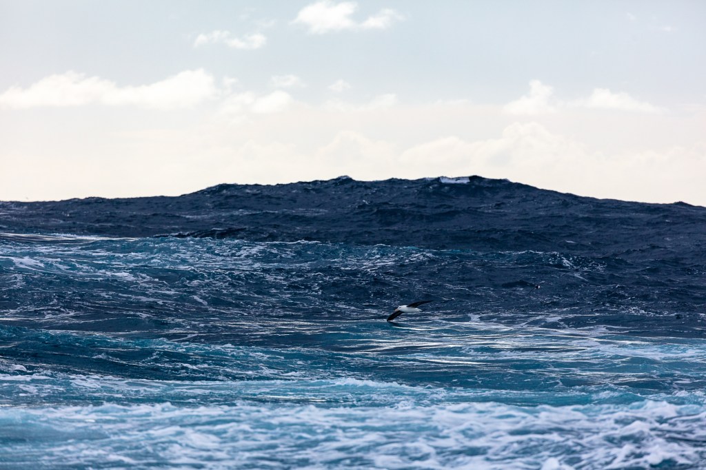
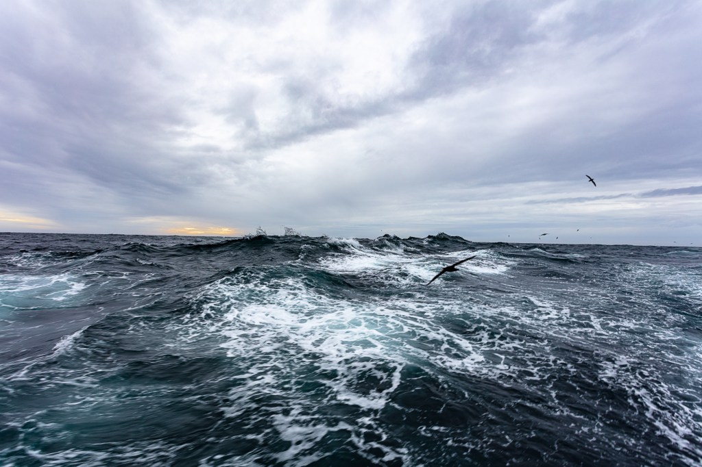
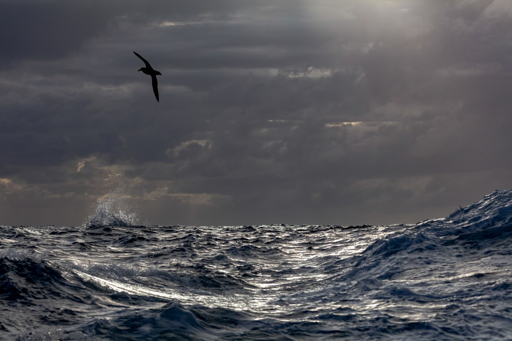
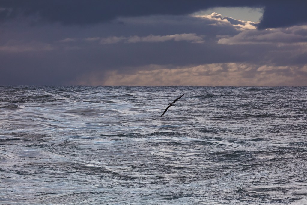
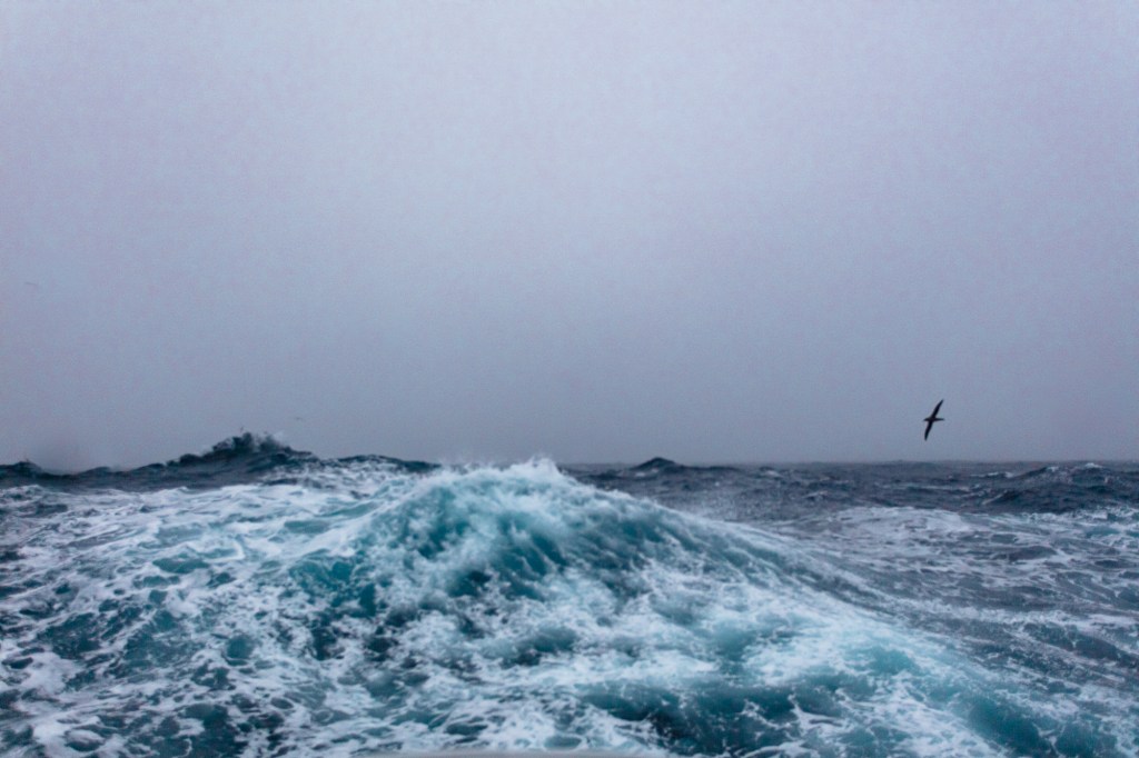
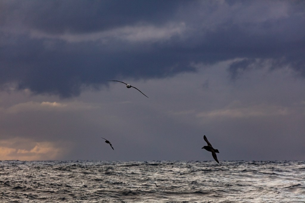
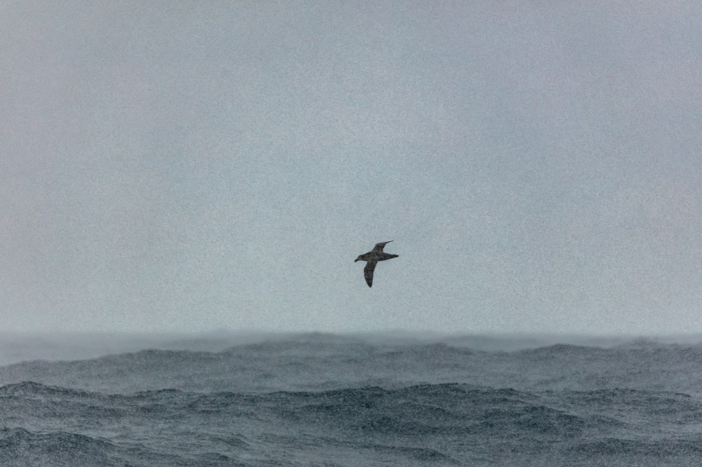
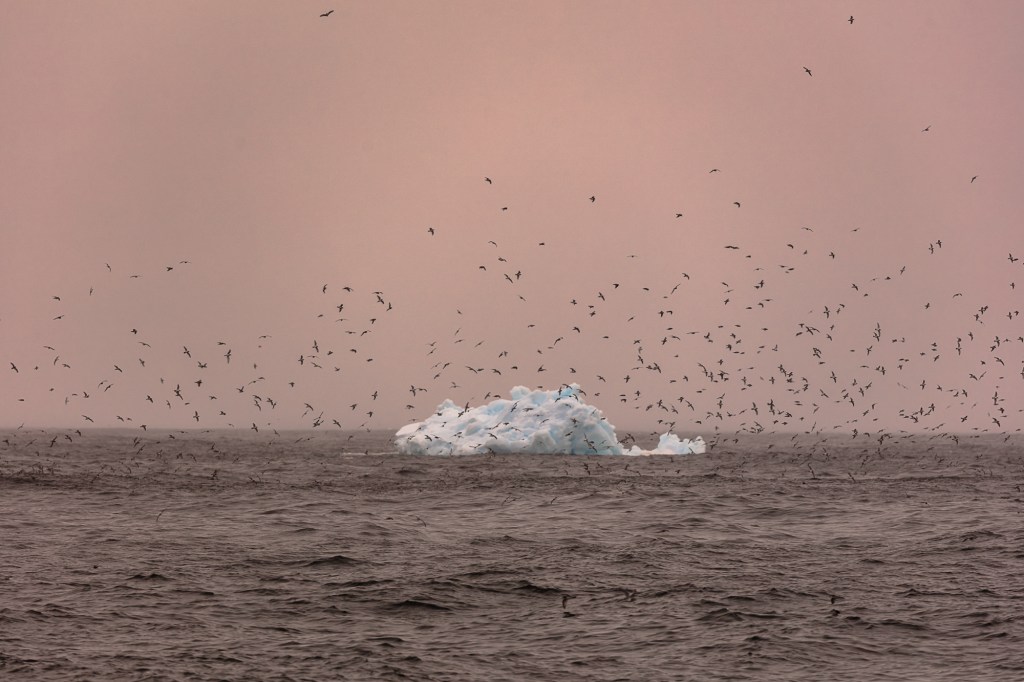
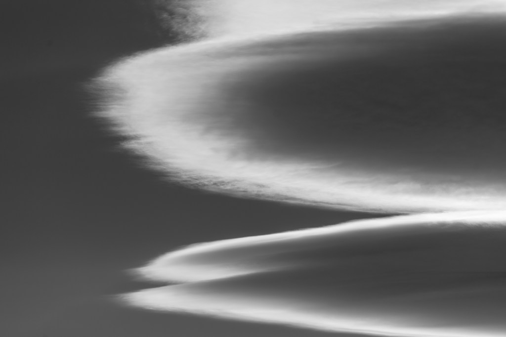
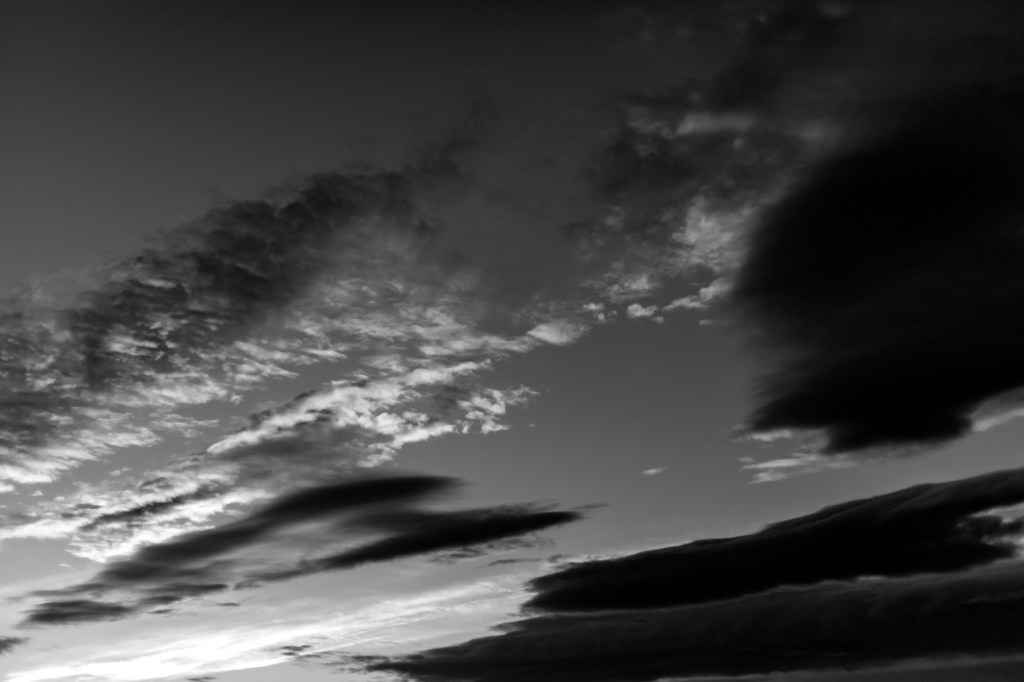
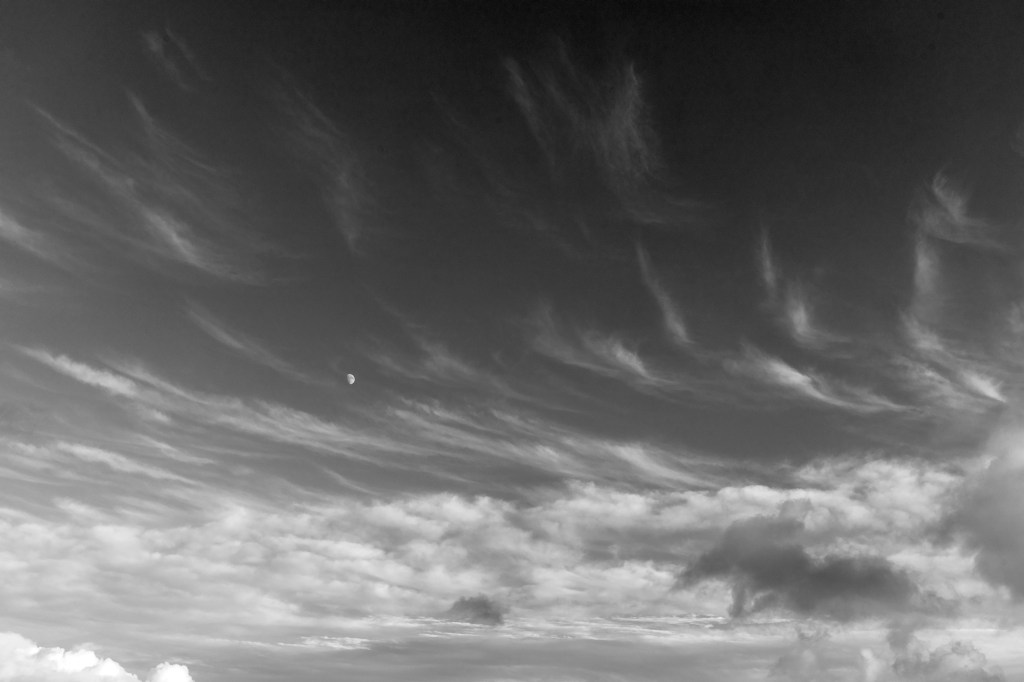
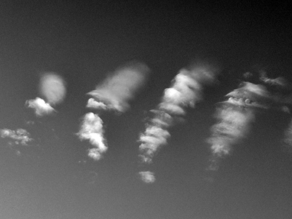
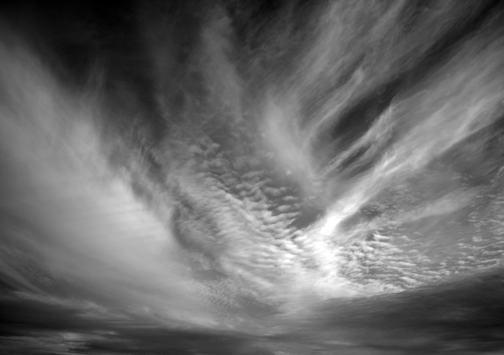
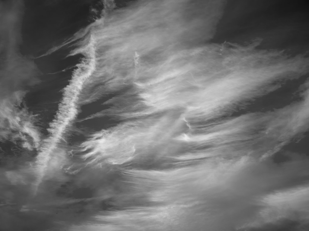
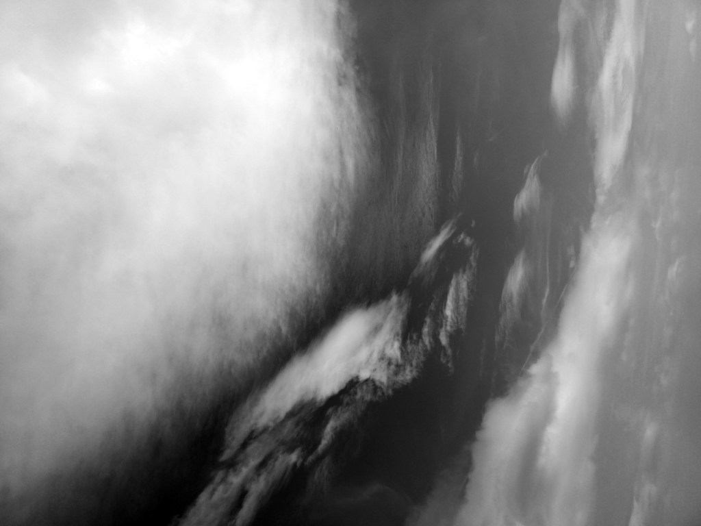
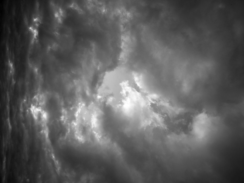
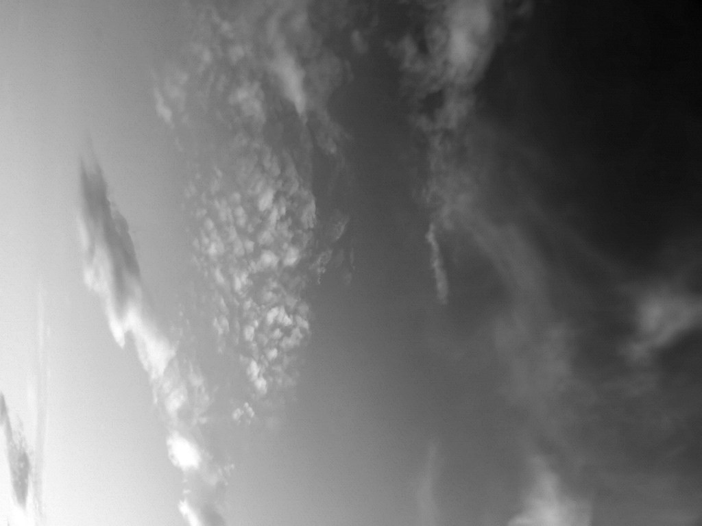
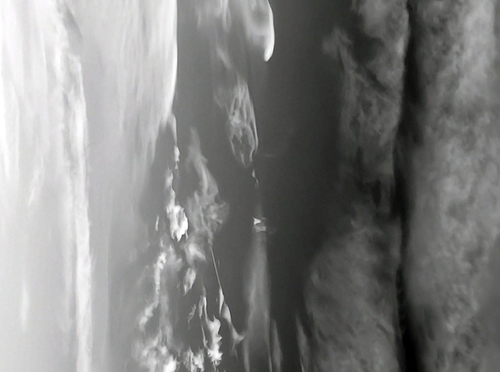
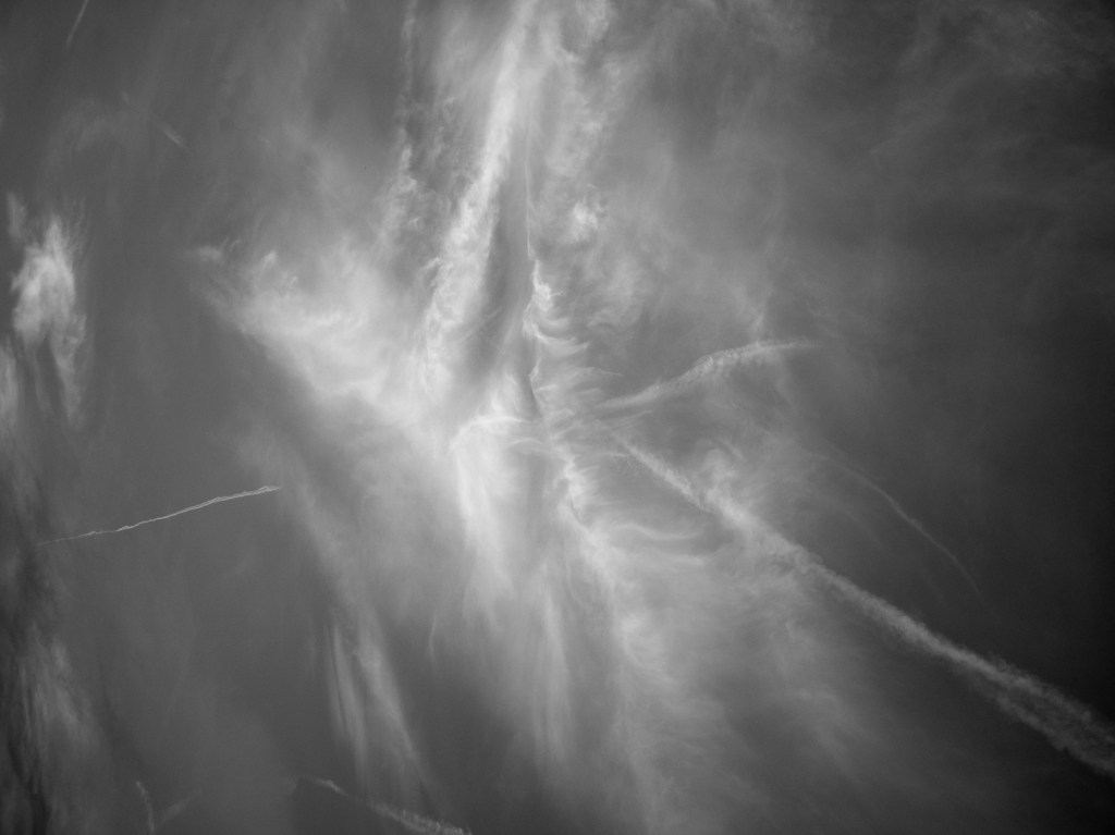
1. The many states of the sea.
2. The ease in which nature inhabits this space.
3. The indifference I feel this space shows to mankind.
This space becomes a place when someone or something passes through and briefly becomes part of its existence. Humans have technology that they rely on, This technology soon becomes useless when we over rely on it.
Helen Keller said “Science may have found a cure for most evils; but it has found no remedy for the worst of them all — the apathy of human beings.” (1903) We have GPS, EPIRB, Immersion suits not to mention ships and aircraft however when the elements want to take us they will.
When a wilderness takes us we use terms such as “Evil” or “Violent”. After my experience I think the best way to describe the conditions we encountered is indifference, it has no emotion it just is.
It seems strange now that I had been researching Peter Breugel the Elders painting “Landscape with the fall of Icarus”. (Breugel) A painting depicting the way humans show indifference to the suffering of others and how no matter what technologies we employ (Wings) we cannot master the elements we encounter.
The paintings I have researched show the sea in its different states and use it to embroider the story they are depicting.
Picasso described his art thus “The artist is a receptacle for emotions that come from all over the place: from the sky, from the earth, from a scrap of paper, from a passing shape, from a spider’s web” (1928).
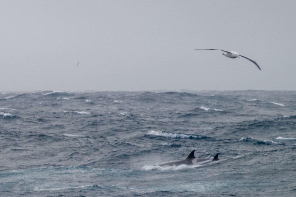
I want to to show some of the emotions I experienced during the harrowing hours searching the sea for the 38 lost souls. Lost in a plane crash a few miles from the ship I was on. See my research here https://wordpress.com/post/michaelgreenlevel2landscapeblog.photo.blog/560 The inhabitants of this space were indifferent to the suffering of the poor people.
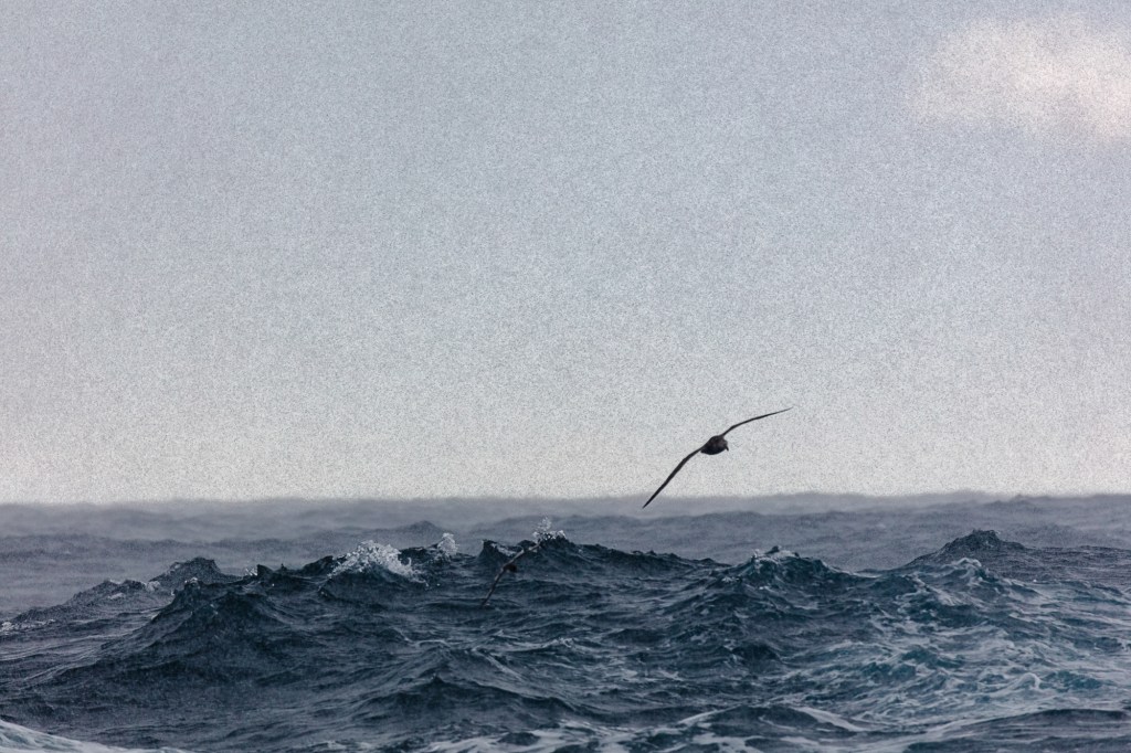
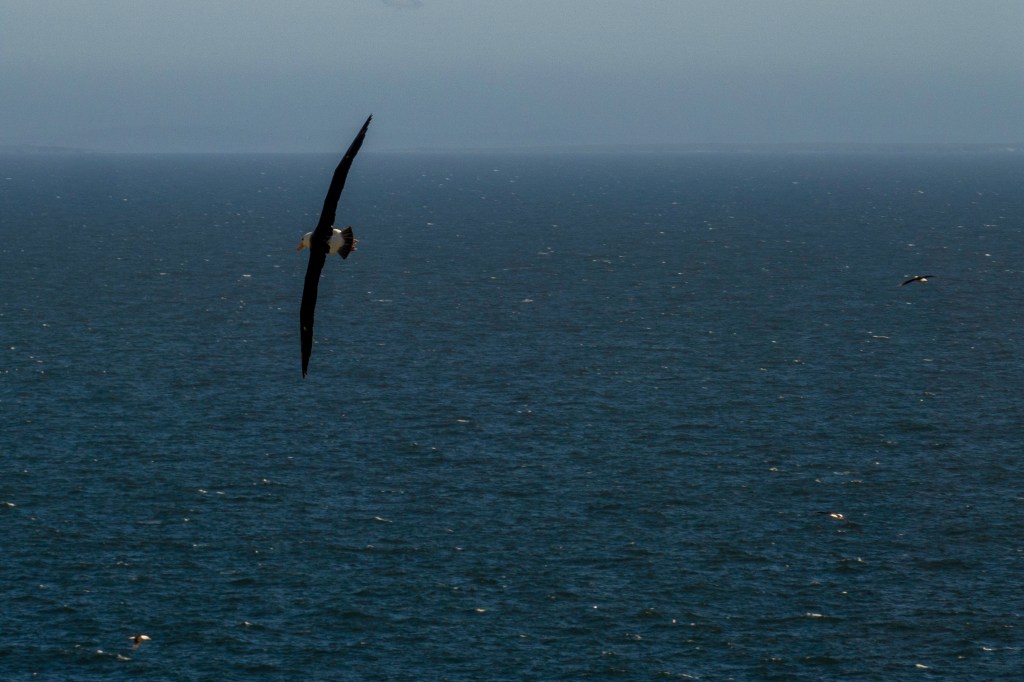
My twelve seascapes all show flight and mastery of the elements we humans with all our equipment, skills and endeavours can never hope to emulate.
This space is one of the largest on the planet it is the Drake Passage part of Southern Ocean below the tip of South America called Cape Horn. Named not because it looks like a animals horn, but after the town in Holland that the explorer William Schouten came from Hoorn in 1616 (Schouten).
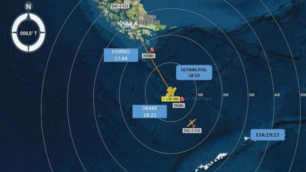
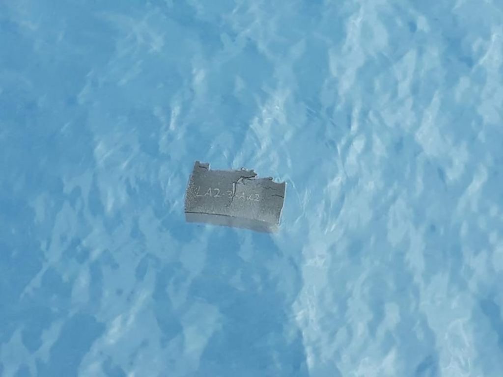
This massive space becomes a place when the planets animals including us inhabit it even the most fleeting moment. The position we inhabited on the fateful night of the 10th of December 2019 became the resting place for 38 souls when their C130 transport plane crashed on its way to King Edward Island, Antarctica. This work is a tribute to these lost people.
Bruegels painting shows the indifference of man to the suffering of others. I was amazed by the indifference the worlds media showed to this disaster. I could only find two small articles about the crash one on the BBC news website and one On the Chilean government site. Again showing the indifference of the suffering of others.
Words taken from William Carlos Williams Poem “Landscape with the fall of Icarus” (1962).
Work Cited
Keller, Helen. The story of my life. Tuscumbia Alabama: Ladies Home Journal, 1903
Elder, Peter Breugel The. Landscape with the fall of Icarus. Royal Museum of Fine Arts, Brussels.
Picasso, Pablo. “Quotation.” MoMA. Madrid, January 12, 1928.
“Cape Horn.” Cape Hoorn William Schouten. Amsterdam: Globe Press, 1618.
Williams, William Carlos. Landscape with the fall of Icarus. Performed by William Carlos Williams. Pictures from Breugel and other poems, New York. 1962.
Research for Assignment 3 Spaces to Places.
For my research into this assignment I considered a journey I was about to make across the Drake Passage in the South Atlantic one of the biggest spaces on this planet. I thought there must be something about this space that could inspire me.
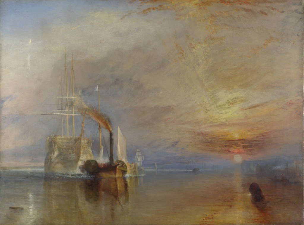
I looked at Maritime landscapes and liked three (1)JMW Turner The Fighting Temeraire. (2)Theodore Gericault The Raft of the Medusa and (3)Peter Breugel the Elder Landscape with the fall of Icarus
The Fighting Temeraire is a peaceful painting at first glance however on consideration it shows what must have a been troubling time for the Victorian people as sea travel transitted from sail to steam. The real scene should show two tugs but Turner showed this leviathan being towed into oblivion by just one. Hinting at the might of steam over the fragility of wind and sail. It is much smaller than the Temeraire which served Britain well at the Battle of Trafalgar. Turner was getting old when he painted it and it could show that Turner was thinking about his own mortality. Turner painted the Temeraire with its sails and masts when it fact it was a hulk with no masts. He wanted to depict her in all her glory. The painting clearly shows the end of the old system and the rise of a new industrial age. Depicting this with a setting Sun and a Rising moon. However this picture is too calm to inspire work from where I am heading. The sea is like a mirror reflecting the calm sky and the sunset.
The second picture I considered was painted by Theodore Gericault entitled The Raft of the Medusa. It shows the crew of the French Frigate Medusa at the moment of rescue. The survivors are deranged with thirst and starvation. Suffering so badly that they have resorted to canabilism. One suprising thing is the negro at the head of the mast leading the way to salvation. Gericault was showing that if you persevere you can move from despair and no hope to salvation rescue and hope. The sea is shown menacing, rough and the violent sky has menace also .One amusing thing clearly on show is the fact that the artist couldn’t paint feet so you will not find any in this painting unless its covered by another person or bandaged. If I was to pursue this for Assignment 3 I would need to use models and probably wont have time to pose them.

The Third painting I looked at was purported to be by Peter Breugel the elder. Whether he painted it or not it is a superb painting with humour and a story.
Icarus the son of Daedlus stole his fathers wings made of feathers stuck with wax. He ignored his fathers warnings as he tried to climb higher than other men and crashed into the sea and drowned.
The painting shows the figure of a farmer in the foreground his red tunic hints at danger. Then you see a sheperd tending his flock. Your eye searches for Icarus but next you see a fisherman fishing from rocks on the shore and a ship with full sails and the crew working to control the ship. Where is Icarus? He should be by the setting sun the heat of which makes the drama unfold. Then under the ship you see a leg stuck out of the sea. At last Icarus and his demise are visible. A shock to find the main player shown as an insignifant bit player in a corner.
It is beautifully painted with strong colours and detail on every part of the canvas. It has humour all the people your eye sees are indifferent to the plight of Icarus. This is the paintings message it invites us to consider how we are indifferent to the suffering of others. With a second message of men who try to climb to higher levels than ordinary men usually take a tumble back to earth. The sea is depicted symbolically in a state of calm, it has played no part in Icarusses demise.
You can, I am sure think of men/women like this politicians, officials, colleagues at work. All try to climb to heights and most fail, then if we are not careful we are indifferent to their suffering even turning our backs on them.
The artist is extremely clever showing the whole story in one scene, (4)John Berger describes this process “In a painting all its elements are there to be seen simultaneously. The spectator may need time to examine each element of the painting but whenever he reaches a conclusion, the simultaneity of the whole painting is there to reverse or qualify his conclusion. The painting maintains its own authority”.

DISASTER
As I was considering this assignment onboard the ship a Chilean C130 Hercules crashed twelve miles from the ship. We spent the next 24 hours searching the sea in 60 mph wind and 5 metre waves in the pitch black of night and gloom of the Drake. We saw a light flash 4 times over a couple of minutes. 38 souls were lost in an instant. After the Chilean navy had taken over the search it seemed to fit into all my thoughts and research I had completed for this assignment.
In my work I want show the space of the sea and how it becomes a place to the birds that inhabit it. The different states of the sea will show its different moods. Combining the two will show it is indifferent to human efforts and the technology we use to go into this space. These animals fly all their lives and look to be most relaxed when the elements are at there most extreme. I want it to be a tribute to these 38 lost souls.
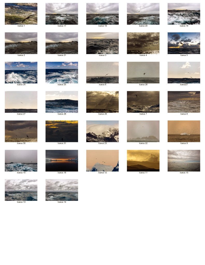
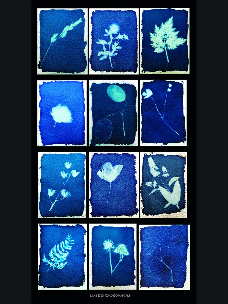
Below is my contact sheet of 30 exposures from which I chose 12 in tribute to these 38 lost souls.
Bibliography
(1)Turner, JMW, and John William Turner. The Fighting Temeraire. National Gallery, London.
(2)Gericault, Theodore. The Raft of the Medusa. The Louvre, Paris.
(3)Elder, Peter Breugel The. Landscape with the fall of Icarus. Royal Museum of Fine Arts, Brussels.
(4)Berger, John. Ways of seeing. London: Penguin, 1972.
Assignment 2 A Journey.
When I read the brief for this assignment I wanted to show the separate components that made up this module.
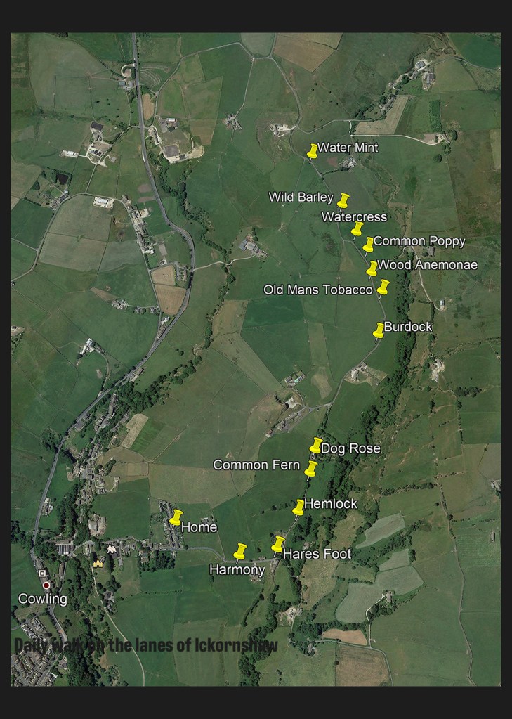
At the end of the last assignment my tutor advised me to look in more detail and not to cover too much in my work. The title of the brief is “A Journey” so I completed a couple of walks to focus my attention. My attention was drawn to the plants in the hedgerow and verge along the way. These four things show my learning journey and the physical journey I take daily.
My work shows a pictorial depiction of our countryside, it uses an old technique developed to capture the detail. After reading about and listing words on a walk it seemed a good way to carry this practice into this assignment. Completing this walk puts me in the Promised Land just like the returning soldiers after the war. I see the vegetation on my walk, doing so makes it easier for me to return.
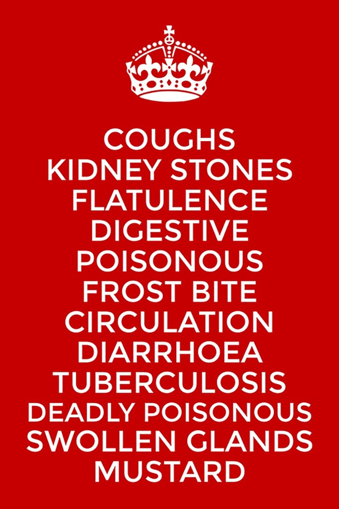
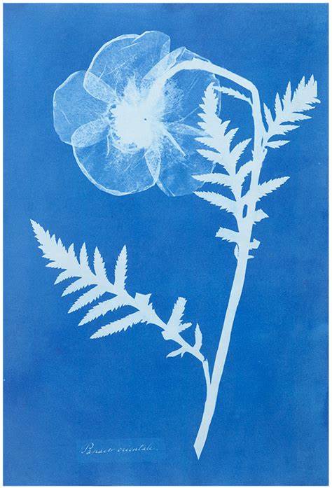
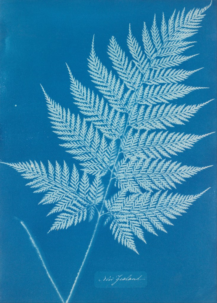
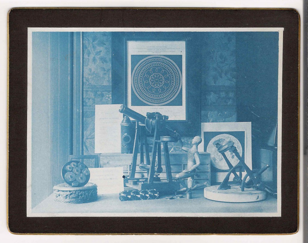
The work completed for this assignment shows the process (1)Anna Atkins used in her work. My composition is good the left and right column point into the centre column keeping the eye on the page. The map is taken from Google and pulls in the appropriation discussed in the coursework. The list of ailments shows words in art it is simple and visually fits in with the era of the soldiers return. The cyanotypes are the main part of my response; they have good detail show the plants in all their glory. The process made me get to know each of the specimens extremely well. Finishing with the poster completing the journey and pointing out you can choose a different path to complete any journey.
If I were to develop this project further I would continue collecting specimens and would place them in a book. To improve them I would work on exposures to get the final colour even more consistent.
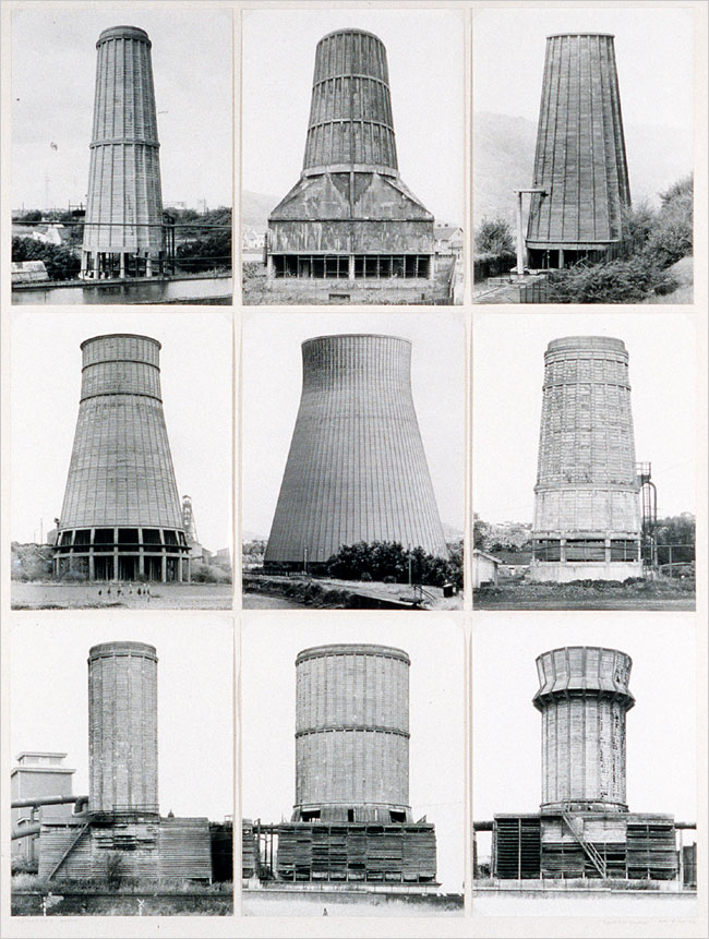
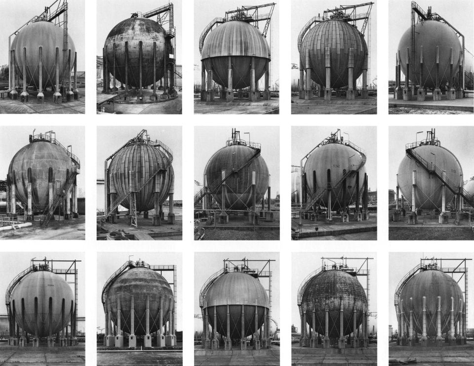
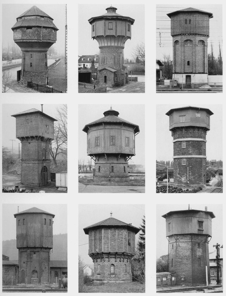
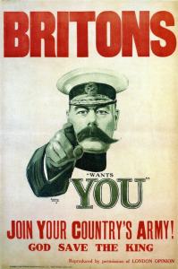
All the decisions I made for this work had to include the work covered in the second part of the course. I have already mentioned Anna Atkins however two other artists influenced my work, (2)Washington Teasdale made cyanotypes in Leeds different to Atkins in as much as they show scenes. Finally (3)Kinetta Hill offered advice to me when I started learning the process. She helped me source the chemicals needed. (4)Bernd and Hilla Becher influenced how I presented the work and the war office poster (5)“Keep Calm and Carry” influenced the poster along with the first world war poster (6)“Your Country wants you”.
My tutors advice to focus, made my choices easier, I really wanted to zoom in on the smallest detail. Doing this has helped me understand what I need to do when I get to Assignment 4. This whole project has been a journey, taking me through many new learning’s the most important one has been to look, really look and the subject will jump out at you, with a little luck.
Works Cited
(1)Atkins, Anna. “British Algae.” Victoria and Albert Museum. British Algae. London , 1844.
(2)Teasdale, Washington. Kirkstall Abbey. Museum of the history of science, Oxford.
(3)Hill, Kineta. Bristol Cyanotype. Kineta Hill Gallery, Bristol.
(4)Becher, Bernd and Hilla. Watertowers. MoMA, New York.
(5)Servant, Unknown Civil. “Keep Calm and Carry On.” MoI. Keep Calm and Carry On Poster. London, 1940.
(6)Leete, Alfred. “Your Country Wants You.” War Office. Your Country Wants You. London, 1914.
Research for Assignment 2 A Journey.
Researching this assignment I want to consider the work of Anna Atkins, Washington Teasdale and Bernd and Hilla Becher then I want to look at types of text I could use to complete this work. I want to try to present all the subjects covered in this second part of the course.
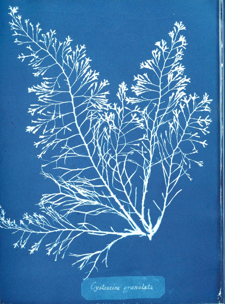
(1)Anna Atkins was born in 1799 and was a botanist and photographer. She made impressions of British algae using the cyanotype method in 1843. The detail in these impressions is amazing almost looking three dimensional. She was a great scientist and created work on algae, working mainly in biology but also studying marine shells. Copies of her work on algae are kept in institutions across the world and are still a great reference point both scientifically and in the art world. Making her one of the few who have crossed across the two. Earlier this year I saw one of the cyanotypes in the Victoria and Albert museum in London and it was breathtaking. She worked closely with William Henry Fox Talbot who was a close associate of her husband so both were at the forefront of the new technology of photography.
(2)Washington Teasdale was born in Leeds he worked in India developing the rail network. His early photographic work was creating slides for magic lantern shows. He was interested in cyanotypes and created high quality work. He was a founder member of the Leeds Photographic Society. Familiar with many disciplines within photography but specialising in three Cyanotypes, Silver Gelatin print and Collotypes.
His interest in lenses led him to develop an early field microscope and he subsequently became a fellow of the Royal Astronomical Society.
He took several exposures at Kirkstall Abbey in Leeds these plates allowed him to make a contact print using the cyanotype process. Whilst not as strong as Atkins work they are still strong prints.
(3)Bernd and Hilla Becher produced some of the greatest photos of the most mundane subjects ever. The way they composed the separate components of the typological works is mind blowing. Take the poster of photos of pit workings. They are all exactly the same composition but showing separate sites. This must have been so hard to achieve. The amount of work to capture each must have been immense. They met in 1957 in Dortmund at the Kunstakadamie. They first worked together taking exposures of mines and steelworks. They did this as their families had worked in these industries.
They had thought of everything they shot on cloudy days to stop shadows, but went further by shooting only in the same season either spring or autumn. They moved around the subject to ensure no distractions are in the frame. Whilst the shots look simple you can see the attention to detail in the simplicity.
In 1965 they came to Britain for a six month project travelling around the country repeating the process on the industrial sites here. In the seventies they repeated the process in North America.
After Bernd died Hilla worked mainly with the existing photos they had captured and continued doing so until her death in 2015.
Creating a poster is new to me so I thought of the four that came to my mind. First to pop into my head is the First World War poster which just says (4)“wants you” with Field Marshal Kitchener pointing right at you. This is a strong image with the finger pointing right at you and the eyes looking straight into you. In 1914 how could it not call to whoever looked at it.
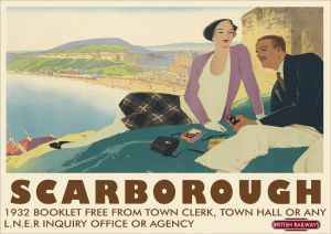
Second I thought of the posters used by (5)British Rail to show destinations to get the public to use their leisure time to travel by rail for their holidays. One I have seen shows Scarborough in all its sunny glory to entice you to spend some time at the resort. They all show depictions of the landscape of the place and are works of art in themselves. This one was produced in the 1930s.
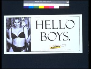
Next I thought of the (6)Wonder Bra poster I remember this poster and the car crashes it caused in 1994. It has a slogan of “Hello Boys” and was extremely provocative. It was withdrawn not because it objectified women but because it was causing lots of rear end shunts so damaging vehicles.
All of these posters have an accompanying image; I don’t want this for this assignment. The image will detract from the main part of the work offered. I want to create just text on my poster so I looked at posters with only text.
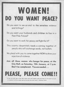
First I found a poster from (7)Belfast University which was posted in Belfast in 1973 to recruit women to campaign against the troubles. It follows a very similar format to the “Wants you” poster from the First World War. Without the image.
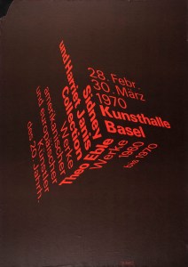
Next I found a text only poster for the (8)“Sydney and Harriet Janis Collection” an exhibition in 1970. This is a beautiful design. Simple but strong with just two colours Black and Red. The words form a cube the clever part is the words still work being easy to read. I don’t have the skills to do this…….Yet!
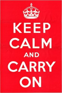
Finally I thought of the (9)“Keep Calm” poster which has been popular on all kinds of products from posters through t-shirts and mugs. One I have seen recently said “Keep Calm, drink Gin. I wonder if the purchaser realised this was an information poster used in WW2 by the ministry of information. It simply read “Keep calm and carry on”. What many don’t realise is it was designed to be used if Britain was invaded as it wasn’t, the public never got to see it until one was discovered in 2005.
This is the design I will use I like its simplicity and it won’t detract from my main body of work.
How do I make the cyanotype process work. I learned the process from a (10)Thames and Hudson Book it is simple but you need to follow each stage carefully.
So mixing 10g of Potassium Ferricyanide with 100ml of distilled water we create the first solution called A.
Then mixing in the cleaned glass bowl 25g of Ferric Ammonium Citrate with 100ml of distilled water I create the second solution called B.
These solutions can be kept in Brown bottles in a cool dark place for several weeks. When I am ready to coat the paper I mix equal quantities of solution A and B. The size or number of sheets of paper dictate how much I will need to mix. 5ml of each will coat two postcard sized sheets of watercolour paper.
Then you allow the paper to dry in a dark room. Again you can store the paper for a couple of weeks once dry in a envelope or a black photo paper bag.
Then place your paper with the subject on top of the paper. Place the glass on top and ensure it holds the subject as tight as possible. Then expose to sunlight, exposure time differs but on a cloudy day 20 minutes suffices. I look for the coating to gain a metallic grey colour then I know it is exposed.
Rinse in cold water under the tap until all the yellow coating has washed off and leave to dry. If you want to change the tones now is the time to play. I have tried Red wine, Tea, Coffee and Cocoa so far. The mid tones change slightly and improve the detail in the exposure. Tea seems to work best of all.
One last point is the finished print will change colour darkening and allowing detail to sharpen as it dries. It will bend also as it dries so placing the dry paper between kitchen paper under a large book this will help flatten it.
Works Cited
(1)Atkins, Anna. “British Algae.” Victoria and Albert Museum. British Algae. London , 1844.
(2)Teasdale, Washington. Kirkstall Abbey. Museum of the history of science, Oxford.
(3)Becher, Bernd and Hilla. Watertowers. MoMA, New York.
(4)Leete, Alfred. “Your Country Wants You.” War Office. Your Country Wants You. London, 1914.
(5)Broadhead, William Smithson. “Scarborough LNER Poster.” LNER . Scarbororough Poster. York, 1930-1955.
(6)Rose, Nigel. “Wonderbra Poster.” Victoria and Albert Museum. Wonderbra Poster. London, 1994.
(7)(?). “Women do you want peace?” Belfast University. Women do you want peace? Belfast, 1973.
(8)Arx, Peter Von. “Kunsthalle Basel.” Theo Kabel. Sidney and Harriet Janis Collection. New York, 1970.
(9)Servant, Unknown Civil. “Keep Calm and Carry On.” MoI. Keep Calm and Carry On Poster. London, 1940.
(10)Gomez, Anthonini Minniti, and Lunganella Bendandi. Experimental Photography. London: Thames and Hudson, 2015.
Excercise 2.6 Edgelands
After reading the two short essays Wire and I am struck by the endless possibilities this approach offers. The two essays cover such topics as Cooling stations, Wind Turbines, Cold War buildings and wire fences. All linked by being on the edge of Society in one way or another. Services that we want to keep close enough to use but distant enough to be not seen. The second link I saw was barriers, razor wire and pointy fences.
The work around Greenham Common and the Hush House were interesting to me. Making me think of textile mills locally that are now unused.
If I walk a mile through my local area noting these types of things I get the list below.
1. Walls (Drystone).
2. Walls (Mortared).
3. Waste bins.
4. Derelict farms.
5. Ancient boundaries.
6. Old industrial sites.
7. Wire fences.
8. Wind turbines.
9. Litter Bins.
So spending 20 minutes wandering around looking has produced eight topics that could easily be projects and long term ones at that.
Reading of the sites that were edgelands in the time of writing some of the ones I know such as Tinshill cooling tower are now not on the edge they are part of the town. It could be interesting to find old edgelands within our towns.
Work Cited
(1) Wire Farley, P. and Roberts, M.S. (2011) Edgelands, Journeys into England’s True Wilderness.
(2) Power Farley, P. and Roberts, M.S. (2011) Edgelands, Journeys into England’s True Wilderness. London: Vintage Books
Response to Feedback for Assignment 1. Look UP!
In considering my first assignment in the Landscape course I have been pondering why my shots are sublime to me. I look at the photos I took and I still see the sublime in them. What am I seeing?
I agree with my tutors comments in his feedback and fully understand the difference between the picturesque and the sublime. Do my offered photos have that wildness and savagery that it needs to be sublime?
Listening to (1)Radio 4 I heard a piece about (2)John Constable and his cloud sketches which he completed in 1821. He drew and painted these sketches as practise for his paintings to come. He did the majority of these sketches from Hampstead Heath as his wife recovered from illness. Constable was so successful at depicting the clouds that one member of the Royal Academy said “When I see Constables clouds I reach for my raincoat”. They range from simple sketches through watercolours and then full oil paint.
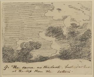
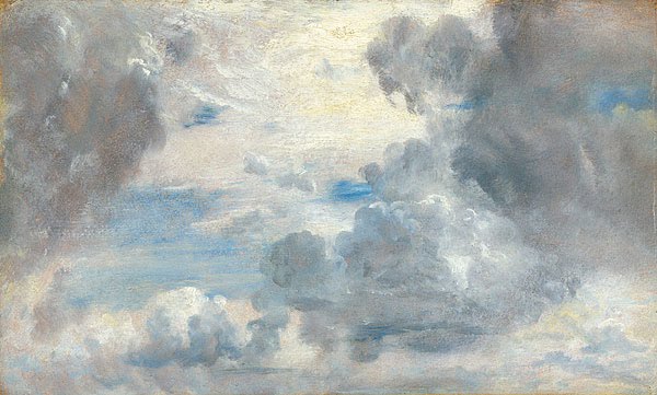
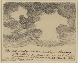
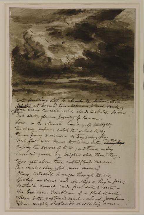
Cloud Study with Verses from Bloomfield 1830s John Constable 1776-1837 Purchased 1974 http://www.tate.org.uk/art/work/T01940
(3)Alfred Stieglitz also created a series of photographs entitled “Equivalents”. He did it to show his technical ability at capturing a difficult subject whilst making art. These works are considered by some to be the first abstract depiction of photographic art having no real subject. Viewers found this fact challenging to see. Stieglitz knew precisely what effect he had created saying to one viewer who asked “is this water?” he replied “Why does it matter”. Knowing he had created the question in the man’s mind.
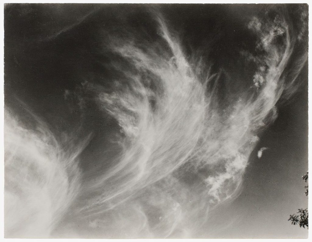
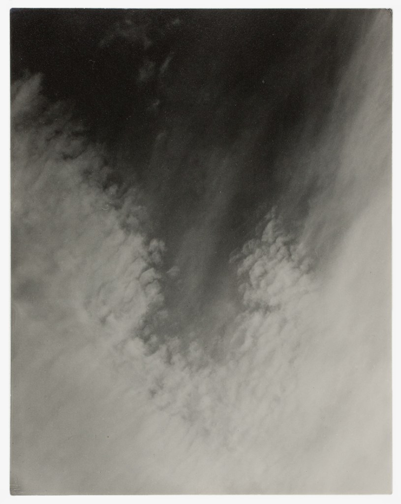
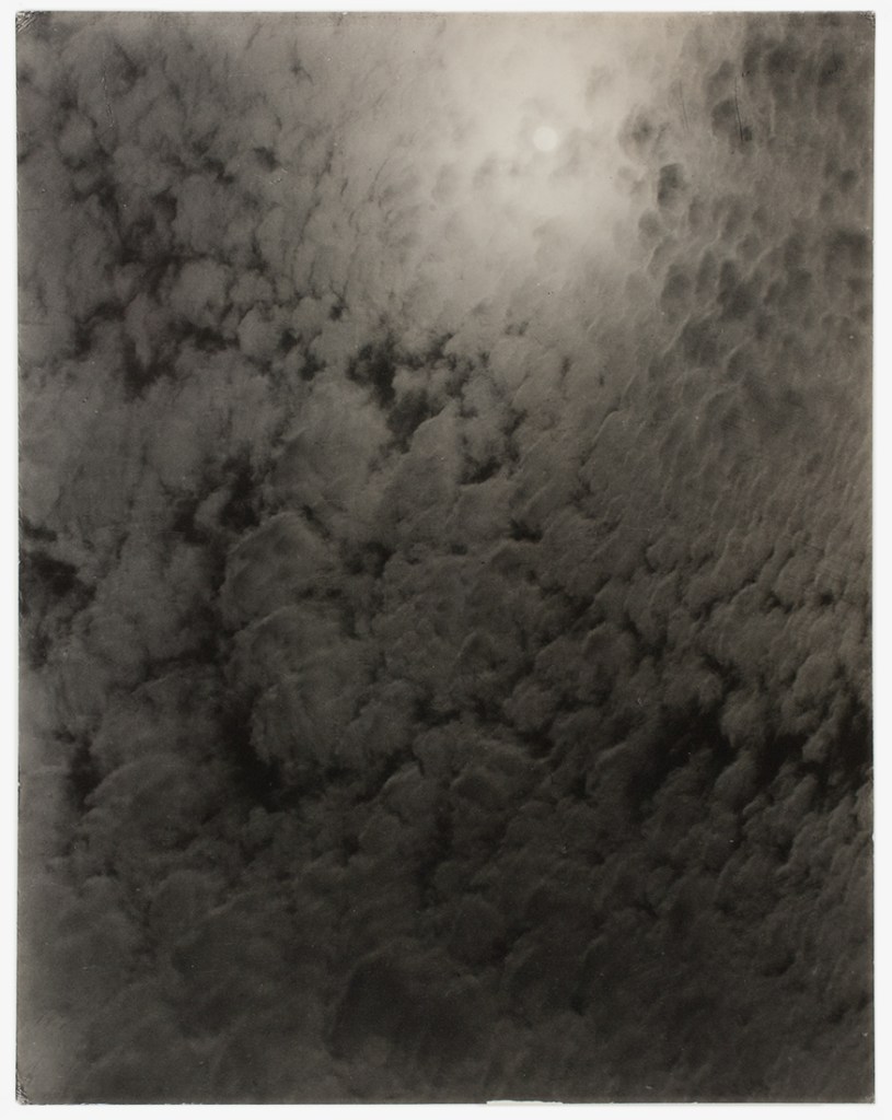
(4)Ansell Adams said in 1948 seeing “Equivalents was his first intense experience in photography”.
I have been taking pictures of the sky in monochrome for the last few months not knowing of Constables sketches but being aware of Stieglitz work and in fact responding to it.
My tutor in Identity and place had told me to look in completing one the exercises; this was an inspiration for me starting recording these photographs. Contemplating the photos offered in response to assignment one of this course I realised I was trying to show this big sky, however I had let the physical landscape overpower the sublime element. I had tried to show too much. I should have captured just the sky and its amazing clouds. They are natural and wild and make me feel small.
This lesson is invaluable thinking about the fourth assignment writing a 2000 word essay. I must be on my guard and ensure I don’t try to cover too much but narrow my sights onto a smaller target and complete the essay well.

Works Cited
(1)Blatchford, Sir Ian. Art of inovation. Performed by Dr Tilly Blyth. Radio 4, London. 26 September 2019.
(2)Constable, John. “Cloud Sketches.” Royal Academy. Constable Clouds above Hampstead Heath. London, 1821.
(3)Phillips, Sandra. Art in America. New York, 2008.
(4)Stieglitz, Alfred. “The Equivalents.” MoMA. Equivalents. New York, 1921.
Assignment 1 Tutor Feedback.
Exercise 2.4 Is appropriation Appropriate.
We have always appropriated other peoples work, I remember as a small boy cutting male and female figures out of comics and making our own version of “Fuzzy Felt”.
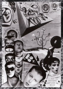
A more grown up version of this practise was created by Moholy-Nagy who cut out photos from magazines then joined them with lines and shapes to change their meaning to depict his political ideas. Some are humorous most attack the narrow thoughts of Weimar Germany. Man Ray did much the same with his work cutting out shapes and creating a surreal collage.
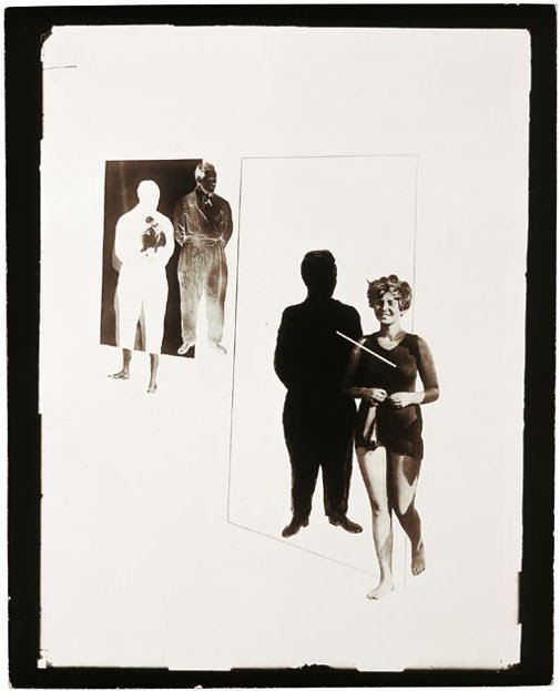
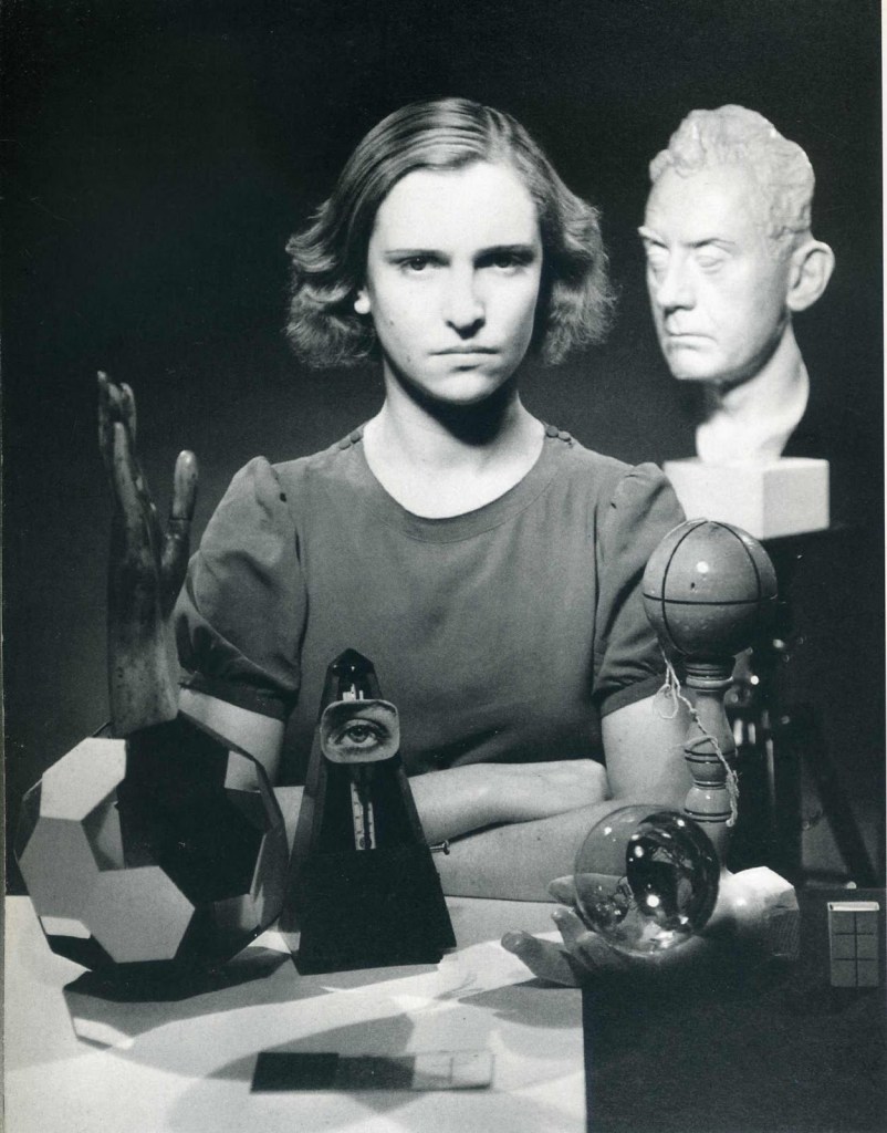
Claude Cahun used this kind of effect a lot however he placed himself into his pictures to get messages across to his audience. His work challenges but also pleases at the same time. His use of pictorial humour draws you in.
So seeing this it is no surprise to think of new ways to do the same. Michael Wolf must have spent hours finding his work for Hong Kong detail, looking for people doing interesting things is difficult in real life, online looking at Google maps must be nearly impossible. Wolf manages to show the big picture then gives you lots of detail fabulous work.
I would have no qualms about doing something similar as long as the end result was worthy of taking the work of others and using it.
Using others work and adding a touch of humour can be thought provoking, however it is vital that you make it clear you are do this in your work. Otherwise your audience will stop trusting you and your work. If you are honest they will accept the work and even admire it.
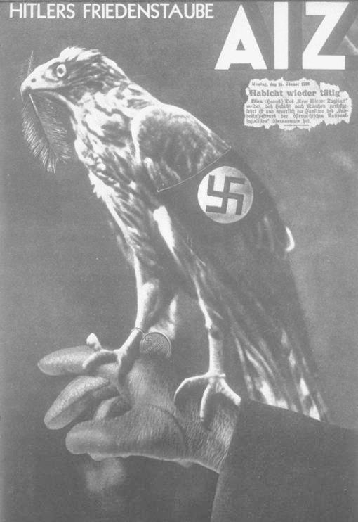
Imagine how Hitler felt when he saw Moholy-Nagy`s “Hitlers Dove of Peace” no wonder Hitler hated Dadaist work. It can be extremely powerful.
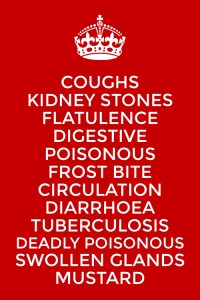
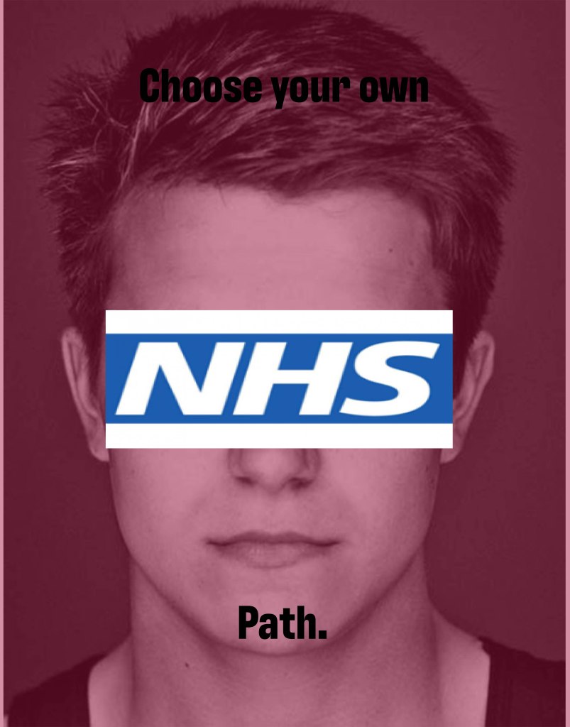
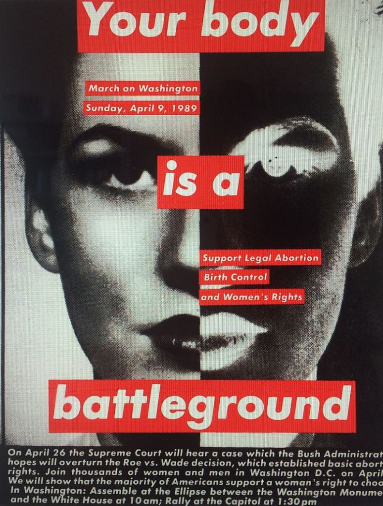
Exercise 2.5 Text in Art
I don’t want to give away my work for Assignment two so some of my explanation here may seem vague, stick with me all will be revealed later in the project.
In the brief we are asked to look at the work of Ed Ruscha, Barbara Kruger and Mark Kitchener. I did so and was amazed to find I had seen their work around over the years in magazines and online. Below is an example of each artists work except Mark Kitchner whose work I couldn’t find.
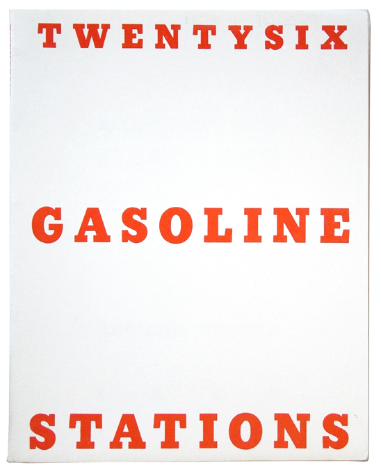
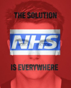
So looking at the work of these two artists I thought about my planned work for assignment 2. It works well together as I have 12 pieces I will display. The words relating to each work well displayed in an Ed Rusha Style. I thought completing the list with the recognised “Keep Calm” would add an official almost Health Department warning feel to it. The second one is my mock up of a poster to support the end of the project. You will have to wait for the assignment to be complete to see the outcome………SORRY!!! However the clues are all there on the posters just look and think.